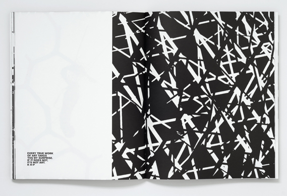
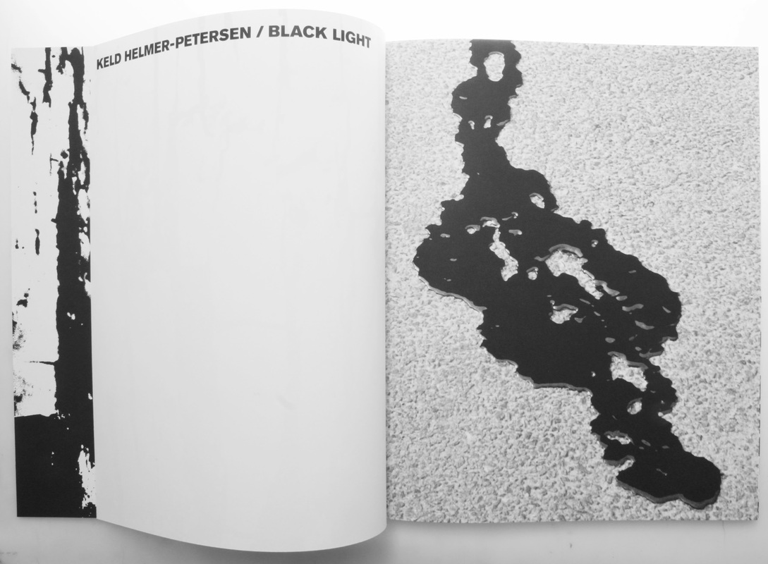
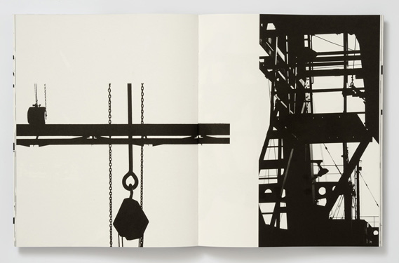
Black Light
Keld Helmer-Petersen
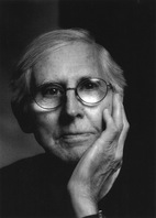
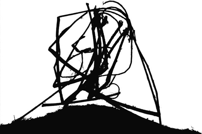
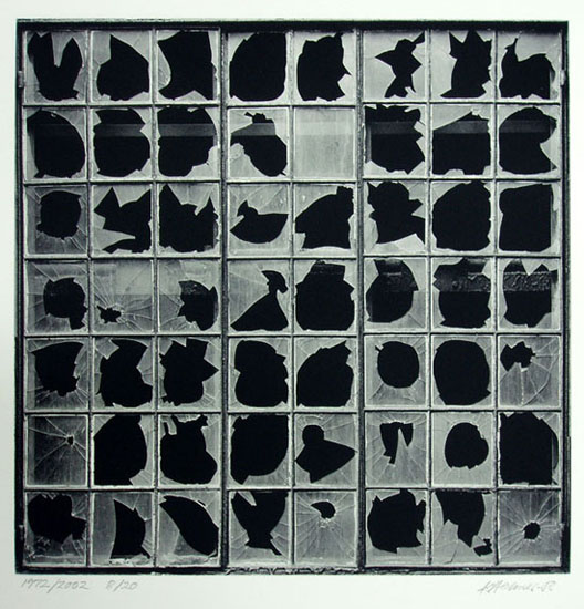
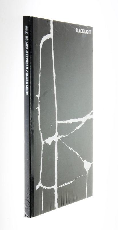
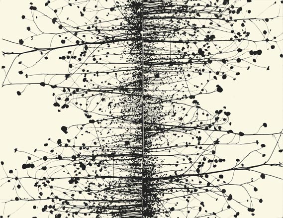
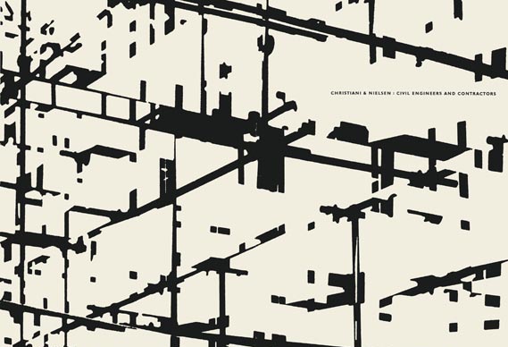
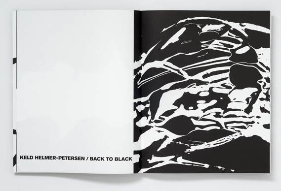
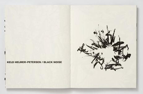
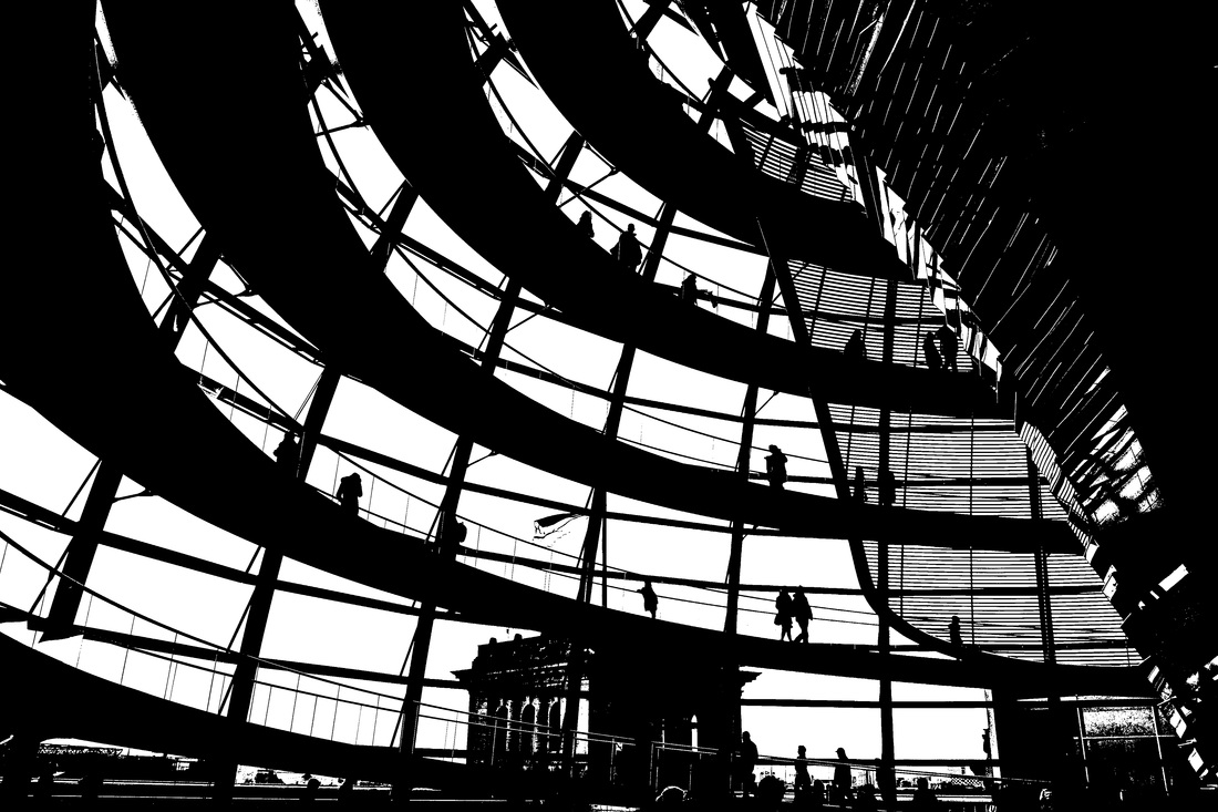
Keld Helmer-Petersen (1920-2013) was a Danish modernist photographer, who started photographing in the late late 1930's. Keld Helmer-Petersen was particularly inspired by the work of Albert Renger-Patzsch, who influenced his first major breakthrough '122 Colour Photographs/122 Farvefotografier', which was also especially inspired by the 'New Objectivity' movement. This book was particularly famous due to his use of colour in this set of photographs, as using colour for art photography was particularly unusual at that time. It focused closely on patterns on various subjects, especially patterns in buildings and some landscapes; again, similar composition and subject matter to Albert Renger-Patzsch. Following this, he began focusing particularly on architectural and design photography in the 1950s and 1960s. He became particularly focused and one of the best architectural photographers, up until quite recently. Although being well known for colour photography, he published a number of books focusing on Black and White photography, particularly focusing on high contrast between black and white areas - removing much of the mid tones to create dramatic contrasts of tone. These recent publications include 'Black Light' and 'Black Noise', both books focusing on high contrast, abstracted Black and White images. He used cameras and scanners to achieve the effect he wanted, with both his own and found photographs.
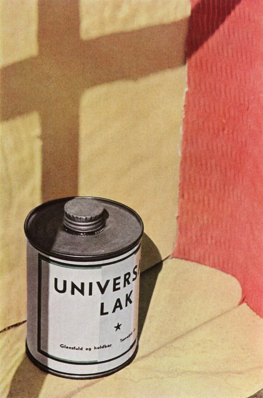
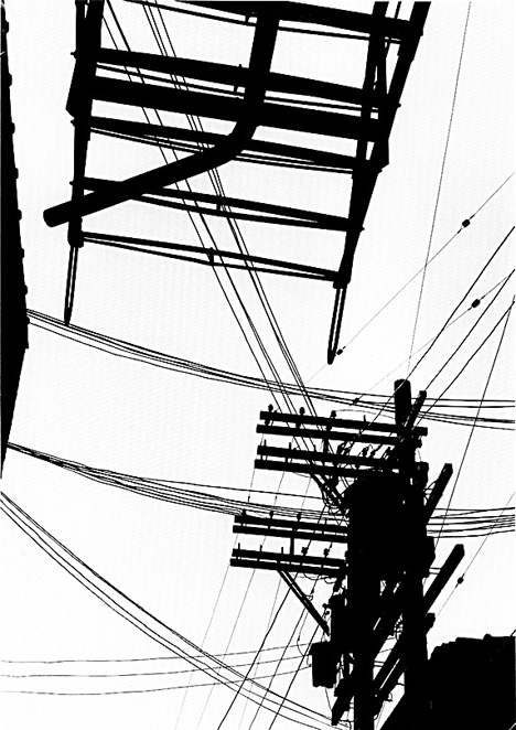
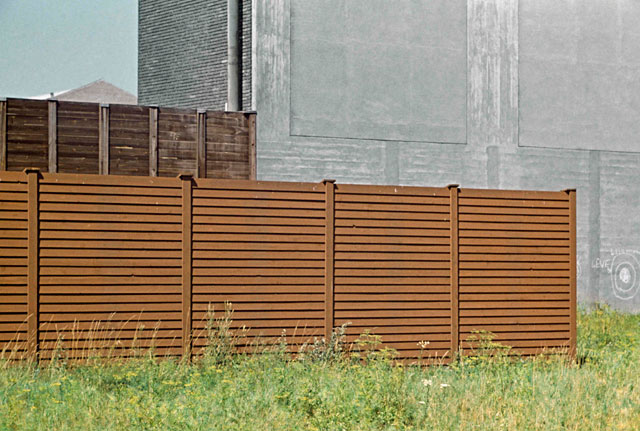
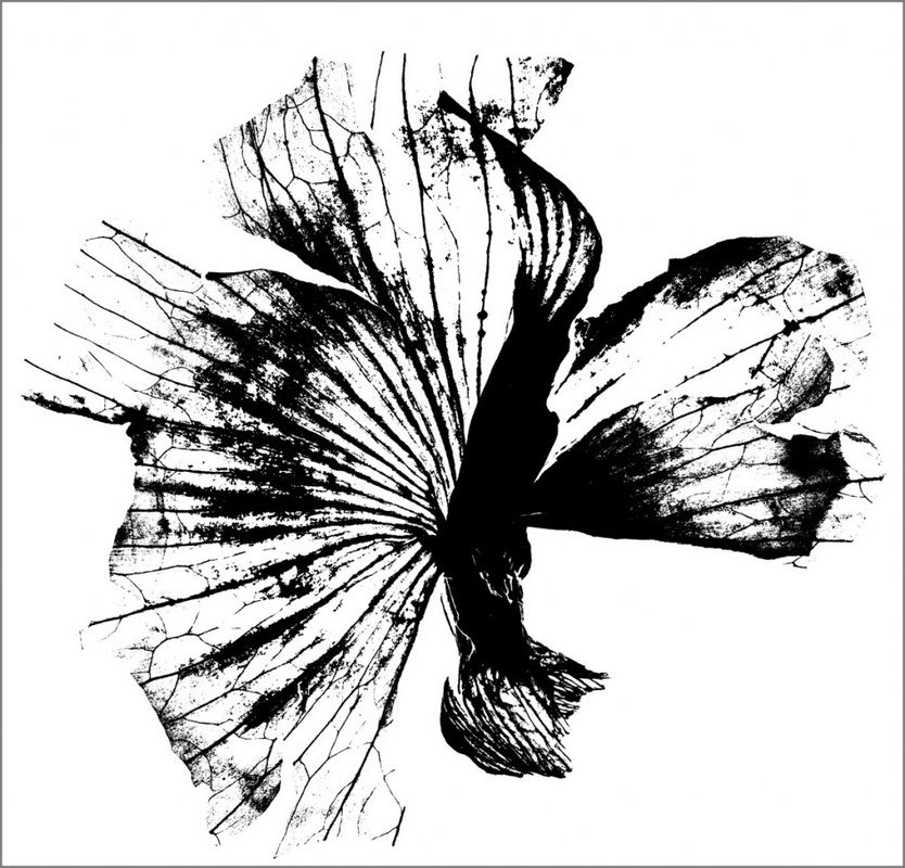
Gallery of Keld Helmer-Petersen's photographs
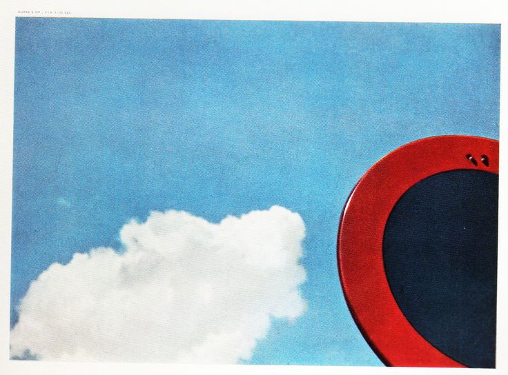
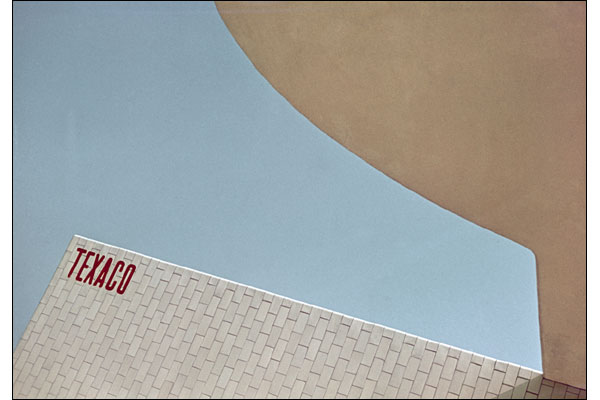
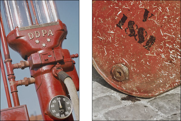

Keld Helmer-Petersen's Black and White Publications:
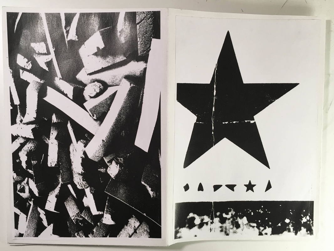
('Black Light' and 'Black Noise' particularly)

Editing my images
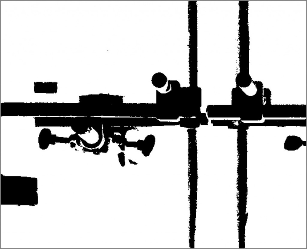
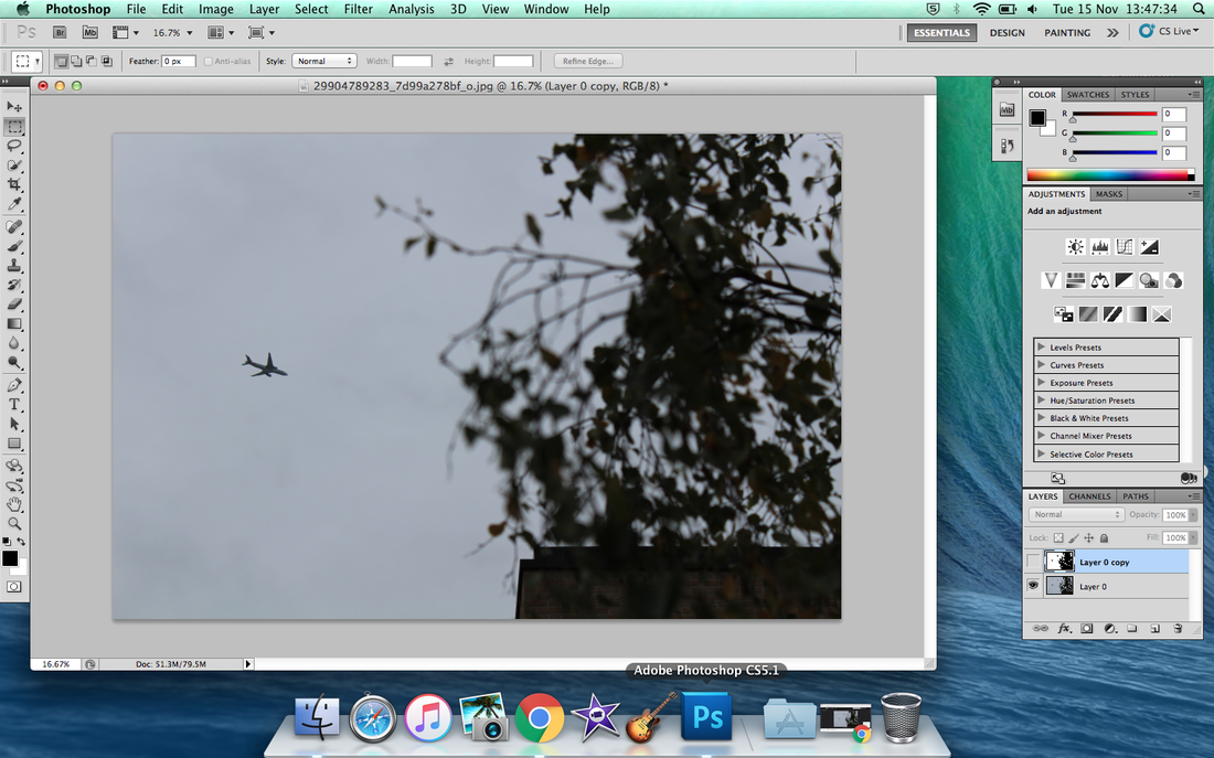
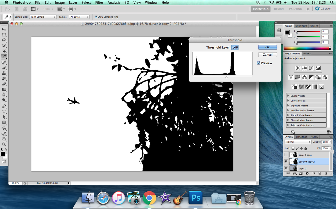
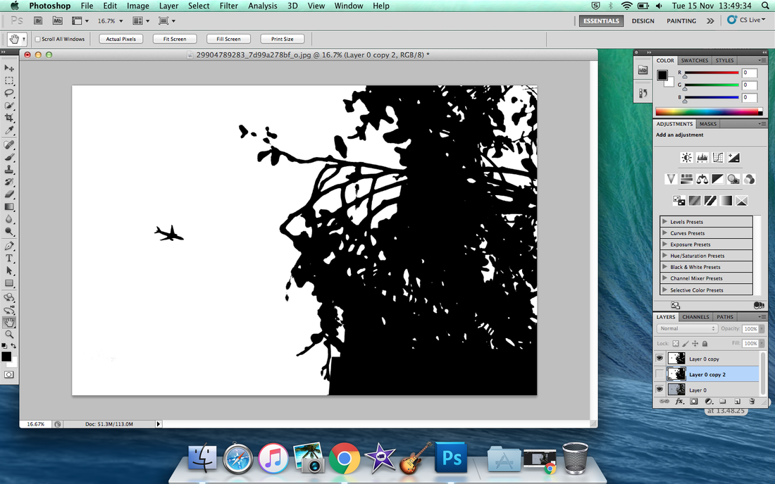
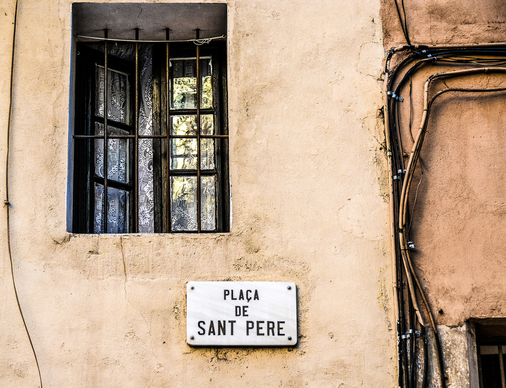
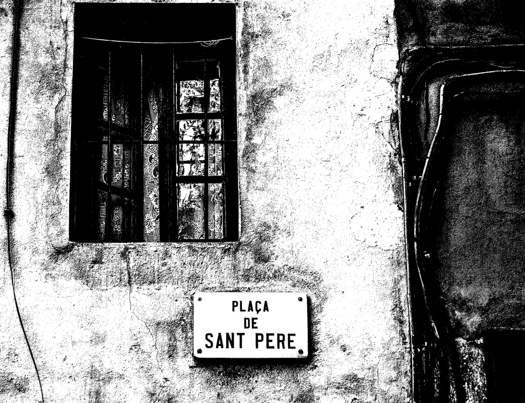
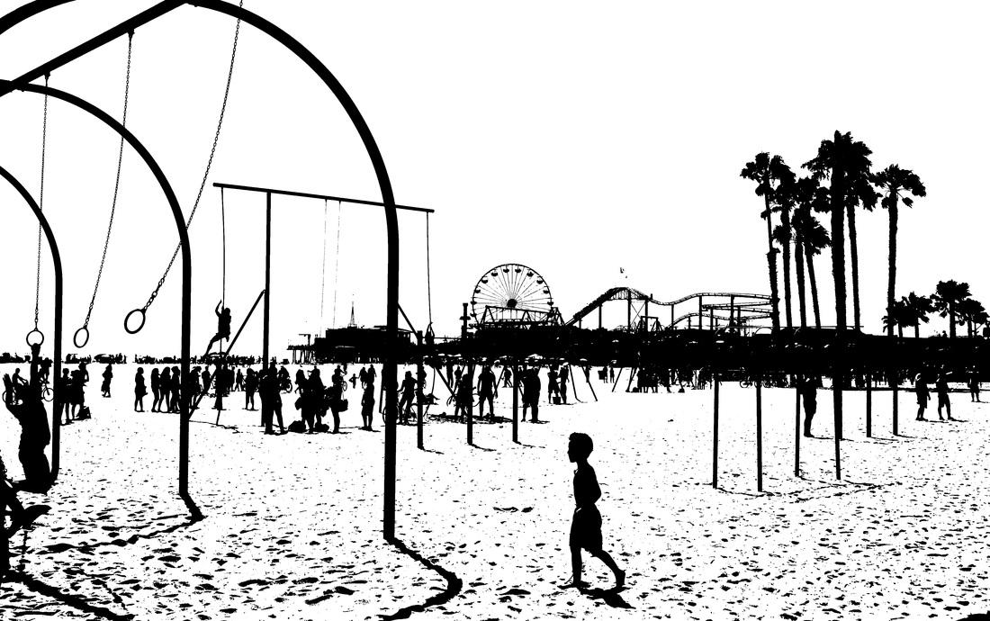
After I had selected the images that I wanted to include from my photos on my Flickr, I then manipulated these images in photoshop. After opening an image in photoshop, I then duplicated the image layer (to avoid editing the original layer) and selected the dropdown, Image > Adjustments > Threshold. I then varied the level of the threshold using the slider on the histogram; increasing blacks and darkening the image by sliding to the right, and decreasing blacks and Brightening the image by sliding to the left. Using the threshold filter creates a strongly contrasting monochrome effect - it removes nearly all grey midtones. I selected a few differnent images that I had taken. However, I mostly chose images that i though would contrast or correspond or contrast well with one another; or images that I thought would work and respond well to the threshold filter.
|
|
|
|


My edited images
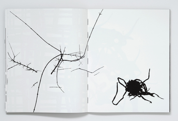
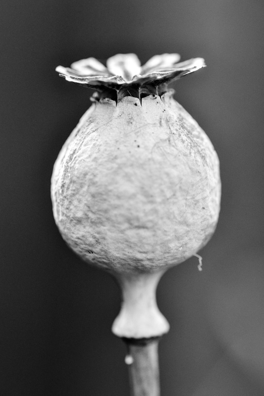
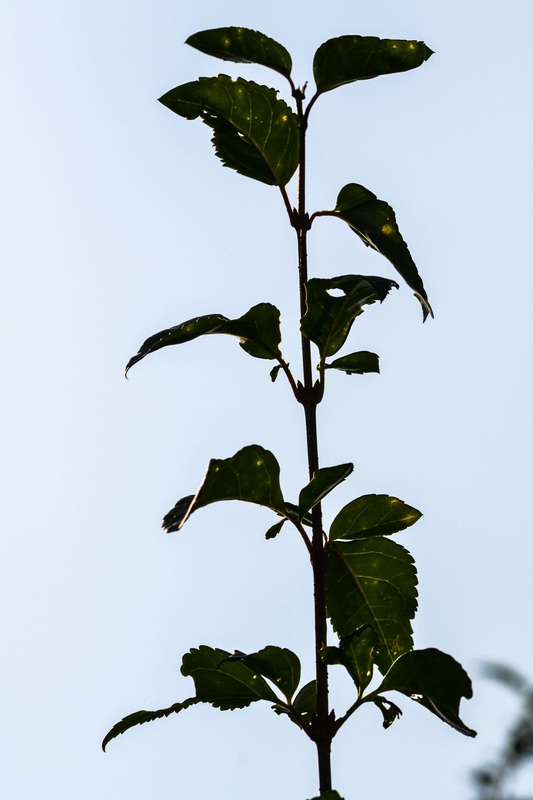
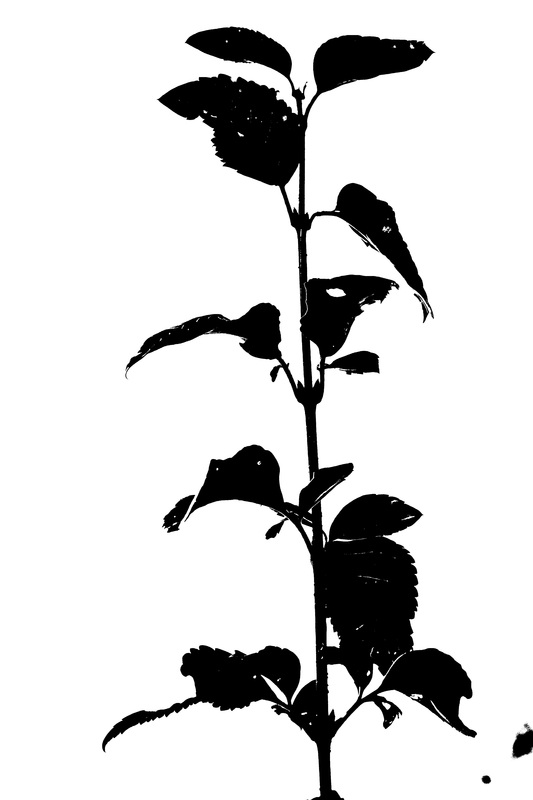
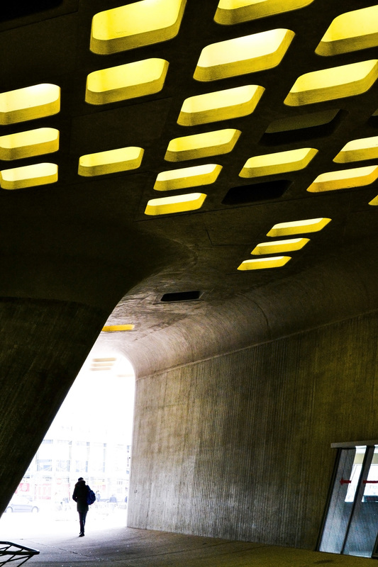
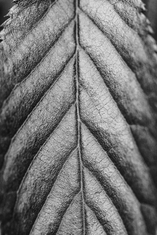
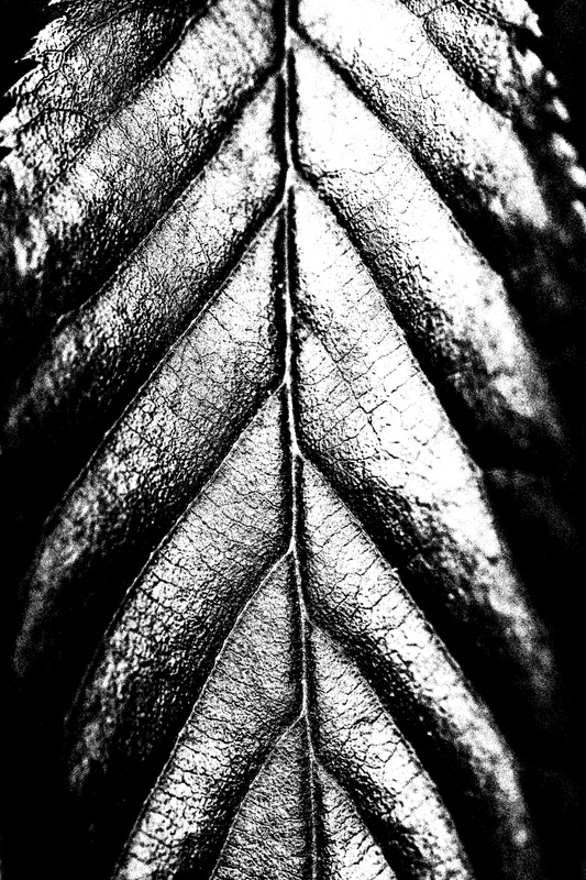
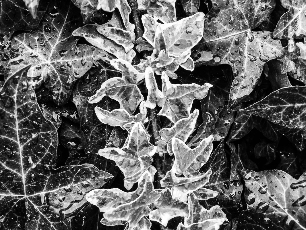
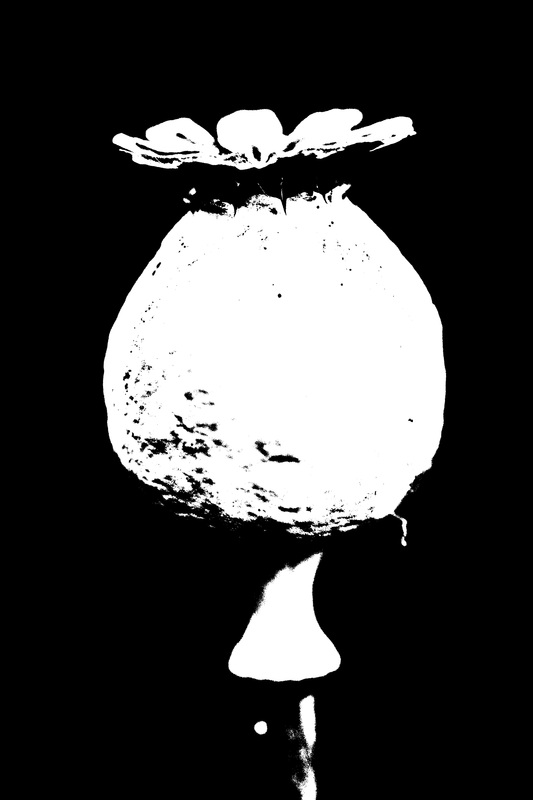
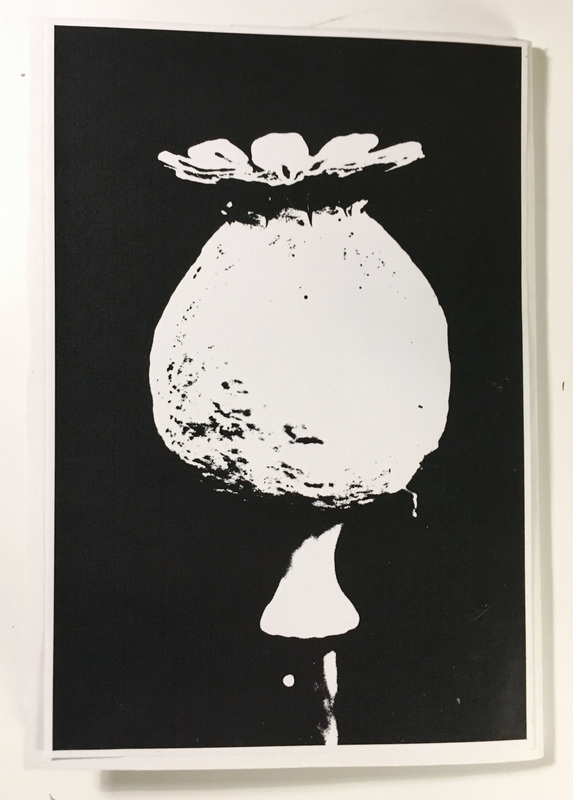
This gallery shows my edited images that I exported. I am quite pleased with the outcome of these edited images - I like the different effects and results created. When selecting the images, I thought about how different images would look and respond to the threshold filter. When choosing the images, I also thought about how they would relate to one another, or contrast, when laid out in the book. For example, I selected two images of plants as these images could relate to one another when laid out over a double page spread; as well as this, I selected two images featuring silhouetted images as they corresponded well to one another.
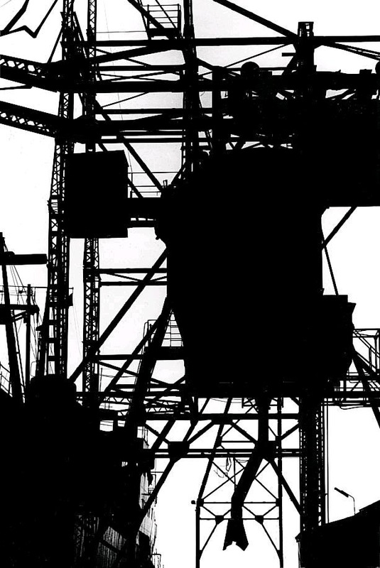
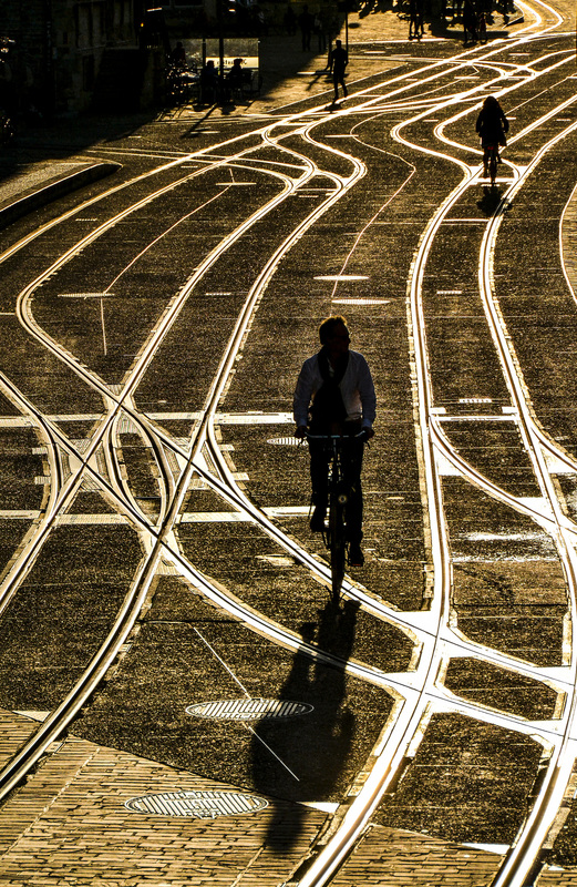
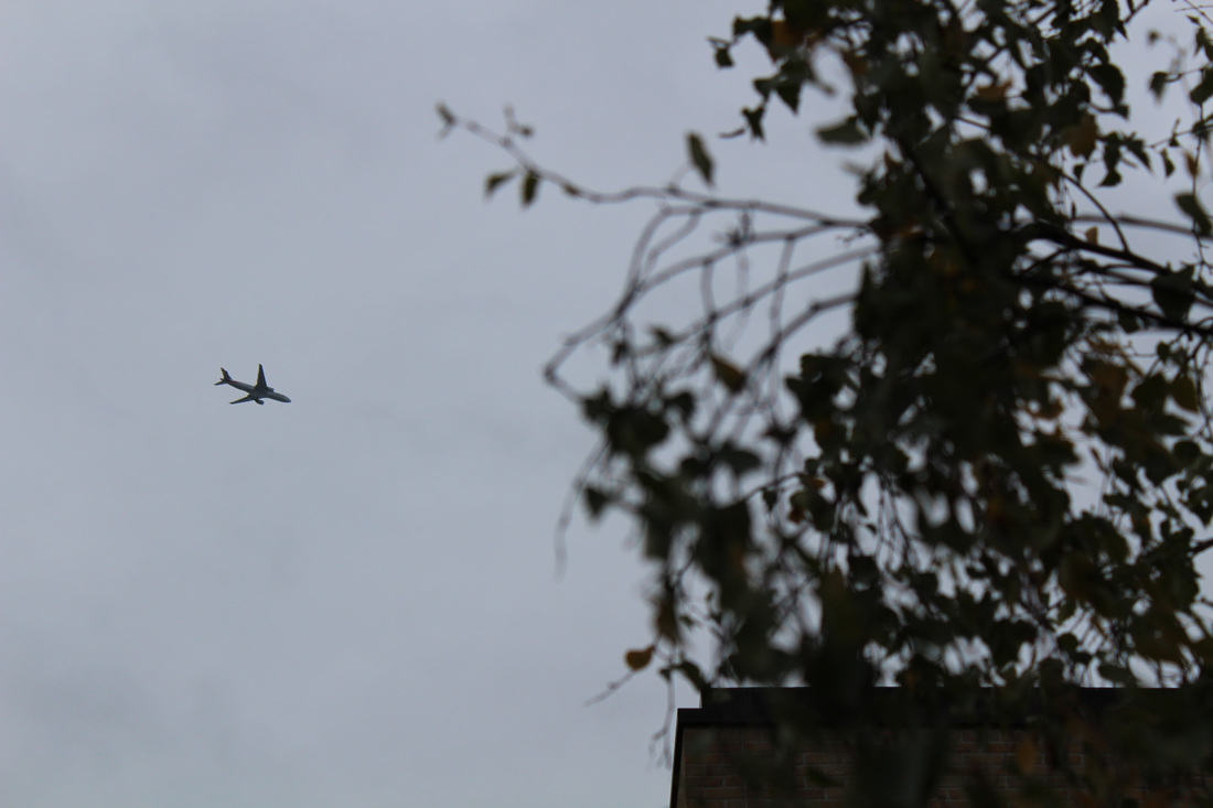
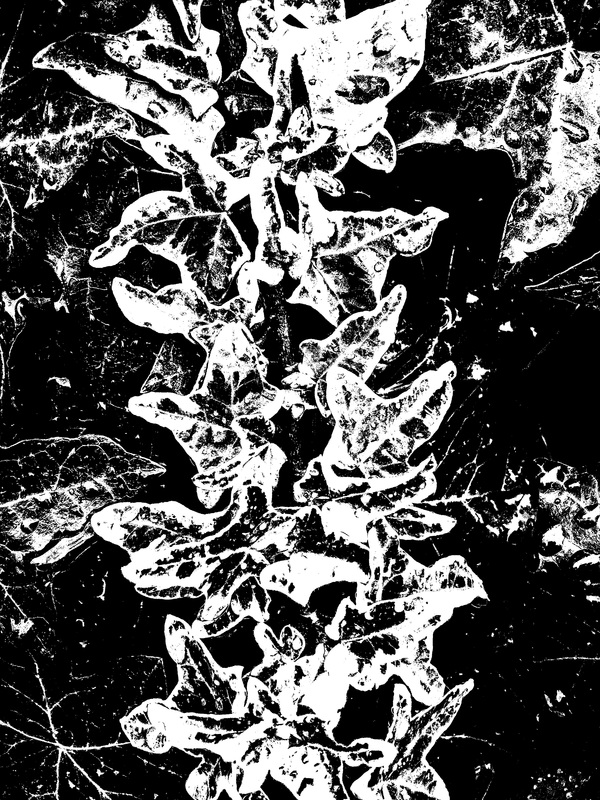
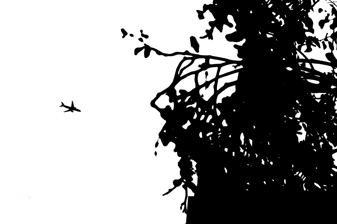
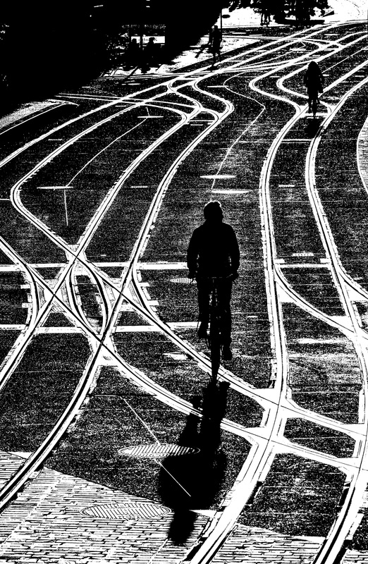
The images responded quite differently to manipulation and the 'Threshold' filter. The photograph with the plane and branches (left of centre) is quite abstracted and has little detail (it has more blocks of black tone), whereas other images (such as the close up of a leaf, and the photograph with silhouetted cyclists and tram rails) have retained quite a lot of fine detail. I think that these imaged do show influence from Keld Helmer-Petersen, with some images emulating his contrasty Black and White images more than others. I think that the images with less detail, with solid black areas emulate Keld's photographs more than the photographs that have retained more finely detailed areas. For my printed book I included 7 of these 9 edited images.
The images responded quite differently to manipulation and the 'Threshold' filter. The photograph with the plane and branches (left of centre) is quite abstracted and has little detail (it has more blocks of black tone), whereas other images (such as the close up of a leaf, and the photograph with silhouetted cyclists and tram rails) have retained quite a lot of fine detail. I think that these imaged do show influence from Keld Helmer-Petersen, with some images emulating his contrasty Black and White images more than others. I think that the images with less detail, with solid black areas emulate Keld's photographs more than the photographs that have retained more finely detailed areas. For my printed book I included 7 of these 9 edited images.


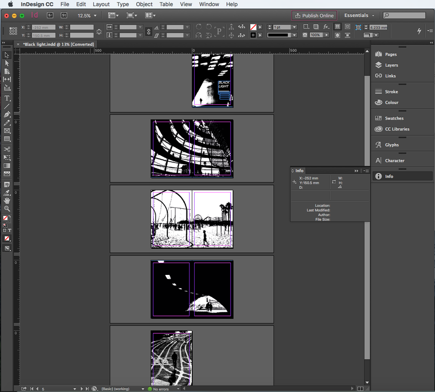
My First Book
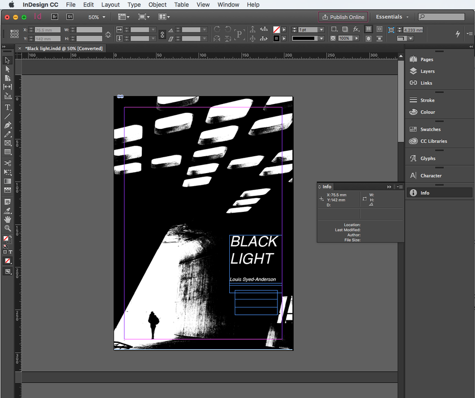
In response to Keld Helmer-Petersen's Black and White photographs and books, I created my own book of strong contrast Black and White images that I had taken. I created this book using a folded piece of A2 paper, then printing and sticking images onto the various pages. For this book, I included 7 of the 9 images that I edited. This enabled us to quickly create a book, so we could lay out and see how are printed images looked side by side on different pages. However, my book wasn't perfect or immaculate as it was created using paper relatively quickly - as a test piece. However, I would like to print these photographs in a proper book - I could use websites such as Photobox to have this made professionally, and include more edited images. This used this book to test the layout and look of the photographs in a book, using Keld Helmer-Petersen's Black and White books as inspiration; these books also paid close attention to design.
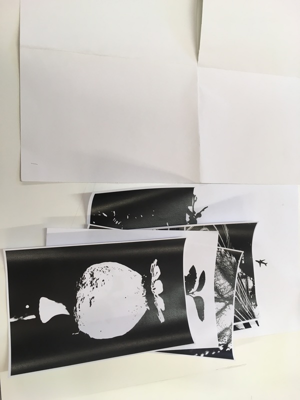
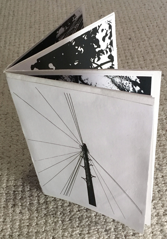
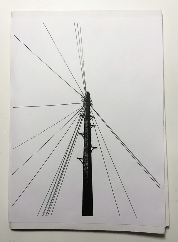
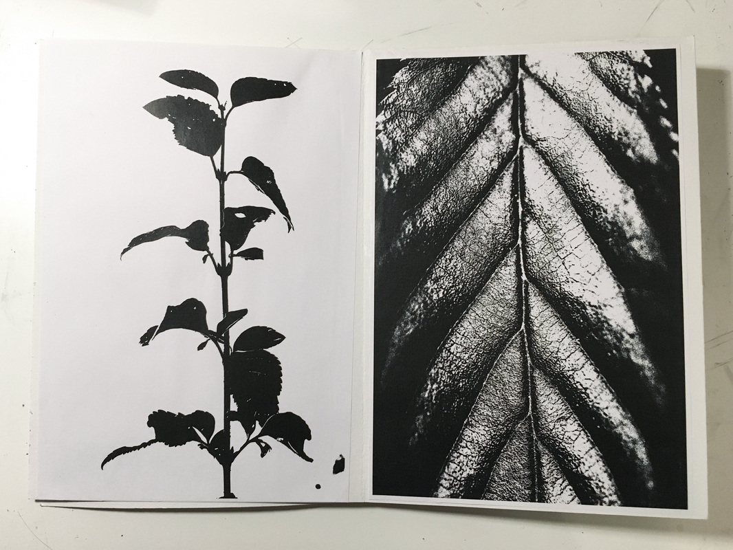
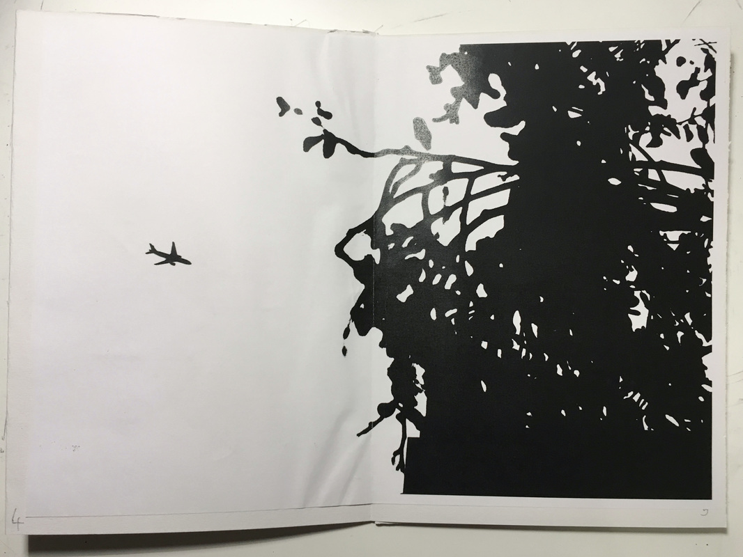
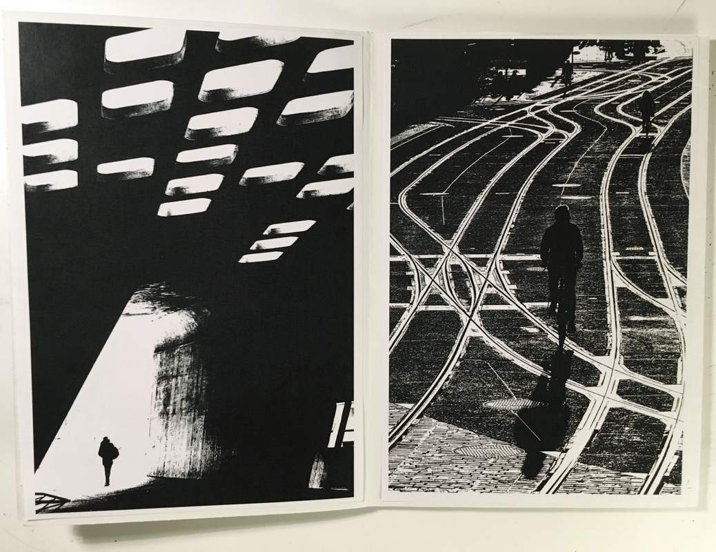
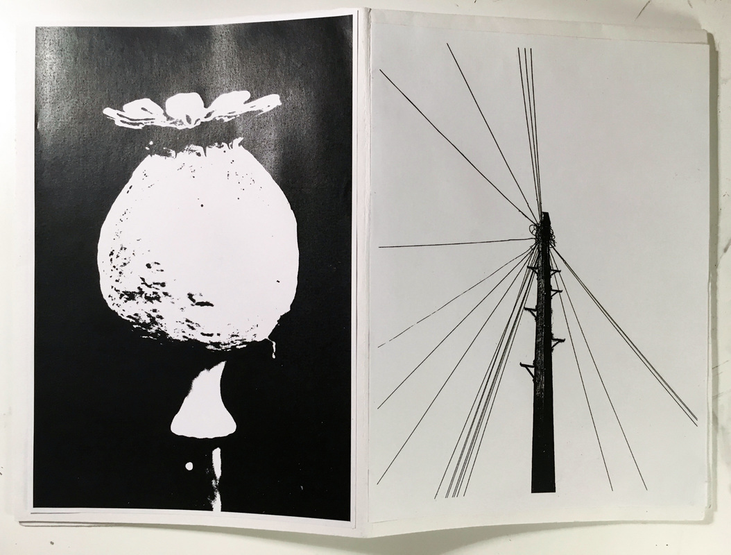
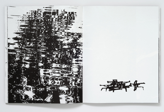
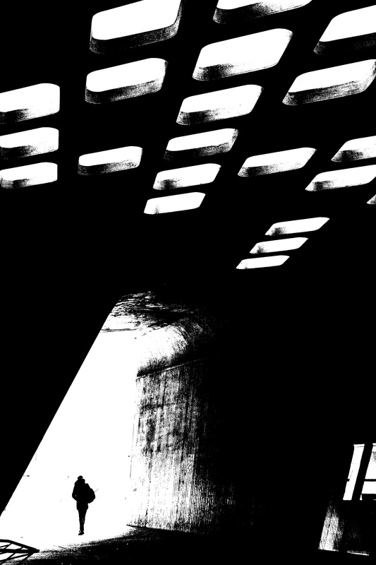
When the paper was folded and divided into a book, there were 8 pages available for images. I included 7 images in my book from the images that I edited, with a large A4 printed image taking up a double page spread. When laying out and placing images side by side, I had to think about how these images correspond or contrast one another. For example, I placed the image of a silhouetted branch next to the photograph of a close-up, detailed leaf. The contrast one another as the photo of the branch on the right has mostly white space (with the black branch against the white background), whereas the detailed leaf has more black/darker areas, with some whiter details. However, these photographs also correspond to one another as both images focus on plants. I chose to include the photograph of a plane and some branches due to the contrast created over the two pages. The right hand side on the image is quite cluttered and busy, with dark abstracted branches taking up this half of the image. In contrast the left hand side of this image, with only the single plane against the white background - the two sides of the double page spread contrast. I took this idea as inspiration from Keld Helmer-Petersen, who included opposing images and pages contrasting one another; often contrasting in tone, size or shape - many of these images also corresponding in another way, often having similar subject matter.
My Second Book
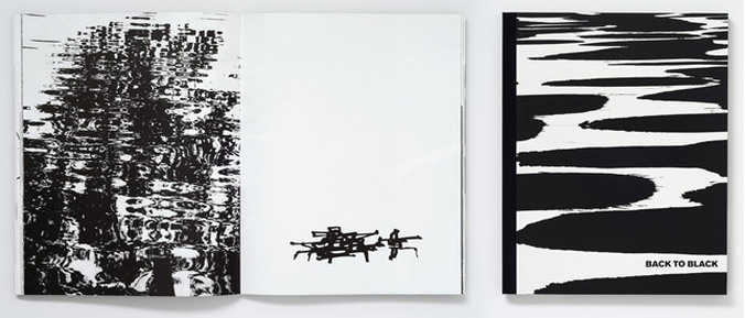
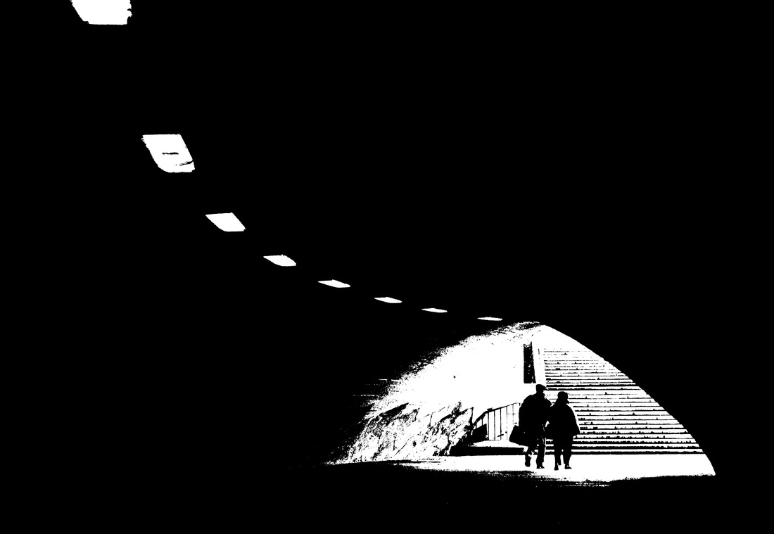
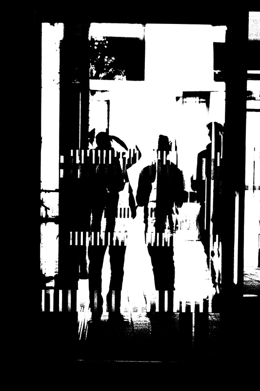
For my second book, I create a digital photobook of my edited images using Adobe InDesign and Calameo software. After experimenting with a printed, physical book, I wanted to try creating a digital photobook which can be interacted with on-screen. I also stuck to a theme throughout this book much more. For this photobook, I stuck to the theme of silhouettes, selecting images featuring silhouetted figures; this created a theme and link that ran throughout the book.
Edited images
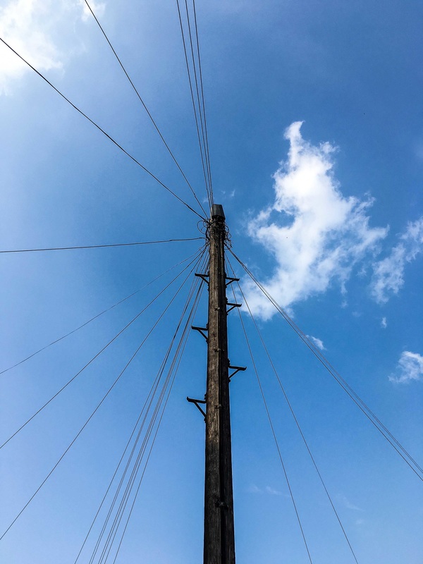
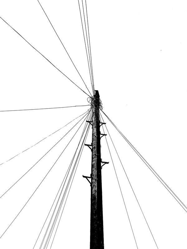
Firstly, I selected my favourite images that I have taken that feature silhouetted figures. I also chose these photographs as I thought that they would respond and work well with a threshold filter applied to them. Again, I used the same techniqueof applying the threshold filter in photoshop that I applied when editing images for my first photobook.

Creating the Digital Book
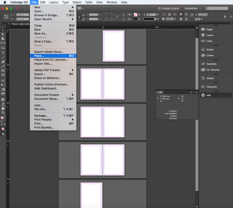
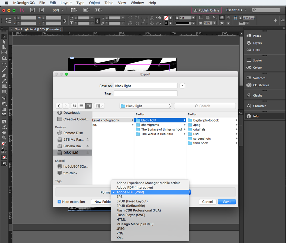
I created my digital book using InDesign and the Calameo. In InDesign I selected New > Document and then created an 8 page, A4 book. After the pages of the book appeared on screen, I then began to place images in the book. To do this I selected File > Place and then selected an image to place on the page, I clicked on the page to place the image. I then adjusted the size of the image on the page, holding shift to make sure the image wasn't stretched when resizing. After I had placed all the images on the page and adjusted their size, I added a title to the book. I selected the Text tool, placed a text box on the home page, and typed and adjusted the font. When I had finished the book I saved it as an InDesign file, I then exported it as a Pdf file (so it could be used to create a digital book in Calameo). I then emailed the Pdf to my teacher so that they could put the pdfs into a book in calameo, I then embedded this book on this page using the embed code.
Overall, I think that the digital book works quite well. It is interesting to interact and see the book on screen, rather than only looking at photos of a printed book. With this book, I decided to use more landscape images that fit across two pages I quite liked the effect and look of this in my first book. I have stuck to the theme of silhouettes/silhouetted figures in this book, compared to a wider variety of images in my previous book; I think having this theme running through the book does work quite well. However, on the other hand, I think I could have chosen a bit more of a variety of images
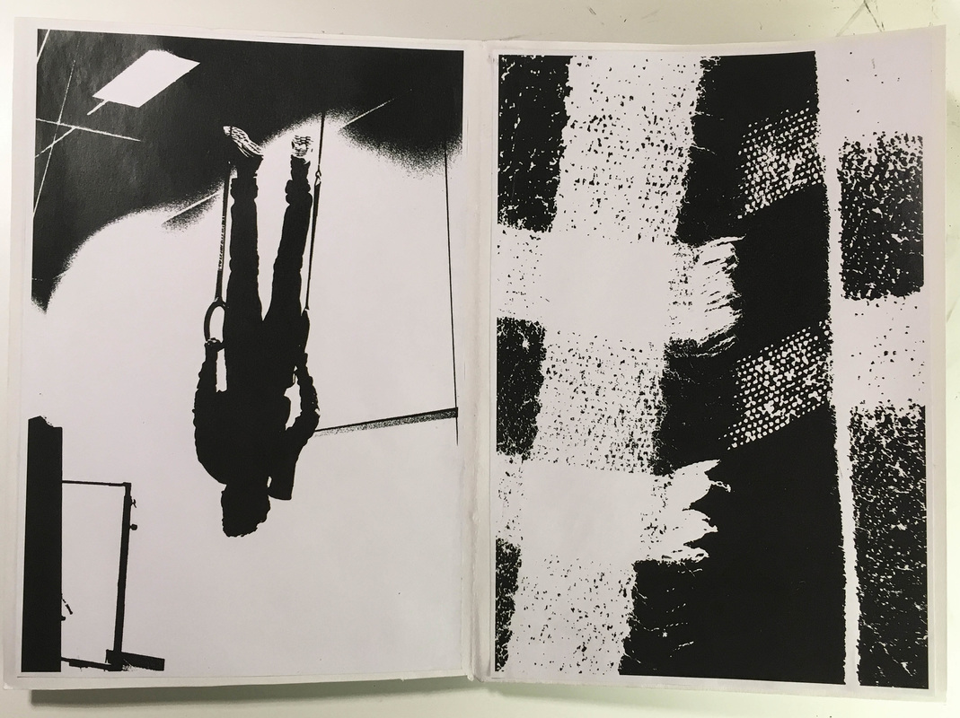
My Third Book
For my third book, I used a sheet of folded A2 paper again and stuck on my printed images. Again, this book was also inspired by Keld Helmer-Petersen's high contrast Black and White photobooks. However, for this book I used my more abstracted images. In my first two books, I selected images where you could see and identify the subjects quite clearly in the images. Both books did have contrasting images, but many of the images had similarities particularly in terms of the subject matter (for example images of plants opposite one another). However, for this book, I wanted to select more distorted and abstracted images, where the viewer may struggle to identify the subject matter in these photos.
Edited Images
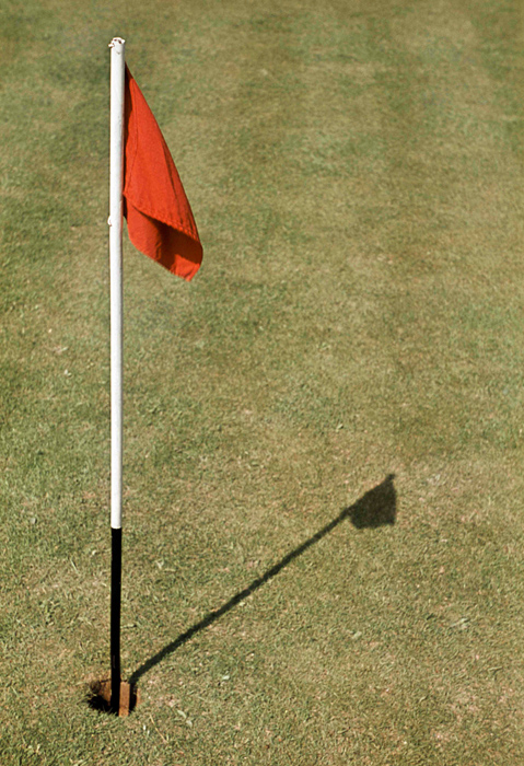
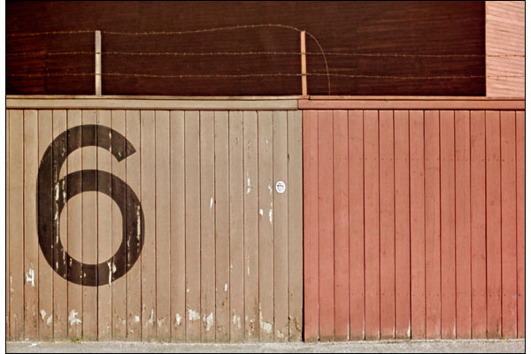
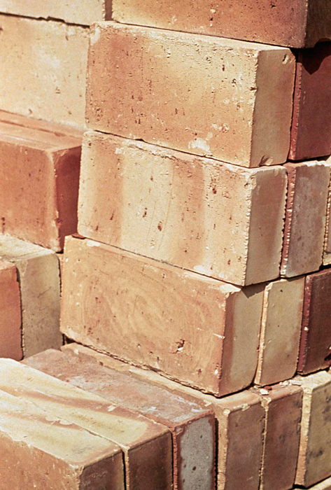
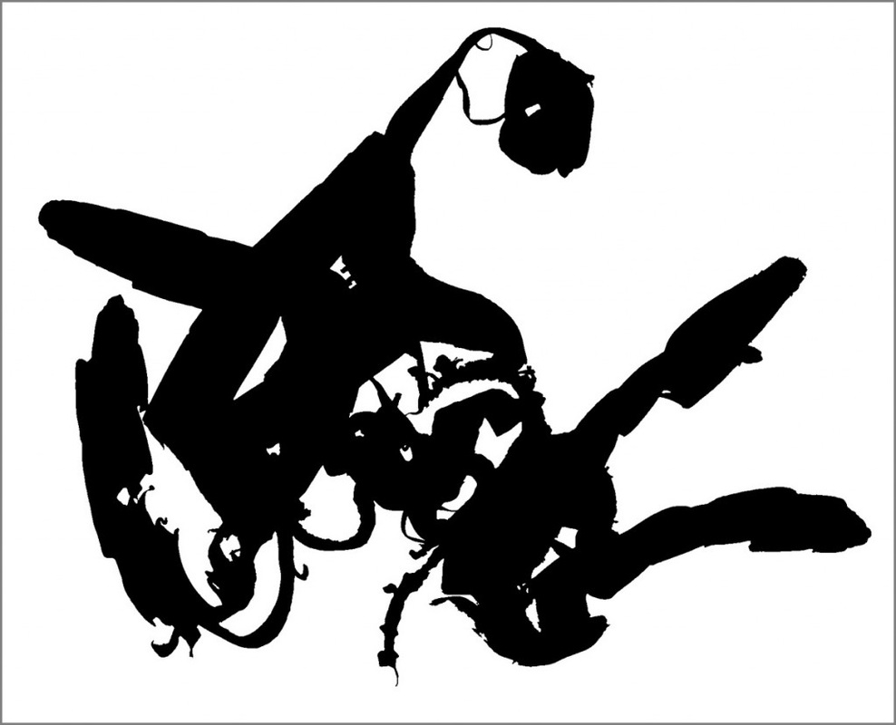
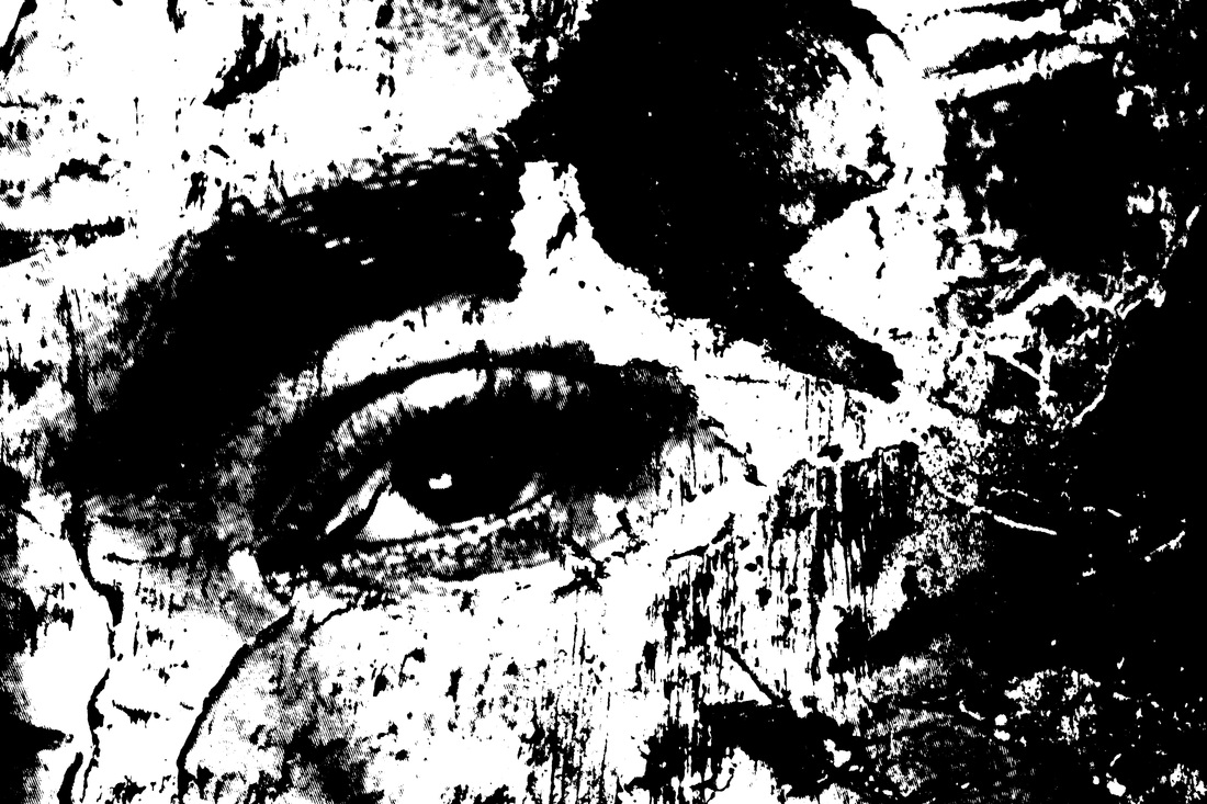
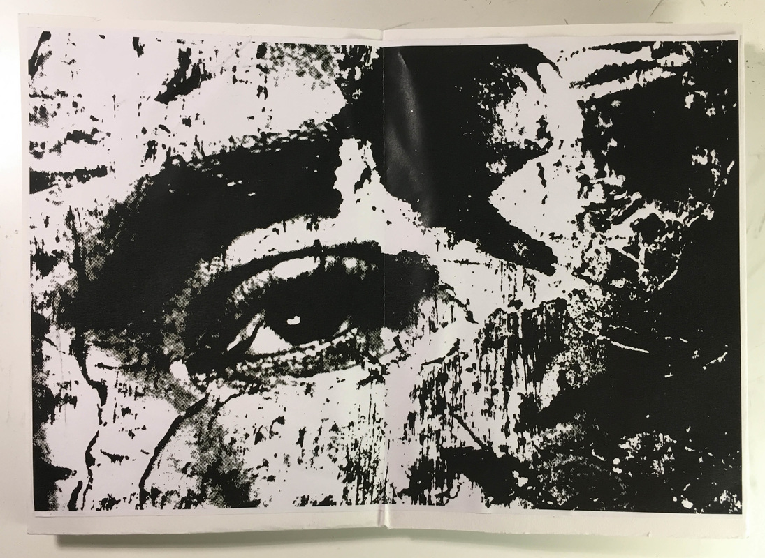
Again, I used the same process of applying an threshold filter in photoshop to achieve the high contrast effect. I selected images that I had taken in school for my 'Surface of Things' project. I selected images from this set as many were quite abstracted and distorted, often focusing on sections of many abstracted artworks. Generally, I thought that the images responded pretty well to the threshold filter; some interesting distorted effects were created. I particularly like the image of a section of an artwork (far right of top row below) with the abstratced shapes and paint marks surrounding an eye on the left hand side of the photo.
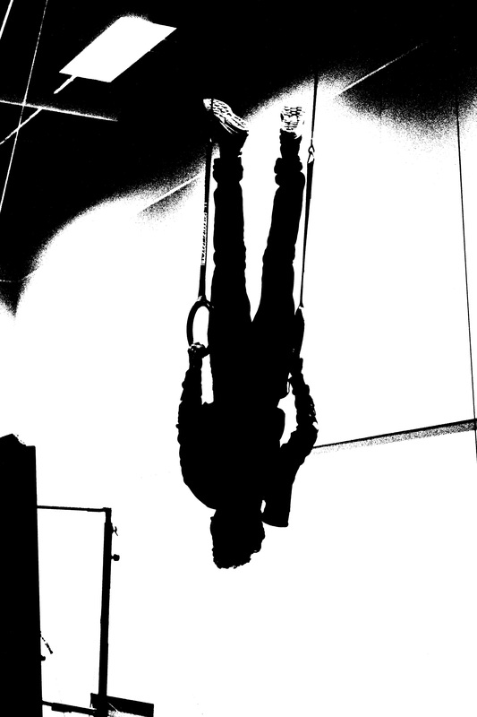
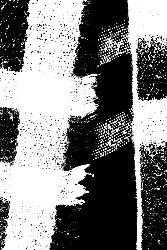
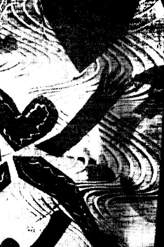
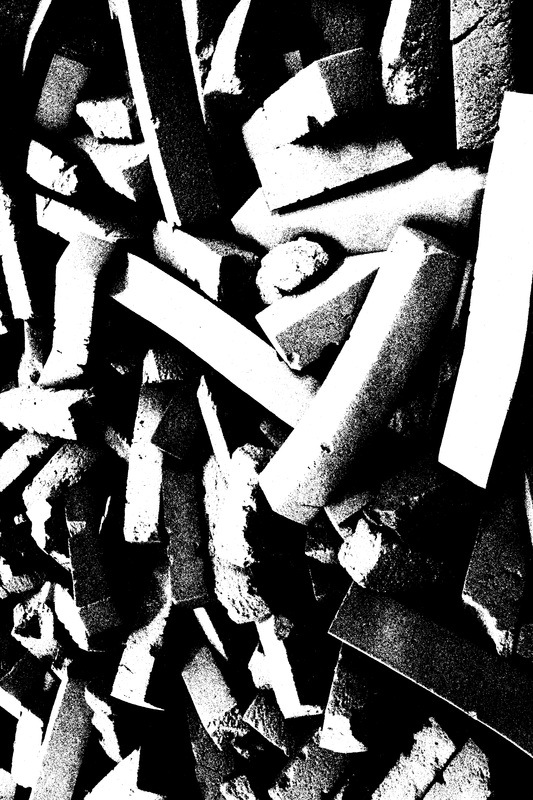
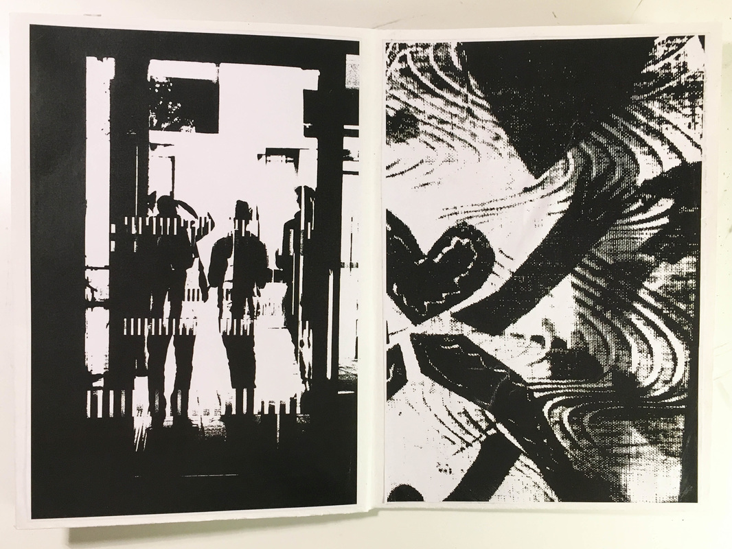
I selected 7 of the 8 images above for my book, I left out the image (in the bottom right of the gallery above) as I thought it was too abstracted; it is only splodges of distorted paint across the images, with no different areas or feautures (like the distorted image of the eye). When arranging the images on the pages of the book, again I thought about how different images could correspond and/or contrast to one another. I have placed some of the images opposite one another as they contrast in terms of the differing tones, and how dark or light these images are. However, I also thought about how some of the images could correspond to one another (however this was not obvious due to how distorted and abstracted many of these images are). For example, I thought the image of the upside down figure on the hoops corresponded in some ways to the close-up of the material, mostly due to the composition and components in the photographs. Although these images differ in many ways, both have verticle lines running down the picture.
Overall (similarly with many of my folded paper books) I enjoyed selecting the images and thinking about how they could correspond and be laid out in a book. I also enjoyed the editing process and seeing the edited hight contrast results. However, (again with the other paper book), the finish/production quality of the finished book wasn't great as it was a quickly made DIY book. I think the finished product could be improved if it was printed professionally and printed in high quality. If I did this, I could create a larger book with more images, potentially similar to the size of Keld Helmer-Petersen's Black Light Publication.
