Threshold Concept 7:
'Photographs are not fixed in meaning, context is everything'
The meanings of photographs are never fixed. They are not only in the photographs themselves and rely on a combination of the viewer's sensitivity, knowledge and understanding and the specific context in which the image is seen.
|
I selected this Threshold Concept because I found it particularly interesting and relevant to my interests in photography, and what I want to investigate further. In particular, it is extremely relevant in terms of my interest in documentary photography. Moreover, in terms of the ability of the camera to provide a social documentary and capture your environment at a point in time. Context in photography is particularly relevant to this, mainly because it gives us information about the photograph, and greater knowledge to understand a particularly photograph.
'The camera is my tool. Through it I give a reason to everything around me.' -- André Kertész
|
Through my research into this Threshold Concept, I found that context is critical in understanding what we know about the photograph. This gives us a clearer and better understanding historical photographs, we can better understand what they document, and what they are about; giving us a better understanding of historical events.
In Paul Strand's 'Blind Woman' (1916) there is clear context and description within the photograph itself. The woman has a label around her neck with 'BLIND' written across it, immediately providing context for the viewer and describing what is wrong with the woman. This is quite a direct photograph, the viewer is forced directly at the woman.
Themes are also a key area of interest for me, particularly in the research of this threshold concept. Different photographers observe and photograph different themes and subjects. Themes within photography are 'passed on' through the history of photography, each photographer extending the observations of the last. This creates narrative and documentary progression throughout the history of photography. I am particularly interested in the idea of freezing a moment in time - thus freezing that particular point in history forever.
Themes are also a key area of interest for me, particularly in the research of this threshold concept. Different photographers observe and photograph different themes and subjects. Themes within photography are 'passed on' through the history of photography, each photographer extending the observations of the last. This creates narrative and documentary progression throughout the history of photography. I am particularly interested in the idea of freezing a moment in time - thus freezing that particular point in history forever.
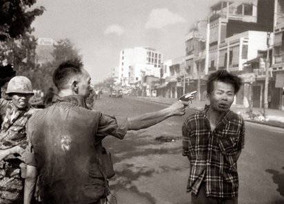
For example, in Eddie Adams' 'Murder of a Vietcong by Saigon Police Chief, 1968', the photograph freezes the police chief forever as a villain, executing the suspect; and the photograph also freezes the moment before the suspect's death in history. However, the context of the Vietnam war is key in this photograph - both information surrounding the photograph, and what we can see in the photograph itself. I find it very interesting how truth, and the way in which this event is frozen in time, is manipulated within this photograph. A photograph can never capture the whole, complete, objective truth - it always is subject to the interpretation of the photographer to a certain extent, all photographs are lies to an extent. Although the photographer captured only what he saw in front of him, the two people in this photograph are captured as a villain (the police cheif), and a man being summarily executed. The viewer may feel some sadness for the defenceless man being executed, but investigating deeper into the context of the photograph shifts the way you look at this photograph. The man being executed had just been captured whilst he was involved in mass killings, he had just killed a soldier as well as the soldier's wife and children. This piece of information would surely change how one sees the photograph, and could possibly cast the executed Viet Cong suspect as a villain in many people's eyes. The photographer regretted the effect of this image, and subsequently talked about how photographs are only half truths and also show a particular point of view:
Eddie Adams wrote in Time Magazine: "The general killed the Viet Cong; I killed the general with my camera. Still photographs are the most powerful weapon in the world. People believe them, but photographs do lie, even without manipulation. They are only half-truths. What the photograph didn't say was, "What would you do if you were the general at that time and place on that hot day, and you caught the so-called bad guy after he blew away one, two or three American soldiers?"
Eddie Adams wrote in Time Magazine: "The general killed the Viet Cong; I killed the general with my camera. Still photographs are the most powerful weapon in the world. People believe them, but photographs do lie, even without manipulation. They are only half-truths. What the photograph didn't say was, "What would you do if you were the general at that time and place on that hot day, and you caught the so-called bad guy after he blew away one, two or three American soldiers?"
Again, Robert Capa's iconic photograph 'Royalist Militiaman at the Moment of Death, Cerro Muriano, September 5, 1936 (The Falling Soldier)' captures a moment in time, freezing the soldier's death. However, in this case, the context surrounding the photograph is misleading (many people have questioned the location of the photograph), and many people think that the photograph is fake or had been staged. In this case, the context provides further doubt about the photograph, and compromises how truthful the photograph is (even more significantly).
Not only this, but I am also very interested in how photojournalism can be a powerful tool, illustrating political events and conflicts. I am interested in the way that photographs can radically change the views of the masses. For example, in history, I studied how photojournalism and moving image changed the American population's views of the Vietnam war, subsequently causing protest and changing the course of the war. I find it very interesting how much of a powerful tool photography is; as Eddie Adams said, 'photographs are the most powerful weapon in the world'. Photography can show such a clear story/message, and can be manipulated to show a particular point of view. Moreover, the title or information/context of the photograph can change the meaning or how people see a photograph.
Not only this, but I am also very interested in how photojournalism can be a powerful tool, illustrating political events and conflicts. I am interested in the way that photographs can radically change the views of the masses. For example, in history, I studied how photojournalism and moving image changed the American population's views of the Vietnam war, subsequently causing protest and changing the course of the war. I find it very interesting how much of a powerful tool photography is; as Eddie Adams said, 'photographs are the most powerful weapon in the world'. Photography can show such a clear story/message, and can be manipulated to show a particular point of view. Moreover, the title or information/context of the photograph can change the meaning or how people see a photograph.
My Personal Investigation
|
In terms of what I am curious about, I covered the areas in photography that I am most interested in currently. I wrote about documentary photography, particularly as I want to investigate this further and look at aspects of this genre during my personal investigation. It is also one of my favourite genres in photography. I also talked about this genre involving capturing history and documenting society, as well as the implications of truth surrounding photography. More widely, I also wrote about society and politics which are both more general interests of mine. This links to the documentary genre, and it could link to some photography work.
|
In terms of what I enjoyed most so far in the photography course, I wrote experimentation and photobook work as the work that I enjoyed most. Experimentation (especially in the darkroom) helped me widen my skill set and I enjoyed experimenting with new skills and materials. I also really enjoyed my photobook project as I worked on and improved my street photography particularly, and I enjoyed the process of pairing and laying out my images. The process of making the photobook massively improved my skills in photography (especially street photography), and it is the project that I am the most pleased with and proud of so far
|
|
In terms of what I found most challenging, I wrote about the process of ordering images and making the photobook itself. This is because it was an extremely lengthy and difficult process pairing and selecting the images to include - I found it very difficult, but rewarding when I completed the process.
|
Above, I have drawn two columns - one titled 'what' on the left, and 'How' on the right. On the right I listed the genres/types of photography I like and what I'm most interested in - I mentioned documentary photography and different subjects including people and the urban environment. In the 'How' column, I described how I would achieve 'what' I'm interested in. I described the technologies I want to use, the habits that I have as a photographer, as well as my techniques.
|
Peter Fraser
Peter Fraser was born in 1953 in Cardiff, and was given his first camera aged 7. Peter Fraser initially studied science, and trained initially as a Civil Engineer before dropping out at 18. However, his study of science and engineering was significant and influential throughout his career, mainly as he studied materials and science was a major interest throughout his photographic career. In terms of his photographic training, Peter Fraser began studying photographic aged 19, at Manchester Polytechnic, completing his degree in 1976.
In terms of influences, Fraser worked at Laurel Photography Bookstore in New York in 1974, which greatly influenced Fraser and 'significantly expanded his sense of photography’s expressive possibilities'. After he had returned to England, Peter Fraser subsequently travelled to Memphis, USA in 1984 to spend time with William Egglestone, one of the most influential living photographers and pioneer of colour photography. Working with Egglestone at this time was very important and significant for his photographic career. Working with William Egglestone was a major turning point for Fraser and 'confirmed for him the desire to commit his life to working with colour photography'.
After working on different series, William Fraser completed his first publication Two Blue Buckets, which won the Bill Brandt prize in 1988. He has since worked on and published a range of different photographic projects throughout his career.
Peter Fraser's photographic career:
Below, I have uploaded a gallery of Peter Fraser's photographs - I have placed them chronologically, spanning the whole length of his career. By placing them chronologically, I can see how his style and the focus of his photography has changed and developed throughout his career. Not only this, but seeing a range of his photographs can give me a broader understanding of his practice; especially if I make Peter Fraser inspired photographs.
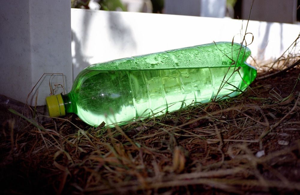
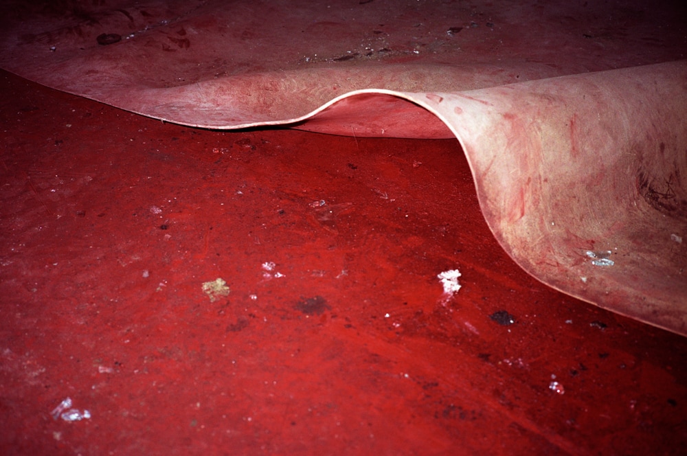
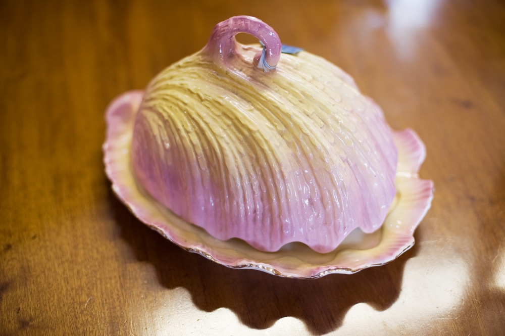
I really like Peter Fraser's photography, especially his ability to document and capture details and make beautiful photographs from objects that are considered ordinary or mundane. Peter Fraser is not photographing anything particularly rare or beautiful, but he is able to photograph ordinary items and make you see them in a different way. For me, I find that Peter Fraser's ability to observe and document his environment is particularly inspirational for me. In particular, I like some of his more recent photography particularly, especially A city in the Mind, Lost for words and Nazraeli Monograph. In Nazraeli Monograph, Peter Fraser 'continues his exploration of the overlooked object', and I am interested in the range of different objects and subjects that Peter Fraser photographs, as well as the contrast and rich tones in his photographs. I like these projects particularly as many of the photographs are of very interesting details, often photographs containing contrasting textures (smooth, shiny, rough, smooth etc.) and often vivid, vibrant colours. Moreover, I particularly like his photography that focuses on colour, especially the photographs that capture vibrant, saturated colours. This is one of my favourite features of Peter Fraser's photography, with colour being such an important part of his photographs. In my photographs inspired by Peter Fraser, I will try to replicate these features particularly and try to show inspiration from his photography. In my photographs inspired by him, I will probably photograph over quite an extended period of time, I will capture details when I see them.
Image Analysis
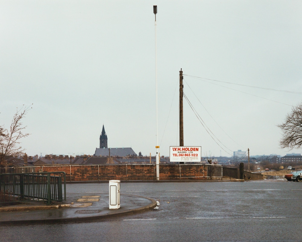
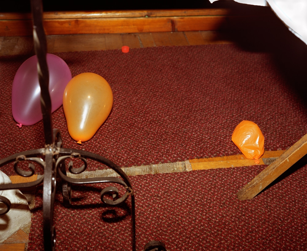
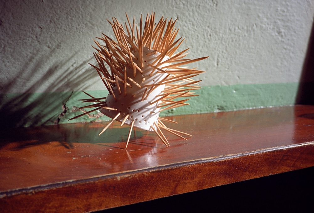
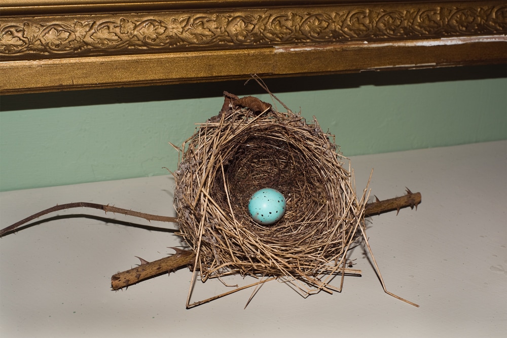
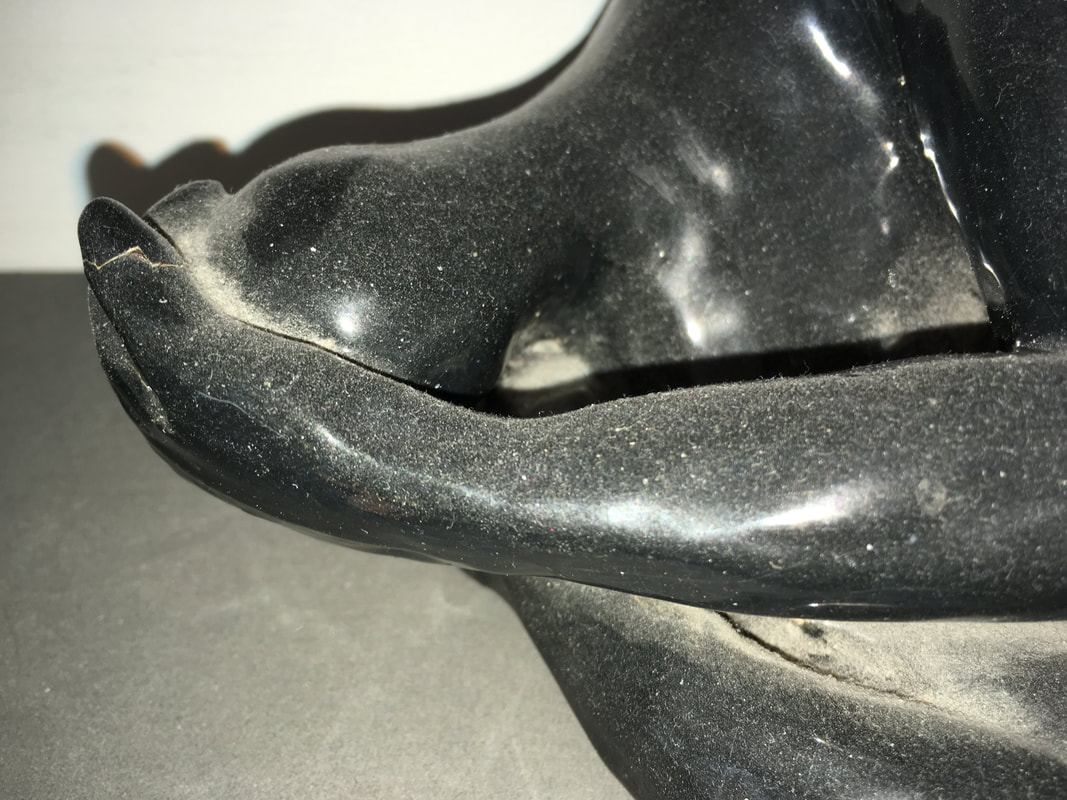
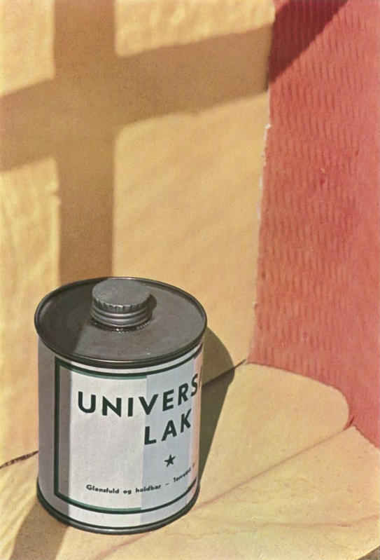
Background: This photograph was taken as part of Peter Fraser's 2010 series 'Lost for Words'. In this series, he focuses on his home country of wales, photography are range of different, varied sites. In particular, he photographed in many museums, homes and captured models and ornaments in particular. In this project, he looked particularly at the 'artificial' and 'illusionary', capturing small details like the photograph below.
VISUAL: The Formal Elements:
Focus - The image is clear and in-focus throughout, indicating a relatively small aperture was used; and therefore with a wide depth of field.
Light - The photograph is taken indoors and it isn't possible to tell the time of day from the photograph. It is clearly taken with a flash as the shadows are so clear and stark, with the overall image filled with the bright light from the flash. The light is harsh and artificial, and has frozen any potential movement in the scene (although there is no indication that there would be any movement.
Line - In this image, there is a mixture of sharp, straight lines as well as jagged, varied lines. The centre of the frame is dominated by the jagged and curved lines of the nest; contrasting with the straight lines of the frame and painted wall in the background.
Repetition - A few straight lines are layered and repeated at the top of the image. Not only this, but a pattern is created in the curved nest of twigs.
Shape - Mixture of organic and geometric shapes, but the photograph is mostly dominated by the organic, varied shapes in the nest in the centre of the photo, and the patterned frame at the top of the image. There is also a contrast between the straight lines against the jagged varied shapes at the centre.
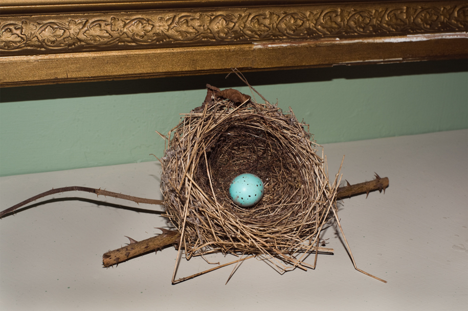
Peter Fraser 'Lost for Words' 2010
Form (3D) - The objects in the image obviously do appear to be three-dimensional; this is many due to the the shapes and directions of lines in the image, as well as the dark shadows and tones - giving the object clear form and shape.
Space - There is some depth in the image with the shadows, but it doesn't have a huge amount of depth overall, and the nest is placed up against the flat wall, and there isn't much distant background space or perspective.
Texture - Extremely rough, sharp textures in the nest; this contrasts with the smooth flat wall in the background.
Tone - Not many mid tones (only some in the background wall), but the image is mostly dominated by highlights and fill light from the flash - with some contrast to the harsh, stark and quite dark shadows. The lightest parts of the image are the highlights on the egg and frame in the background.
Colour - The turquoise/green egg correlates to the green band of paint on the wall. Not only this, but the gold/brown colours in the nest also correlate to the golden frame.
My images inspired by Peter Fraser
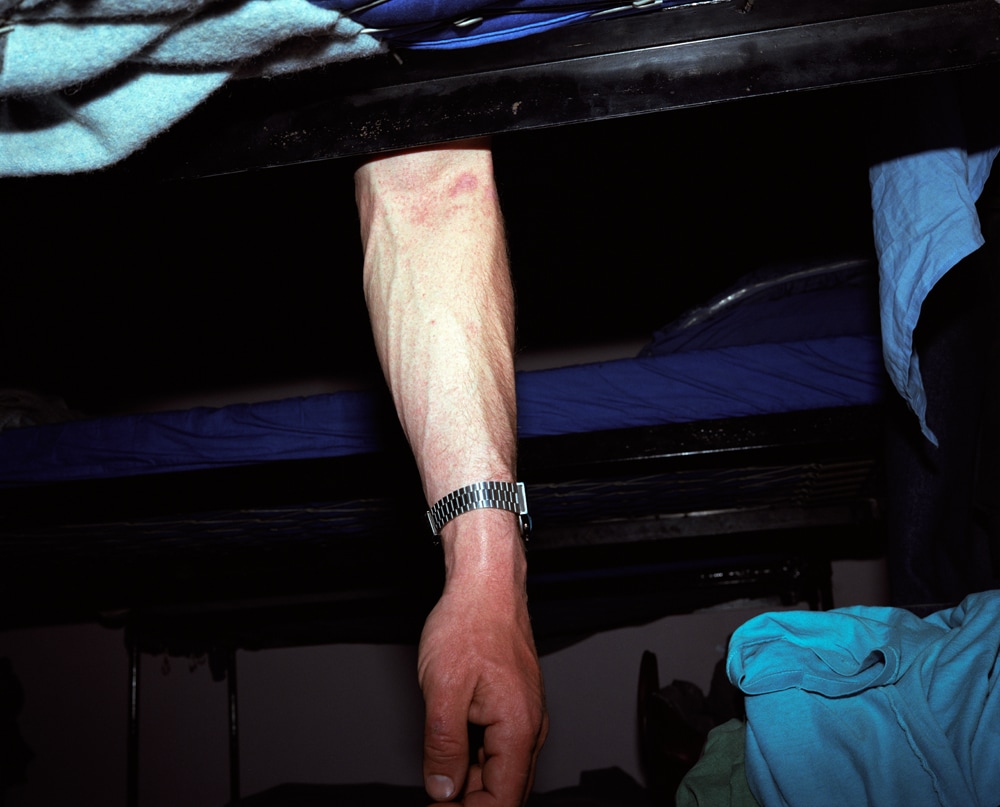
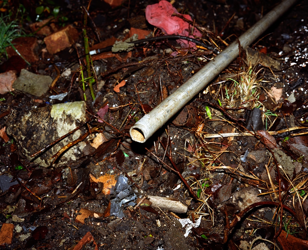
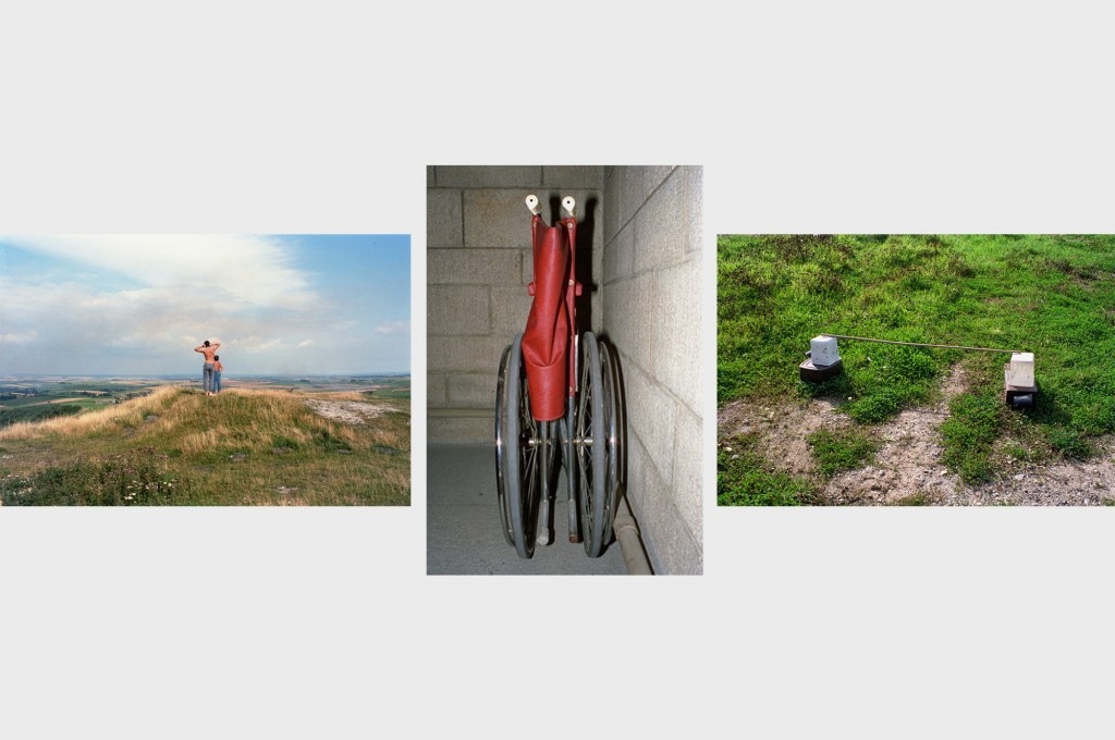
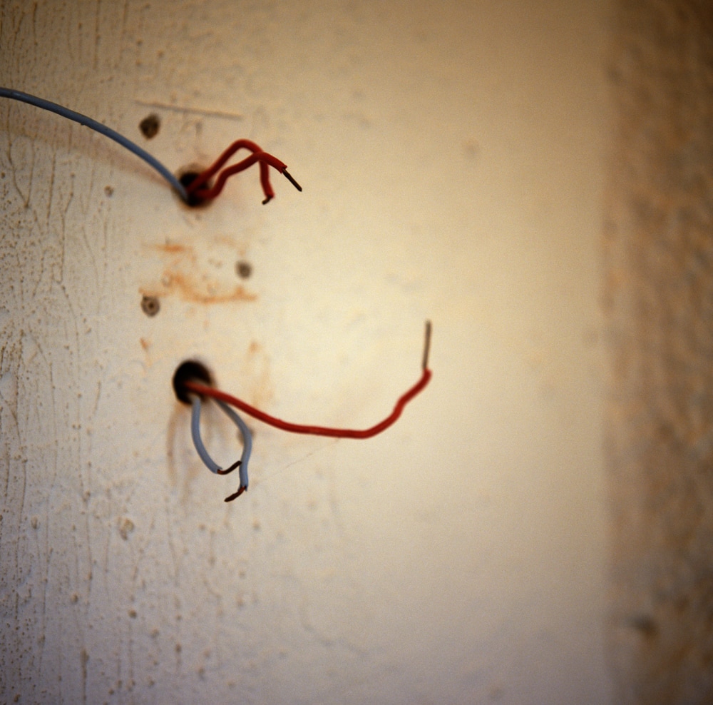
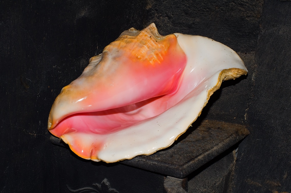
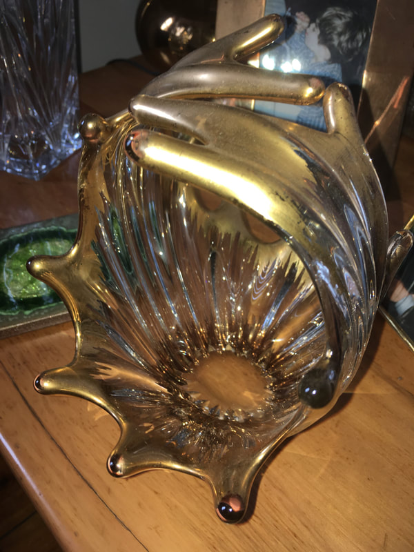
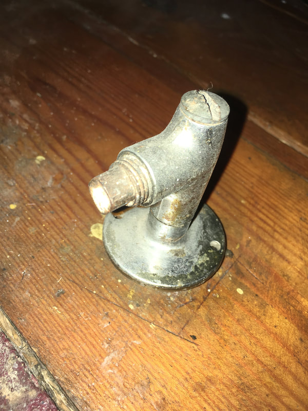
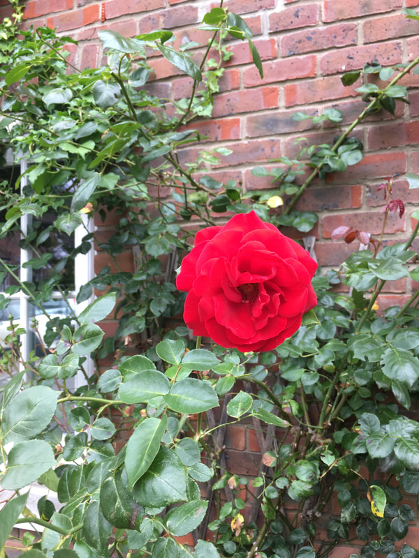
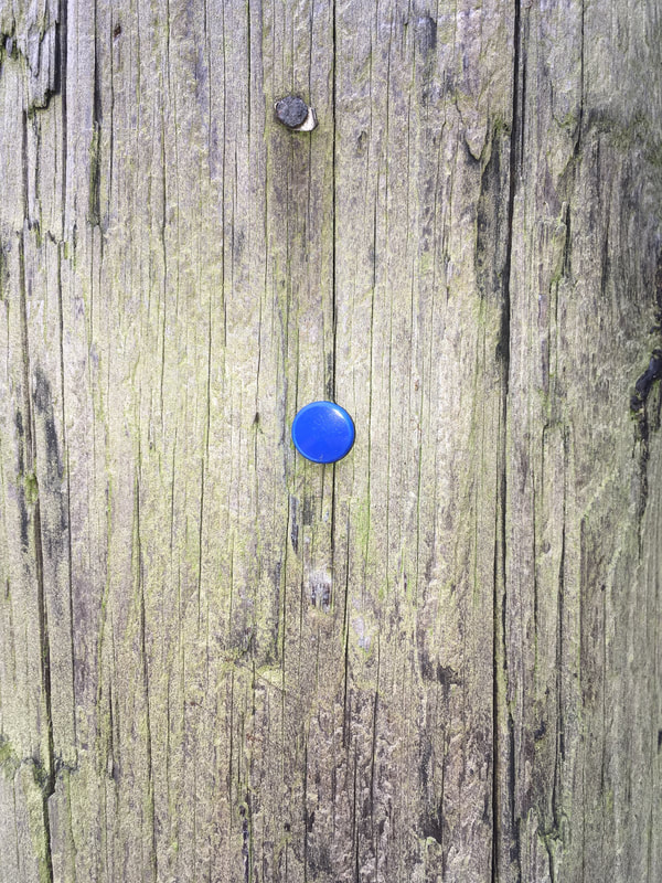
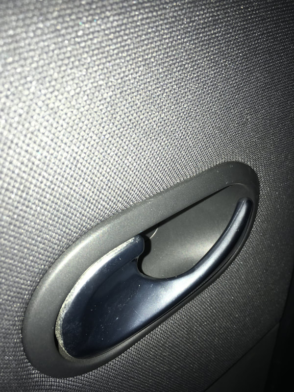
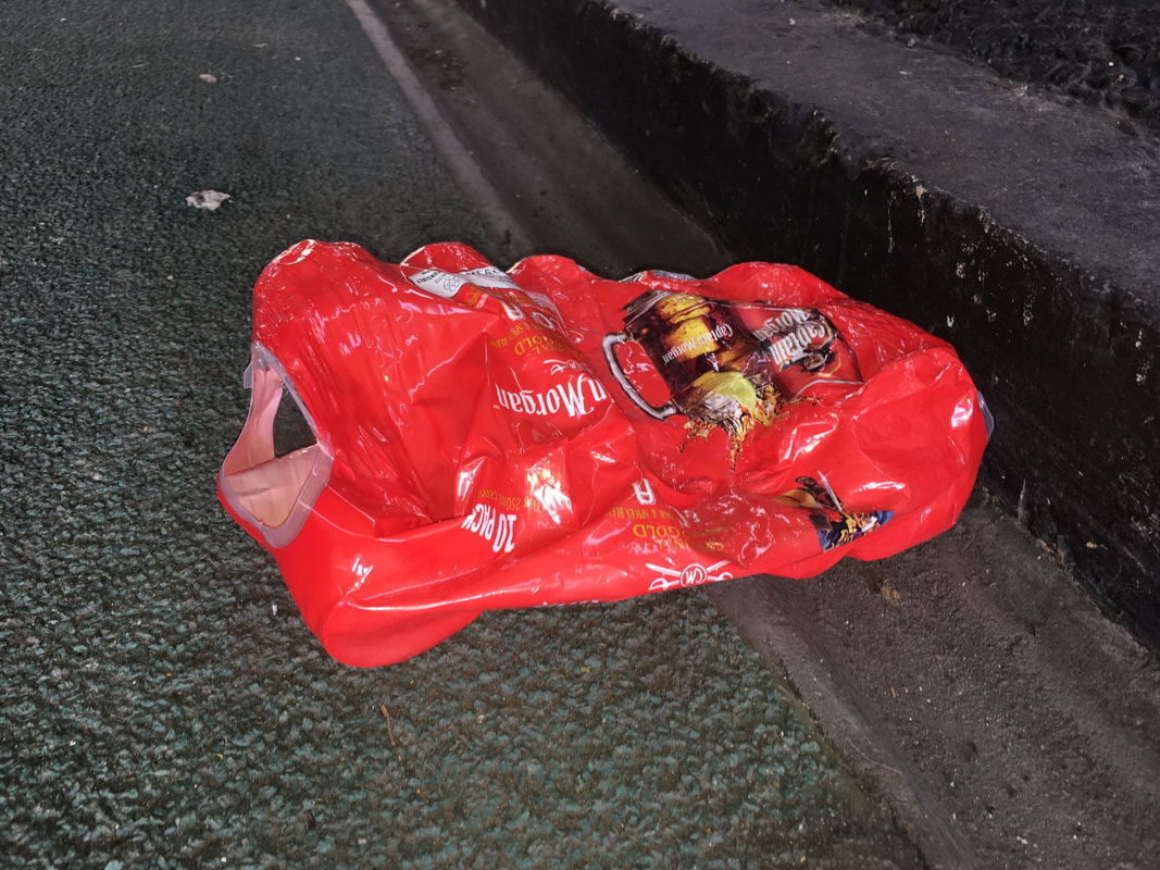
After studying Peter Fraser's photography, I subsequently made of series of images inspired by Peter Fraser. I made this series over a period of two weeks, taking photographs of details and things that I noticed in my everyday life. To shoot this series, I used my iphone camera - primarily as I always had it on me, so that I could capture things that I noticed in my everyday life. When photographing, I was looking for subject matter and objects that are typical of Peter Fraser's work. In particular, I was looking for traces of human interaction, as well as objects owned, or discarded, by people. For example, I photographed a number of possessions such as household ornaments, discarded objects and litter, as well as industrial objects (such as pipes, wires. chemicals etc.) When photographing, I replicated some of Peter Fraser's framing techniques - I had to get low down when photographing many subjects, similarly to Peter Fraser who often lay on the ground to photograph. I also used flash when photographing close-up to my subject - a technique commonly used by Peter Fraser. Overall, I found it relatively challenging to create a series of photographs in the style of Peter Fraser. Fraser's style, and the subject matter he photographs, are very unique to him; therefore trying to replicate such a specific style was difficult. I think that you can see some inspiration from Peter Fraser in some of my photographs, as I have replicated the style and subject matter of Peter Fraser's work. However, for some of the images in my series, it is less obvious to see that these are inspired by Peter Fraser. I think this photograph taken by myself does show some inspiration from Peter Fraser, with some similarity to this photograph by Peter Fraser. In my images, I have composed a colourful, shiny object against a darker, rough background; when composing my image I thought of Peter Fraser's photograph of the shell, with the shiny, colourful surface of the shell standing out against the darker, rough background behind it. I also commonly used flash to illuminate the subjects, similarly to Peter Fraser, to illuminate the detail and texture of the subjects.
Gallery of my Peter Fraser inspired images:

Peter Fraser visit
Following research into his work, Peter Fraser visited our school to talk to our about his work and answer our questions. The talk Peter Fraser gave us surrounding his different projects from throughout his career was extremely informative, and I saw a new side and looked differently at his work as a result. Hearing him talking about his work in depth, and listening to him cover the main contextual ideas behind his work massively improved my understanding of his work and concepts. Not only this, but listening to his question responses was also really useful in terms of understanding how successful photographers like him work.
Notes from Peter Fraser's talk
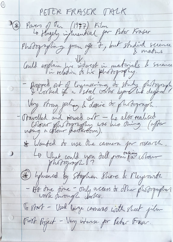
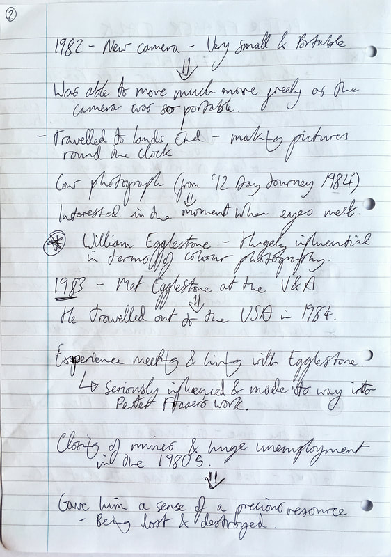
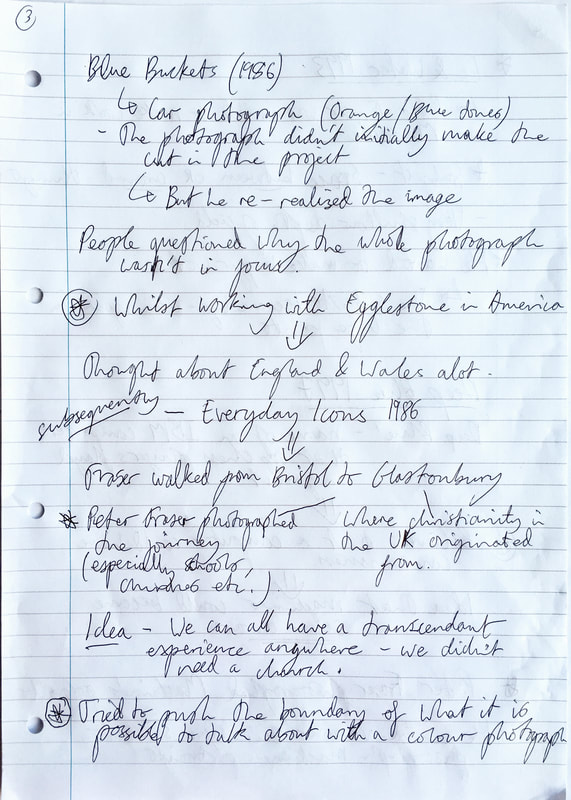
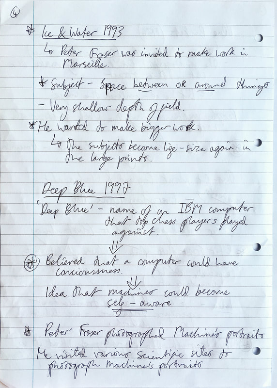
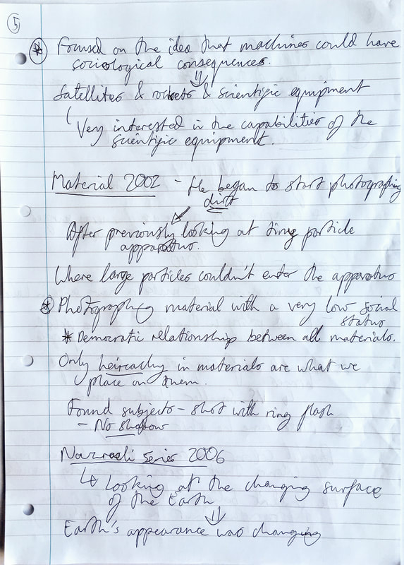
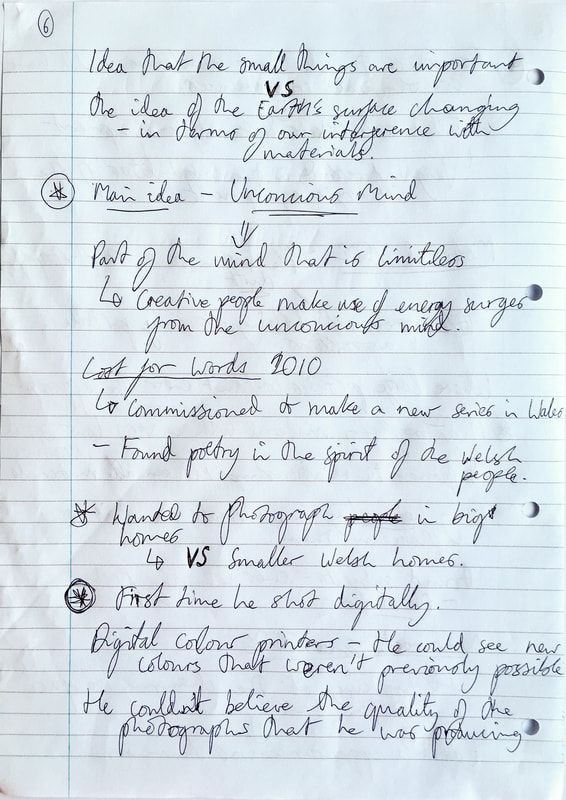
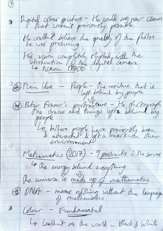
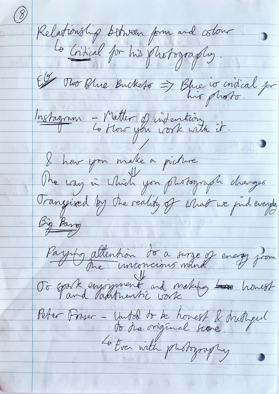
As you can see from the extensive notes that I wrote, I found his talk very informative, and I learned a lot about his work and photography more generally. In particular, I understood the ideas behind Peter Fraser's photography much more, especially his ideas surrounding the universe and the hierarchy and importance surrounding material in his photography. Not only this, but I found his ideas surrounding the unconscious mind very interesting as well, especially how he describes upsurges of energy in his mind, that motivates him to make a photo. Previously, when researching him, I found it difficult to understand the ideas and meanings behind his photography, but listening to him speak really helped me to understand them finally. One of the most important and interesting things that learnt from his talk was about the residue and traces left behind by people, and how he documents this. When asked about portraiture, he said that he is always taking portraits - but they are represented/manifested in the traces of people that he photographs. He believes that taking a photo of an object left behind (or interfered with by a person) is like taking a portrait, he is documenting human presence and traces. This was one of the most important concepts I took away from his talk - and an idea I would like to use for inspiration and investigate further.
Gerry Badger's essay: Eventually, Everything, Connects
 Peter Fraser 'Hirwaen, South Wales' from The Valleys Project 1985 (known as 'Two Blue Trucks')
1. How does the author describe his experience of seeing this photograph for the first time?
When describing his experience of seeing the photograph for the first time, the author describes feeling a rane of different emotions. Initially, the author describes his confusion when he first viewed the image; describing is bafflement and incomprehension'; this is mainly because it is very difficult to make out what Peter Fraser's photograph actually depicts. However, after this, the author's feelings then turn to 'pleasure and admiration', mainly because the author says that Peter Fraser was able to reveal the 'whatness of a thing'. the author had admired what the photographer had done, in causing the viewer of the photograph to be baffled at first, but subsequently having a moment of realisation when the subject of the photograph is actually revealed. The author called this a moment of 'epiphany'. The author also praises Peter Fraser's accomplishment of discovering the 'whatness' of the thing, which the author says is the 'photographer's mission'. In terms of the 'whatness' of the thing, I think that the author is talking about the material nature of the subject and the 'stuff of life', as he later talks about in the essay. He is referring to Peter Fraser's interest and obsession with capturing the material nature of objects that surrounds us, and the fabric and matter that forms these objects; linking with Peter Fraser clear interest in science and materials. Materials are the key focus of Fraser's photography, he is not only looking to look at the 'poetics of the ordinary', but the 'poetics of materials', as referred to by Gerry Badger in the essay. The author says that he admires Peter Fraser's ability to find other aspects within this photograph, more than just the subject matter.
2. According to the author, what is Peter Fraser's relationship to the objects he photographs?
In terms of the objects and subject matter that he photographs, Peter Fraser was partly inspired by William Egglestone. In particular, William Egglestone's photograph 'Red Cieling', which clearly focuses on the colour red; similarly to Peter Fraser's photograph ('Two blue trucks') that seems to focus on the colour blue . However, Peter Fraser's photograph of the two trucks (dominated by the colour blue) is also about the metaphors and emotions derived from the colour blue, as well as the whole structure of the photograph; described as creating 'unease' and 'a state of powerful, unseen energies'. Not only this, but the author also describes how Peter Fraser is 'looking to go beyond the object'. The author also says that the object 'is not of primary importance for Fraser' and, 'not as important as it is for Eggleston'. Again, Peter Fraser's main interest and focus on materials and nature is clear here. Peter Fraser studied science before his career in photography, and subsequently the link between art, objects, science and materials is evident throughout Peter Fraser's work. As written by Gerry Badger in the essay, 'His take on the everyday is informed generally by an interest in science, and specifically into the nature of materials'. And, as mentioned in the previous response, the 'poetics of the ordinary' becomes 'poetics of the materials in Peter Fraser's work.
3. What does the author say about the nature of Peter Fraser's practice? what interests him?
Overall, the author says that Peter Fraser is especially interested in making 'allusive' photographs. I think that this means that Peter Fraser gives suggestions and clues of what exactly is depicted in many of his photographs, rather than showing exactly what the subject of the photograph is. For example, in 'Two Blue Trucks' , there are clues and details that give clued and allude to what the photograph is depicting, but it is very unclear of what the is actually in the photograph. Not only this, but the author says that the meaning in Peter Fraser's imagery is 'by no means fixed' (compared to many photographers with clear meanings and political points throughout their work). Not only this, but Peter Fraser 'has tended to begin afresh with each project, throughout the progression of his work in his career. Not only this, but the author describes how Peter Fraser's personal work is also 'exploratory and experimental', with 'science' being the main heading and interest in much of his work. In particular, Peter Fraser's observation of the everyday is influenced and 'informed generally by an interest in science'. In particular, Peter Fraser investigates the 'nature of materials', and his clear interest in the 'poetics of the ordinary' becomes 'poetics of the materials' with Peter Fraser, according to the author. As a photographer, the author describes how natural it is for the Fraser to investigate 'the stuff of life' as photography is essential about materials. In terms of the objects that Peter Fraser is interested in, the author talks about how Peter Fraser is particularly interested in exploring the 'overlooked object', the subject matter in his photography ranging through a range of different objects that normally wouldn't be noticed. This is justified by Fraser as he says, 'all things by their nature are equally fit subjects for poetry'.
4. How is the final quotation from Charles Eames "Eventually, everything connects" relevant to Peter Fraser's practice?
Firstly, Peter Fraser photographs a range of different objects throughout his work. Although initially they do not appear to be linked, Peter Fraser is able to find 'connection between these disparate objects' when he displays them. Peter Fraser also investigates the 'connection between these disparate objects' (again linking to Charles Eames' quote). Peter Fraser also investigates the 'object's identity and being' in relation to space and time - especially the object's 'interdependence upon other objects'. Again. this links to Charles Eames' quote 'Eventually, everything connects'. Not only this, but the author talks about the connections between things, saying that 'things can be known only through their association with other things', and talks about how connections between things 'encompass the whole world'. In his photography, the author describes how Peter Fraser investigates in his photography, and Charles Eames' quote is extremely relevant to Peter Fraser's work and practice.
Roland Barthes: Camera Lucida
• Studying excerpts from Camera Lucida gave me a greater understanding of our perception of photography and photographs.
• The signifier is the photograph itself, whereas the referent is the thing in the photograph.
In photographs, the signifier becomes the referent - in other words, when viewing the photograph, you only see what is depicted in the photograph, not the photograph itself. For example, if you showed someone a photograph and asked them what it is, the overwhelming response would be to describe what is depicted in the photograph (the referent). In other words, the signifier becomes the referent. As said by Roland Barthes, 'a photograph is always invisible: it is not that we see', meaning that we look at the photograph, but we really see what is in the photograph.
• What is felt by the photograph can be described with the Latin word 'studium' meaning enthusiasm, zeal, eagerness, spirit etc. The studium in the photograph is the general cultural impact of the photograph. In comparison, Roland Barthes also describes the punctum of the image - with latin meanings, in particular 'pin prick', puncture, piercing etc. In effect, the punctum is what makes the photograph interesting, what makes the image come alive and possibly even shock the viewer.
Photographs as evidence
Subsequently to my research particularly into context and connotations of photographs, I have subsequently looked into truth and photographs as evidence. In particular, I find the concept of photographs being key pieces of evidence and used to document reality, whilst also all being lies (to some extent) very interesting.
Larry Sultan & Mike Mandel: Evidence
This photobook was very influential when it was released by photographers Larry Sultan and Mike Mandel in 1977. In this book, Sultan and Mandel sifted through thousands of photographs in hundreds of corporations including the Los Angeles Police Department, the Jet Propulsion Laboratories and the US Department of the Interior - 'American government agencies and educational, medical and technical institutions'. When searching, 'They were looking for photographs that were made and used as transparent documents and purely objective instruments' - in effect, they were searching for evidence. After selecting 59 of the best images, they published this set in a high quality photobook, removing any context or explanation surrounding the photographs. By taking these images out of their previous location, they have removed the original documentary purpose of the photographs - creating a mysterious set of images. Without any context, the viewer has to guess and think about what the photographs depict and mean. The images taken on an almost poetic, artistic meaning with all context and the original purpose of the photographs removed.
Gallery of Larry Sultan & Mike Mandel's 'Evidence' photobook
Diana Matar: Evidence from Conflict, Time, Photography exhibition
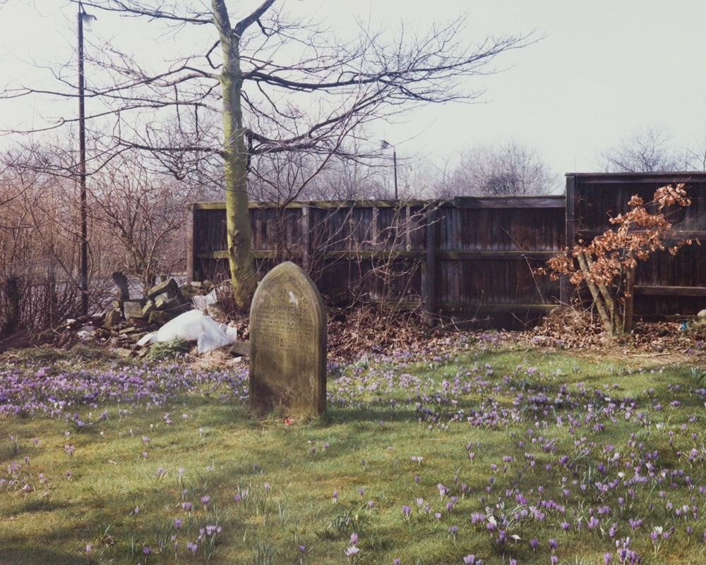
I saw this series of photographs by Diana Matar the recent photography exhibition at Tate Modern - Conflict, Time, Photography. Diana photographs her home country of Libya, with her work relating to the Libyan uprising, as well as atrocities and human rights abuses committed by the former leader Colonel Gaddafi. In this set of photographs, Diana photographed buildings and places in Libya where atrocities committed by Colonel Gaddafi's regime had taken place, after the revolution of 2011. Although there is no clearly visible evidence of these atrocities in her photographs, Diana is photographing how 'history’s traces are somehow imprinted on the spaces' and sites where people can remember the atrocities and human rights abuses that occurred there in the past. In this series, Diana set out 'to photograph things that can no longer be seen', where all evidence has been destroyed.
Gallery of 'Evidence' by Diana Matar
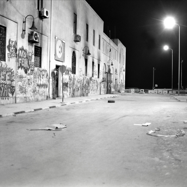
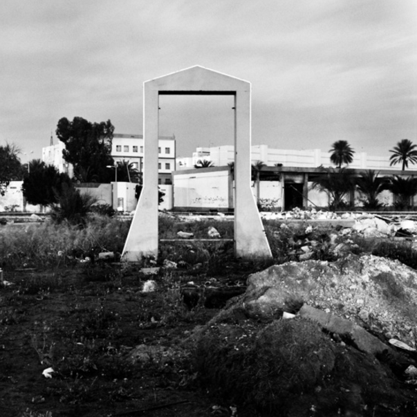
I am interested in Diana Matar in particular due to her interest in photographing traces of human activity, although not necessarily clearly visible evidence. I like the style of her photographs, in particular the mood and eeriness created in her photographs - they appear very atmospheric and almost ghost-like. I find her interest in traces and residue of human activity very interesting, and there are clear links to some of the concepts behind Peter Fraser's photography as well. Although Peter Fraser directly photographs the objects and evidence of human activity (whilst Diana only photographs the places), the concepts of traces of human activity, or where someone has interacted with their environment, are very similar.
Antonio Olmos: The Landscape of a Murder
The Landscape of a Murder is a documentary series documenting murder locations in London. This series by photojournalist Antonio Olmos documents every site in London where a murder had taken place between January 1st 2011 and December 31st 2012. In these images, Olmos photographs the remnants and traces that indicate that a murder occurred at that location, or he simply photographs the location if there is no visible evidence or traces of a murder being committed. As said by Olmos, 'My aim is to give memory to what are mostly forgotten events, unseen places, landscapes where great violence has occurred.' My interest in this particularly series by Olmos links to his focus of this series to document the traces and locations where past actions have occurred - focusing on the residue and remnants of people's actions, in this series murders being committed.
Gallery of 'The Landscape of a Murder'
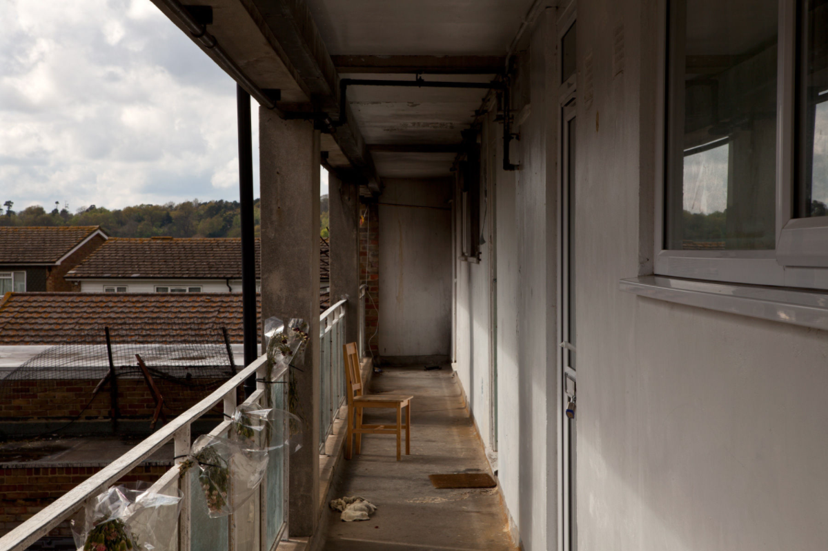
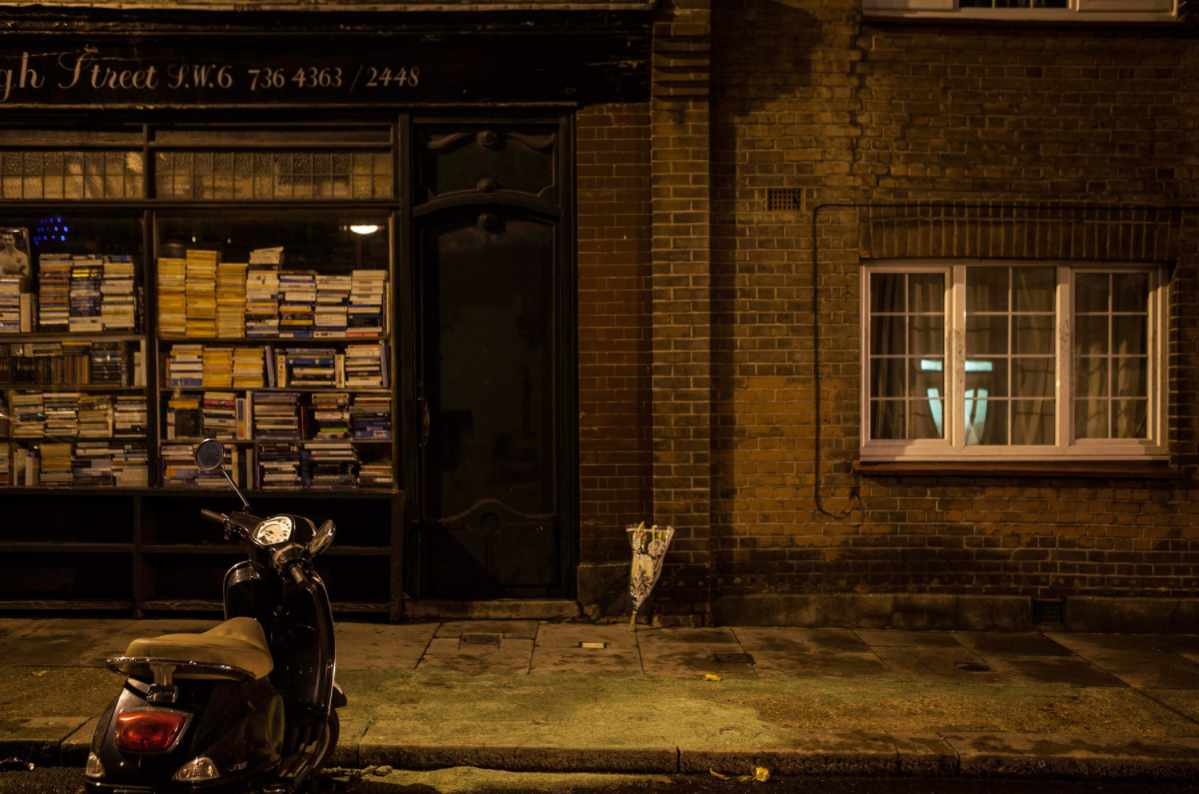
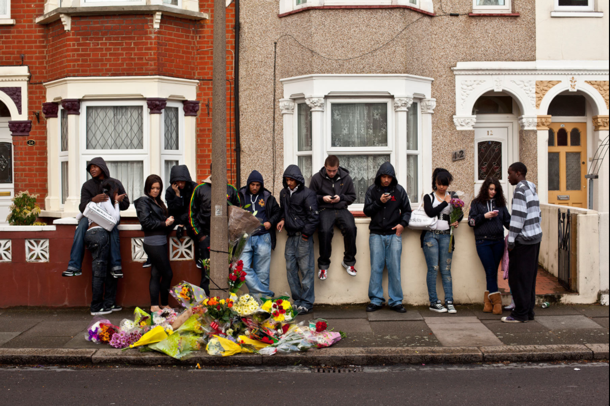
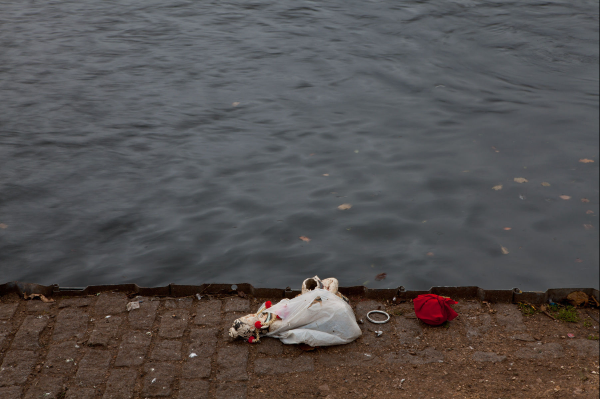
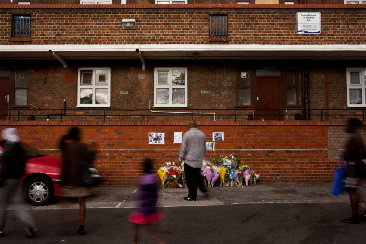
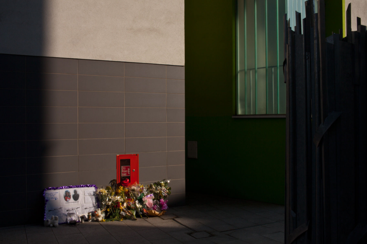
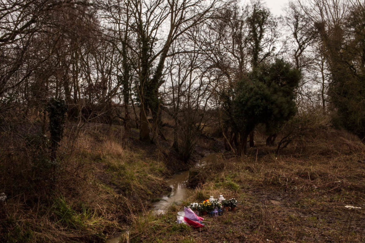
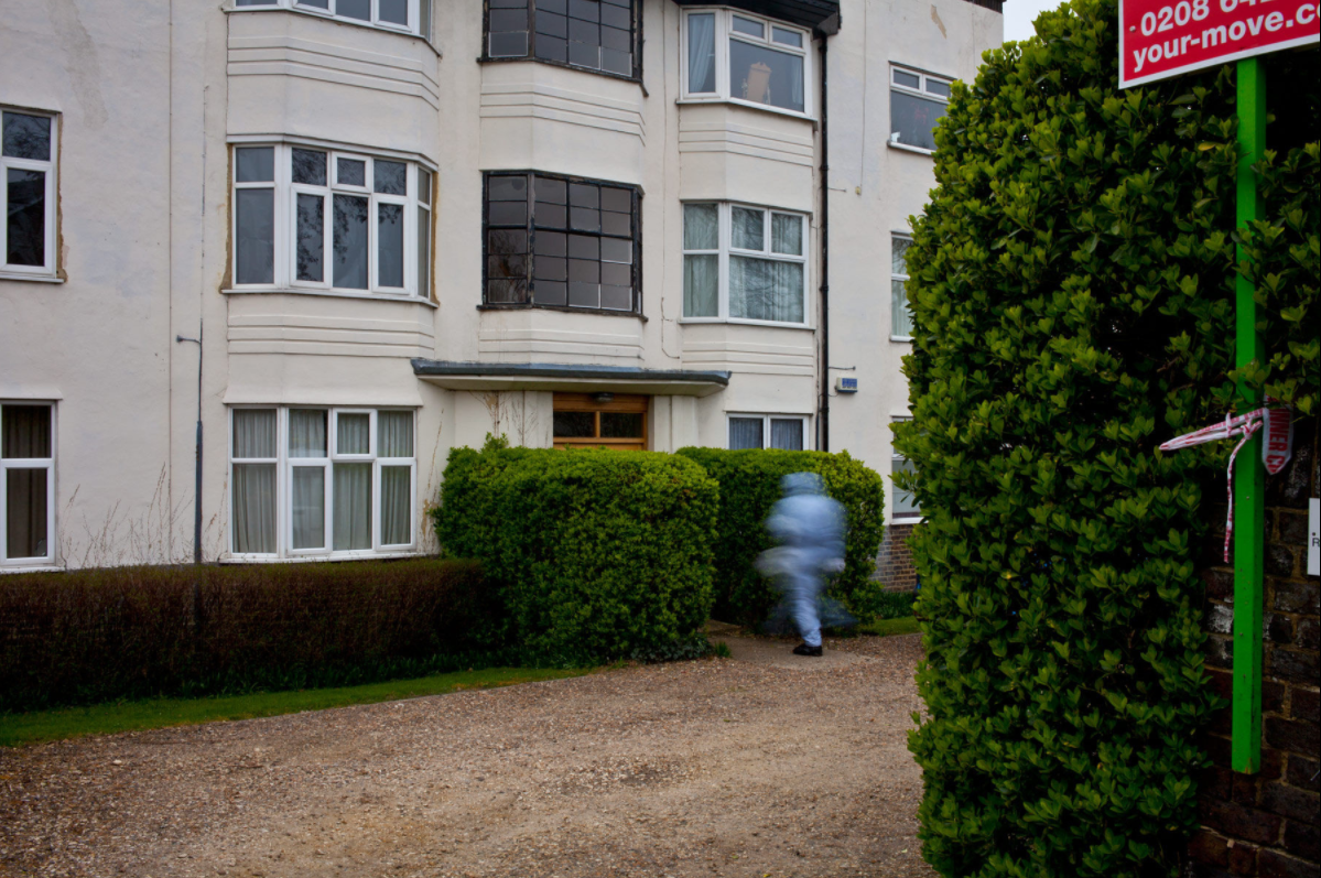
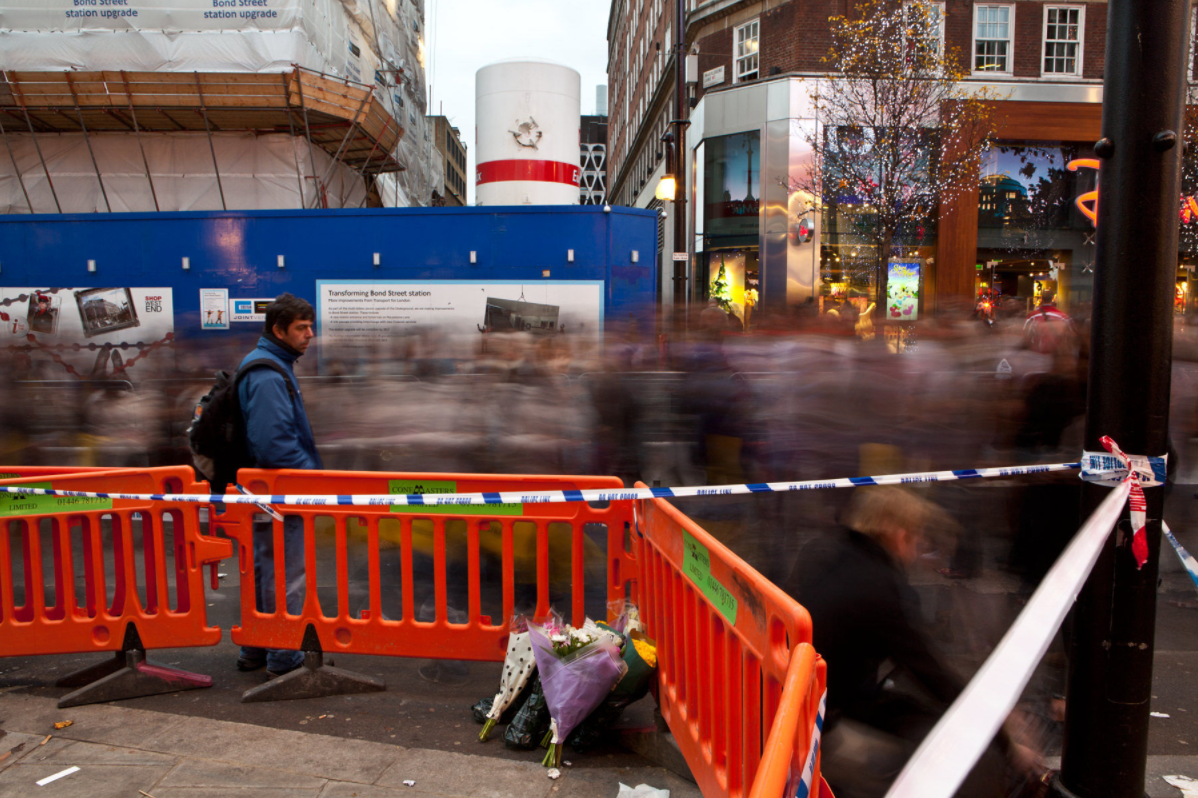
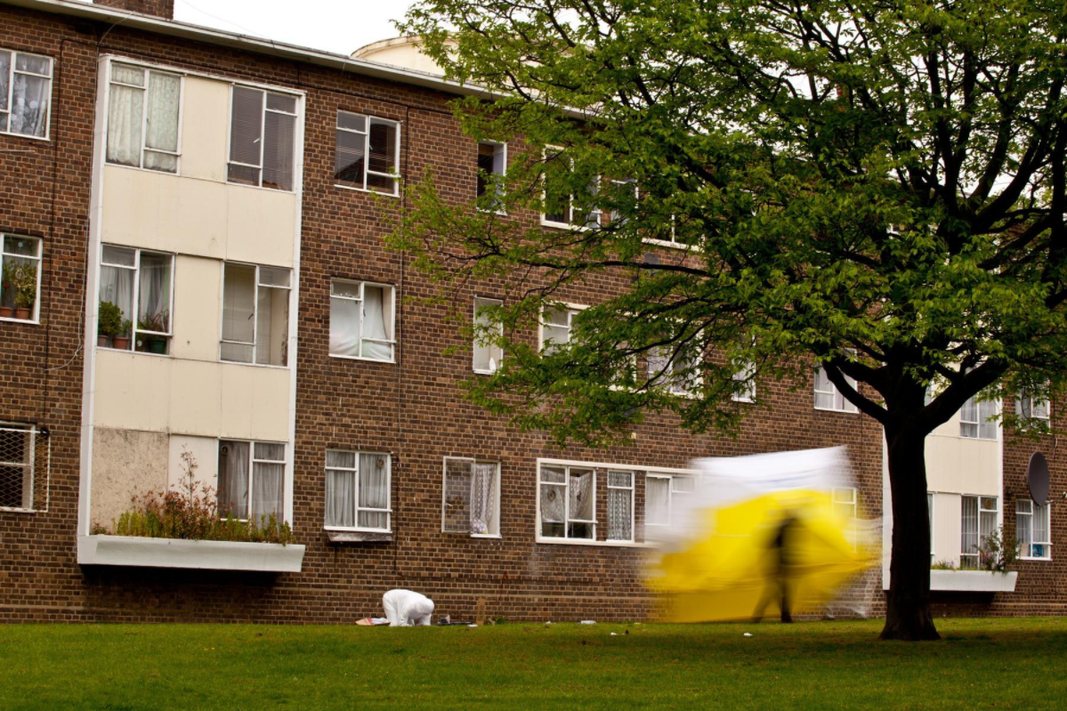
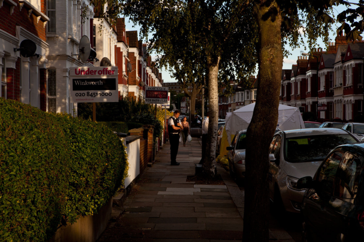
I am interested in the range of different photographs in this series; with photographs clearly showing flowers, mourners as well as forensics teams - clearly indicating a murder has occurred there, whereas other photographs are simply landscape images of a location of a murder - so the caption/provenance of the image is the only way that the viewer would know that a murder had been committed there. There are clear similarities between Antonio Olmos' series and Diana Matar's series - both focus on the sites of where violence has been committed, although Olmos' photographs offer more evident clues of this in the photographs themselves. Again, my interest in traces of human activity and residue of past events on the landscape (similarly to Peter Fraser's concepts) links with Olmos' series.
Threshold concept #10
'Photographs warp our sense of time; they remind us of things lost'
Photographs warp our sense of time. All photographs present us with the past and present at the same time. Photographs remind us of people and things that have gone. Photographs record what has been lost, what no longer exists, or what still exists but will be lost at some point in the future.
|
I've previously studied Threshold concept 7 at the start of my personal investigation, which linked to my interest in documentation and capturing history; it also linked with the meaning and interest in context of a photograph. Moreover, Threshold concept 7 is very relevant in terms of recent study of evidence (particularly with the Antonio Olmos, Diana Matar and Larry Sultan & Mike Mandel above all investigating evidence).
I've studied Threshold concept 10 as it links with my interest in traces of human activity, and residue of human interaction on the environment. More broadly, it is also very relevant with my interest in documentary photography, as well as photo essays. I like the idea of photographs capturing a fleeting moment of time that can never be replicated - especially photography's ability to capture the world in a moment of time, documenting the world at that moment. |
'For me the noise of Time is not sad: I love bells, clocks, watches — and I recall that at first photographic implements were related to techniques of cabinetmaking and the machinery of precision: cameras, in short, were clocks for seeing.' -- Roland Barthes, Camera Lucida: Reflections on Photography
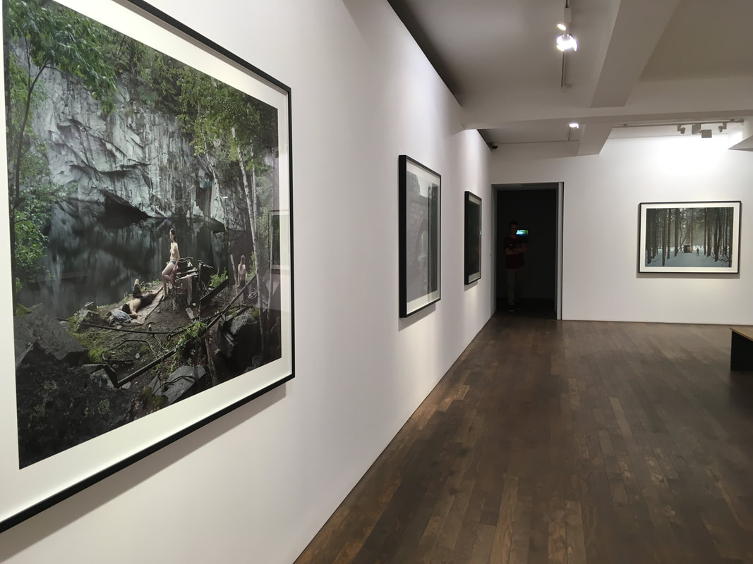
The Photographer's Gallery: Gregory Crewdson
I visited the Photographer's Gallery in Soho to view Gregory Crewdson's new exhibition, Cathedral of the Pines. This exhibition displayed Gergory's new body of work, with a large volume of work displayed as all 3 gallery spaces were devoted to his exhibition. Despite much of Gregory's work focusing on suburban subjects, in this exhibition he focused much more on the natural world, photographing and exploring 'human relations within more natural environments'. Cathedral of the Pines was shot in a small town in Massachusetts, with many photographs staged in the surrounding forest - reminiscent of his childhood. Gregory uses local residents as well as family members to feature in his elaborate photographs, placing them in the forest or set-up scenes.This project was described as Gregory's 'most personal', especially with the links to his childhood as well as inclusion of family members.
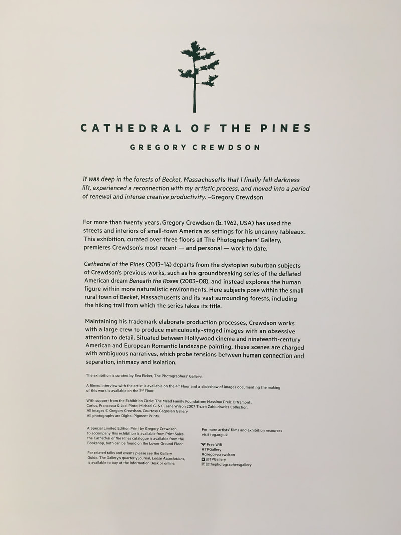
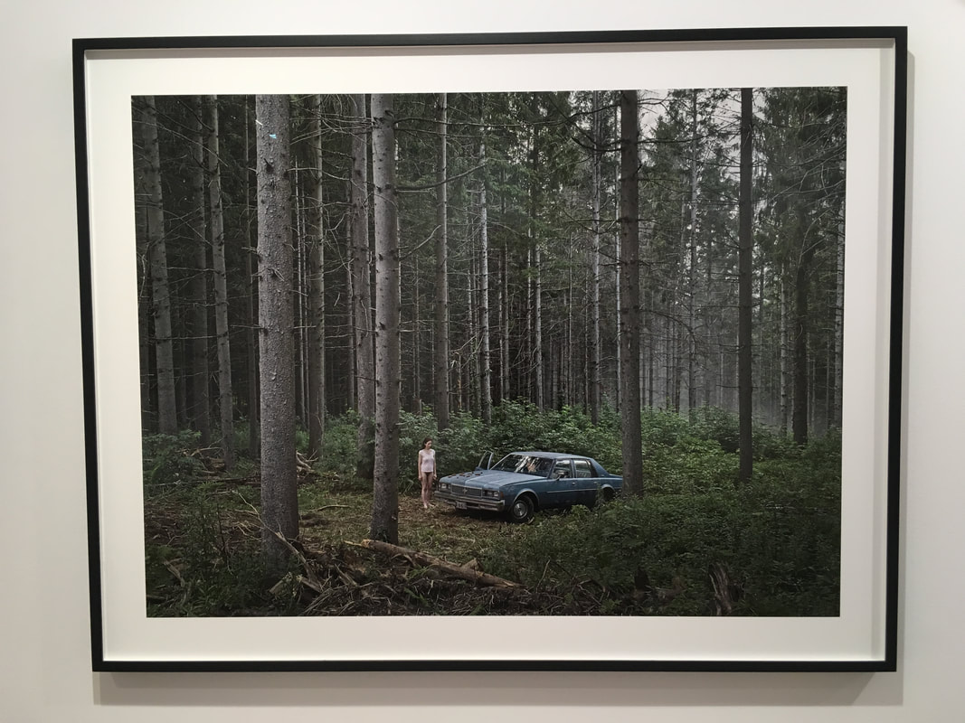
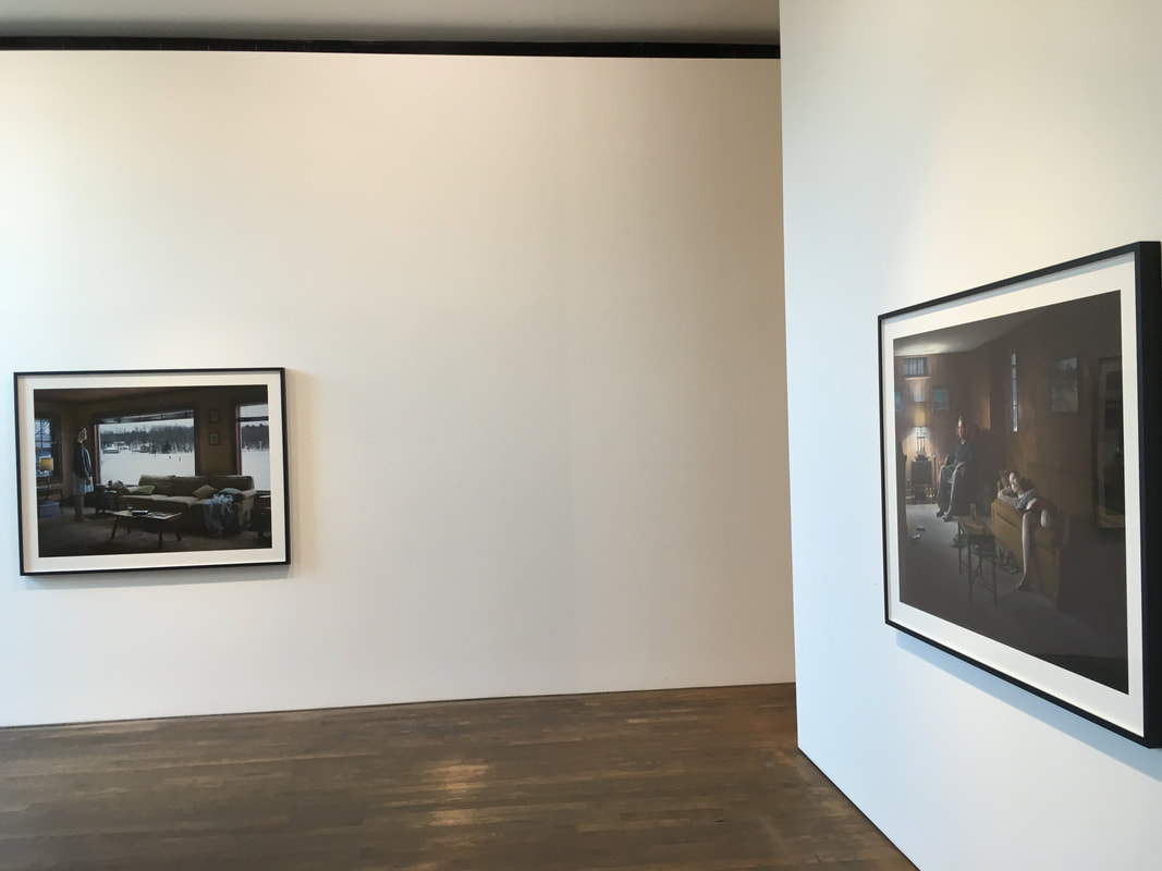
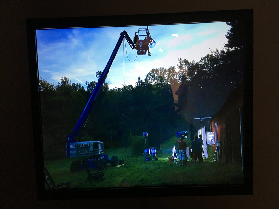
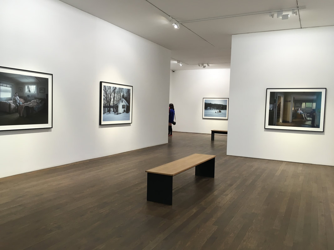
Gregory Crewdson's photographs are meticulously planned and set up, with very close attention to detail. Using many different lighting and staging techniques, Gregory is able to create very atmospheric, 'distopian' photographs; it is clear to see that lighting and staging are key focuses in his work. At the exhibition, there was a screen showing behind the scenes images from Gregory's shoots (see 4th image above), and I was able to see the extremely complex lighting and staging involved to make one of his photographs.
Personally, I find Gregory's photographs extremely interesting - I particularly like the atmospheric quality to them. I also like the different scenes that Gregory sets up, with both the models and complex scenery and sets in his photographs. In particular, I really like Gregory Crewdson's use of lighting, and the way he uses it to create atmosphere and the eerie quality that is evident in many of his photographs. I would like to experiment with light similarly to Gregory, although it would be difficult to create similar style images considering how complex his lighting set up is.
Personally, I find Gregory's photographs extremely interesting - I particularly like the atmospheric quality to them. I also like the different scenes that Gregory sets up, with both the models and complex scenery and sets in his photographs. In particular, I really like Gregory Crewdson's use of lighting, and the way he uses it to create atmosphere and the eerie quality that is evident in many of his photographs. I would like to experiment with light similarly to Gregory, although it would be difficult to create similar style images considering how complex his lighting set up is.
Experimenting with colour and texture
Keld Helmer-Petersen
Gallery of Keld Helmer-Petersen's colour pohotography
As part of my investigation into documentary colour photography, Keld Helmer-Petersen was an important colour photographer that was suggested for me to research. I have previously looked at his high contrast black and white photography, but Keld is also very famous and influential in terms of his colour film photography. Keld's 1948 publication 122 Farvefotografier (122 Colour Photographs) was hugely influential, due to the very limited use of colour film for fine art photography at that time. I really like the style of Keld's colour photography; not only his ability to capture vibrant colour compositions, but the closely cropped details that he captures in his images. I like the objects and typography he photographs, his compositions also seem quite abstract without any surrounding context.
Izaac Enciso
Gallery of Izaac Enciso's photography
As part of my work looking at evidence and its relation to photography, I looked at the work of Izaac Enciso. Izaac is a contemporary street photographer, who captures and focuses on details he finds on the street. Similarly to Peter Fraser, he also explores human intervention and traces of human behaviour in his photographs. For example in his project symbols, Izaac photographs 'found sculptures' that he finds on the street, documenting where a person had previously been and interacted with their environment, as well as some intervention from the photographer. This is similar to peter fraser's photography, as Peter Fraser said that he photographs people, but in the form of traces and past actions that have been left behind. However, Izaac Enciso focuses largely on composition and colour particularly in his photographs as well, finding interesting compositions and colour in the streets. He also focuese on light shadows and shapes particularly in his photographs, finding interesting compositions of shapes and components in his photos.
In my images inspired by Izaac Enciso, in particular I was focusing on interesting details and colour in partciular. Similarly to Izaac, I got quite close to my subjects, cropping them quite tightly in the frame (I had to get quite close as I was shooting with a 35mm lens). When photographing, I was looking for interesting compositions that caught my eye, bright colours especially attracted me. Altough I wasn't looking specifically for signs of human interference and traces in my surroundings, I was subconciously thinking about this when photographing.
In my images inspired by Izaac Enciso, in particular I was focusing on interesting details and colour in partciular. Similarly to Izaac, I got quite close to my subjects, cropping them quite tightly in the frame (I had to get quite close as I was shooting with a 35mm lens). When photographing, I was looking for interesting compositions that caught my eye, bright colours especially attracted me. Altough I wasn't looking specifically for signs of human interference and traces in my surroundings, I was subconciously thinking about this when photographing.
John Maclean - Hometowns
Gallery of Hometowns
In Hometowns, fine art photographer John Maclean visited a number of different cities and towns where his favourite artists originated from. At each location, John documented his surroundings, picking out details and compositions from the scenes that surrounded him. In these images, John shows his own style clearly, but also the influences from the artits, whose origins John is visiting and documenting. There are some parallels to be drawn between John and Izaac Enciso as well as Peter Fraser. John Maclean is documenting there places where his favourite artists have previously lived and grown up, places where they originated. Similarly, Izaac Enciso and John Maclean have focus on human traces and where people have previously been and left their mark.
Not only this, but I really like the style of John Maclean's photography. I particularly like his ability to capture interesting details, and create interesting compositions from his surroundings. Not only this, but I also like John's focus on colour, and his skill in picking out small details as well as the style of his documentary photography. I also like many of his photos where he has distorted and manipulated his photographs, like this image for example. I also read this book at the book shop at the Photographer's gallery, and I really like the layout, design and construction of the his photobook.
Not only this, but I really like the style of John Maclean's photography. I particularly like his ability to capture interesting details, and create interesting compositions from his surroundings. Not only this, but I also like John's focus on colour, and his skill in picking out small details as well as the style of his documentary photography. I also like many of his photos where he has distorted and manipulated his photographs, like this image for example. I also read this book at the book shop at the Photographer's gallery, and I really like the layout, design and construction of the his photobook.
Same Page - TJ Tambellini and Lark Foord
Gallery of Same Page:
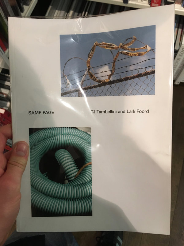
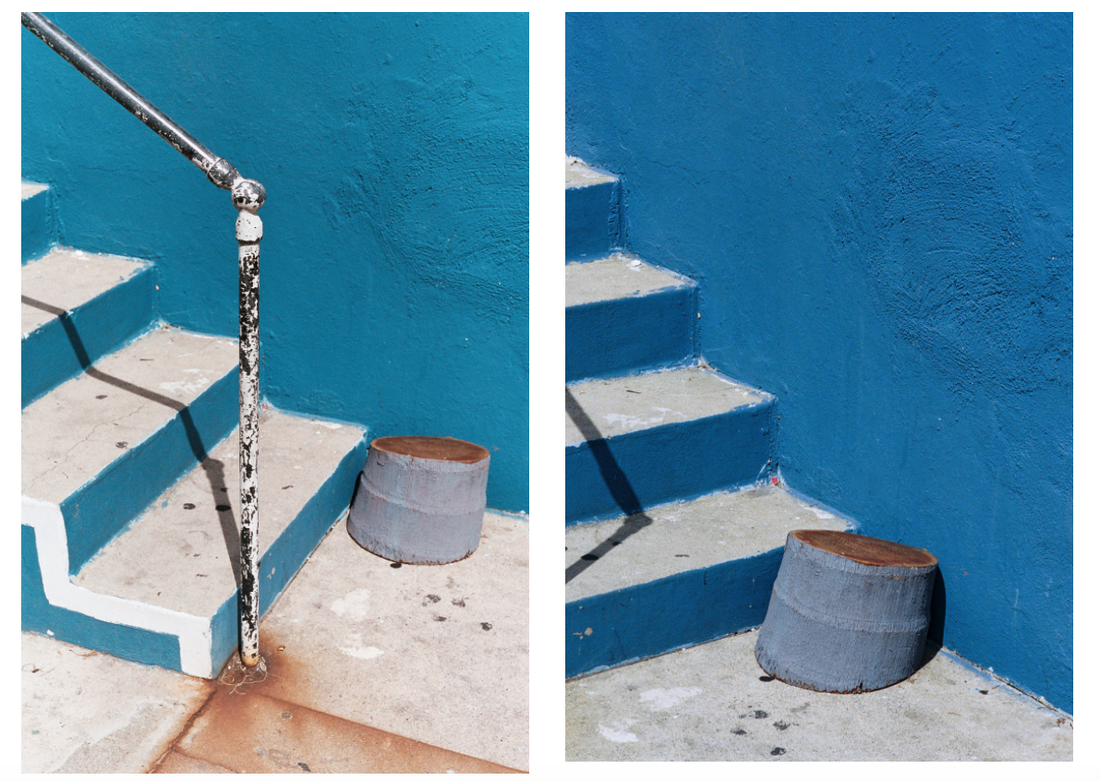
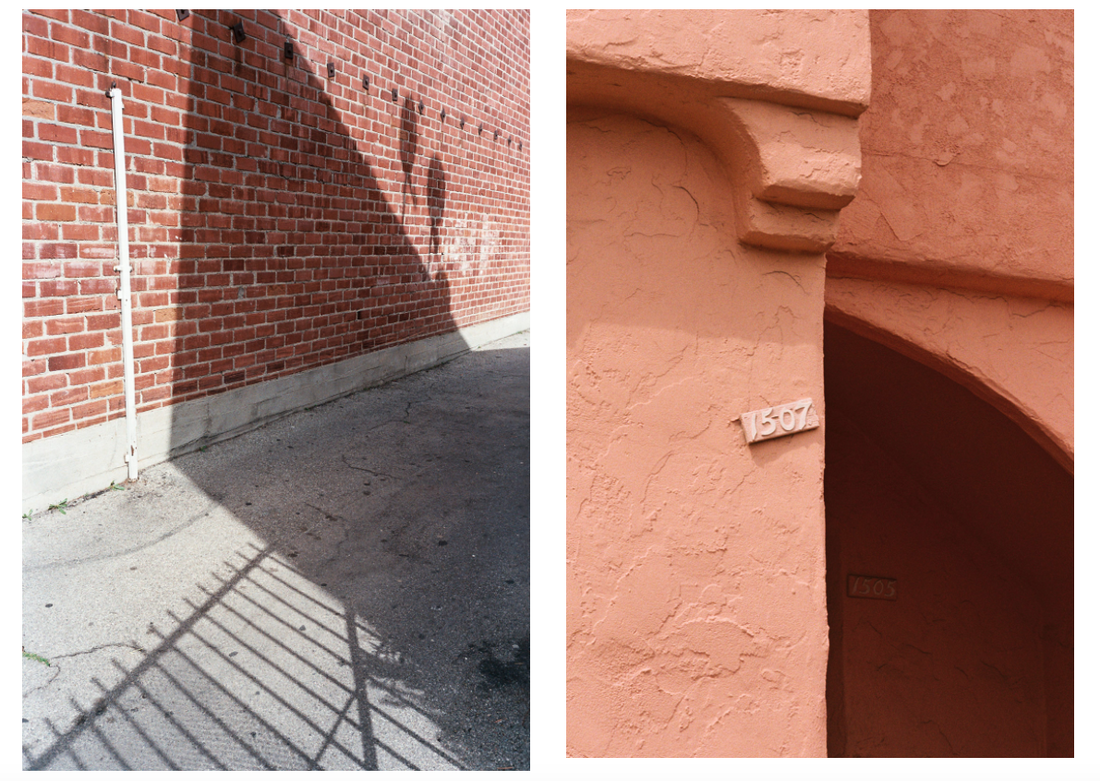
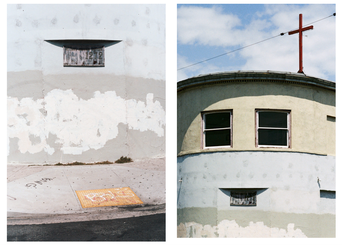
In their book 'Same Page', TJ Tambellini and Lark Foord display images side by side, releaving different things about each location they were taken in. In each page depicting a diptych of images, both photographs in each case have been taken from the same place, but focus on different subjects in each location. I like the style of this zine, the diptychs are especially effective and I like the individual images throughout the book. I especially like the ability of the photographers to capture details and traces, especially signs of human activity and interaction on the environment. The style of these images are also similar to Izaac Enciso particularly - the focus on colour, texture and interesting details left behind are key elements in common between these artists. Light and shadow, as well as lines and shapes are other key elements that are in common with Izaac Enciso's work visually.
My photographs focusing on colour and texture
Sample:
Full set of 42 images:
Click here for the full set of my inspired photos focusing on colour and texture
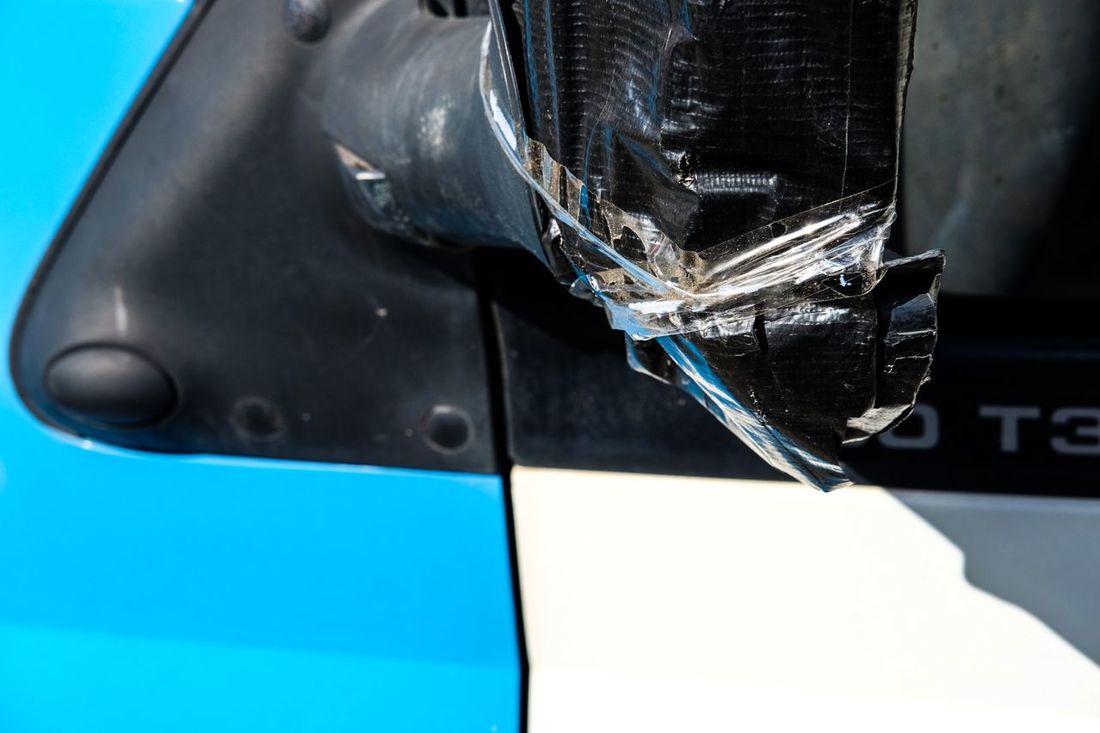
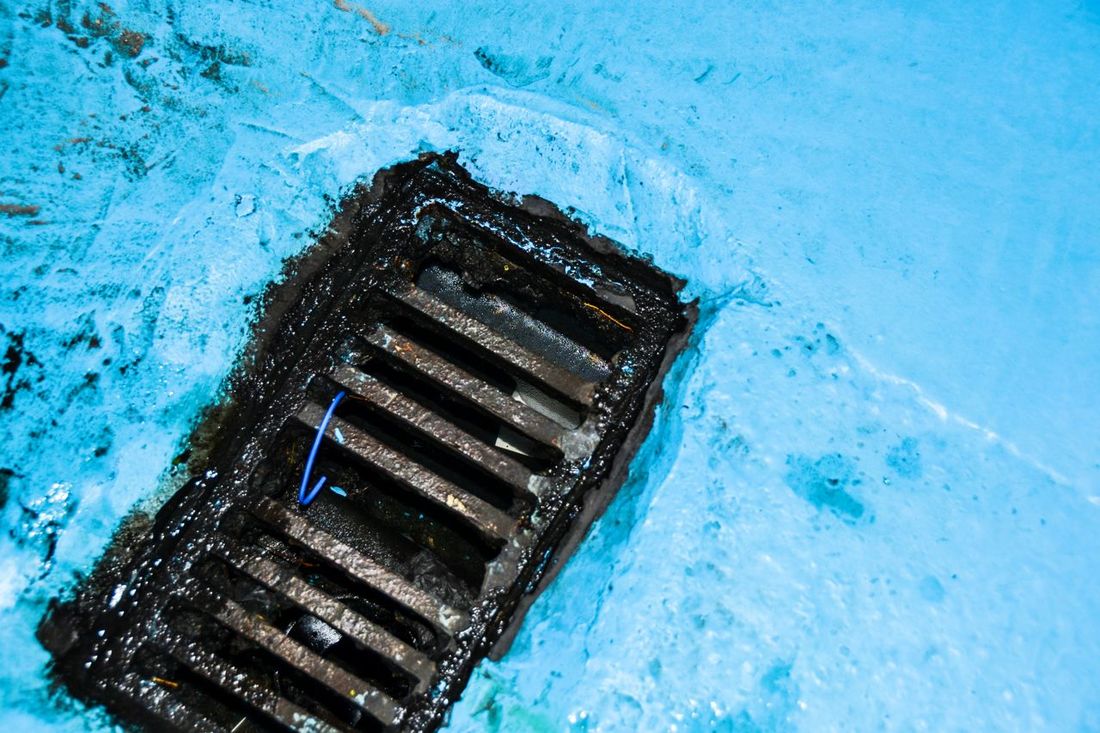
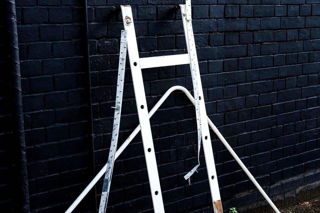
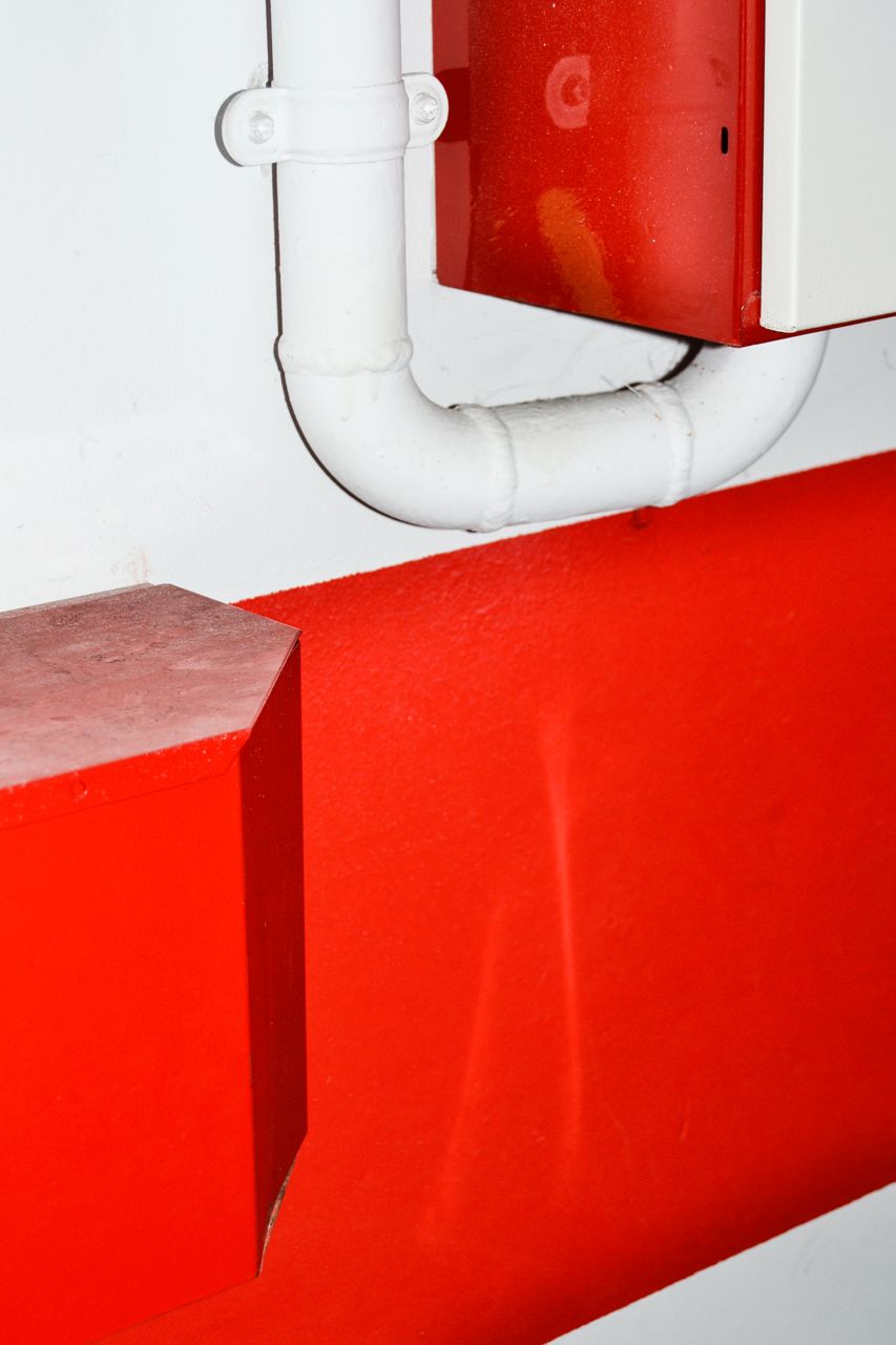
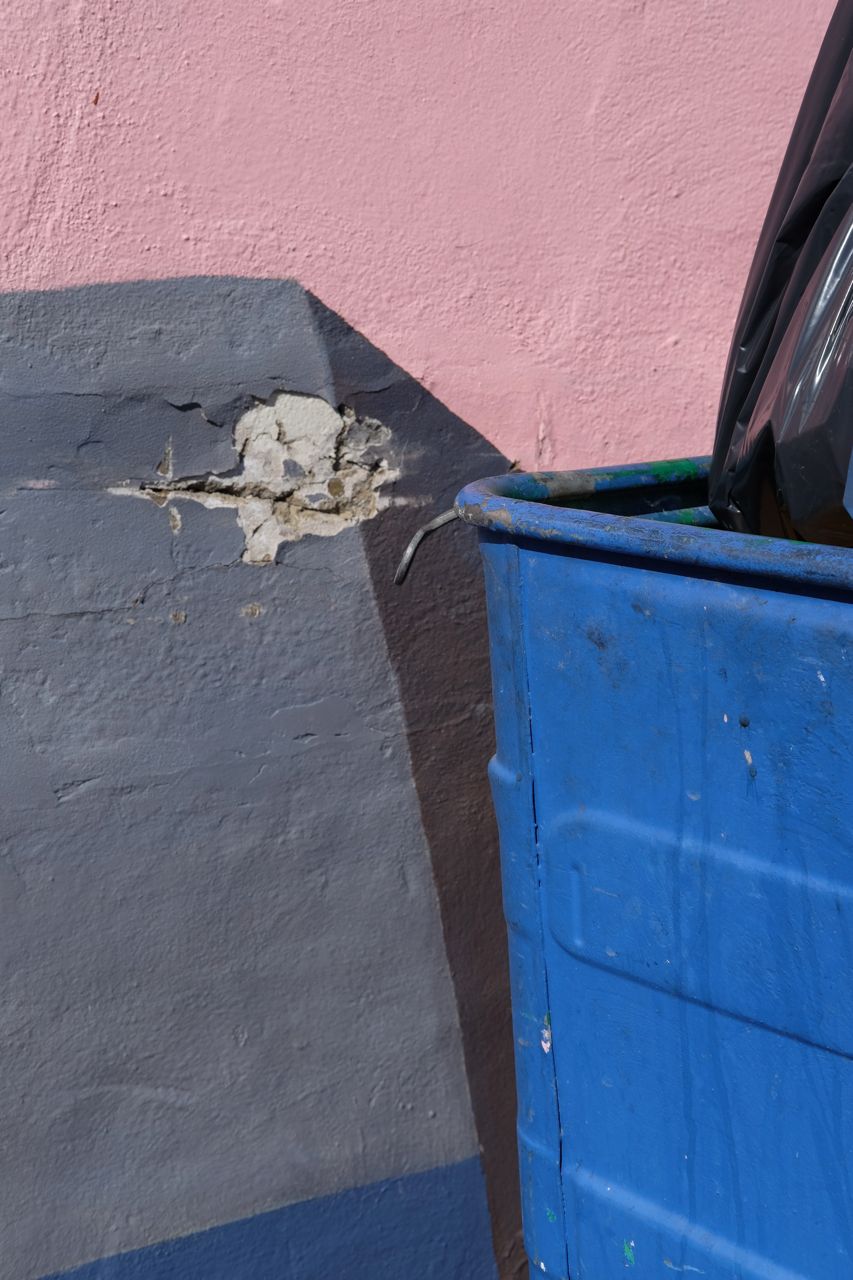
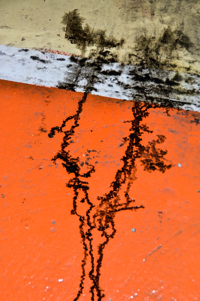
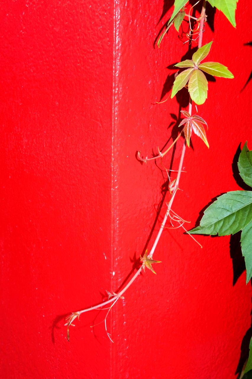
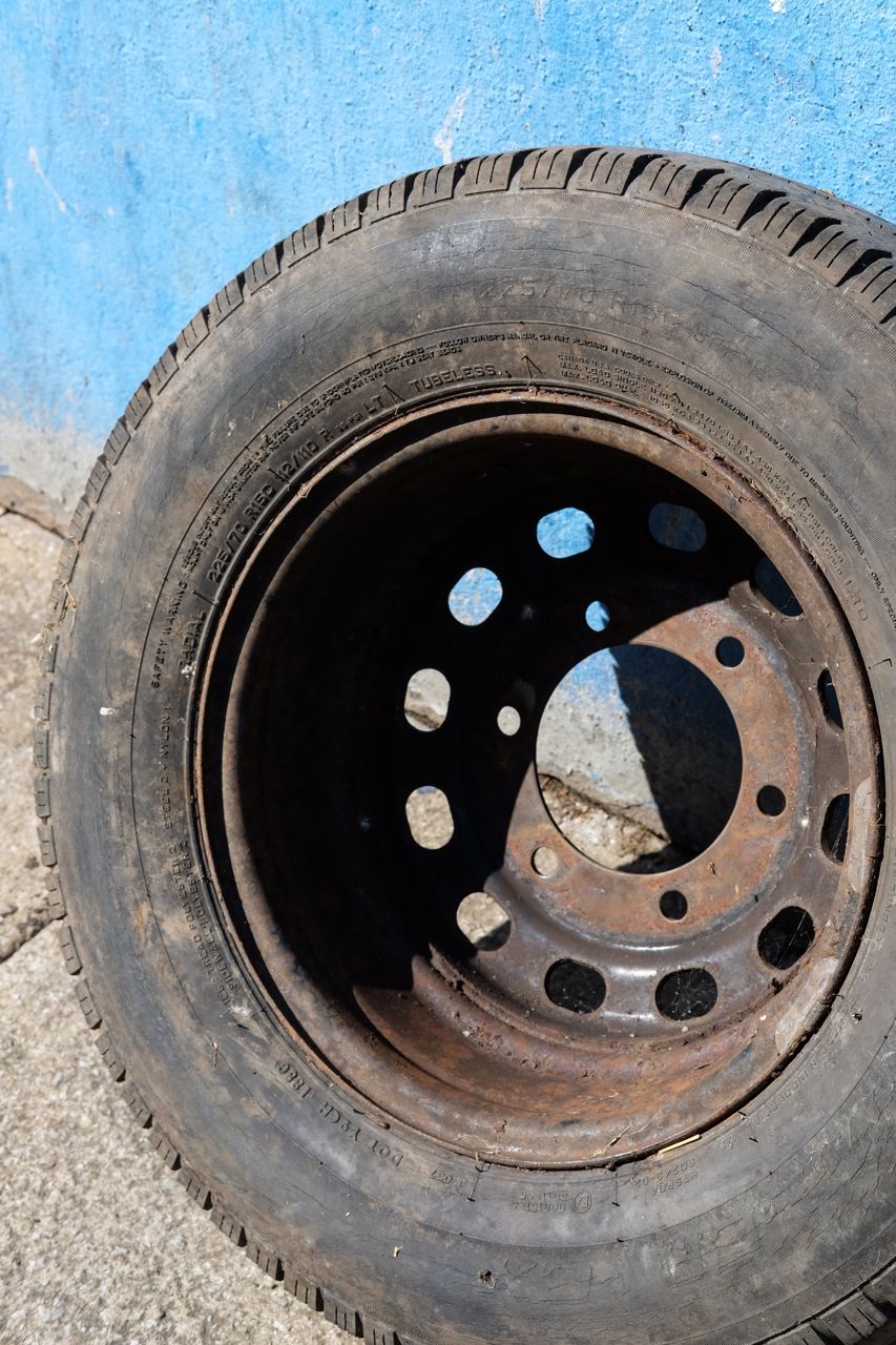
After producing this set of images, I think the overall outcome is relatively successful. The purpose of this project was primarily to experiment with colour and texture - visual experimentation. I had researched a number of artists whose work I was particularly interested in. I was especially drawn to these artist's ability to capture the overlooked details and marks left on the environment, particularly their ability to make interesting compositions of objects, shapes, colours and light. Not only this, but I was also thinking about wider concepts, especially the inspiration of photographers like Peter Fraser. In these photos, I also wanted to be able to capture the traces of human interaction and activity left on the environment. This concept was inspired by Peter Fraser, and I was focusing on the abundance of traces left visible in the urban environment where I was shooting.
I am happy with the outcome of my images overall. In my set of photographs, I think I was relatively successful in creating interesting compositions of colour and texture. Throughout my set of images, colour, texture and my focus on details are the primary elements that knit together the whole of this mini project. I am also quite happy with the range of images in my series. Some images are dominated by saturated colours, whilst other photographs primarily focus on particular subjects discarded on the street. As a whole, I think the inspiration from the particular artists I researched above is quite evident. I think my images show inspiration from all 4 artists, but especially inspiration from Izaac Enciso and the 'Same Page' zine as well.
I am happy with the outcome of my images overall. In my set of photographs, I think I was relatively successful in creating interesting compositions of colour and texture. Throughout my set of images, colour, texture and my focus on details are the primary elements that knit together the whole of this mini project. I am also quite happy with the range of images in my series. Some images are dominated by saturated colours, whilst other photographs primarily focus on particular subjects discarded on the street. As a whole, I think the inspiration from the particular artists I researched above is quite evident. I think my images show inspiration from all 4 artists, but especially inspiration from Izaac Enciso and the 'Same Page' zine as well.
Photo selection exercise
In this exercise, we individually selected a group of images, placed these photos together and found similarities and relationships between these images, before we narrowed down these images into a selection of 5 in each of our groups. After this, we placed these images together as a class to be displayed in a long line. The main focus of this exercise was to experiment predominantly with image selection. In photography, narrowing down large sets of images into a smaller selection is a key skill. This exercise taught us to think about both the relationship between photos and placing them together, as well as the ability to narrow down photos, and choose images to be displayed together. Overall, I though it was a goo exercise to improve these particular skills.
In the above gallery, you can see the individual image selection process that I undertook. As there were such a large number of images, I had to sift through piles of photos to find the particular images that I like, and that I thought would work well together in a group. I tried to find quite a varied variety of images, but I was also looking for certain links and similarities within the photos. In the image at the centre of the gallery above, you can see the first few images that I selected to fit together. On the far right hand image in the gallery above is the selection of 10 images that I chose. Although the images that I selected are very varied, there are clear similarities and parallels that are clearly visible amongst my selection. The main colours that run through all of these images are brown, blue, green and red. I was thinking about these colour themes when I was selecting my images, whilst I was also focused on selecting a varied set of images, in terms of both subject matter and composition.
After each three members of my group had finalised their image selection, we then placed all of our selected photos together. After this, we placed all of the images together in certain groups, mainly depending on similarities in terms of composition, subject matter or colour. on the left hand image above, you can see the different rows that we split our images. We had a group of predominantly blue images, a group of images with strong shadows and graphic shapes, a group with predominantly circular shapes and a group of predominantly red images. Grouping our images together subsequently made it easier to then make a final selection of 5 images. Initially, our final selection was based on the similarities between our selected images, but we then refined our selection to a group of images with varied colour and composition. In the right hand image in the gallery above, you can see our final selection of 5 images. Our set of images contained images that varied significantly in terms of colour, composition as well as shapes and subject matter. (From left to right of the image selection) Our first image was predominantly red containing square shapes, the second image was quite geometric containing harsh shadows, the next image was an abstracted image focusing on a torn advertisement with mainly brown tones, the next image was quite wide angle with blue tones with sunlight and shadows, with the final image at the end containing abstracted circular shapes.
Finally, all of the selections of images from each group were placed together in a row, with the images slightly overlapping. To place the images together, we placed the first and last images from each group of 5 together, seeing which photos worked best together - the focus of this process was looking at the pairing and relationship between images. We placed all of the images together in a lines, with quite a varied mix of images overall. However, it was clear to see a good flow and relationship between the images displayed in a line.
Following this, we photographed the places where each image overlaps in the sequence. In effect, creating new photographs from corresponding images that were displayed beside one another. When creating these new images, I was looking for interesting compositions, or similar/contrasting colours and shapes between the displayed images.
Following this, we photographed the places where each image overlaps in the sequence. In effect, creating new photographs from corresponding images that were displayed beside one another. When creating these new images, I was looking for interesting compositions, or similar/contrasting colours and shapes between the displayed images.
Progression of my ideas:
Part 2 of my Personal Investigation
• So far, I have investigated artists as well as well as concepts that I find particularly interesting in terms of my photography, and to feed into the progression of my personal investigation. 'Evidence' was the first key threshold concept I was interested in, in particular the role of photography as a documentary tool to record the world around us, and how contextual knowledge surrounding a photograph could change our perception and understanding of what a photograph depicts. This tied into my interest particularly on documentary photograph, particularly in terms of how photography can record and provide a narrative or message - linking particularly with my interest in photo essays as well. This was a natural progression from part 1 of my personal investigation, with my street photography photobook work, documenting the streets and people of my city.
• After this, I found studying Peter Fraser's work particularly inspiring. In particular, I found his concepts surrounding the documentation of traces of human activity a key point of interest for me . In his work, I like the focus that he has on photographing the residue of human actions, and where someone has interacted with their environment. Listening to Peter Fraser talk about his photographs investigating the tiny details, with their equal importance to the vast universe was also very interesting
•After this, I began to research photographs (namely Antonio Olmos, Diana Matar as well as Larry Sultan & Mike Mandel's photobook) who all photograph evidence, in particular the traces and residue of human interaction and interference on the environment - particularly in Olmos' and Matar's projects focusing on the places where crimes and murders had been committed. With this research, my interest in human traces and residue, that began with Peter Fraser, was a key point of inspiration for me.
• I subsequently began to experiment, and focus on visual elements in my photography more. I produced a set of images focusing on capturing details of colour and texture particularly in the urban environment. This set of images were inspired by a number of photographers who focus on visual elements like colour and texture this in their photography, but also share the same interest in traces and residue of human activity that I had been investigating, although to a lesser extent. In my photographs, documenting traces of human interaction wasn't my primary intention, but more of a background thought. However, when urban streets are full of traces human activity (from paint work and buildings, to litter and rubbish left behind).
• Moving forward, traces of human activity will remain a key concept behind my photography. However, I want to expand this wider, and focus on documentary photography and photo essays in particular. In the second part of my personal investigation, I want to focus on a particular subject or place that I can produce a set of documentary images, or potentially a photo essay. This could tie in with my personal interests as well - I could document and work on a project relating to something that I find interesting, or an aspect of my life. I am planning to retain ideas of traces of human interaction in my projects moving forward, but I'm planning to expand it further in terms of documentary photography to include people and a rang of subjects in a photo essay, not only traces of human interaction.
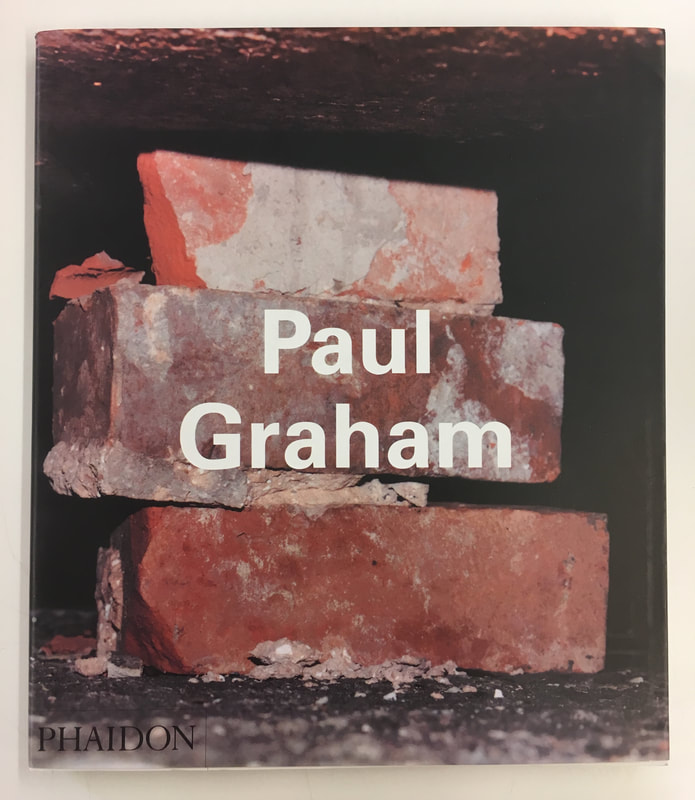
Paul Graham |
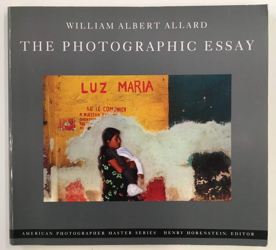
William Albert Allard: The Photographic Essay |
|
|
|
I was primarily interested in Paul Graham's documentary photography, in relation to my interest in documentary photography. In particular, I was inspired by Graham's ability to capture minute, overlooked details. For example, a photograph of a roundabout in N. Ireland contains clues of nationalistic graffiti and writing after further examination.
|
I found it useful and informative reading Allard's book. Again, linking to my interest into documentary photographs and the ability of photo essays to provide a documentary narrative. The range of different documentary photographers in the book was also informative, as Allard's own photographic essays.
|
My Personal Investigation: Football
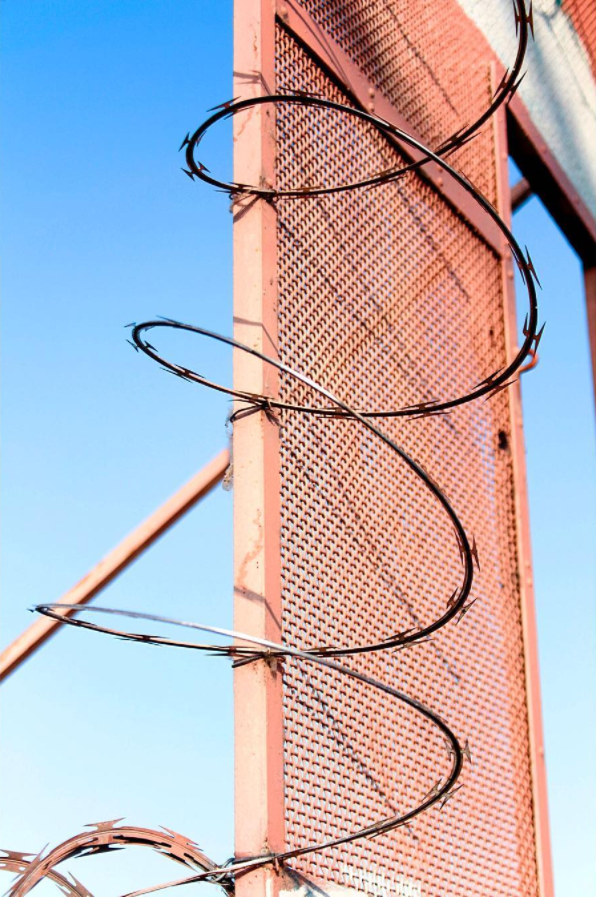
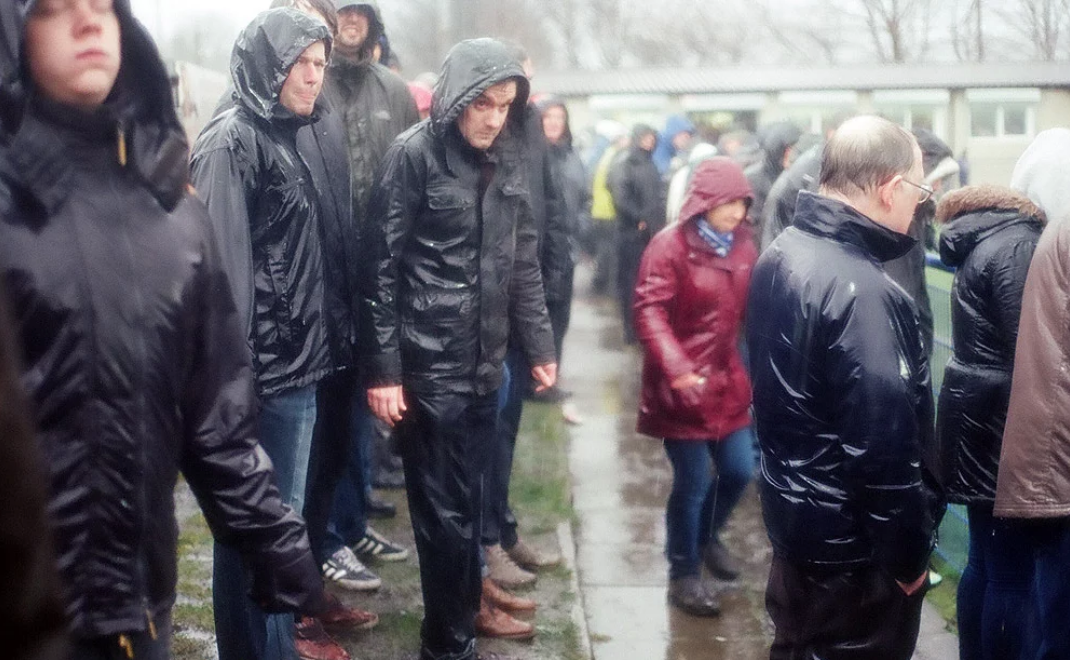
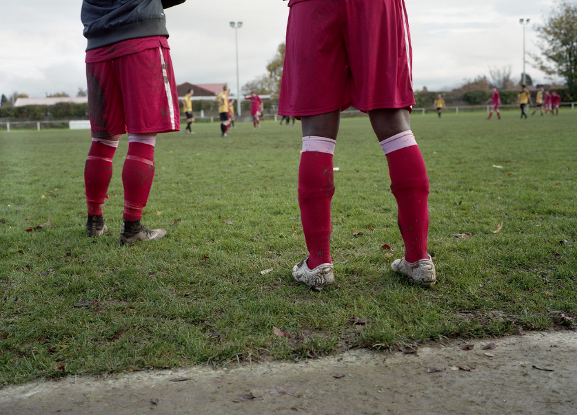
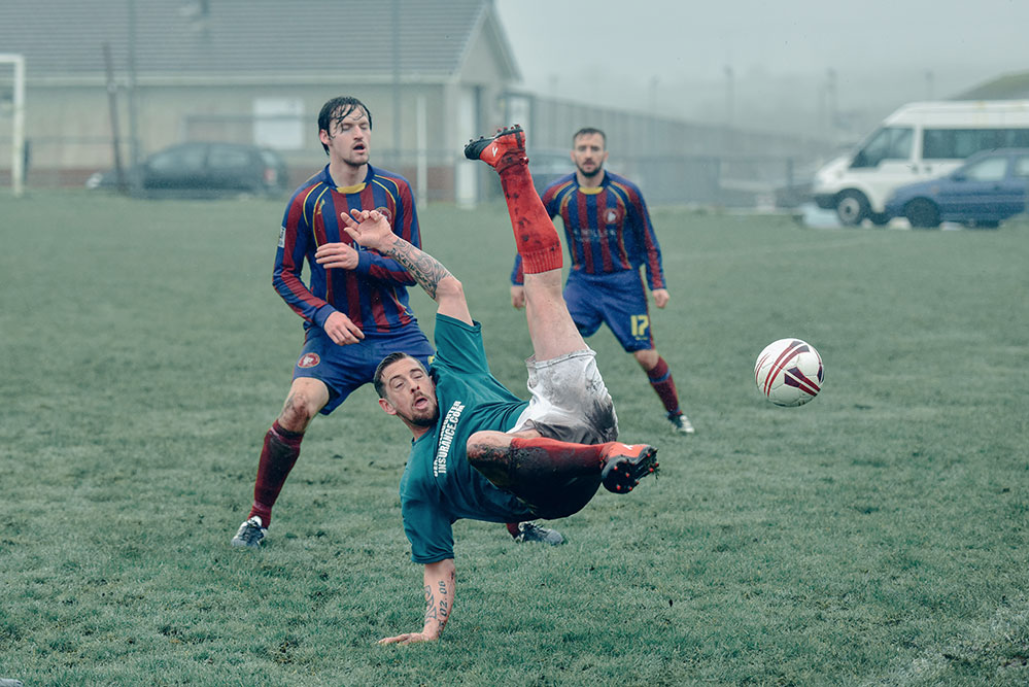
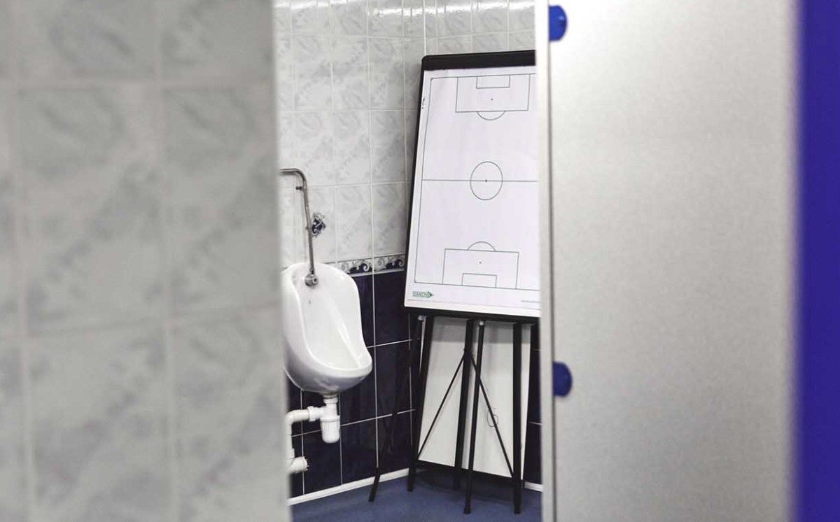
• I have chosen to produce a documentary series focusing on Football for a number of reasons. Although this isn't my final choice for the focus of my personal investigation, I am planning to produce quite an extensive series which could be my main focus. I have chosen to focus on football, not only because it is a key interest and passion of mine, but also because of the wide ranging subject matter as well as different parts of football I could photograph. There are a huge range of different possibilities and directions that I could take this series, and a number of ways I could experiment. Football is a perfect subject for my interest in documentary photography and photo essays - there are so many aspects that I could document.
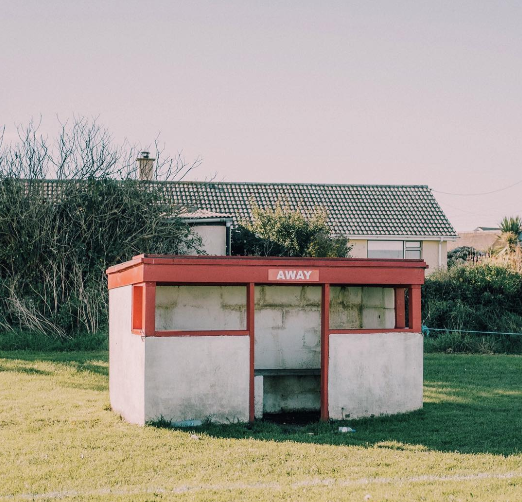
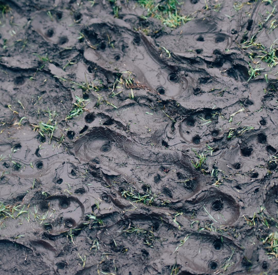
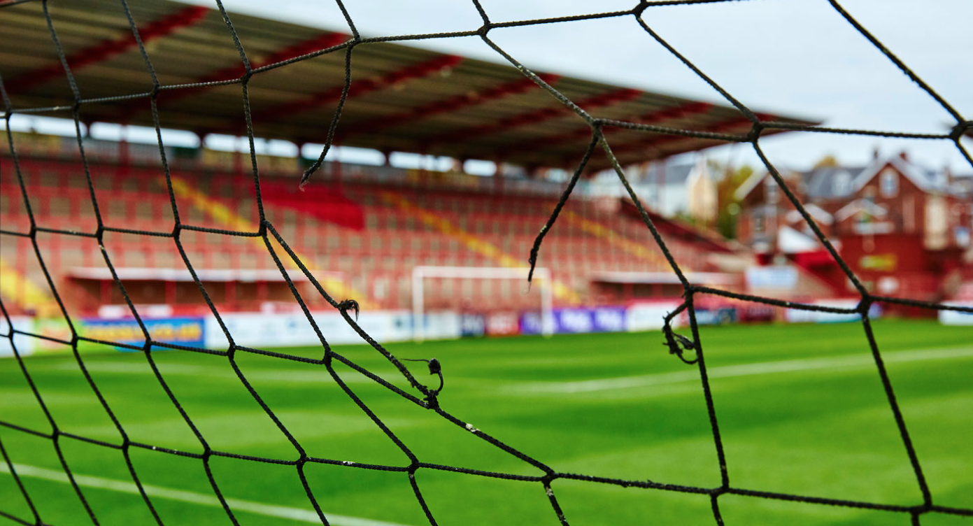
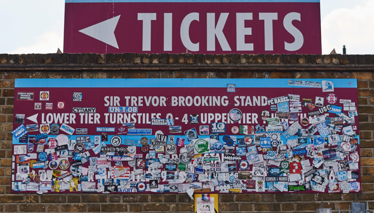
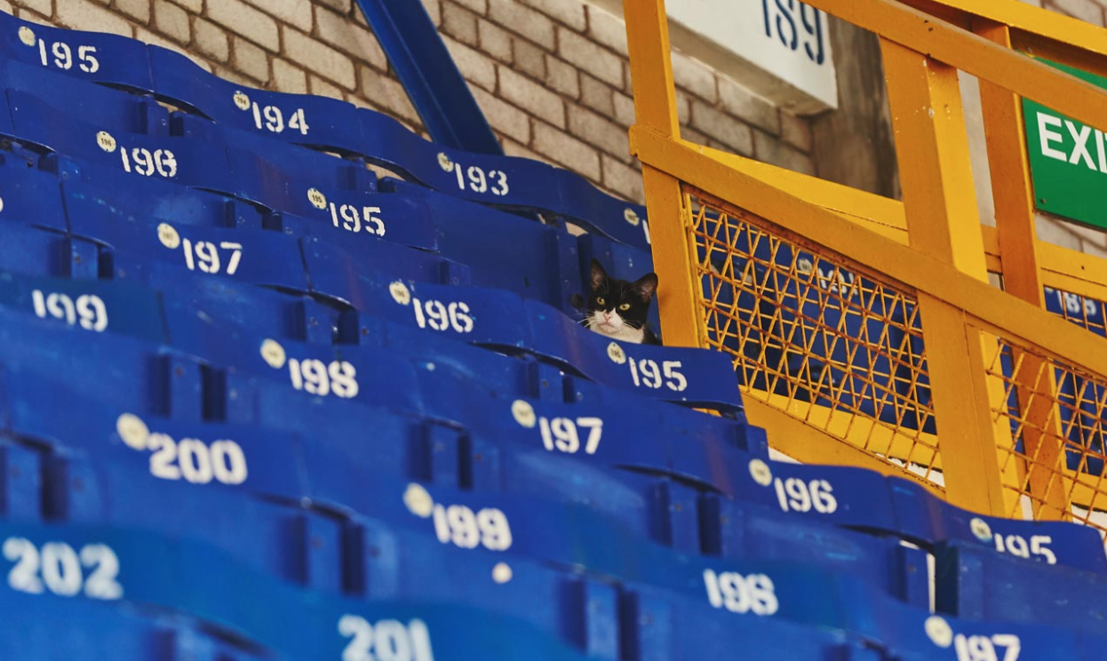
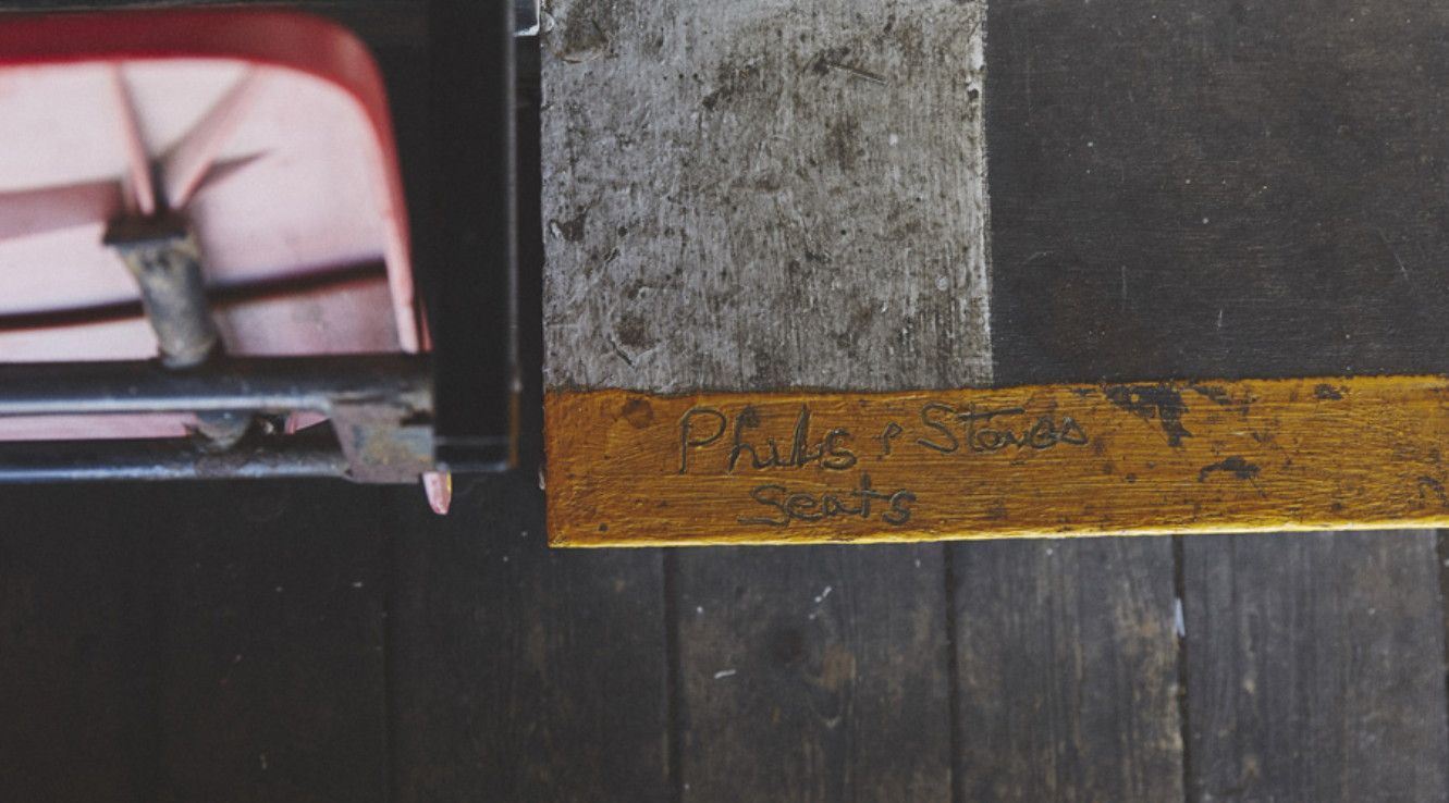
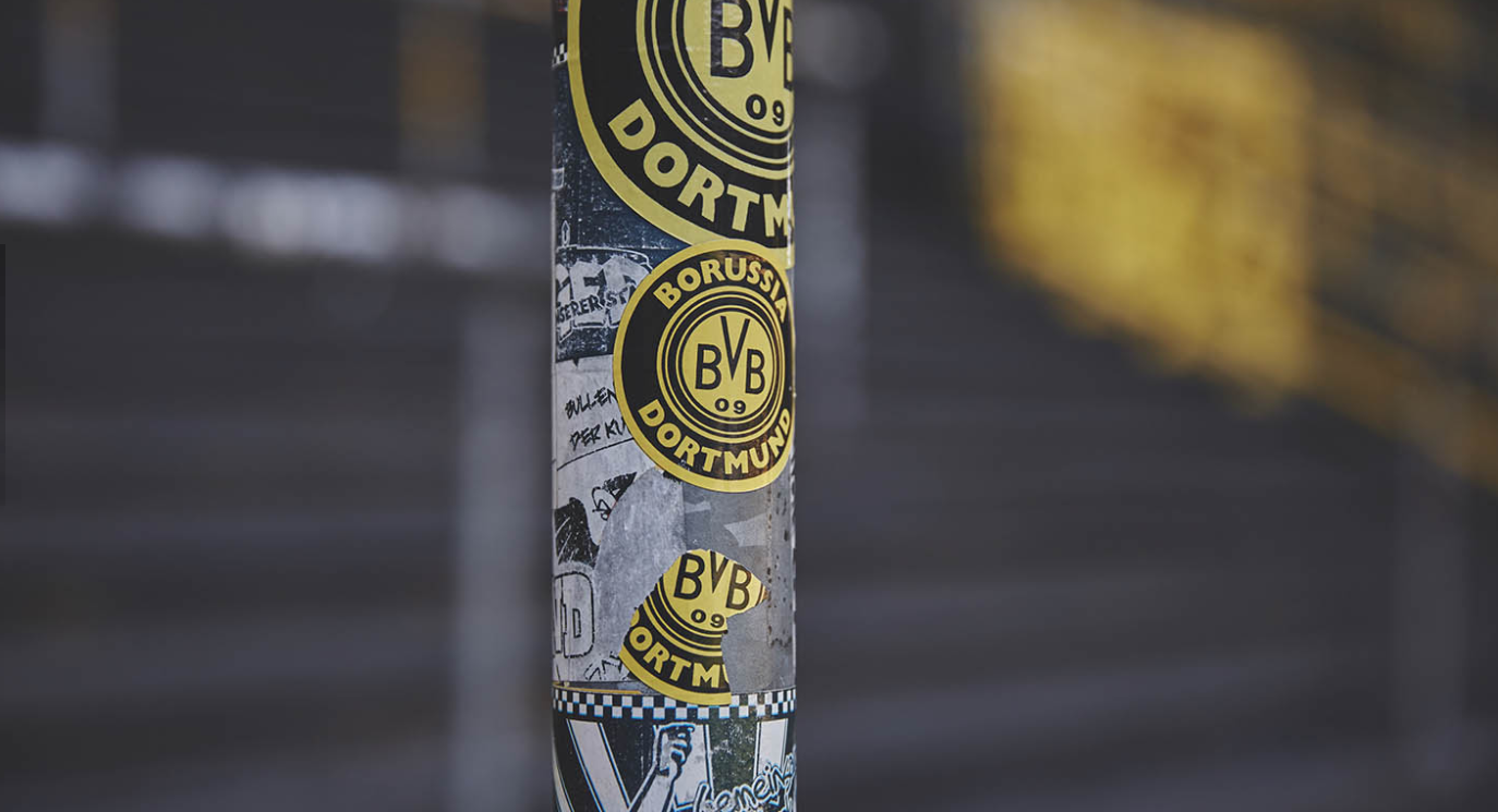
• Not only this, but it also links to my wider ideas and interest in traces of human activity. For example, the traces left behind in a stadium or on a pitch could be a particularly interesting avenue to go down - For example, stickers, murals, banners, programmes, litter etc. left behind by supporters, or litter left behind by players. Empty stadiums, which were previously full of thousands of supporters, noise and passion could be an interesting focus; the almost eerie residue and metaphorical echoes of the passion of the supporters almost ingrained into these stadiums, the centres of the such passion. Stadiums are like the church or place of worship for supporters and hold such importance in so many people's lives, especially at the heart of the community and football's importance on communities and towns or cities. Empty stadiums are quite eerie and almost too quite when empty - this could be an interesting to document.
• Not only this, but focusing on football as a general topic can encompass a range of different genres which I am interested in. It could encompass architectural photography (focusing on stadiums), portrait photography (focusing on stadiums and people involved in football), sport photography (a genre which I'd like to try) as well as possibilities of creating documentary series of photos and photo essays. Moreover, I would especially like to experiment with different types of film on analogue cameras - something which I think could expand my photography. in particular, I would like to try double exposures as well - potentially using a medium format camera. I would also like to experiment with different film stocks, I'd like to see the different outcomes of different types of film.
Inspiration: Photographers
Stuart Roy-Clarke
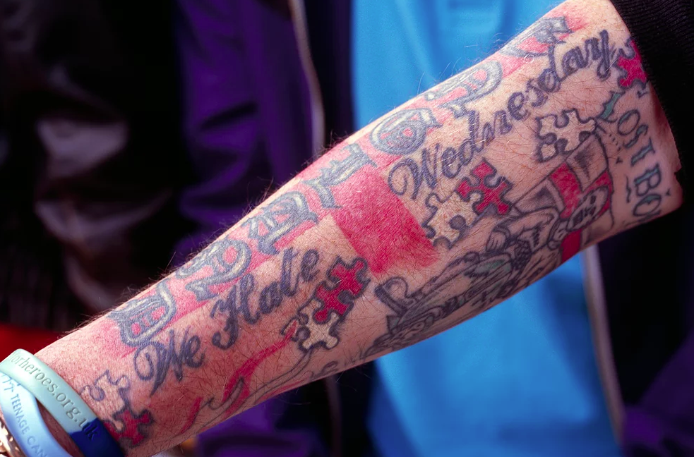
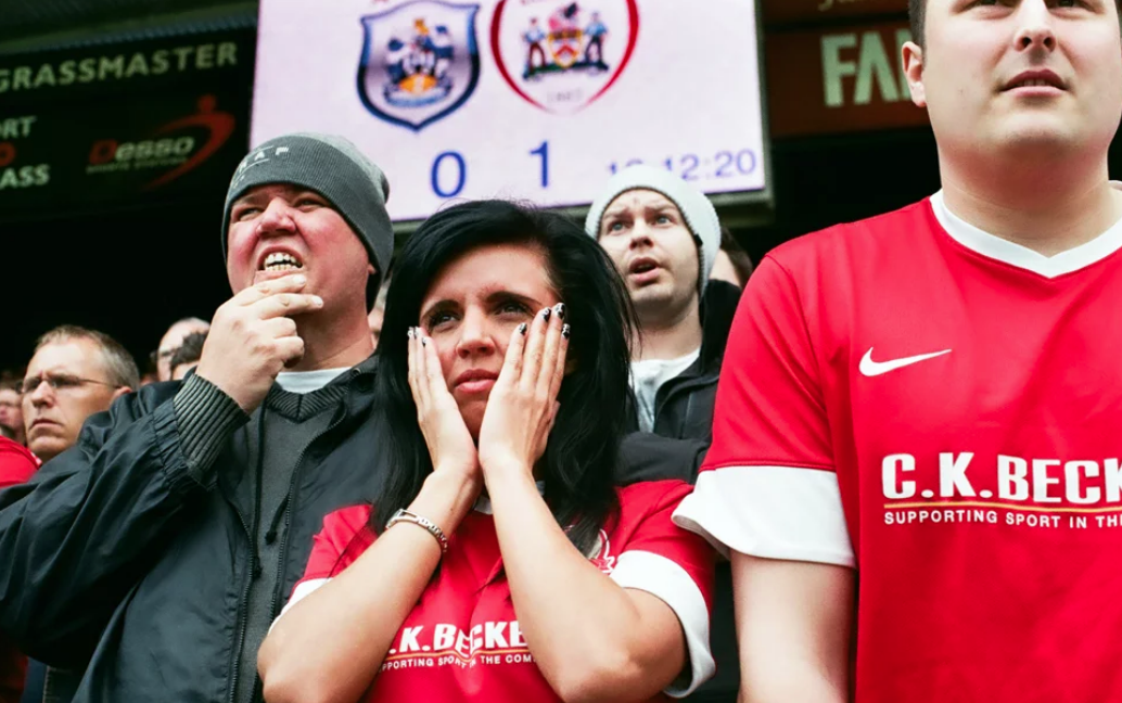
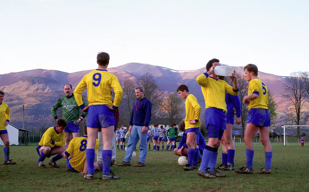
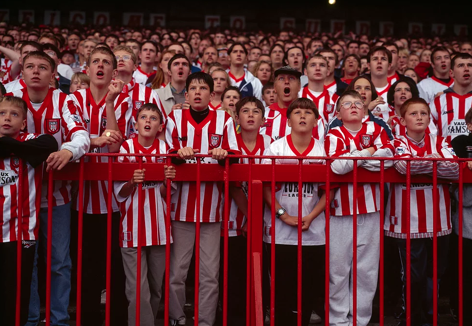
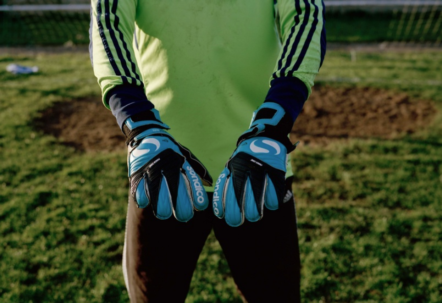
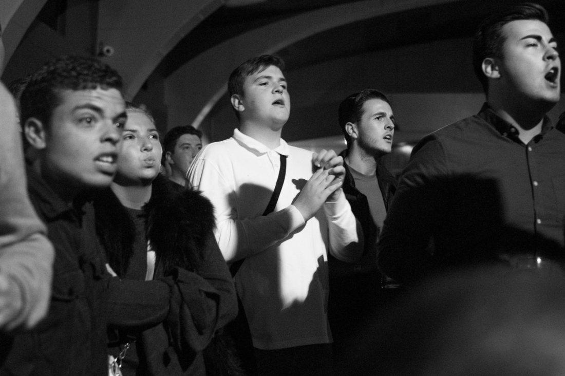
Stuart Roy-Clarke is a documentary photographer who has been documenting the changing face of football and development of the game for over 20 years using a medium format camera. He has documented how every aspect of the game has developed, from new stadiums after the Taylor report in 1989, to the players and way we support our clubs. Stuart's has documented a vast range of clubs and people, with a huge collection of photography. I find his documentation of the behaviour of fans is especially interesting, especially his images of different faces of anguish and joy amongst vast crowds. Stuart is hugely inspirational for me, he has an incredible body of photography documenting football fans, culture, players and stadiums. I can take inspiration from his documentary photography, although I wouldn't be able to create the level of work he has in his career. However, I can take inspiration from his photographs of lower league football and photographs of details (such as fan's tattoos, details in the various stadiums, football fans' reactions etc.)
Gallery of Stuart Roy-Clarke's photography:
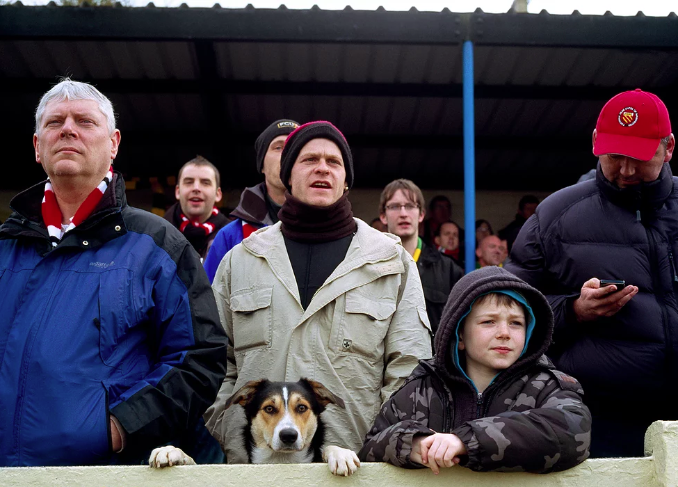
Ross Cooke
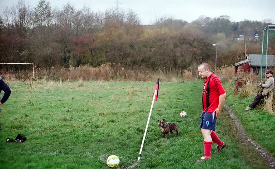
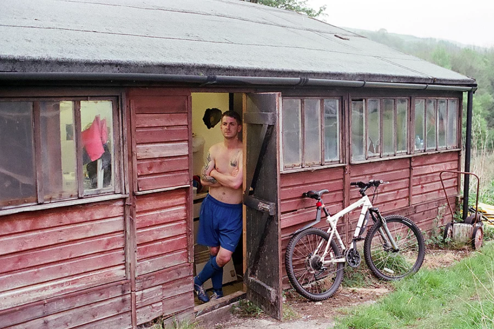
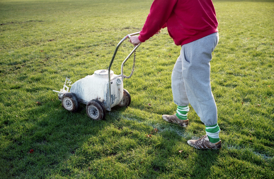
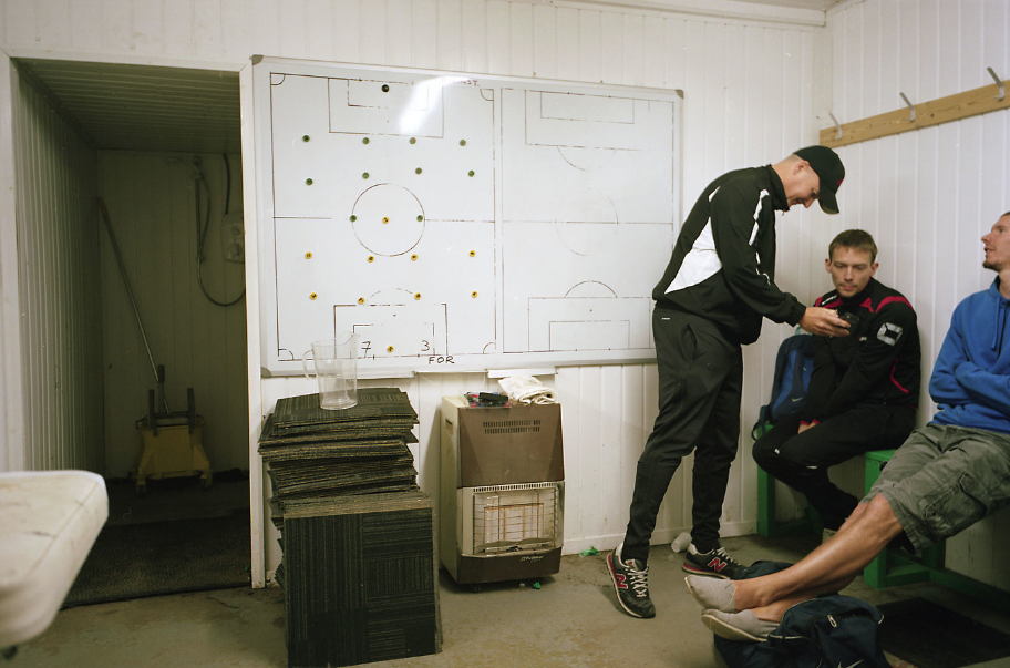
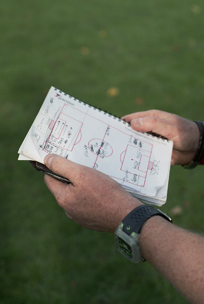
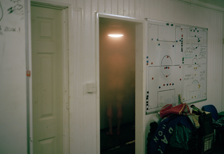
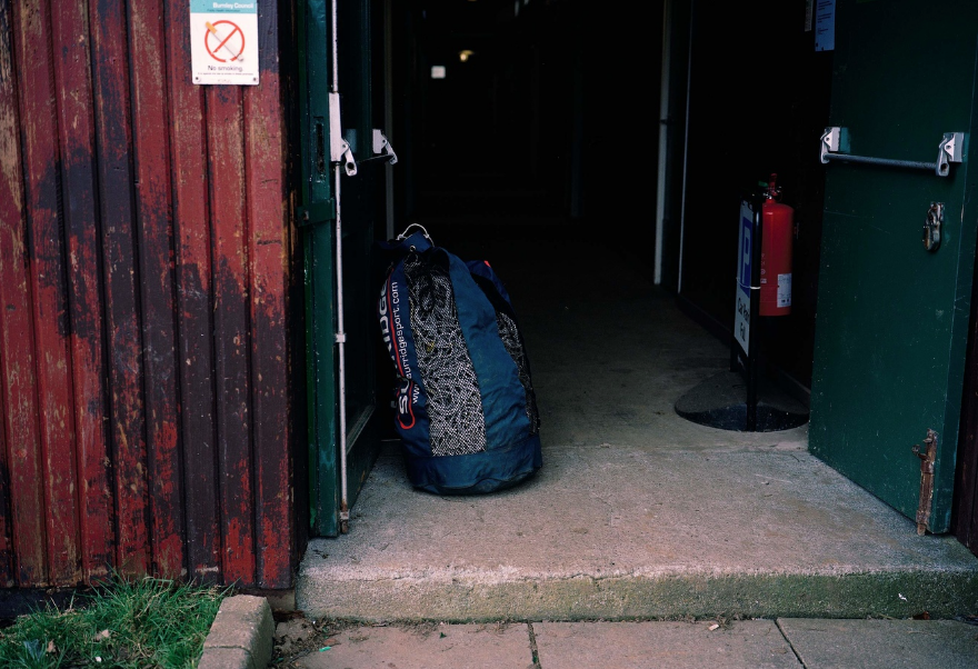
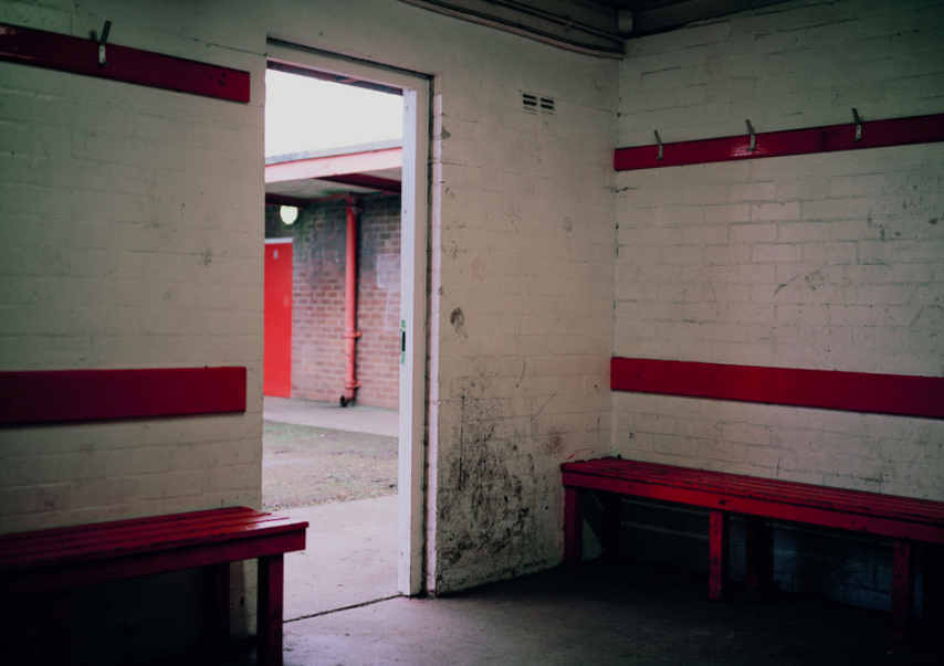
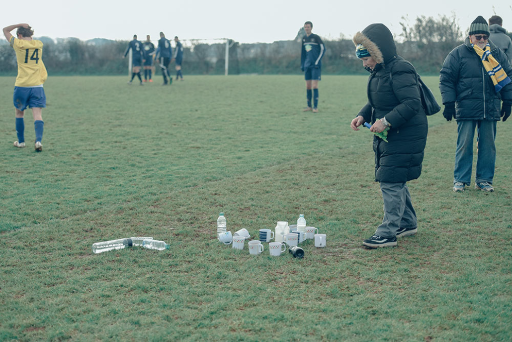
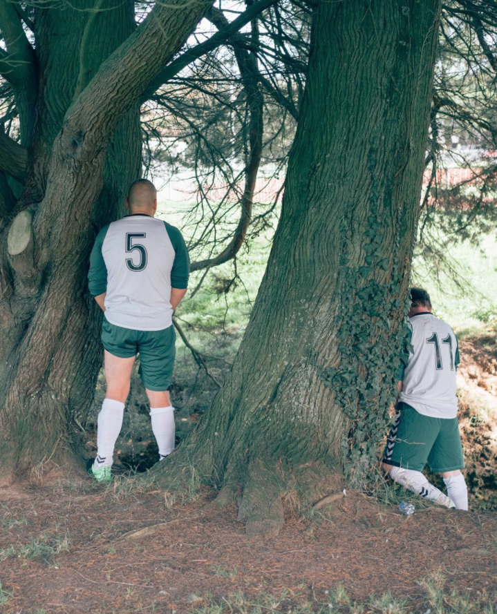
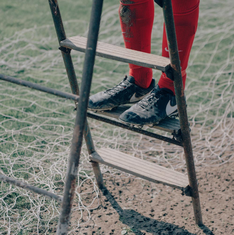
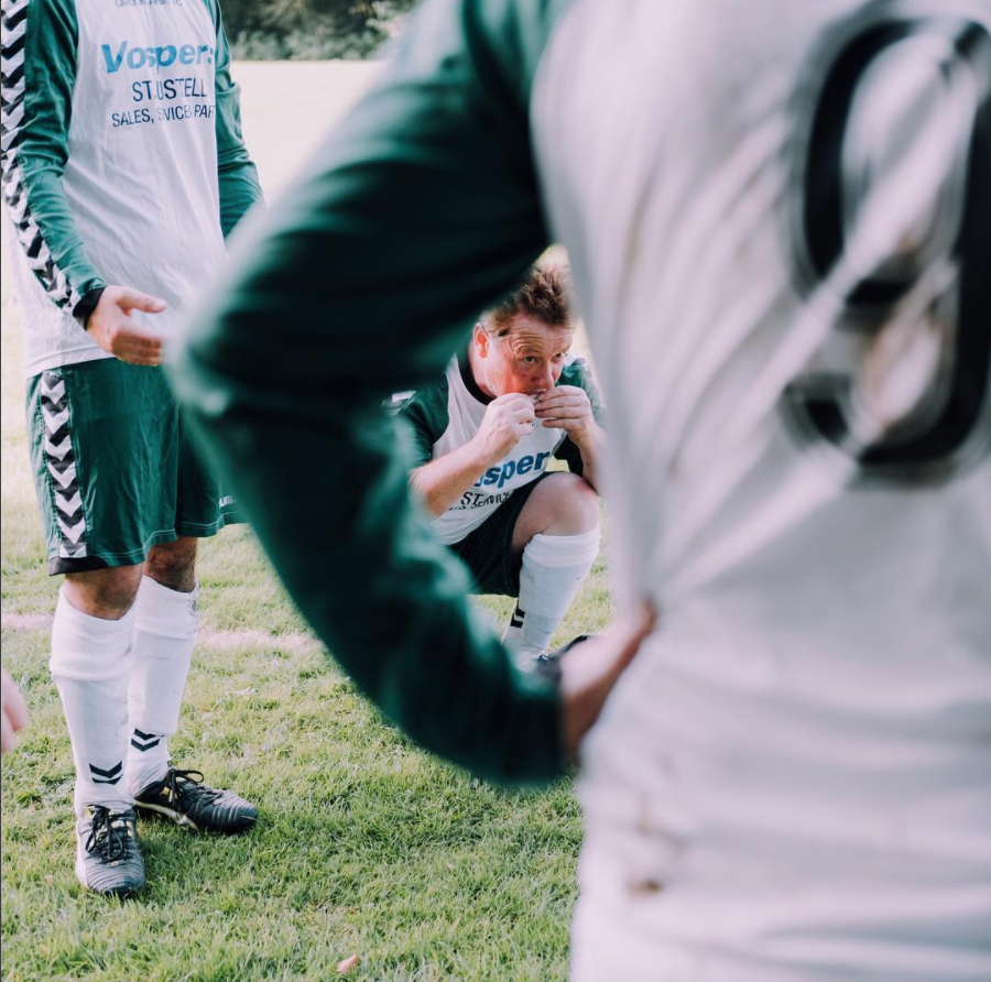
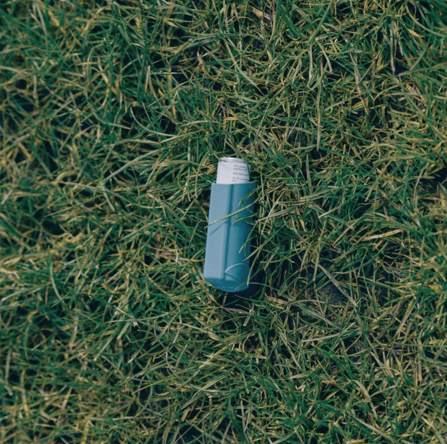
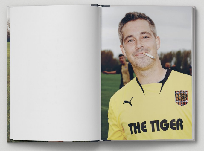
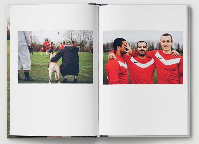
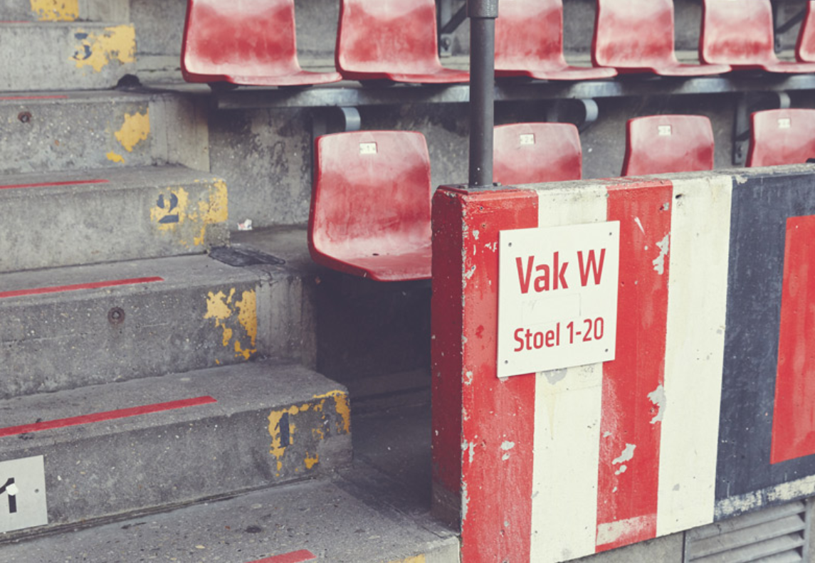
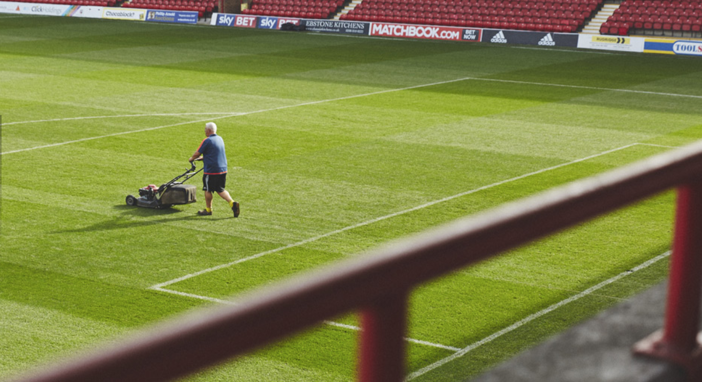
Ross Cooke is a documentary photographer, with football being a primary subject for him. Below, I have mainly included Ross' intimate photographs of lower league football. I was particularly inspired by this set of images below, particularly as I especially like is ability to pick out details and traces. He has managed to capture the feel and essence of lower league football. I am especially interested in details and traces particularly, (for example the notepad, litter left behind, the groundsman marking out the lines, the empty changing room) - really capturing the essence and the overlooked details that encapsulate amateur football.
Gallery of Ross Cooke's photography:
Louis Bamford: Cornish Sunday League
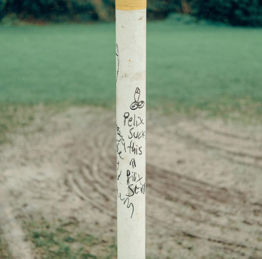
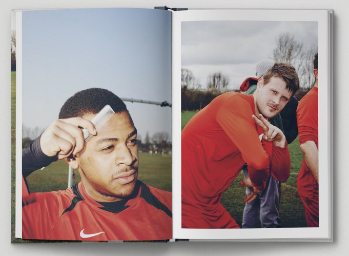
I love this series of sunday league football by Louis Bamford. In particular, I really like his portraiture, as well as the details that he captures as well. I especially like the range of images he has captured from this single series. Whilst he has captured images of players competing for headers, whilst also capturing boot prints in the mud and graffiti on the goal posts. Again, Louis has really captured the details and feelings that encapsulate amateur football, with humorous documentary images (the players styling his hair, players going to the loo behind a tree), alongside really interesting details. I am very interested in lower league football as well, often at the centre of the local community. The details and traces that Louis captures are especially successful - his ability to capture details is an area of photography that I would particularly like to study.
Gallery of Louis Bamford's series:
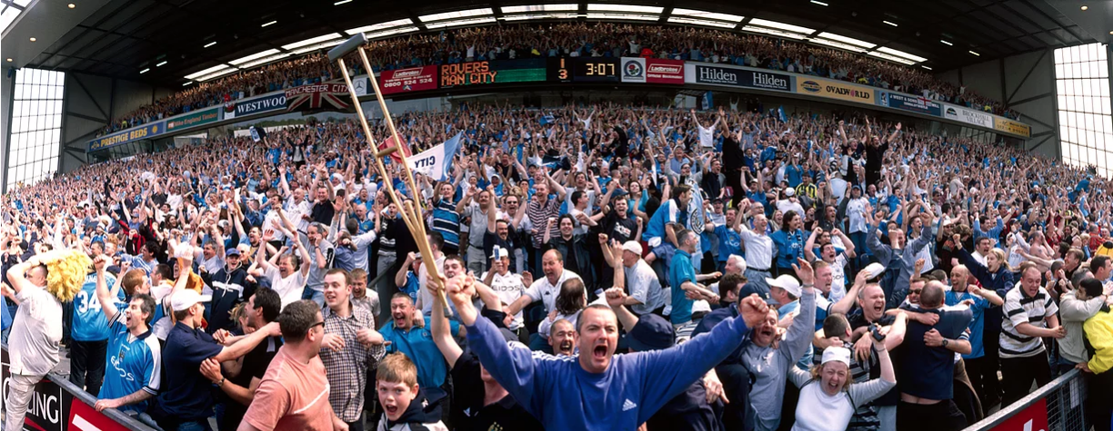
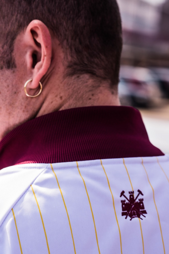
Marcus Drinkwater: 112 Years photo essay
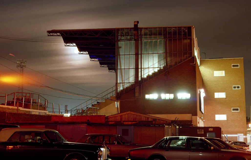
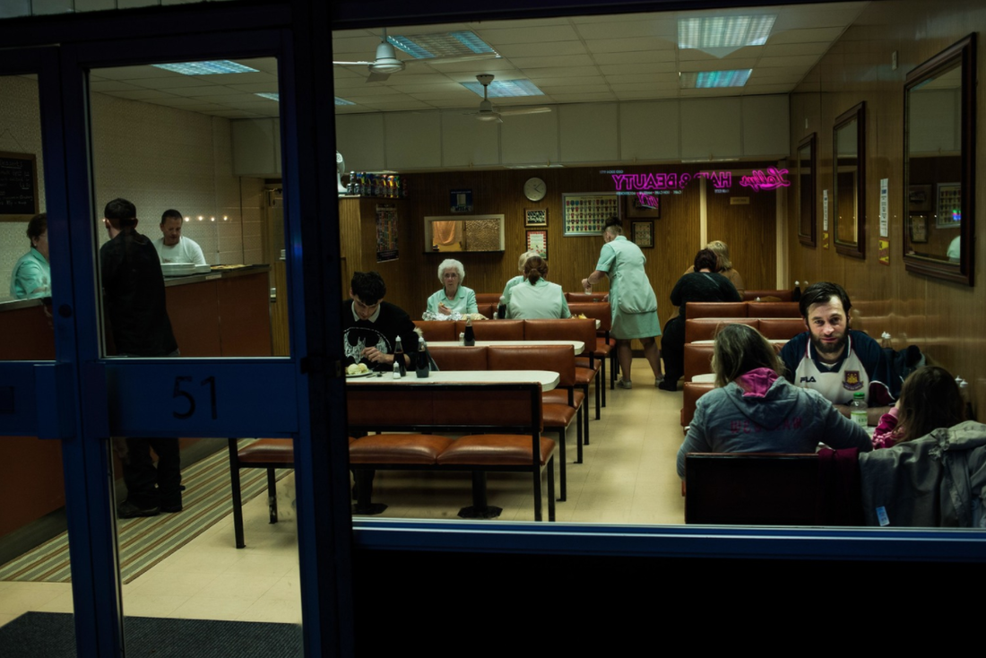
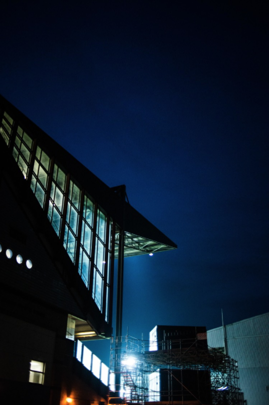
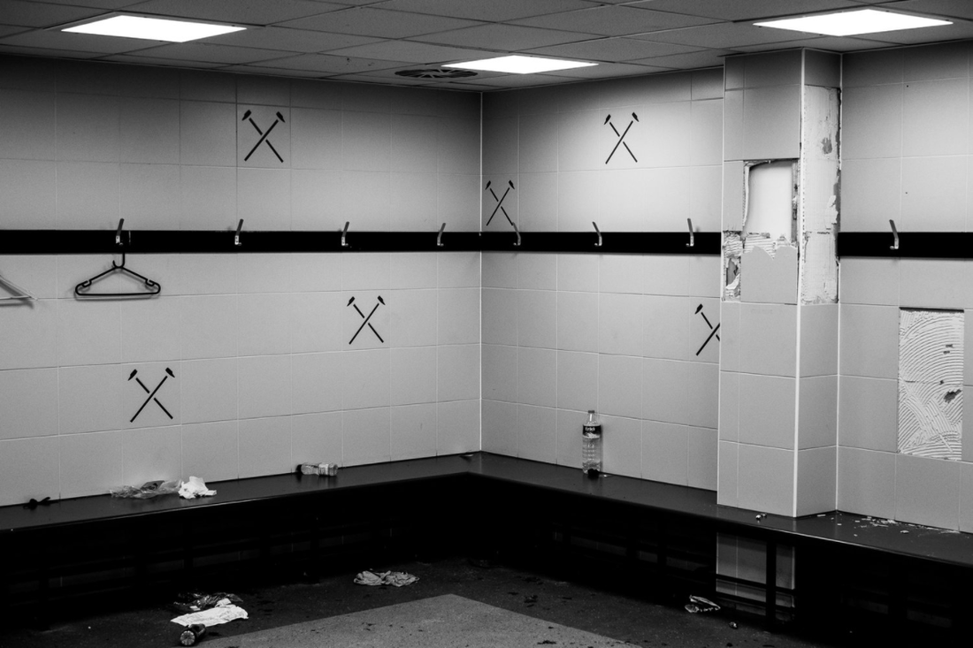
I really like this photo essay by Marcus Drinkwater, documenting the last season of West Ham at the Boleyn ground. I love the range of documentary images in this photo essay, from the empty seats, abandoned changing room and the stadium at night, to the fans, flags and local cafes the make up the fabric of the club and local community. Marcus' photo essay really captures the essence of West Ham, picking out the details around the ground. '112 years' is a very and effective example of a successful photo essay, one that provides a real documentary narrative of a subject. Again, this series is another key inspiration with me - especially with my interest in documentary photo essays; the details that he captures is a kay inspiration for me
Gallery of Marcus' 112 years photo essay:
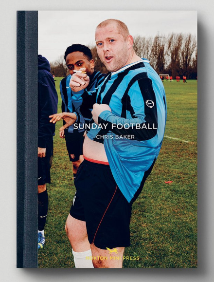
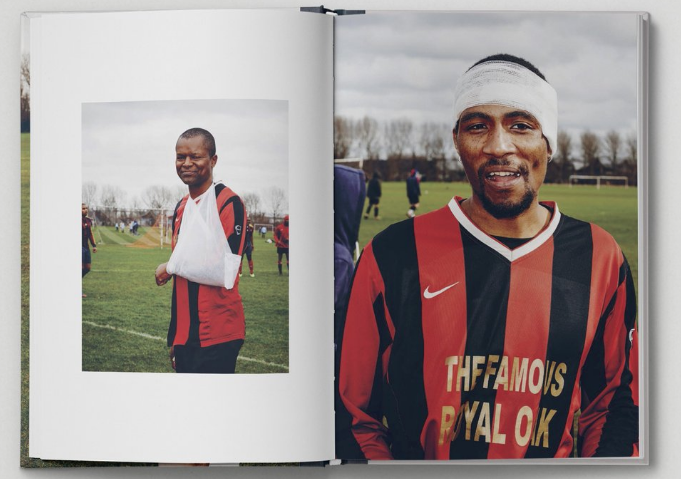
Hoxton Mini Press: Sunday Football
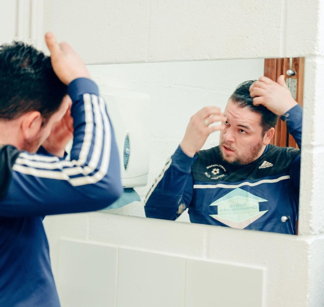
I really like Hoxton Mini Press' variety of photobooks, focusing on different subjects. I previously looked at their documentary photobooks that I really liked such as Adventures in the Lee Valley, Along the Hackney Canal and Hackney by Night. I love the documentary landscapes in these photobooks, particularly with the mix of portraits landscapes and details that the photographer picked out in Adventures in the Lee Valley especially. In this Hoxton Mini Press focusing on amateur sunday league football, the photographer has taken quite a humorous take on the subject. I like his portraits of the players, some with cigarettes, or taking up poses in front of the camera. Not only this, but the layout of this book works well, with the odd detail or quote added in to the majority of portraits.
Gallery of Sunday Football:
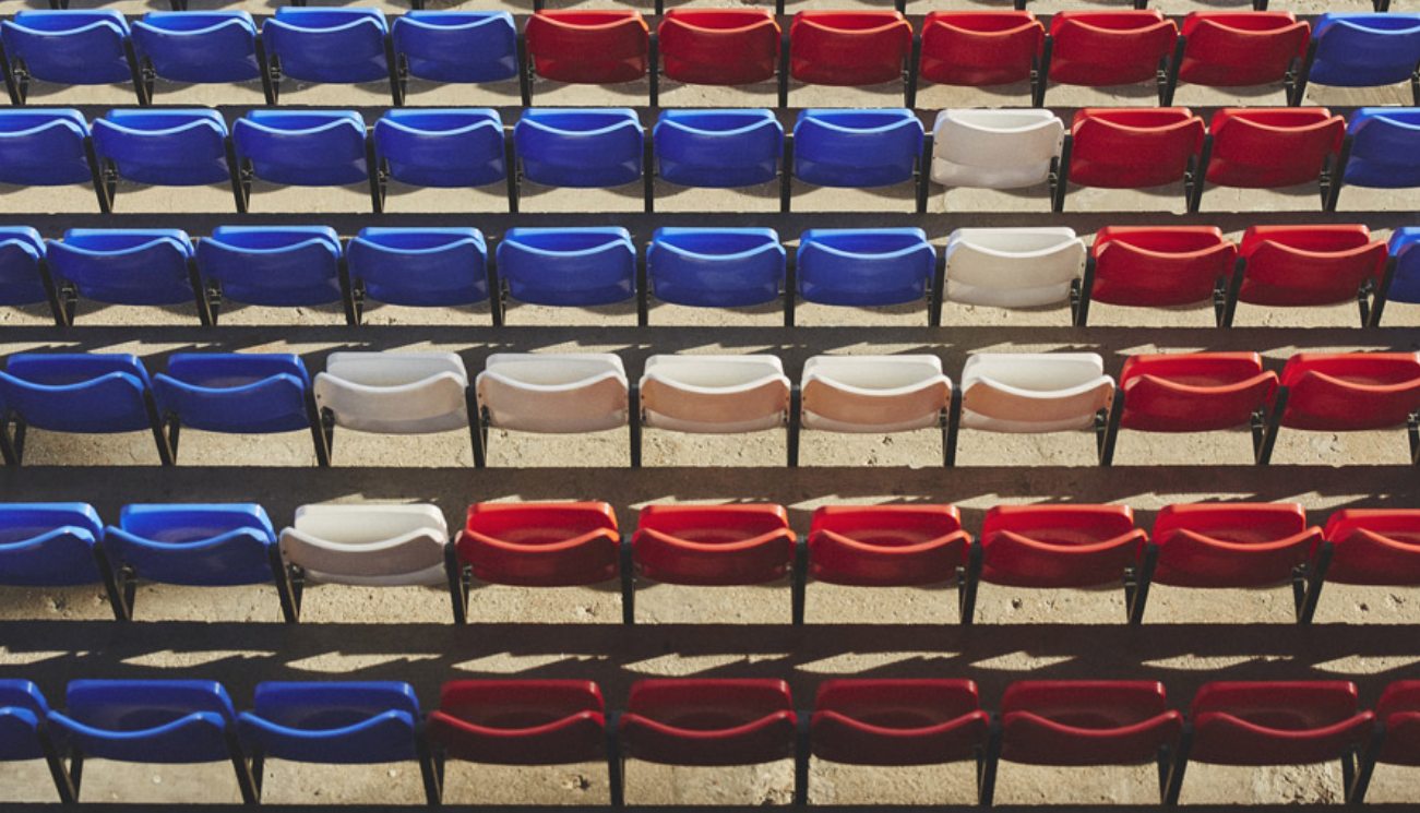
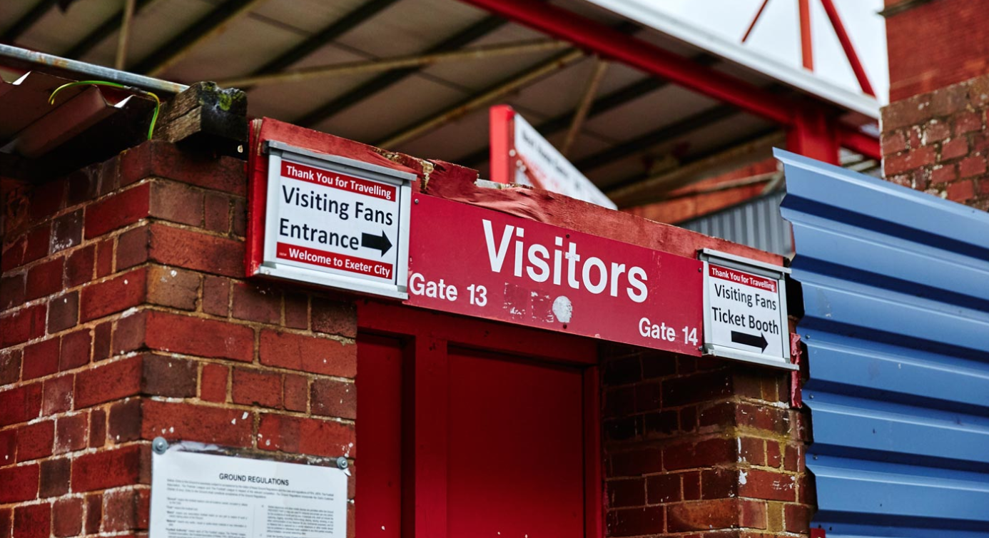
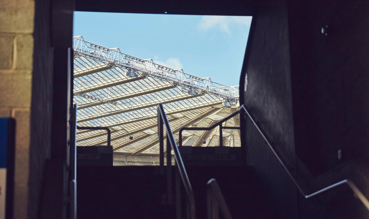
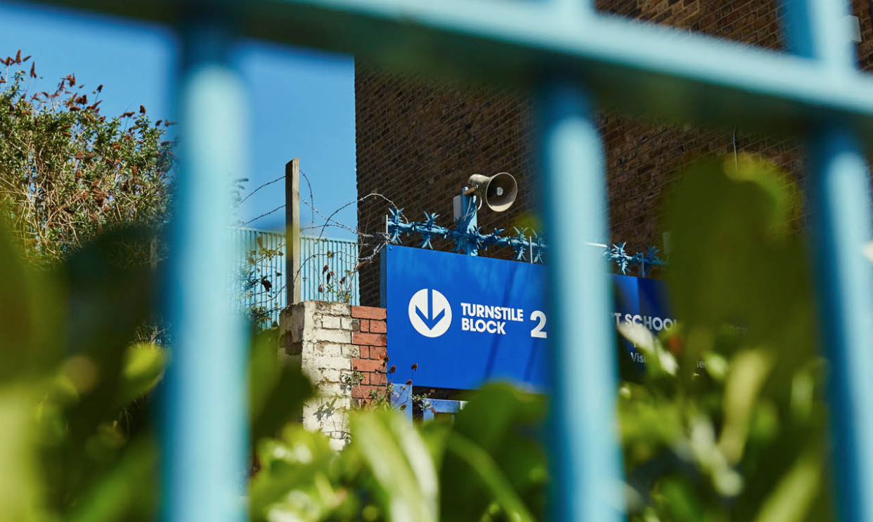
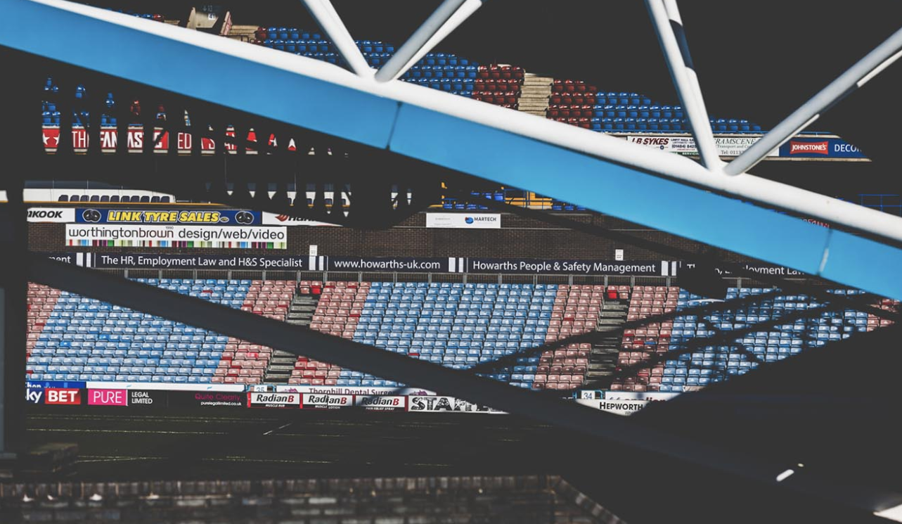
Soccerbible: 'Residence' series
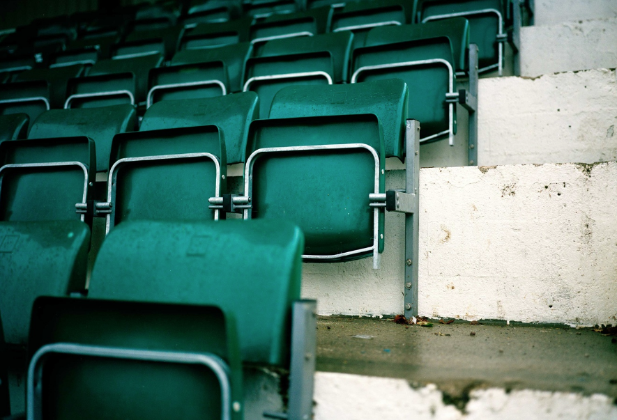
Soccerbible is a magazine that focuses particularly on the creative aspects in football, such as design and photography. In particular, I really like their Residence series - a documentary series that documents the details of a number of different football stadiums in the U.K. and abroad. I really like the images that pick out details and marks left behind by fans, such as stickers, banners etc. This series really captures the essence and feeling you get in the home of your football club. I especially like the architectural images and photos picking out interesting patterns and almost geometric compositions in the stadiums that are documented in this series. This series is especially inspirational, as I want to take a number of images documenting stadiums (picking out details), as well as photos focusing on patterns, and the unique design and architecture of individual stadiums (from the worn out seats and signs, to the stands and decrepit walls and structure of the stadiums).
Gallery of the 'Residence' series:

My first set of images
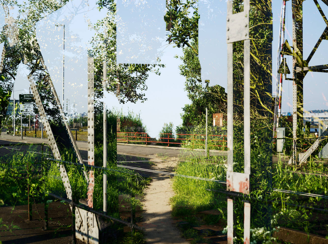
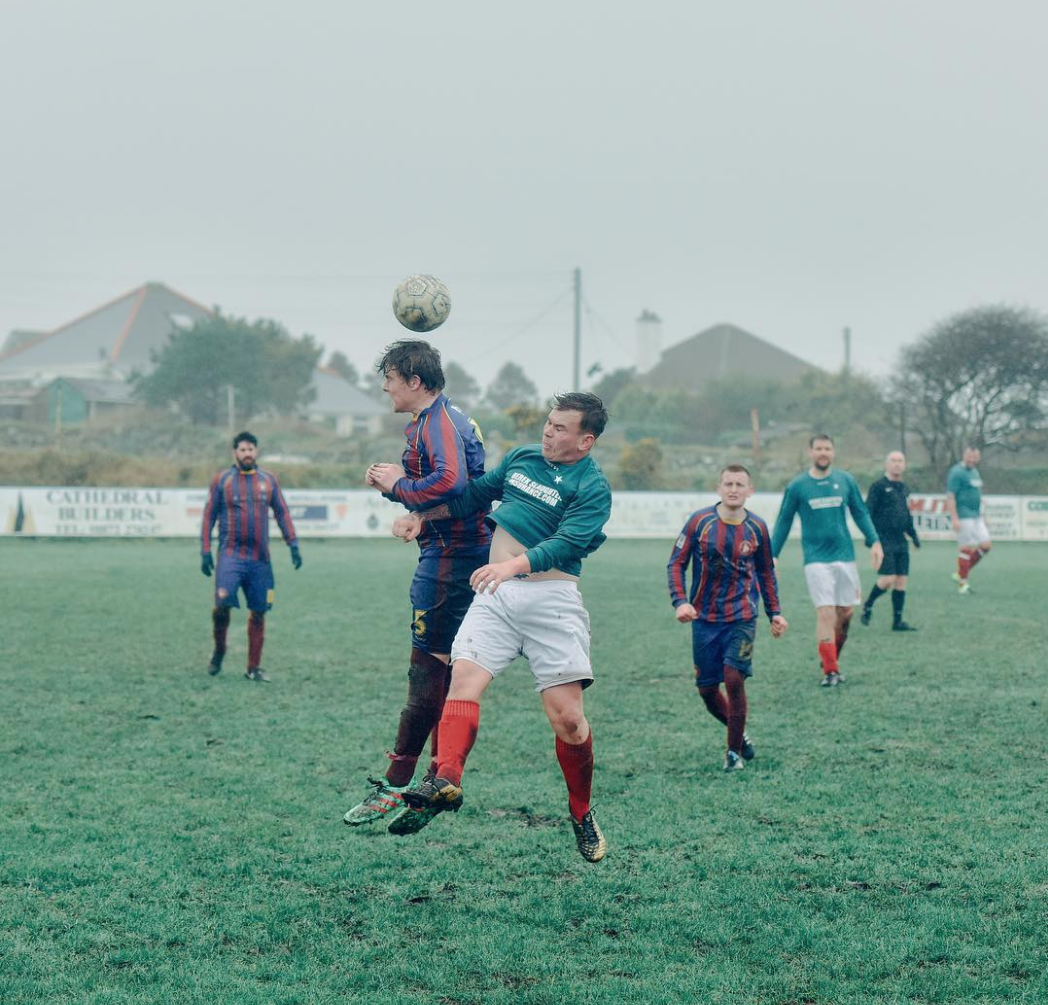
During my summer holidays, I visited Northern Spain. Spain is a country notorious for its passion and obsession with football, football clubs often hold strong political importance, and also represent the people and communities in different regions of Spain. I visited 4 different clubs in Spain - C.D. Llanes (a very small club on the northern coast), Real Oviedo (a working class club in the city of Oviedo, the capital of the Asturias region), Real Sociedad (a very successful historic club in San Sebastian, with a strong Basque identity) and Athletic Club Bilbao (a religiously supported club that represents the working class community in Bilbao, which represents the strong Basque identity of the people there - the city particularly is covered in Basque flags and red and white stripes of the football club). Not only this, but I also previously photographed a lower league fixture between Southend and Millwall at Southend's ramshackle ground Roots Hall, where I mainly focused on the decrepit old stadium and supporters. I used my Nikon DSLR with a telephoto zoom lens (18-200mm), meaning I could zoom into particularly details, or zoom to compose an architectural compositions of the stadiums for example, or through gaps in fencing as well. It is quite a versatile lens, so I could create a range of different images and varied compositions.
Sample:
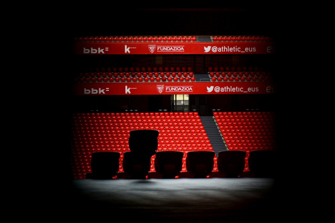
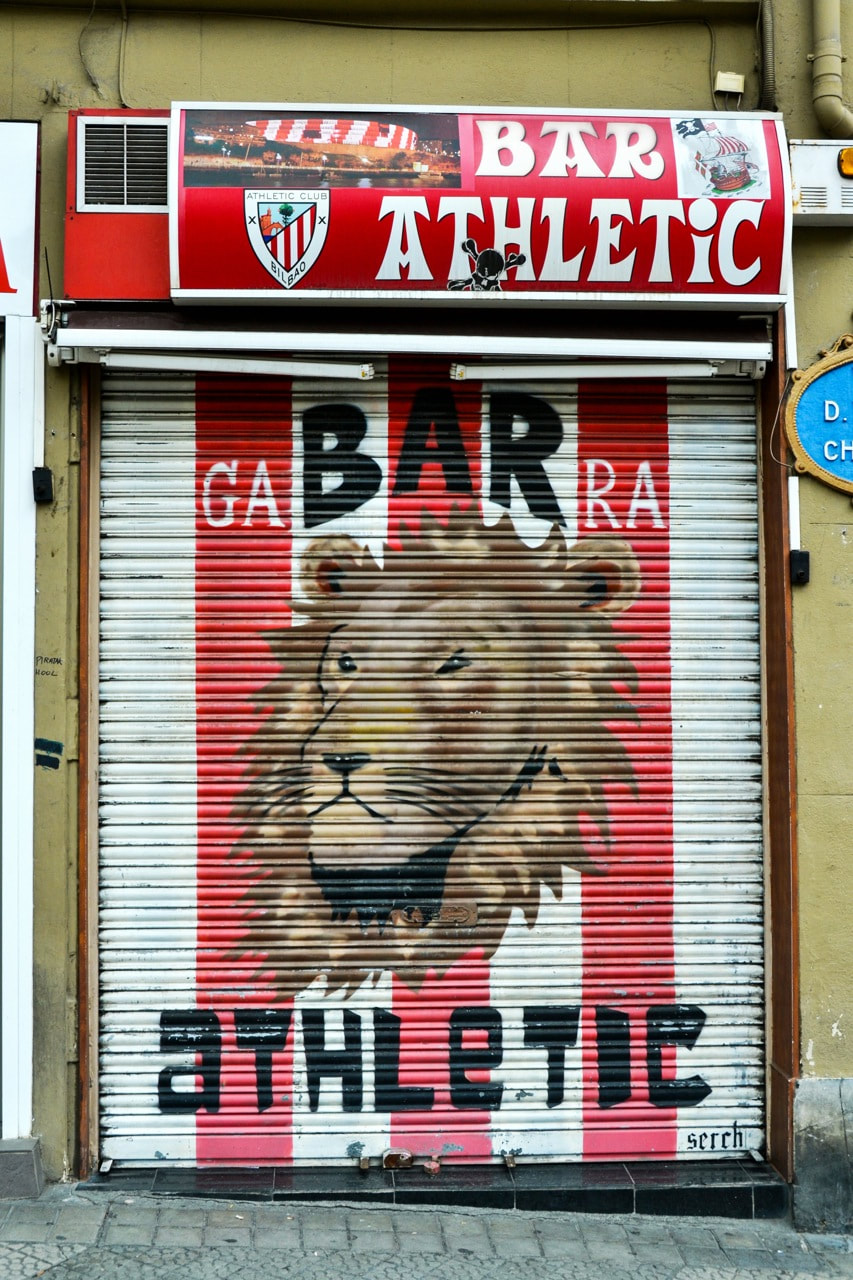
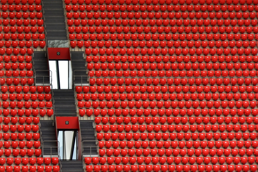
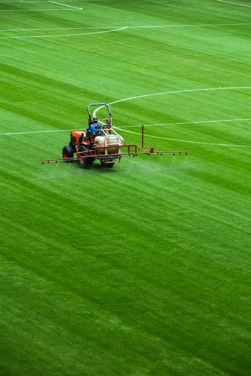
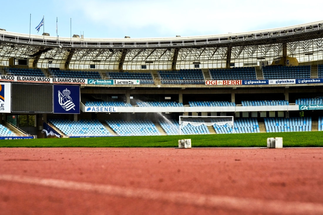
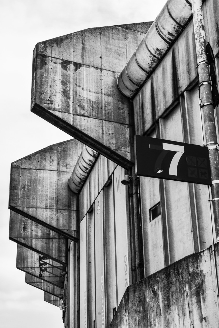
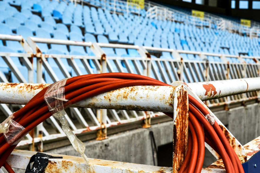
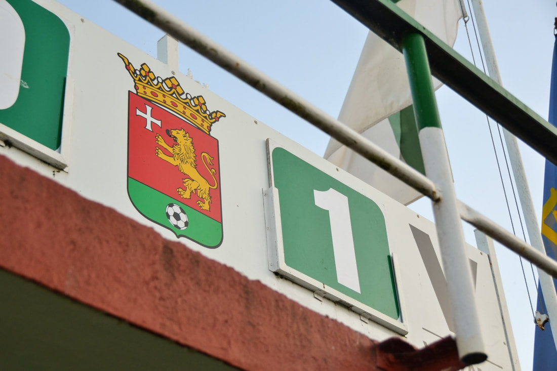
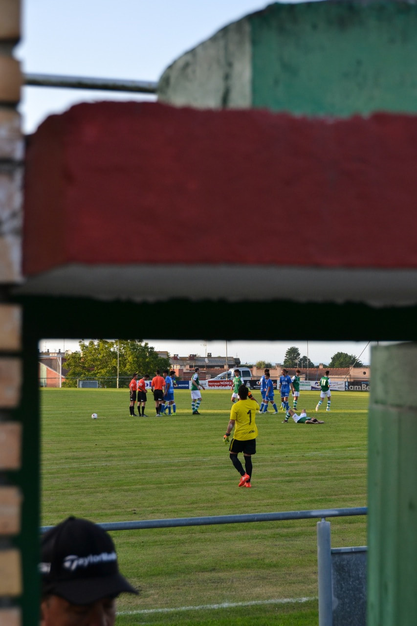
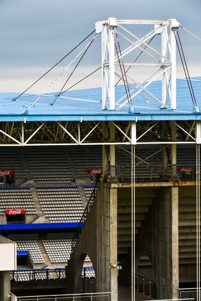
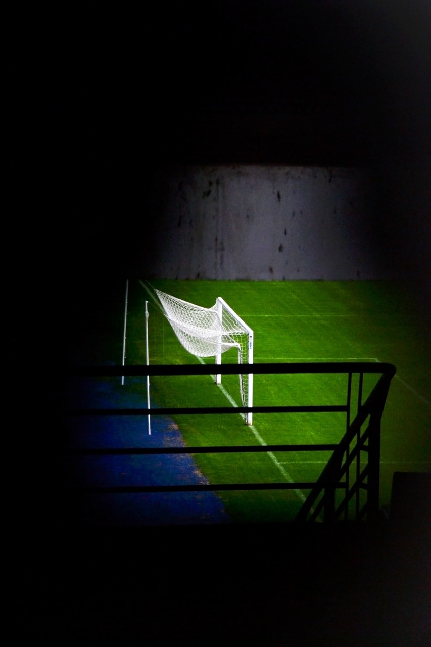
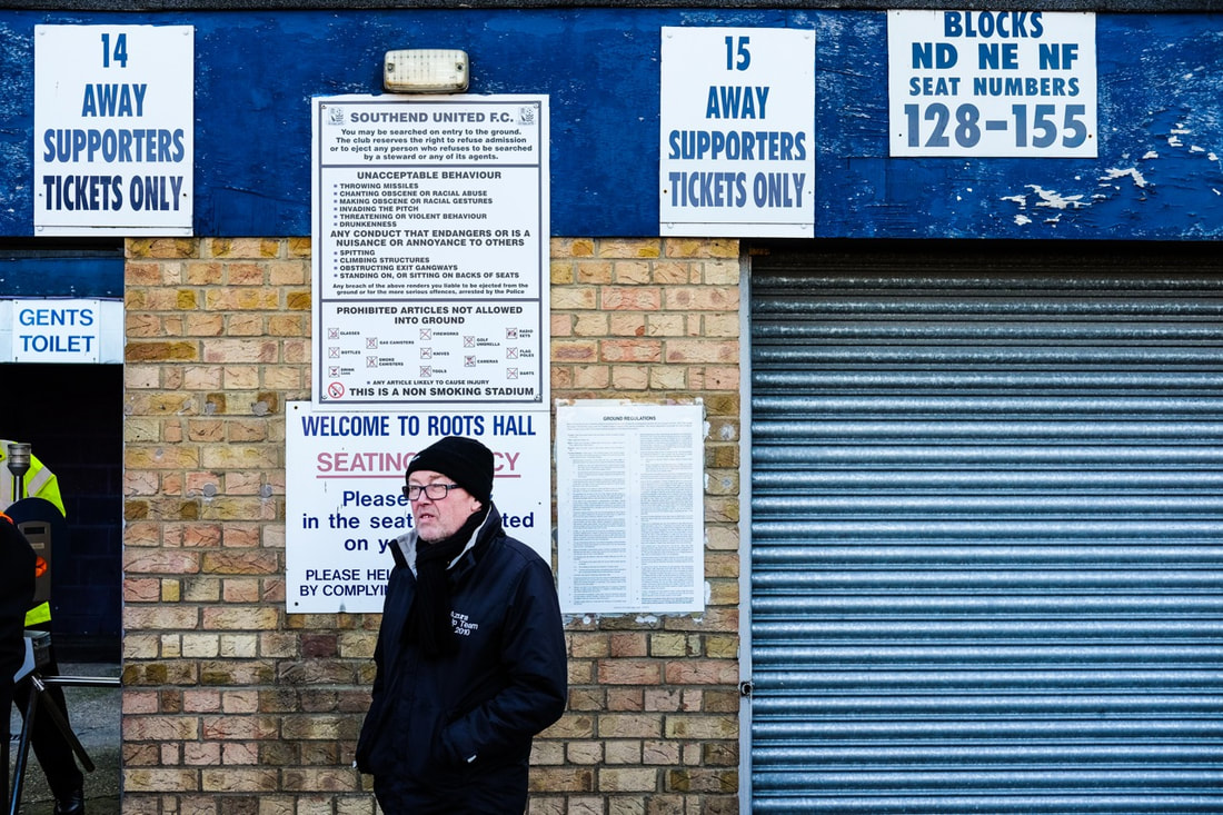
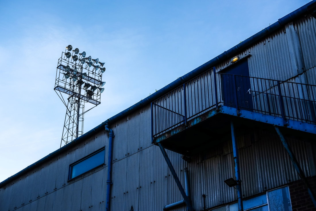
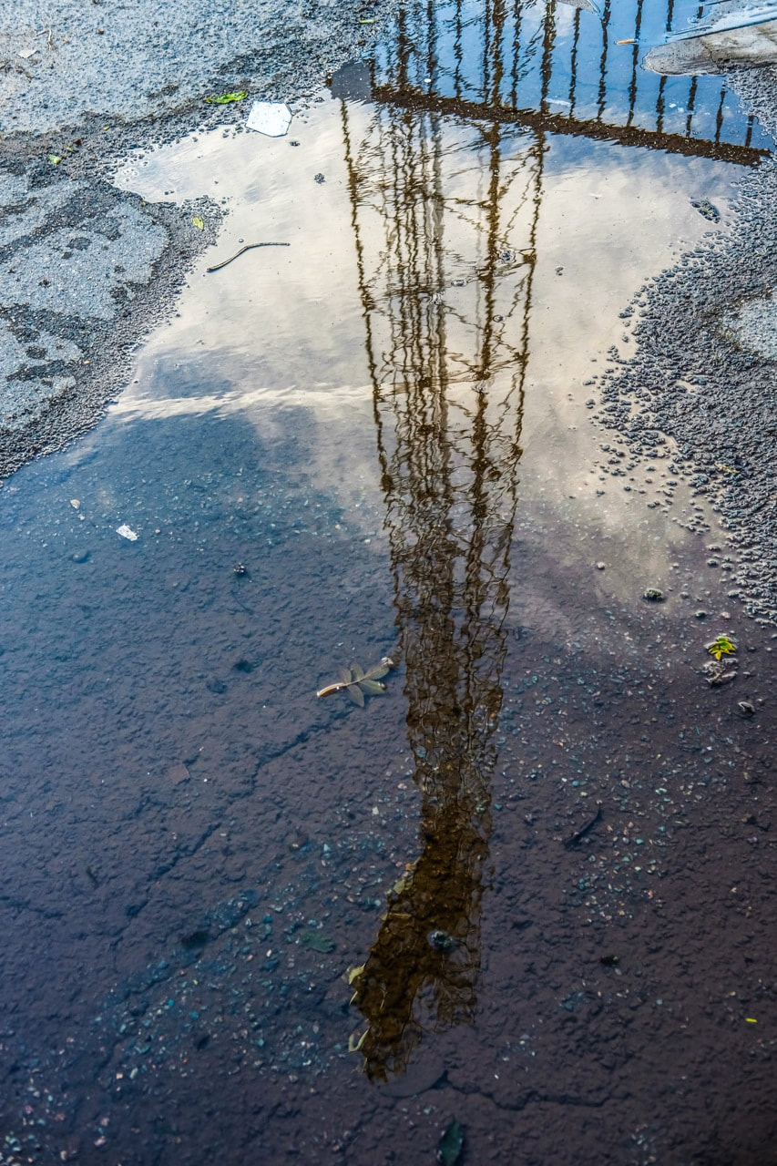
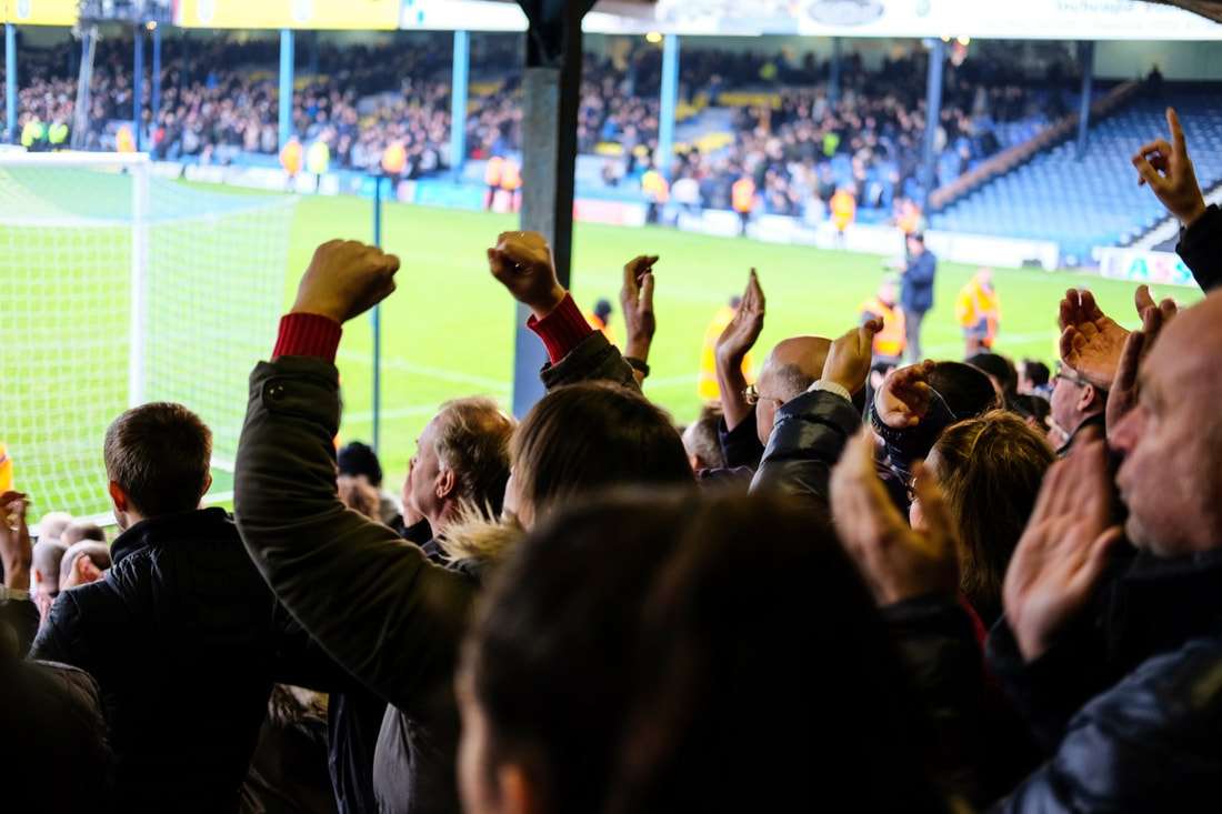
Full Set of 197 images:
Click here for the full set of my personal investigation photographs focusing on Football
Evaluation
Overall, I was happy with the results of the images I took focusing on Spanish football (as well as Southend United). I have a wide range of different photos, and an interesting range of different perspectives and different focuses in my images. I photographed 3 of the stadiums which were empty at the time, with C.D. Llanes and Southend United both having games on at the time. When photographing these stadiums, I was particularly focusing on the architecture of the stadiums, as well as documenting details and compositions around each stadium. At the Southend match, I was shooting the crowd and people alongside the ground. I created some compositions - particularly capturing the ramshackle run down exterior of the ground, as well as shooting some of fans as well. I particularly liked these candid intimate photos, it captures lower league football well.
In Spain, at the small ground (C.D. Llanes), I was particularly photographing details, as well as composing shots around the small, basic ground. I like the photographs that show the details that make up the fabric of a small amateur club like Llanes - for example, the mural on the wall of the ground, the small trophy cabinet, or the small community bar. After this, I photographed Real Oviedo's stadium, which was deserted at the time; there was quite an eerie feel, it was so quiet when usually it would be full of thousands of spectators, noise and colour. when shooting this stadium from the outside, I was particularly focusing on architecture, as well as creating compositions by shooting through gaps in the stands, or through the fences around the edge of the stadium. This was quite a successful shoot, I particularly liked my photos shot through gaps and apertures, as well as my photos capturing details such as murals and banners. I subsequently visited the Real Sociedad ground, and I was able to shoot inside the stadium as well as behind the scenes and in the changing rooms. Here, I was able to take a wider range of images - I could take architectural photographs alongside images alongside photos focusing on details around the ground as well as behind the scenes. This was a productive shoot, as I was able to take a wider range of photos, especially with photos from a range of angle, close up low angle shots, as well as zooming into details or architectural compositions. Also, I took a number of photos around San Sebastian, particularly as so many people had sociedad banners draped from balconies around the city. I was also happy with the images I took in Bilbao - the images I took at their stadium as well as banners and details around the city linked to the football club, as well as people playing on the street. At the stadium I took a range of images - particularly architectural photos that came out quite well, especially architectural compositions that I cropped into with my zoom lens. However, I also took a number of images shot through gaps and apertures to create some more unusual images, as well as picking out the groundsman cutting the grass for example. Overall, I built up a varied range of images that were relatively successful in exploring the culture of football, which I could use in different ways, or potentially experiment with. Moving forward, focusing on people more, through portraits of fans and players could provide a more comprehensive photographic investigation into the culture of football.
In Spain, at the small ground (C.D. Llanes), I was particularly photographing details, as well as composing shots around the small, basic ground. I like the photographs that show the details that make up the fabric of a small amateur club like Llanes - for example, the mural on the wall of the ground, the small trophy cabinet, or the small community bar. After this, I photographed Real Oviedo's stadium, which was deserted at the time; there was quite an eerie feel, it was so quiet when usually it would be full of thousands of spectators, noise and colour. when shooting this stadium from the outside, I was particularly focusing on architecture, as well as creating compositions by shooting through gaps in the stands, or through the fences around the edge of the stadium. This was quite a successful shoot, I particularly liked my photos shot through gaps and apertures, as well as my photos capturing details such as murals and banners. I subsequently visited the Real Sociedad ground, and I was able to shoot inside the stadium as well as behind the scenes and in the changing rooms. Here, I was able to take a wider range of images - I could take architectural photographs alongside images alongside photos focusing on details around the ground as well as behind the scenes. This was a productive shoot, as I was able to take a wider range of photos, especially with photos from a range of angle, close up low angle shots, as well as zooming into details or architectural compositions. Also, I took a number of photos around San Sebastian, particularly as so many people had sociedad banners draped from balconies around the city. I was also happy with the images I took in Bilbao - the images I took at their stadium as well as banners and details around the city linked to the football club, as well as people playing on the street. At the stadium I took a range of images - particularly architectural photos that came out quite well, especially architectural compositions that I cropped into with my zoom lens. However, I also took a number of images shot through gaps and apertures to create some more unusual images, as well as picking out the groundsman cutting the grass for example. Overall, I built up a varied range of images that were relatively successful in exploring the culture of football, which I could use in different ways, or potentially experiment with. Moving forward, focusing on people more, through portraits of fans and players could provide a more comprehensive photographic investigation into the culture of football.
Visual Literacy
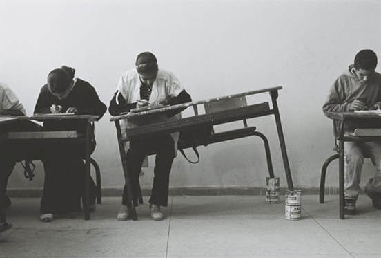
Hicham Benohoud - 'La salle de classe' series
1. Simply describe what you see in the image writing as many things as possible.
In the centre of the frame, a girl is sitting alone on the at a desk, but cans of paint have been placed under the two legs of the desk on the right hand side. This is making the desk tilt to one side at a angle, so that the girl is working at a sloping desk. The girl and the students around her are focusing intently on their work with their heads down. Half of the two desks on each side are framed at the edges of the image, with two students on the left and one student on the right. The background is a simple white wall, with a plain tiled floor and skirting board along the back wall.
2. What do you find unusual about the photograph?
Usually, people would place objects under table legs in order to make the table flat and level, if it had been unstable or slanting to one side. However in this image, the objects placed under the table legs are making the table slanted and creating an uneven surface for the girl to work on. The slanted desk also looks unusual compared to he other flat stable desks surrounding the girl.
3. What do you find interesting about the photograph?
I find it interesting that the girl and the students around her are working hard with their heads down, seemingly unperturbed and they don't find it unusual that the girl is woking at a tilted desk. Also I like the composition with the slanted desk framed in the centre of the photo, breaking up the continuity of flat desks either side.
4. How would you describe the background?
The background is a simple plain white wall, there aren't any distracting features or elements in the background. The plain background makes the eye focus on the people framed in the image - it frames the main subjects in the image.
5. How does the photographer use space within the image?
The photographer has focused relatively closely into the girl, the with tilted desk in the centre of the frame, but he has also included some background and given the main subject some breathing room in the frame. The photographer has also included the two desks at the sides of the image, to give some more context in the image.
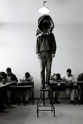
Hicham Benohoud - 'La salle de classe' series
|
Notes
- The face of the boy is obscured, darkened in shadow by the scarf wrapped around his head. - He has been separated and segregated from the rest of the class, it looks like he has been punished and they are making an example of him by standing on the stool in front of the rest of the class. - His class mates are working hard with their heads down looking at their work, they are not bothered by the sinister figure standing at the centre of the room. - Quite strong contrast between the natural light flooding into the class room from the left hand side of the frame, in contrast with the shadowy figures and desks. - I get the impression of feelings of mystery, eeriness, sinister feelings and the images focuses on the boy that appears to have been separated and outcast from the group, like he is being punished |
Portraiture exercises
Working and collaborating with our partner, our task was to take an interesting portrait of our partner, playing with lighting, props and compositions/framing. This exercise was inspired by Hicham Benohoud's 'La salle de classe' portraiture series. We took inspiration from this particularly by using props and different objects, which our partner could wear, or experiment with when photographing.
• Collaboration - Our main ambitions were to collaborate and play with possibilities, take risks, be open to happy accidents, and become more free in our approach.
• Our main focuses when photographing were composition, considering the planes and foreground and background, as well as thinking about props and elements within my photographs.
My Outcome
Outdoor shoot:
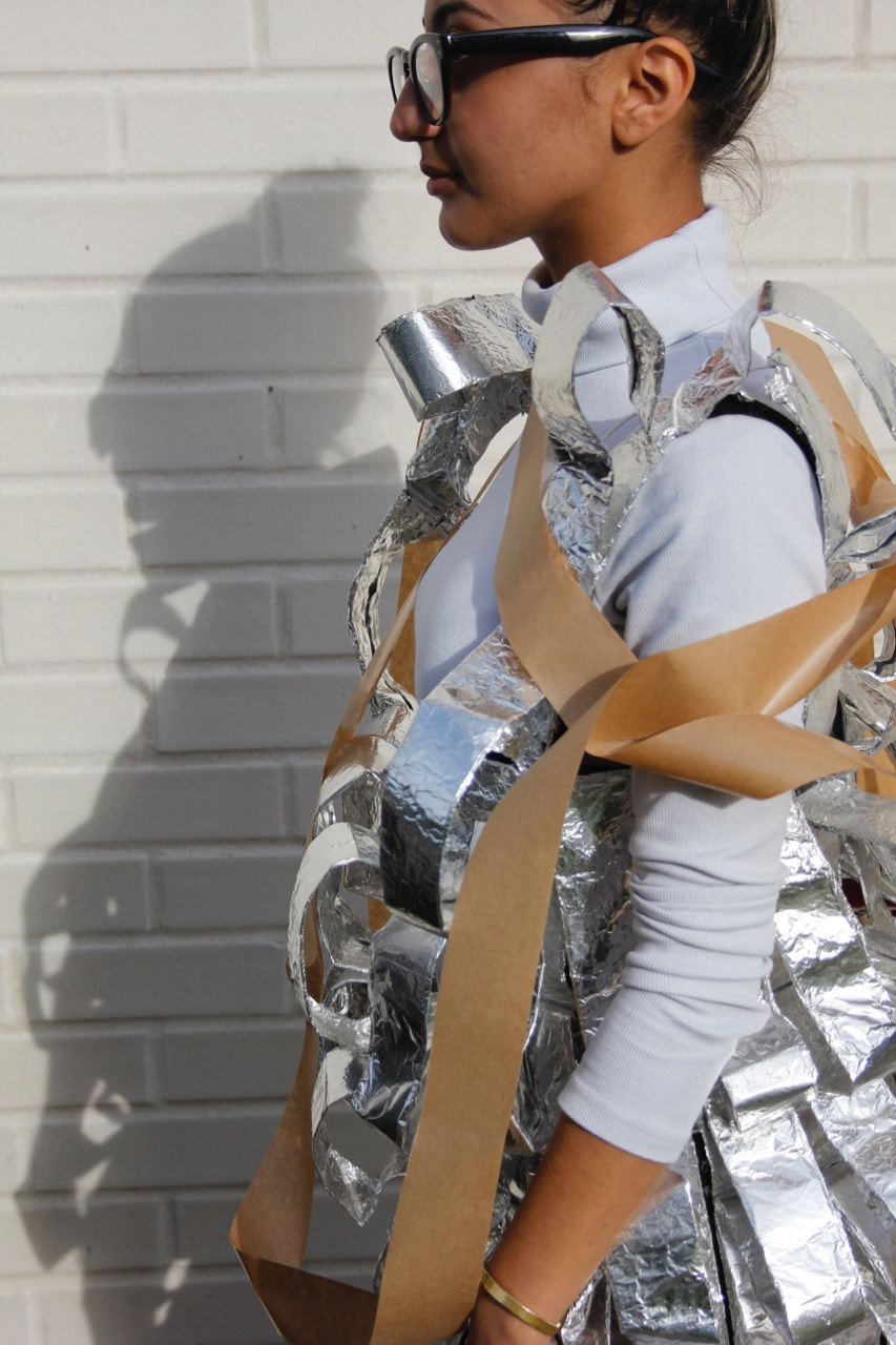
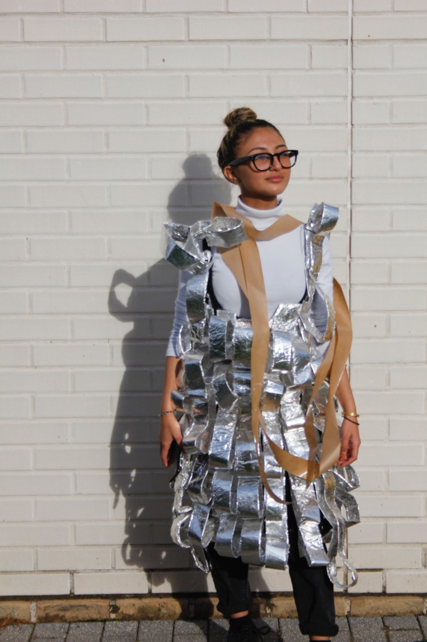
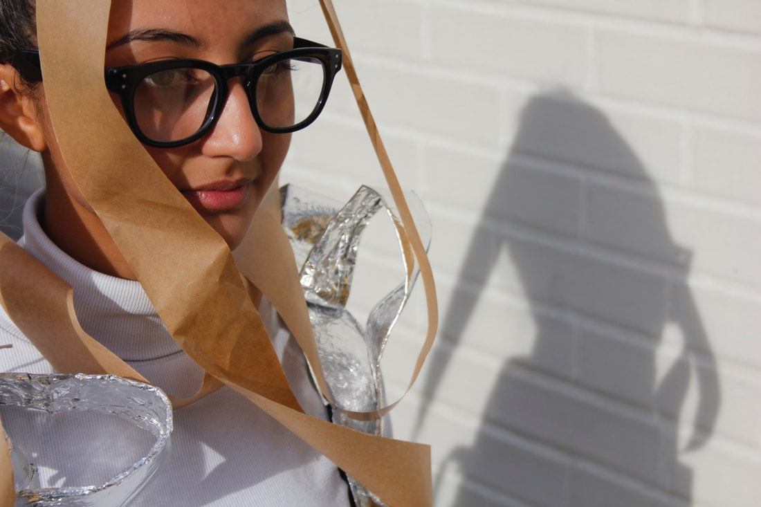
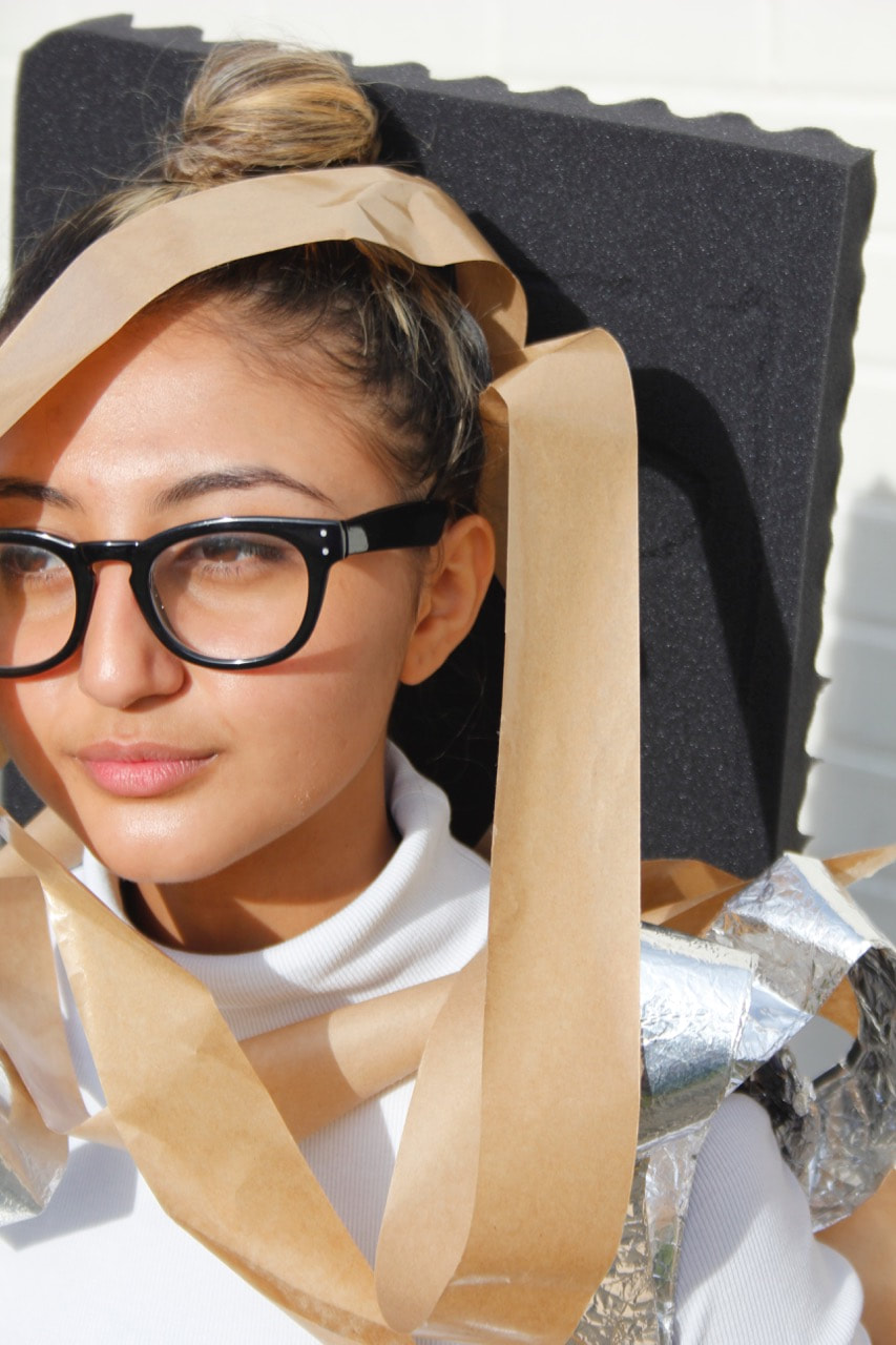
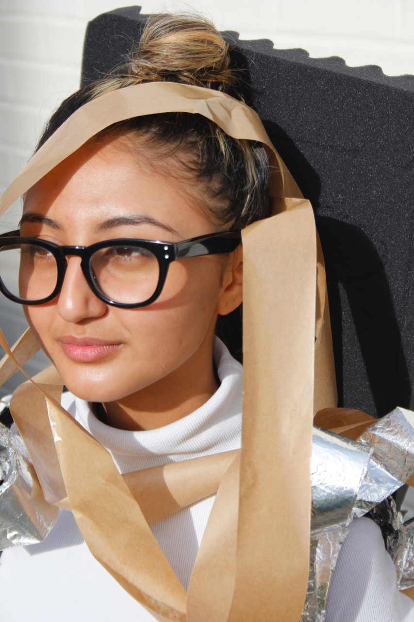
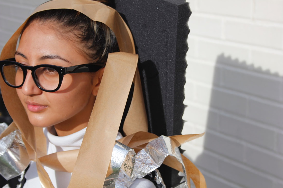
- When approaching this task, I immediately grabbed some props (the foil dress and brown paper), and headed straight outside. rather than meticulously planning and thinking about my images, I started by taking pictures straight away. I worked by making images, learning and refining my work by taking photographs. In photography, I like to start by photographing instinctively, rather than thinking about it too deeply. This was definitely the approach for this task.
- I set up my partner in the morning sunlight, setting her up against a white brick wall. I wanted a relatively plain background, to focus the viewer on the shapes of the dress and brown tape, as well as the shadows cast from my partner. The light was very effective, the low morning sunlight cast interesting shadows and provided a natural fill light when I was photographing.
- I particularly like the reflections and texture on the foil dress, as well as the interested curved shapes of the dress. I think that the tones and colours of the foil dress work well against my partners white top and white brick background. I also like the corresponding colours and tones in the image - the white top corresponding with the white background and reflections of the foil, as well as the beige/brown tape corresponding with the tones of my partners skin. When photographing, I directed my partner to pose in a range of different stances. I was mostly photographing quite close up, with some medium shots of my partner's upper body, as well as some closer shots, cropping closely into my partner's shoulders and face.
Indoor shoot:
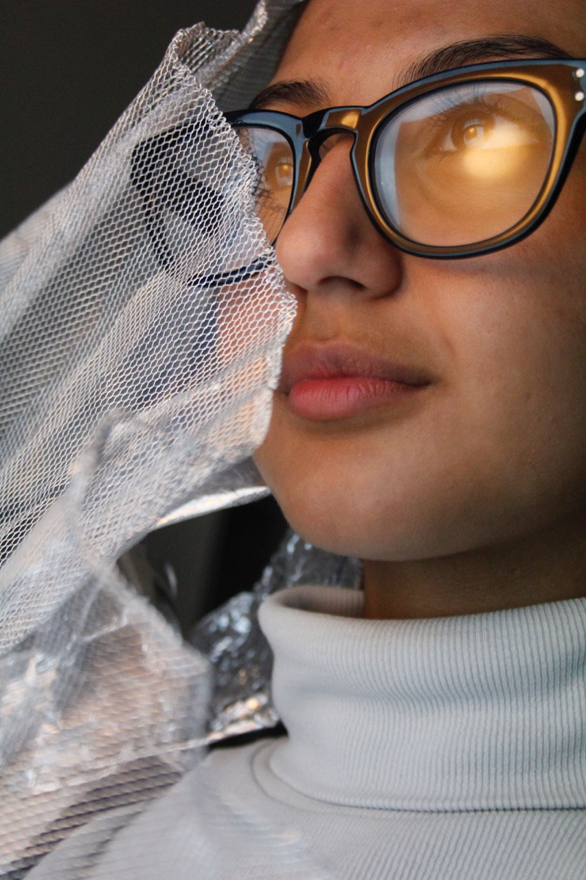
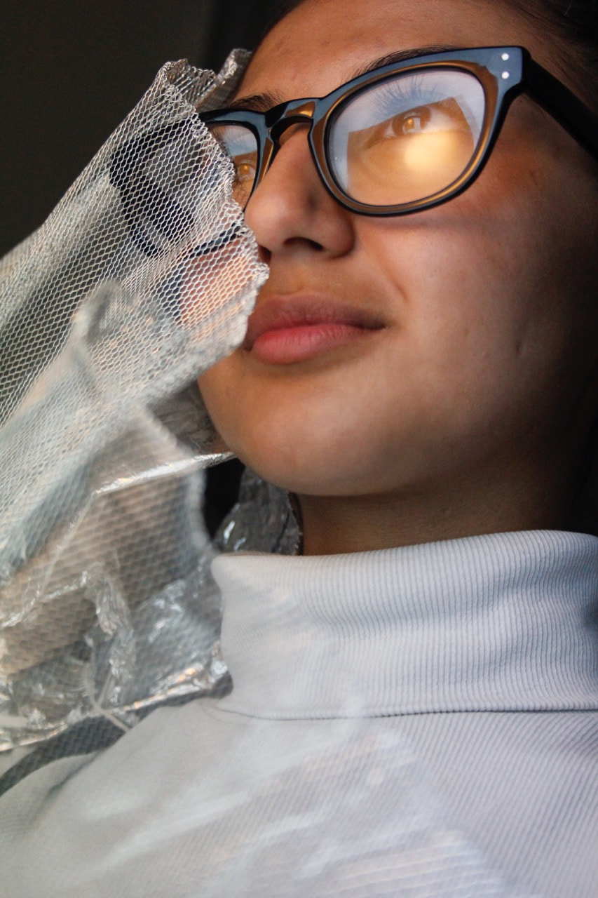
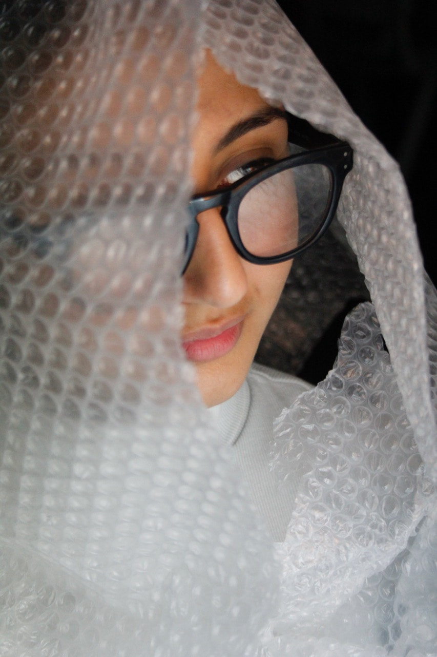
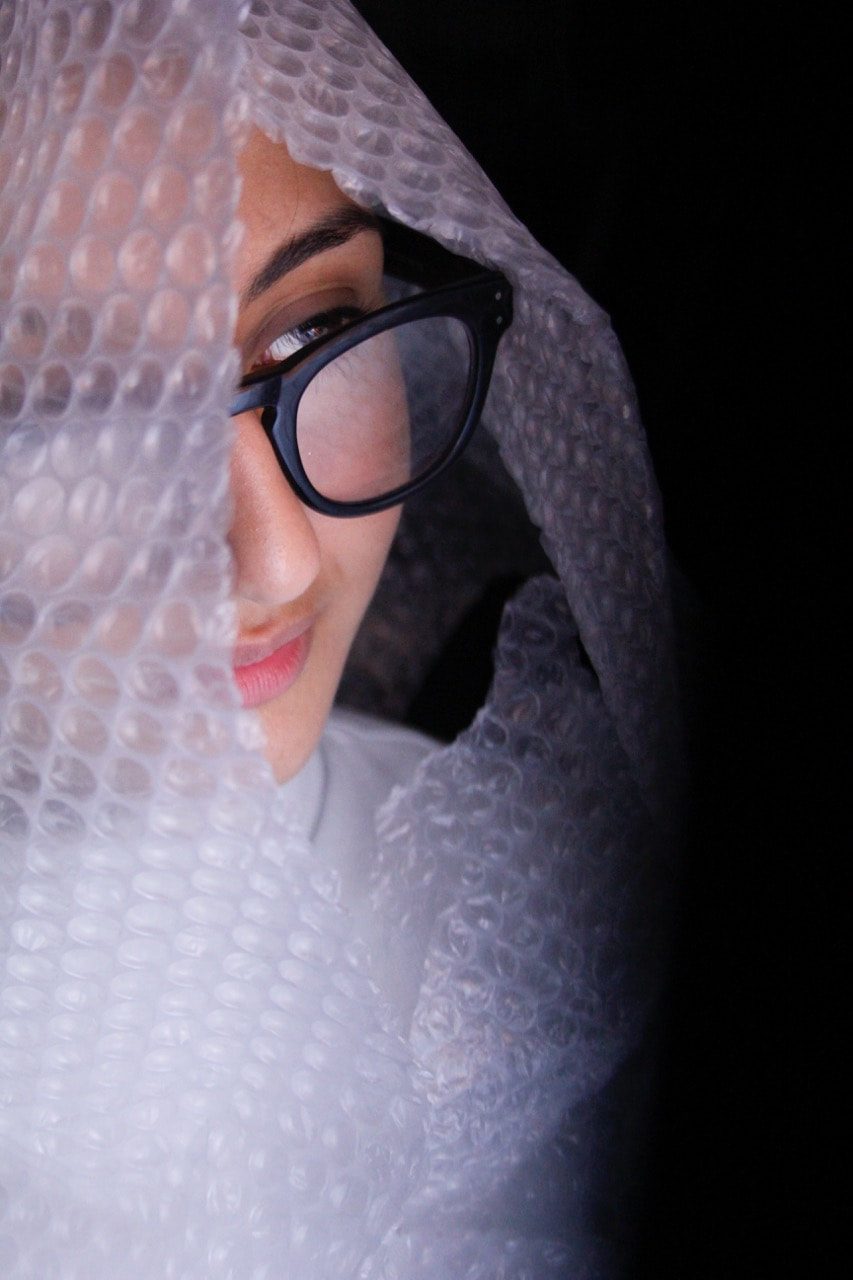

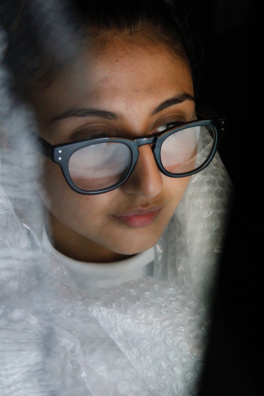
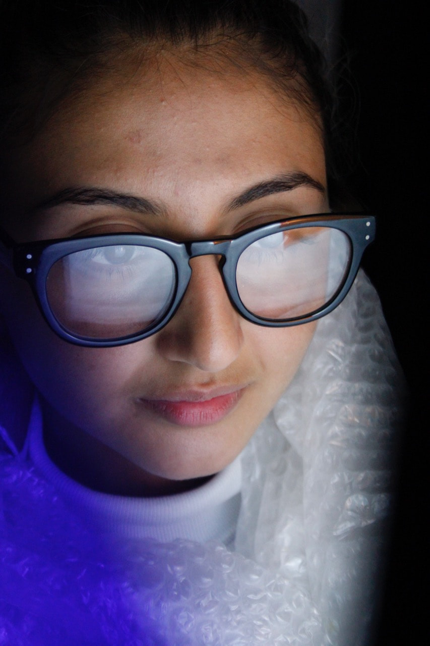
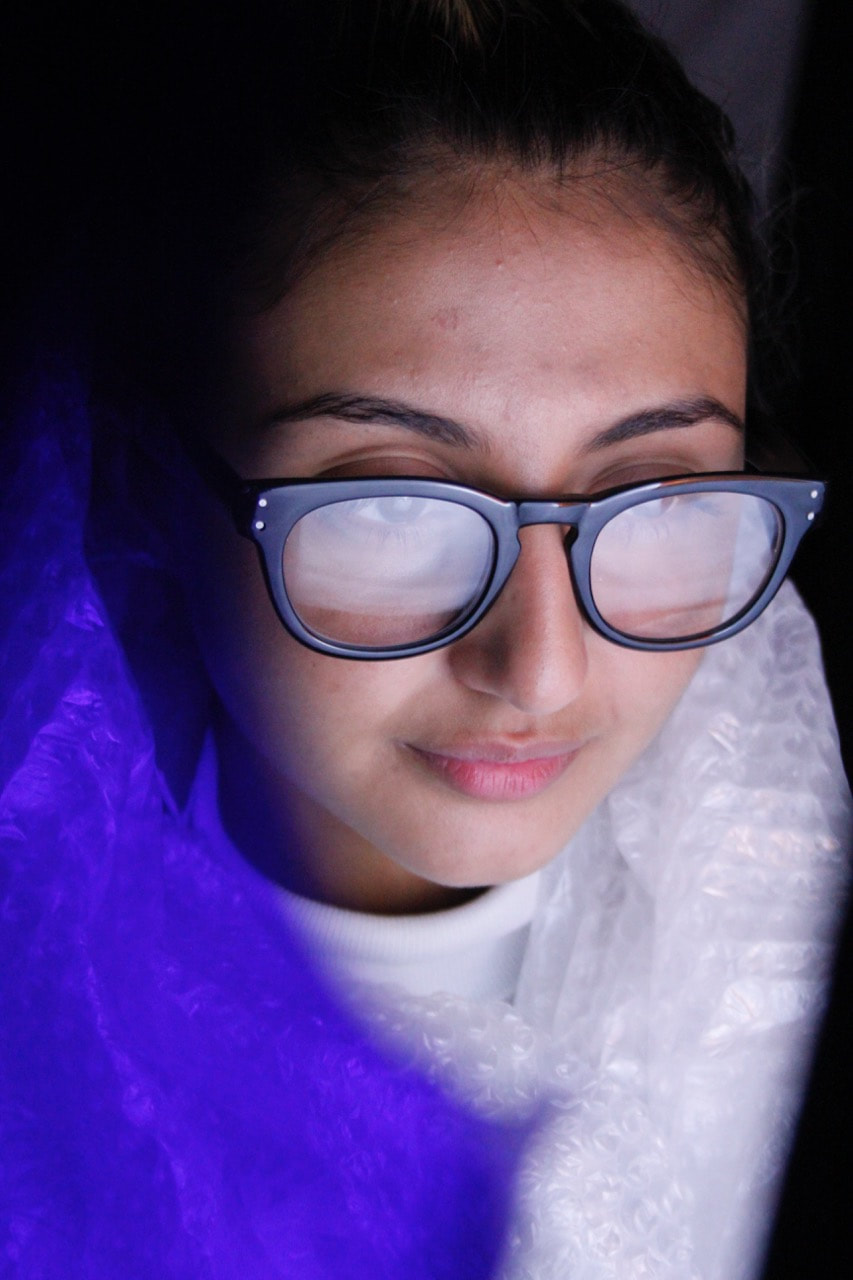
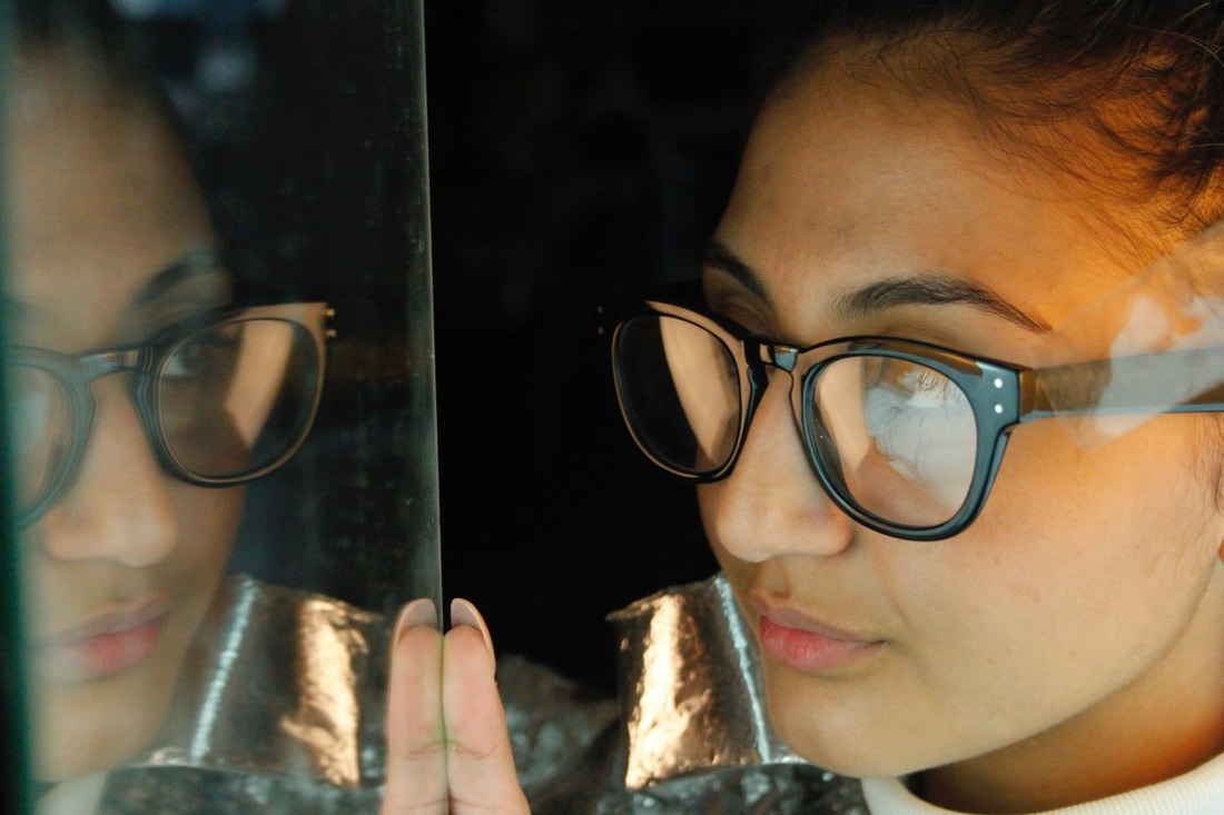
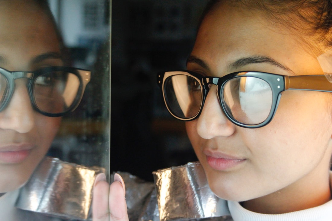
-After this, we went inside to use the studio lights and experiment more with different props. I set up a large fill light, and I placed a blue gel over part of the light. I used this blue gel as I wanted to experiment with different lighting, and I liked the effect of the reflection on my partner's glasses, and on the foil dress.
- Using the fill light and blue gel as the main light source, I photographed my partner from a range of different angles. I zoomed in quite tightly to my partner's face and upper body - I wanted to cut out the negative background space and focus on my partners face, and the props that I had arranged. I shot a number from a low angle, with the foil dress and brown tape in the lower half of the frame, drawing the viewer's eyes up towards my partner's face.
- After this, I used wire mesh to partially obscure her face, and it was an interesting texture and element to photograph with the studio light. I later experimented with bubble wrap, which again looked interesting in the studio lights; I also liked the composition of these shots, framing my partner's face well. I also used some blue semi-transparent plastic, which I used to partially obscure the lens. This added another plane and element to my images, I liked the contrast between the blue shape and the bright white fill light on my partner's face.
Overall, I am relatively pleased with the outcome of this photoshoot. In terms of the process of setting up and shooting, I think that we worked effectively as a pair, and created some interesting outcomes as a result. We collaborated well, we suggested things to each other (framing, props etc.) and we communicated well to direct each other when shooting. We worked instinctively, taking props that caught our eye, and heading outside quickly to shoot. We worked by making and photographing - not overthinking but acting instinctively, and experimenting. We took some risks - I used lighting and coloured that I hadn't used before, and I experimented a lot with different props and framings.
Selection

|
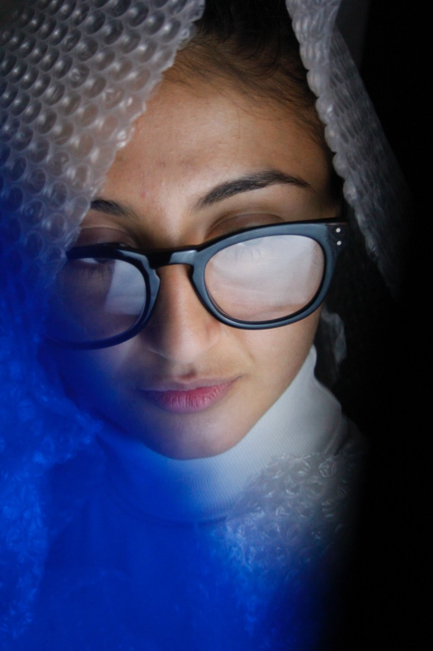
|
|
After reviewing my images, I made this selection of two images. I selected the image on the left particularly due to composition/framing and the lighting especially. I really like the bright white, low angle sunlight illuminating my partner. The shadow cast by the sunlight also added another element and shapes to this image. I am quite satisfied with the composition, with my partner composed off-centre, on the right hand side of the image. This roughly divides the frame with 3 elements - the white brick wall, the shadow in the centre, and my partner framed on the centre right. I think that the framing works quite well, focusing on my partner's upper body, with the interesting tones and shapes of the foil dress and brown tape. I also like the colour scheme - with the corresponding white and silver tones (the wall, her top, and the shiny dress), as well as the corresponding tan/brown coloured tones (the brown tape and my partner's skin tones.
|
It was difficult to select an image from the photos that I took indoor using studio lights, as there were a number of shots that I thought were successful. I selected this image primarily due to the overall composition, with my partner's face framed by the bubble wrap each side of her head, the blue plastic effect in the left hand corner (I also like this splash of vivid blue colour), as well as the darker element in the bottom right hand corner. When photographing, I cropped quite tightly into my partner's face as well; primarily as I was drawn to the light reflecting on her glasses and I wanted to tightly frame her face with the other surrounding elements around the edge of her face. I like the bright lighting effect, especially the tone and from of my partner's face with the white fill light picking out the highlights on her face.
|
Edited
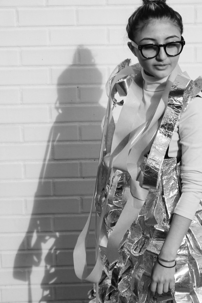
As this portraiture exercise was inspired by Hicham Benohoud's 'La salle de classe' portraiture series, I experimented with Black and White post production editing in photoshop. Overall, I quite like the outcome of this monochrome edit. The image works quite well in monochrome, especially in terms of the tones and feel of the image. I like the contrast of the light and dark tones in this Black and White image, especially with the skin tones and tones of the foil dress and tape working quite well in monochrome. In this example, I find myself focusing much more on the shapes and tones in the monochrome image, whereas in the original colour version, my eye is immediately drawn to the tan/brown colours; as they stand out against the whiter tones of the wall, foil dress, and my partner's top.
|
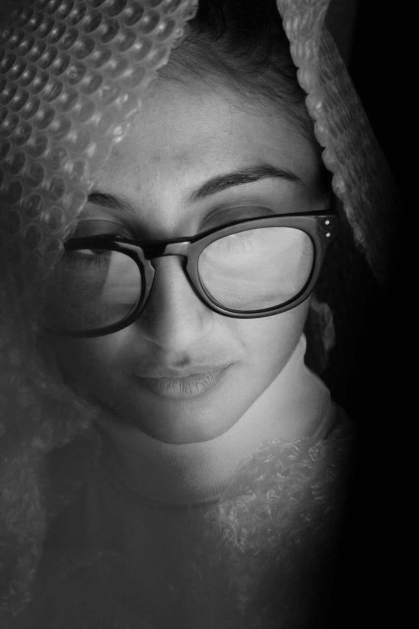
Again, I experimented with Black and White post production in this image in response to Hicham Benohoud's 'La salle de classe' portraiture series. However, in this case, I think that the colour original is much more effective compared to this monochrome edit. Although I like the look of the glow and the highlights on my partner's face, I think that the blue element (on the bottom left hand side of the original image), works much better in colour. In monochrome, it just appears to be a distracting element. I think that the balance of colours, and the skin tones against the vivid blue plastic, give the image much more impact. Although I quite like the framing in monochrome, the colour original works much better on balance.
|
My Personal Investigation focusing on Football:
My Second set of images
For my second set of images focusing on football, I went to a small, local non-league club called Welling United. After reviewing my first set of images, this time I wanted to create different types of images, particularly types of photographs that I hadn't taken before. In my previous set of images focusing on football, I was mainly photographing the architecture and details around the grounds that I visited, such as murals and club branding around each stadium (although some of those previous images focused on spectators and people within football). However this time, I wanted to take more personal images - focusing more on people (spectators, people working around the ground, players and coaches etc.) Not only this, but I also wanted to focus more on capturing details around the ground, especially the way the ground has been built and changed by fans psrticularly . Moreover, I wanted to capture traces that people had left behind, such as litter, food, club merchandise etc. This links especially with my interest of human traces - marks on the landscape where traces of human activity had been left behind.
Sample:
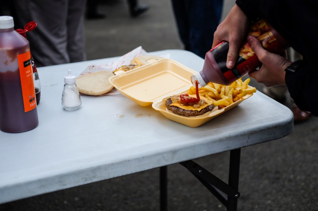
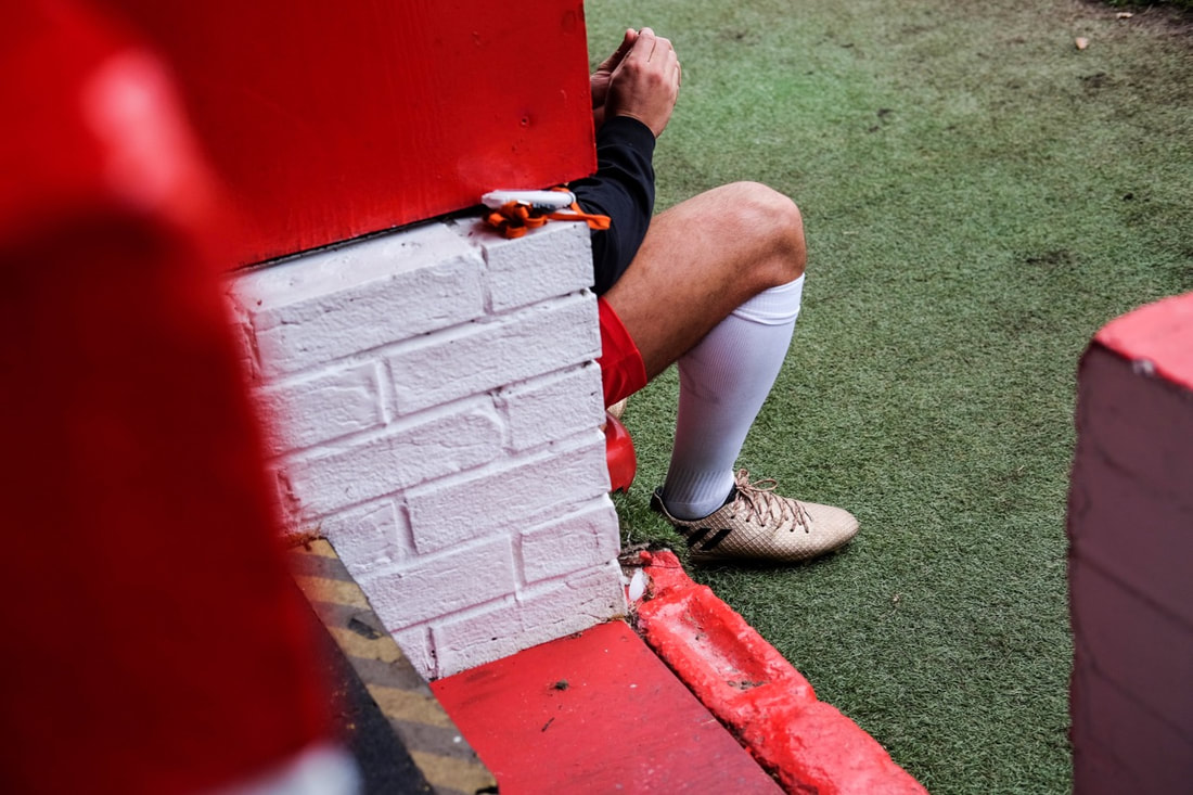
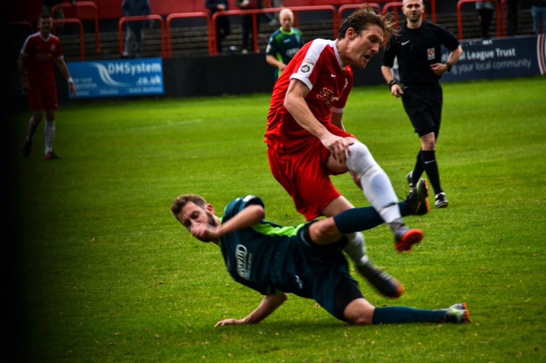
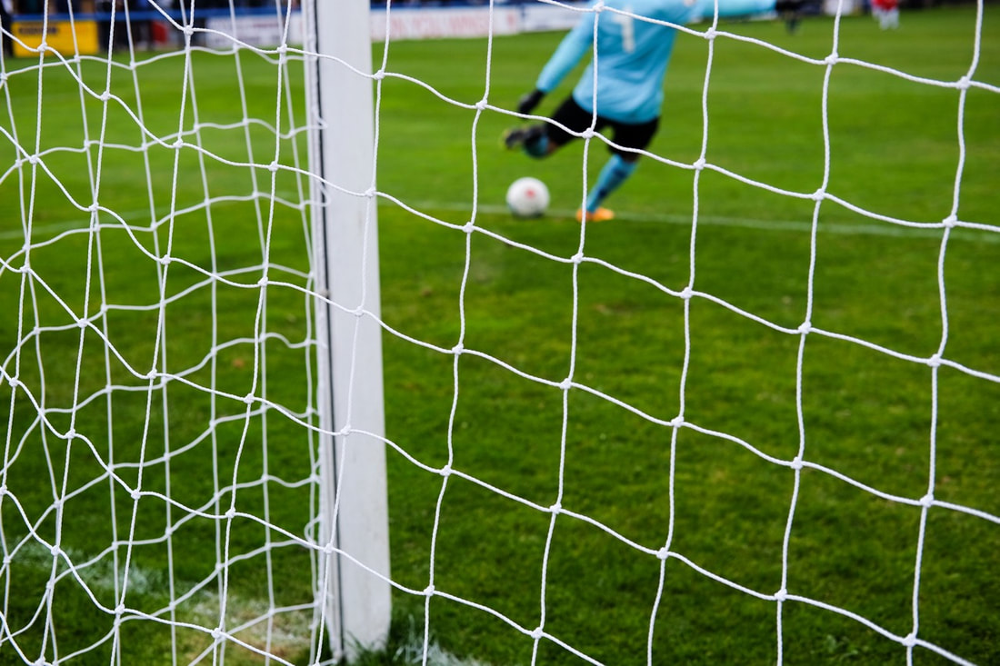
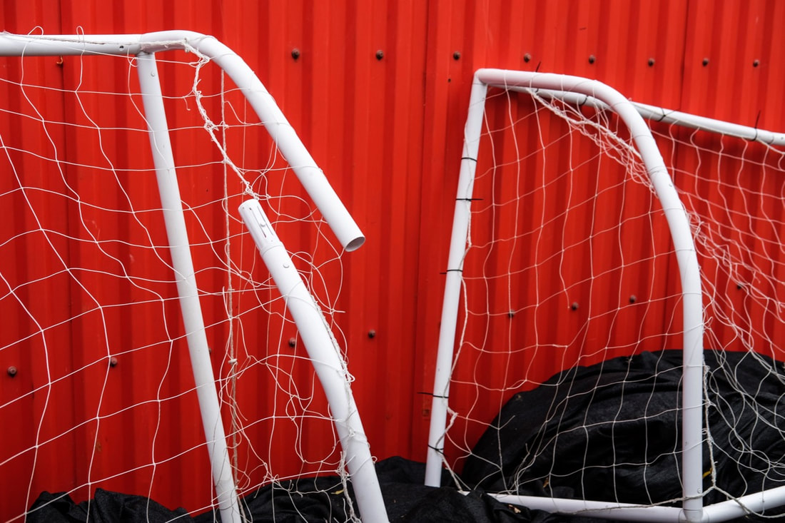
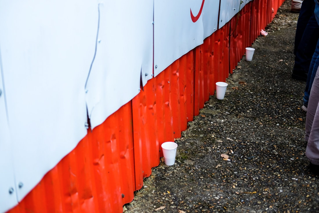
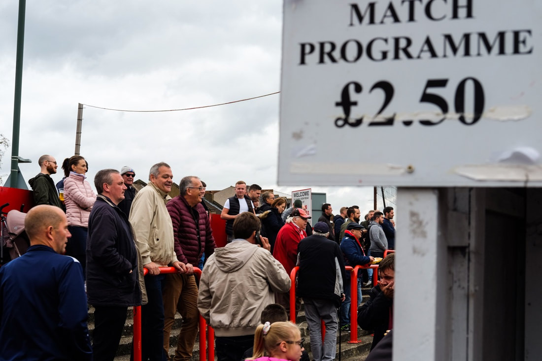
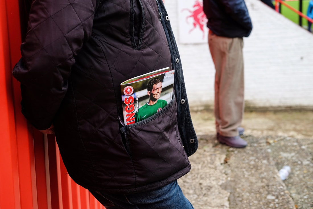
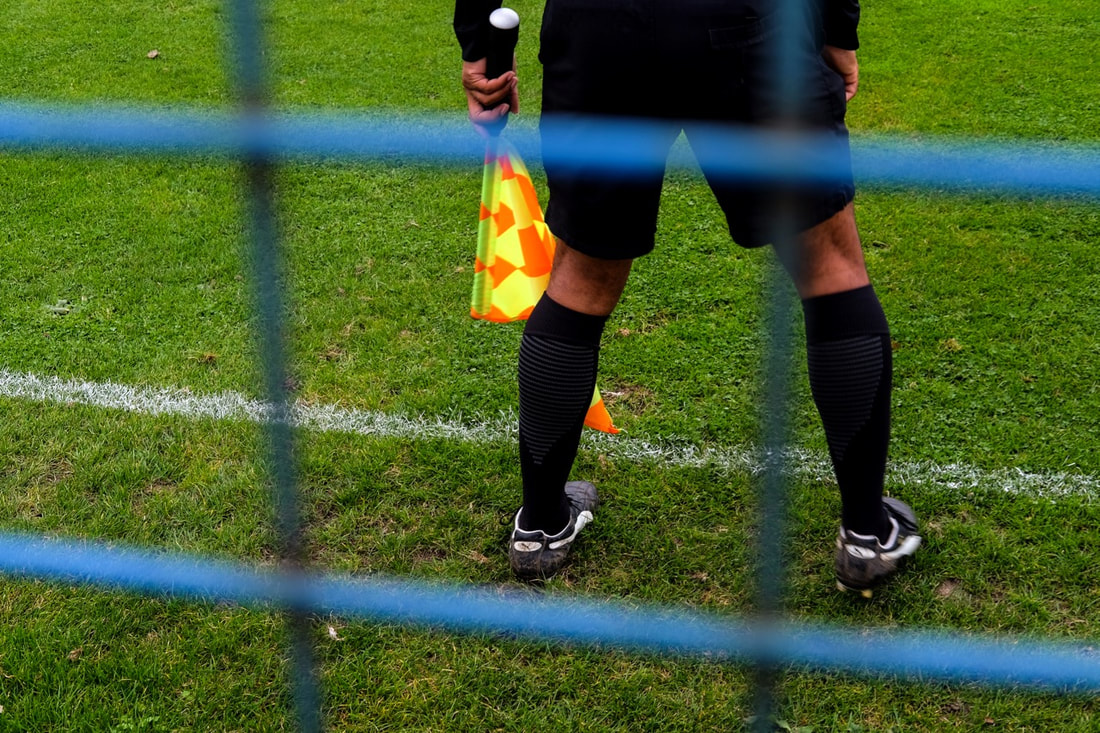
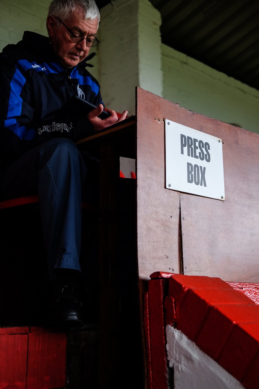
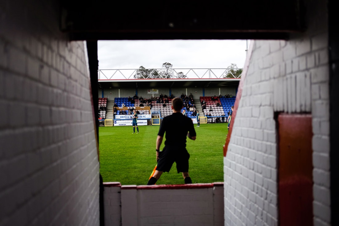
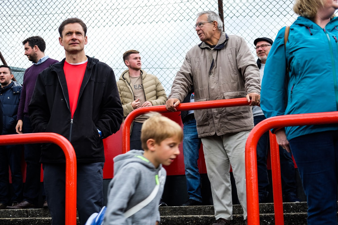
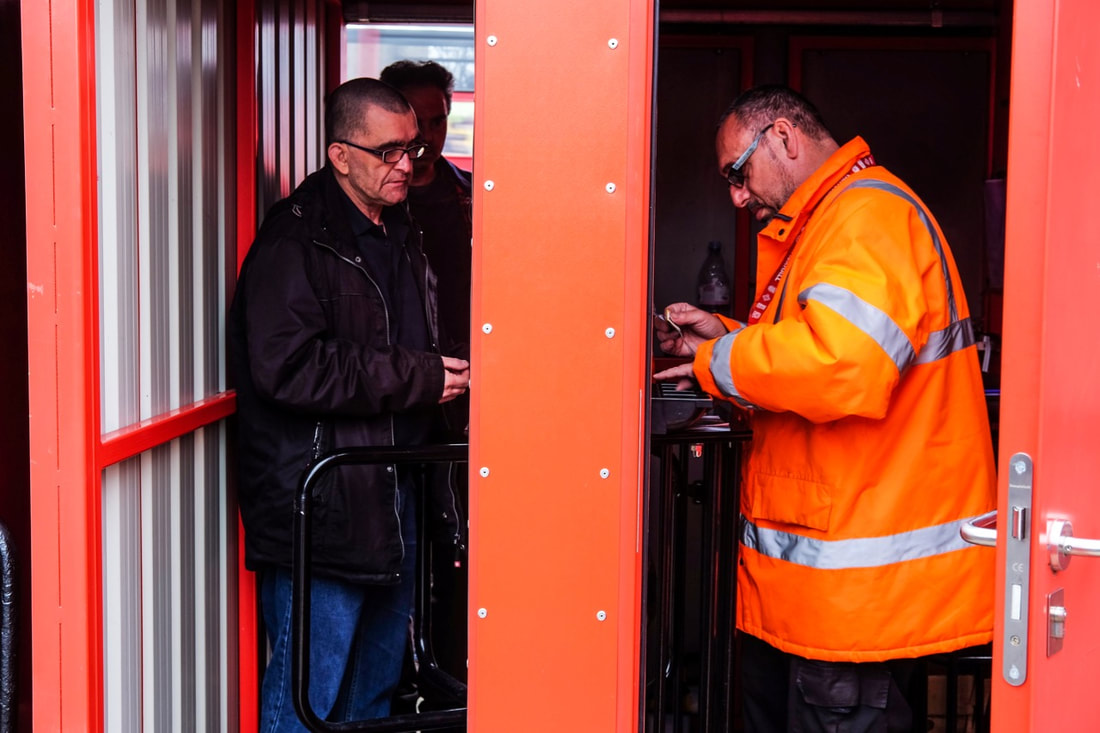
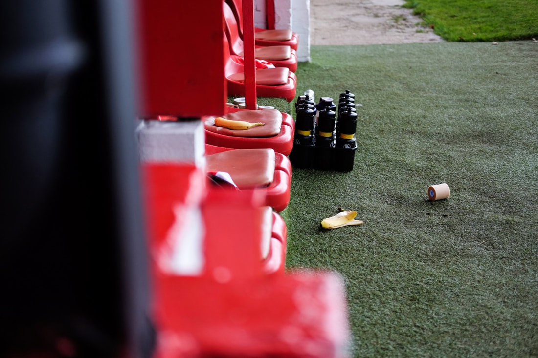
Full set of 113 photos:
Click here for the second set of my photographs focusing on Football
Evaluation
Overall, I was pleased with the outcome of the images that I took at Welling United. In this series, I took a wide range of different photographs. I took a range of photos, with a number of images focusing on people: the fans, club staff around the ground as well as action shots of the players on the pitch. I also took a lot of images documenting the details around the ground - as well as traces and marks left behind by fans as well. When photographing, I tried to take a range of different images, to give myself different options, so I can reflect on the specific type of photography I want to focus on (based on which photos were most effective). I used a smaller Fujifilm compact system camera, with a 35mm lens for my close up, more intimate photos - I used this camera to photograph people (as it is quite a small discreet camera), as well as capturing details around the ground. I also had a Nikon DSLR with a telephoto lens (with 200mm maximum zoom), which I used for the sports action shots that I took - the long zoom range was good for sports photography. I also brought along a medium format camera (a Lubitel 2), which I used to experiment and create some double exposures.
I liked the different range of photos that I took, but I thought the more intimate photos capturing details and people were most effective. Although I was pleased with the outcome of the sports action shots, especially the images with a hint of motion blur, I didn't think they were quite as interesting - they were just plain sports photos. On the other hand, my photos capturing details and traces left by fans and players were more interesting, as well as overlooked details around the ground. I like these photos particularly as they take an alternative viewpoint - in many of these images I have picked out details that would normally be overlooked by a regular spectator at the game. For example, I captured a number of details of things left behind: my image of cups left behind by fans or tape and and a banana skin left by the players or layers of paint that have built up over time on the main stand. Again, these photographs of traces link back to my interest in investigating traces of human interaction and activity on the environment. Moreover, the traces almost look like they are pieces of art or installations, made unconsciously by the spectators. For example, the goals behind the back of the stand almost look like an installation. There are a number of ways I could experiment with these images. Not only this, but I could also make a number of photo selections, making a selection of my images from different viewpoints. For example, I could make a selection for a zine, or an art display, or for an informative article. Although I'm considering to narrow down my focus more, the range of images I have can allow me to experiment.
I liked the different range of photos that I took, but I thought the more intimate photos capturing details and people were most effective. Although I was pleased with the outcome of the sports action shots, especially the images with a hint of motion blur, I didn't think they were quite as interesting - they were just plain sports photos. On the other hand, my photos capturing details and traces left by fans and players were more interesting, as well as overlooked details around the ground. I like these photos particularly as they take an alternative viewpoint - in many of these images I have picked out details that would normally be overlooked by a regular spectator at the game. For example, I captured a number of details of things left behind: my image of cups left behind by fans or tape and and a banana skin left by the players or layers of paint that have built up over time on the main stand. Again, these photographs of traces link back to my interest in investigating traces of human interaction and activity on the environment. Moreover, the traces almost look like they are pieces of art or installations, made unconsciously by the spectators. For example, the goals behind the back of the stand almost look like an installation. There are a number of ways I could experiment with these images. Not only this, but I could also make a number of photo selections, making a selection of my images from different viewpoints. For example, I could make a selection for a zine, or an art display, or for an informative article. Although I'm considering to narrow down my focus more, the range of images I have can allow me to experiment.
Photographing football in my local area:
Amateur football and my local league club
For this next set of images, I was primarily focusing on football in my local area. In particular, I wanted to look at the place of football in relation to the local community, and its impact and place in the local area. For this project, I visited a local park, and I visited the ground of the local club that I support, Charlton Athletic. In the first set of images focusing on local amateur football, I photographed details especially (tape left on the goalposts, tangerine skins left on the floor, the local youth team playing etc.) Subsequently to this, I visited the ground of Charlton Athletic, known as The Valley. In these photos of The Valley, I was aiming to photograph the ground in context of the local area. Moreover, I wanted to photograph the mark that the Charlton Athletic has left on the area, from local roads named after the stadium, to the local cafe where fans eat before the game. I also photographed the ground in the context of the local neighbourhood. For example, I photographed the ground between houses from further up the hill and the stadium dwarfing the local houses.
Not only this, but I also photographers the traces and items left by supporters in the local environment. This also linked with my focus on traces of human activity and residue of human interaction on the environment. There were a number of traces left around the ground: tickets left abandoned on the pavement and empty beer cans left from a matchday.
Not only this, but I also photographers the traces and items left by supporters in the local environment. This also linked with my focus on traces of human activity and residue of human interaction on the environment. There were a number of traces left around the ground: tickets left abandoned on the pavement and empty beer cans left from a matchday.
Sample:
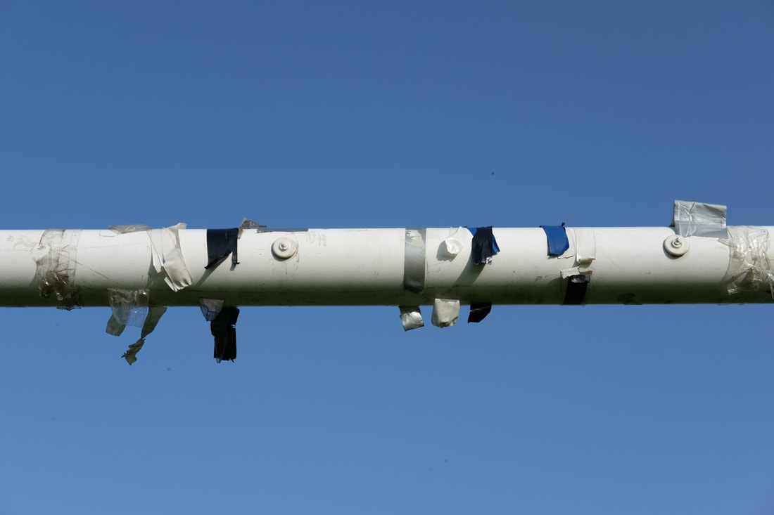
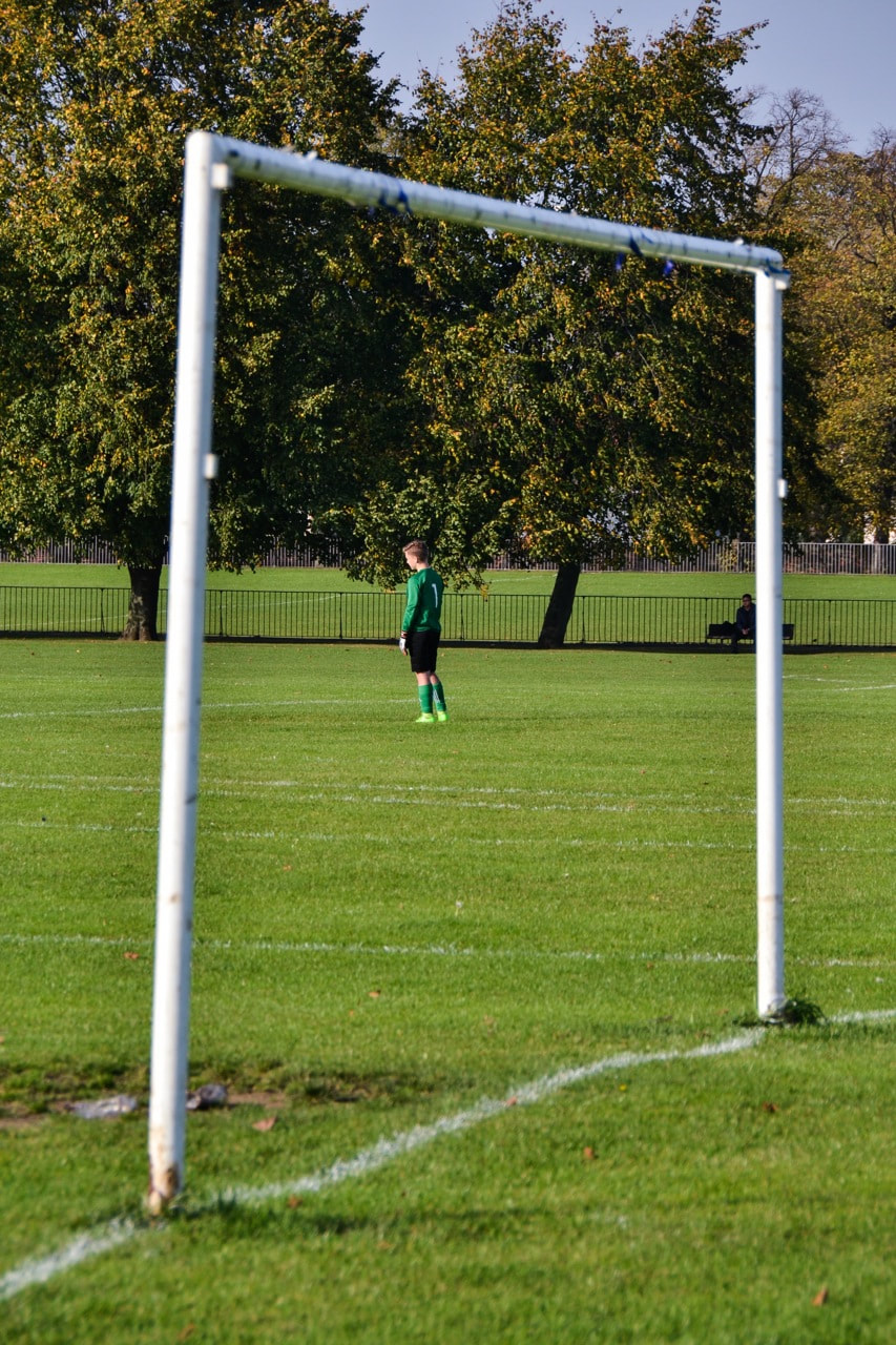
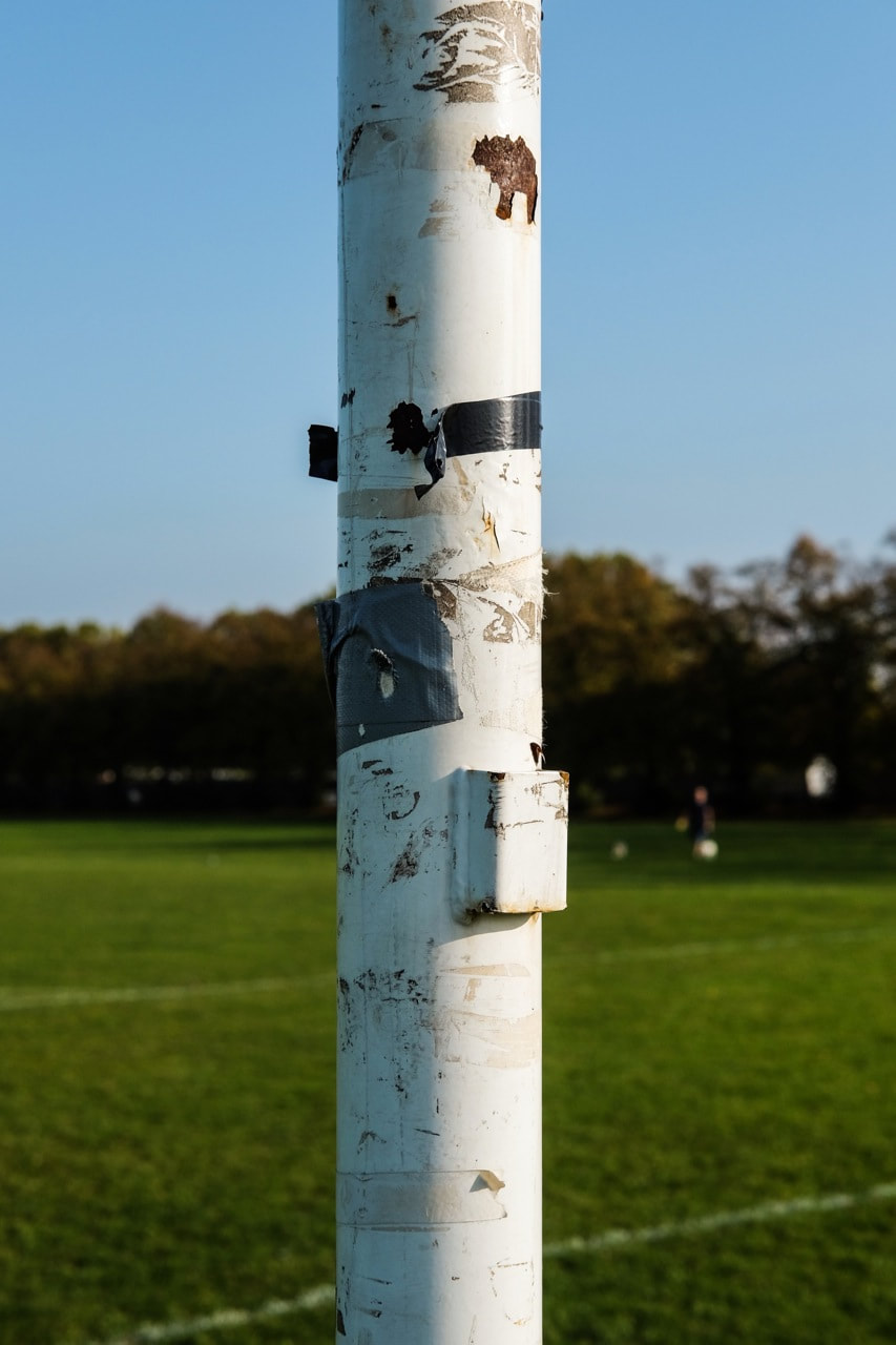
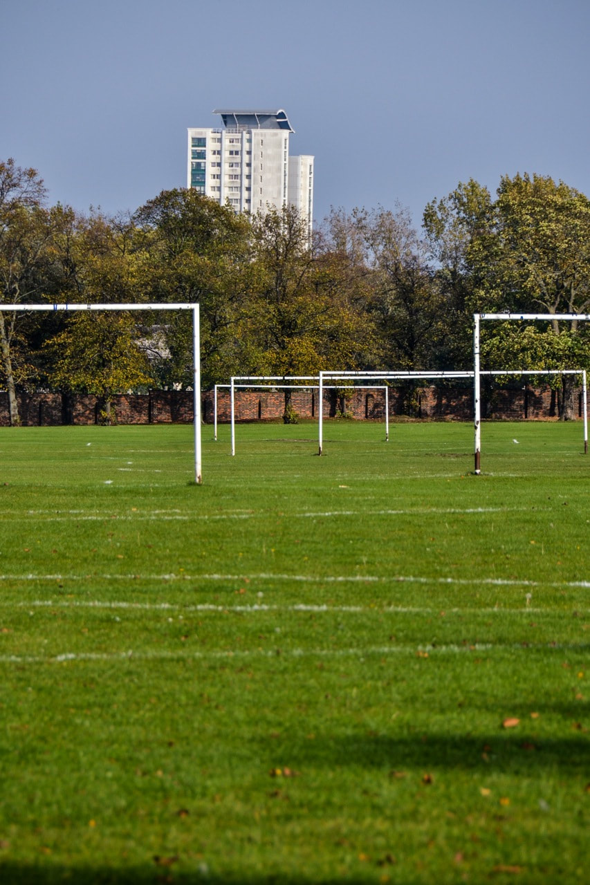
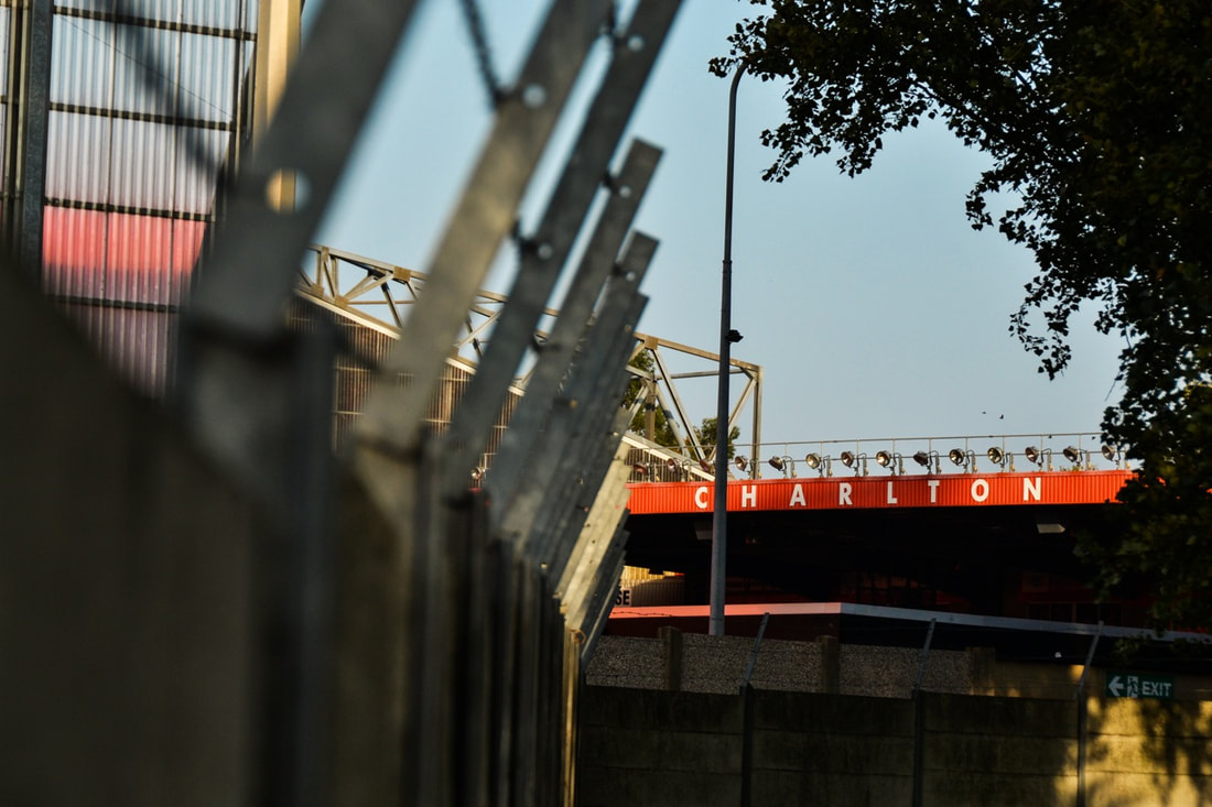
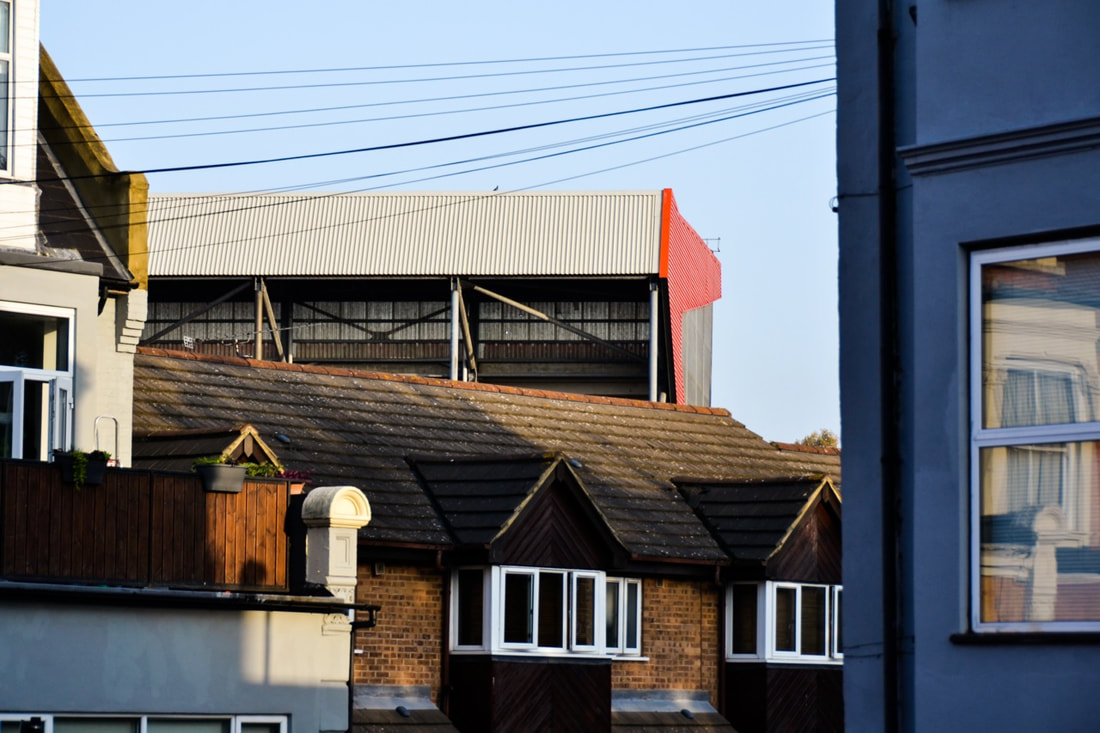
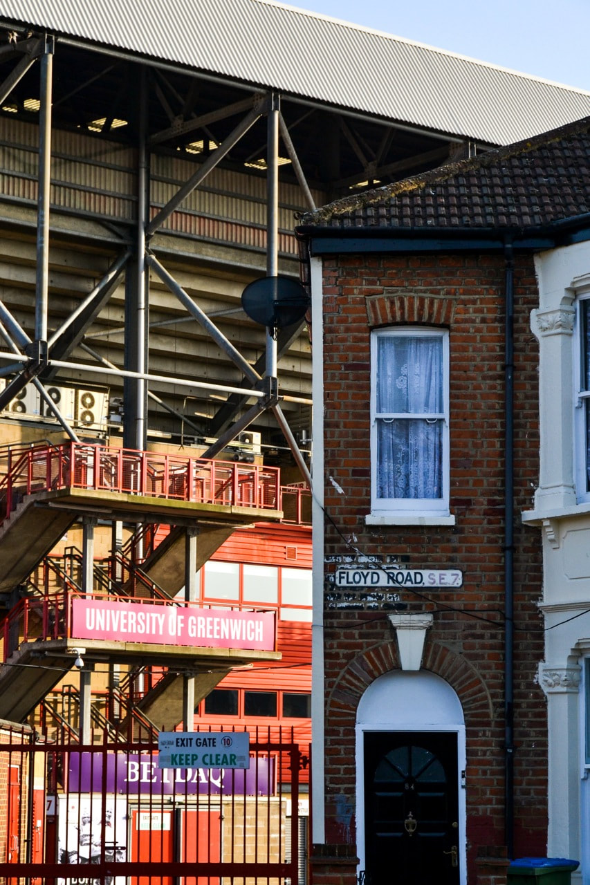
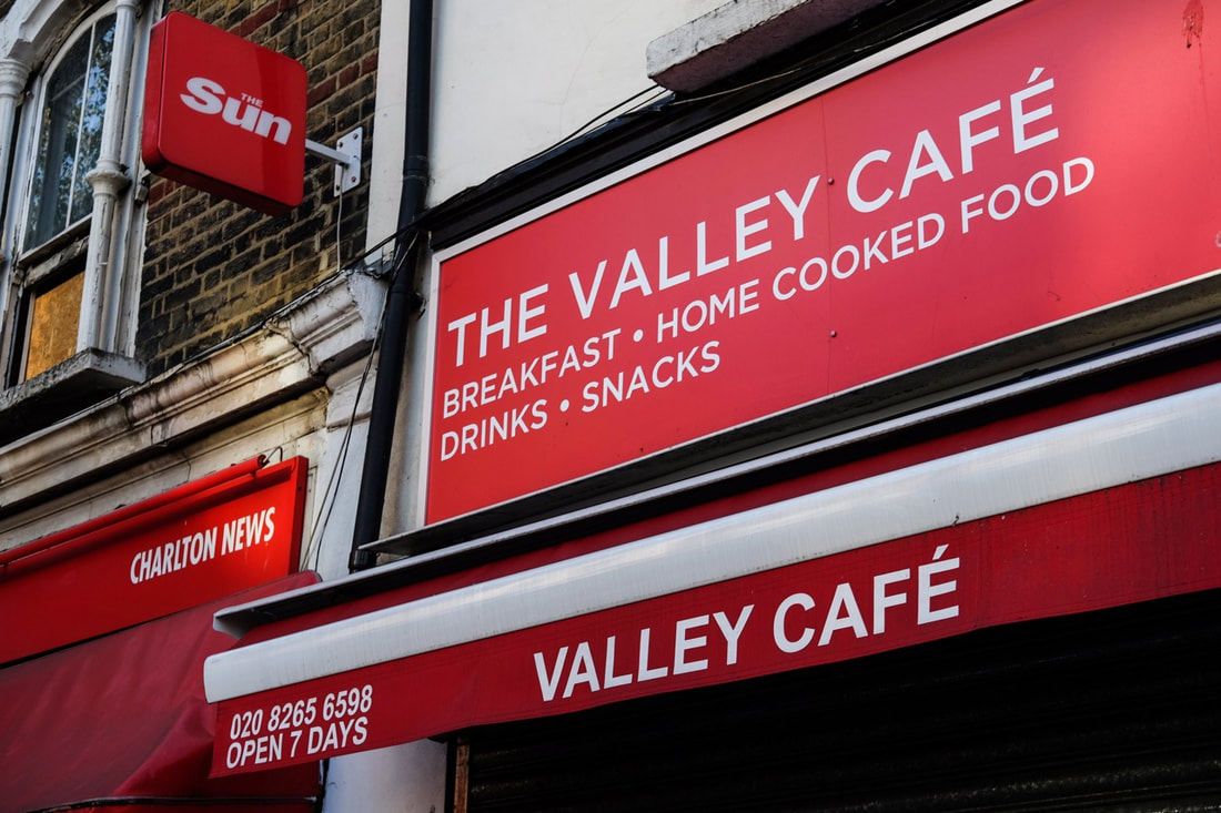
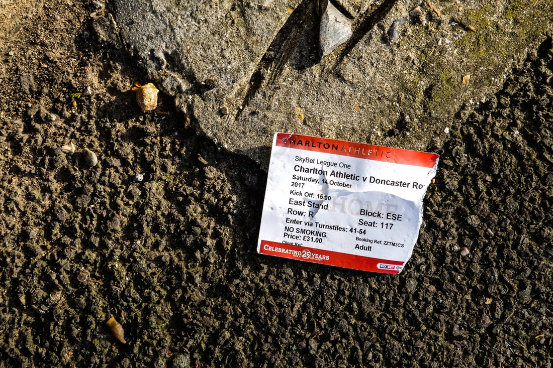
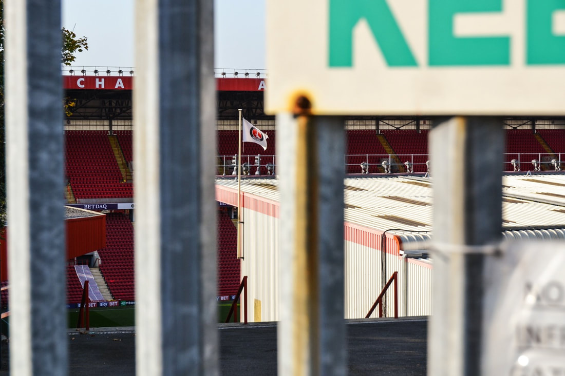
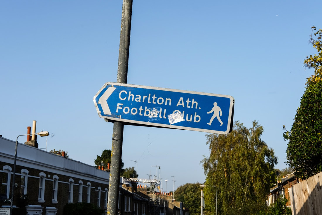
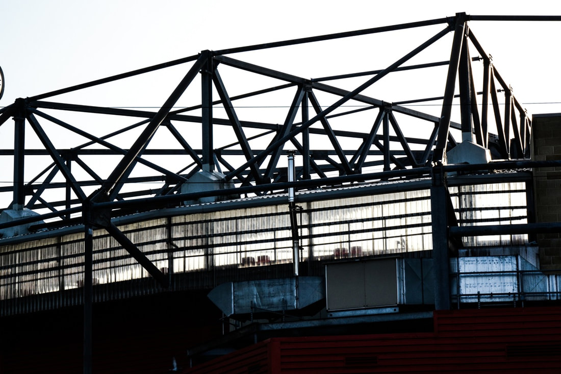
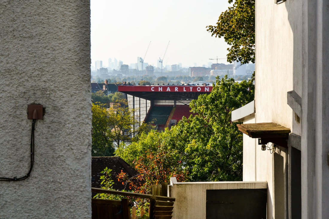
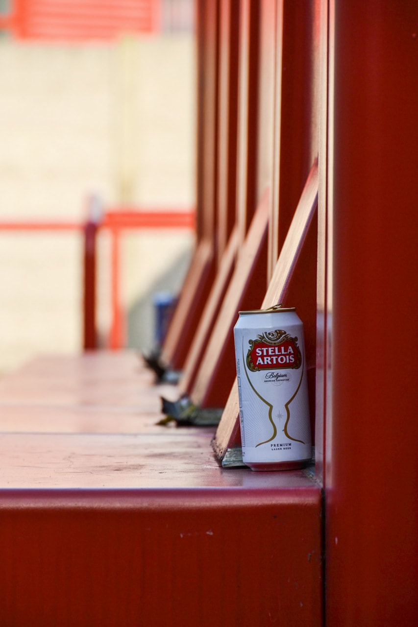
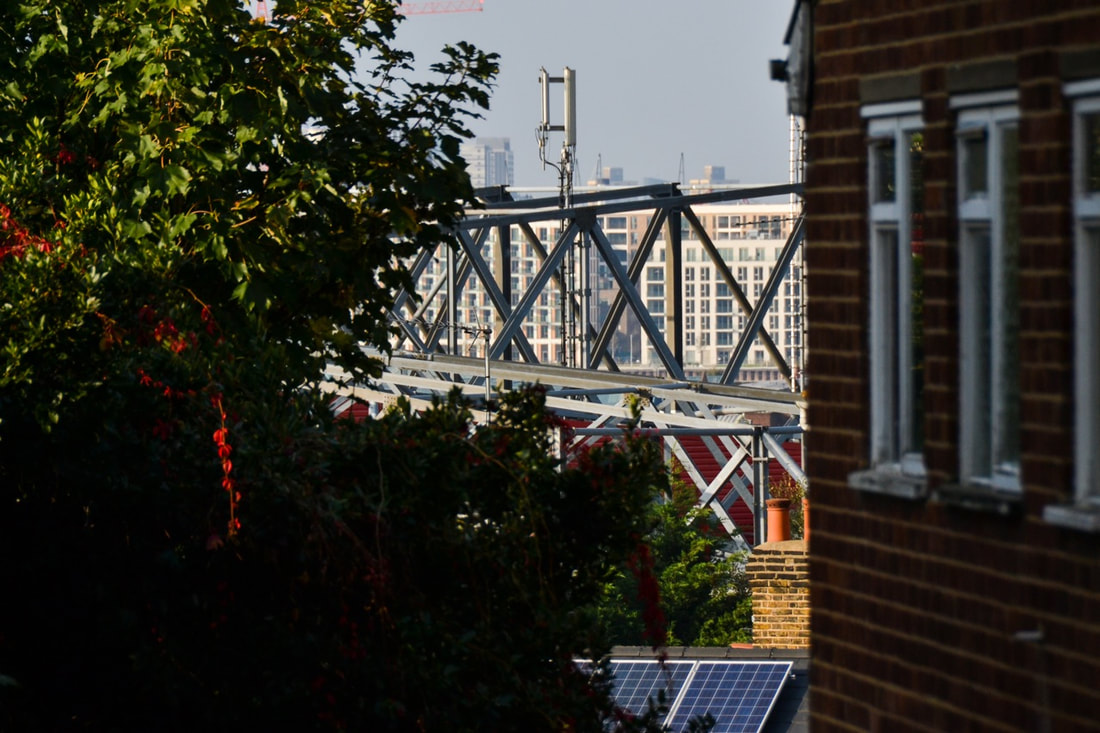
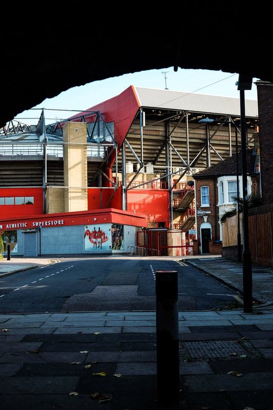
Full set of 89 images:
Click here for my photographs focusing on football in my local area
Overall, I am relatively pleased with the outcome of this set of images. I quite like the images of the amateur football in the park, but the range of photos I took were quite limited. I didn't take a lot of images, and I only really focused on certain details such as litter and tape left on the goal posts - I would like to take more varied of images of people in amateur football, such as portraits. In relation to my local club Charlton Athletic, I managed to document some of the marks and traces that my local football club leaves on the area. This was my main focus, and I quite liked some of the traces I documented, but I also think that the images of the ground in context of the local neighbourhood were also quite effective. The images of the ground between houses for example were effective, especially as they took an alternative view of the football club - I was documenting the club and the stadium from a different angle. Moving forward, I think that I need to experiment further. I could use analougue cameras, and I could try experimenting with different types of film stock. Medium format photography is another medium I could use to experiment.
Experimenting with Medium Format
Whilst using digital photography to capture details when photographing football, I also experimented with medium format photography. I chose to use medium format photography as all of my photographs focusing on football up to this point have been shot digitally. However, I wanted to use different mediums of photograph. I wanted to be able to experiment more, and play around with effects like double exposures.
Lubitel 2 + Black & White 120mm film
For this set of medium format photographs, I used a 1950s medium format camera. Although it was difficult to operate at first, I learned quickly how to work the camera effectively and I produced a set of 10 medium format photographs subsequently. I had to think quite carefully when photographing - not only the composition, but also the settings I used on the Lubitel camera, and I had to check my exposure setting using a digital camera beforehand (the Lubitel was fully manual). I used a roll of black and white ISO 100 film - which was suitable as I was mostly shooting in bright daylight conditions.
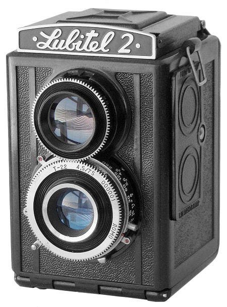
Lubitel 2 medium format camera
|
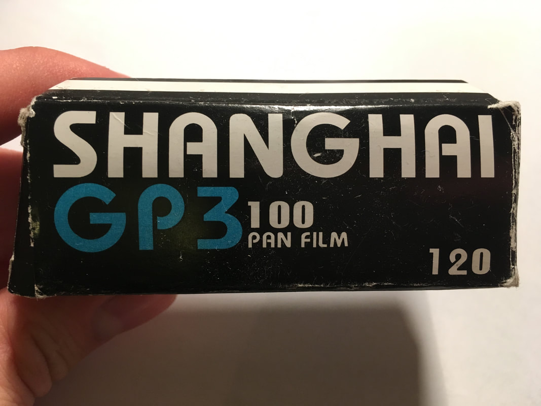
B&W 120mm ISO 100 medium format film
|
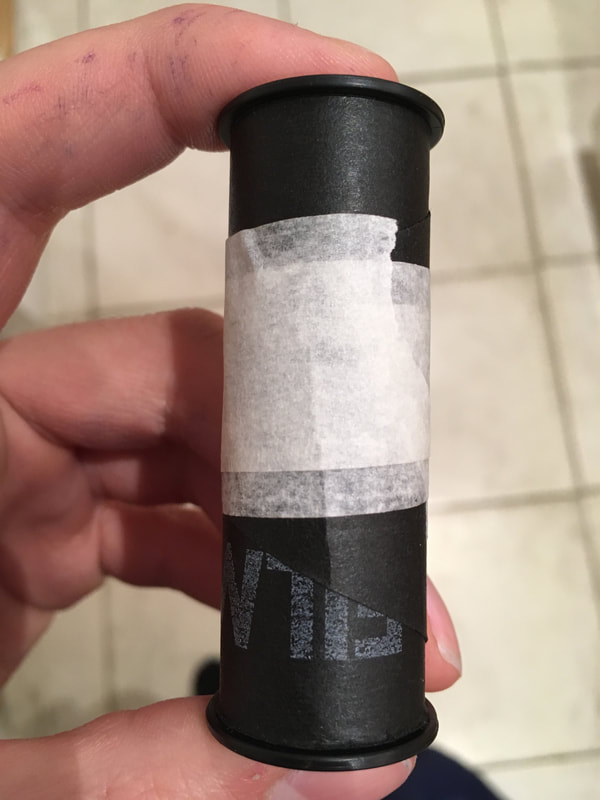
Finished role of film
|
My medium format photographs:
Overall, I was quite happy with the outcome of my medium format photographs. I experimented quite significantly when photographing, producing quite a varied range of different photographs. For a number of these photographs, I purposely double exposed them to produce some unusual effects. As I hadn't used medium format before, I wanted to experiment and create a range of outcomes. The first two photographs (below) are triple exposed; I wanted to double expose these photographs, but I had difficulty winding on the film and subsequently produced triple exposures. However, I really like the outcome of both of these photographs - with the layering of different shapes and elements in each frame. When creating double exposures, I often took an image focusing on quite a contrasty subject, and layered this with a photograph focusing on details and textures. For example, I double exposed a photograph of the floodlight, layered with a photograph of the textures of the turf and white lines (click here to see). Overall, I really like the outcome of the double exposures - they add some unusual variation and experimentation to my set of photographs. I also quite liked the single exposures - where I focused on details of interesting shapes.
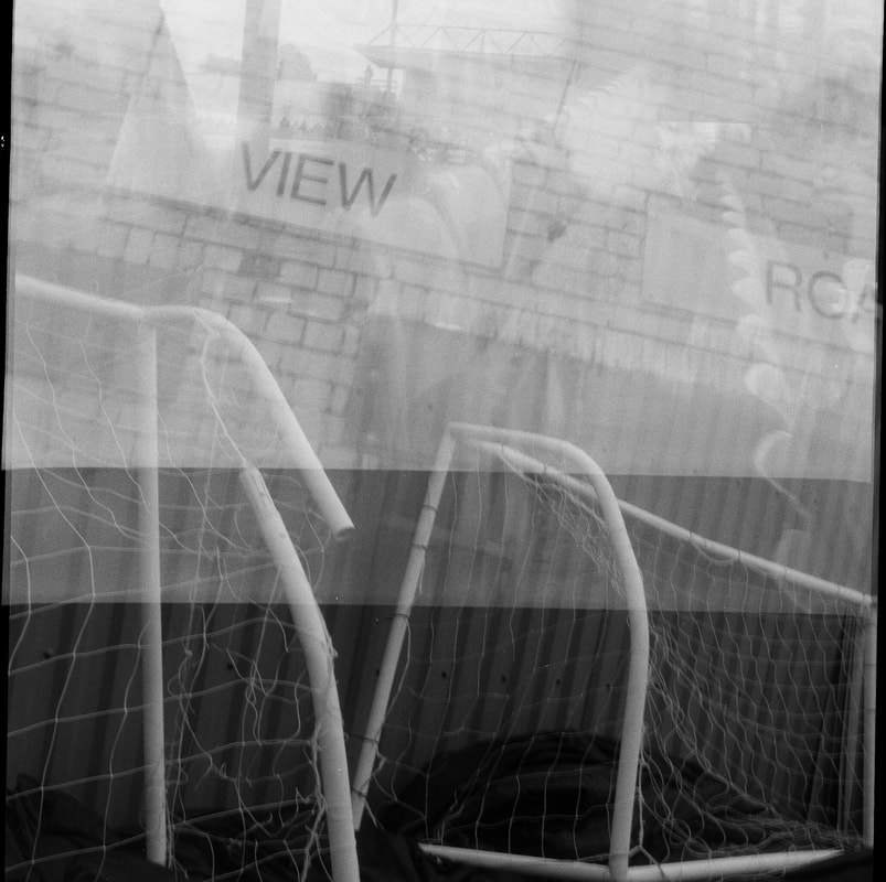
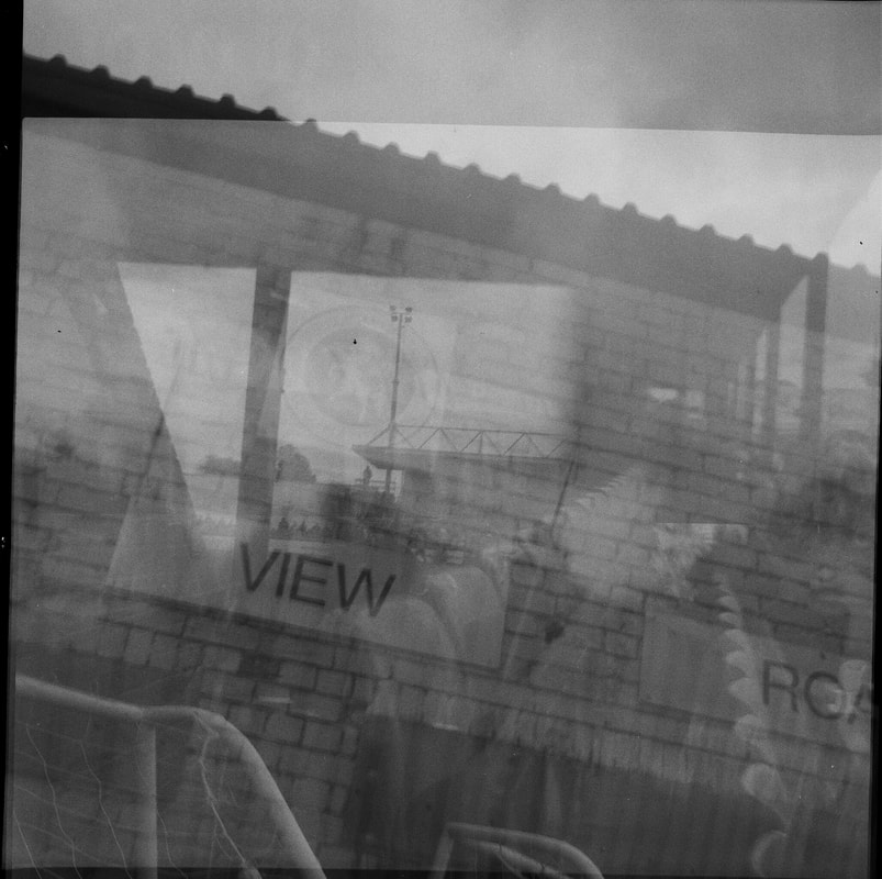
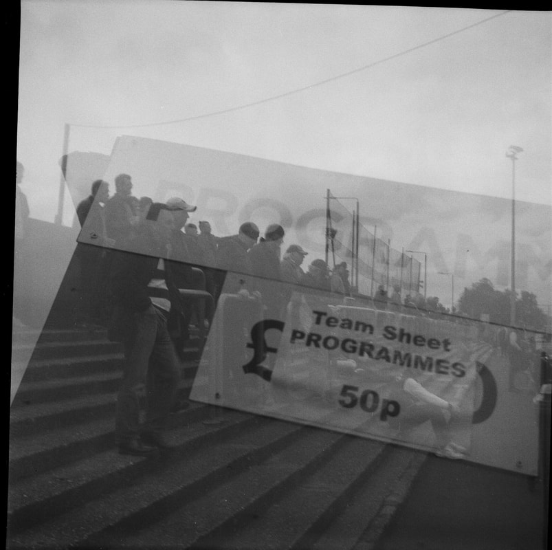
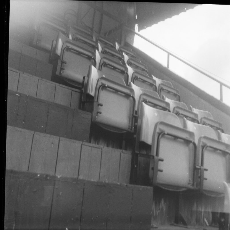
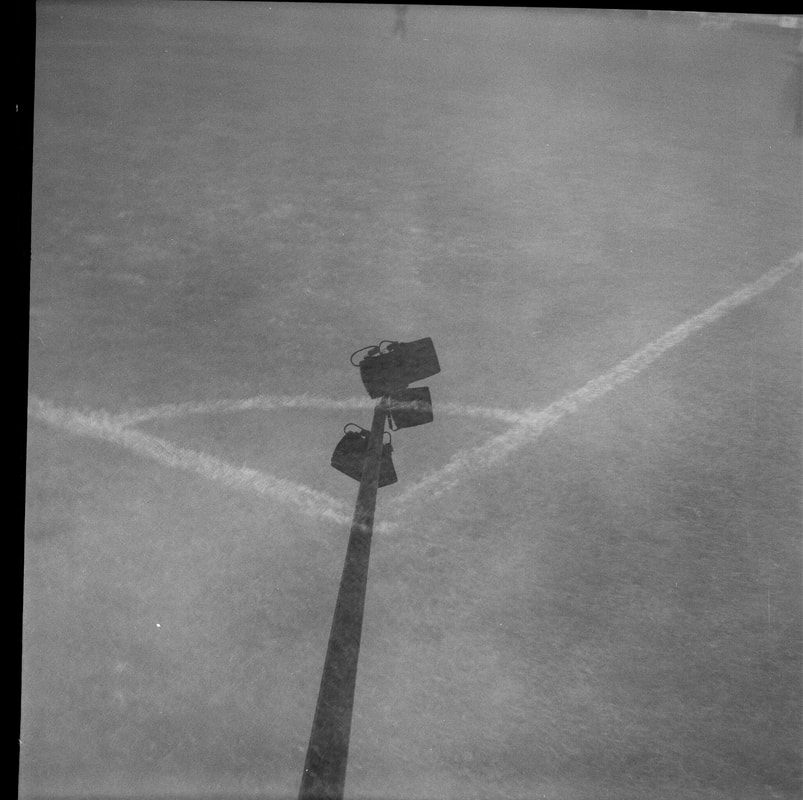
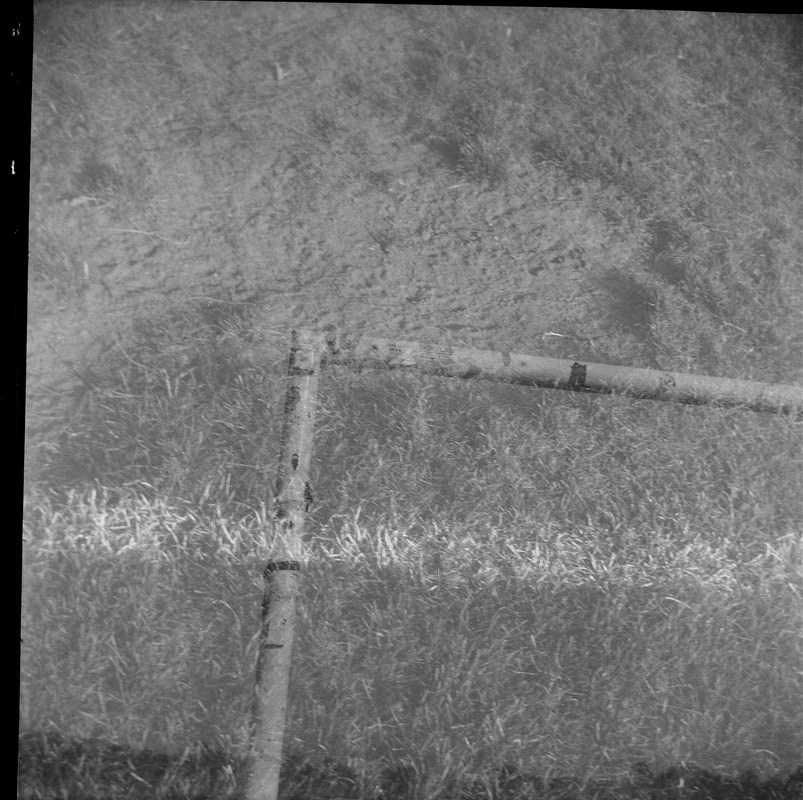
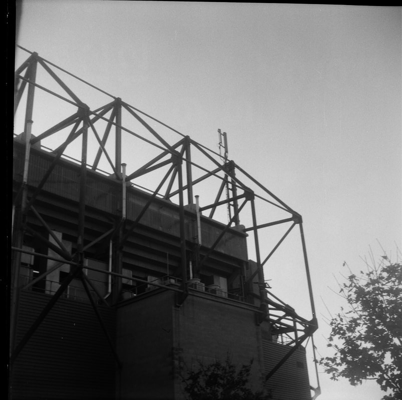
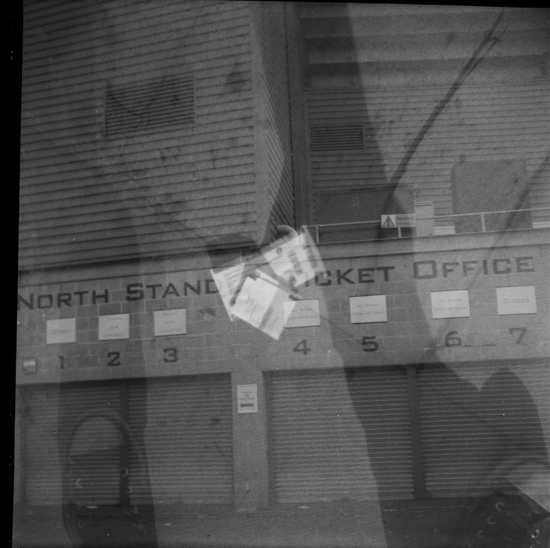
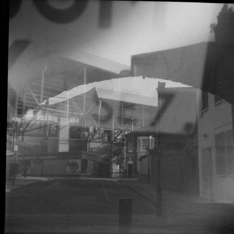
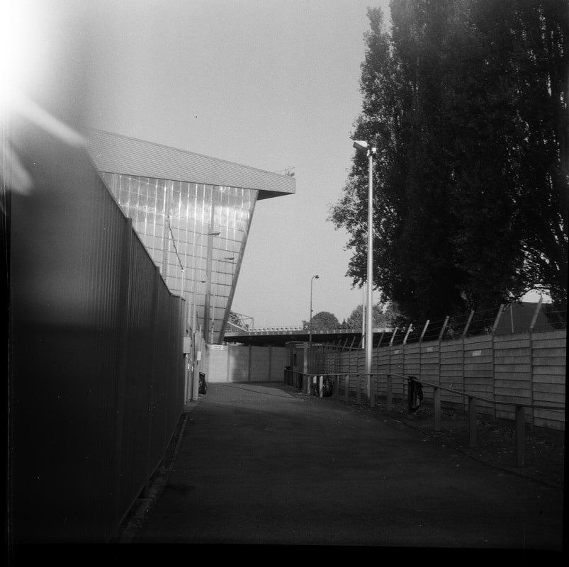
Evidence?
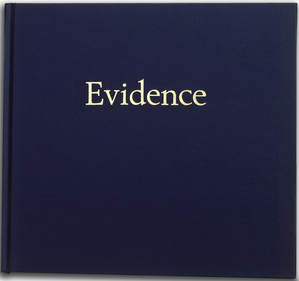 Evidence by Mike Mandel and Larry Sultan
(See my research on 'Photographs as Evidence' and this photobook towards the top of this webpage)
Evidence by Mike Mandel and Larry Sultan was a photobook that included images that the authors had found in the archives of major corporations and companies; they selected images that they thought were particularly striking and unusual for the photographic evidence that was stored in these archives. They were using evidence from these archives to create an artistic document - they were looking at the photographs in a visual way, rather than their intended purpose of documenting evidence for these institutions. Taking inspiration from this photobook, I used instagram as the archive to collect images that I found striking visually; using a hashtag to select certain images.
Evidence by Mike Mandel and Larry Sultan was a photobook that included images that the authors had found in the archives of major corporations and companies; they selected images that they thought were particularly striking and unusual for the photographic evidence that was stored in these archives. They were using evidence from these archives to create an artistic document - they were looking at the photographs in a visual way, rather than their intended purpose of documenting evidence for these institutions. Taking inspiration from this photobook, I used instagram as the archive to collect images that I found striking visually; using a hashtag to select certain images.
#Residue
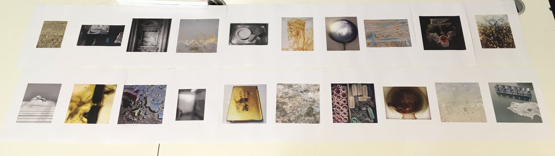
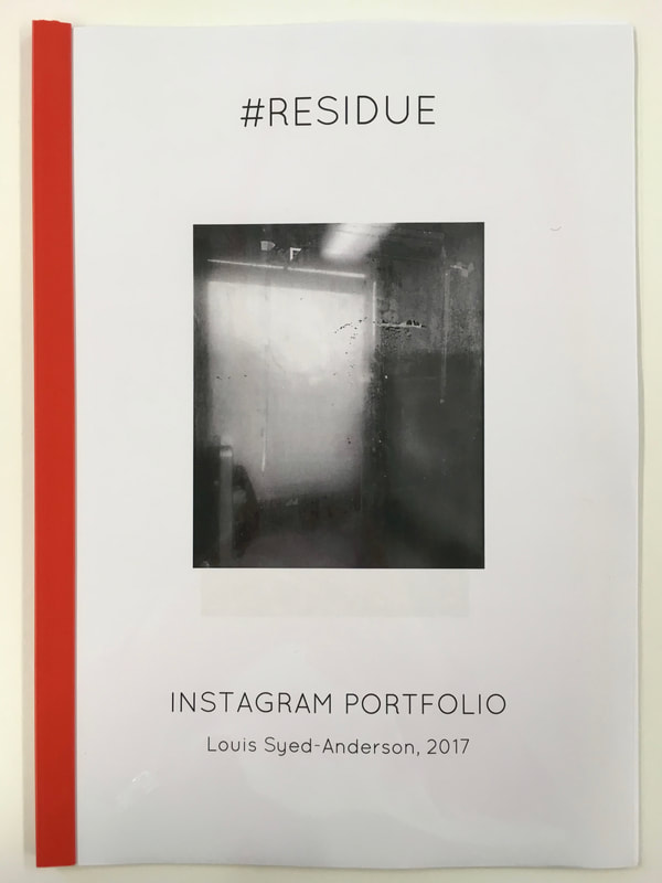
|
The hashtag that I chose for the theme of my instagram portfolio was #Residue. I selected this hashtag as it links to my interest in the residue of human activity, and I was looking to find some unusual images hashtagged with residue.
Overall, the results were quite varied, but there were a number of interesting posts that I could scroll through and select for my zine. When selecting images to images, I was particularly looking for images that I found particularly striking. Similarly to Mike Mandel and Larry Sultan, who chose the evidence photographs that struck them in visual way. I chose a relatively varied selection, although all the images were quite subdued in terms of colour. I subsequently laid the images out, and ordering and arranging them for my individual zine. Overall, I think the outcome of my zine was quite effective, I especially like the ordering of varied images. I also like the range of images I found under the hashtag, some images literally photographing residue, whilst other images were focused on residue in a different sense. |
#Residue instagram screenshots:
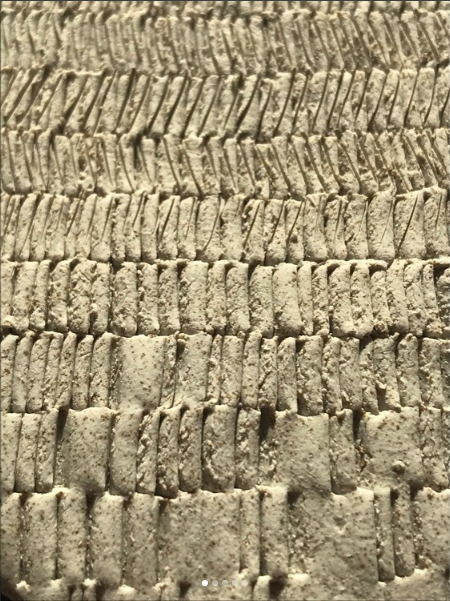
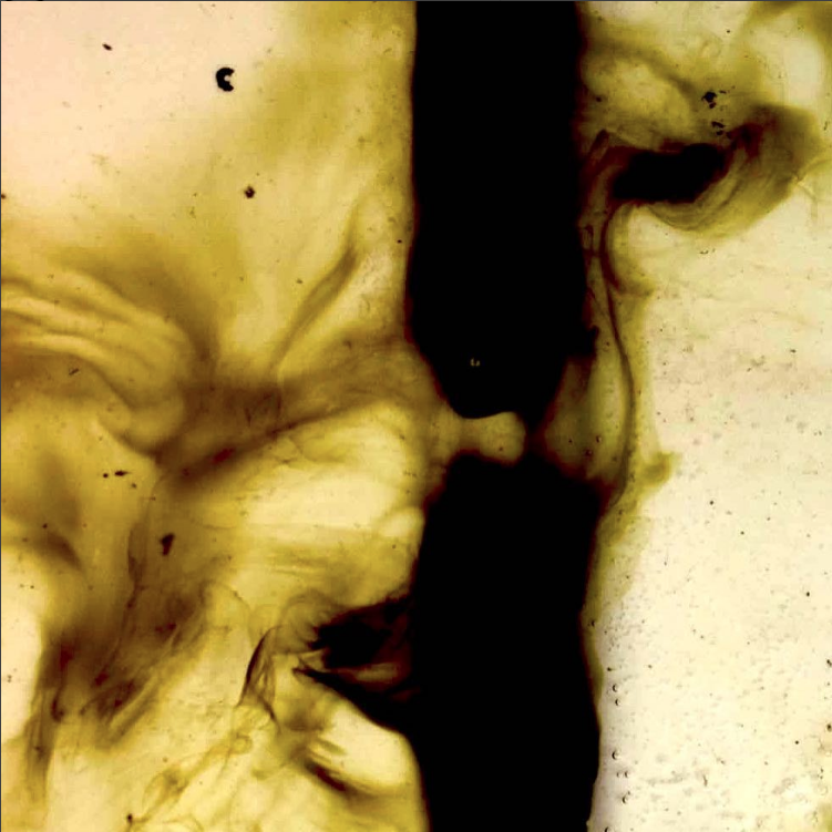
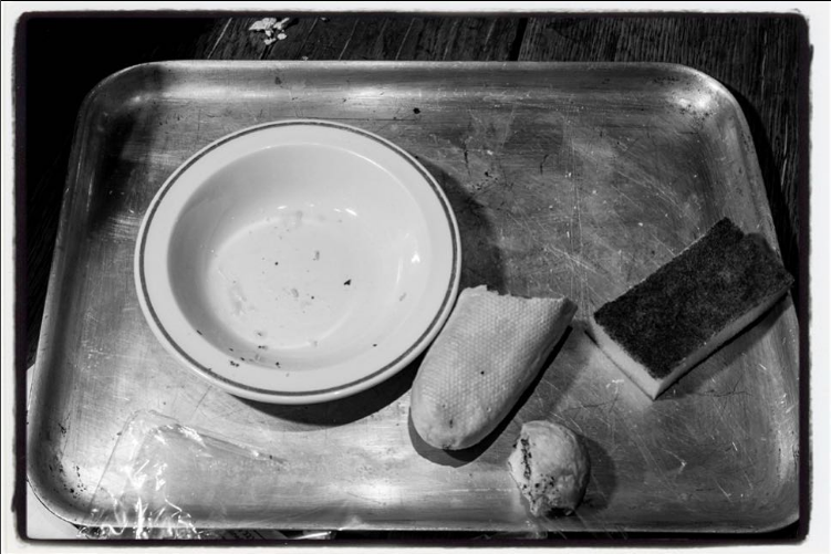
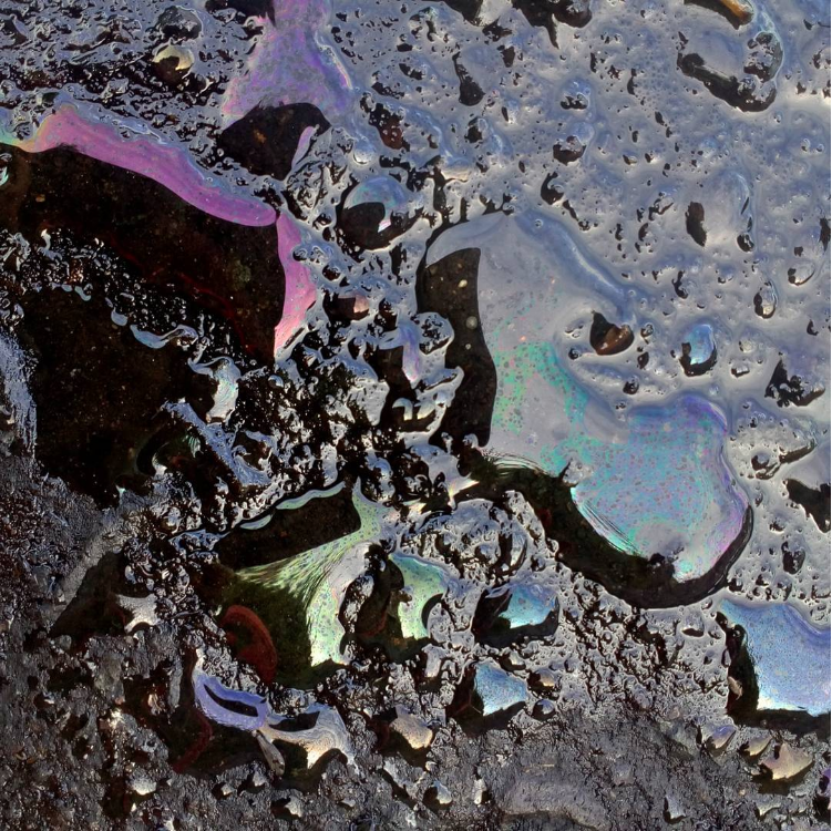
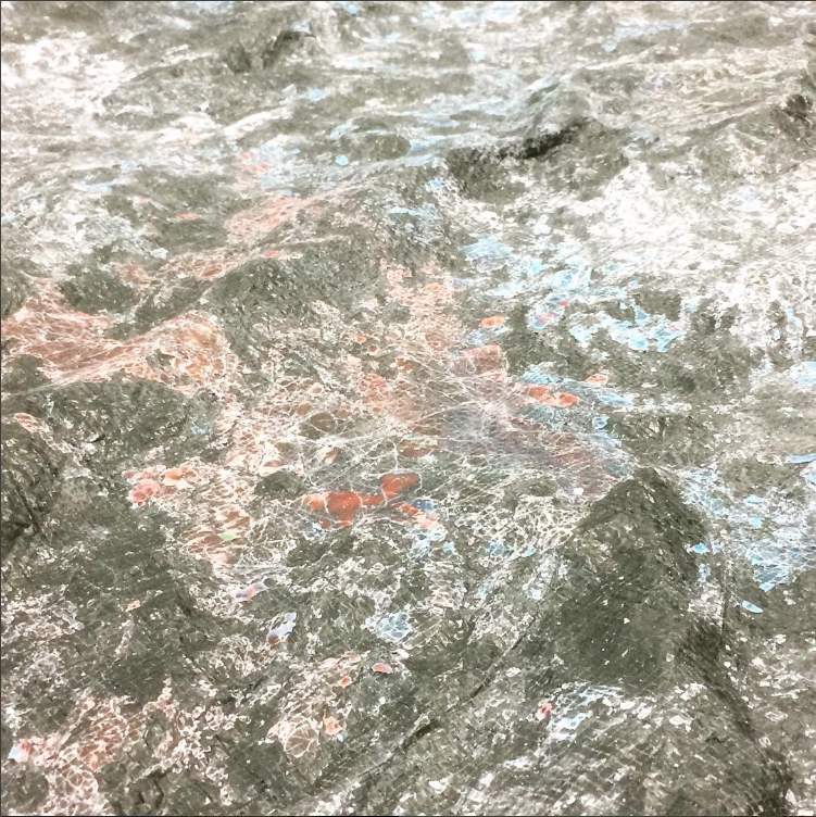
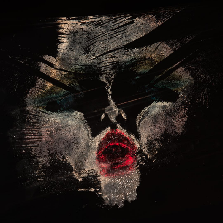
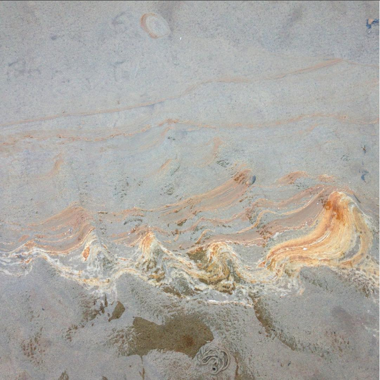
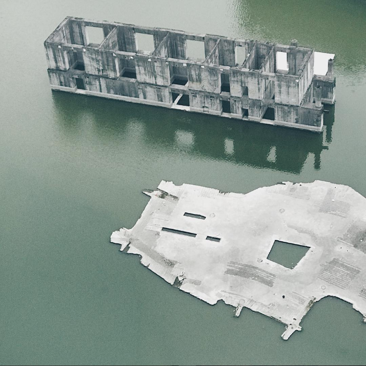
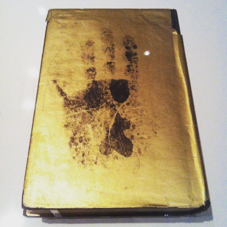
Mini project: 'The Thames Path' photo essay
As part of my investigation into documentary photography and photo essays, I wanted to experiment with a mini project documenting a subject or a particular area. Although this was a self motivated project and I initiated my own ideas, a number of Hoxton Mini Press books that I had read played a role in terms of my inspiration for this project. I was inspired by their photo books focusing on particular subjects, especially the photo essays focusing on different areas for example. I chose to document the Thames Path (primarily around Greenwich and Charlton) as it is a very interesting stretch of the river to document - particularly with the mix of industrial and run down areas of the Thames Path alongside the modern areas surrounding Canary Wharf and North Greenwich. This Provided me with an interesting mix of subject matter to document and experiment with various compositions.
Olympus OM20 + 35mm colour film
For this project, I decided to experiment with film for the first time. I decided to use film for this project not only due to the visual results, but also due to the way it changes how you photograph and approach different subjects. I used a relatively modern Olympus SLR for this project, which I was confident would produce some good quality photographs. I used a 50mm 1.8 lens, which is one of my favourite focal lengths; I also like using fixed focal length lenses as they make me more active as a photographer, forcing me to get closer to my subject and consider my framing. I used a roll of colour film given to me - which is known to produce strong contrast and colour rendition.

Olympus OM20 SLR with a 50mm f1.8 lens
|
Vista plus 35mm ISO 200 colour film
|
Gallery of my photos:
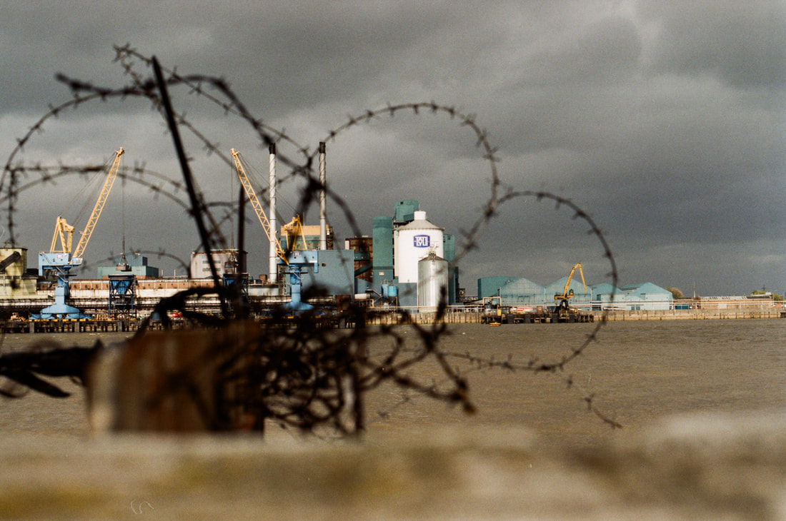
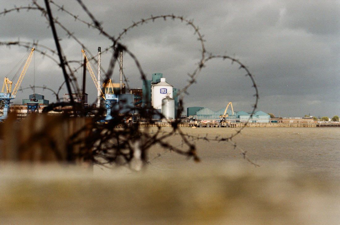
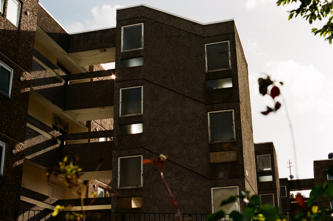
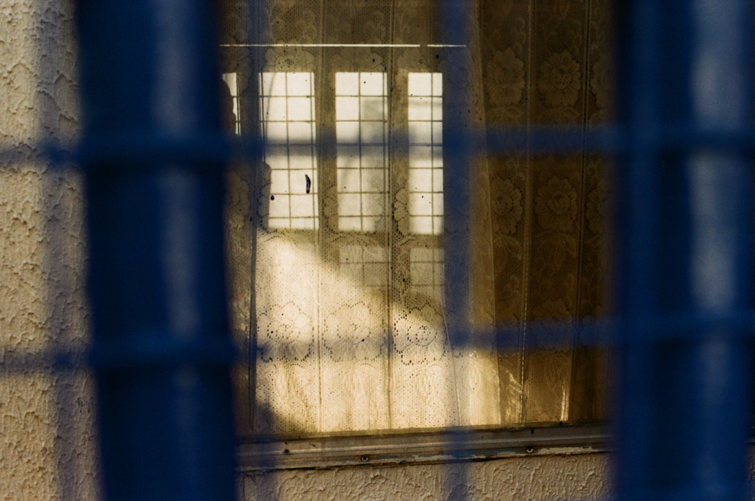
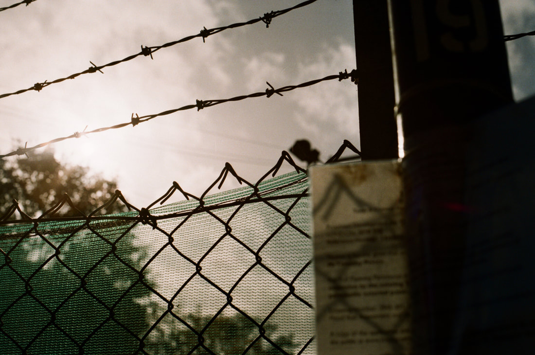
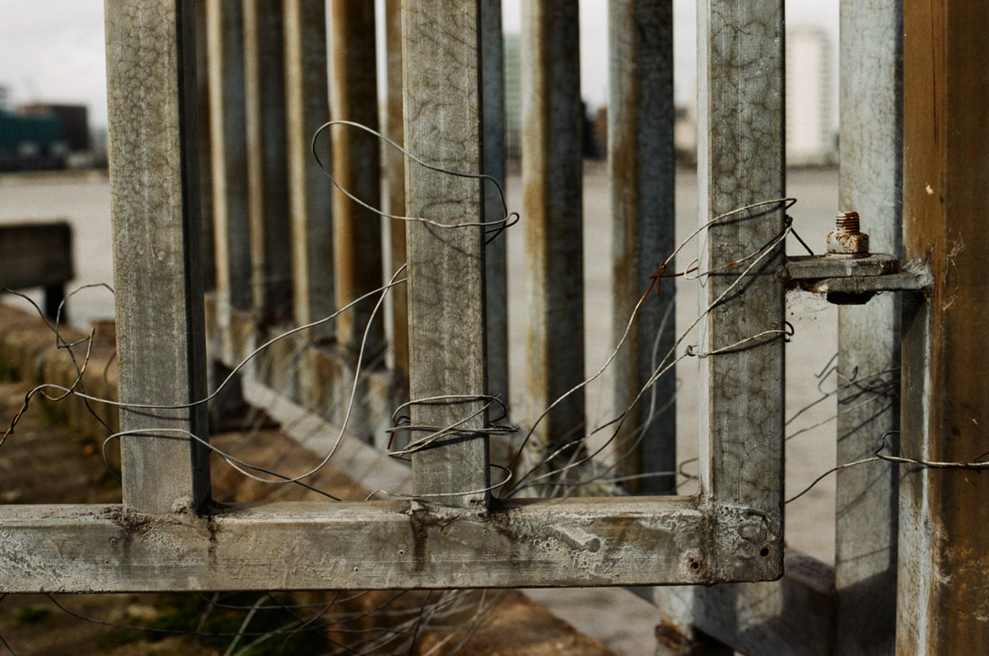
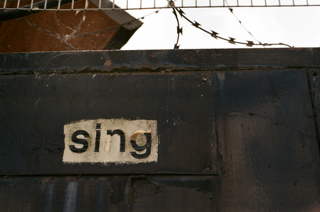
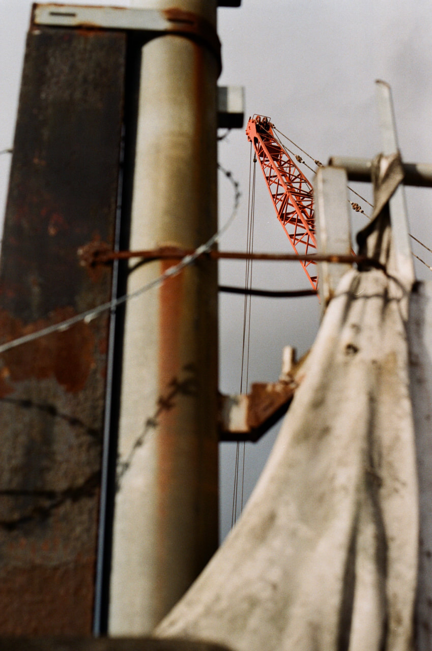
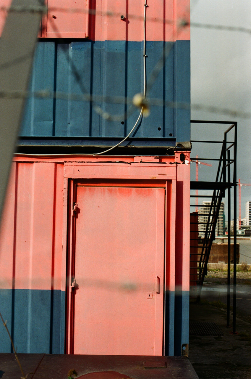
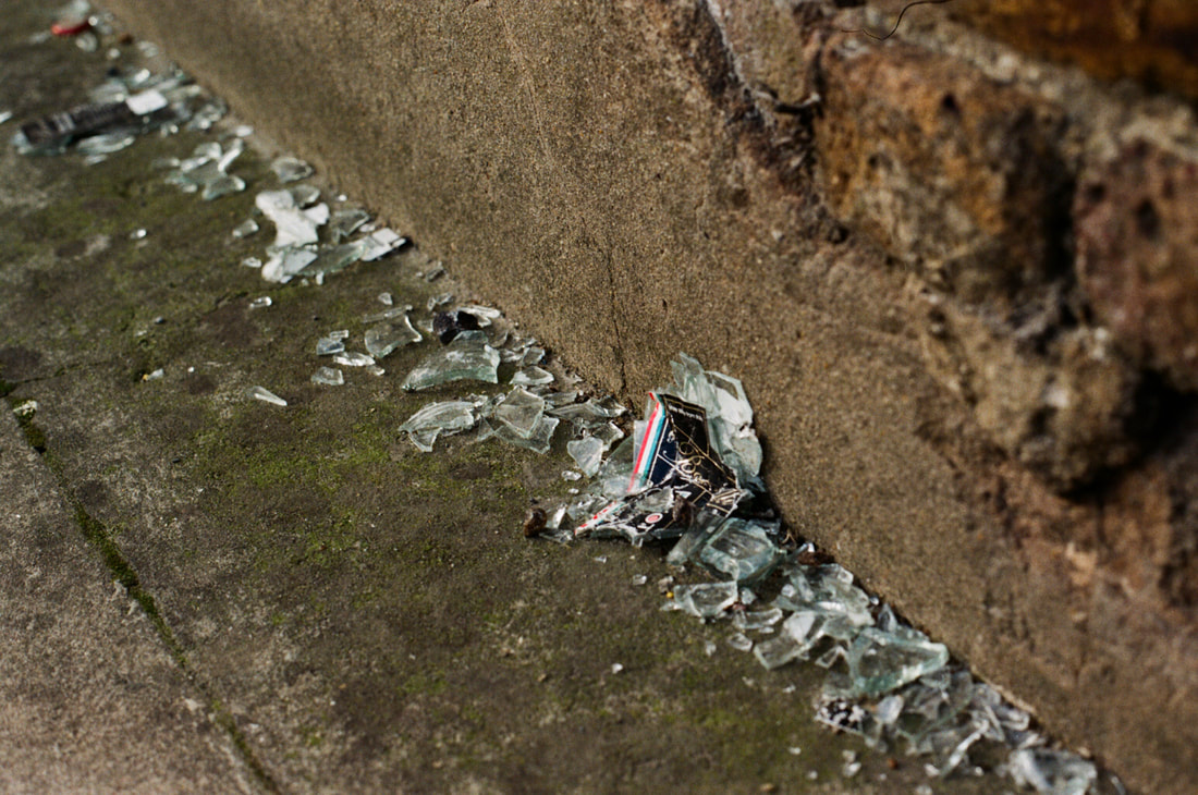
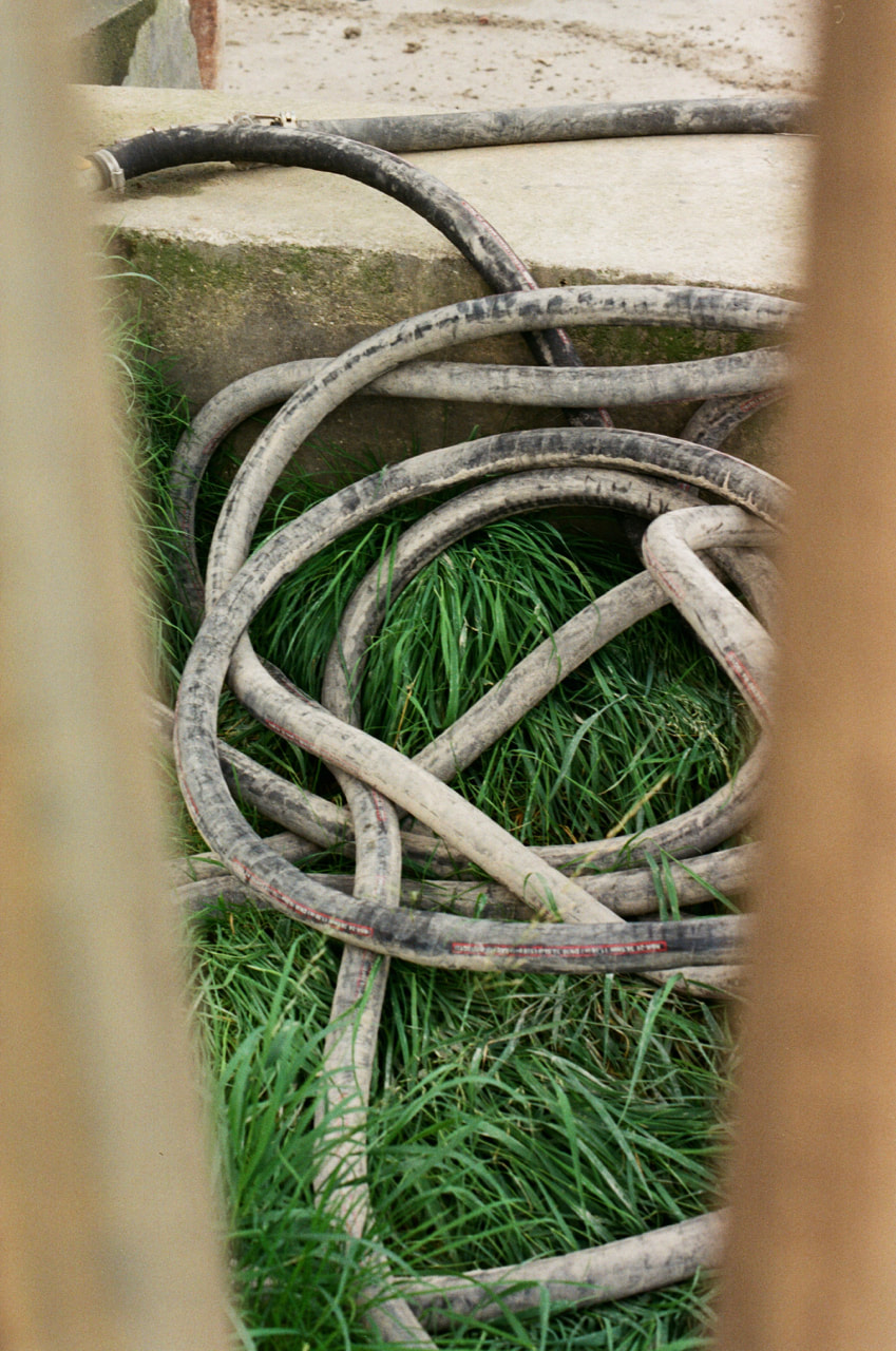
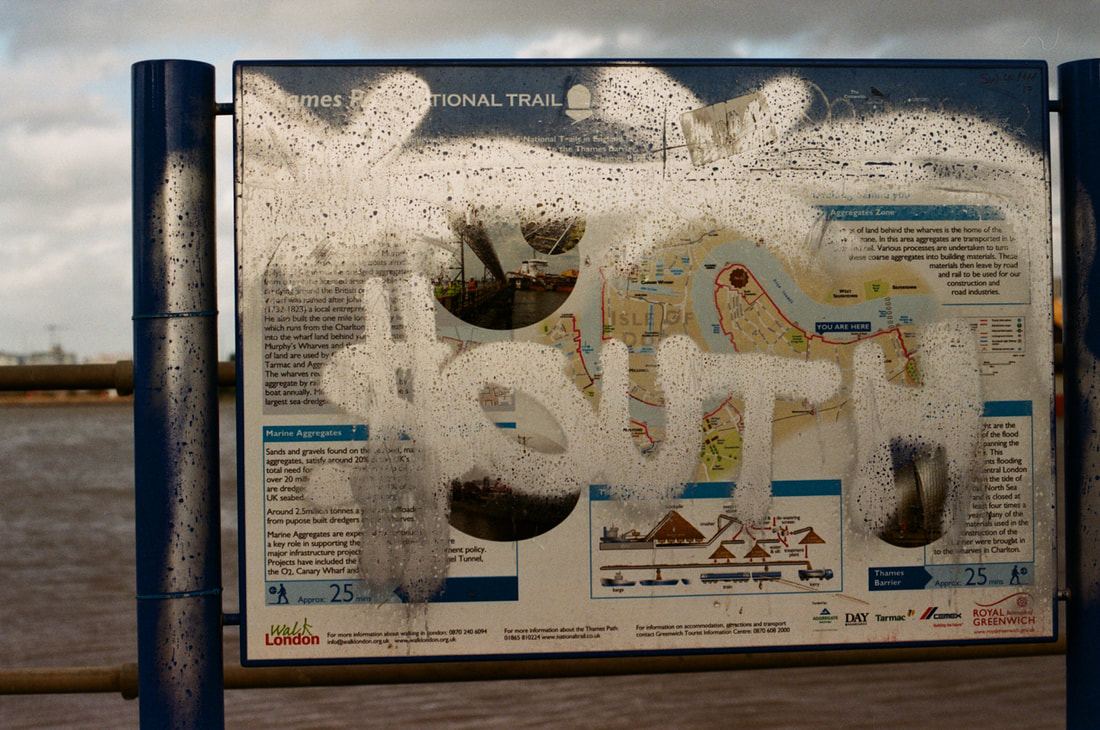
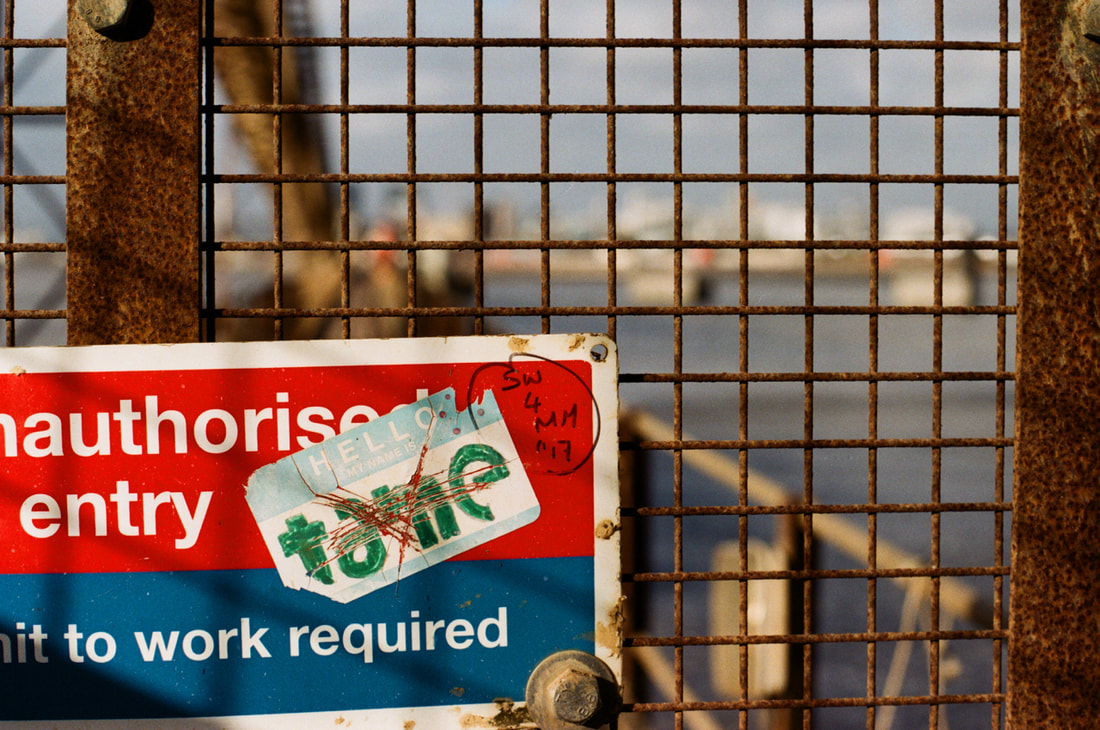
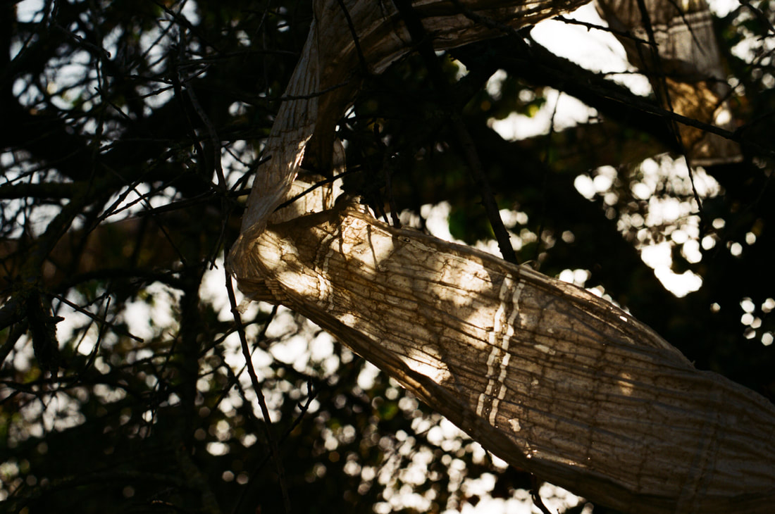
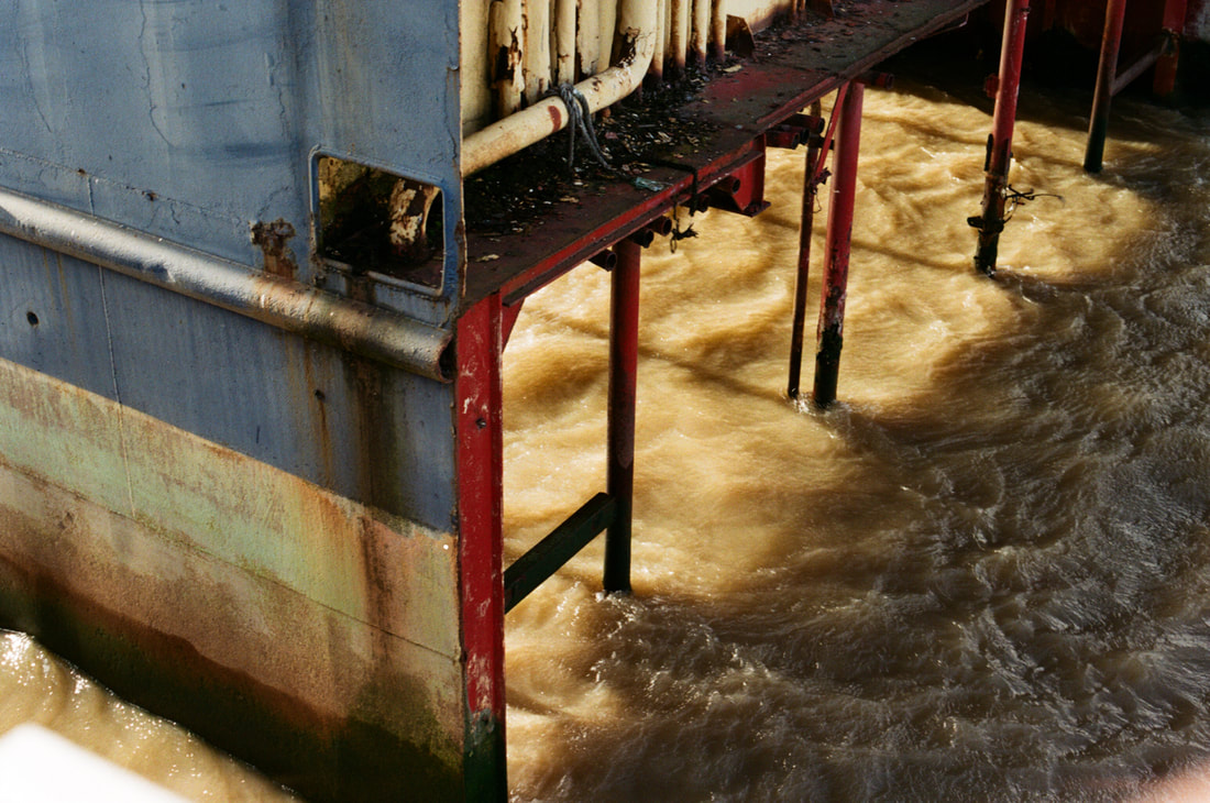
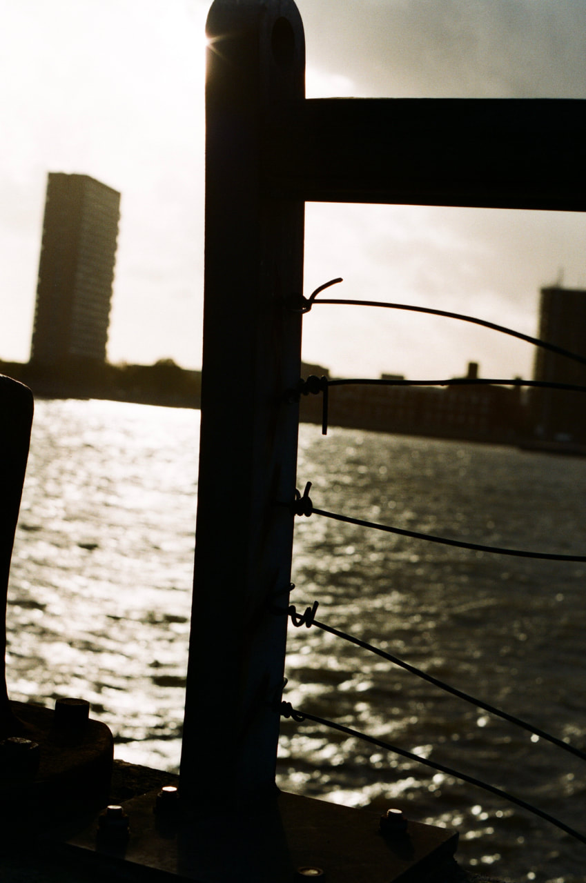
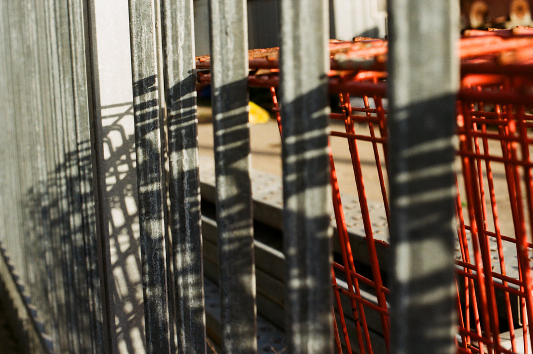

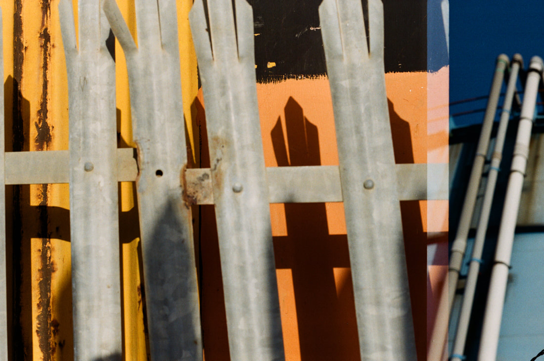

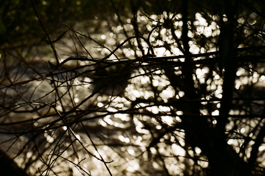
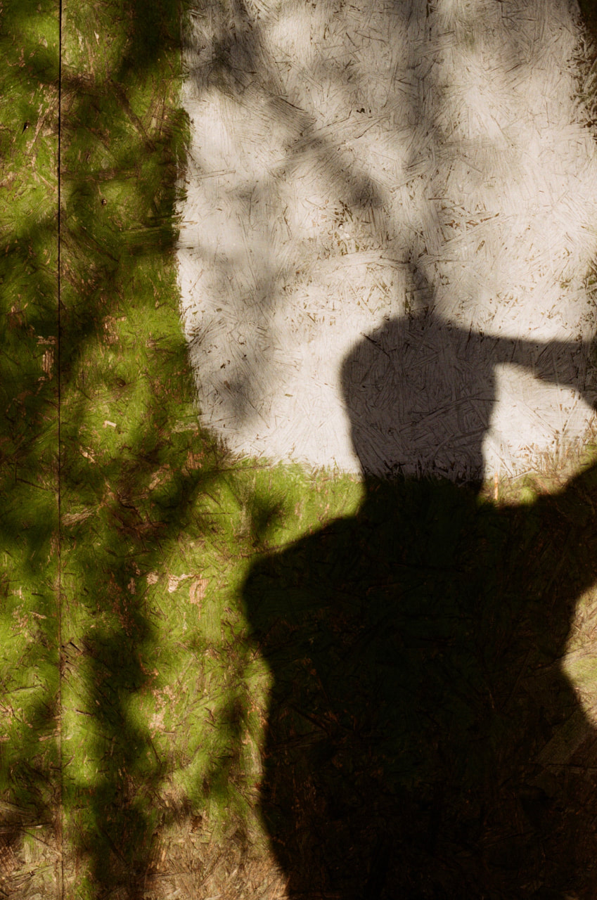
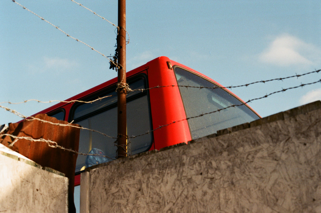
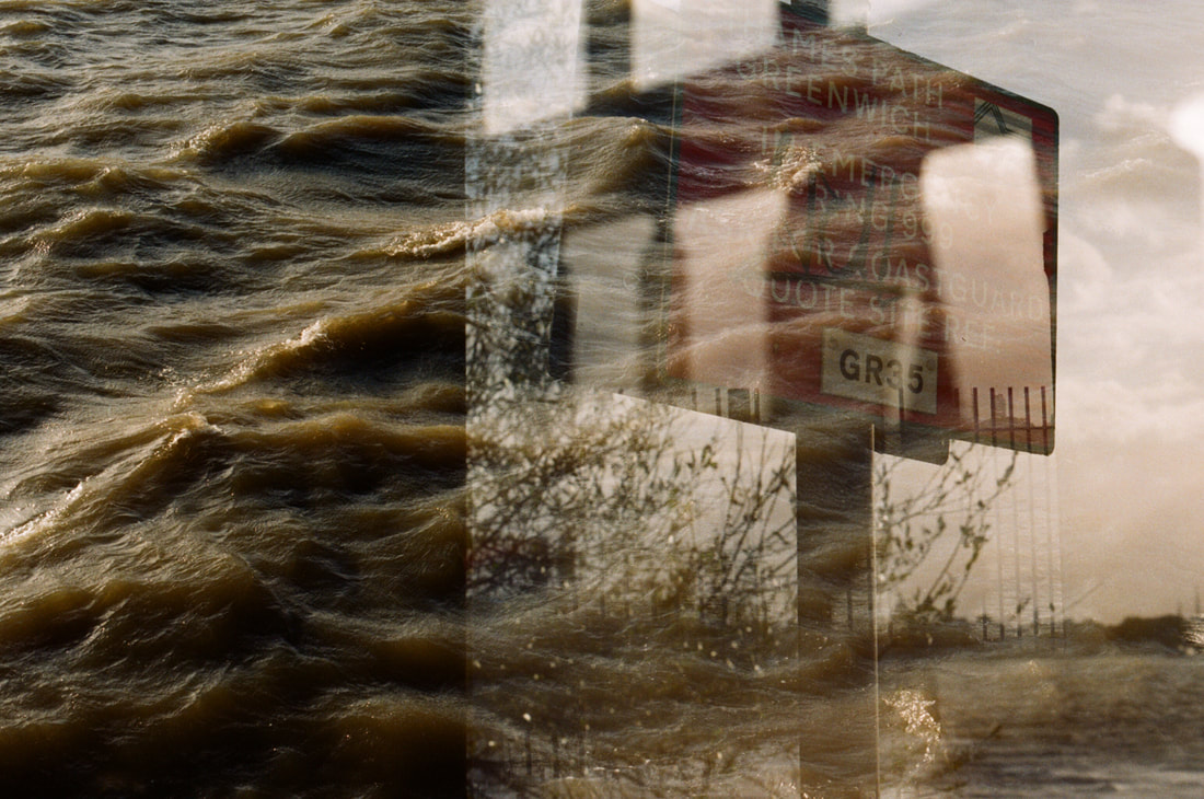
Evaluation
Overall, I am happy with the outcome of this mini project. I really enjoyed working with film particuarly - especially the fact that it made me consider my surroundings and what I was photographing so carefully. As I only had a limited number of photographs, I had to focus when photographing and really think about the subjects that I was willing to use up a photograph to capture. Shooting film naturally makes you refine your practice - you only photograph the really interesting details as you have a limited number of frames. It also made me carefully consider my composition - I re-framed my photographs a number of times.
Not only this, but I also really like the colour rendition and visual quality of the film. This particular roll of film produced some really contrasty, vibrant images - I was surprised by the quality of the photographs. I think colour film worked well for this set of photographs. The subjects I was photographing were often quite vibrant and varied in terms of colours - the vibrant colour rendition suited the type of subject matter I was photographing in this series. I think that my set of images also works well as a narrative/documentary series. I think that my photographs capture some interesting details along Thames Path - I quite like some of the interesting compositions and details I was able to pick out. It would be interesting to produce some sort of outcome from this set of images - potentially a photobook or experimentation using negatives.
Not only this, but I also really like the colour rendition and visual quality of the film. This particular roll of film produced some really contrasty, vibrant images - I was surprised by the quality of the photographs. I think colour film worked well for this set of photographs. The subjects I was photographing were often quite vibrant and varied in terms of colours - the vibrant colour rendition suited the type of subject matter I was photographing in this series. I think that my set of images also works well as a narrative/documentary series. I think that my photographs capture some interesting details along Thames Path - I quite like some of the interesting compositions and details I was able to pick out. It would be interesting to produce some sort of outcome from this set of images - potentially a photobook or experimentation using negatives.
Unexpected outcomes:
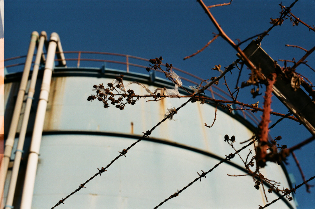
In this image, due to the problem with the film advance lever, a slice of another image has crept onto the left side of this photograph. However, it isn't noticeable in this case and can easy be cropped out.
|
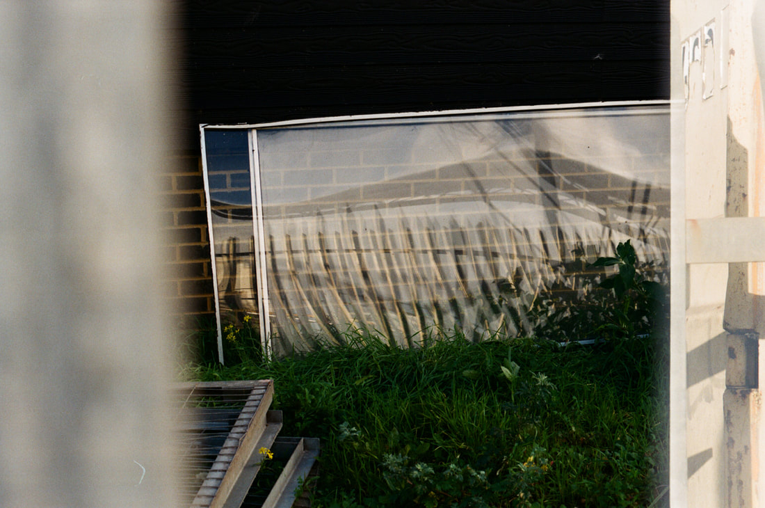
In this photograph, again due to the camera fault, the next photograph has overlapped onto the right hand side of the image. Although this produced quite an interesting effect, I would personally prefer this image without the overlapping.
|

Again, due to the fault in my camera, the photographs have overlapped. The images have overlapped considerably in this case, with the blue industrial photograph on the right taking up the side of the photograph of orange paint and fence. Again, although this was unexpected, I really like the outcome of this photograph. I especially like the contrast of the orange paint, fences and shadows contrasting with the rich blue colours of the overlapping photograph. In particular the intensity of the complementary colours (orange and blue) is what makes this image particularly effective.
|

This photograph produced some very interesting results. Due to the problem with the film advance level and counter on my camera, a triple exposure has taken place in this image. The original photograph I took was of the rough water of the thames, but a photograph of a sign as well as another photograph of sunlight through some railings have been layered on top. This was completely unexpected, but I really like the visual appearance of this image. The layering of images in this frame have produced some very interesting visual results - I really like the details of the sign and shapes of the railings overlapping the tones of the rough water.
|
Thames Path photo essay: Using expired film
For this project, I also used one of my grandfather's old cameras which I had recently inherited. When inspecting the camera however, I discovered that a roll of B&W had been left loaded in the camera, with only one or two exposures used. I decided to use this camera to take a number of more varied images for my Thames Path photo essay. I was expecting some unusual results, as I knew the roll of film had been sitting in the camera for at least a couple of decades, and would the film would have degraded to some extent.
Praktica IV + Expired Ilford FP4 B&W film
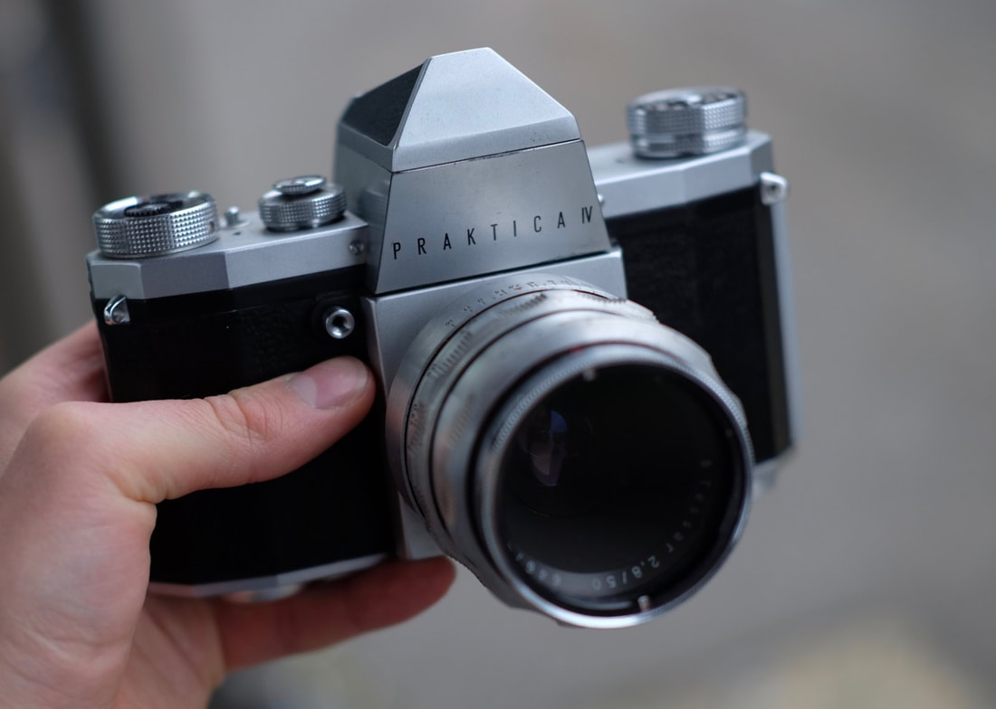
|
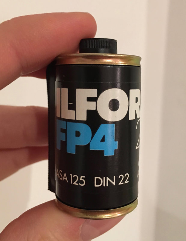
|
Outcome:
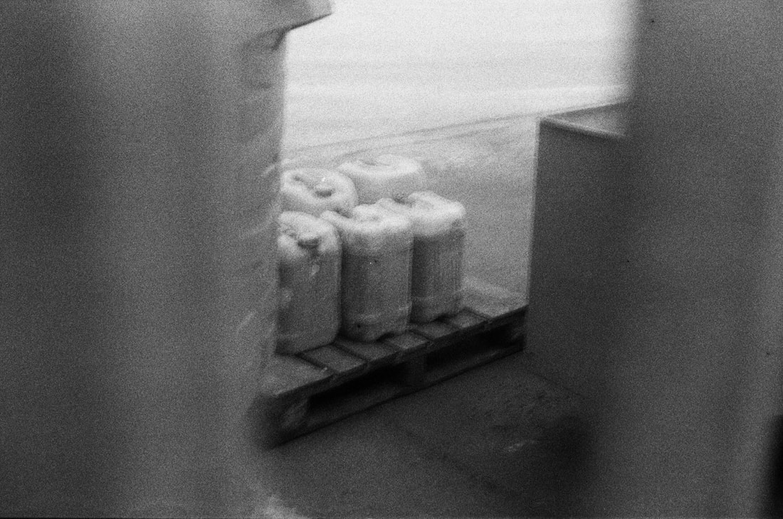
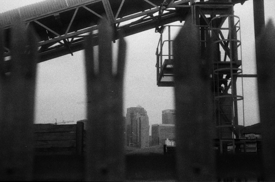
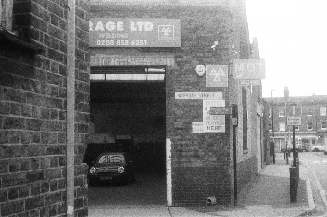
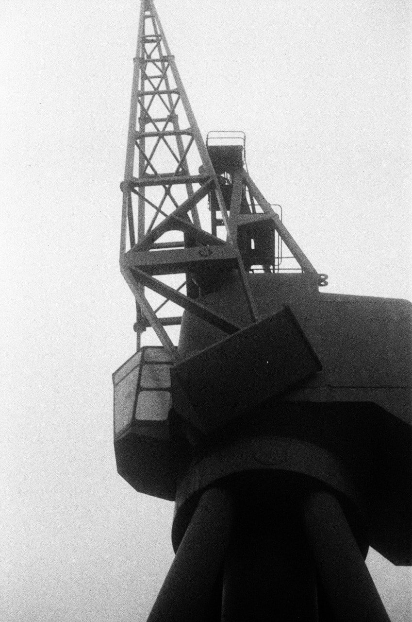
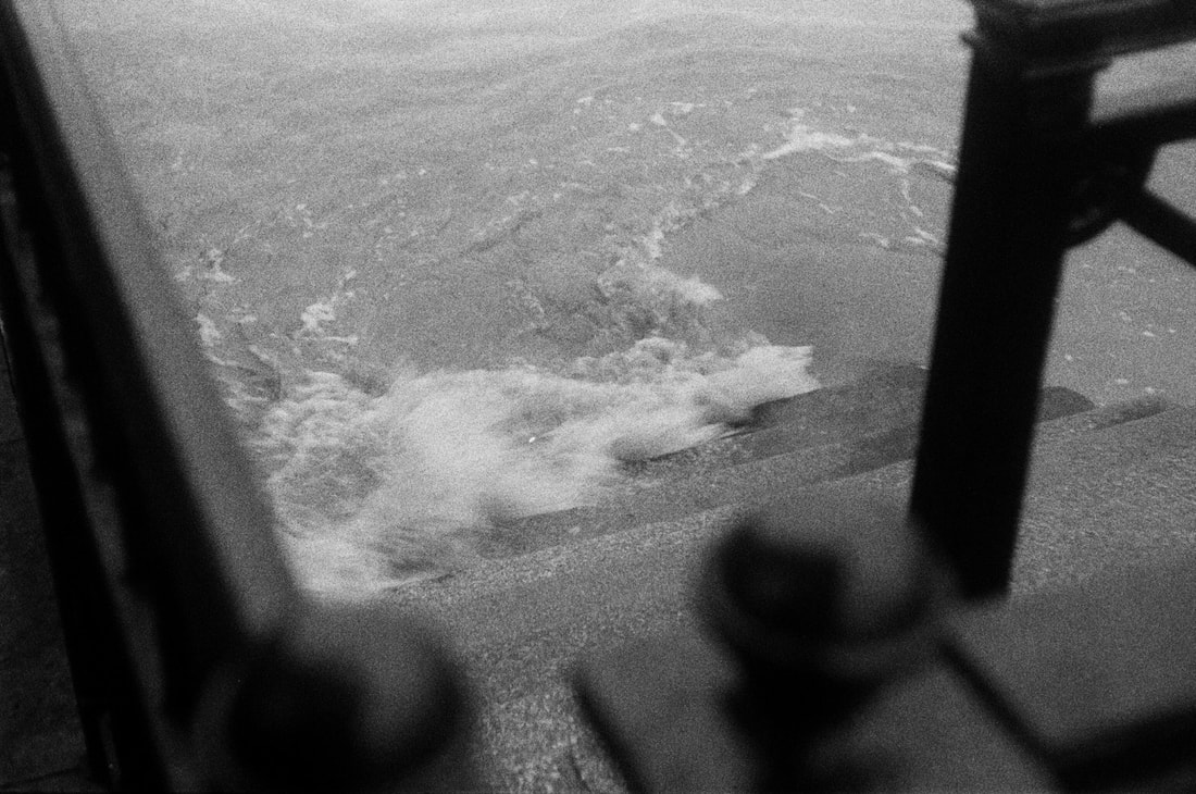
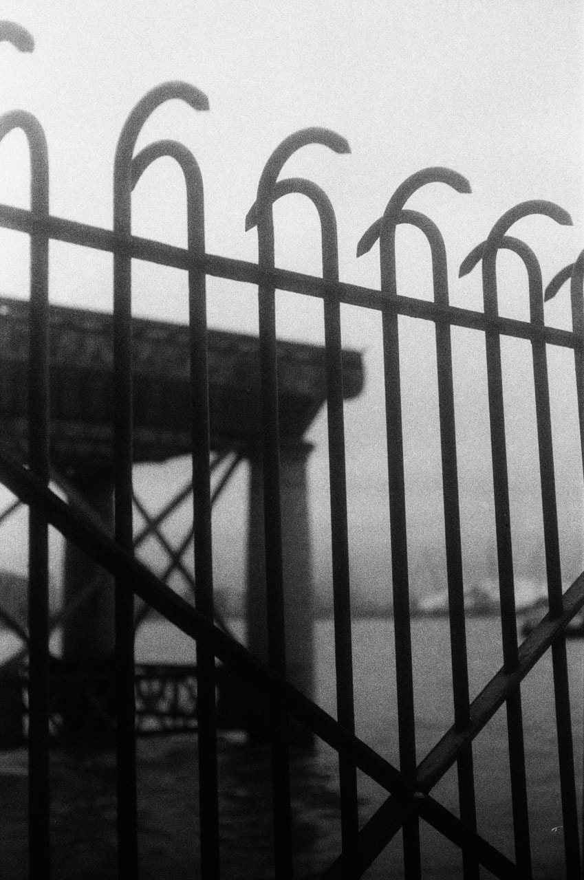
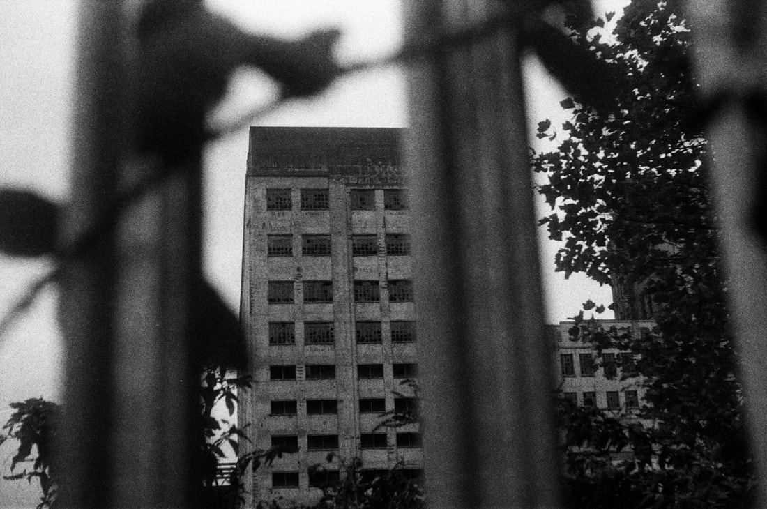
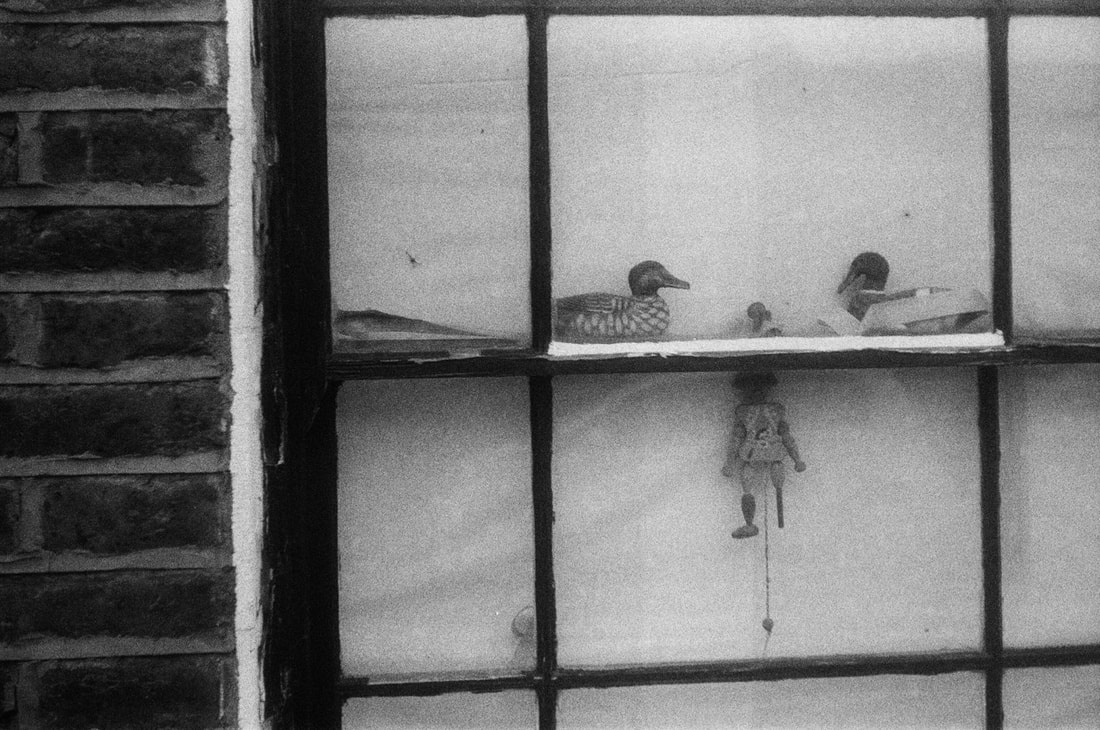
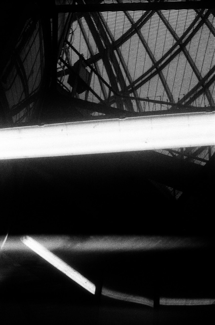
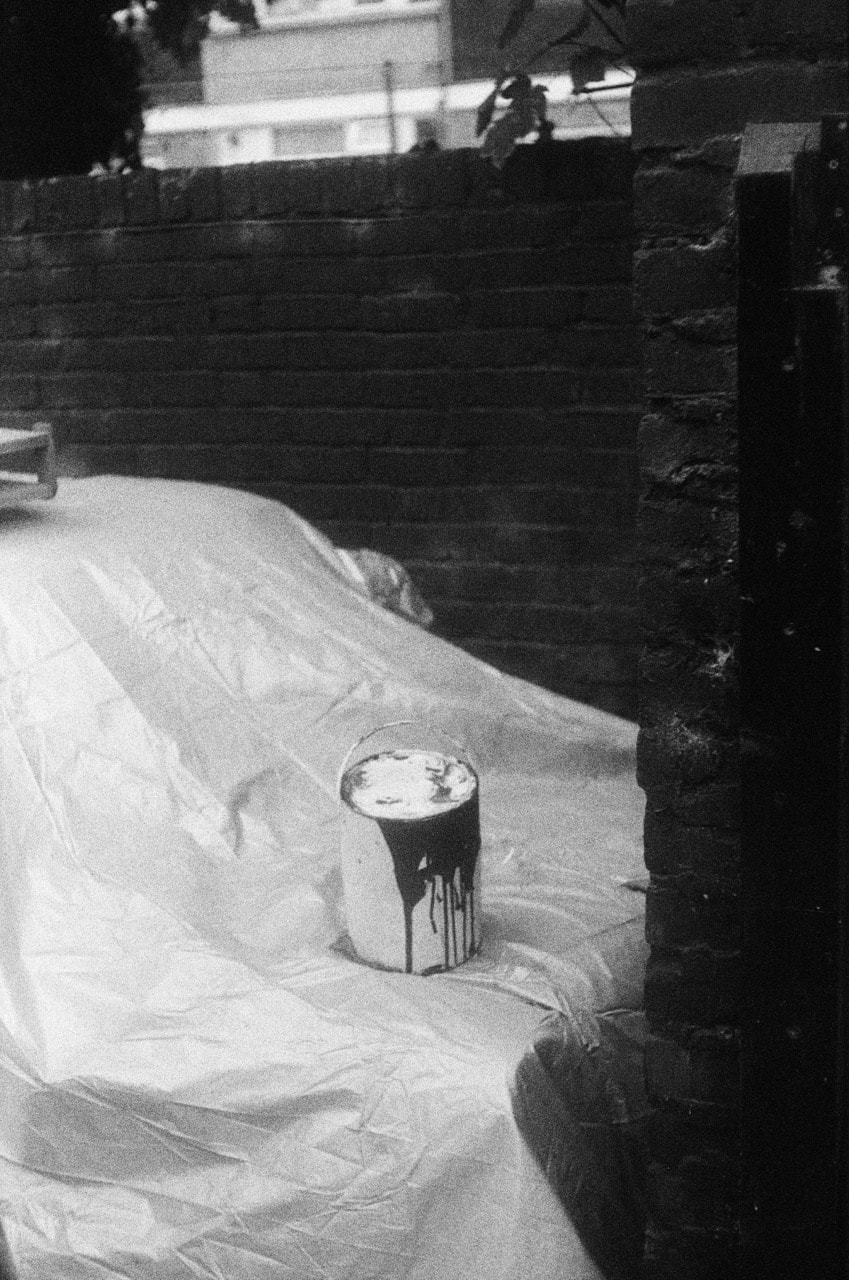
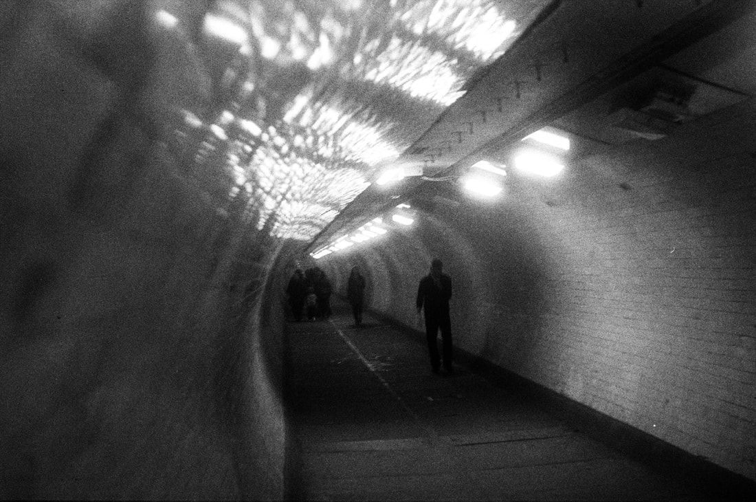
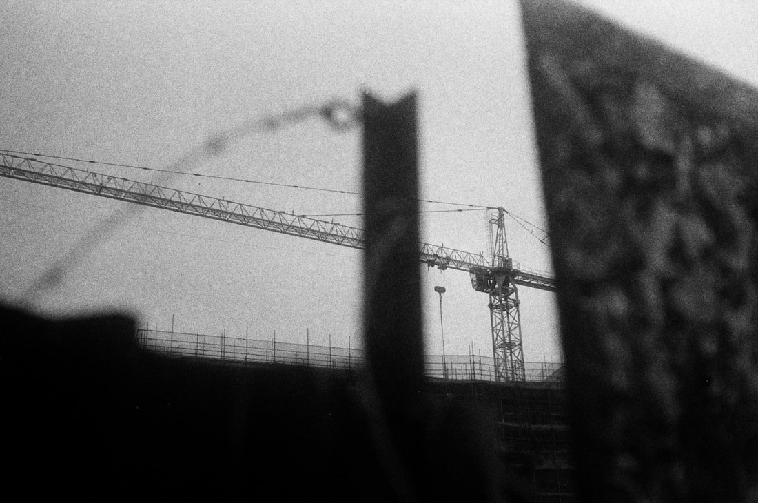
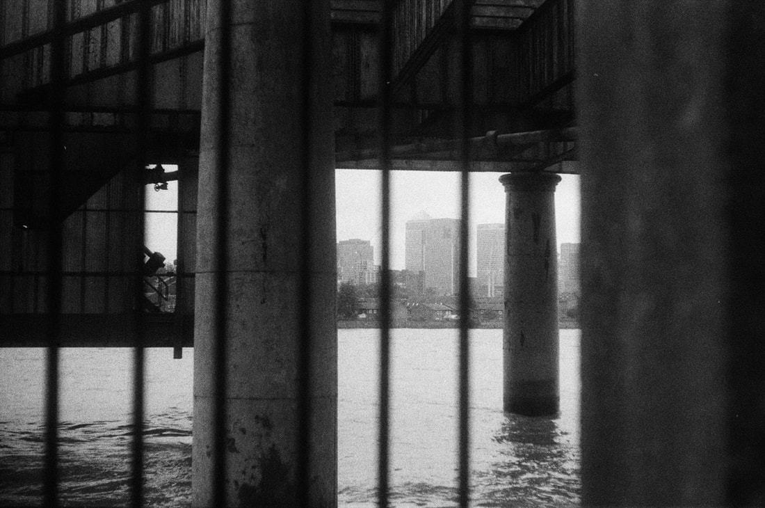
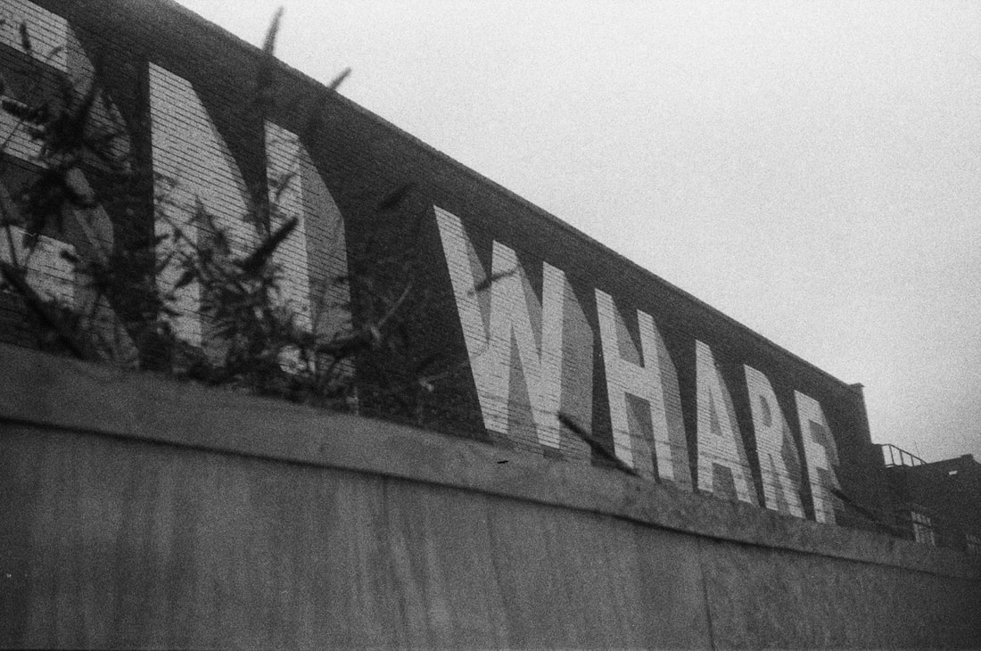
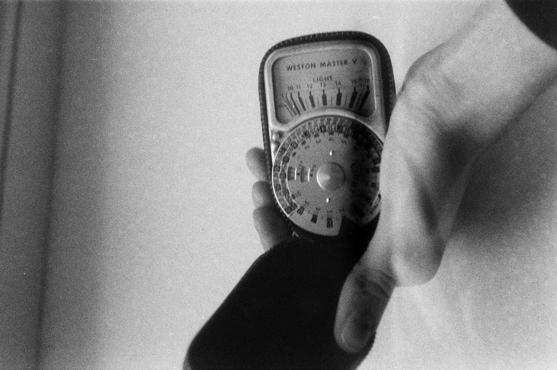
Overall, I am pleased with the outcome of this roll of film. I wasn't sure if anything would be developed - I was worried that the film would be too old and degraded, or could have been damaged or exposed at some point. However, the results were good; the image quality was good, albeit the photos were very grainy considering it was only ISO 200 film. On the other hand, I think that the grain added a grittiness to the photos - in conjunction with the gritty urban subject matter. I think the photos themselves worked relatively well. I shot a relatively wide range of subject matter, with quite varied compositions in each of the photographs as well. My first image (the last photo in the gallery above) was the first test shot I took, focusing on my grandad's old light meter. I then photographed on the Thames Path and surrounding urban areas, mainly around Greenwich. The images were quite varied, some photographs shot through gaps and railings, compared to some more candid photographs.
Mini Project: My Grandparents photo essay
Inspiration: 'Else' by Hannah Lenz
In this documentary series, Danish photographer Hannah Lenz photographed a 100 year old person called Else, who had been living in an apartment in Aarhus for over 50 years. In this series, Lenz follows and shadows Else as she goes about her daily life as well as taking some more posed portraits. Overall, I really like Hannah Lenz's body of photographs. The candid photographs work really well as a documentary series, with Lenz's ability to capture Else's say to day life with such anonimity. It seems to be quite an emotionally driven set of photographs - with Lenz focusing on the details, fragments and traces of Else's life that have built up in her apartment over her life, as Else looks back over her 100 years of life.
Gallery of 'Else' by Hannah Lenz:
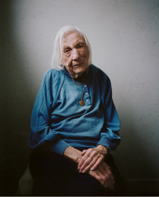
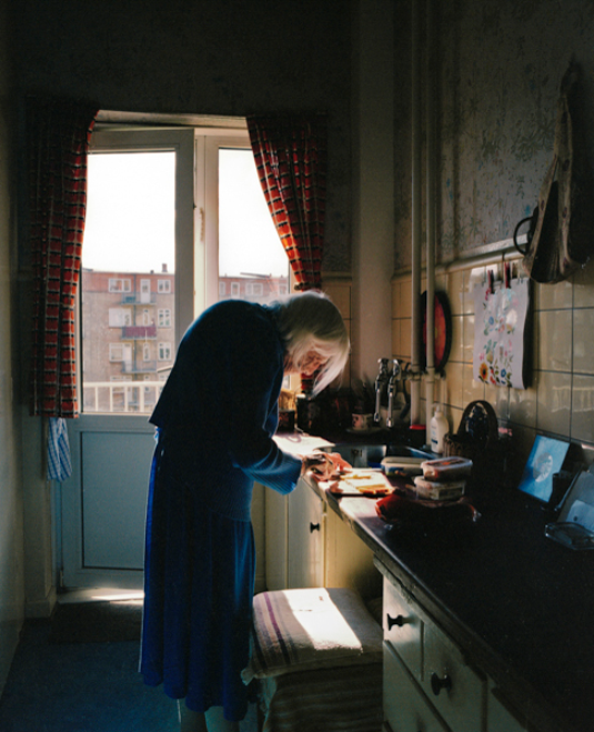
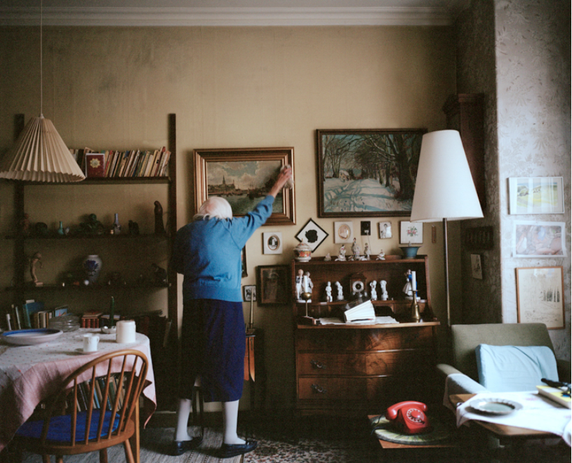
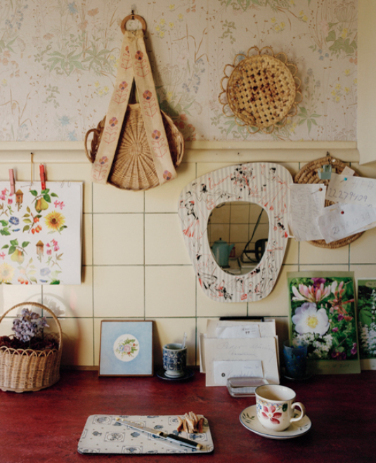
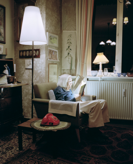
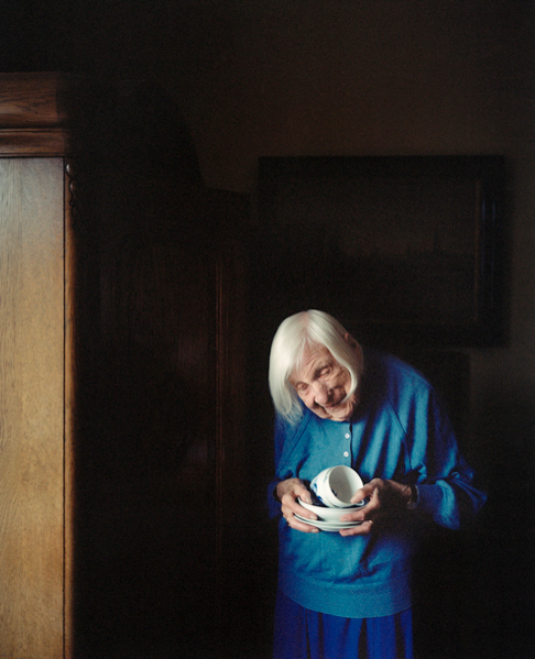
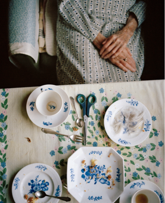
Inspiration: 'Pictures from Home' by Larry Sultan
In this book by Larry Sultan, he combines family photos and memorabilia alongside his own photographs focusing on his family. Not only this, but he also combines quotes from his parents, alongside stories and narratives surrounding their lives. Overall, Larry Sultan was aiming to make a book that focuses on emotional and personal subjects - he is also investigating and producing a family album in his book. His book is arranged with old photos as well as film stills, arranged amongst text as well as fold out sections, alongside photos taken of his parents in old age. Moreover, Larry Sultan produced this book when photographers felt 'the need to take into account the vast quantity of imagery that our culture produces'. I really like Larry Sultan's book, the range of different photographs exploring his family - with his own photographs laid out alongside found, old imagery of his family. This could significantly inspire my own project, where I want to explore my grandfather's old albums of photographs from his life, potentially alongside my own photography in a book or zine.
Gallery of 'Pictures from Home' by Larry Sultan:
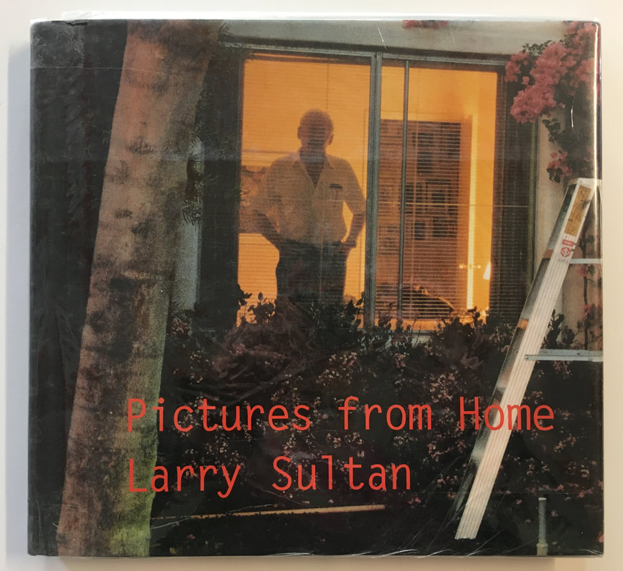
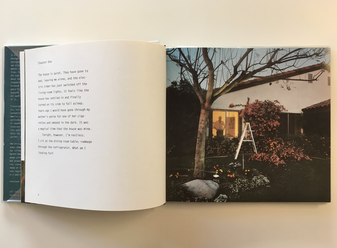
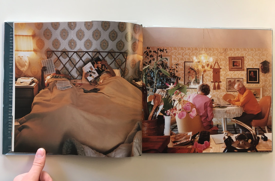
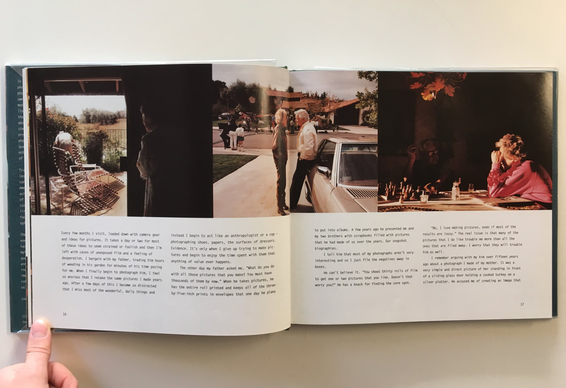
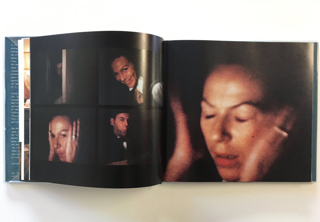
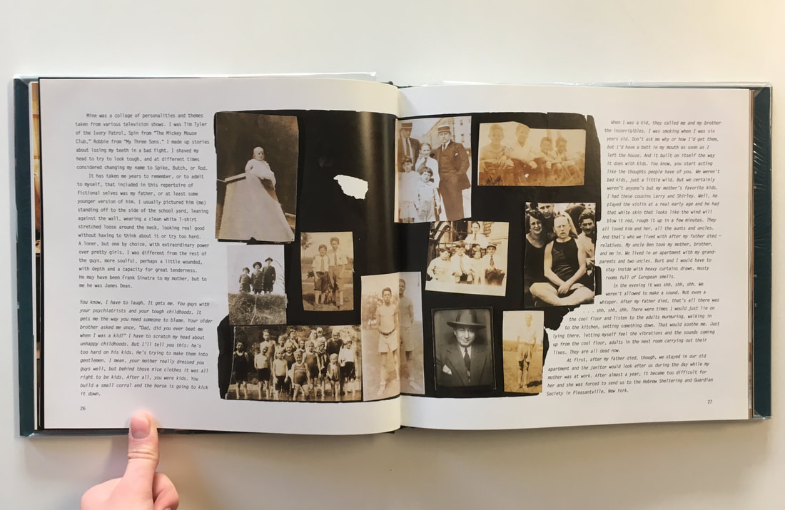
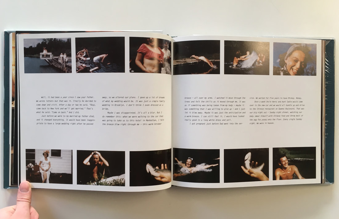
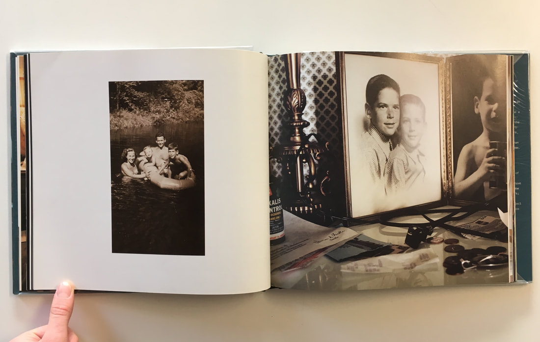
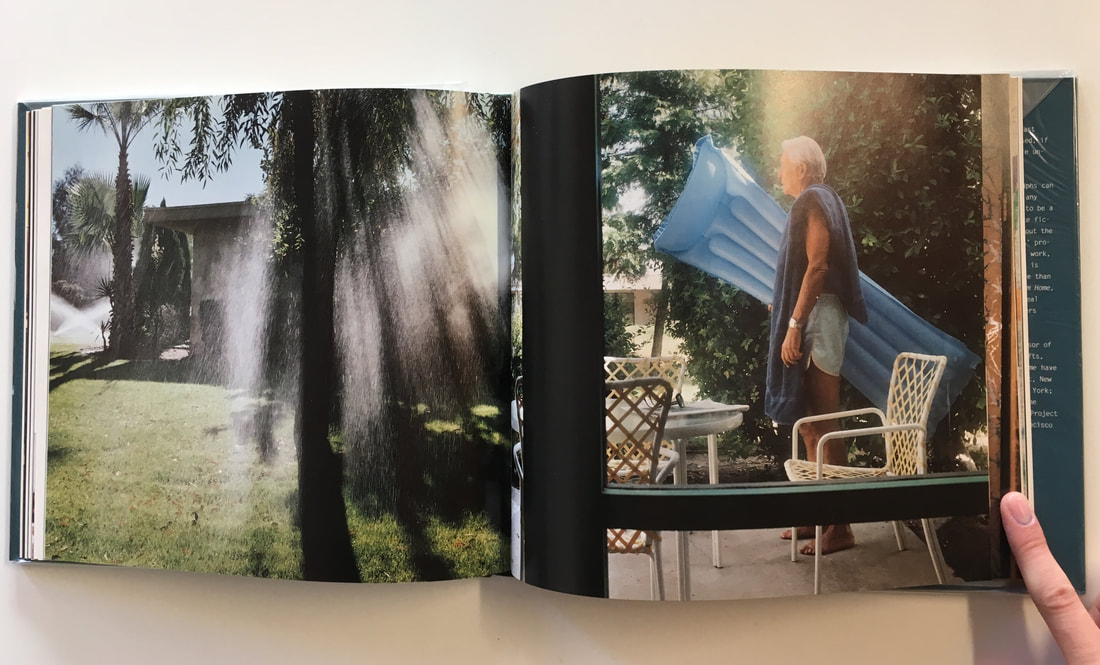
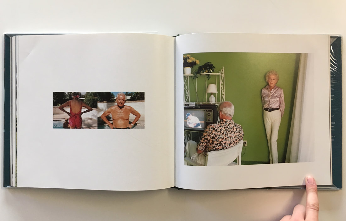
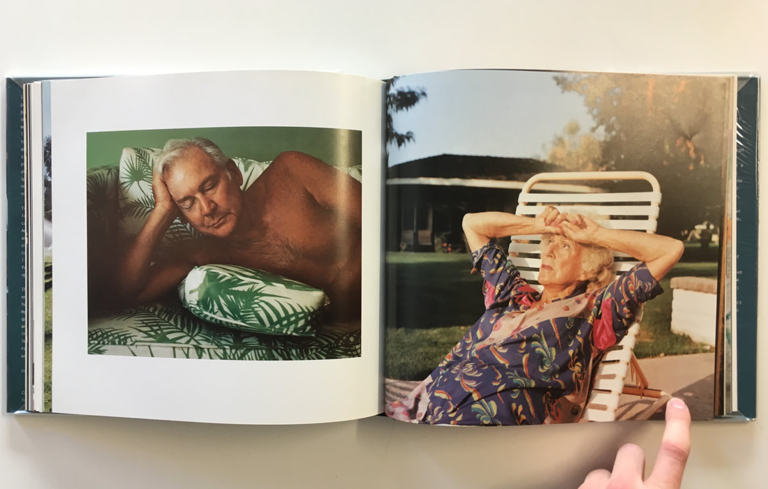
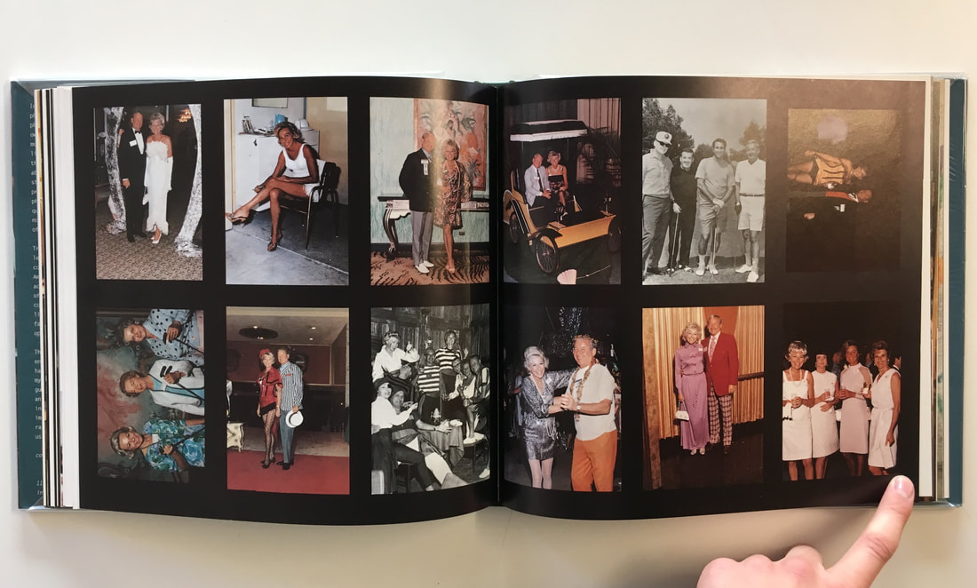
Inspiration: 'For every minute you are angry you lose sixty seconds of happiness' (2005) by Julian Germain
This documentary series by Julian Germain focuses on one man living in Portsmouth, who Germain photographed over a series of 8 years. The man Germain photographed in this series is particularly interested in flowers, with a regular house filled with colour. It was not only the colourful images and the candid portraits that drew me to this photo essay, but also the archives that Germain includes in this series. Whilst also photographing the man in his house and the garden, he also photographs his extensive set of photo archives - the albums of photographs that the man had built up over his life In this series, I liked the contrast between the old albums of memories and the documentation of the man's everyday life. Similarly, I am also planning a documentary series with my grandparents. But I am also planning to focus on their extensive photo albums and archives of old photographs potentially as well.
Gallery of Julian Germain's series:
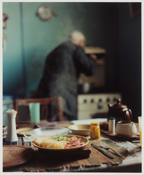
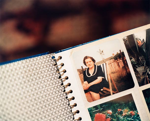
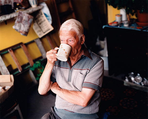
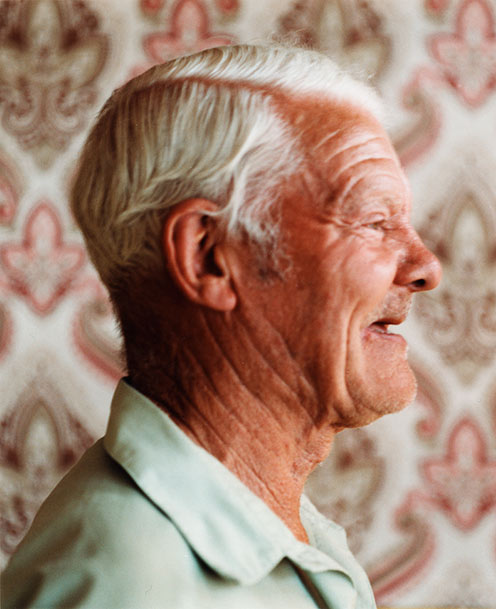
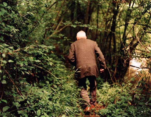
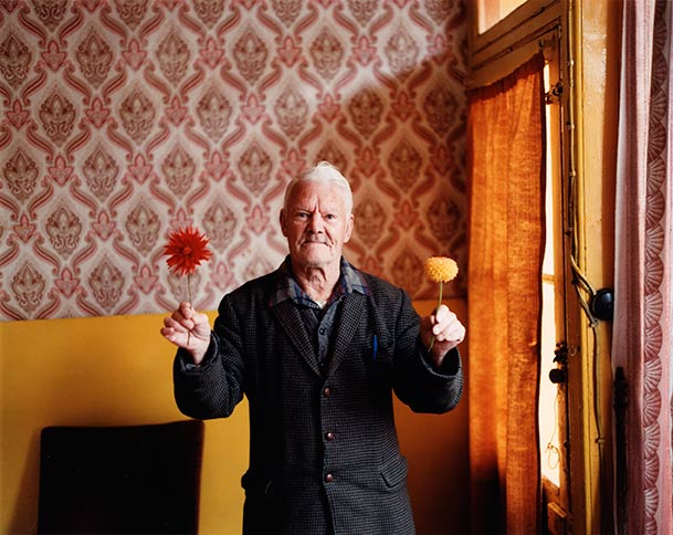
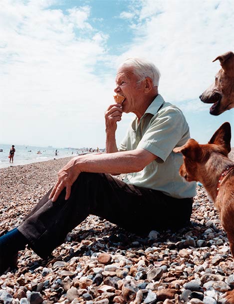
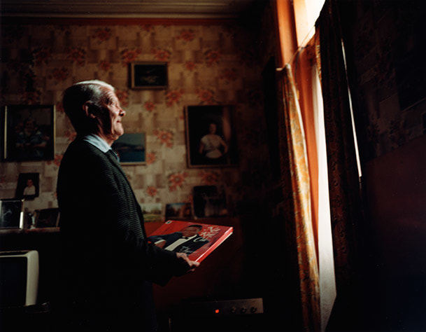
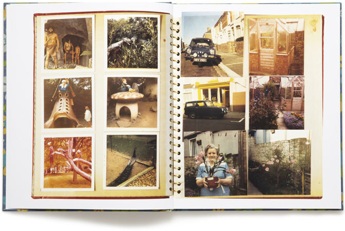
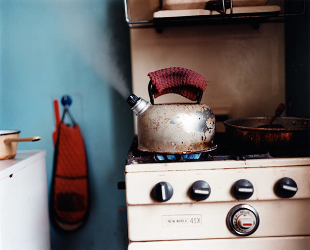
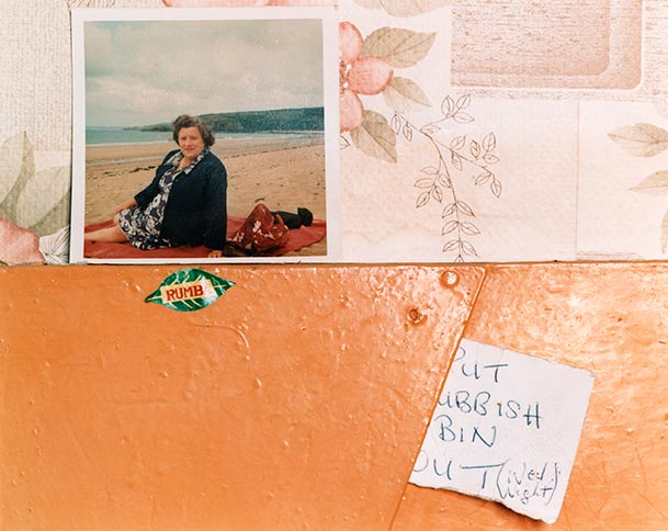
Photographing my Grandparents
Following my research into both Julian Germain and Hannah Lenz's projects, I decided to embark on my own personal project taking inspiration from both photographers. For my project, I chose to photograph both my grandparents. I chose to focus on my granparents as subjects primarily due my my Grandad's keen interest in photography. Recently I inherited my Grandad's Zeiss Ikon Nettar , which he first bought in the 1950s. I also recently discovered the huge range of family albums of my grandparents when they were young, with many of the photographs being taken by this Zeiss Ikon that I inherited. My main idea was to re-photograph my grandparents with the zeiss Ikon that I inherited, using medium format film. Not only this, but I could also photograph the village that they live in, as well as details around their house. Following this, I could then pair the original photographs taken by my grandad in the 1950s alongside the photographs taken by myself, with the same camera.
Zeiss Ikon Nettar + B&W Medium format 120mm film
Zeiss Ikon Nettar (with Novar 75mm f4.5 lens)
|
Ilford Delta 120mm ISO 400 B&W film
|
This is the camera I inherited from my grandad, and the camera I used for this project. As the camera is over 60 years old, it was quite challenging to use to begin with. For this project, I used Ilford ISO 400 Black & White medium format film; I chose black and white as I am able to experiment with black and white film in my darkroom at school. I decided to use ISO 400 film as the light available was quite limited - ISO 400 film is more sensitive to light meaning that I could shoot at faster shutter speeds in the limited light available. Not only this, but I mounted the camera on a tripod to ensure that the camera was steady when I was photographing. It was quite difficult when photographing as the viewfinder (which I looked through to compose the image) wasn't connected to the lens - it was a separate element to give a rough impression of the focal length of the lens. Therefore, I couldn't focus by looking through the lens; I had to judge the distance from my subject and focus based on the number of feet I was from the subject (I could focus changing the amount of feet, as displayed on the lens focus ring on the lens). I also had to use my digital camera to test the exposure settings, as the Zeiss Ikon was fully manual in terms of exposure settings.
My medium format photographs:
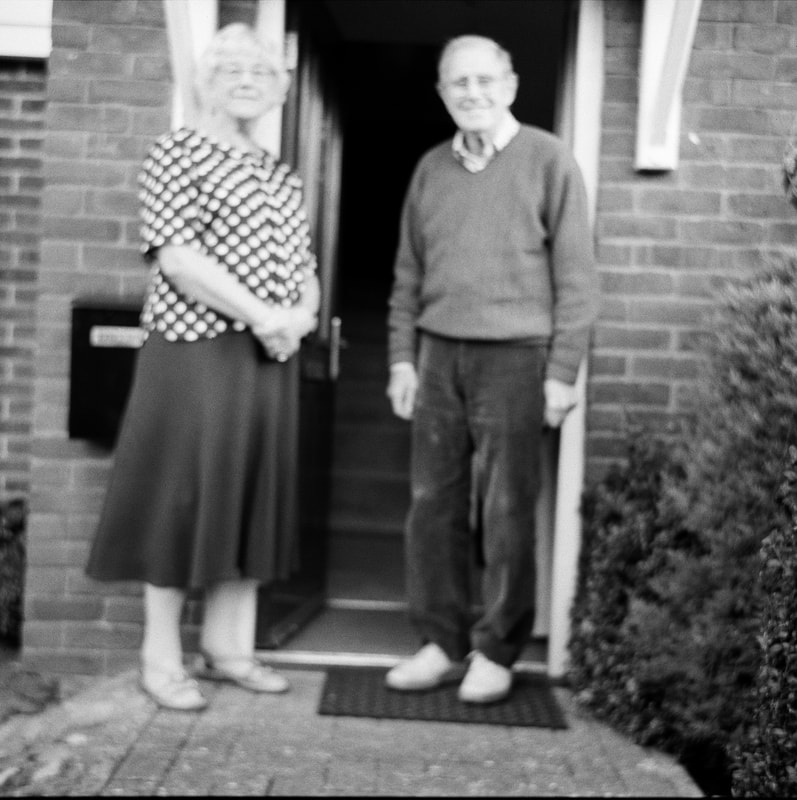
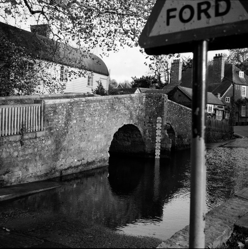
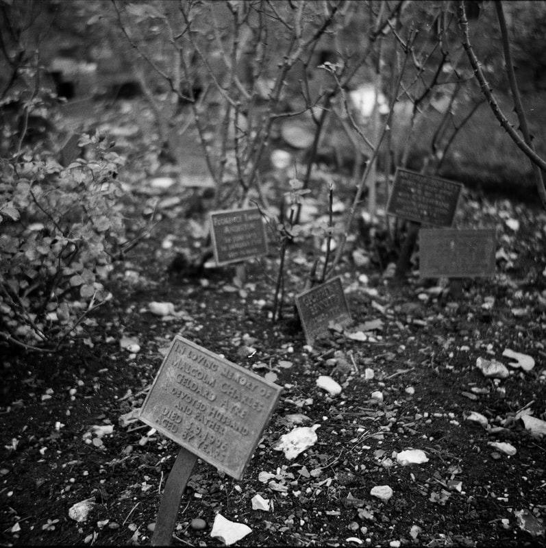
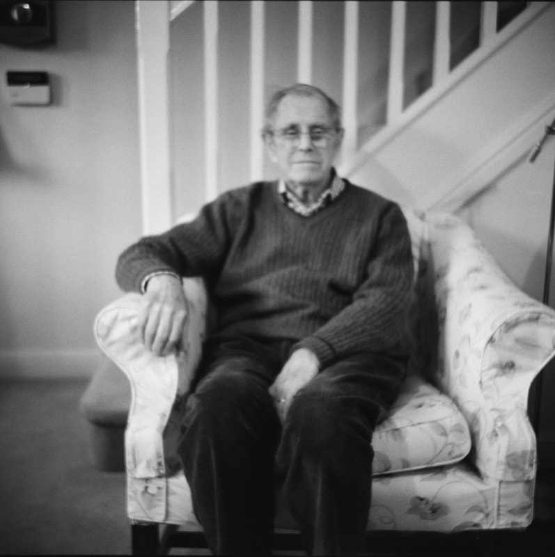
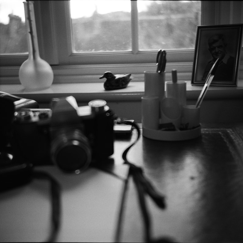
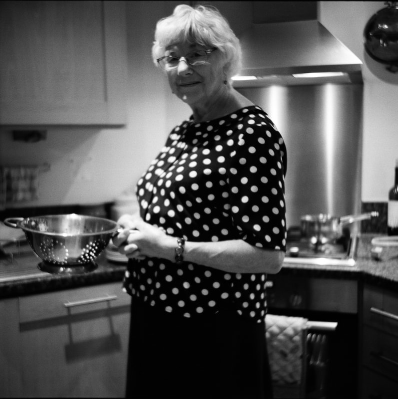
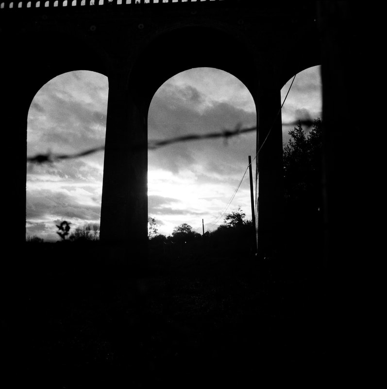
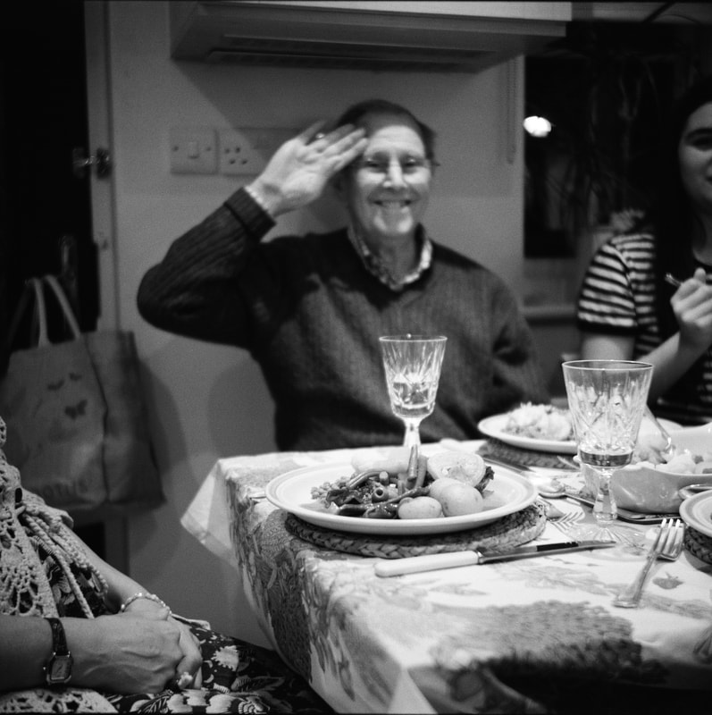
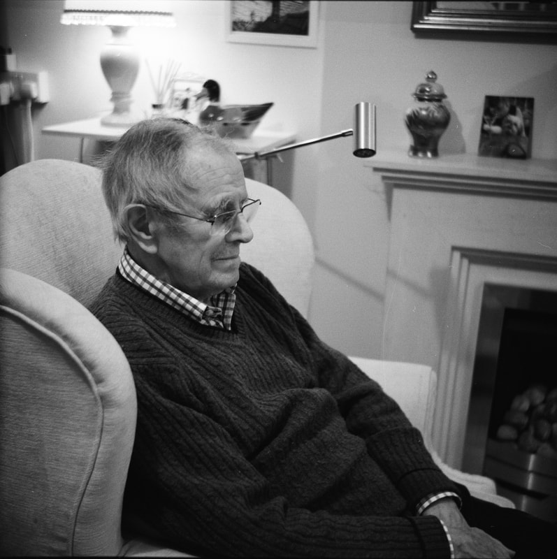
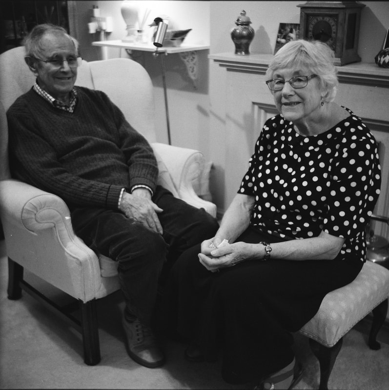
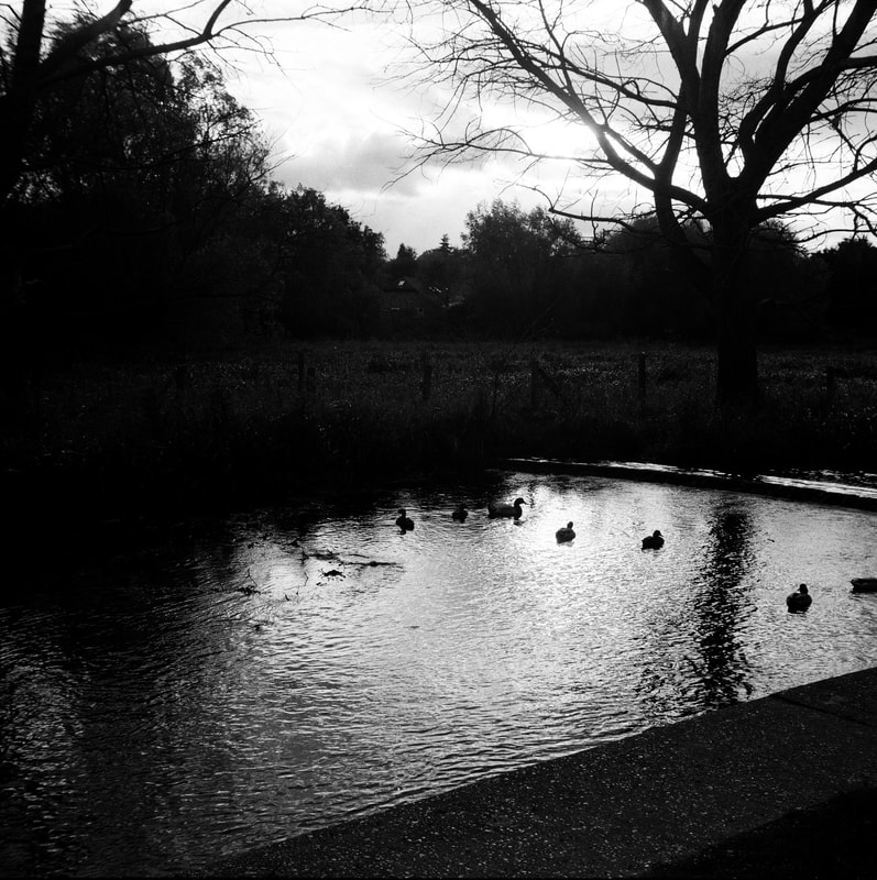
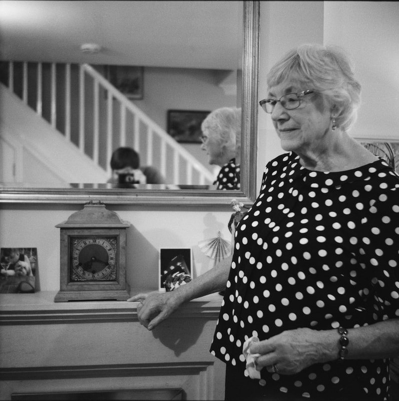
Evaluation
Overall, I am very happy with the outcome of these medium format photographs. Considering how old the camera is, and the difficulties of using such primitive equipment, I think the results of this project have come out very well. As a narrative and series as a whole, I think that the set of images I have produced work quite well together. I think that the variation of photographs (the portraits, the photographs of their village as well as photographs of details around their house) work well as a varied set of photographs. I think this provides quite an effective documenting series/narrative focusing on them. Not only this, but I was also very pleased with the quality of the photographs. The black and white film produced strong tonal contrast, and sharp rendition. Not only this, but he grain from the ISO 400 film wasn't too bad. Although I had to focus by judging the number of feet from my subject, the majority of my photographs are quite sharp and in focus. Although the first image I took was slightly out of focus (I hadn't quite got used to focusing on the camera), the rest of the images were sharp. I'm also glad that I chose to use a tripod, as it meant there was no problem with camera shake blurring. I think that the portraits were especially effective - engaging with my grandparents to arrange and compose these photographs. They appear quite sensitive in a way, shot in black and white.
Archive photographs:
Following my medium format series focusing on my grandparents and their surroundings, I subsequently photographed their archives of photographs. These photographs were taken by my grandparents in the 1950s, soon after they met. Not only this, but these photographs were taken with the same Zeiss Ikon camera that I inherited, and the same camera I used for the own documentary series of my grandparents. In effect, I documented my grandparents with the same camera, but over 60 years since they took these photographs with the same camera. I took these images of their archives as I thought that it would be interesting to compare the photographs of them taken over 60 years ago, with the photographs taken now. It could be interesting to compare these archive photographs with my project, comparing how they have changed over time. I could experiment with both my medium format images alongside the archive images - there are a wide range of different ways I could experiment, display or play with my varied set of images.
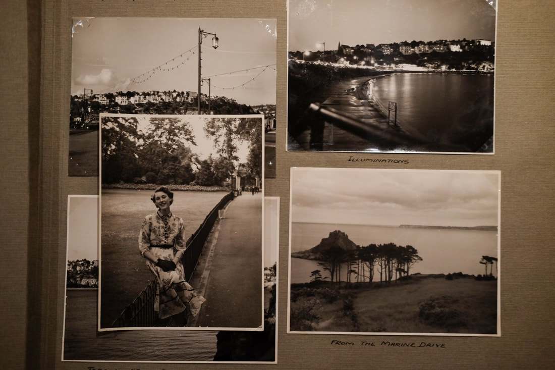
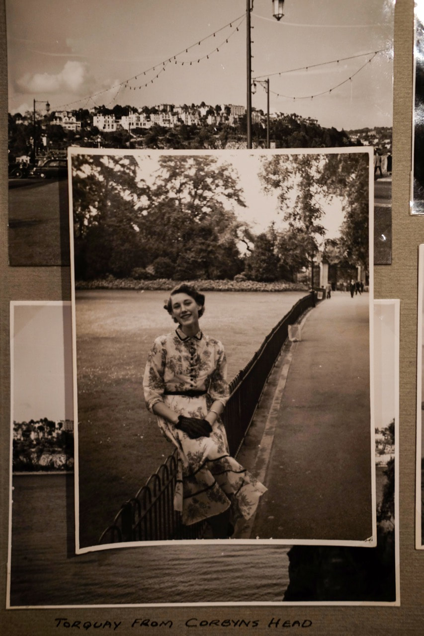
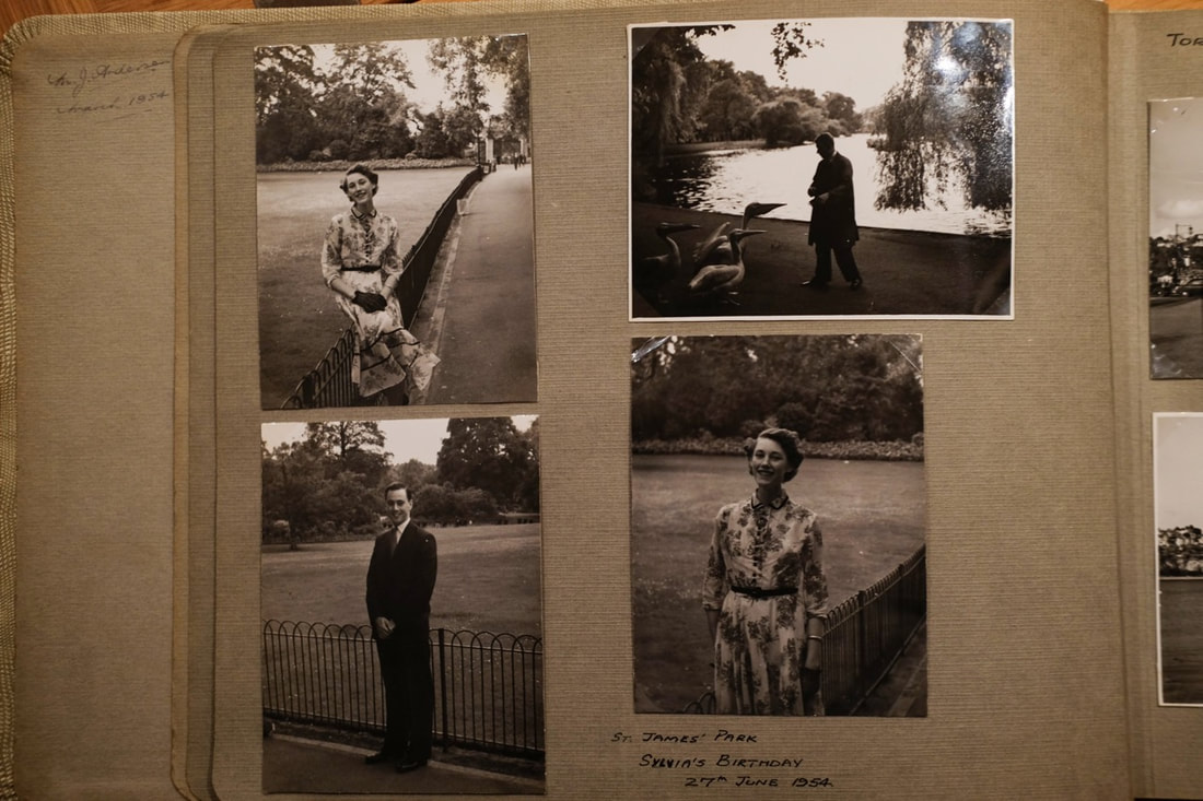
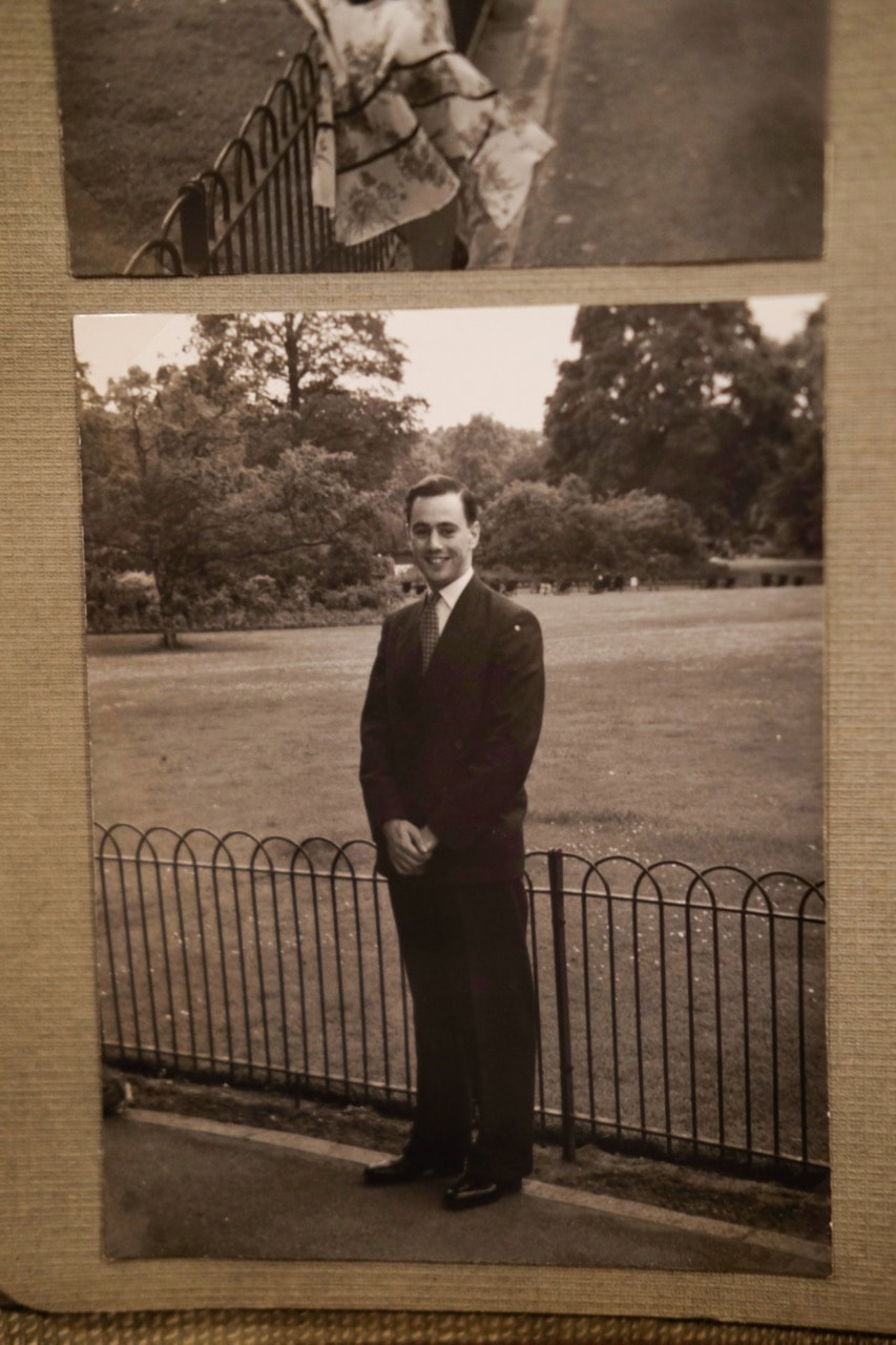
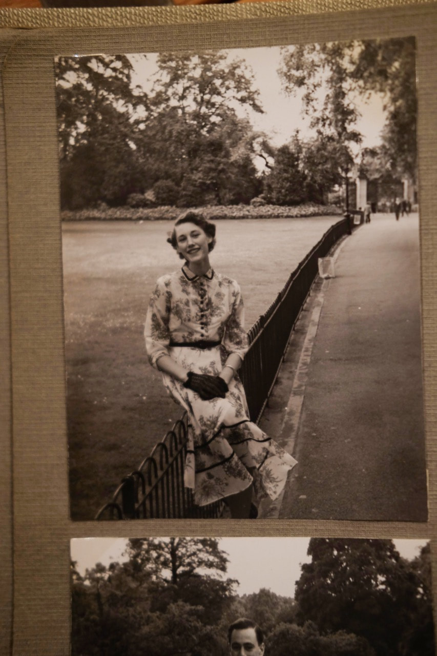
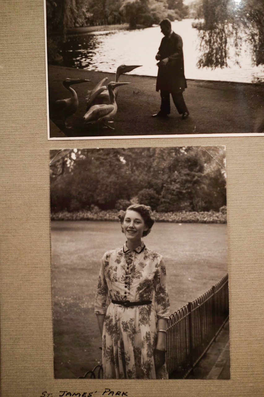
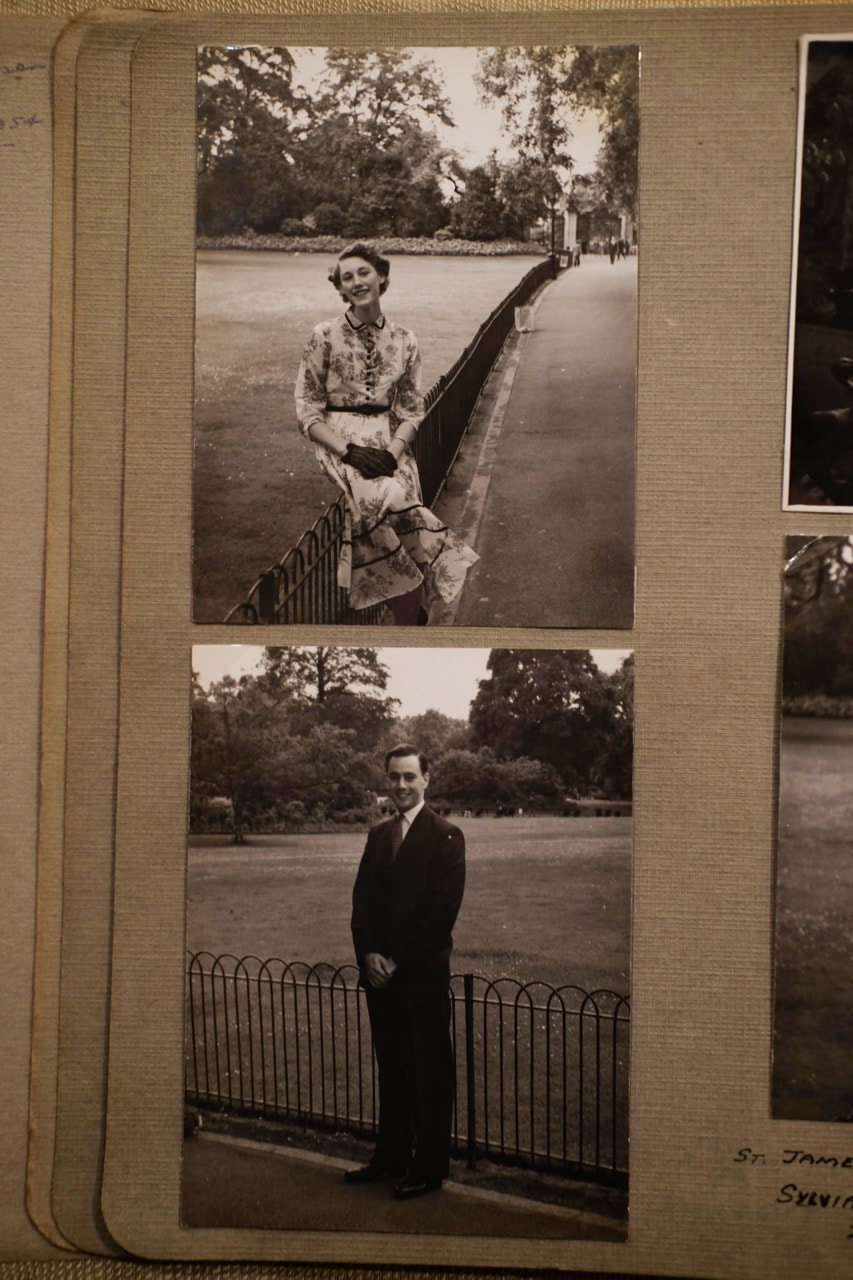
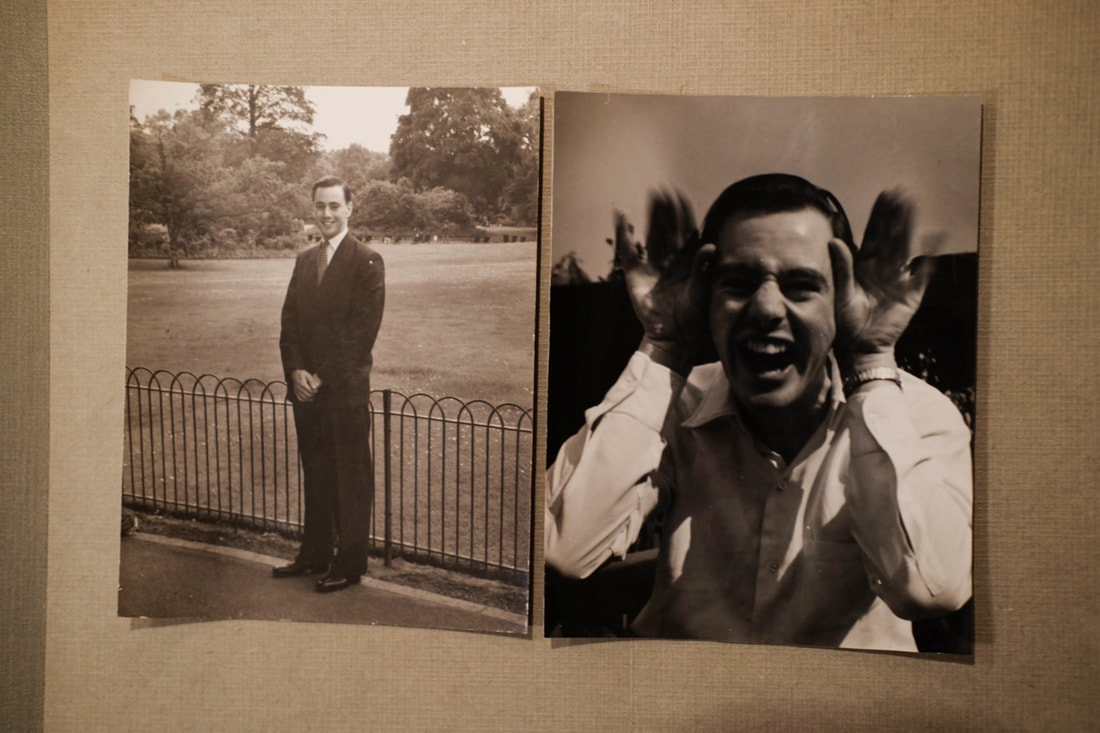
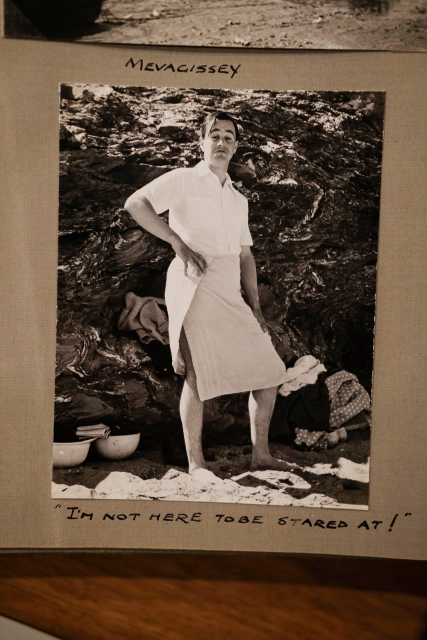
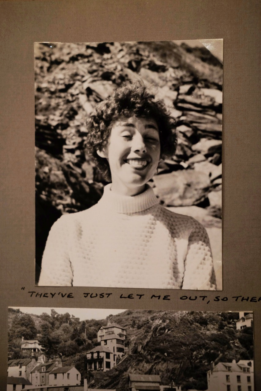
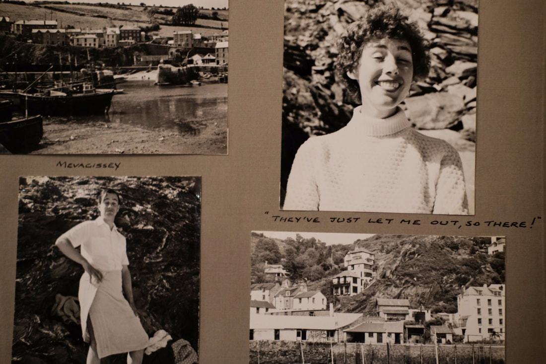
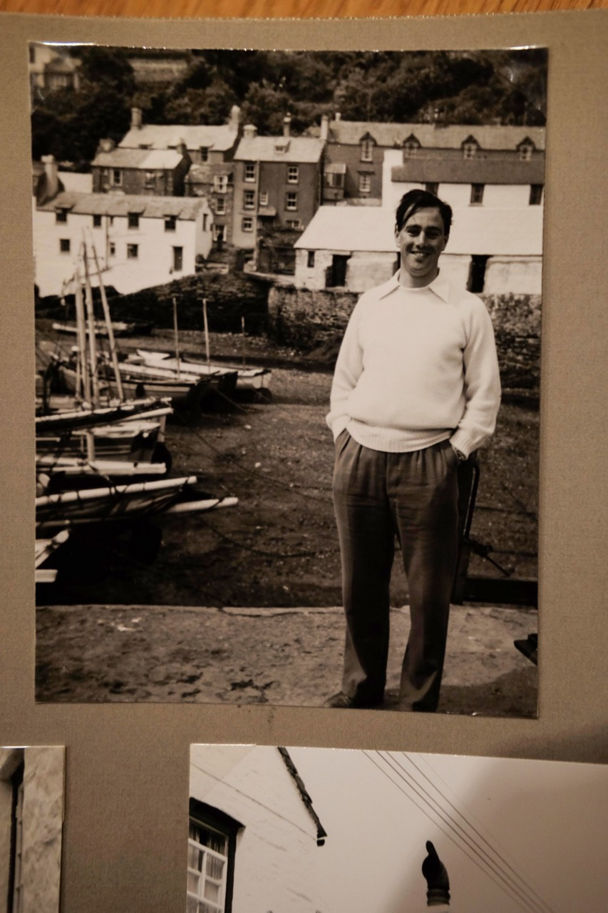
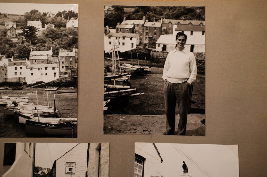
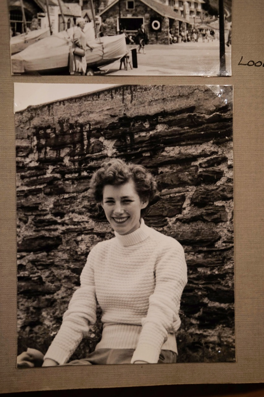
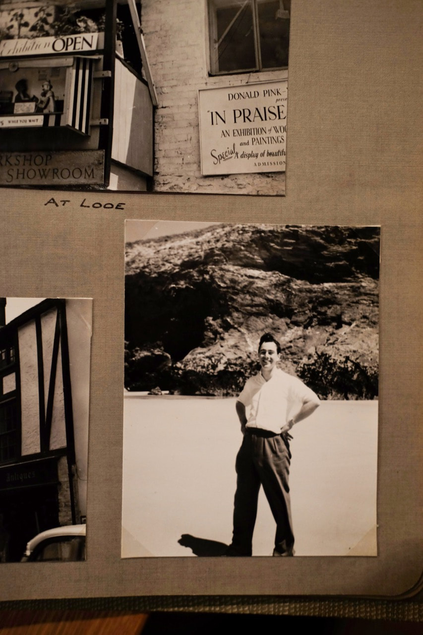
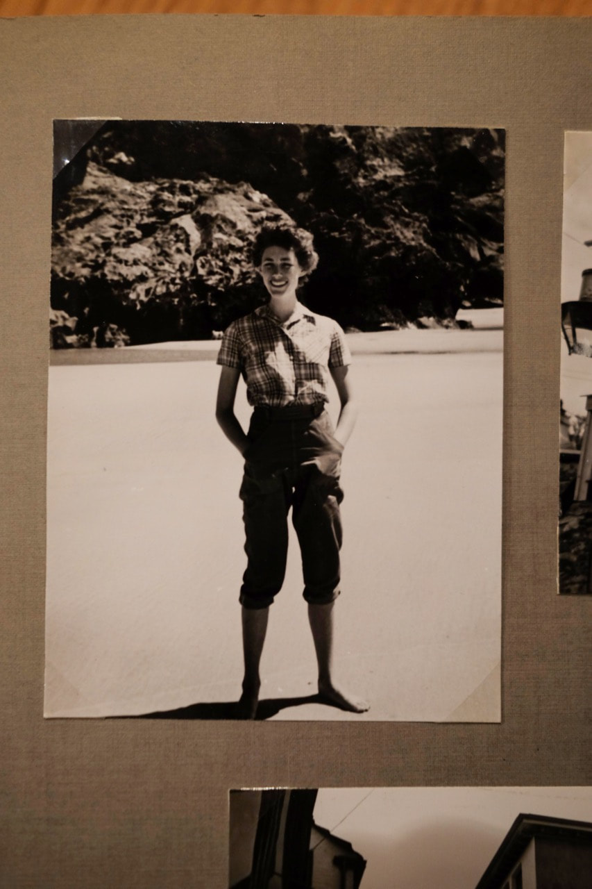
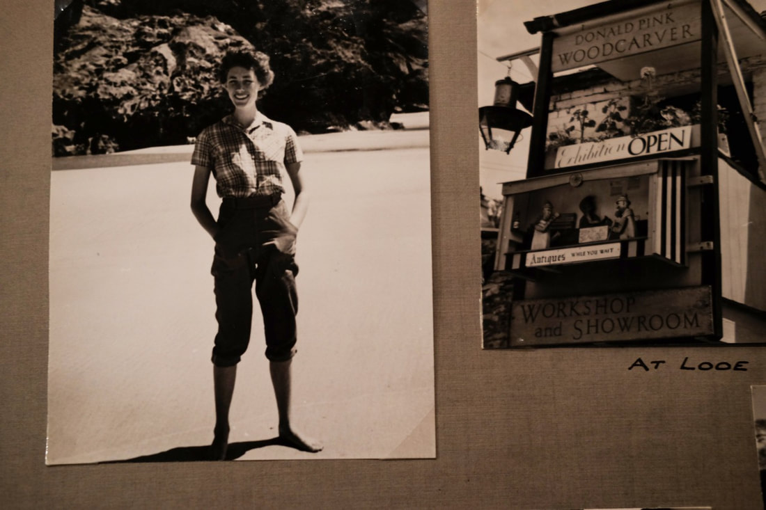
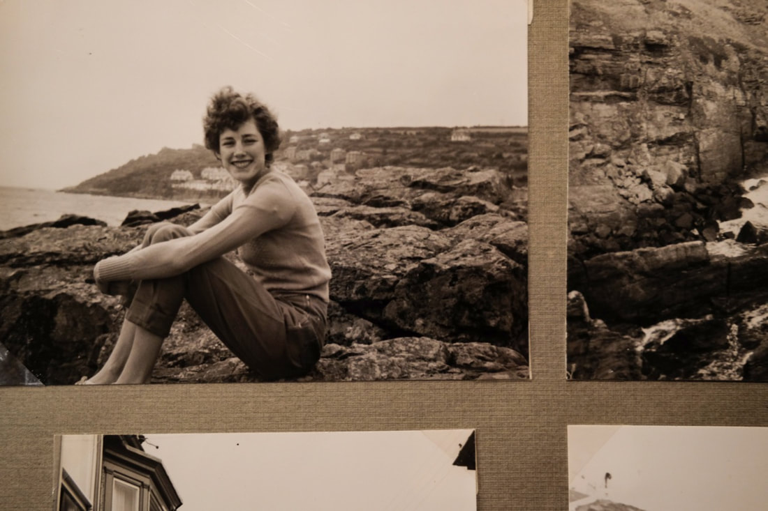
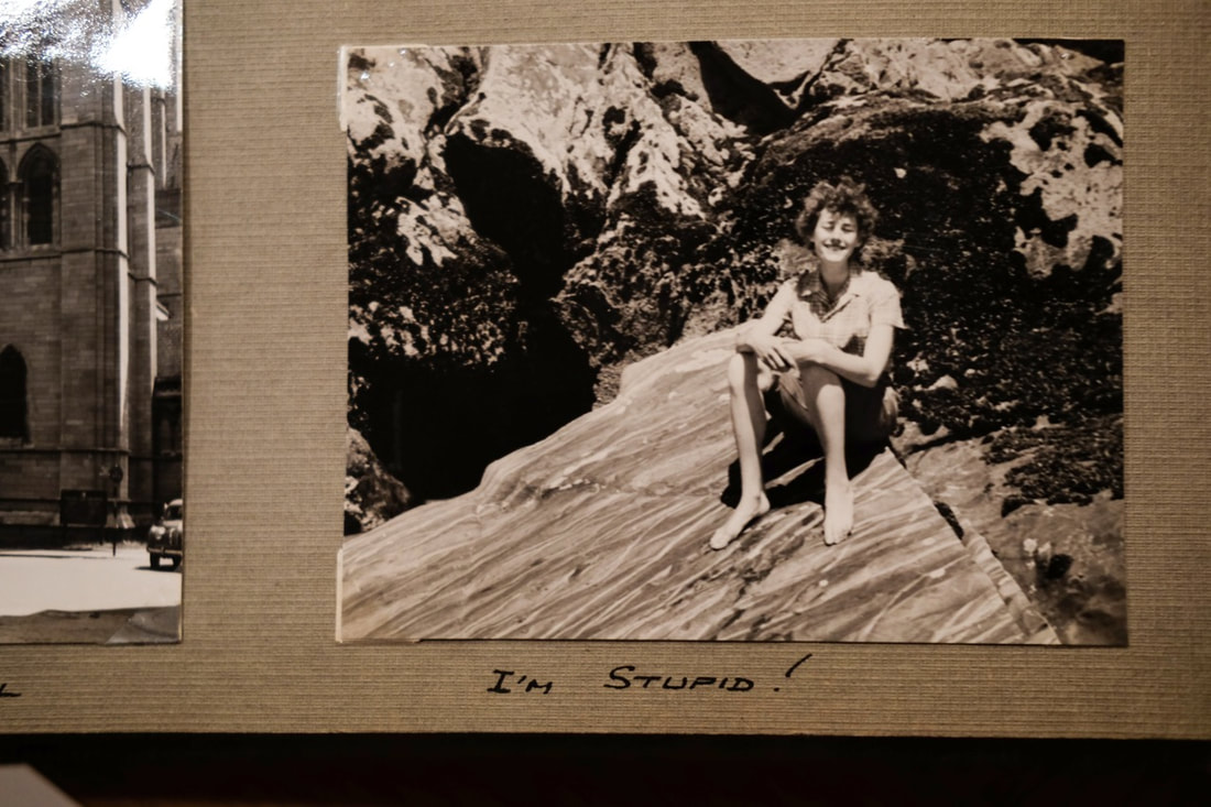
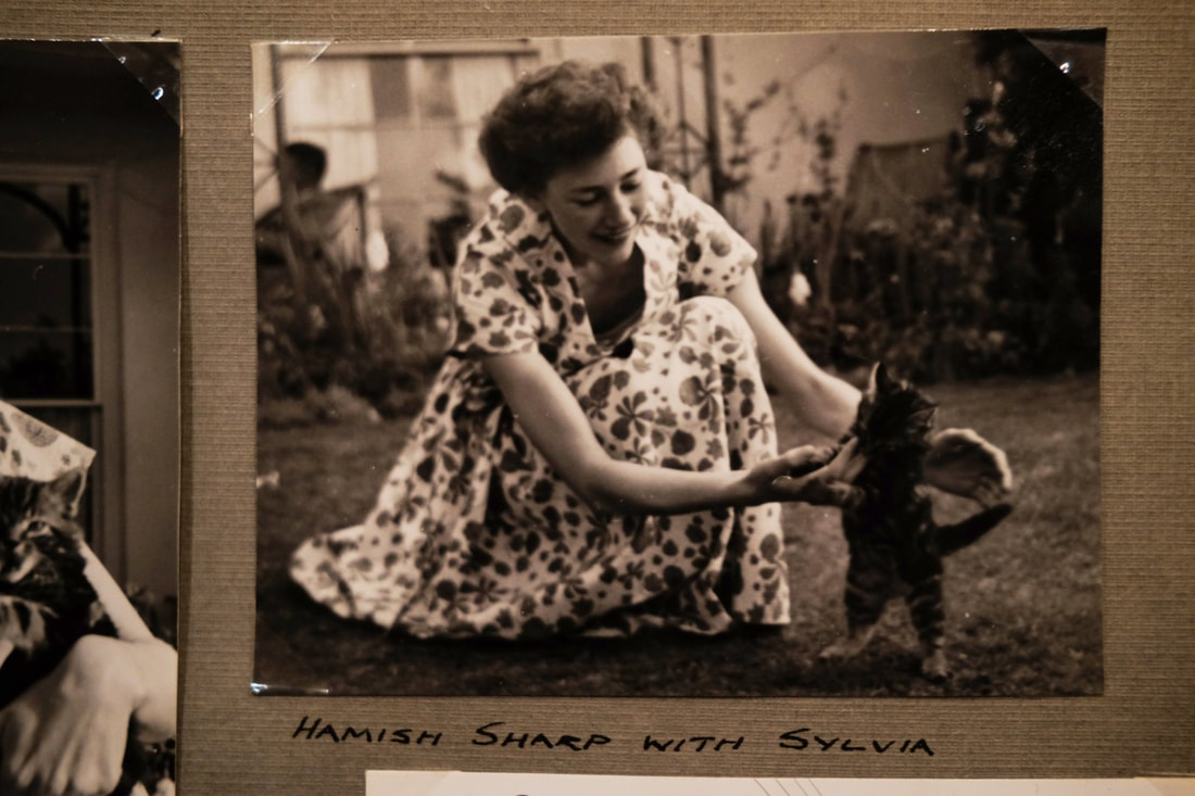
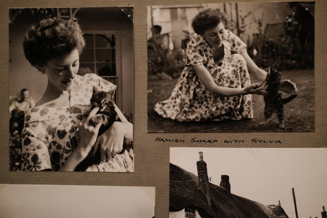
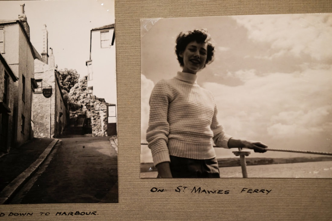
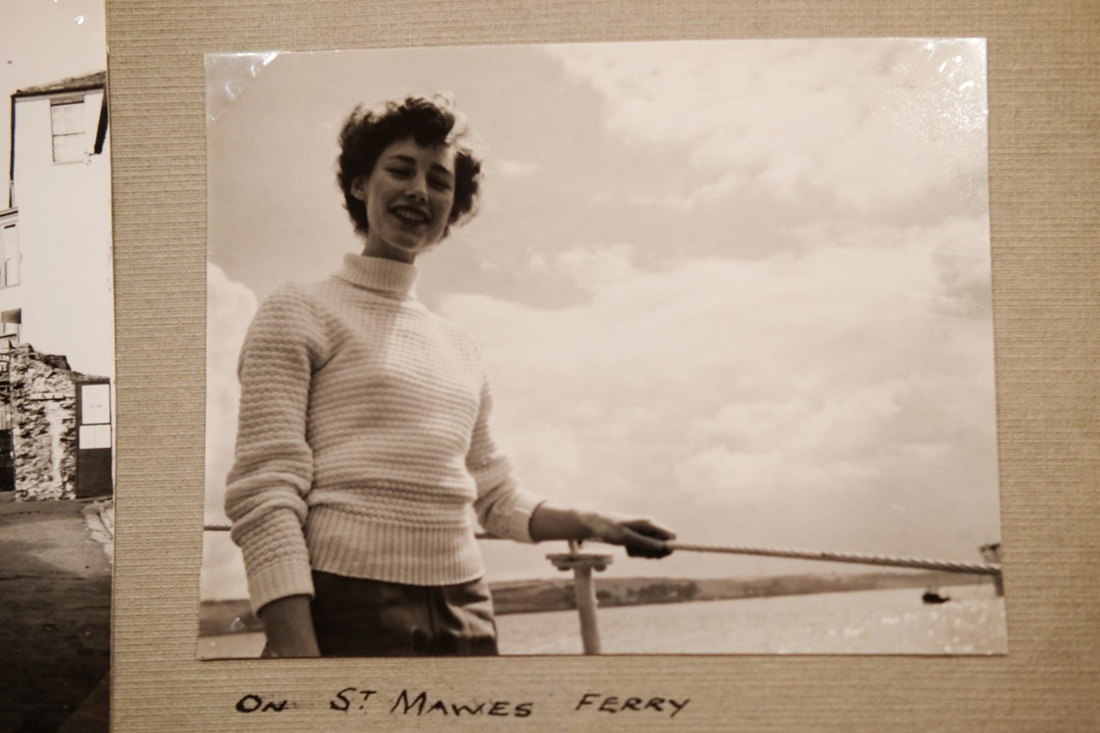
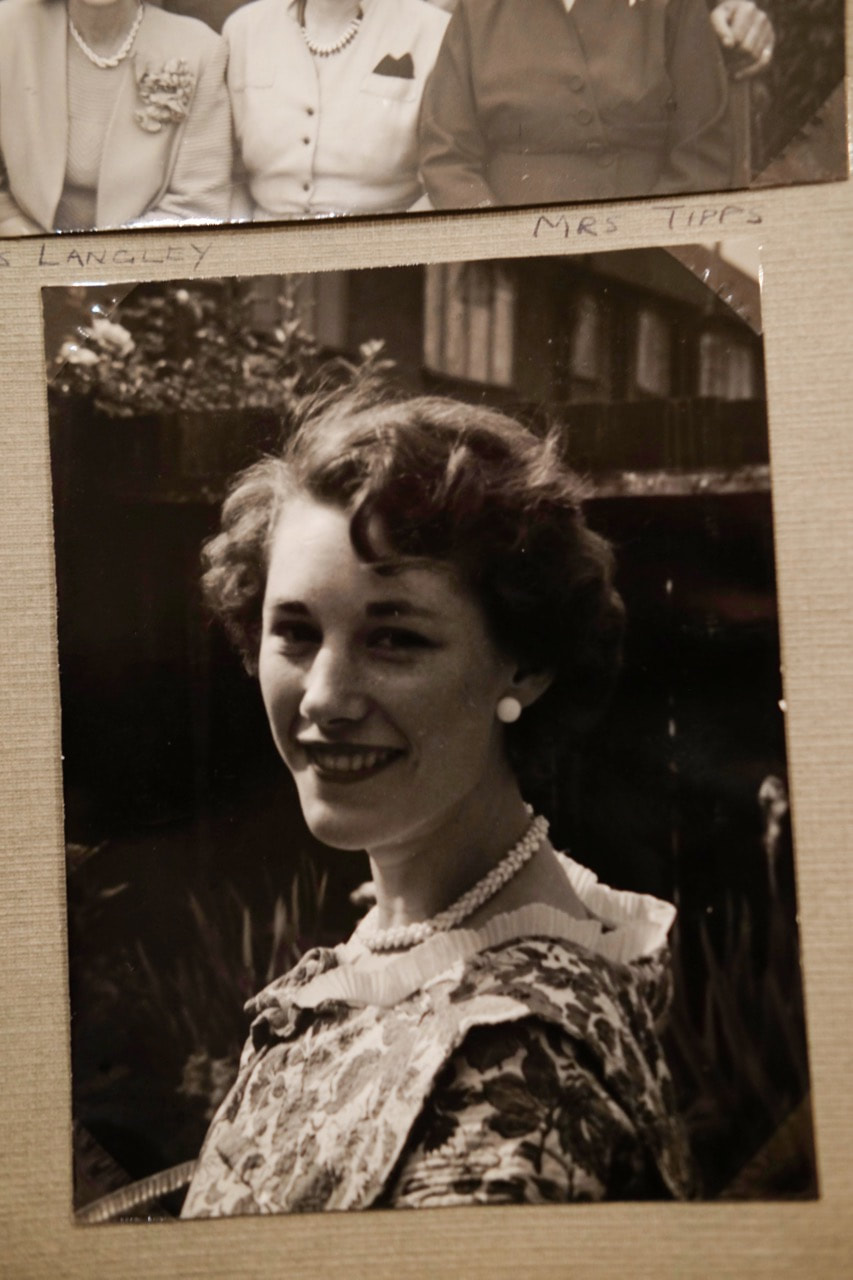
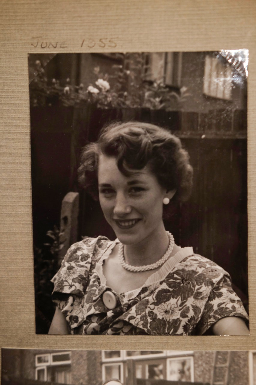
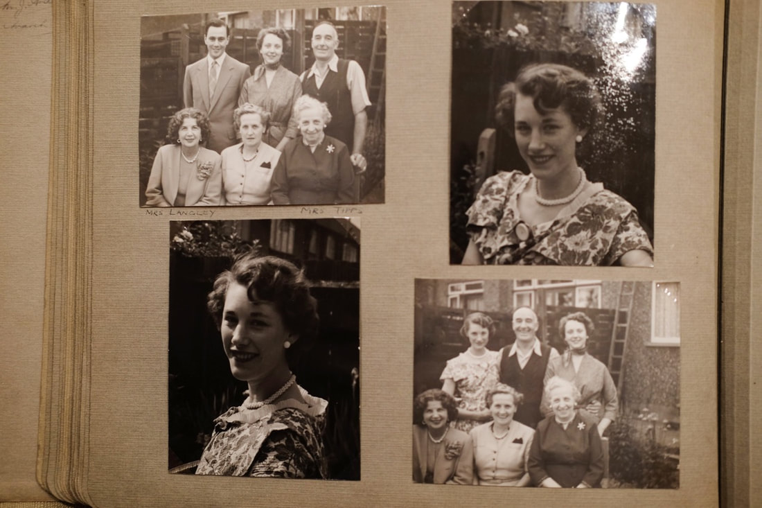
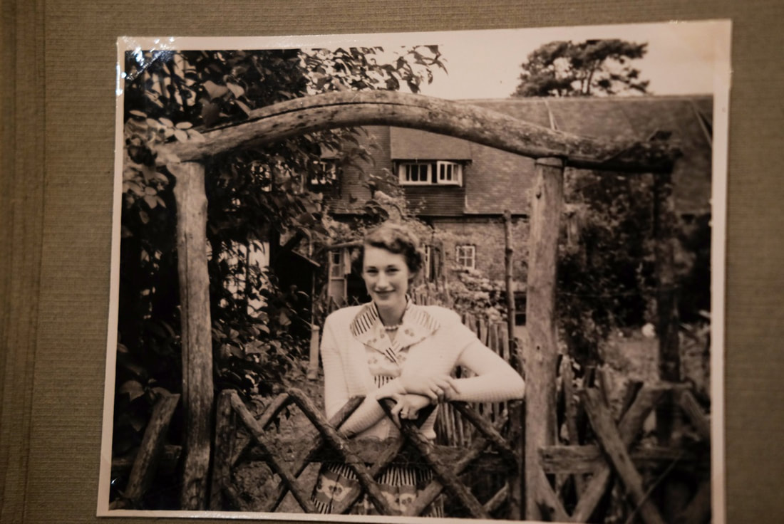
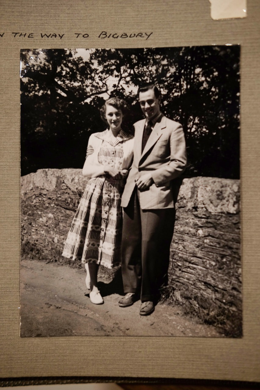
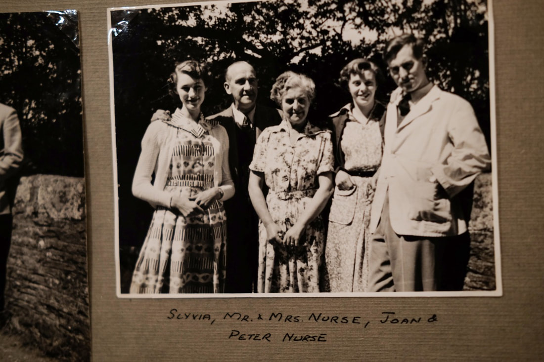
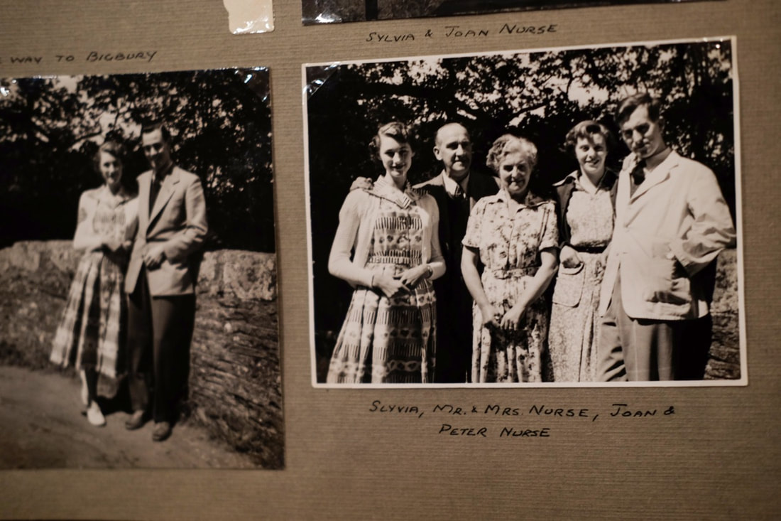
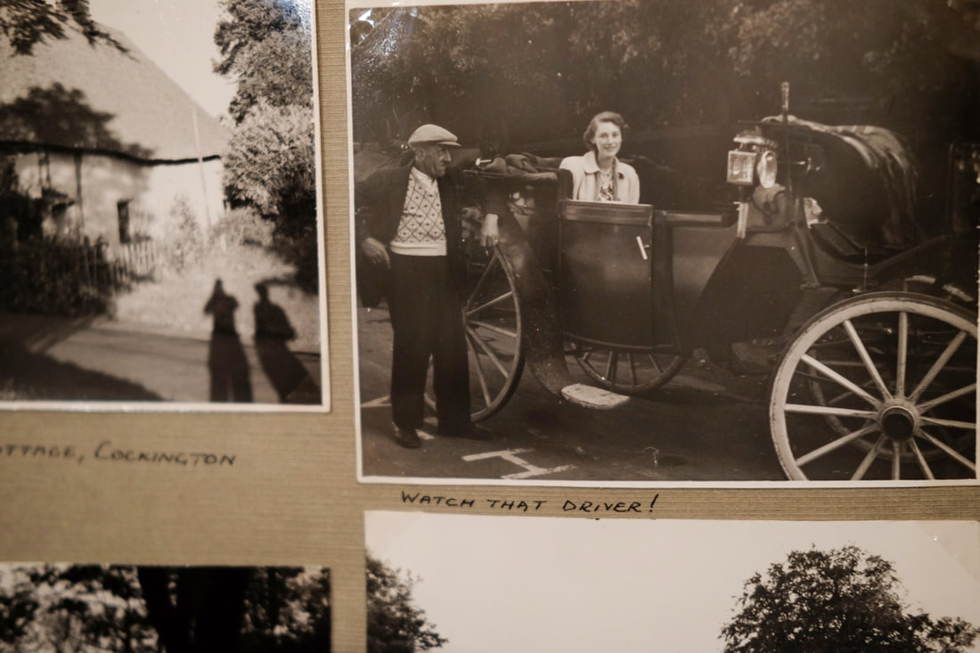
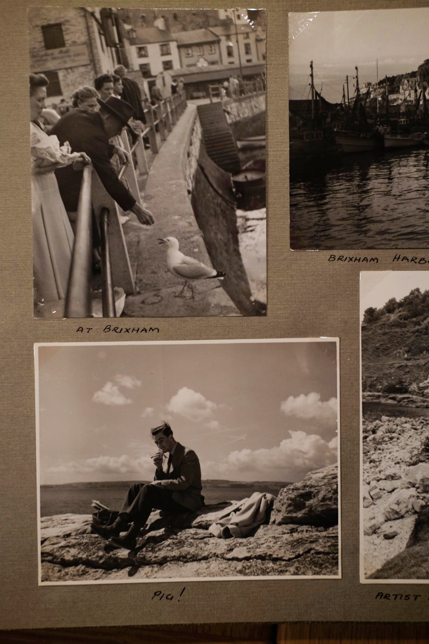
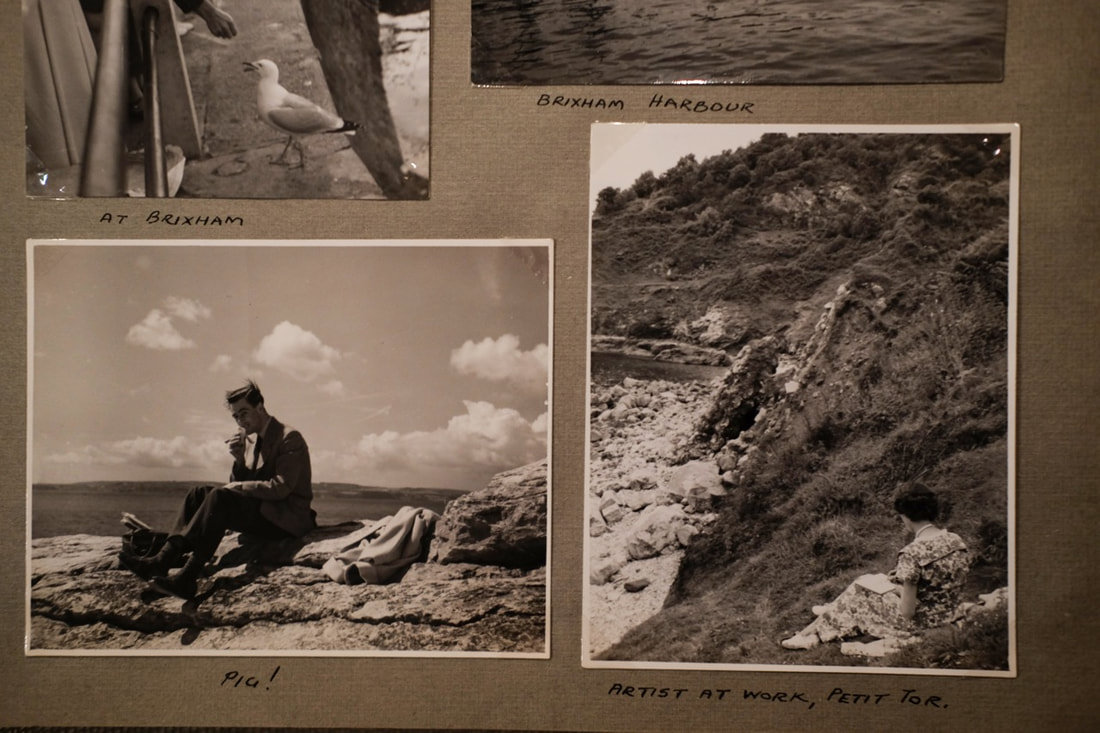
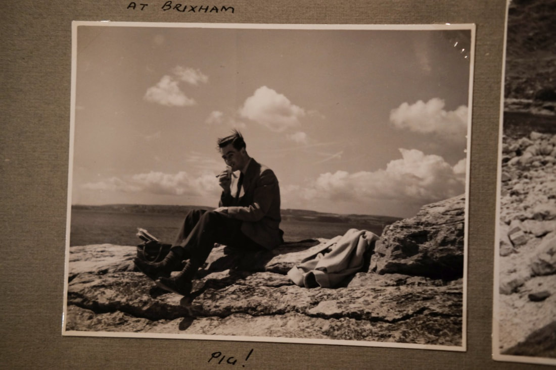
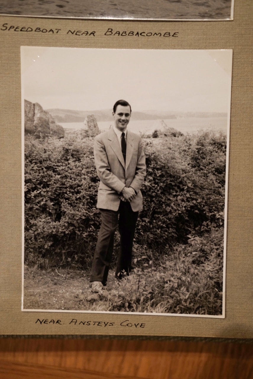
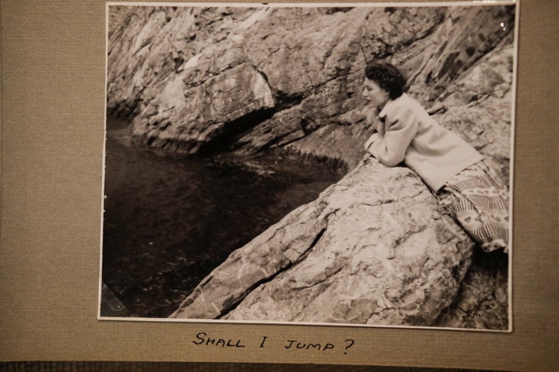
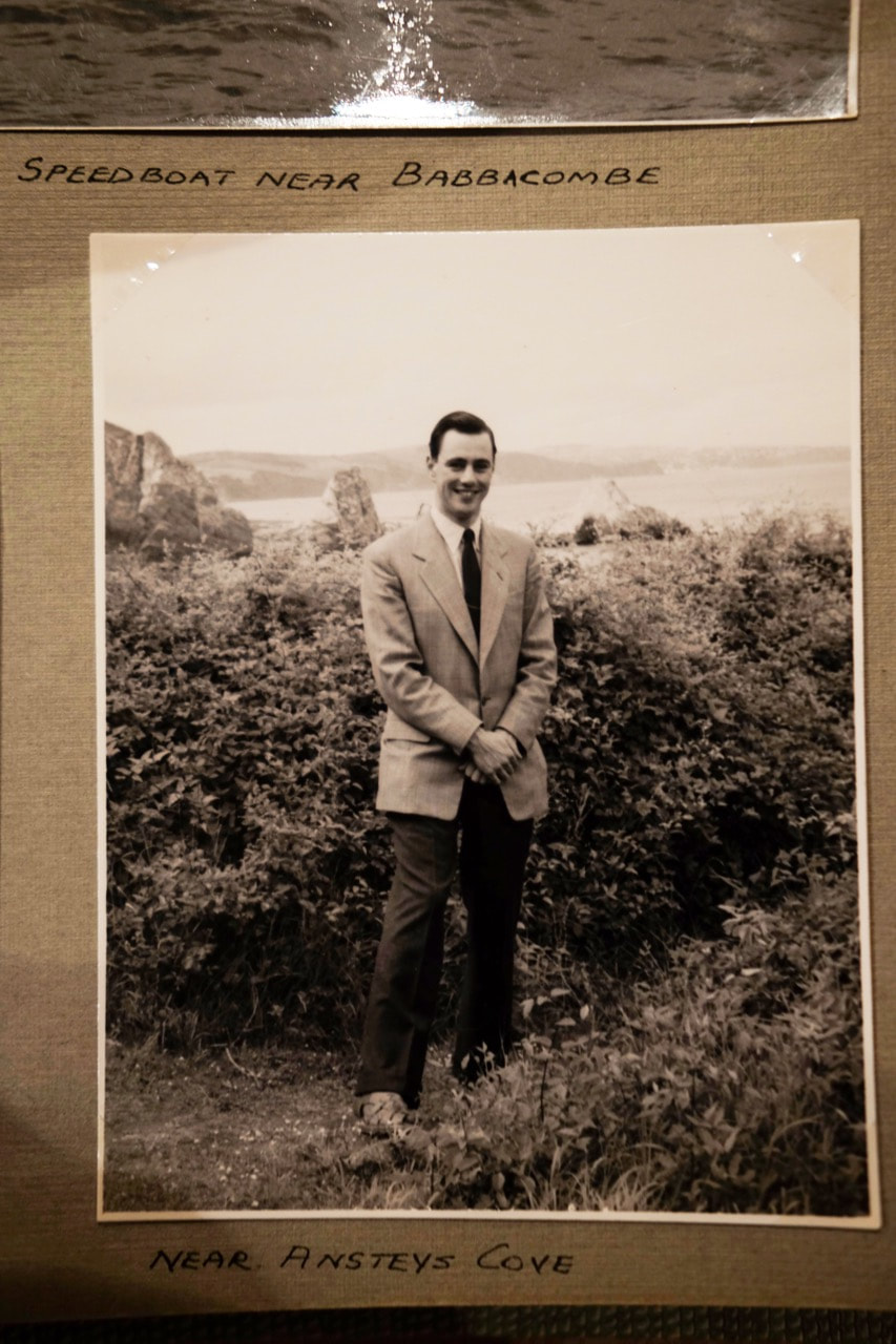
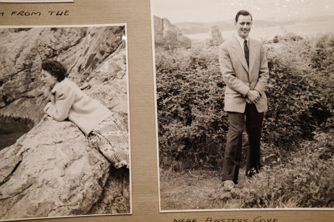
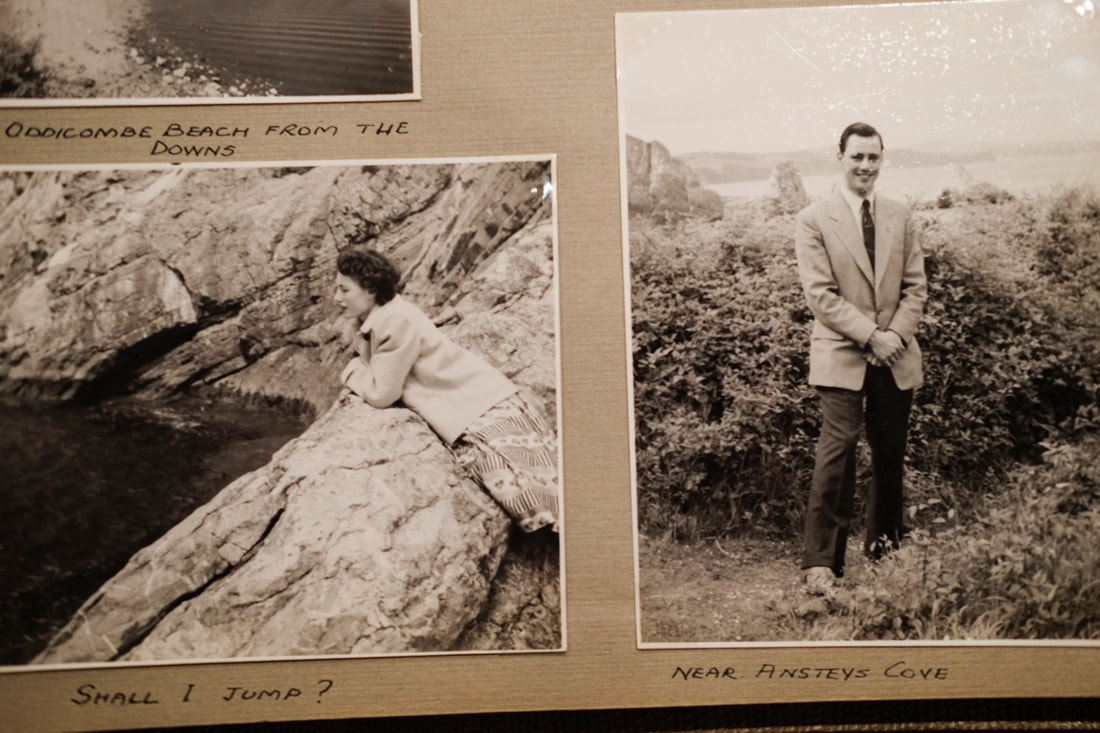
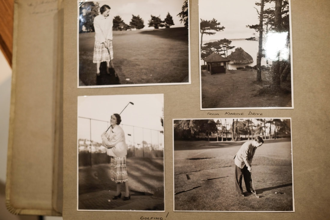
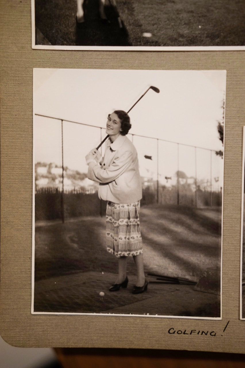
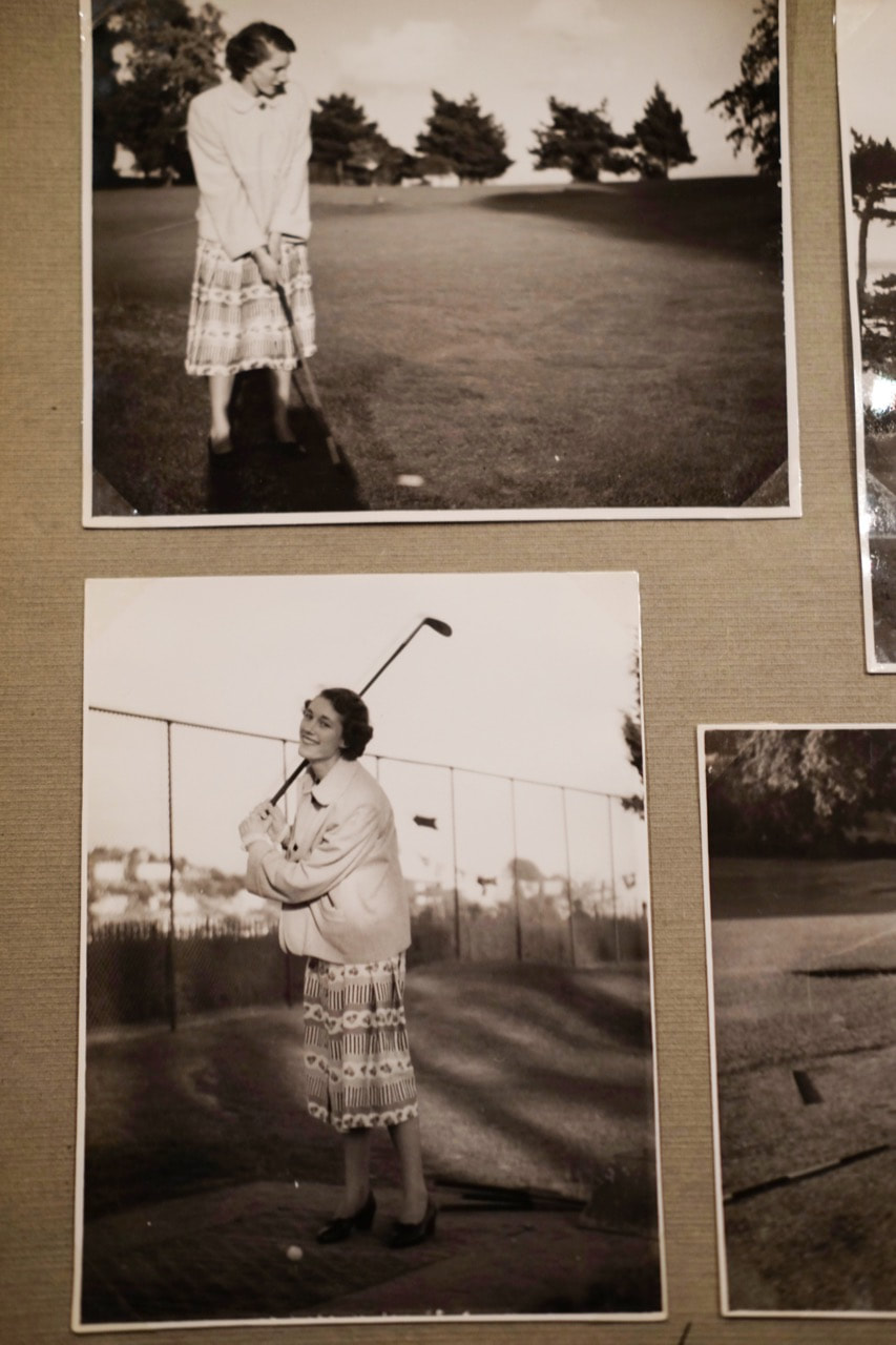
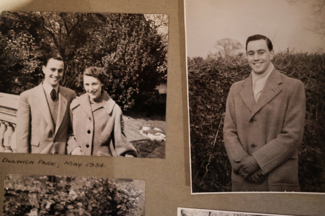
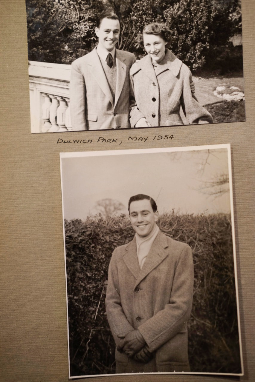
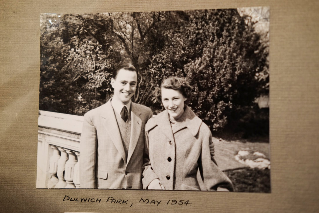
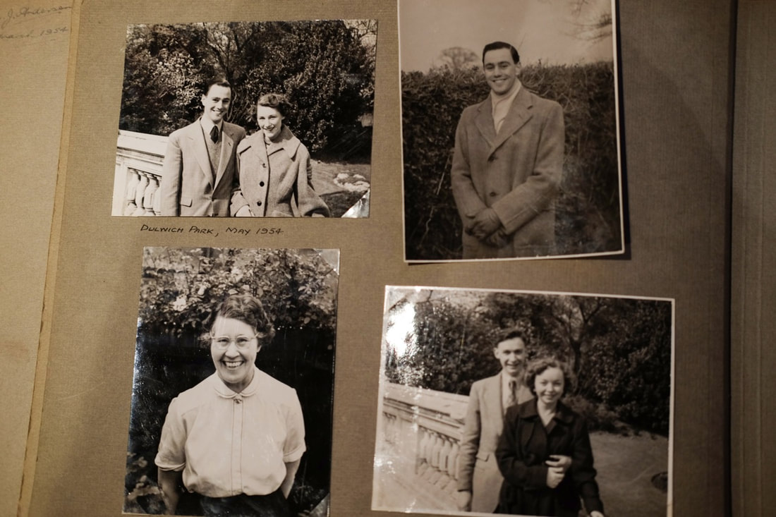
Anouk Kruitof: The Bungalow
After thinking about how I could arrange my photographs, I looked at Anouk Kruitof's book. In this book, Kruitof arranges manipulated and layered images, which she developed a relationship with when she moved into a bungalow. In this book, Kruitof investigates human conception, thinking about the digitisation of images particularly. Moreover, she investigates memories as well as our relationship to images, especially the way in which we can 'process our image memory'. I was very interested by Kruitof's book, especially in terms of the visual arrangement and treatment of images. I especially like Kruitof's arrangement of digital images, where she has overlapped and arranged images digitally, and screenshotted the arrangement, including the dotted lines and edges of boxes for cropping images. It made me reconsider these archival images, particularly the way that they are layered on top of each other - like piles of archival images. On other pages, Kruitof has distrupted images, cutting out sections or adding text and zooming into digital files. The arrangement and way she had arranged this wide range of digital images could be a key source of inspiration - I would like to play with layering images, particularly layering or displaying the archival images alongside my photographs of my grandparents.
Gallery of Anouk kruitof's book:
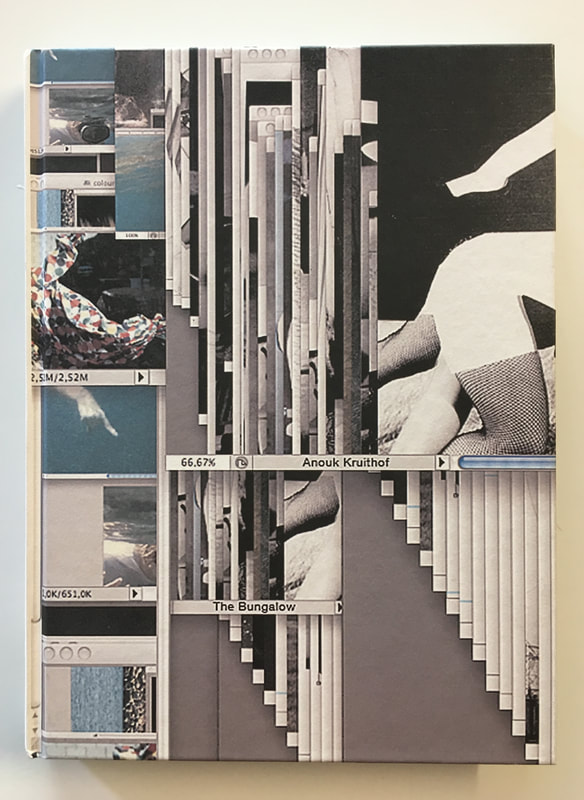
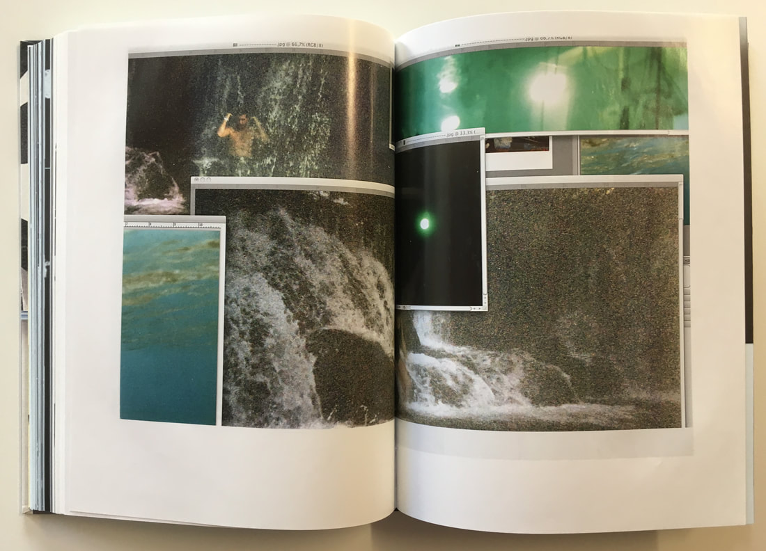
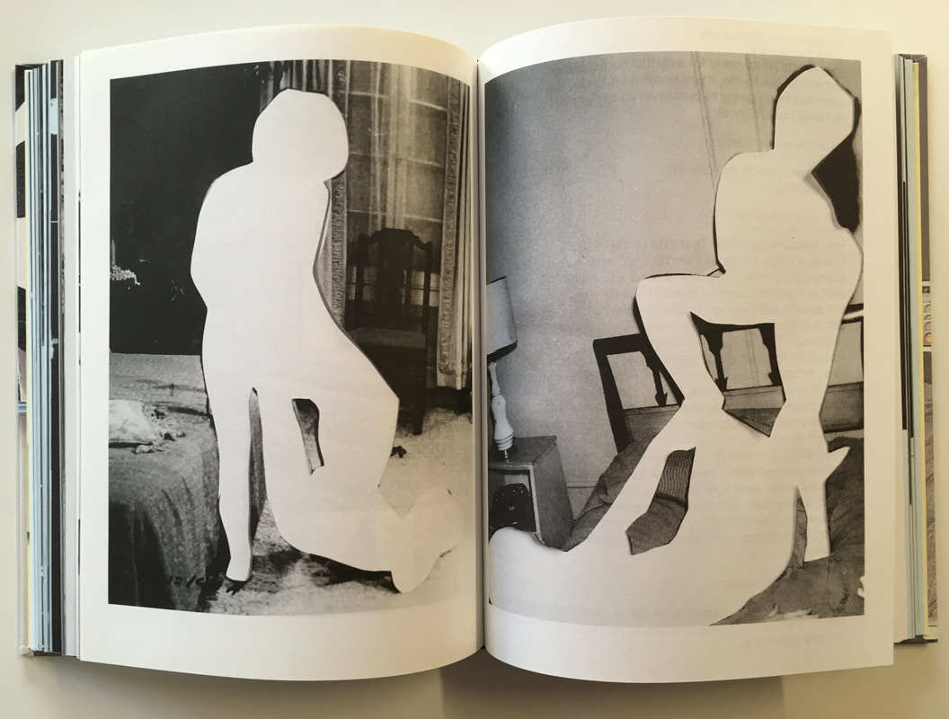
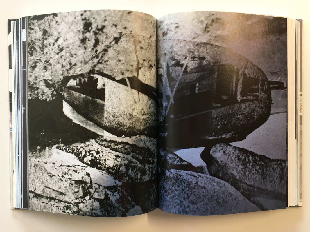
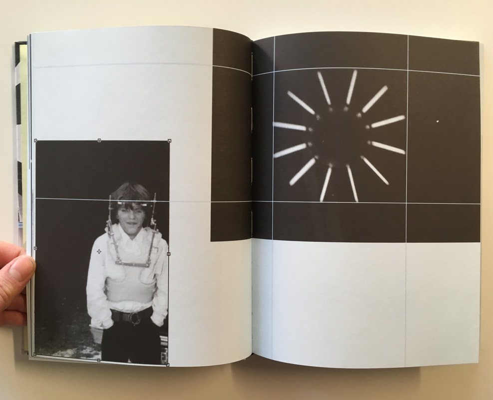
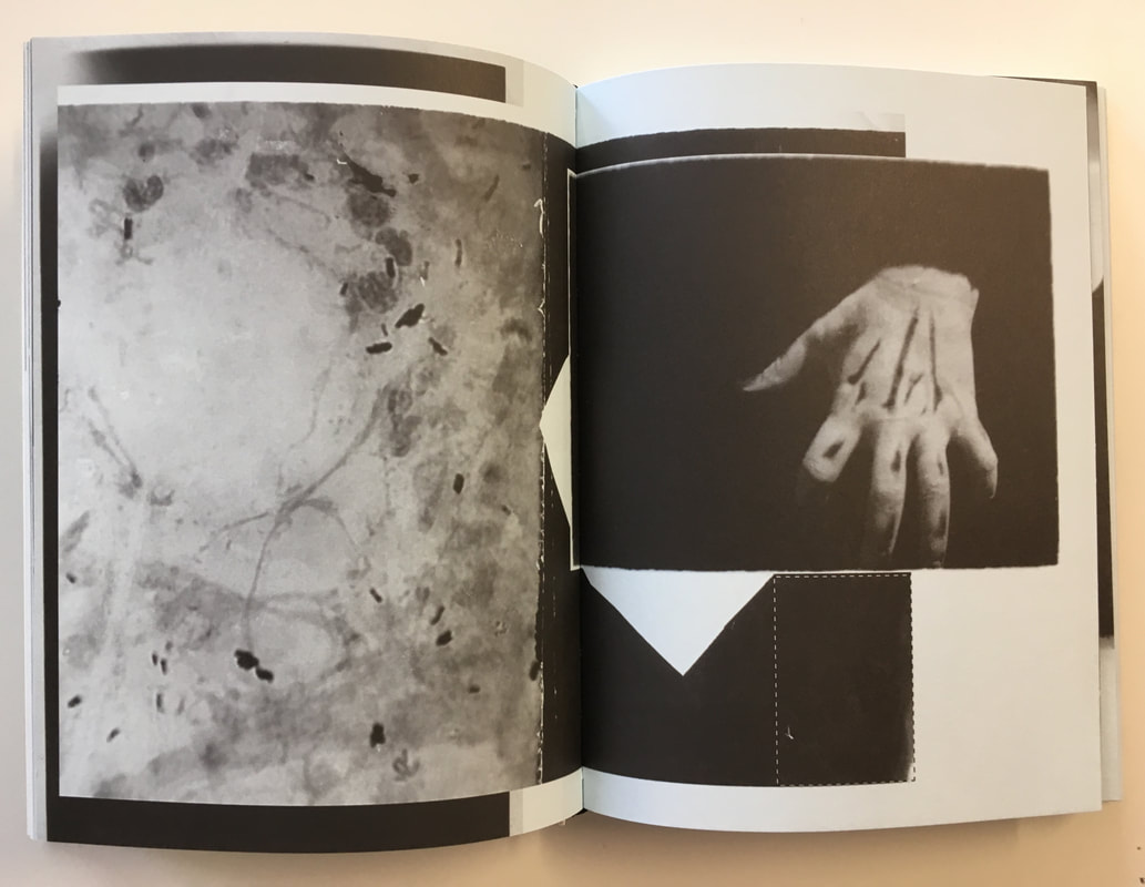
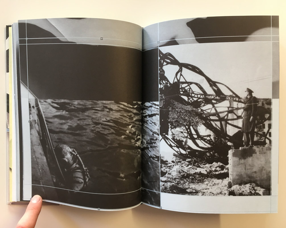
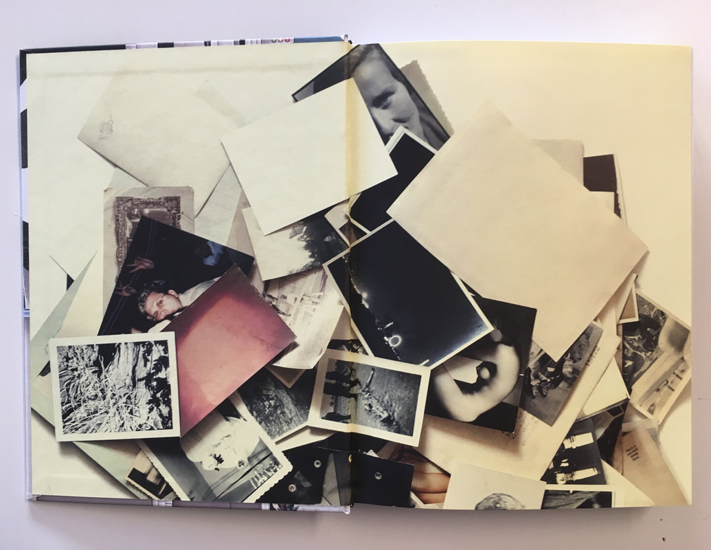
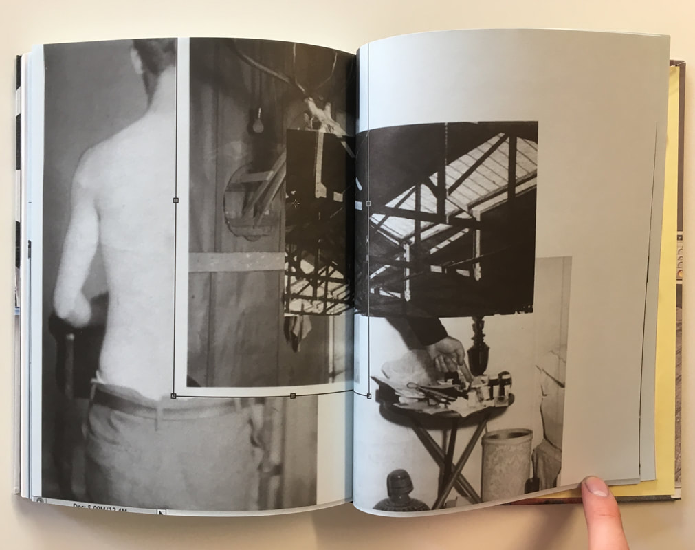
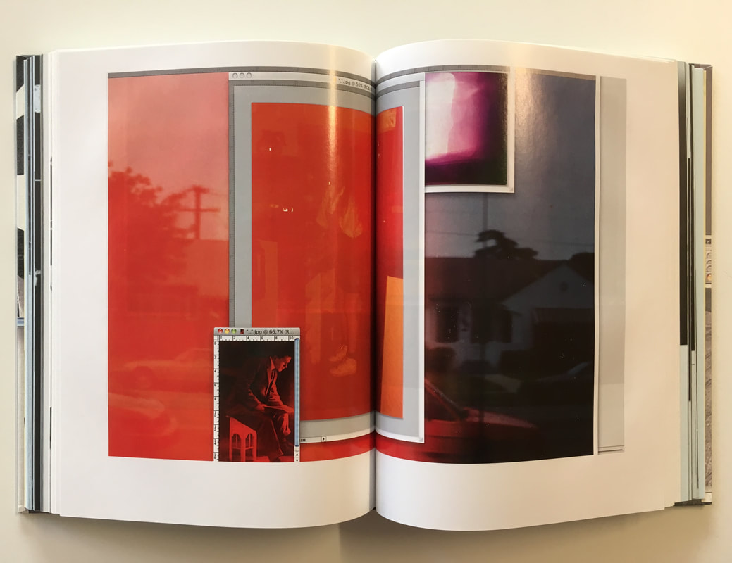
The Photographer's Gallery: Wim Wender's Polaroids
This exhibition at the Photographer's gallery showed the extensive polaroid photography work of Wim Wender, an German filmmaker. In this exhibition, thousands of Wender's polaroids taken in the 70s and 80s were displayed across a number of floors alongside nooks and films. These polaroids were like a 'visual notebook' for wender, where he experimented with different framings and compositions, primarily for his films. This exhibition of Wernder's visual ideas and documentation gives an insight into his way of thinking creatively. I really like the style of Werner's polaroid snapshots, particularly in terms of the way he documents people and his surroundings. His polaroids focus on a range of different images, from rural landscapes to the streets of New York alongside informal portraits and visual records.
'What a unique thing Polaroids were! Once almost science fiction, now definately from the past, they occupy a very special place, in our relartionship to imagery and and phography,
certainly in mine.' - Wim Werner
certainly in mine.' - Wim Werner
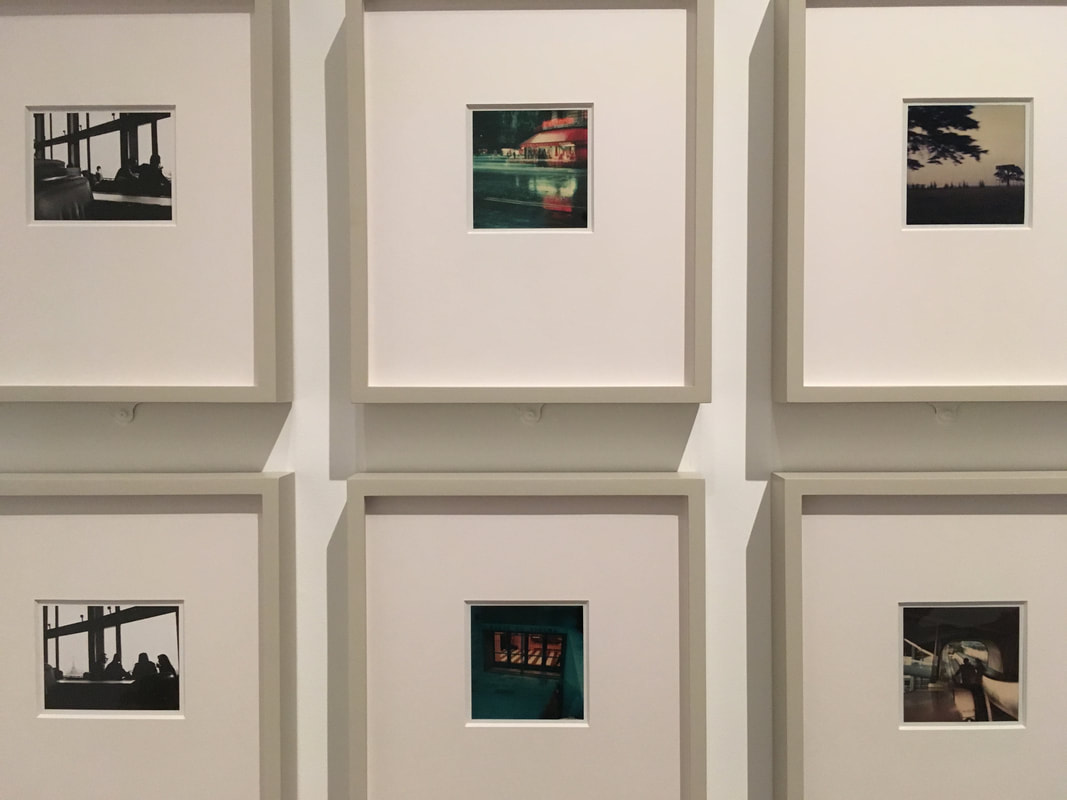
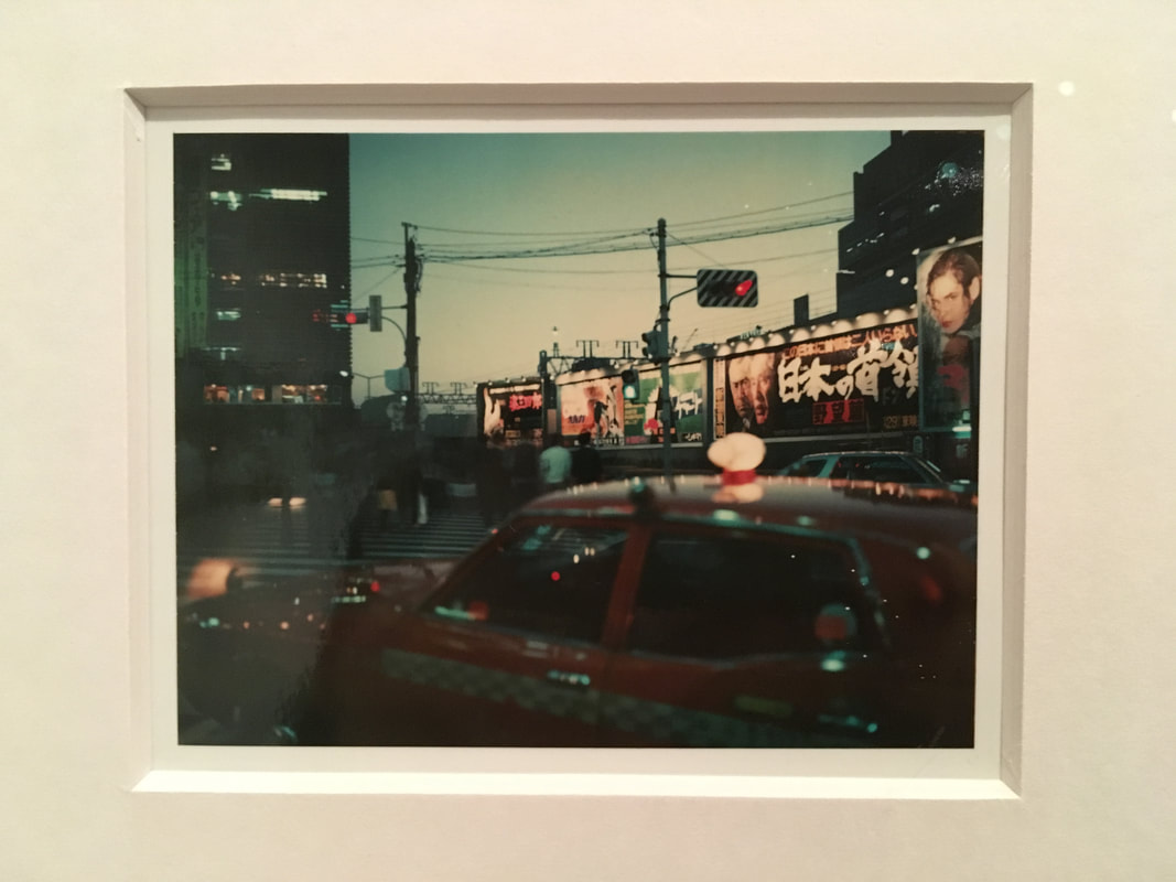
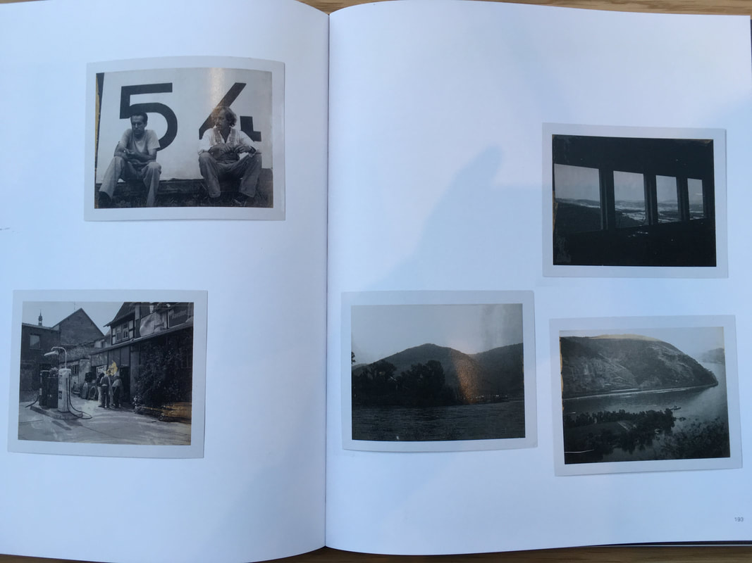
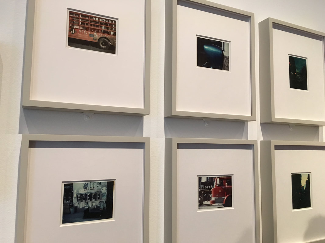
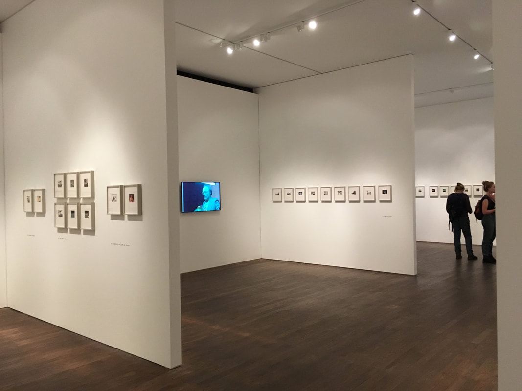
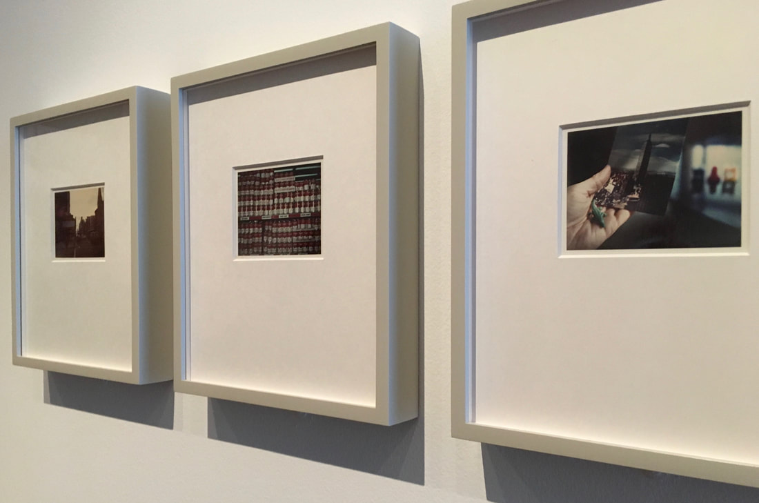
Not only this, but I especially like the style of Wender's documentary photographs. In particular, the vibrant colour rendition of the polaroids, capturing New York shop fronts and cans of soup for example. The gallery display was also interesting, with the polaroids displayed in groups and rows. I had to get right up close to each frame due to the small size of the polaroids - I had to look very closely to examine the photos in detail.
Mini Project: Portraiture/documentary series
Sian Davey - 'Martha (Ongoing)'
In Sian Davey's documentary series, she photographs her teenage daughter over an extended period of time. In this series, Davey documents her daughter in a range of different settings, sometimes singular portraits as well as group or family settings. In this series, Davey focuses on her daughter at age 16, as is on the cusp of becoming a young adult - Davey is documenting this critical period of her daughter's life. I like the style of Davey's photography in this series, the way that she has captured her daughter particularly, I also like Davey's use of light - dappled sunlight to illuminate the portraits of her daughter. However, in my series, I am planning to take a slightly different approach. Similarly, I am planning to photograph a family member, but I'm going to only have one shoot where I focus more on the visual aspects - I could use sunlight in an interesting way potentially in my portraits as well.
Gallery of 'Martha':
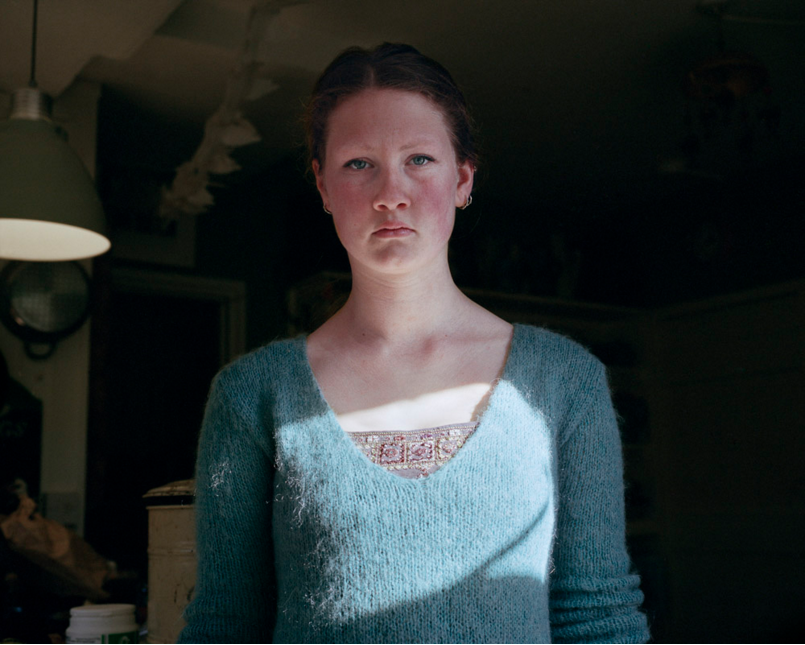
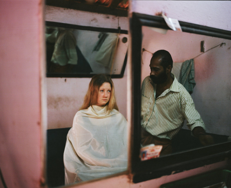
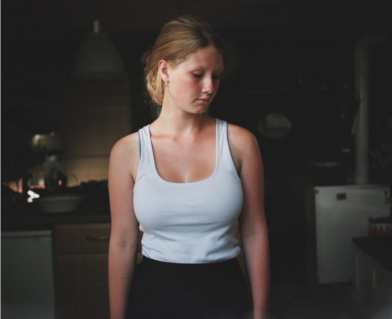
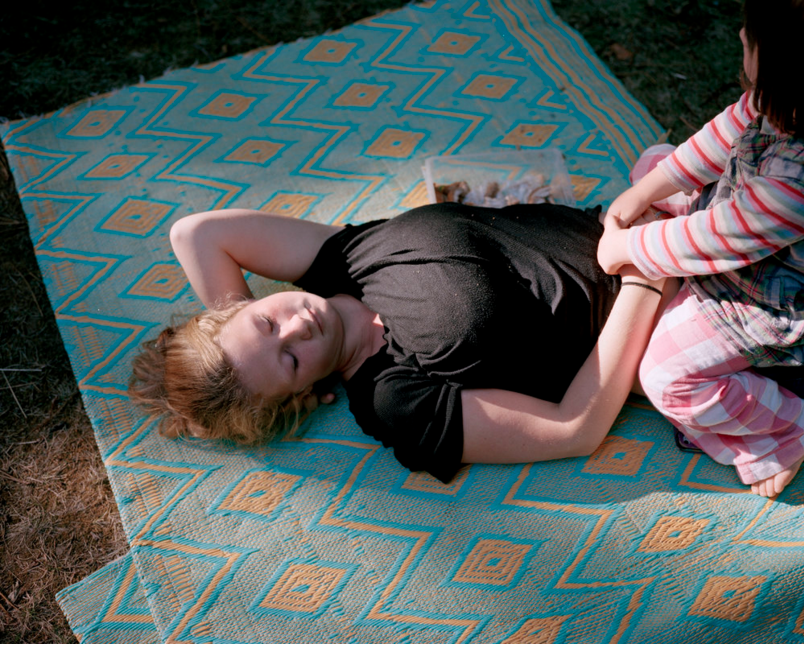
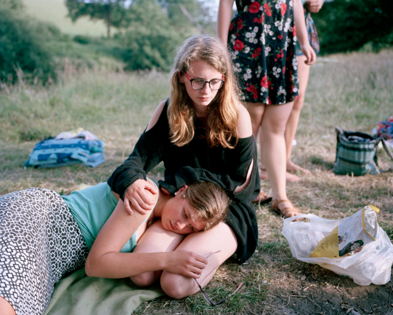
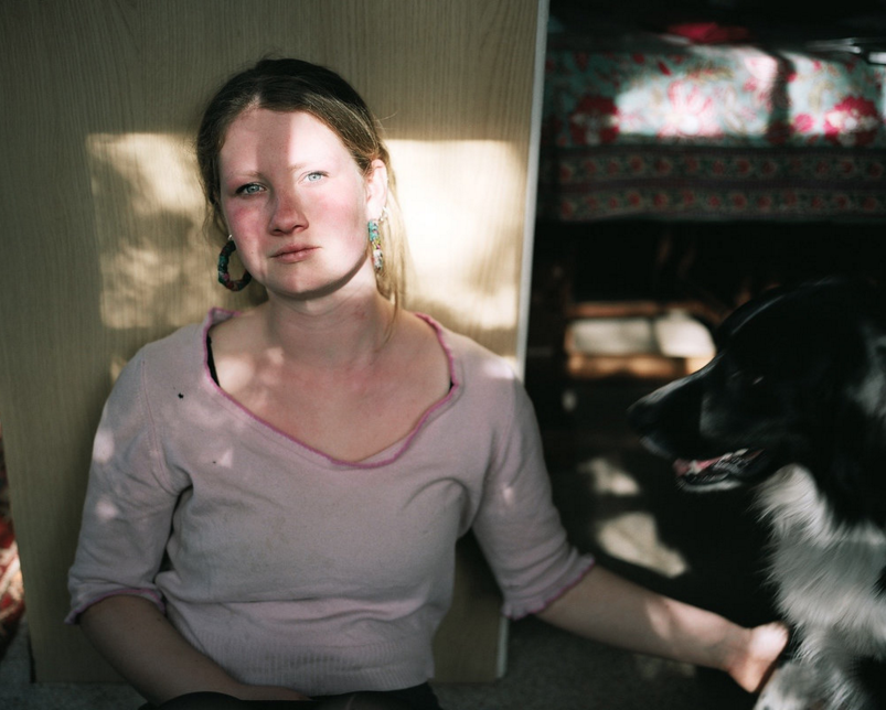
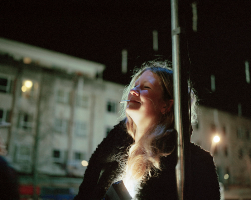
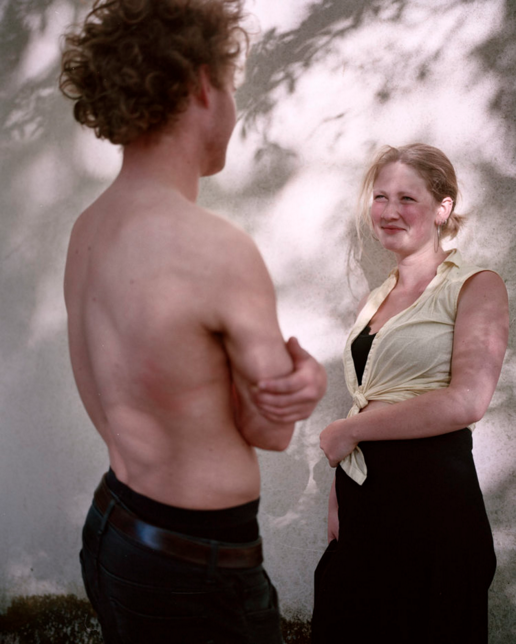

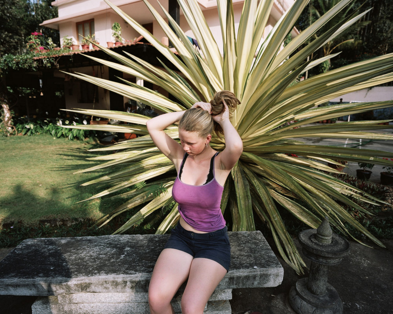
My Portrait series
Following my investigation into Sian Davey's series, I created my own series focusing on portraiture. Similarly to Sian Davey, I focused on one individual for this series, namely my sister. Although I liked Sian's documentarty series, especially the variation (focusing on her subject in a range of settings over time), I wanted to try something different. Instead, I documented my sister on a car journey, primarily experimenting with sunlight in my portraits. I took a wide range of photos of my sister, focusing quite closely on my sister's face. I photographed throughout the journey, as the effects of the sunlight changed throughout the journey. The angle of the sunlight on my sister's face got lower as the sun began to set, and the colour of the light became more orange later in the day. This made for a range of different effects and interesting shapes and colours throughout the series.
Gallery of my portrait series:
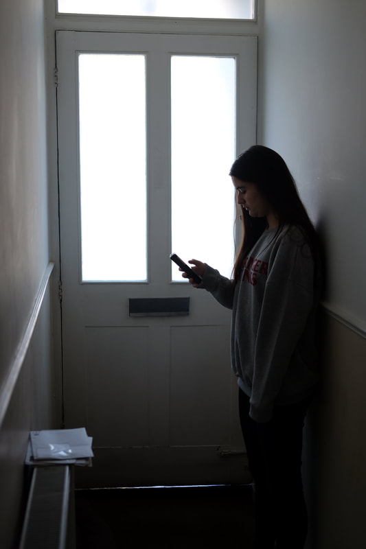
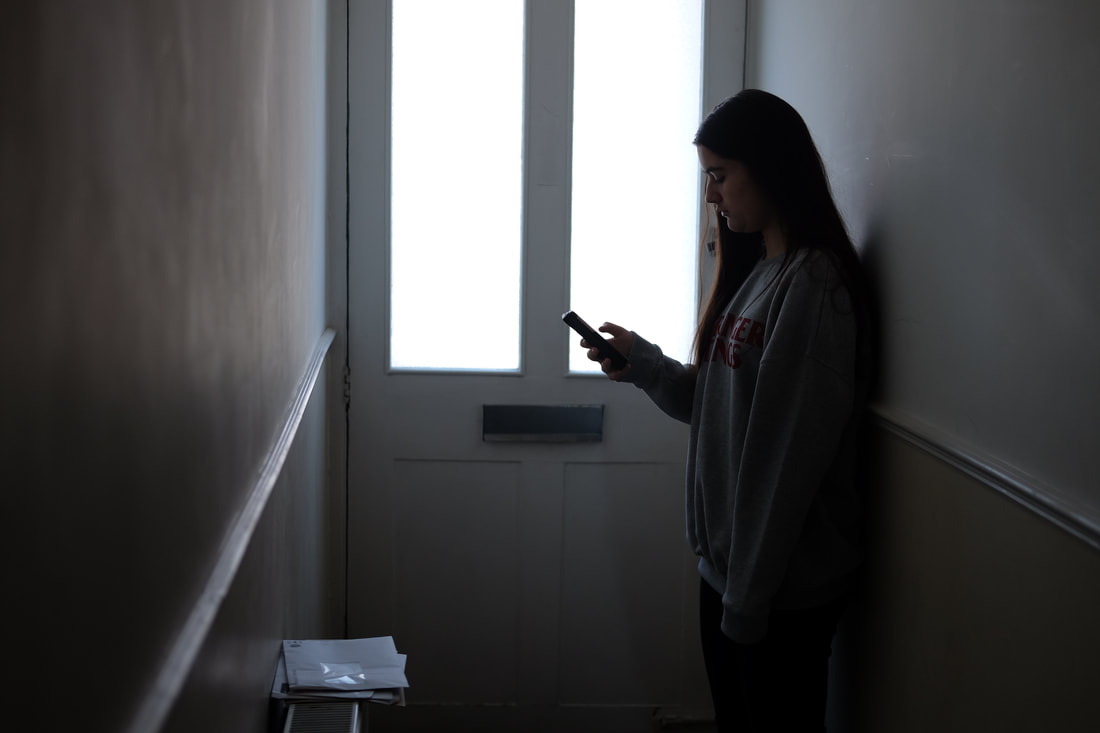
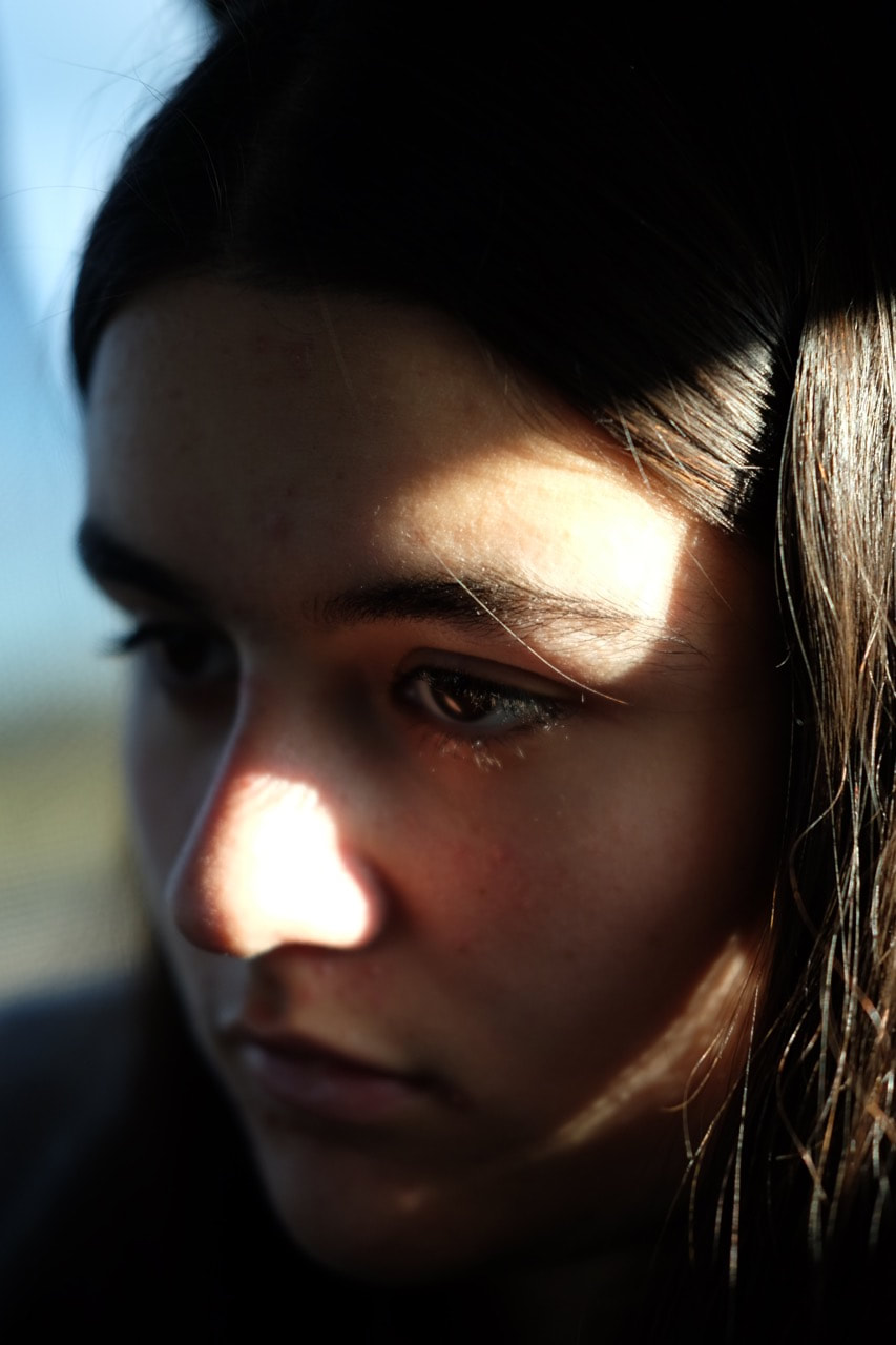
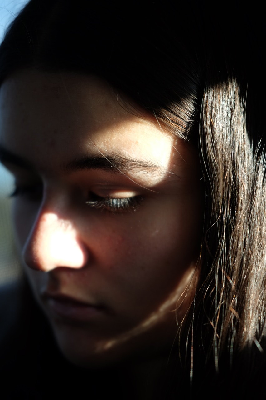
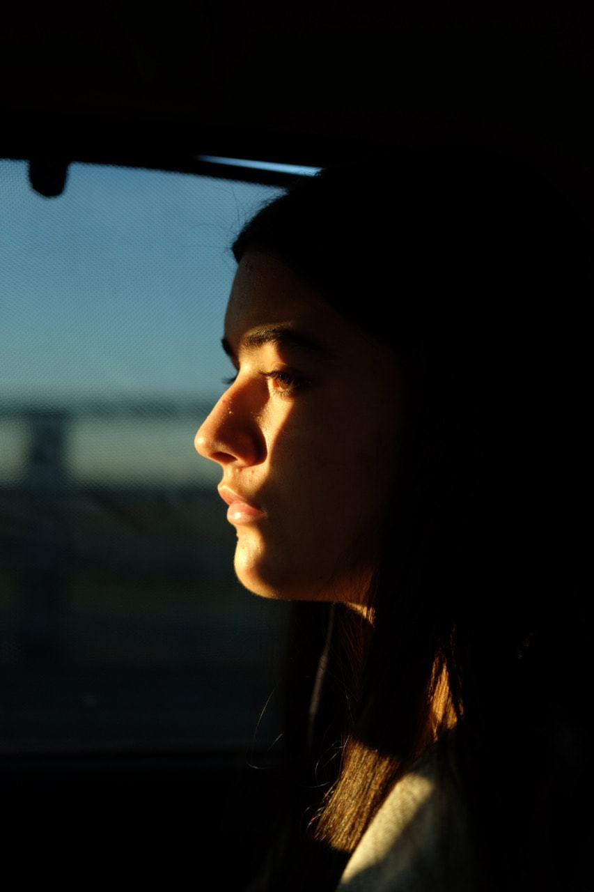
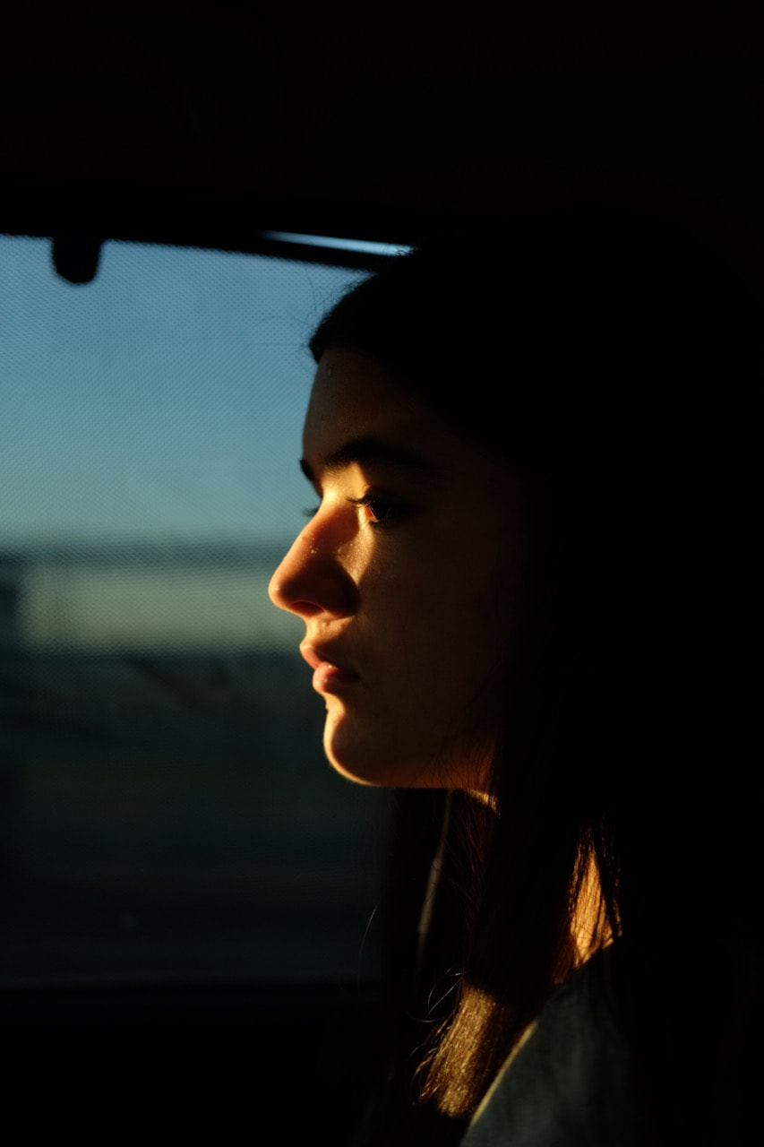
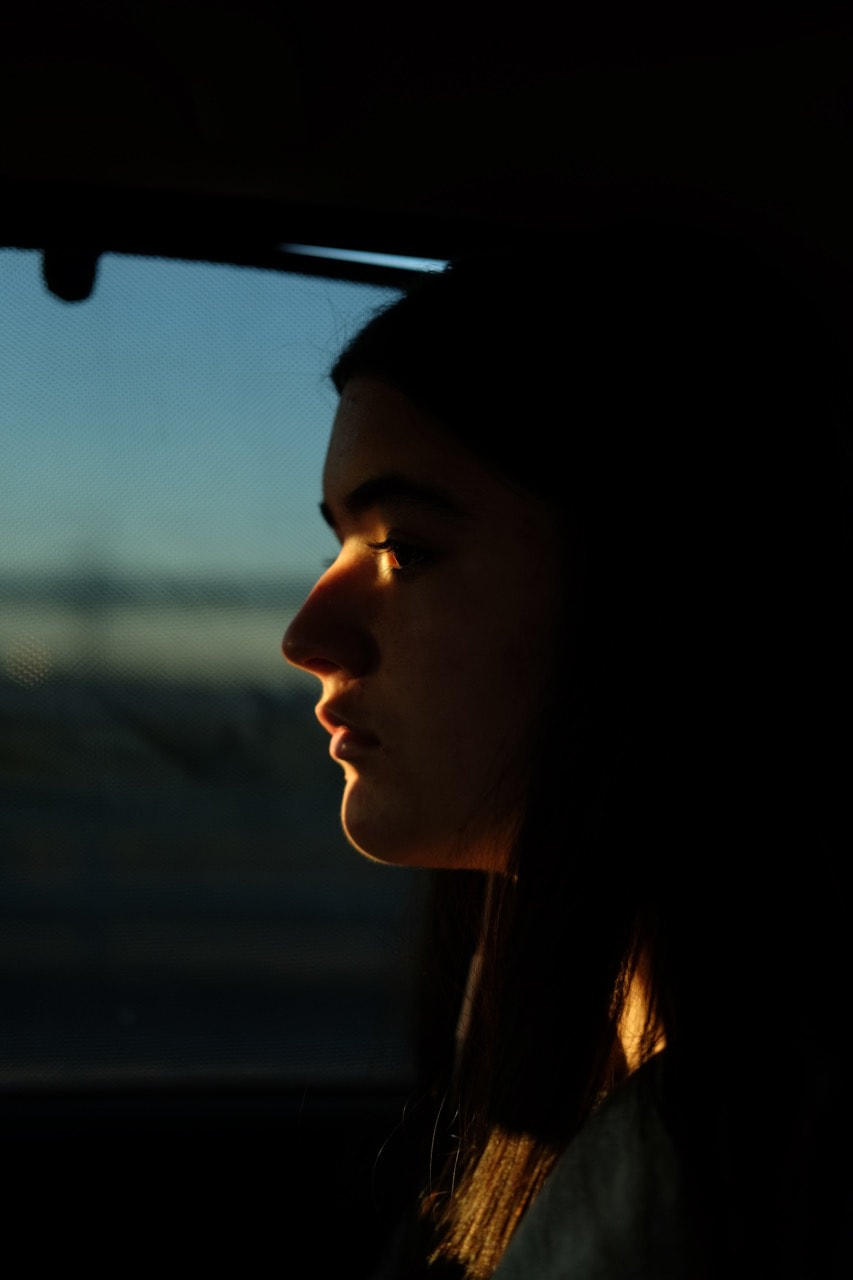
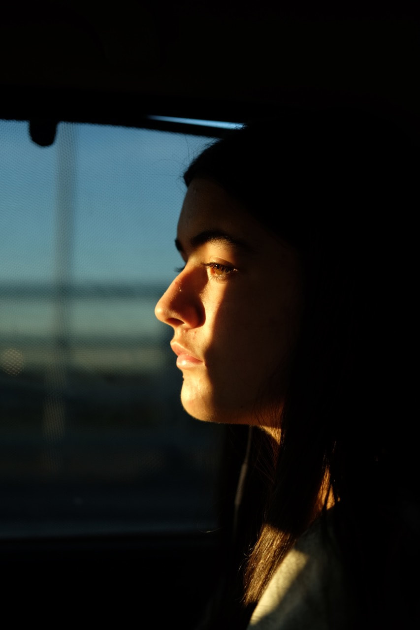
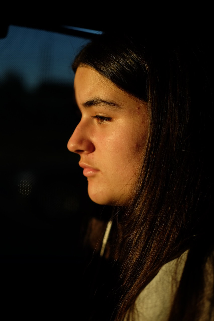
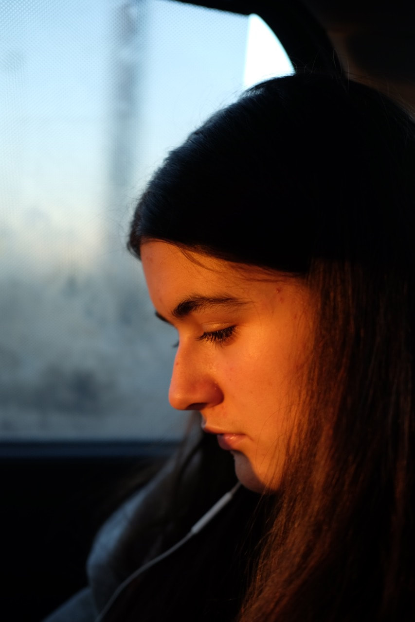
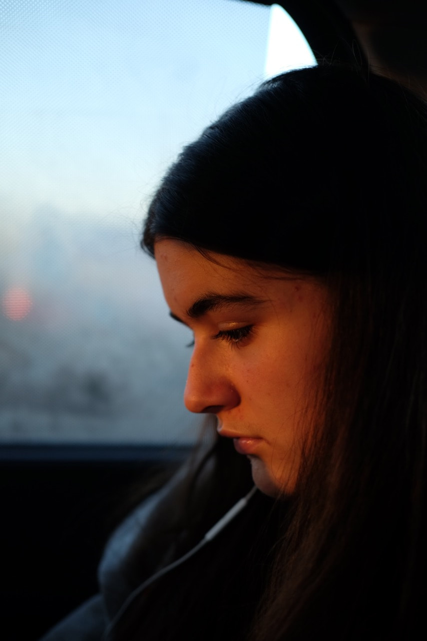
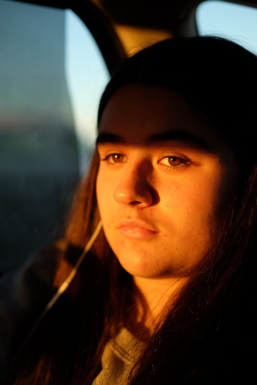
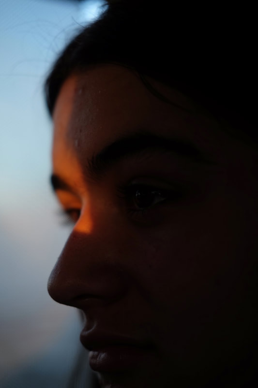
Evaluation
I am relatively happy with the outcome of this photo series. I quite like the effect of sunlight in this series, especially the shapes and colours created from the shards of the setting sun. I tried to take quite a wide variety of different portraits, with different effects of the sunlight as the sun began to set throughout the duration of the car journey. I used a 50mm equivalent lens for this set of images - so I could crop quite tightly onto the faces, but still provide some space and context. Not only this, but I set the exposure compensation to underexpose the images, as I didn't want the sunlight to be overpowering, and i wanted quite dark contrast between the background and my sister's face illuminated by the sun.
Experimenting in the darkroom
On the left is the set of 12 negatives I took of my grandparents, and on the left below is the enlarger with the double layered negatives projected below. I used this set of negatives in the darkroom, layered each row of negatives up in the enlarger to create the double layered effects.
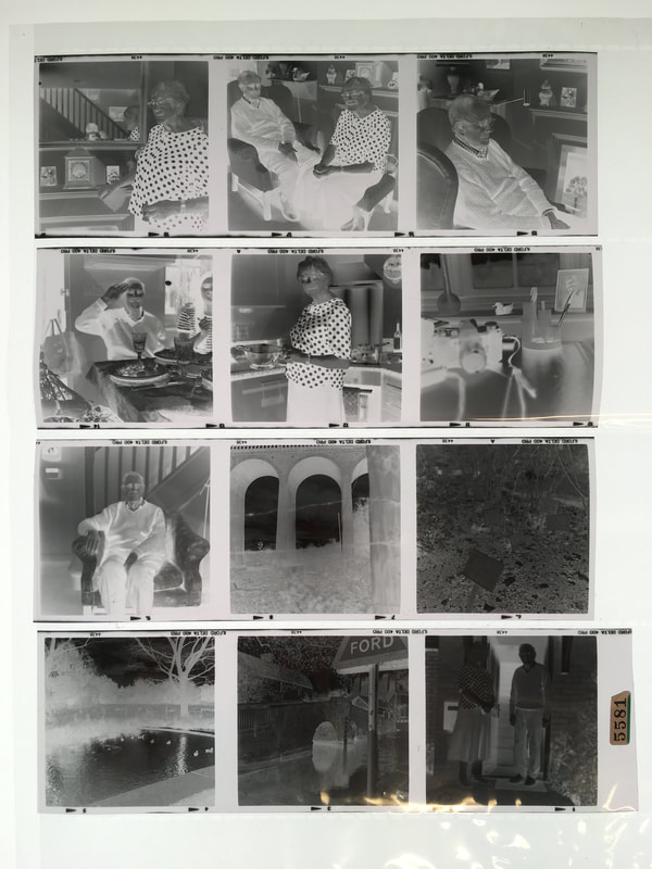
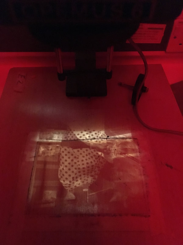
Darkroom Outcome:
Using the medium format negatives that I took, I subsequently experimented in the darkroom. Instead of just printing the medium format negatives, I experimented with the negatives using the enlarger. To create unusual and varied effects, I layered and arranged the negatives in different ways in the medium format enlarger. To create these double layered effects, I selected negatives and layered them on top of other negatives. I arranged the negatives in the enlarger, moving them around to create successful effects and compositions. When I was happy with the arrangement of negatives, I then exposed photo sensitive paper underneath the enlarger. I subsequently tested the exposure time (around 8 seconds at f5.6 on the enlarger was the most successful). I then exposed each sheet of photosensitive paper, before developing the sheets.
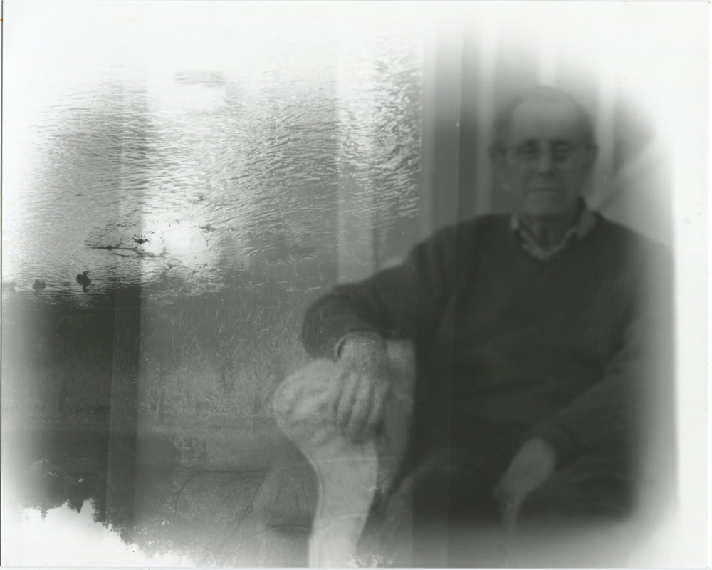
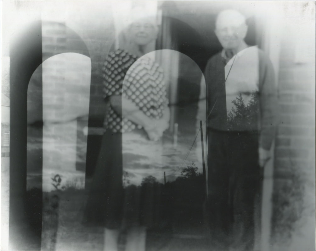
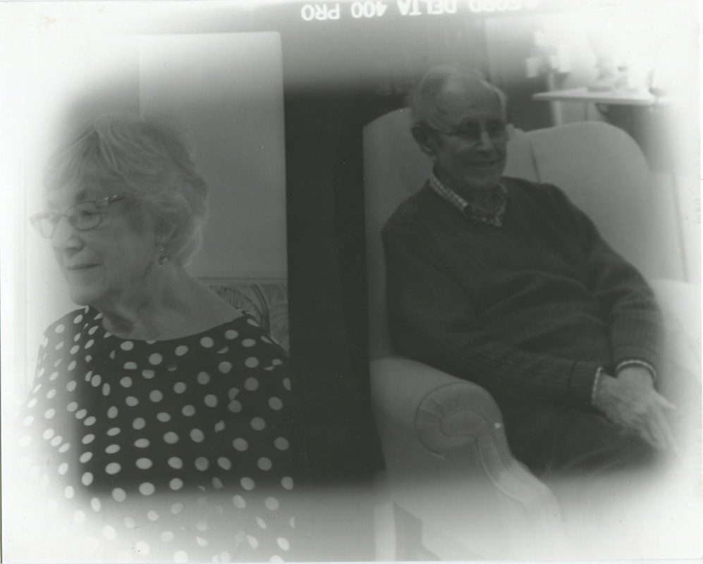
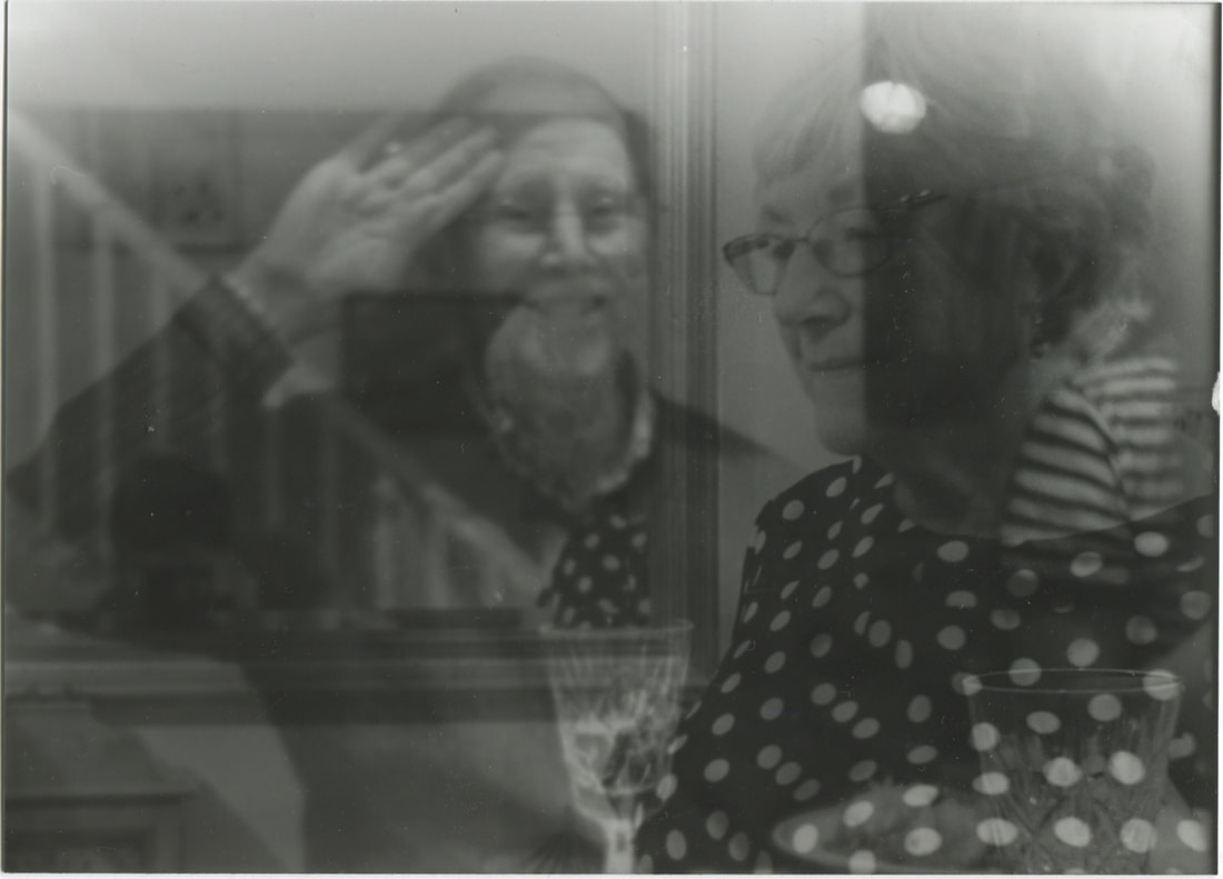
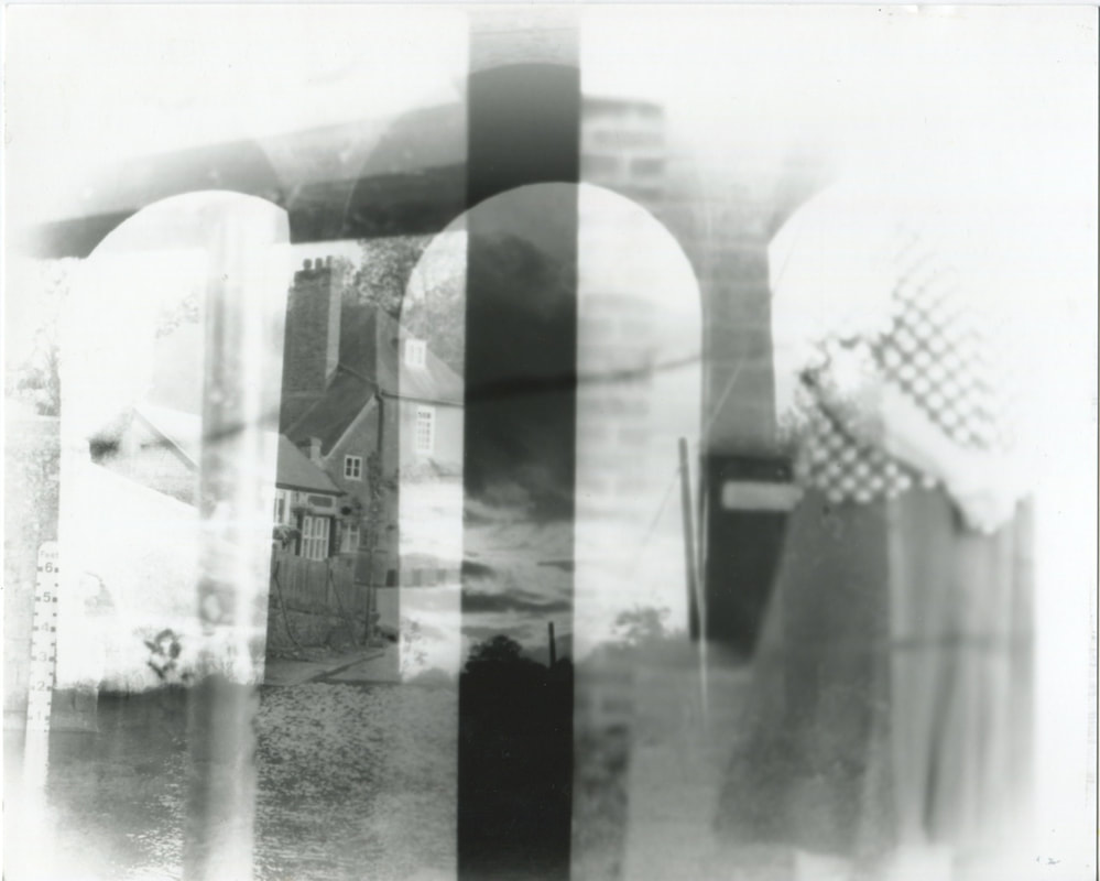
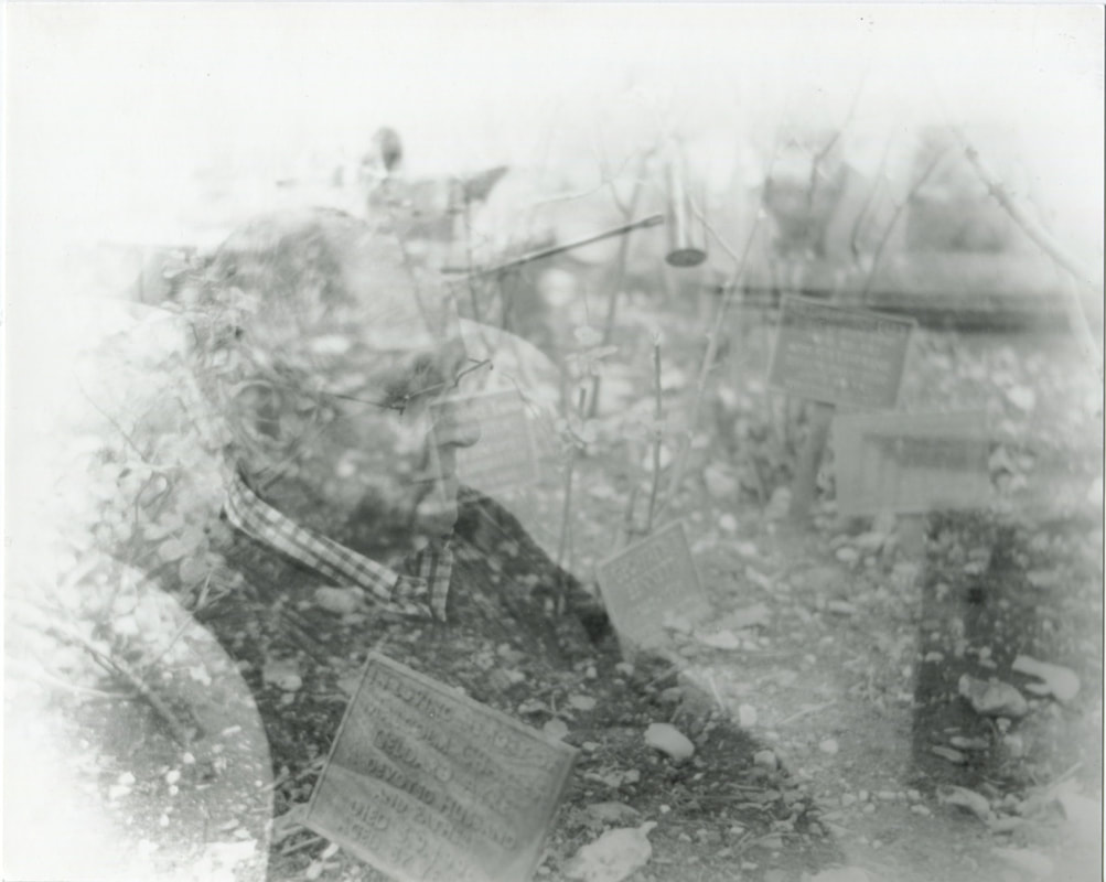
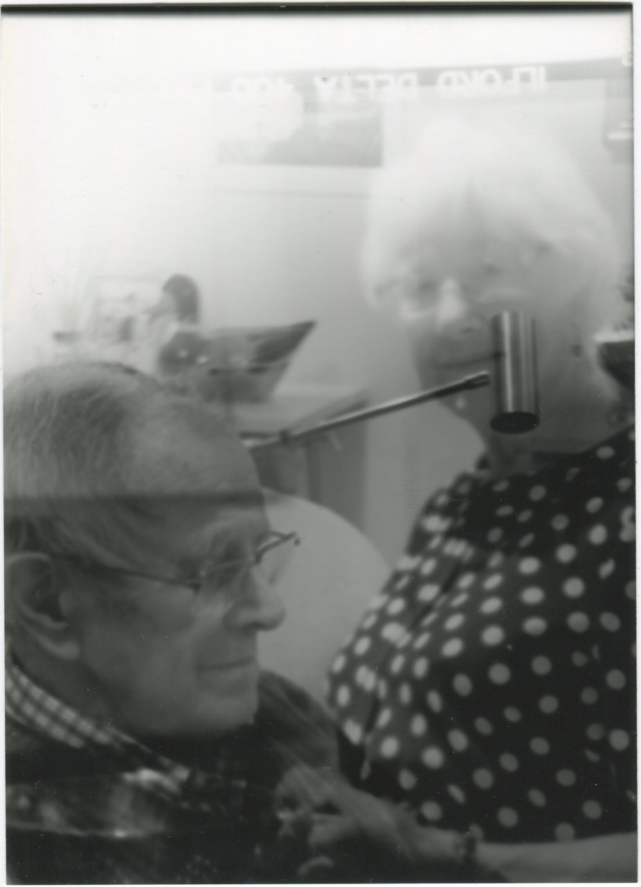
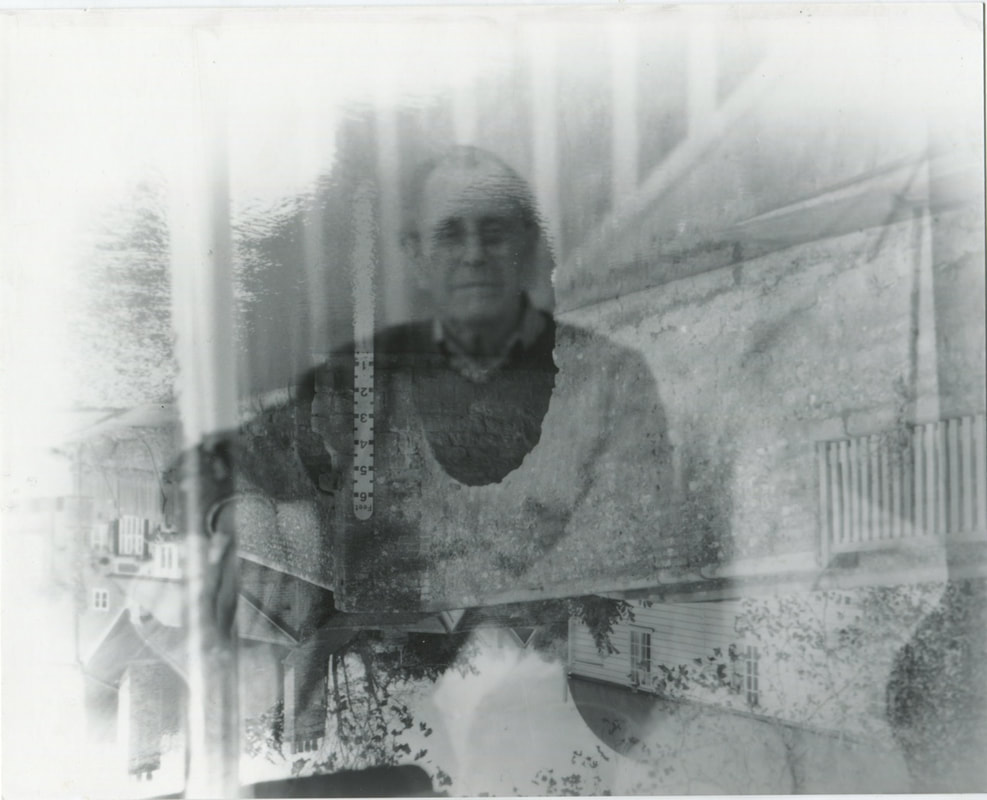
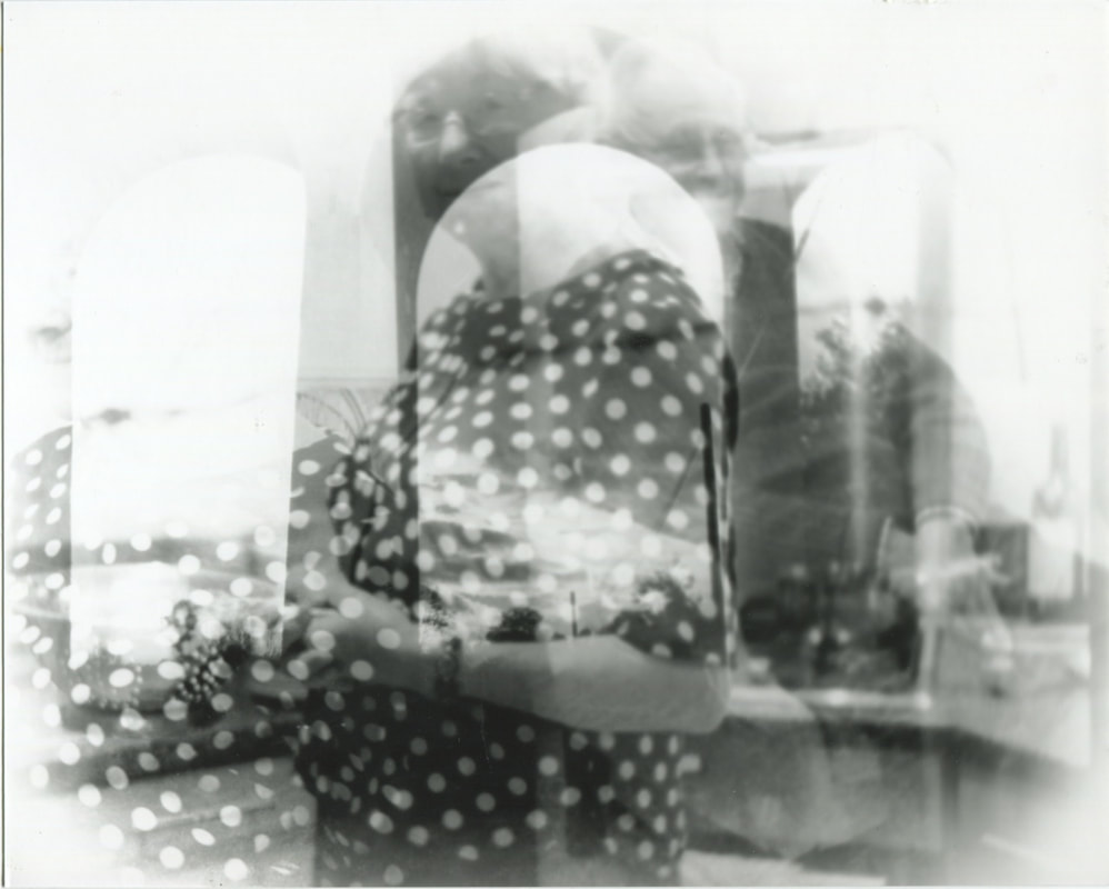
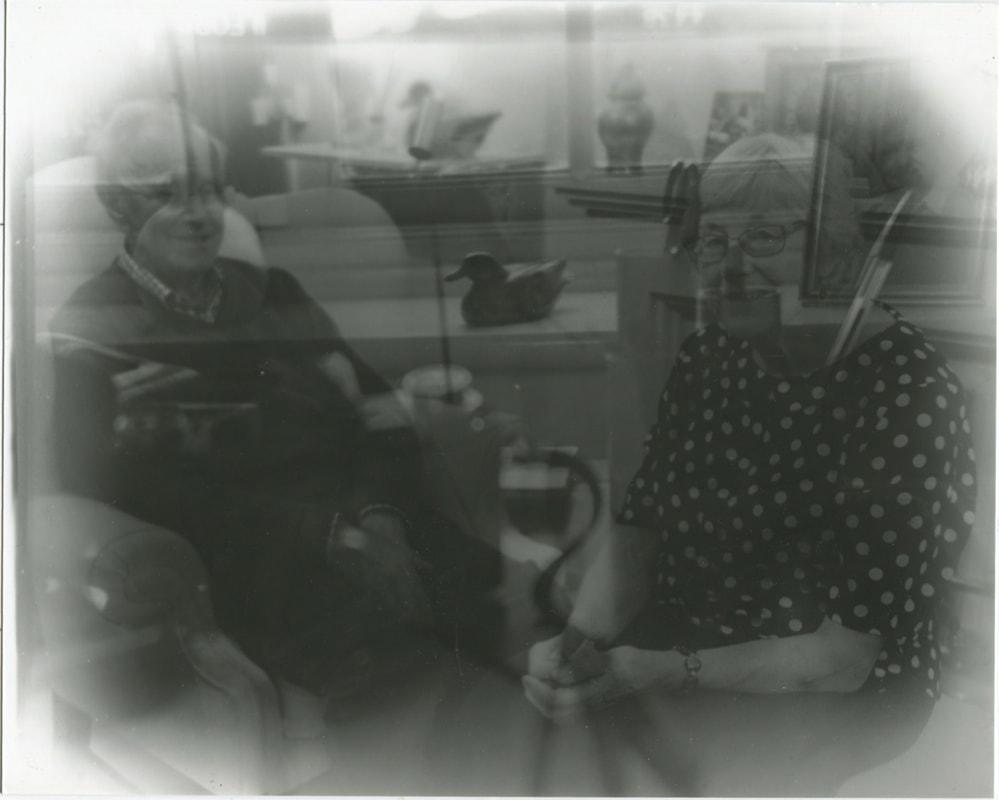
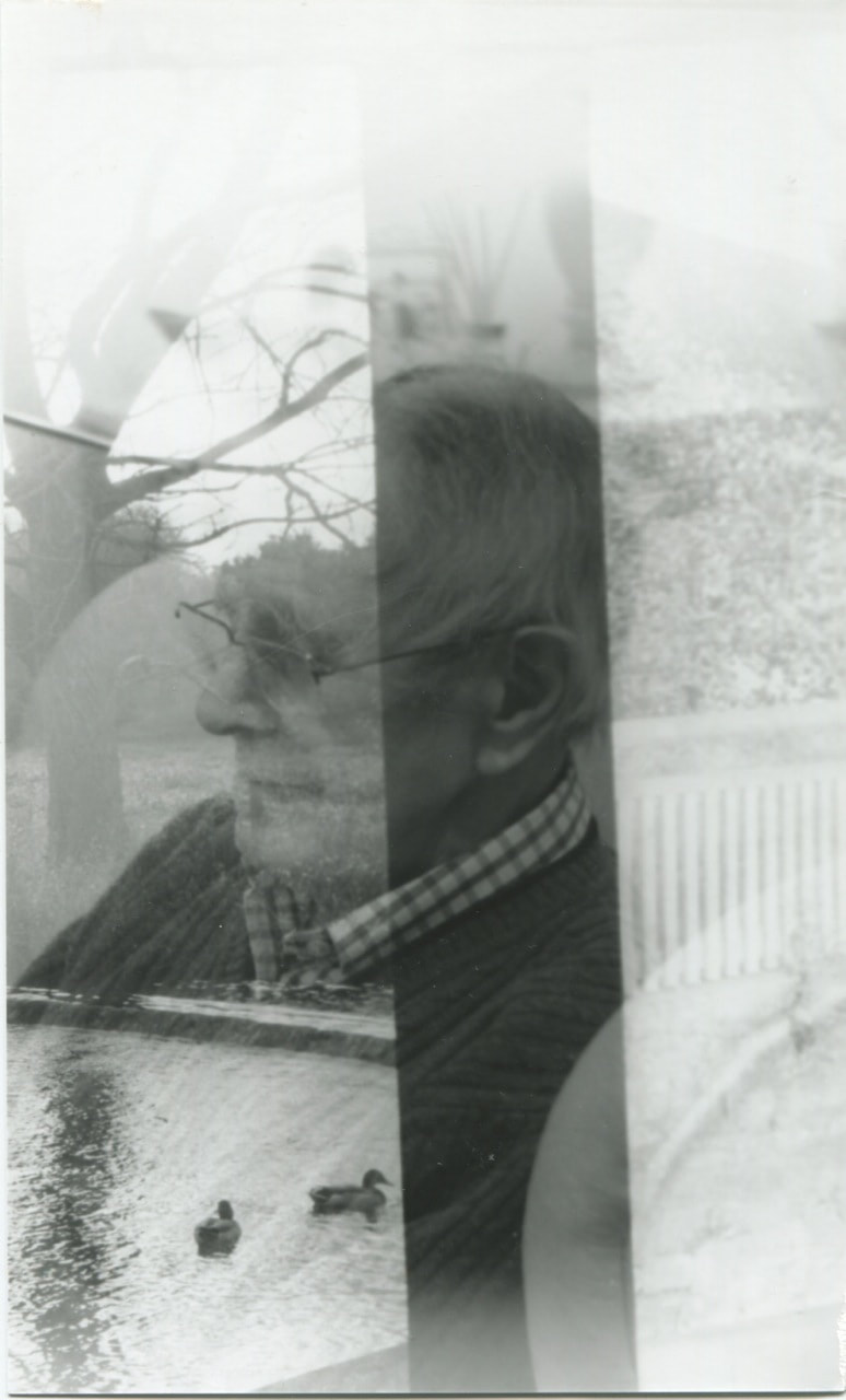
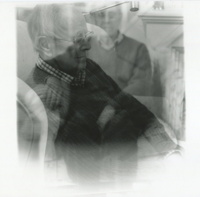
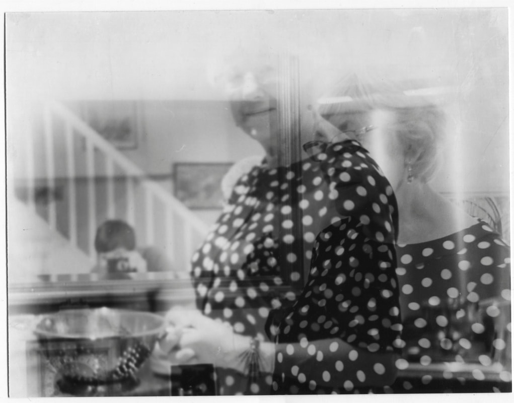
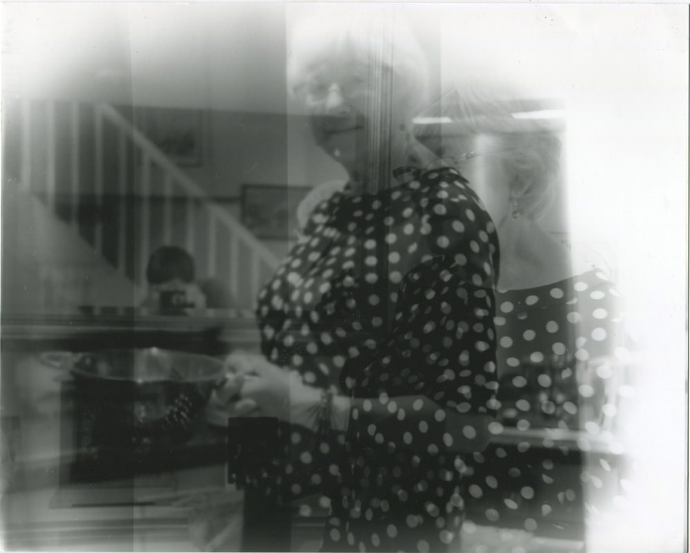
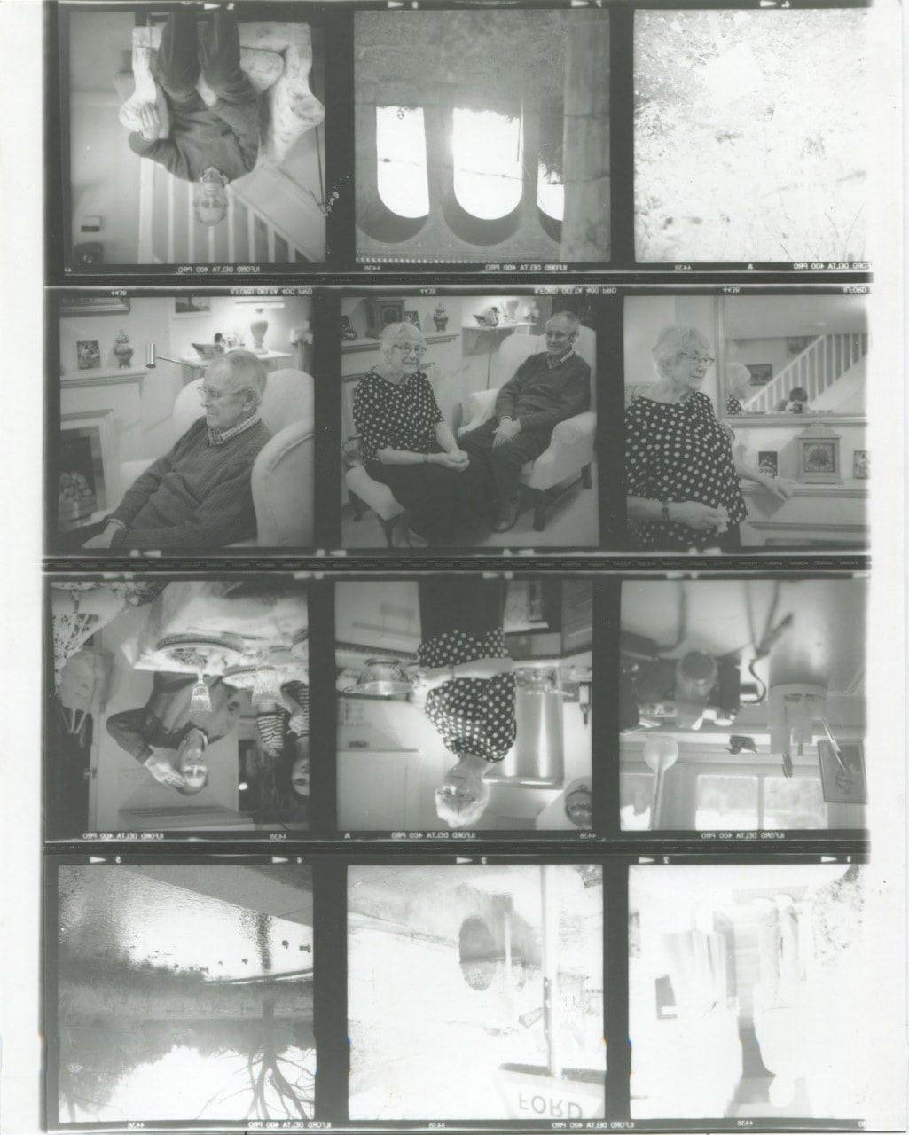
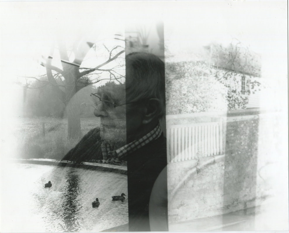
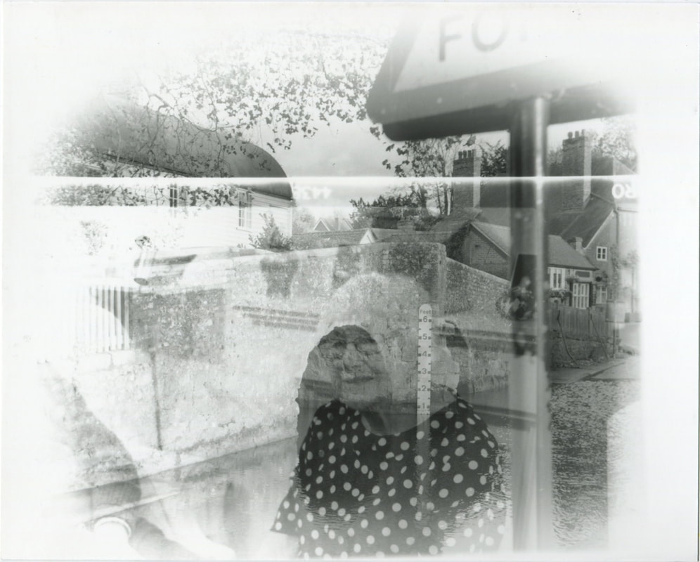
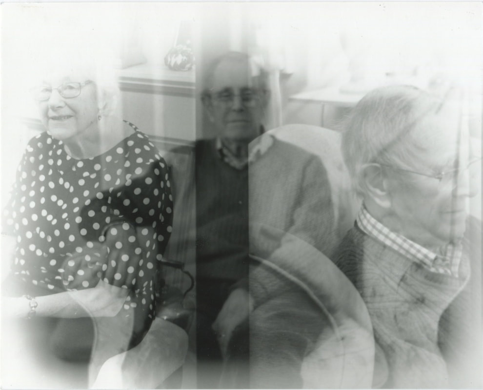
Overall, I am relatively pleased with the outcome of my darkroom experimentation. With these darkroom prints, I wanted to be able to experiment, and created some unusual outcomes. In terms of the effects of layering the negatives, I think that the effects created were quite successful. I especially like the merging and layering of different textures and elements in each of the prints. In particular, I think that prints where portraits are merged with textures (such as the portrait merged with the roses and soil) were particularly effective. I also like the layering of portraits, with the faces merging or layered next to one another.
Photoshop Experimentation
I subsequently combined the archive photographs with the medium format photographs that I took. I used Photoshop, merging the photographs I took of my grandparents photo archive, layering the scans of the medium format photographs I took of my grandparents. These photographs were primarily inspired by Anouk Kruitof's photobook 'The Bungalow', especially the way she layers and arranges imagery. I was also inspired by her investigation into memories and traces. especially the way that she investigates our memory of images. This prompted me to layer the photographs of my family archives with the portraits of my grandparents - the memories and evidence of my grandparents life, layered with photographs 60 years later. I am very interested in the way photographs have the ability to make a record of our lives - these photo albums documenting the memories of my family. I think that these manipulations are relatively successful, some outcomes working better than others. I like the effect of the portraits merged with the archive photographs - the archives appearing in between the portraits that I took. I like the overall effect and impact of the photographs, with the old archive portraits juxtaposed with the photographs taken now.
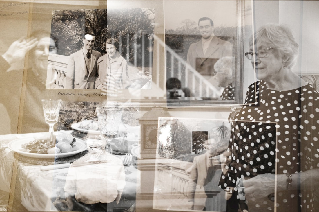
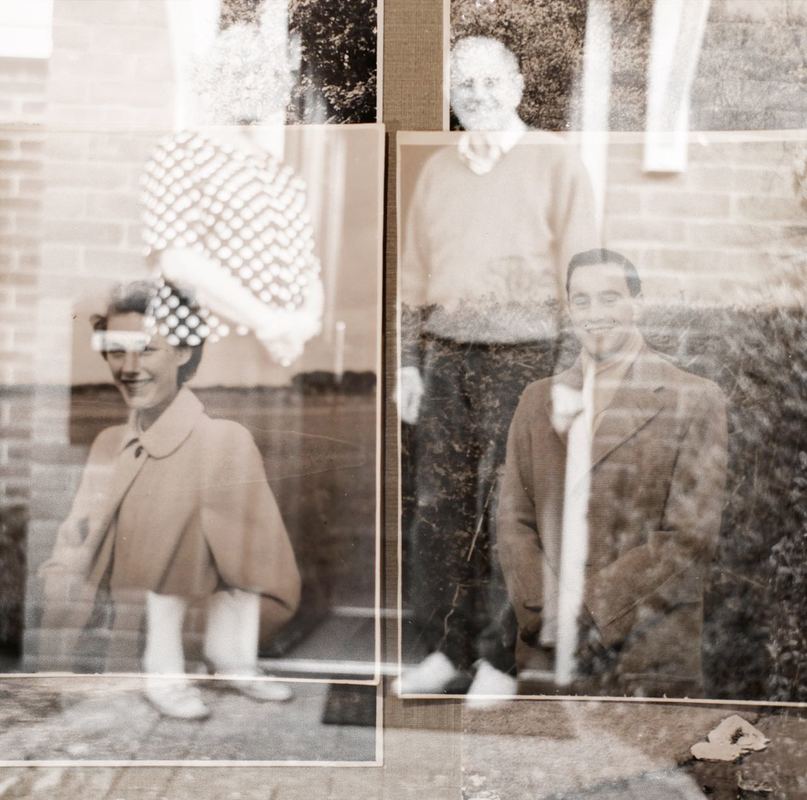
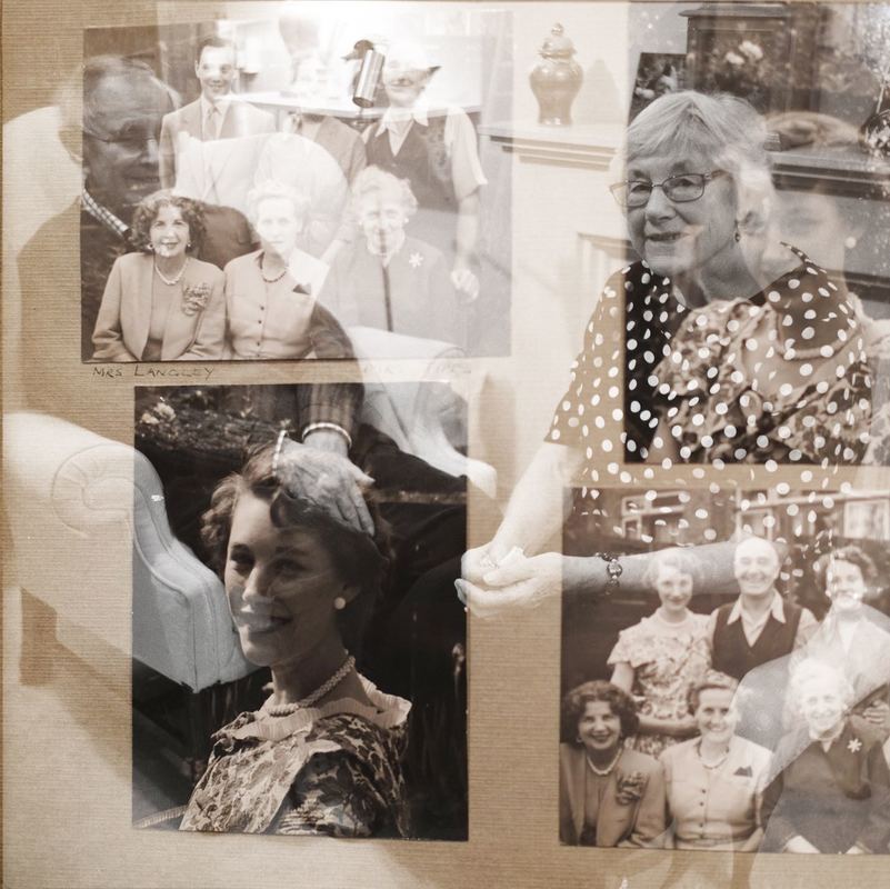
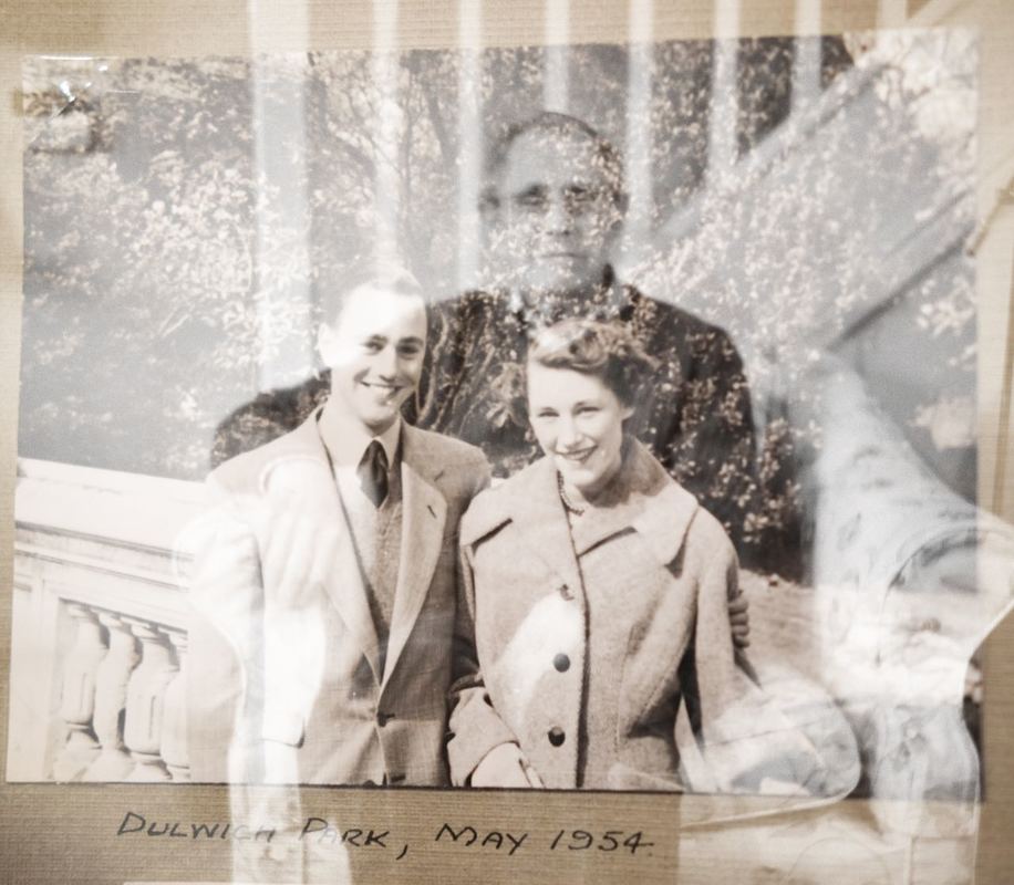
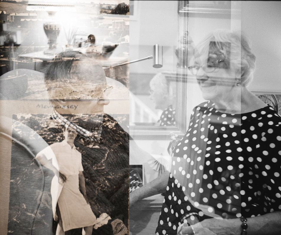
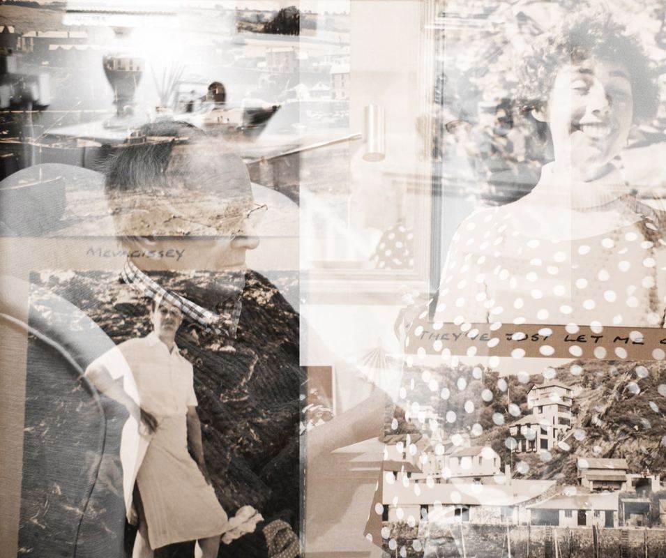
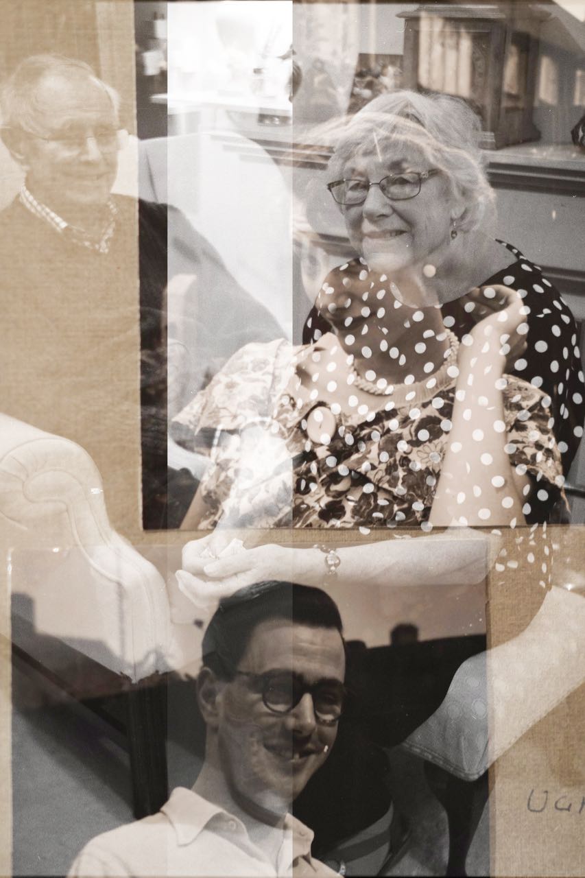
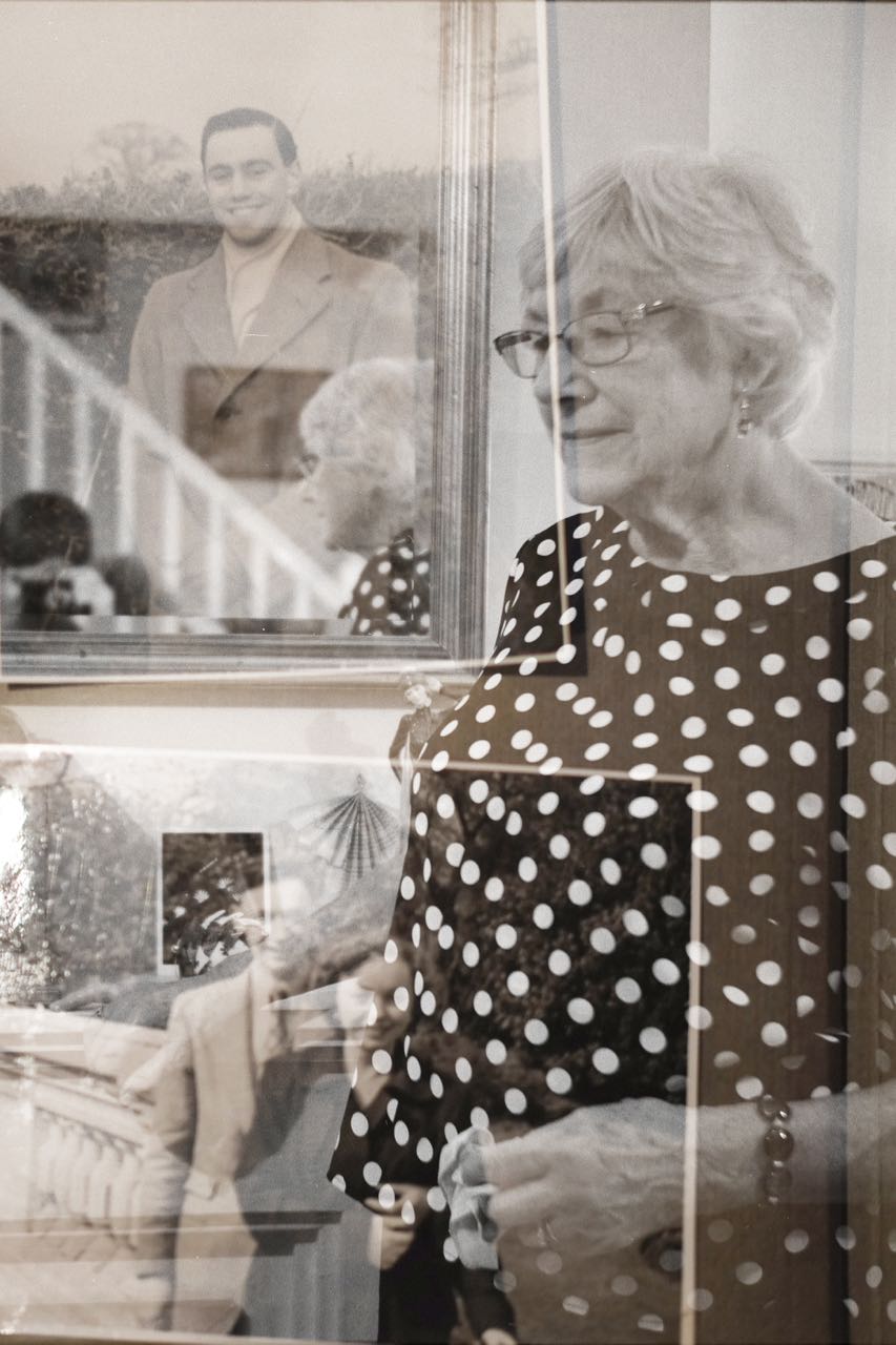
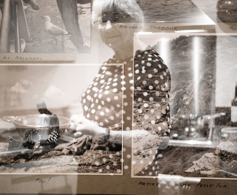
Photographing slides
Subsequently to looking through the archives of photographs, I discovered large boxes full of slides at my grandparents' house. This extensive collection of slide film had built up over decades, documenting the life of my grandparents and my family. I particularly enjoyed the process of searching through the Kodachrome slides, holding the slides up to the light to reveal the range of different photographs taken by my grandfather. Experimenting with slides and projections could be an interesting avenue to take, I would like to experiment with projecting slides, or using them to produce prints in some way. Again, I found it fascinating to see my family and dad growing up in these slides, especially seeing the clothes and cars that were typical of the 1960s and 1970s. I was particularly interested in the way that my grandad documented memories and events through his photography - and the huge number of photographs and slides that he has amassed documenting his life.
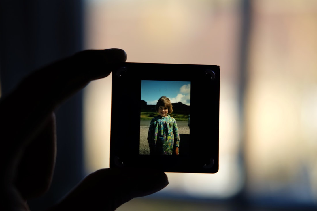
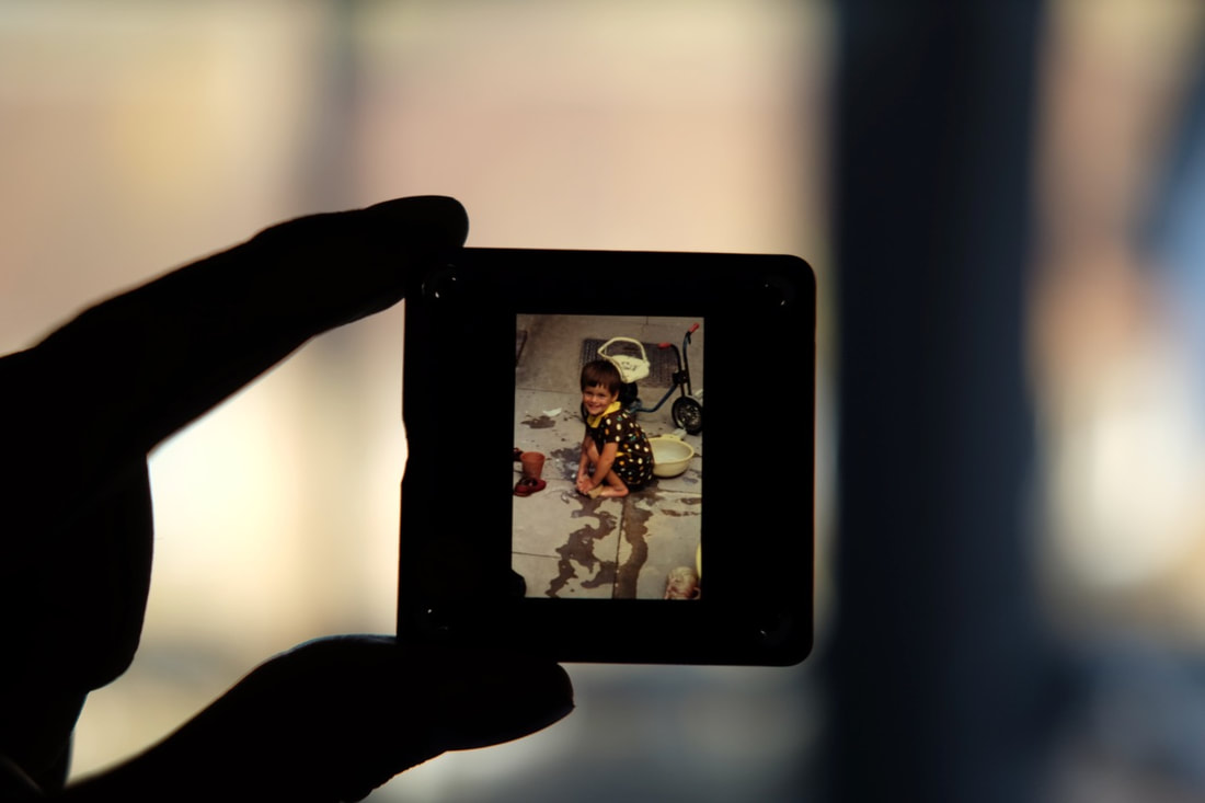
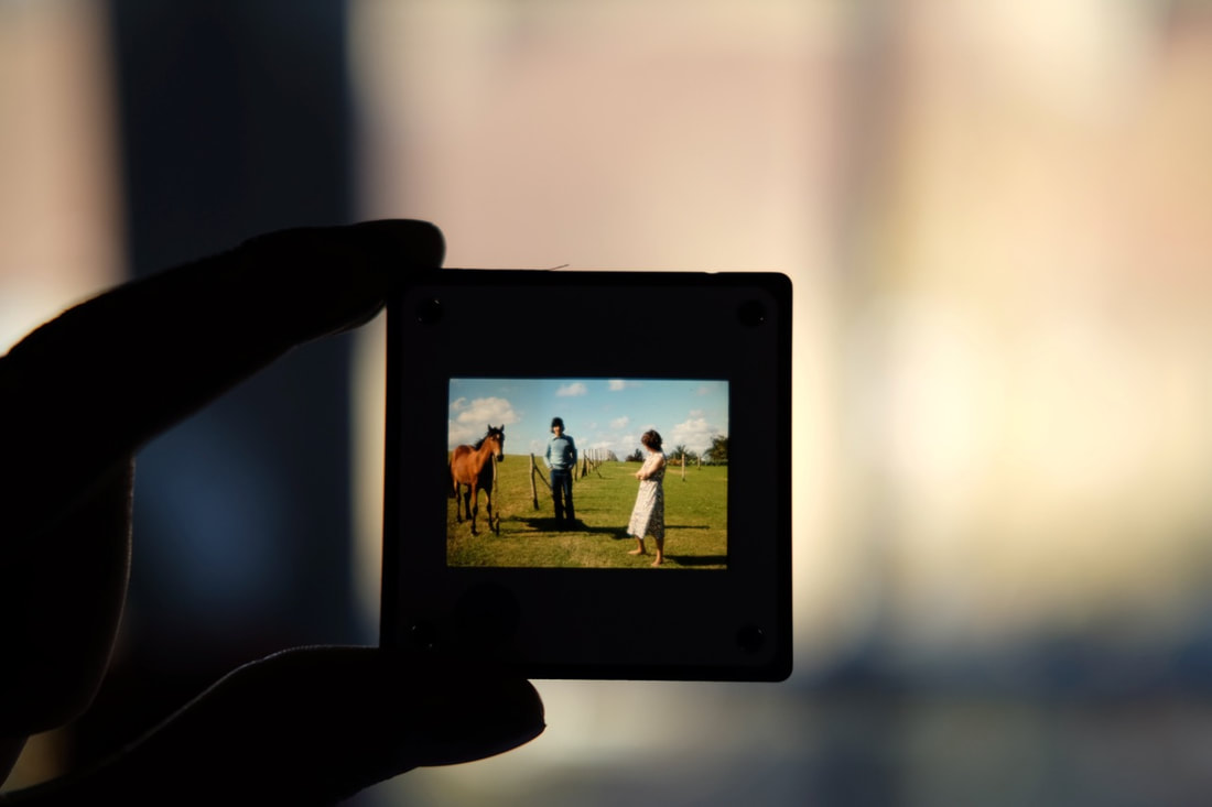
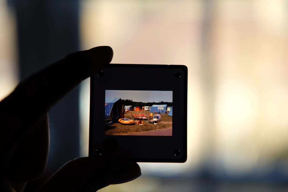
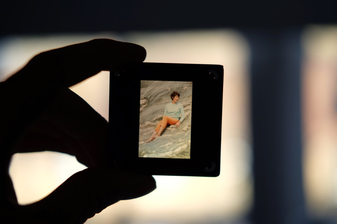
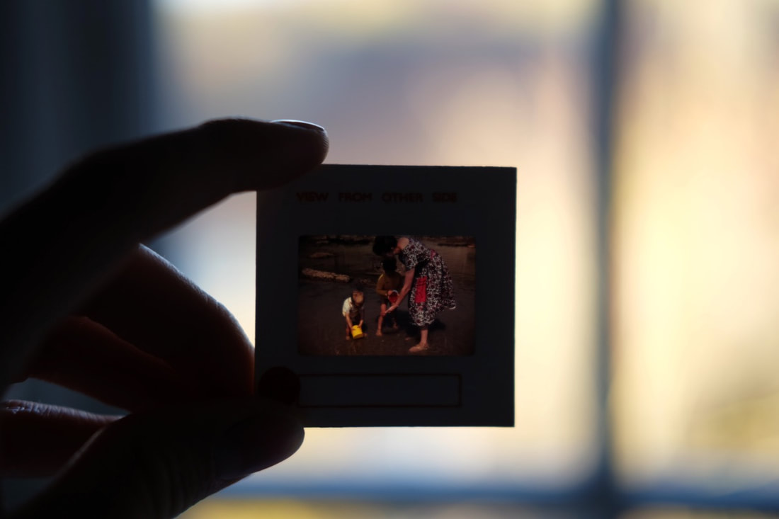
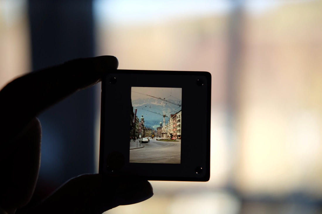
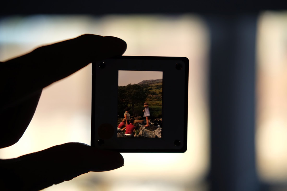
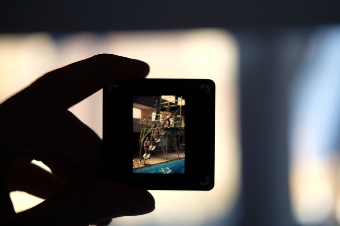
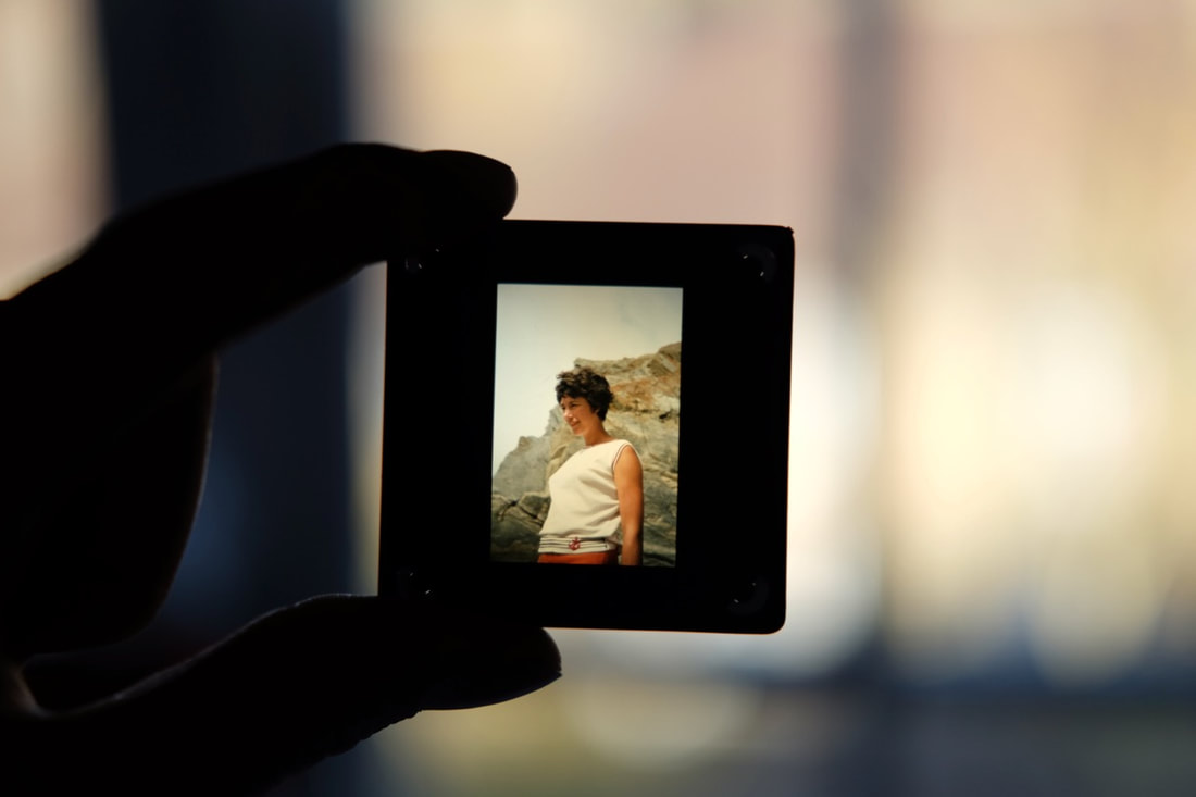
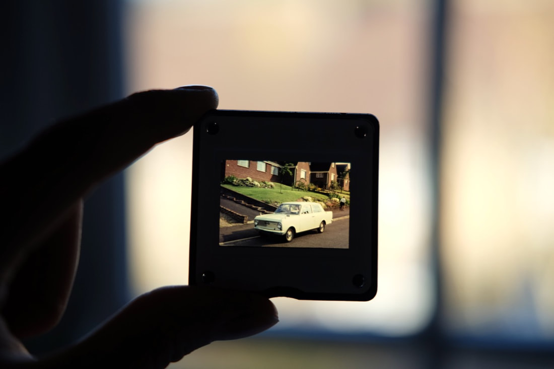
Projecting slides
I subsequently used my grandparent's slide projector, projecting a number of slides onto the wall. I flicked through the boxes of slides, placing them into the projector. I recorded the process of projecting the slides, flashing across the projector, filming the slides projected onto the wall. I quite like the outcome of this film, I really like the range of different slides of film - these are personal family photographs, showing my family growing up. Visually,, the slides are very interesting with the rich, saturated colour rendition from the Kodachrome film stock. This film would be very interesting to use for an installation, I could potentially project it onto my other photographs or alongside these pictures.
Filming my Grandfather's slides:
Joel Meyerowitz: Cape Light
Cape Light is Joel Meyerowitz's first book of photographs published in 1978. This large format colour series documents Cape Cod in Massachussets, focusing on colour and light particularly as well as the landscape of Cape Cod. I was particularly inspired by Meyerowitz's interiors, primarily his used of light and composition. I really like the dappled sunlight particularly, as well as the focus on different elements within the interiors. I looked into Meyerowitz's Cape Light series primarily due to my ideas for my own project photographing my grandparents. After mainly focusing on portraiture of my grandparents, as well as their photo archives, I am subsequently planning to photograph the interrior of their home, focusing more on the objects that they have collected throughout their lives.
Meyerowitz's Cape Light series:
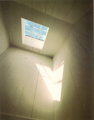
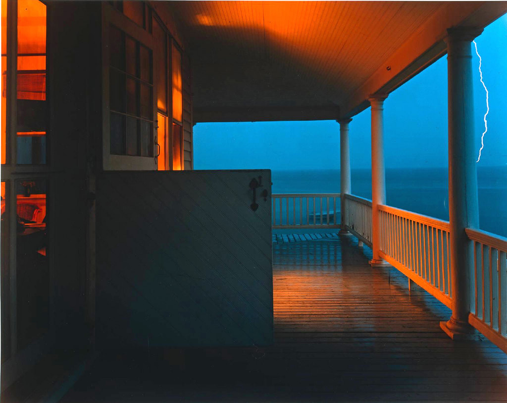
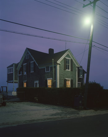
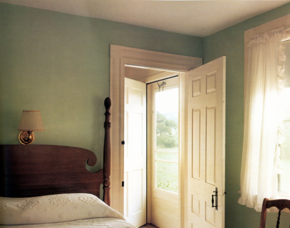
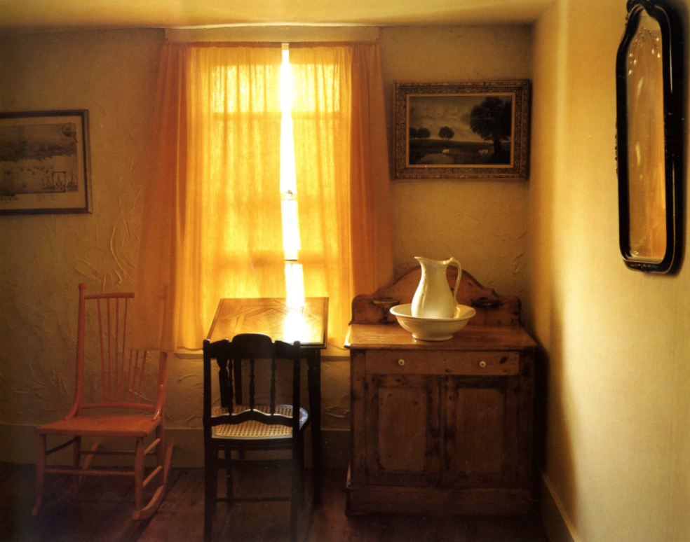
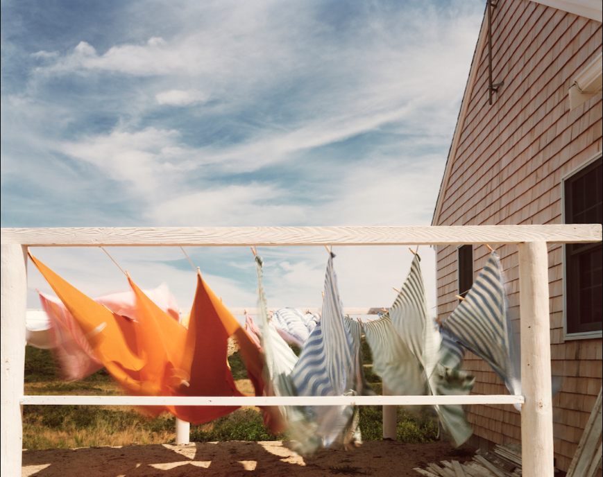
Grandparents project: Documentary/Typology photographs
For my first final outcome, I produced a set of photographs documenting my grandparents, as well as photographing the objects and their extensive archive of photographs. For this project, I used a roll of 36 exposure colour film, using my dad's Olympus OM20, with a 50mm f1.8 lens. I also discovered one of my grandad's old film SLRs, which had an old roll of unfinished film left in the camera. I decided to finish that roll of film, producing photographs on the roll of film left half completed (there were 18 exposures left on the roll of film). I was very interested about how the remaining photographs would turn out, especially as the film may have been expired; I was also interested about what photographs had already taken on the roll of film.
My photographs using expired film
Canon 500N + Expired Kodak 200 colour film
Below left is the analogue SLR that I inherited from my grandad. As this camera was manufactured in the late 1990's, the technology is quite advanced for an analogue camera. The camera has autofocus, and it winds on each frame automatically.
Canon 500N (28-80mm)
|
Expired Kodak 200 colour film
|
For this set of photographs, I wanted to photograph a broader range of subject matter. Alongside some more portraits of my grandparents, I also wanted to photograph their home. I had taken a number of photographs of their extensive photo archive, the pictures that my grandad had taken documenting the life of my family. However, I also wanted to document the objects and ornaments that my grandparents had collected over the course of their lives. For example, their cabinet of plates, china and ornaments that they had collected on their travels. As well as this, I wanted to photograph their home, similarly to the interiors of Meyerowitz's Cape Light series.
My Outcome:
The photographs in this gallery are from the roll of film that I found in my grandad's old analogue Canon SLR. A few photographs had already been taken with this roll of film (the last 4 photographs in the gallery below), but I wanted to finish the roll. I had no idea how old the roll of film was, and I was intrigued to find out what photographs my grandad had already taken. Not only this, but I was very interested in how the roll of film would turn out after development. I had never used expired film before, and I had no idea what to expect. I also liked the idea of photographing on a roll of film my grandfather used, almost bridging the gap between my photography and my grandfathers', and exploring this relationship
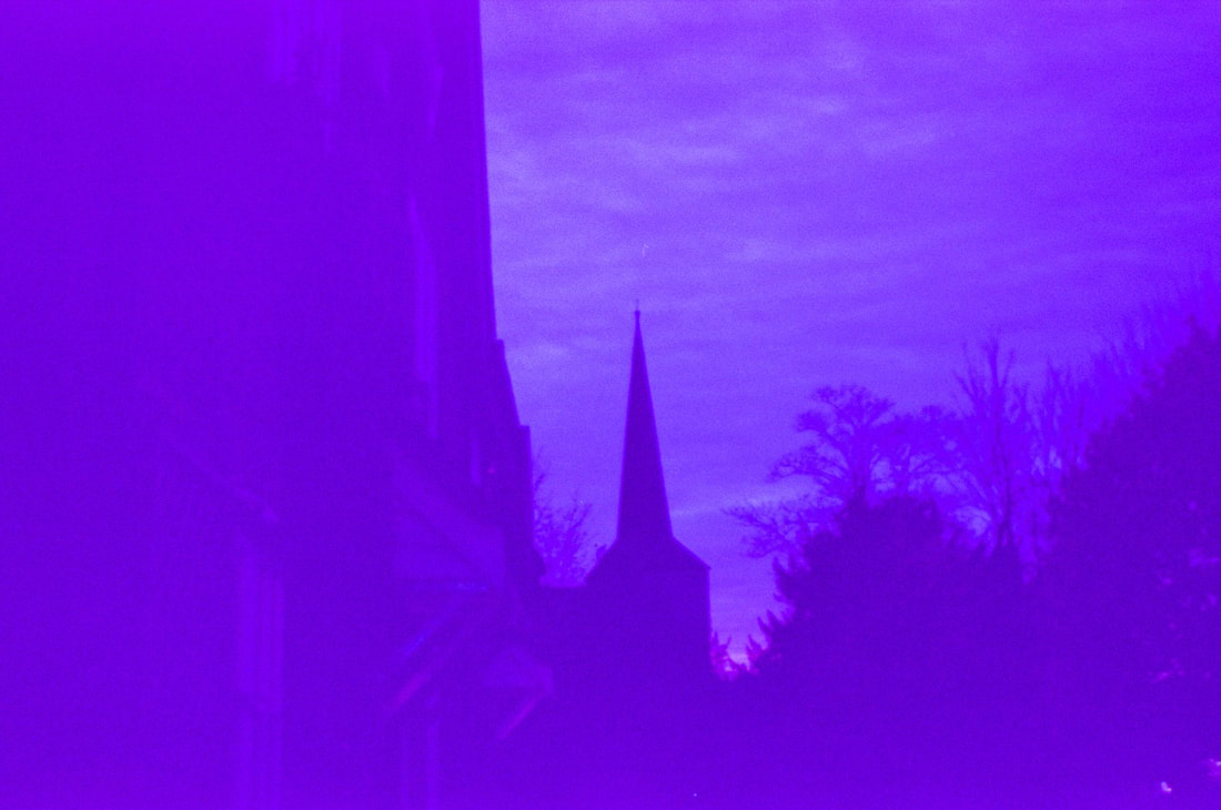
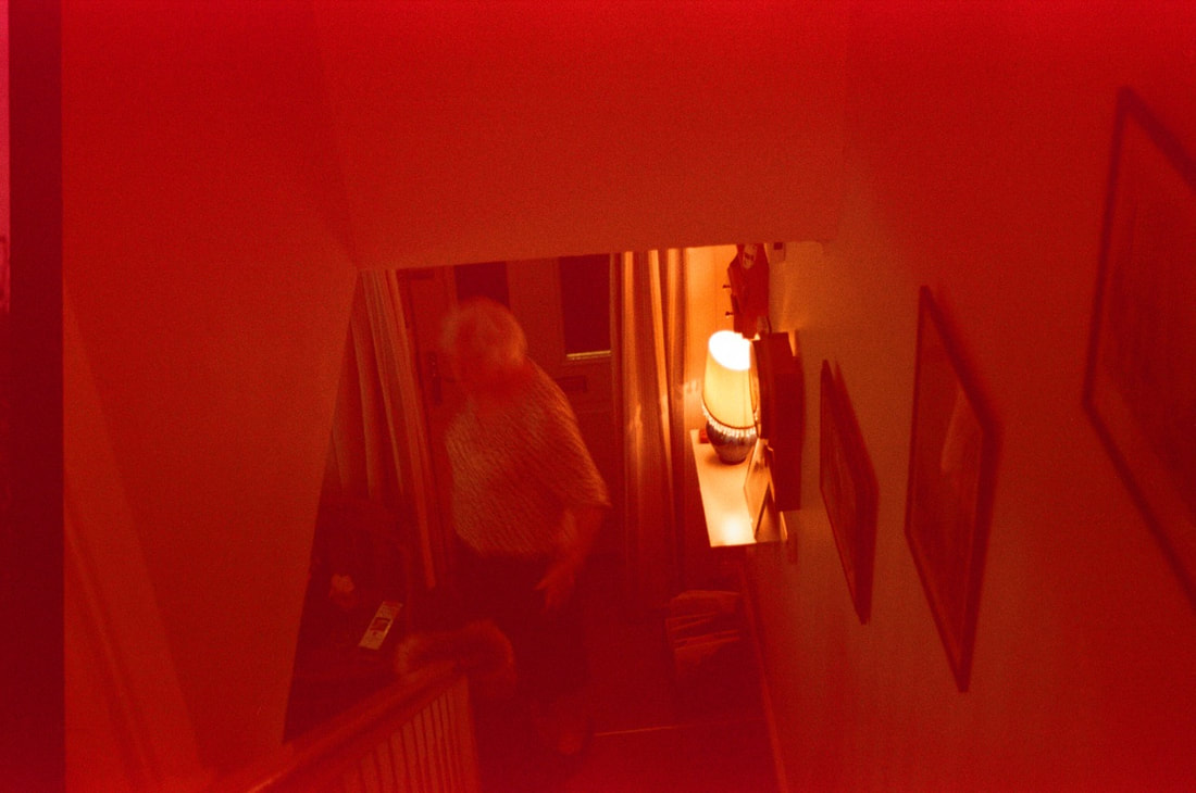
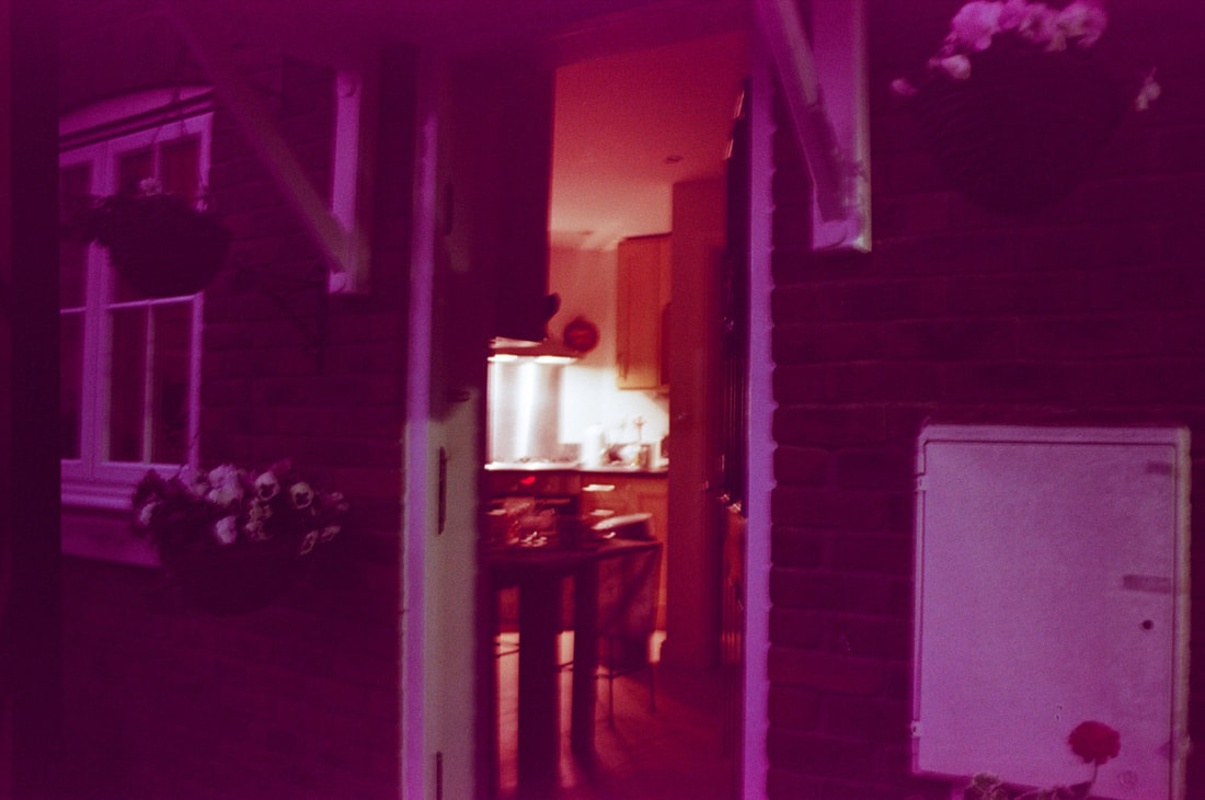
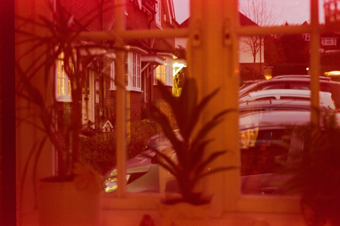
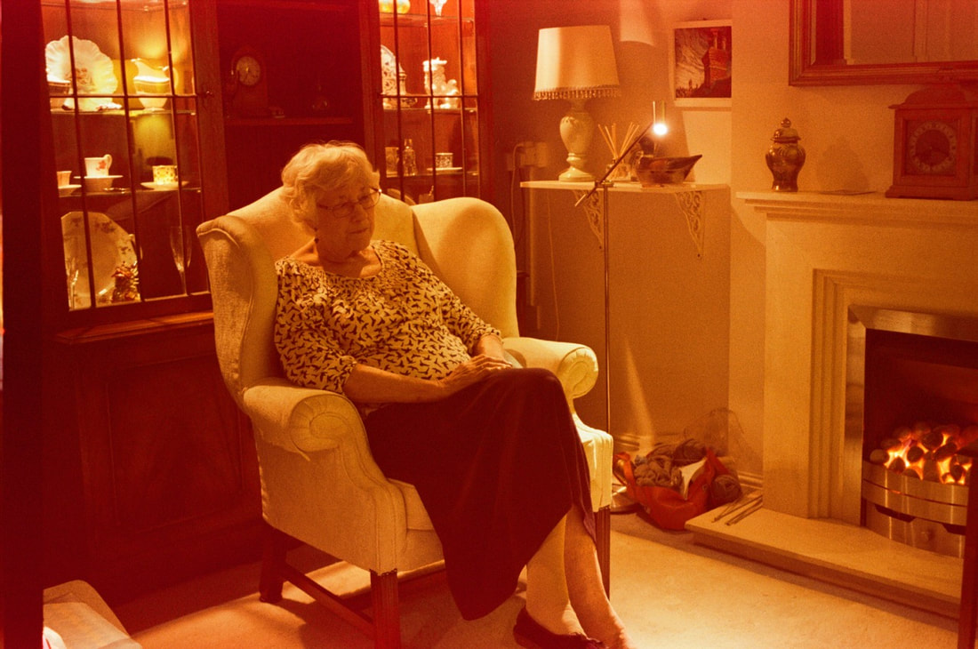
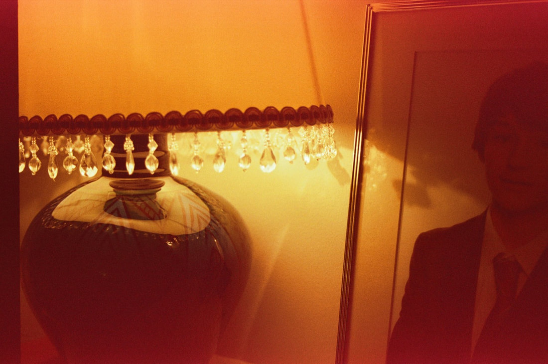
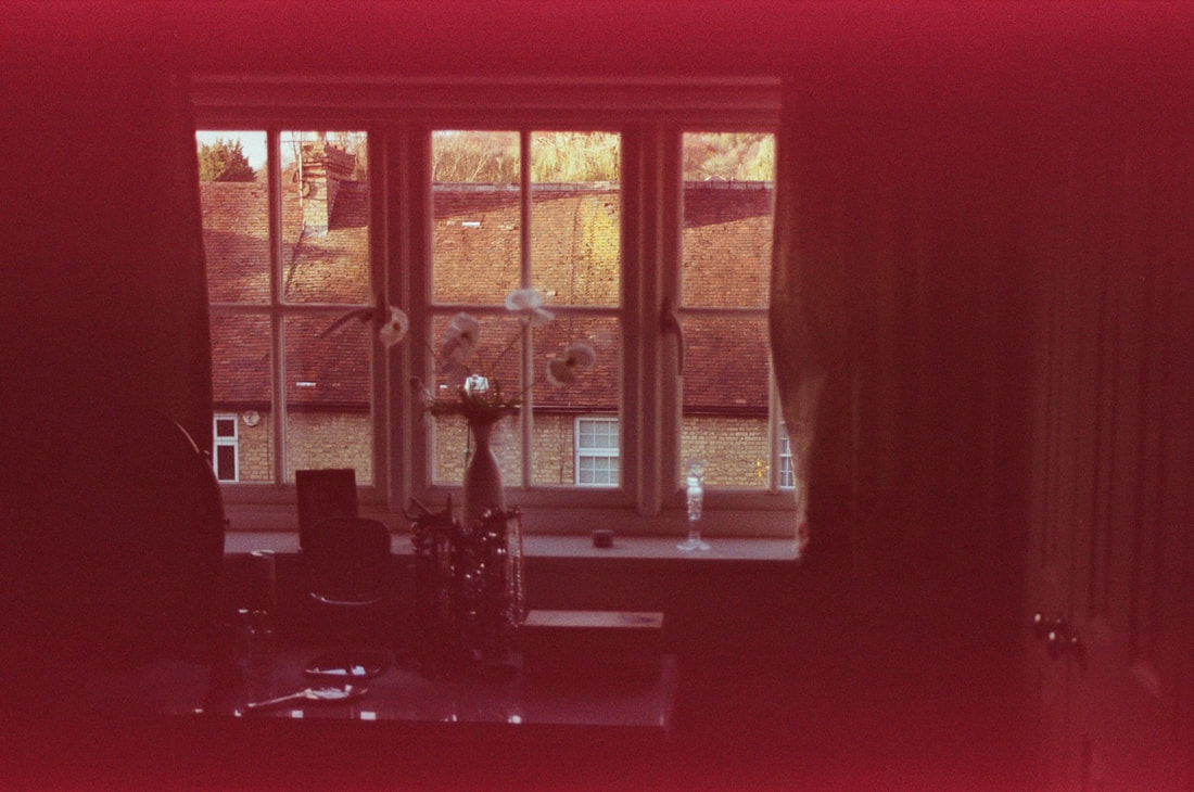
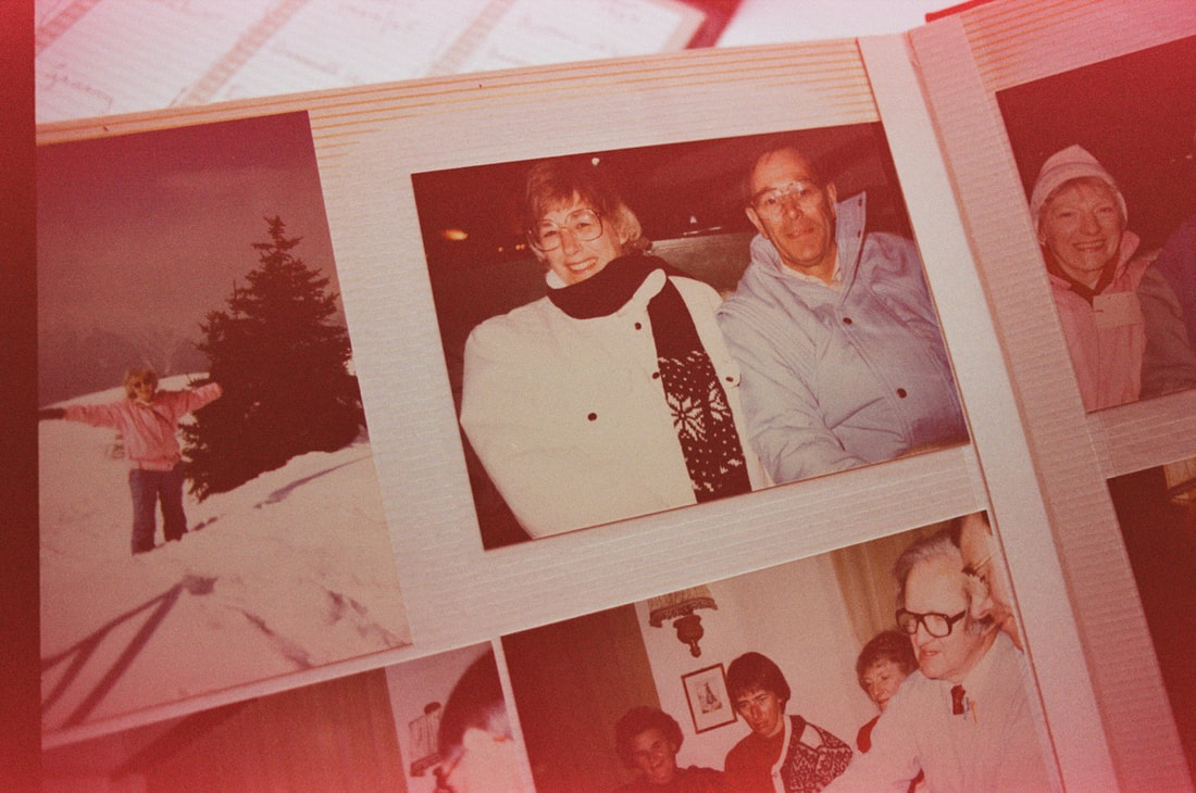
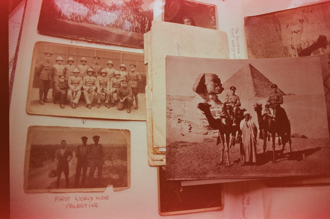
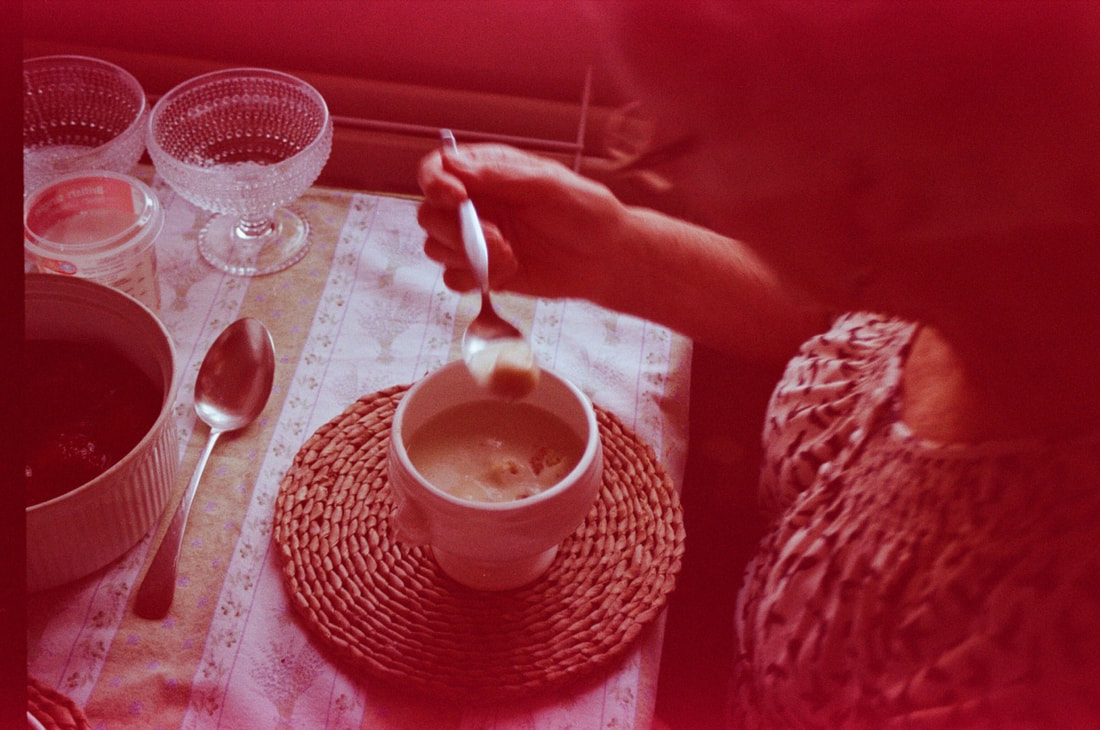
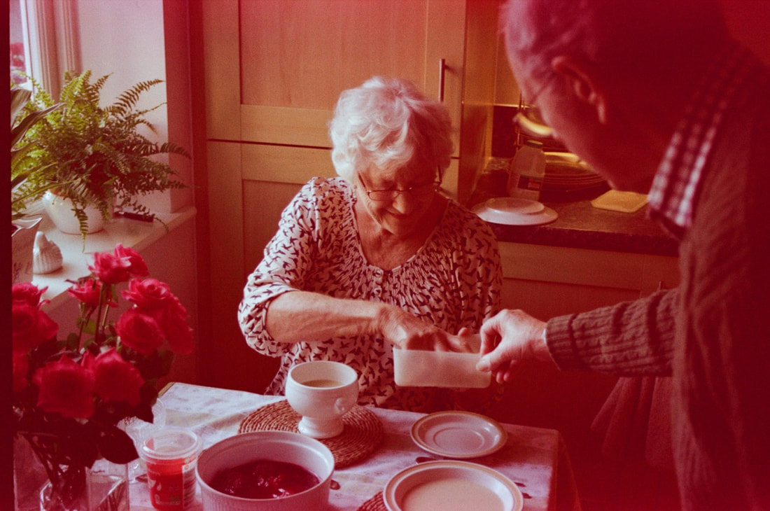
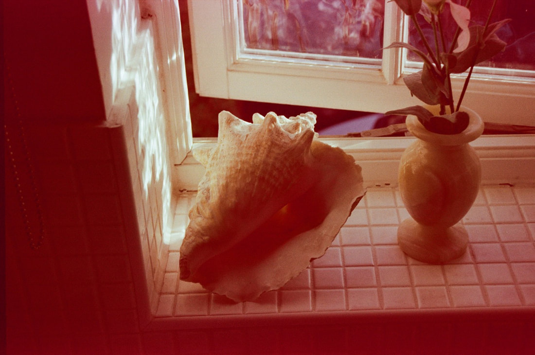
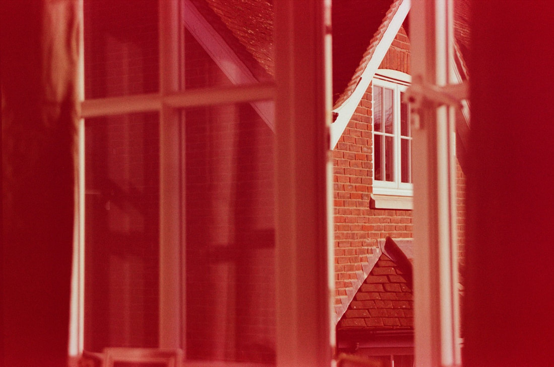
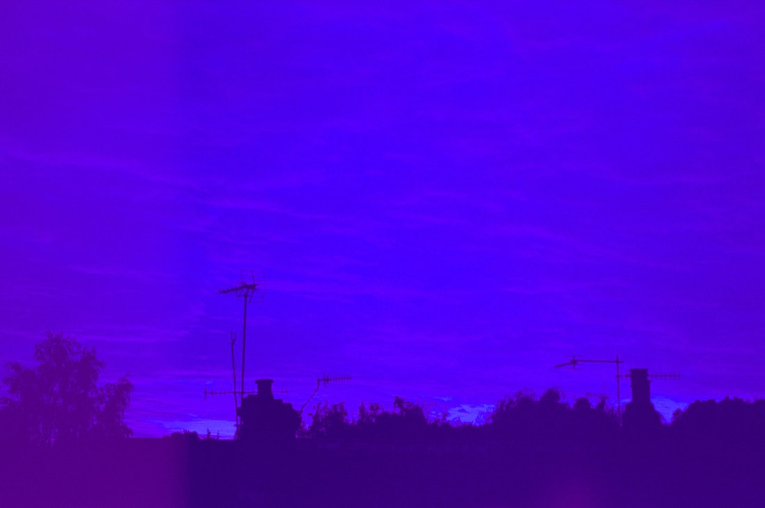
Evaluation
Initially, I was shocked by the outcome of this roll of film. Although I was anticipating some unexpected results from this roll of film, I had no anticipation that the colour rendition would be so extreme. Particularly at the start and end of the roll, the colour rendition of the photographs was very unusual. The first few photographs, and last few photograph in the series are rendered with strong red, magenta and blue tones. However, the photographs in the middle of the roll are less extreme in terms of colour rendition, with some red and yellow tones particularly towards the edges of the frame. Although this outcome was so unexpected, I like the outcome of this set of photographs. The colour rendition is extremely interesting, it brings a new level of interest to these photographs. I also like the photographs towards the middle of the series, with the nostalgic look of the yellow/red colours towards the edges of each frame. The subject matter was quite effective in exploring the vast range of my grandfather's memories and life, captured in the photographs and belongings my grandparents amassed throughout their lives. Moreover, the portraits were quite effective to engage with my grandparents, exploring my relationship to them personally.
Initially, I was shocked by the outcome of this roll of film. Although I was anticipating some unexpected results from this roll of film, I had no anticipation that the colour rendition would be so extreme. Particularly at the start and end of the roll, the colour rendition of the photographs was very unusual. The first few photographs, and last few photograph in the series are rendered with strong red, magenta and blue tones. However, the photographs in the middle of the roll are less extreme in terms of colour rendition, with some red and yellow tones particularly towards the edges of the frame. Although this outcome was so unexpected, I like the outcome of this set of photographs. The colour rendition is extremely interesting, it brings a new level of interest to these photographs. I also like the photographs towards the middle of the series, with the nostalgic look of the yellow/red colours towards the edges of each frame. The subject matter was quite effective in exploring the vast range of my grandfather's memories and life, captured in the photographs and belongings my grandparents amassed throughout their lives. Moreover, the portraits were quite effective to engage with my grandparents, exploring my relationship to them personally.
My Photographs using colour film
Whilst using the roll of expired film in my grandad's old camera, I also used another roll of colour film. However, in this case, the film wasn't expired and newly bought for this series. I used my dad's Olympus OM20, with a 50mm f1.8 lens. I chose this camera as I really enjoyed using it for previous sets of photographs; I also wanted to use a wide aperture. I wanted to take portraits with a shallow depth of field (f1.8 was perfect for this), and I wanted to make sure my photographs were sharp, as light in the winter is unpredictable. I chose to shoot with film mainly as I love the contrast and colour rendition that different film stocks produce, as well as the grainy quality of the photographs I chose Ultramax as it is ISO 400 film, and produces contrasty colour rendition - I mainly wanted a relatively fast film as the winter light is can be dark and changeable.
Olympus OM20 (50mm f1.8) + Kodak Ultramax 400 film
Loading film into my Olympus OM20
|
Kodak Ultramax 35mm film
|
My outcome:
When photographing, I was primarily looking for interesting details, and also photographing a set of portraits of my grandparents. Light was a key point of interest when photographing - I focused on the dappled sunlight and shadows throughout their home. The views through windows and reflections were also key points of focus. I was interested in the views and windows filtering light into the house. I asked my grandma about certain objects and ornaments as well, asking her to talk about the origins of the objects, as well as the photo albums and slides in their extensive archive of photographs. I also combined these with a number of portraits, which I wanted to include alongside the photographs of objects and details.
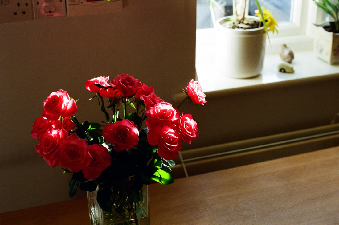
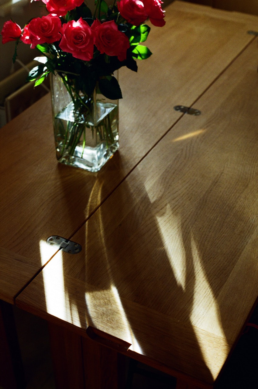
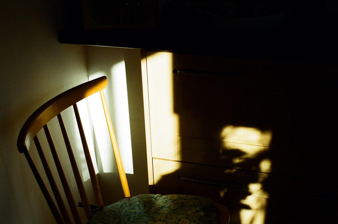
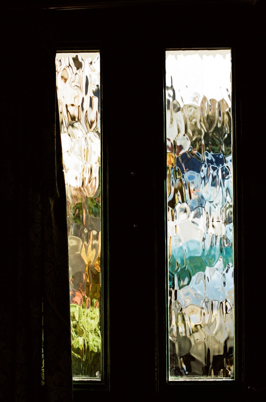
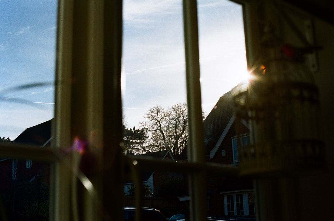
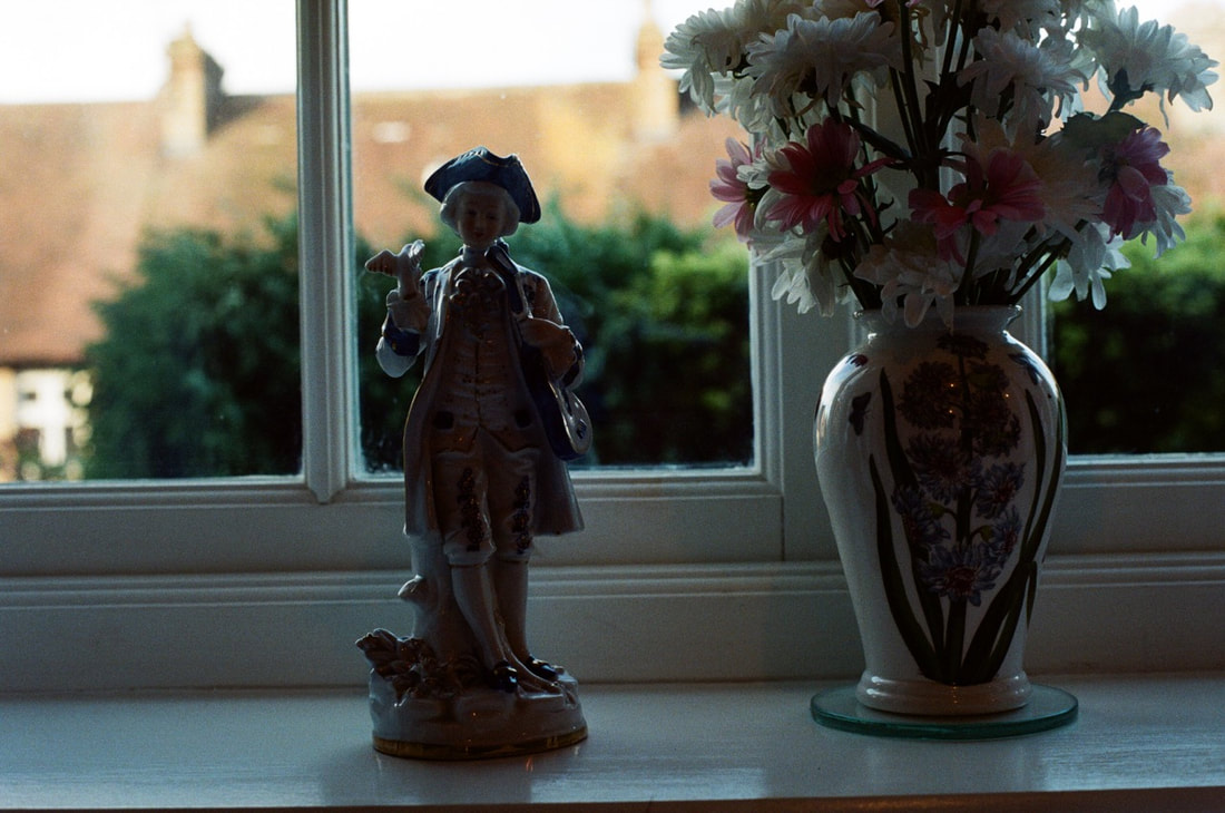
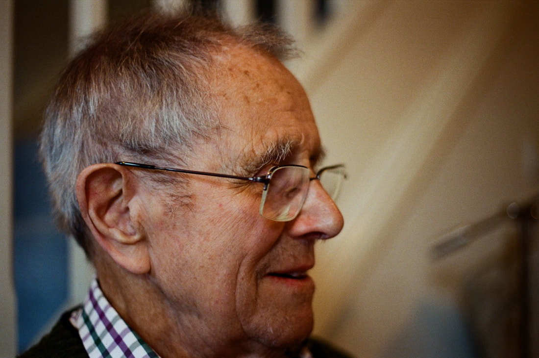
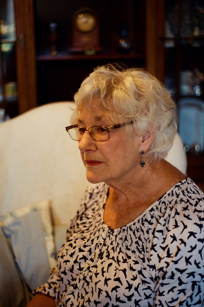
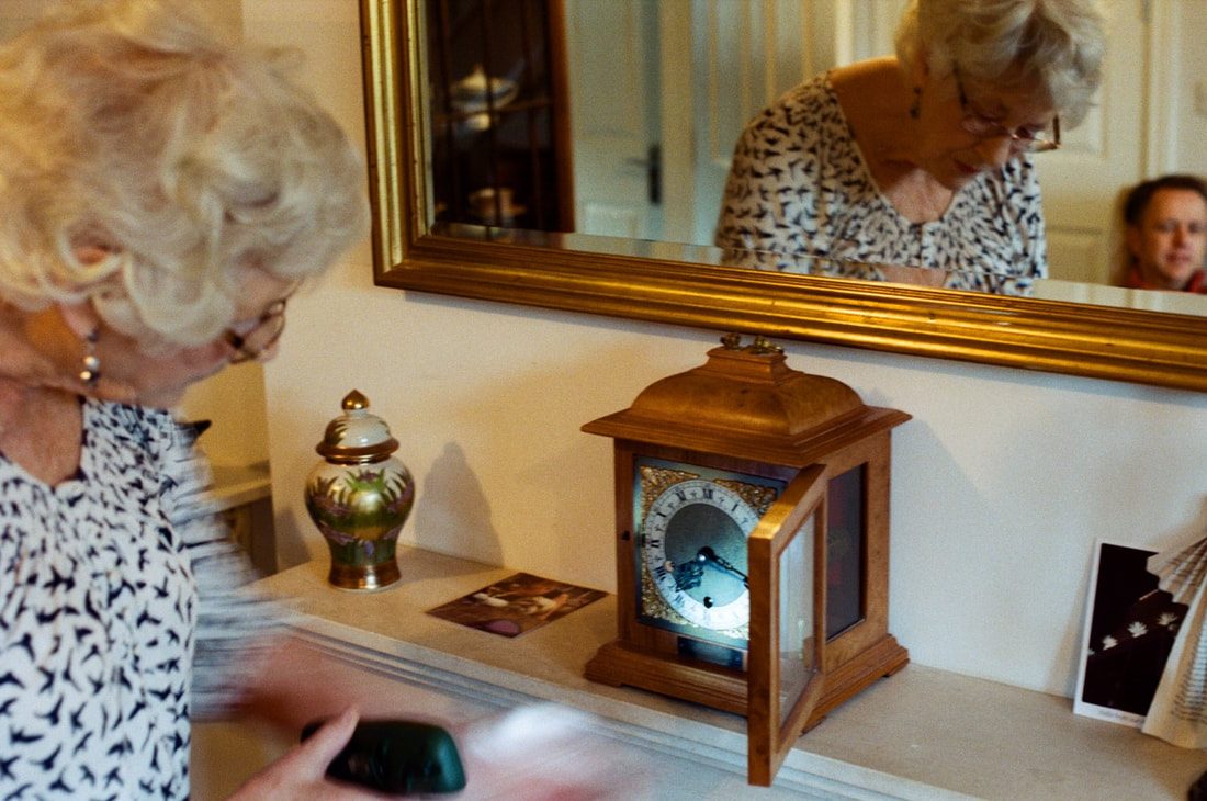
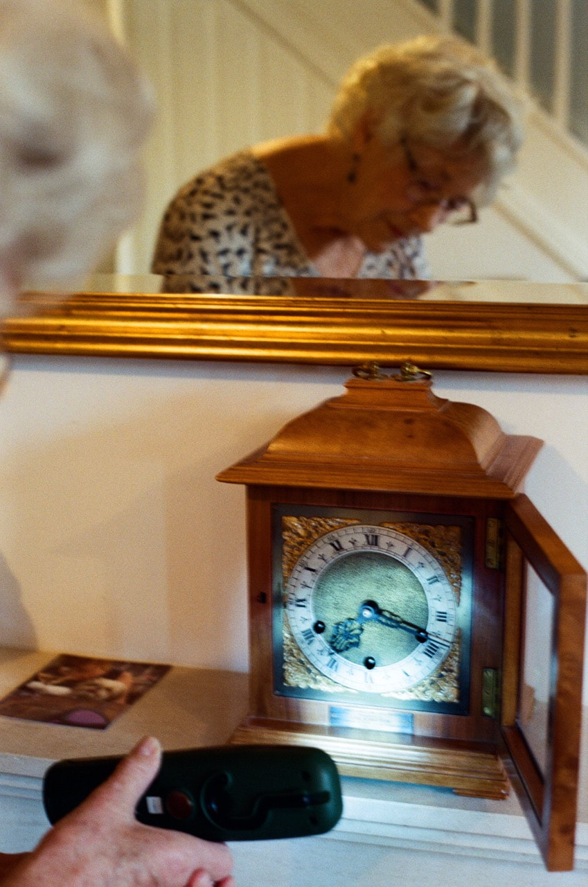
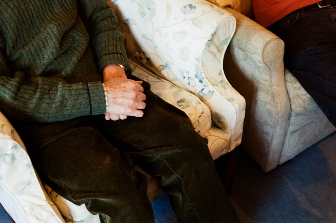
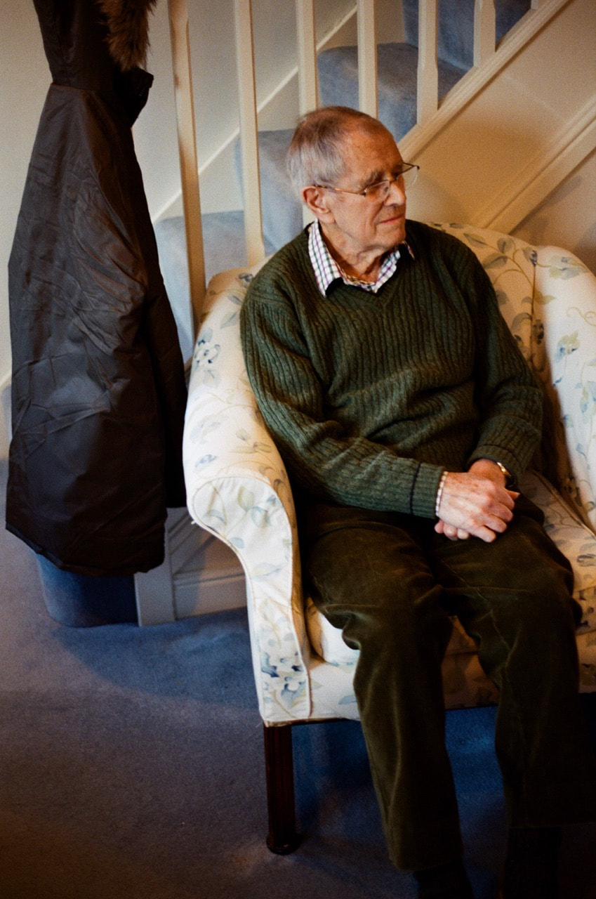
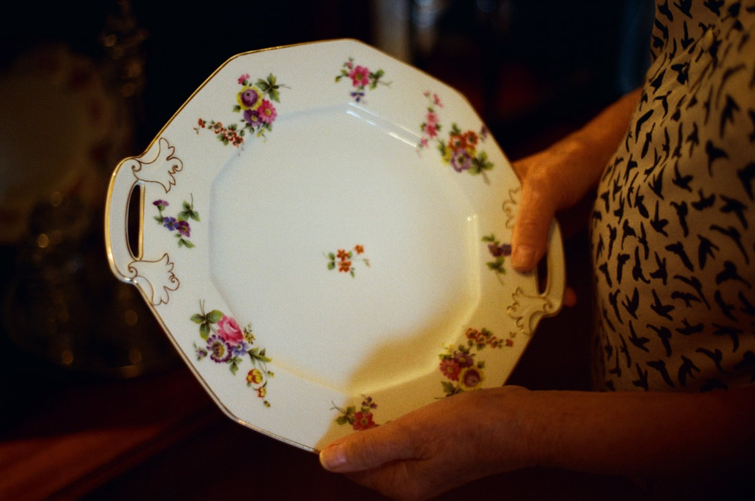
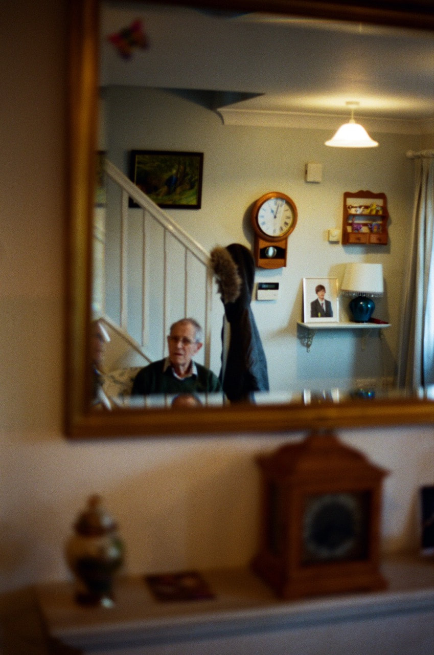
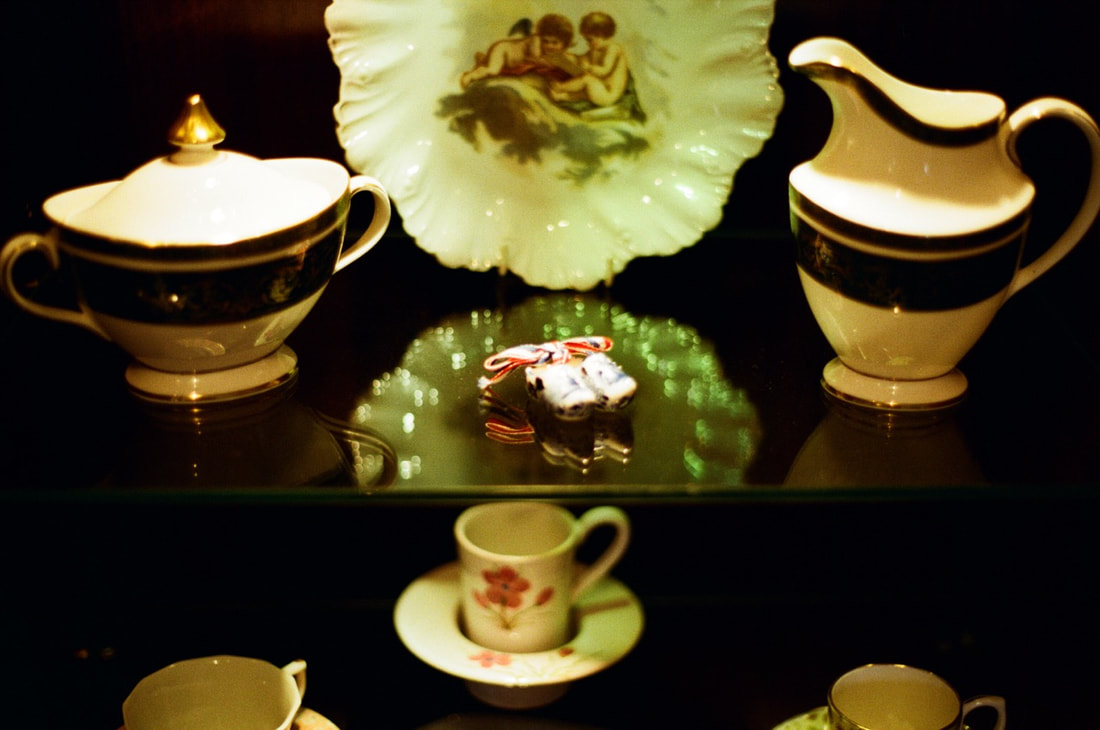
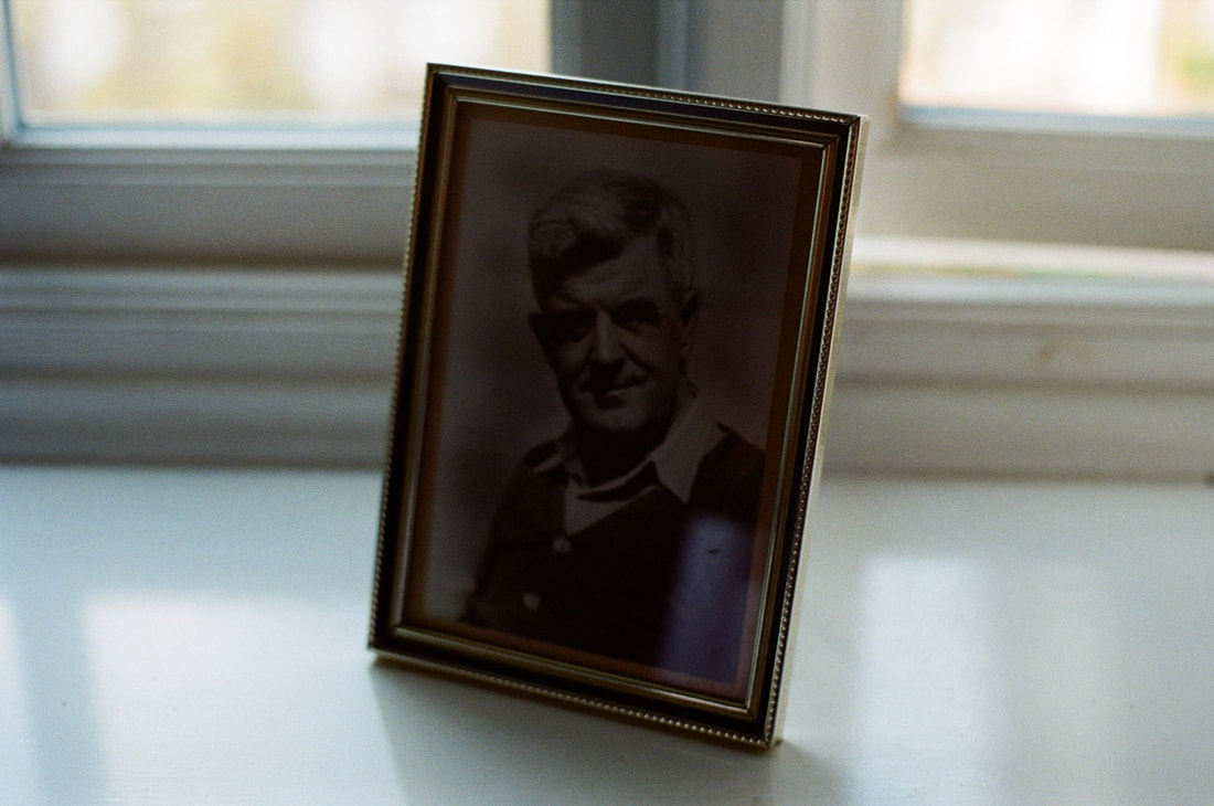
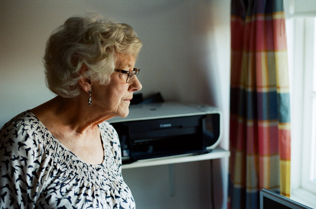
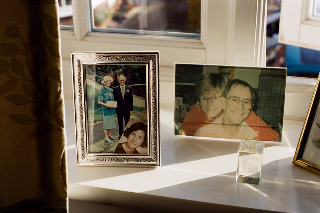
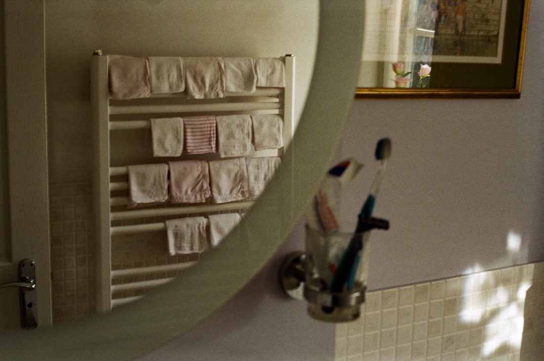
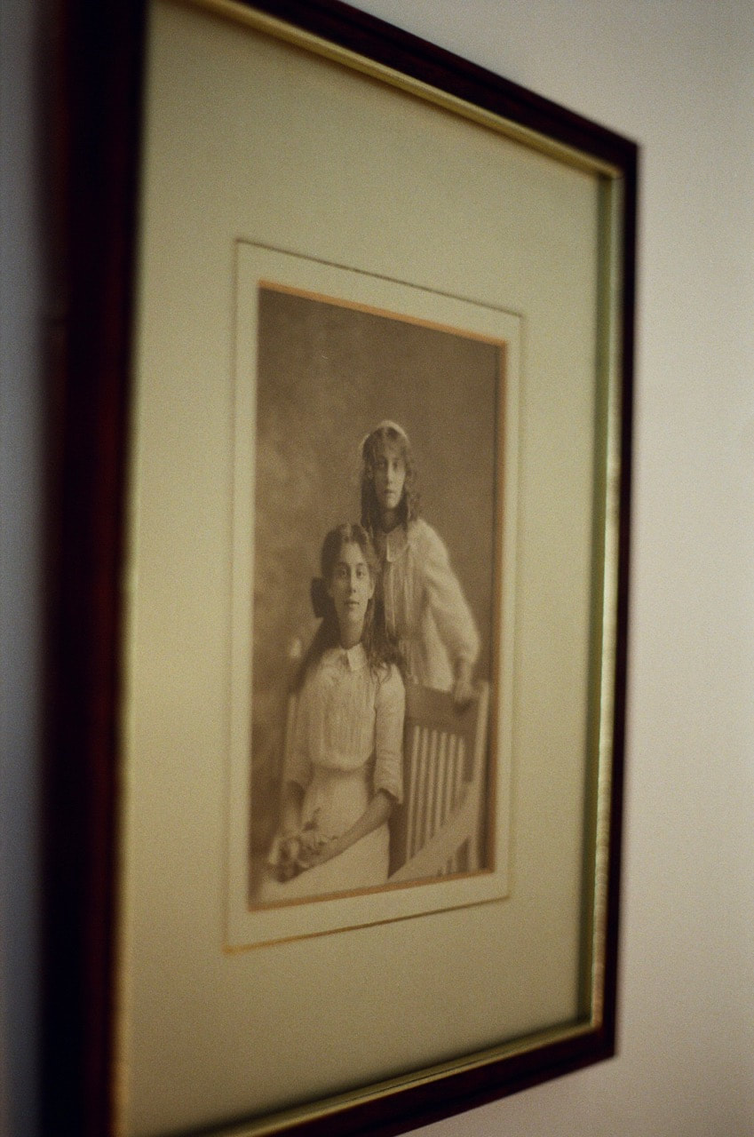
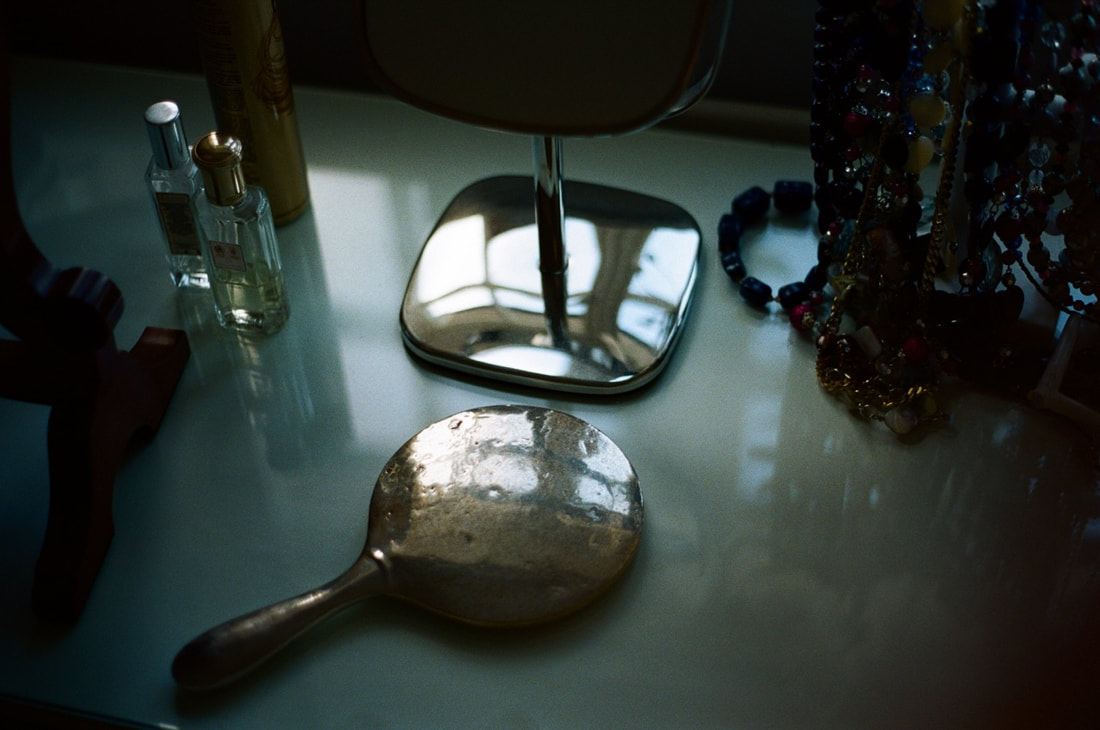
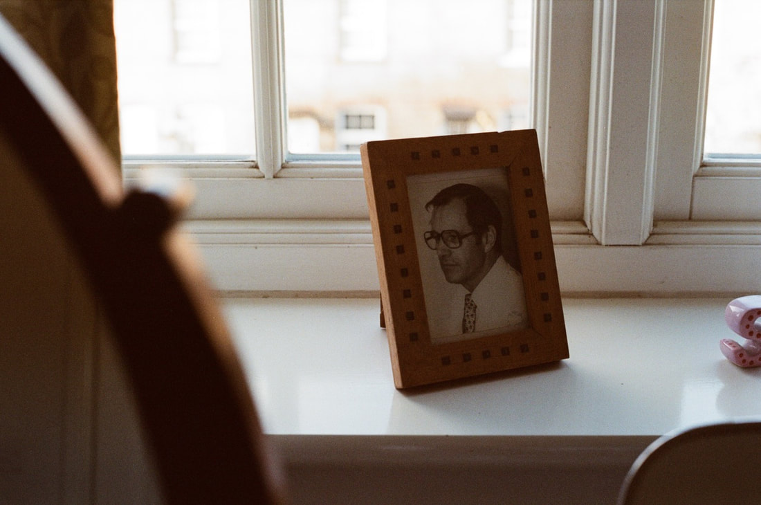
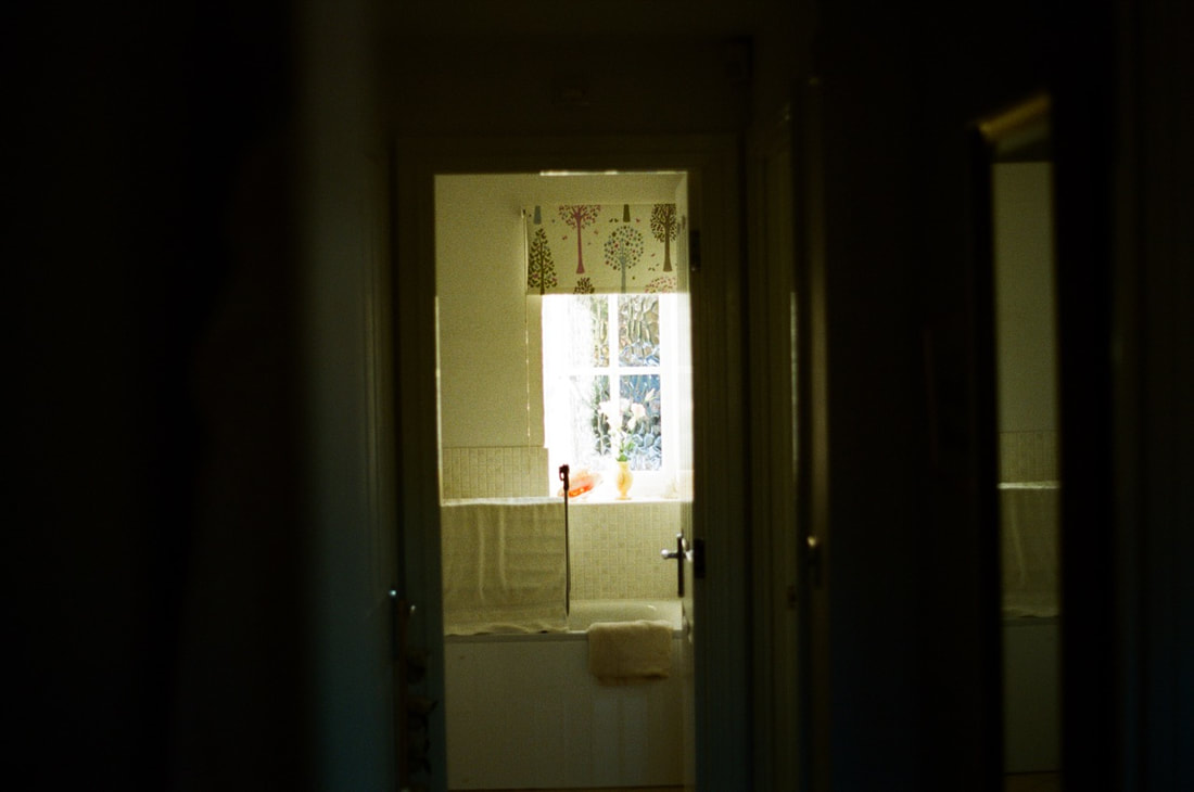
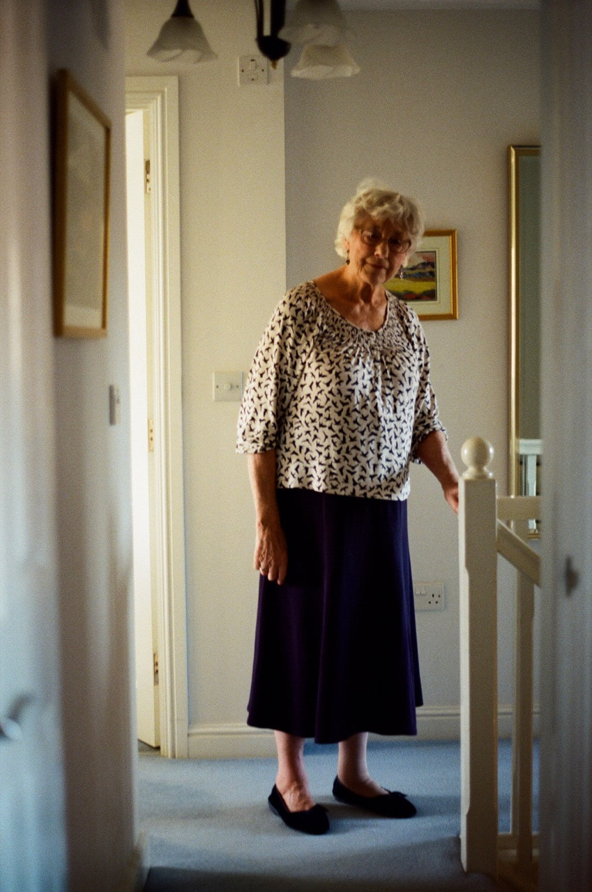
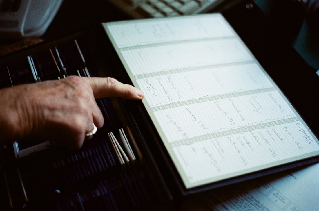
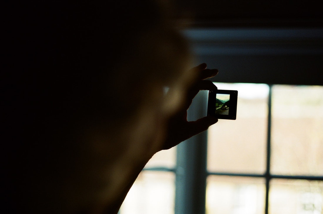
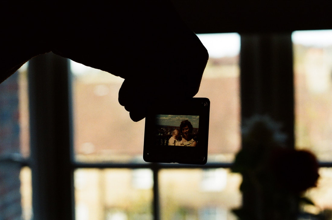
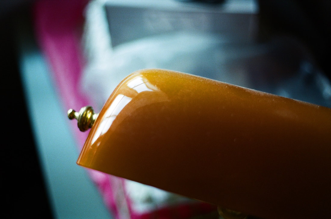
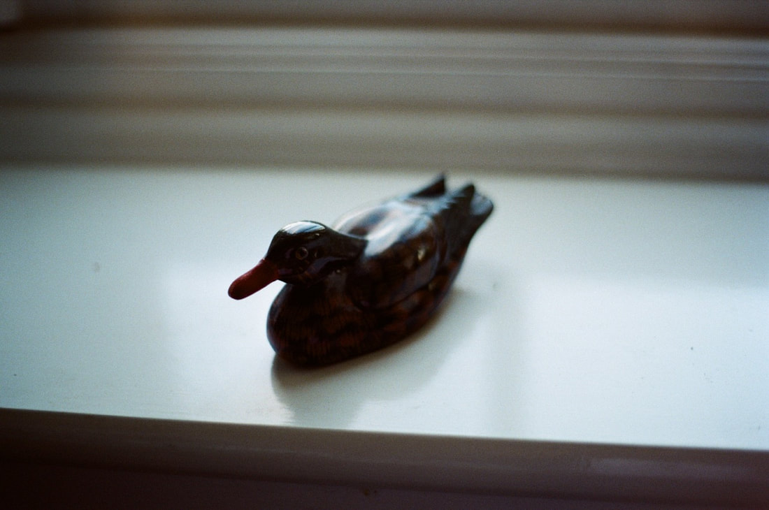
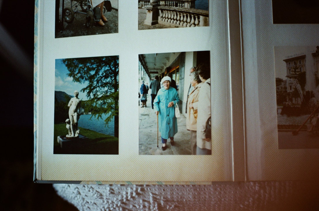
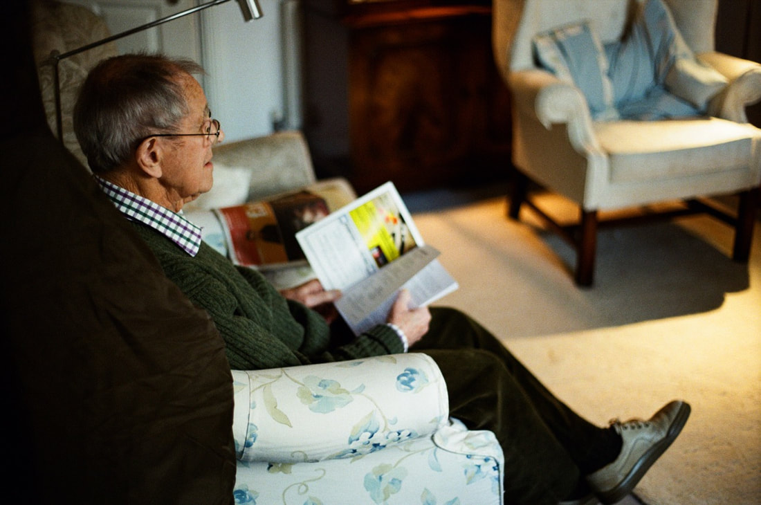
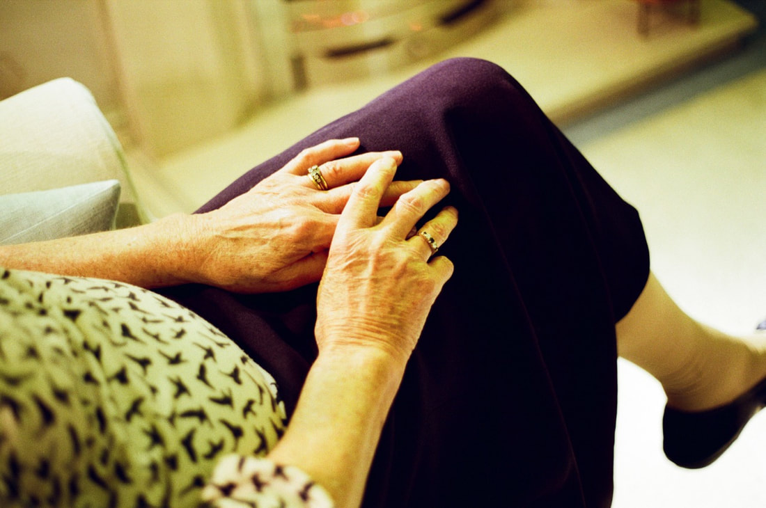
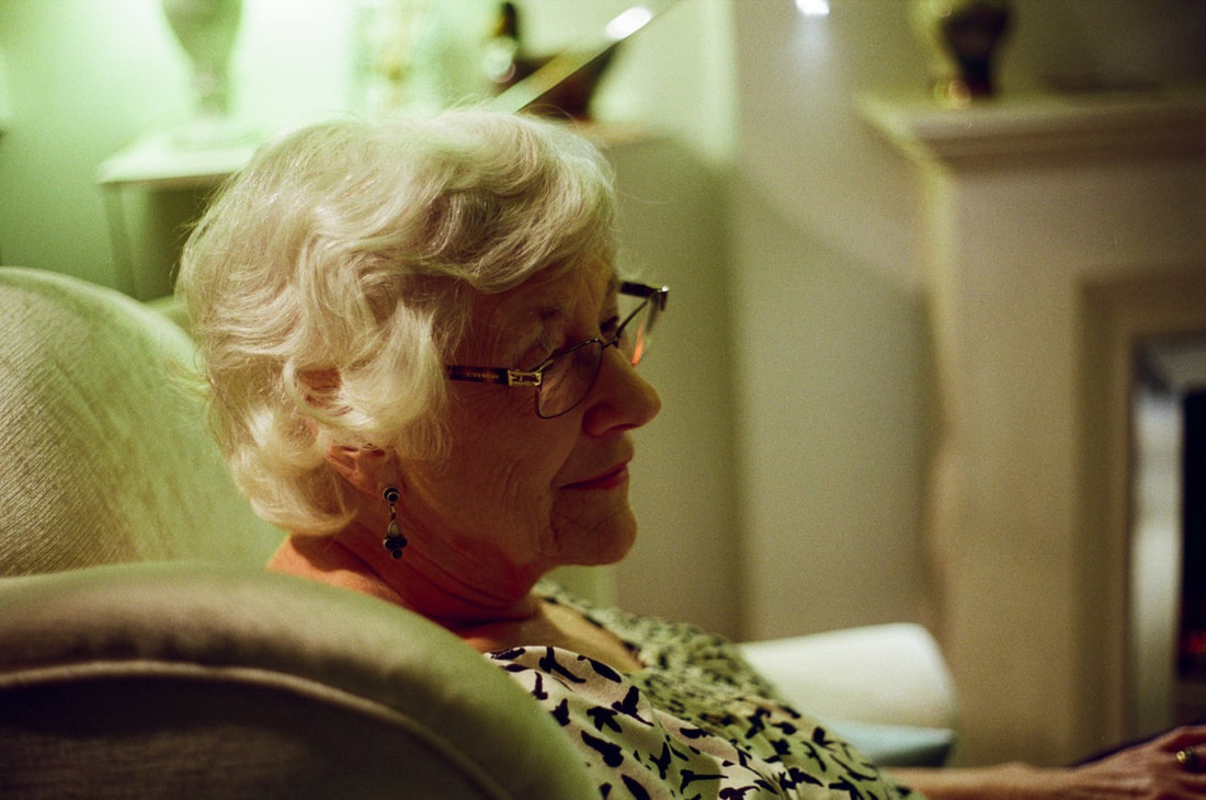
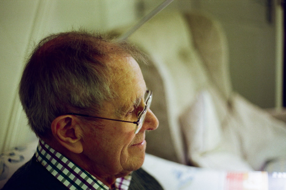
Evaluation:
Overall, I am pleased with the outcome of this set of photographs. I really like the outcome of the film - particularly the rich, contrasty colour rendition. I think this set of photographs work well together as a whole - especially the range of different subject matter, and the ability of this series to provide a documentary narrative. I also focused on some of their old archive photographs and framed old family pictures in this series, contrasting with the portraits I took, and linking with the memories associated with the objects their have collected over the course of their lives. think that my photographs capturing details and objects are particularly successful, as well as the use of light in the photographs of details especially. I am also quite pleased with the outcome of the portraits that I took, I think the lighting is especially effective in these photographs, as well as the shallow depth of field with the wide aperture lens that I used. I think that these photographs have a more sensitive feel overall, whereas my photographs in the past appear more candid and straight forward as a whole. Moving forward, I would like to use the wide range of different photographs focusing on my grandparents and their photographic archives to produce an outcome. Expanding my work further (to create something like an installation for example), or a more documentary/narrative photo book could be also successful using my photographs.
Overall, I am pleased with the outcome of this set of photographs. I really like the outcome of the film - particularly the rich, contrasty colour rendition. I think this set of photographs work well together as a whole - especially the range of different subject matter, and the ability of this series to provide a documentary narrative. I also focused on some of their old archive photographs and framed old family pictures in this series, contrasting with the portraits I took, and linking with the memories associated with the objects their have collected over the course of their lives. think that my photographs capturing details and objects are particularly successful, as well as the use of light in the photographs of details especially. I am also quite pleased with the outcome of the portraits that I took, I think the lighting is especially effective in these photographs, as well as the shallow depth of field with the wide aperture lens that I used. I think that these photographs have a more sensitive feel overall, whereas my photographs in the past appear more candid and straight forward as a whole. Moving forward, I would like to use the wide range of different photographs focusing on my grandparents and their photographic archives to produce an outcome. Expanding my work further (to create something like an installation for example), or a more documentary/narrative photo book could be also successful using my photographs.
My First Final Outcome - Installation test piece
For my first final outcome, I wanted to combine the range of different photographs I had taken, alongside the work I had done filming my grandad's slide projections. Firstly, I printed a range of different images that I had made, printing 2 images from each set in A3 and A4 size. I printed photographs from my medium format portraits, my darkroom experiments, the archive photographs, my photoshop experiments, photographs of the slides as well as both the expired film photographs and colour film photographs. My idea was to combine these photographs with the video I made of the slide projections. This would combine my photographs with the slide film pictures taken by my grandad taken over the course of his life.
Process:
After printing the range of different images, I subsequently displayed the range of images, placing them on a blank wall. I varied how I displayed my photographs, placing different photographs together - similarly to the displays of Wolfgang Tillmans for example. I tested placing them side by side, seeing what arrangement of photographs worked most effectively visually.
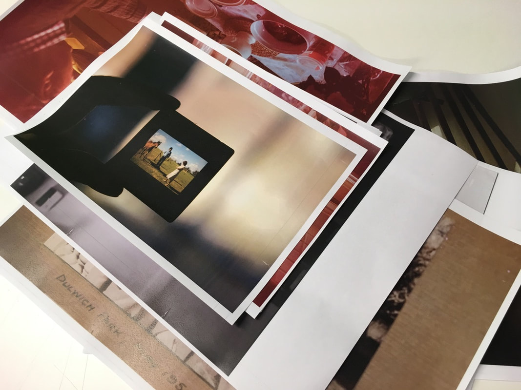
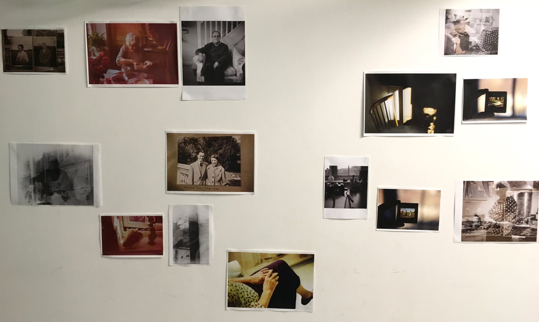
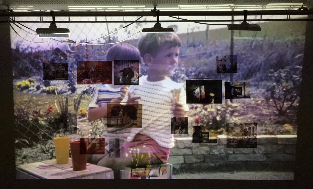
After displaying my photographs, I subsequently projected my video of the slide projections. I arranged the projector to cover the whole display of my photographs. By projecting this video, I was combining the photographs taken by my grandad with my own photographs. This would explore the relationship I have to my grandad's photographs, especially in relation to my own photography.
Recording my installation
After projecting the slide film video onto my installation of photographs, I then filmed my outcome. Using my phone, I filmed the installation as a whole initial and then I focused on particular areas. I filmed certain photographs closely with the projections on top, as well as filming different sections of the installation with the shapes and colours of the projections appearing on top.
My installation film:
Overall, I think the outcome of my installation was relatively successful. This was only a first test piece, but I really like the outcome of the slide film projected on top of my photographs. I especially like the way that it bridges the gap between my photographs and my grandad's photography, providing a dialogue and relationship between his slide photographs on top of my own images. Visually, I like the way that the slide video illuminates different photographs displayed on the wall, as well as the effect faces and colours in my grandad's slides projected on top of my photographs. I also like where I have focused in on specific areas in my video; For example, I focused closely on a few of my photographs, with the projections of faces, shapes and colours flashing across the images. These create individual abstracted compositions of colours and shapes themselves.
Ideas moving forward: Physically combining my photography with my Grandparent's photography
CONCEPT: My main idea is to combine my photography through the medium of film. Conceptually, the main concept that I have developed, focuses on the relationship between my photography, and my grandfather's photography. My grandfather taught me to use my first camera, and taught me the basics of photography - I would like to explore this in contrast to my grandfather's own passion for photography. My idea is to experiment with double exposures, combining my photography with my grandparents'. Although it will be difficult to execute, my idea is to shoot a roll of 35mm film, and then ask my grandparent's to shoot over the top of my photographs. To do this, I will have to rewind a roll of film I have taken, but make sure that it doesn't rewind fully, back into the film cartridge. I can then load that film again and ask my grandparents to shoot over the top of the film. I am keen to explore this idea, but it will be very difficult to execute well, especially with the complexities of rewinding the film, and producing double exposures.
Method
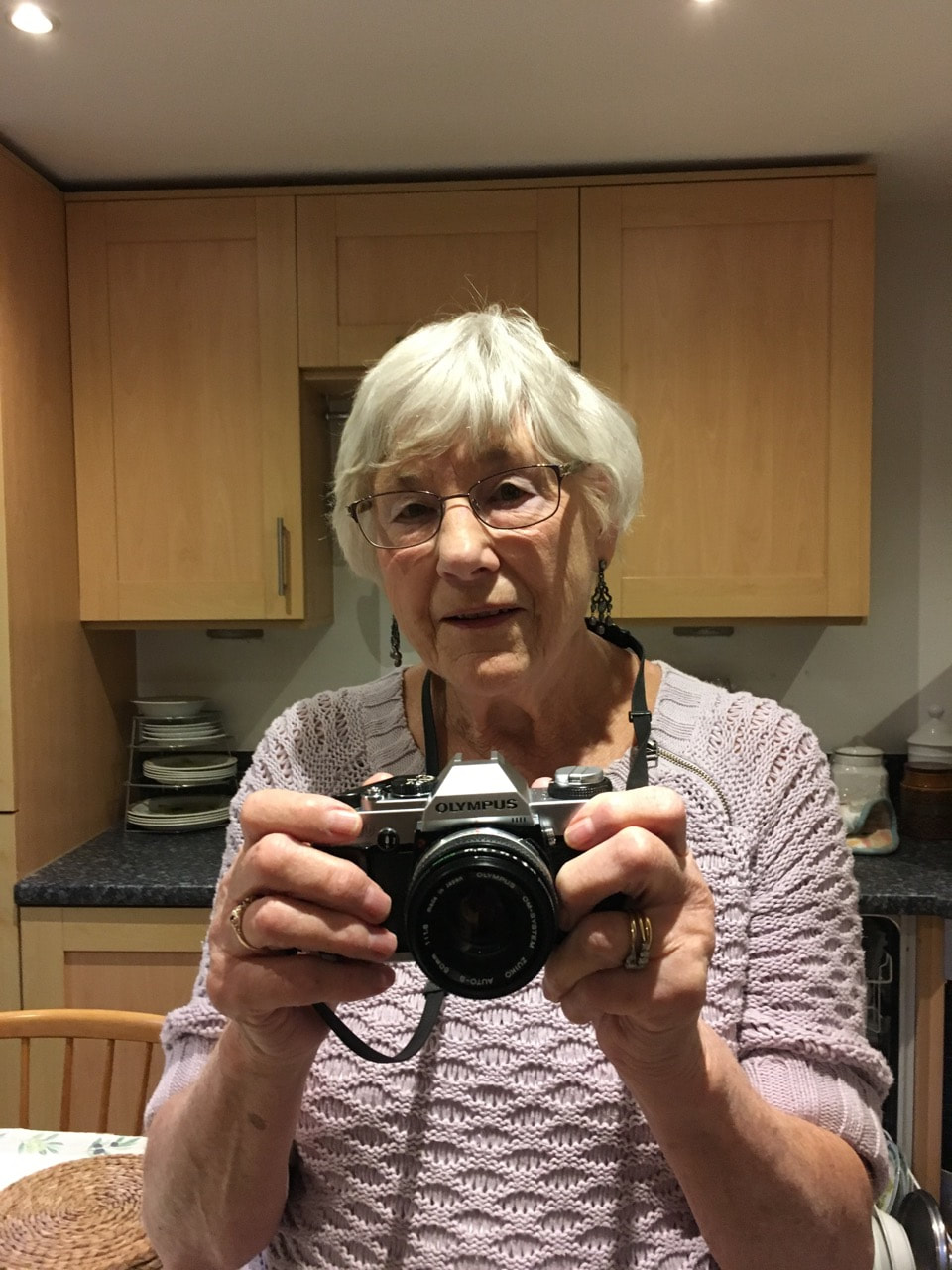
My Grandma shooting over my 24 exposures
|
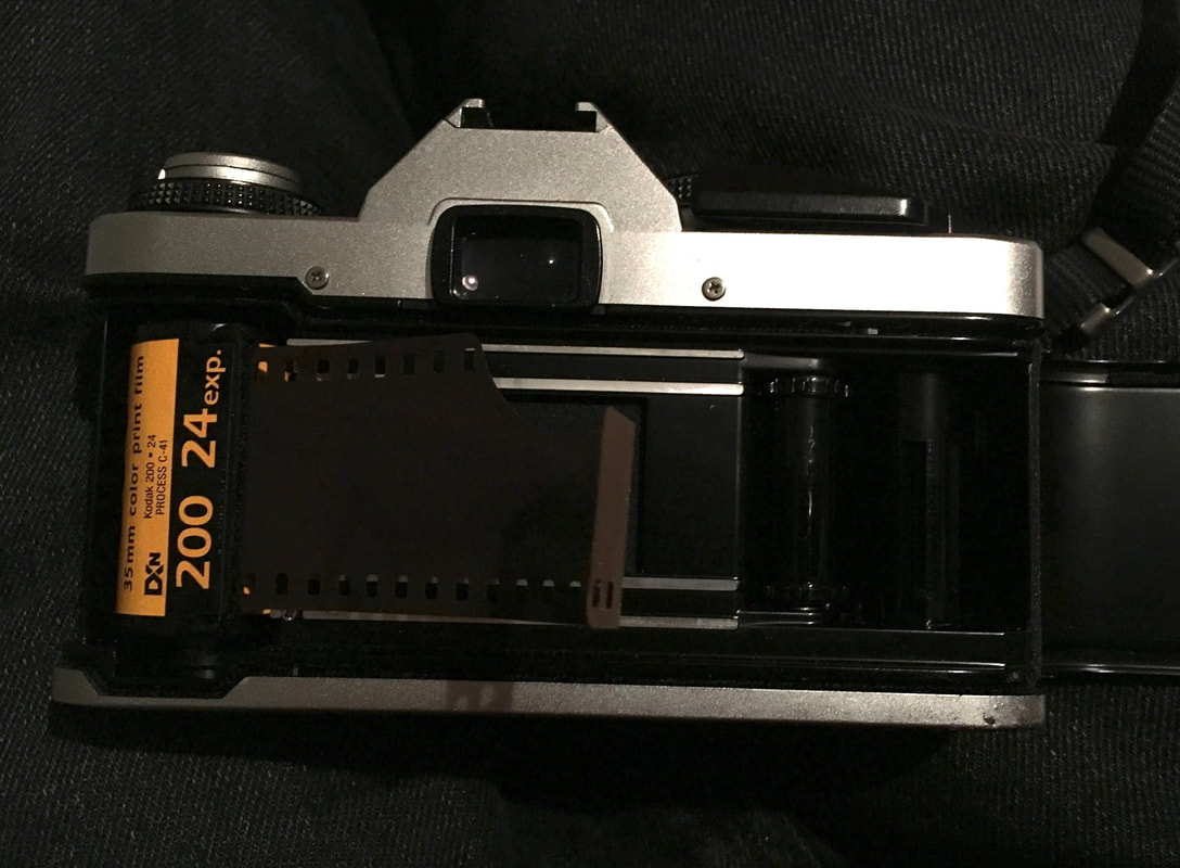
The exposed roll of Kodak Gold 200 - rewound and placed back into the camera
|
The image on the right shows the back of the camera, with the exposed roll of film rewound back into the cannister, although I made sure the tongue of the film was left, so I could load the roll back into the camera. I then gave the camera with the exposed film loaded to my grandma, to shoot over the 24 frames freely. I was hoping that this would produce some interesting double exposures.
|
My double exposures outcome:
To create this set of double exposures, I firstly shot a roll of 24 frames on the roll of film. After finishing the roll, I had to rewind the roll, but I had to make sure the film didn't fully rewind back into the canister, so I had to open the back of the camera in a pitch dark room. I had to feel when the roll of film had come to an end, stopping the roll rewinding fully. I then loaded the film back into the camera, re-loading the film back into the camera and be re-shot. I subsequently gave the camera to my grandparents, and I told them to go off and shoot 24 frames.
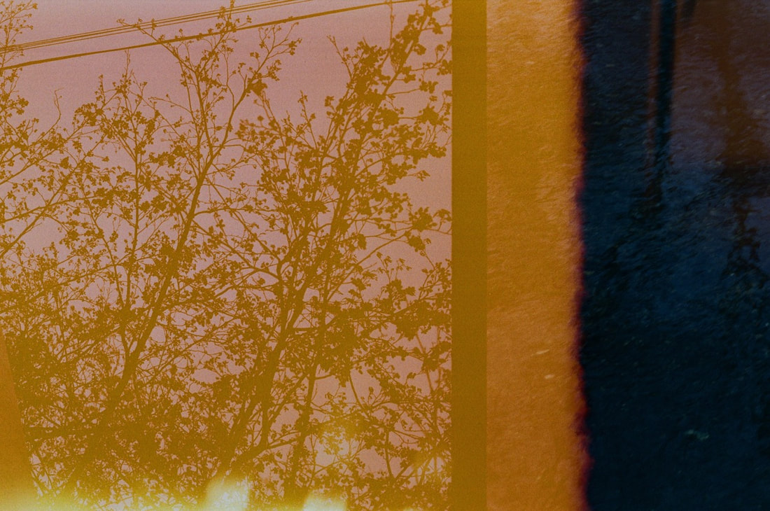
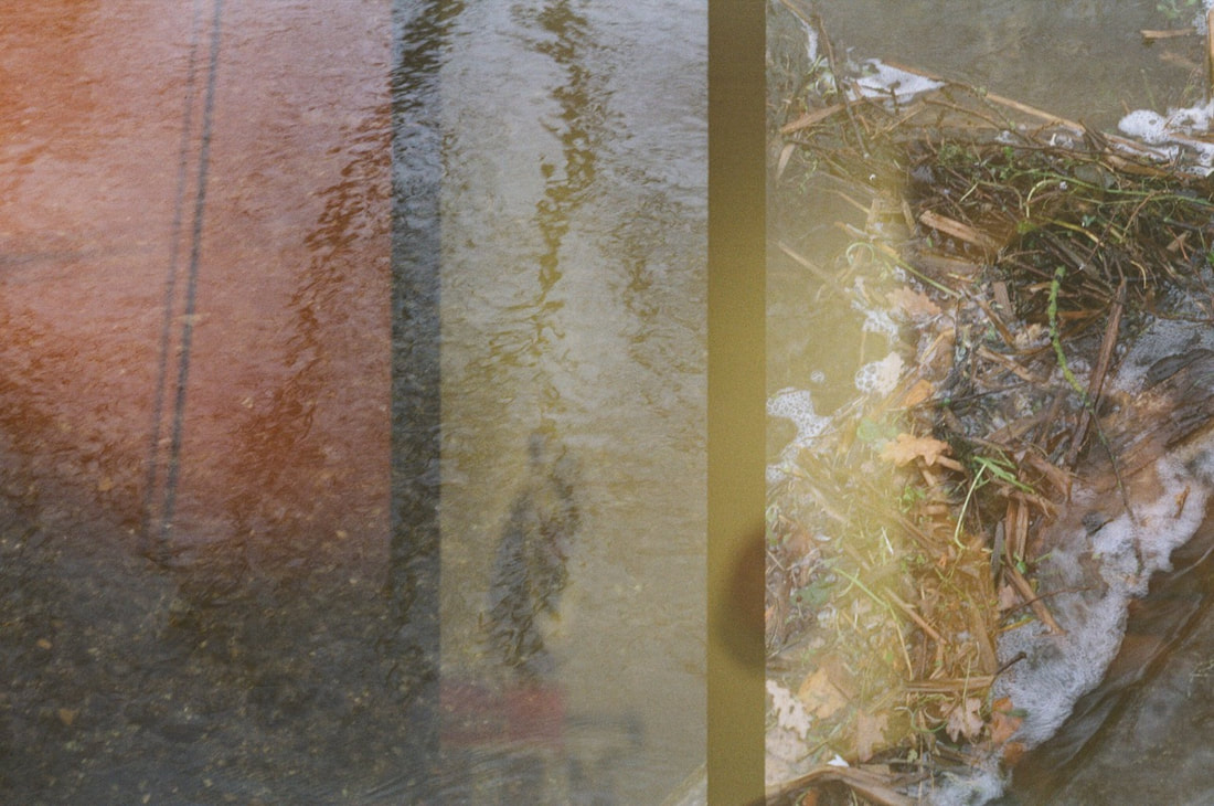
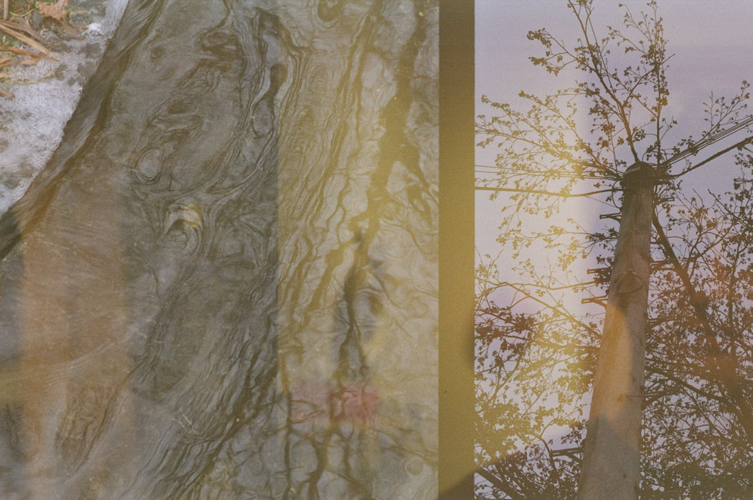
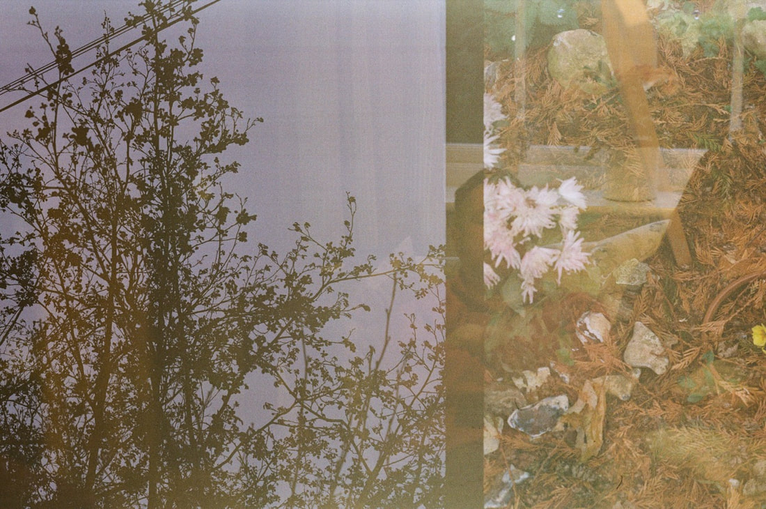
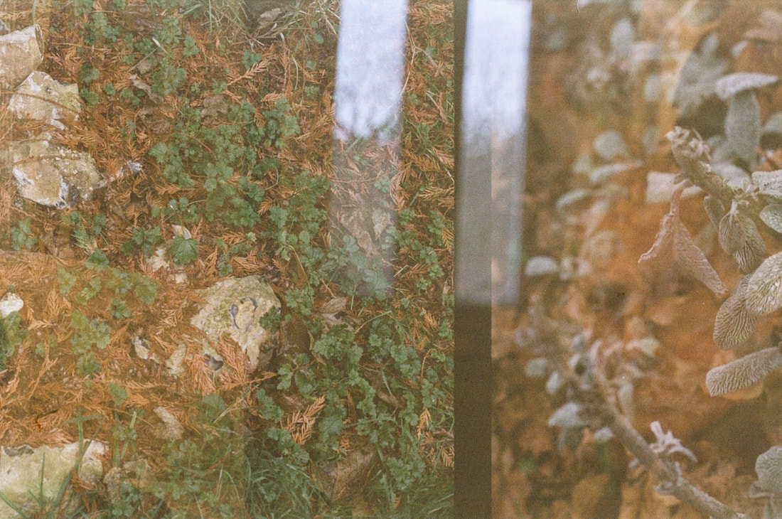
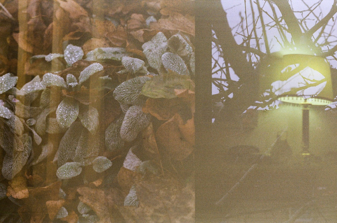
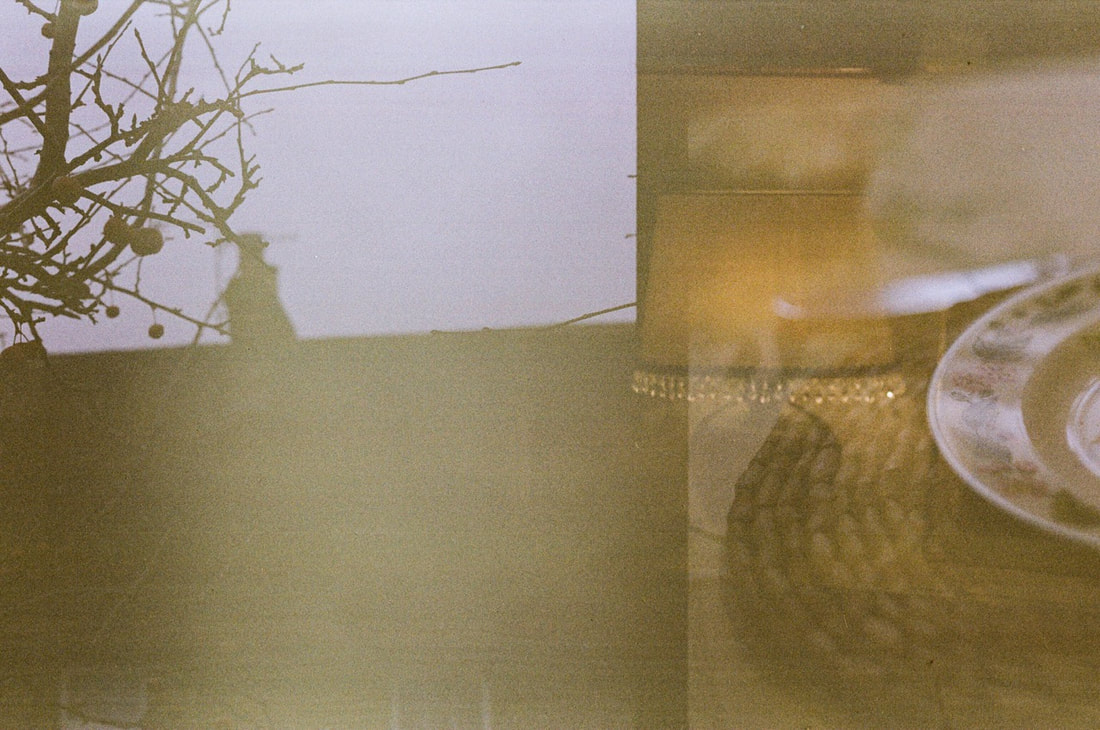
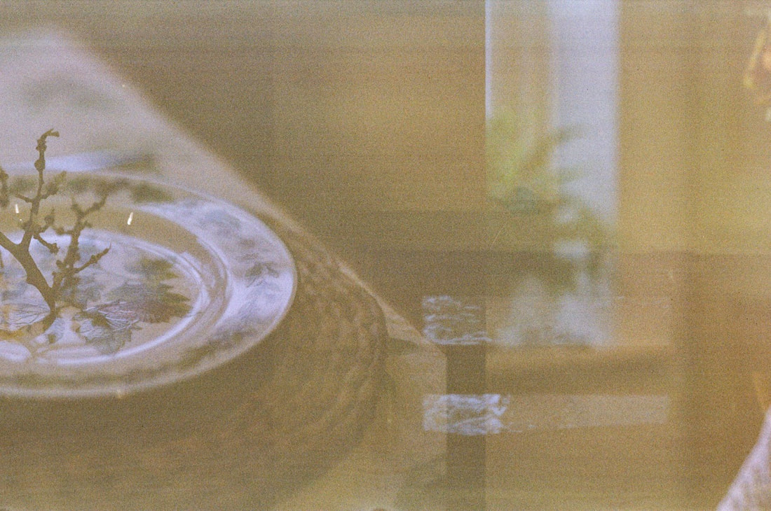
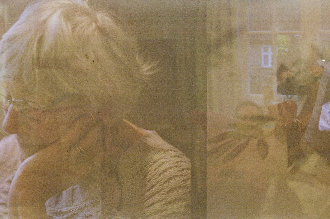
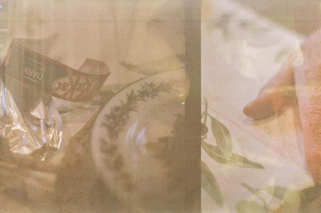
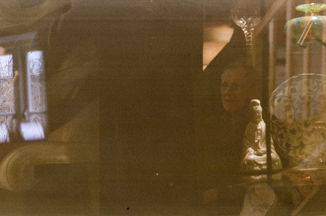
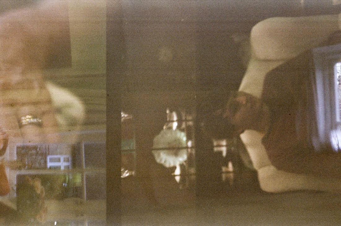
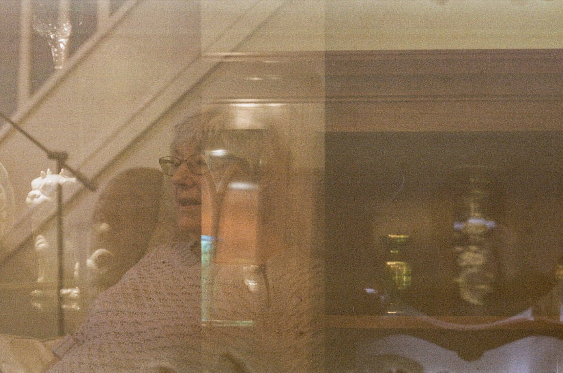
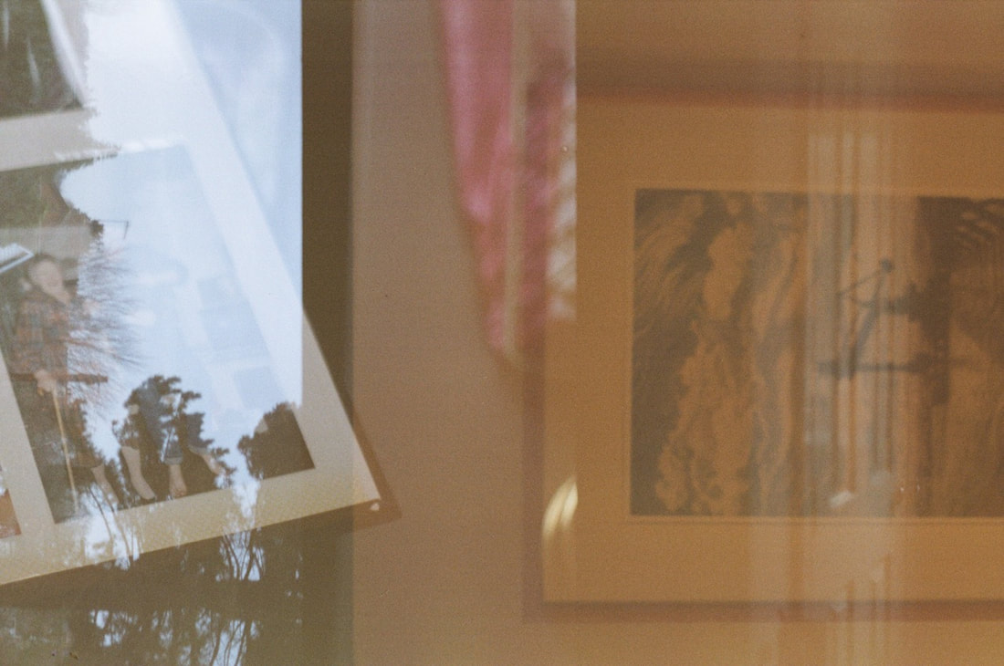
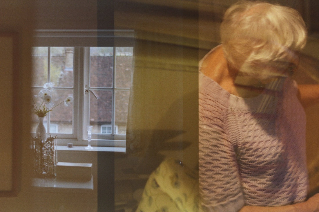
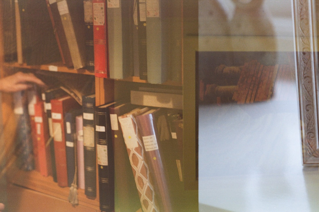
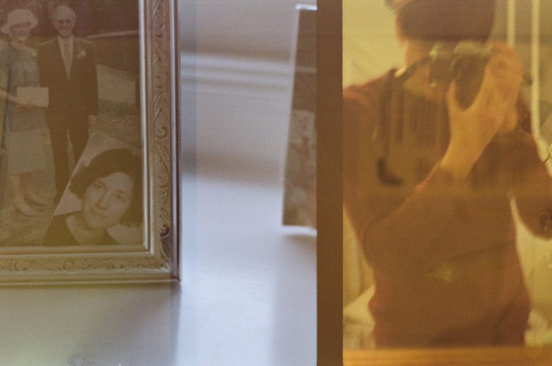
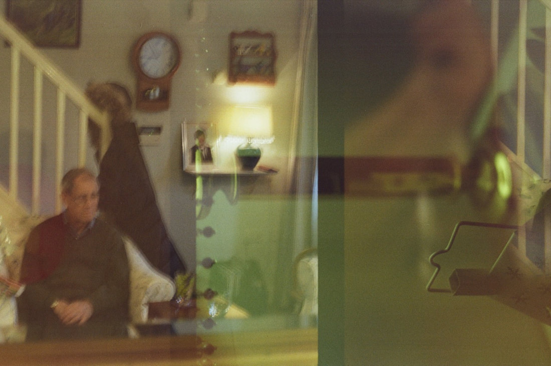
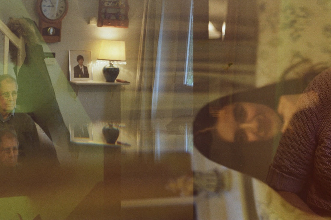
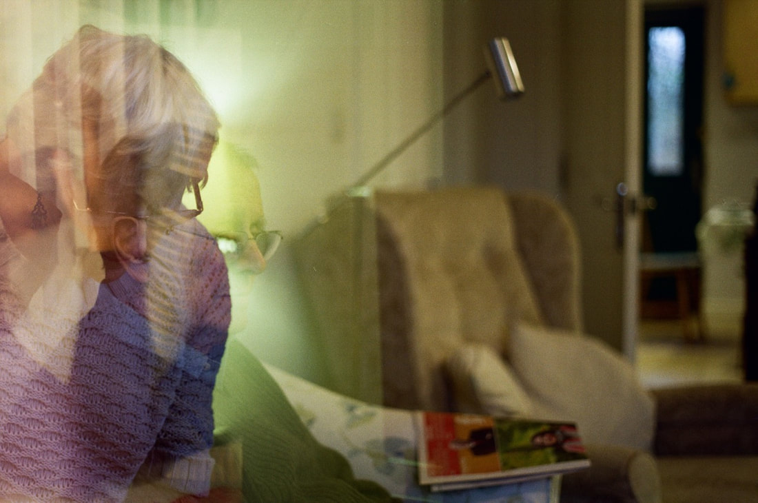
Overall, I think that the outcome of these double exposures are relatively successful. Although I knew what photographs I had taken myself, the final outcome of the double exposures was very unexpected. I had given the camera with the exposed film to my grandma and grandad, relinquishing all control and allowing my grandparents to photograph freely, without any guidance from myself. As a result, I had no idea what photographs they had taken, and I couldn't tell what had been layered on top of my photographs. However, I quite like the outcome of these images, I like the layering of different elements, light and colours in the photographs. Although there had been a bit of fogging from where I had changed the film, the grain and effect of the fogging is quite interesting. I quite like the idea of the film collecting light from my photographs, as well as the light being collected on the film from the room where I had been changing the film. I think that the photographs with strong, bright areas of light, contrasting with details and darker areas. I especially like photographs of details, with bright lights and colours layered on top, such as this photograph, with a lamp layered on top of leaves and branches.
Outcome: Ideas
After having the roll of 24 exposure film developed and receiving the set of scans of each image, I wanted to experiment with different displaying options. As the roll of film was developed as a continuous strip, there is overlapping where the each image continue/overlaps onto the next scan. For example, half of a plate that I photographed was on the right hand side of one image, and the rest of it had overlapped onto the left hand side of the following photograph on the roll of film. This meant when placing images directly beside one another, they partially overlap, forming a continuous image in effect. My idea was to display one continuous image, all of the film scans printed and displayed, in one long continuous line.
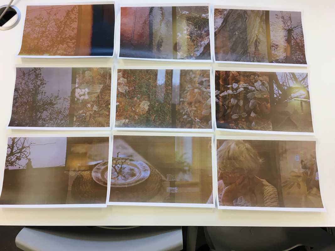
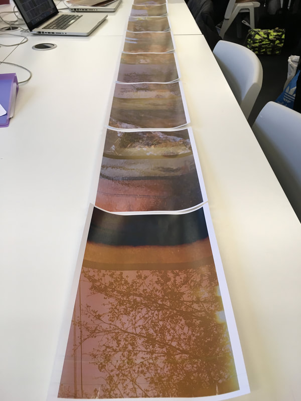
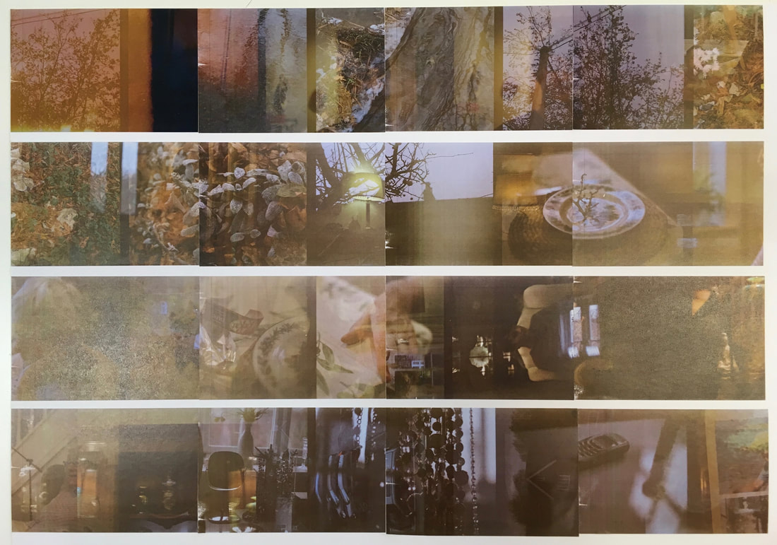
After printing out all of the images, I experimented and tried out different ways in which I could order and display the images. I tried setting out the images in rows like a contact sheet (above left), and also ordering them in one continuous row of images (above centre). I decided that a continuous row of image would be most effective - I like the way that the images flowed and overlapped. I also thought that this would be a more interesting way to display the images, so that the viewer has to move along the continuous row of images, looking at the way in which they overlap and flow. I began mounting the images in chronological order (above right).
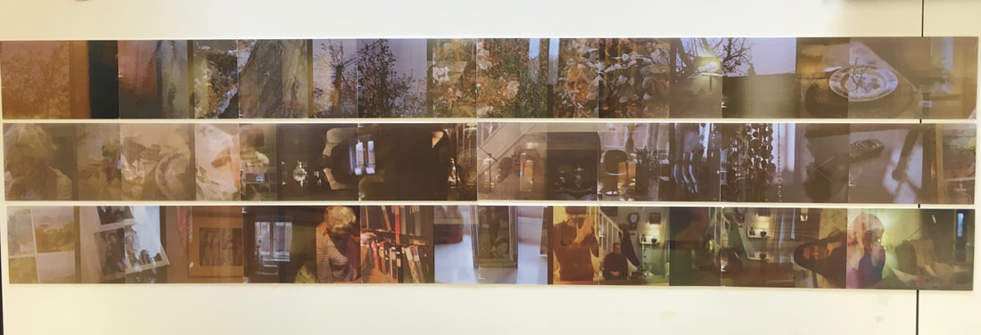
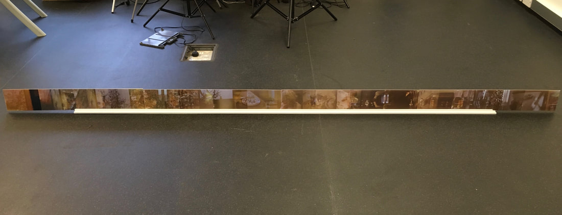
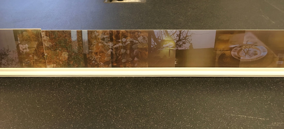
After mounting and cutting out the strips of images, I then began to test displaying options. At first I thought that I could display the strips on a wall, in a continuous line. However, I tested using a shelf after this, seeing how the strip would look standing up on the floor. I particularly liked the display using the longs shelf - the strips of images take an almost sculptural feel - standing in a row like a sculpture or installation. I liked this especially due to the way in which viewers would have to interact with this, you have to kneel down and look closely at the strip.
Photographing my inherited cameras: studio and macro photography
|
|
To photograph the range of cameras I had inherited, I set up a makeshift studio setting. I placed a large white A1 sheet of paper for the white background, and set up three lights to illuminate my subject. I set up 2 white fill lights, arranging them at different angles. I also set up an orange light at a low angle, to produce some varied colour effects in the background.
|
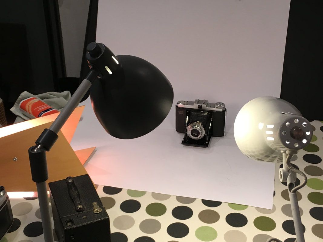
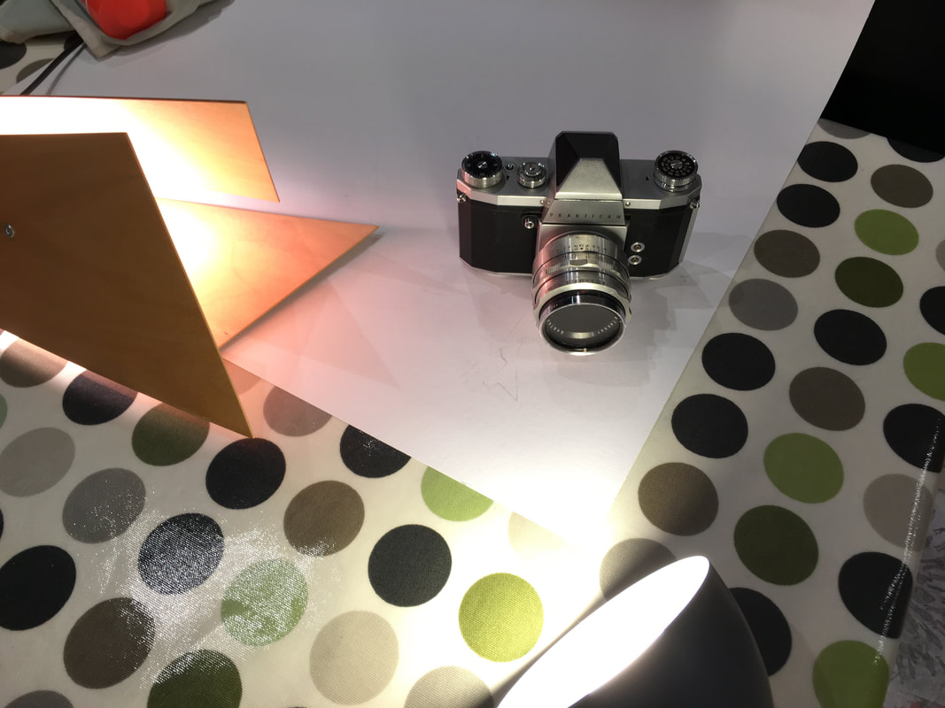
To begin with, I shot straight forward photographs of each camera that I had inherited from my grandad. I wanted to document the cameras like a typology, well lit in a studio setting. I arranged and positioned the lights, arranging the white fill lights to illuminate the scene, and providing the orange light to illuminate the side of the cameras.
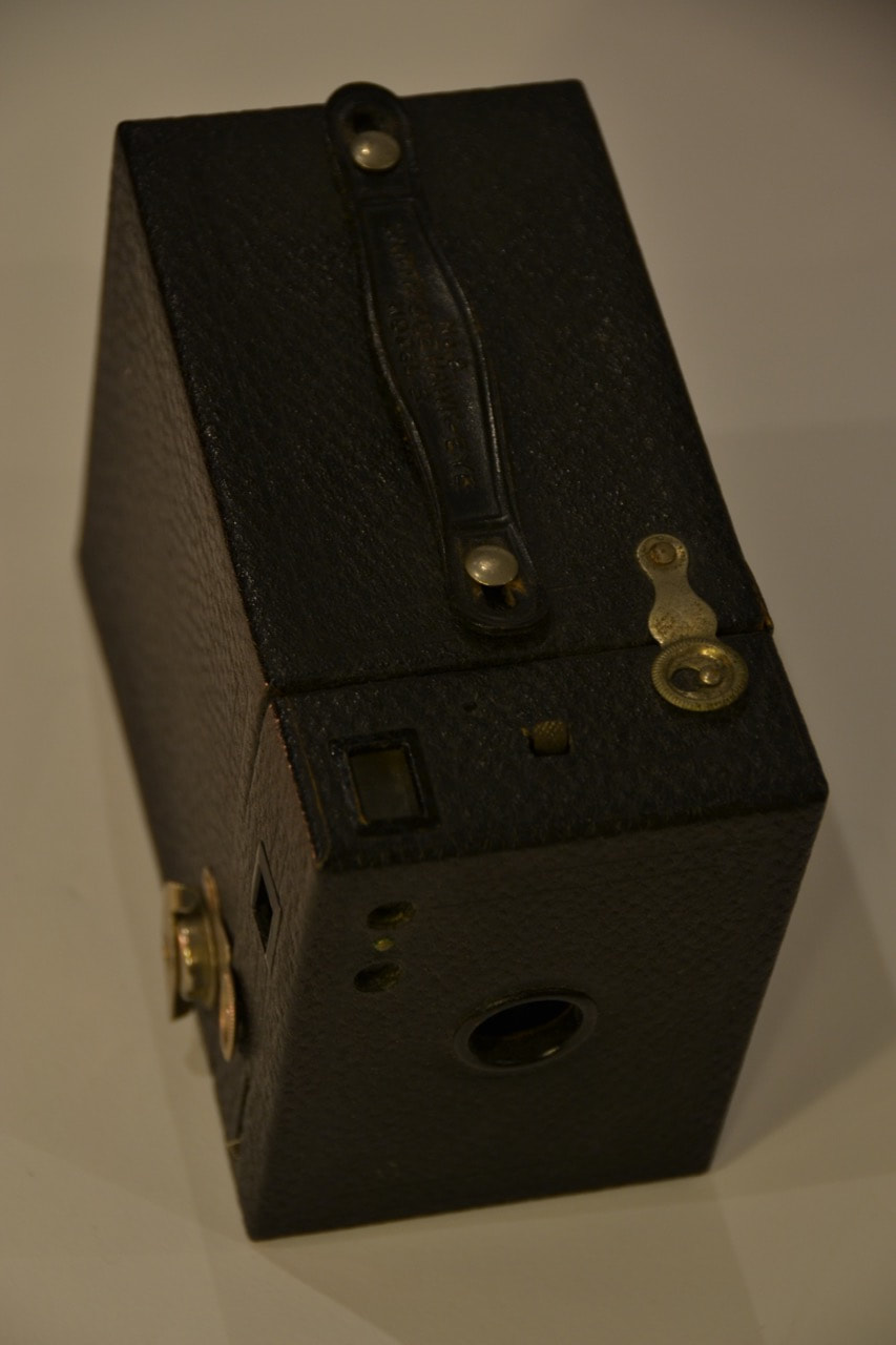
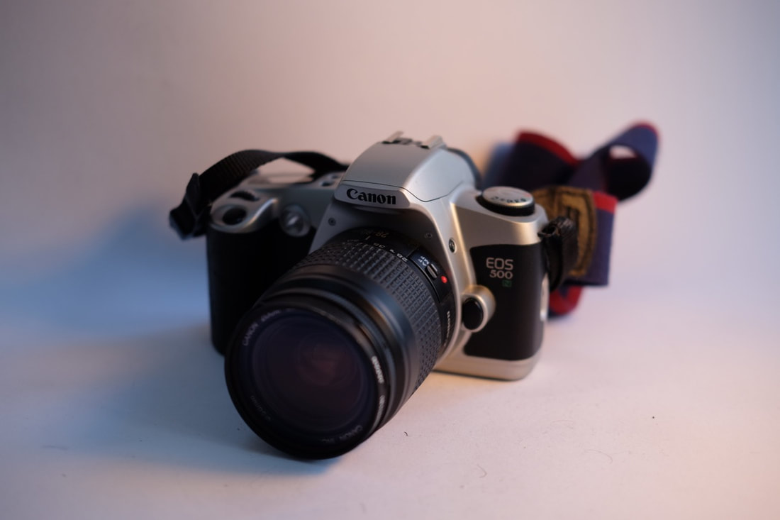
Macro photography
After shooting the straight forward typological photographs of the cameras, I subsequently used a macro lens to focus in on areas and details of the cameras. My idea was to focus in on the the scratches, grime and dust that have built up on the cameras over the decades. Not only this, but my ideas was to focus in closely on the fine detail of the camera. Through this, I would almost be documentary to touch and the marks that have built up over the years of my grandad touching and using the camera. This links with the concept of cameras being like clocks of time - the body of the camera itself documenting history and time.
Sample:
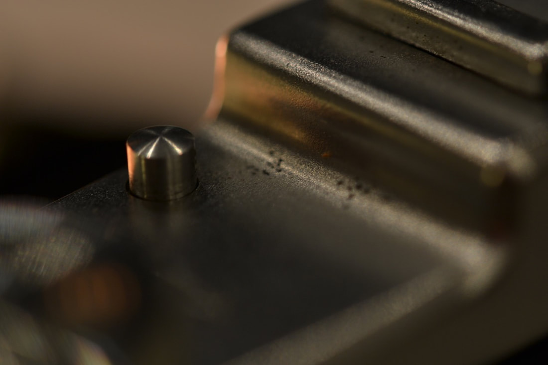
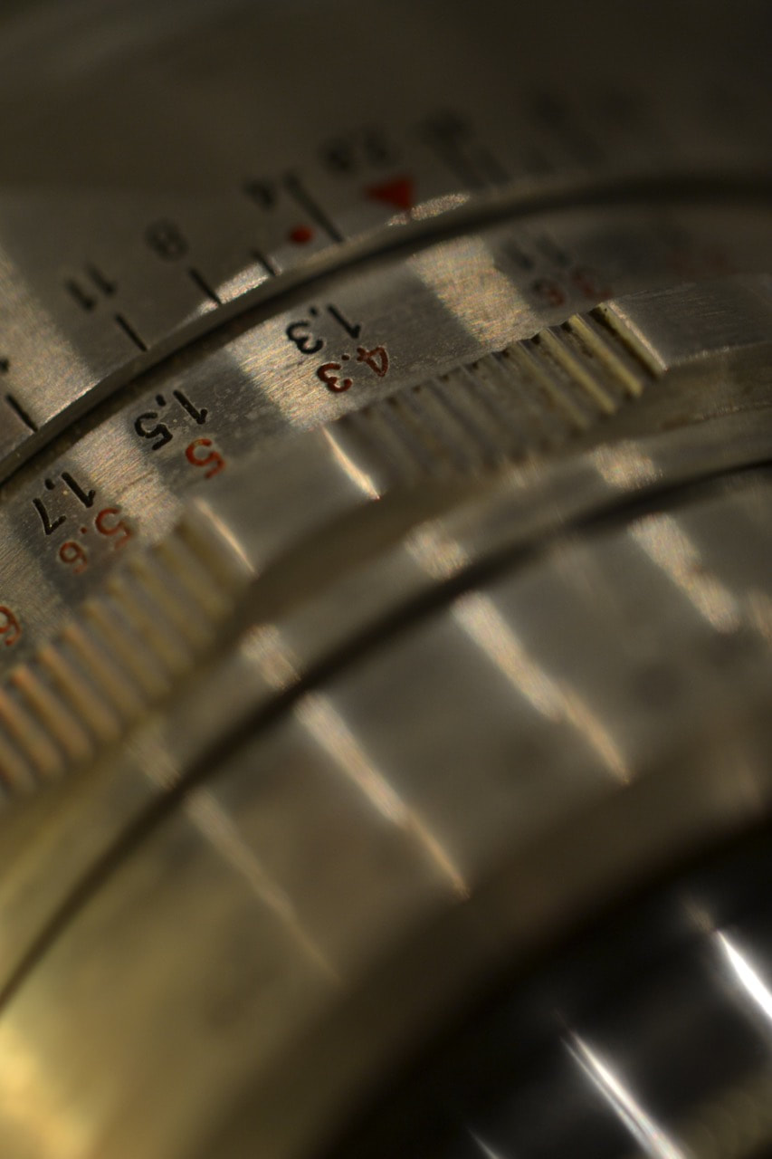
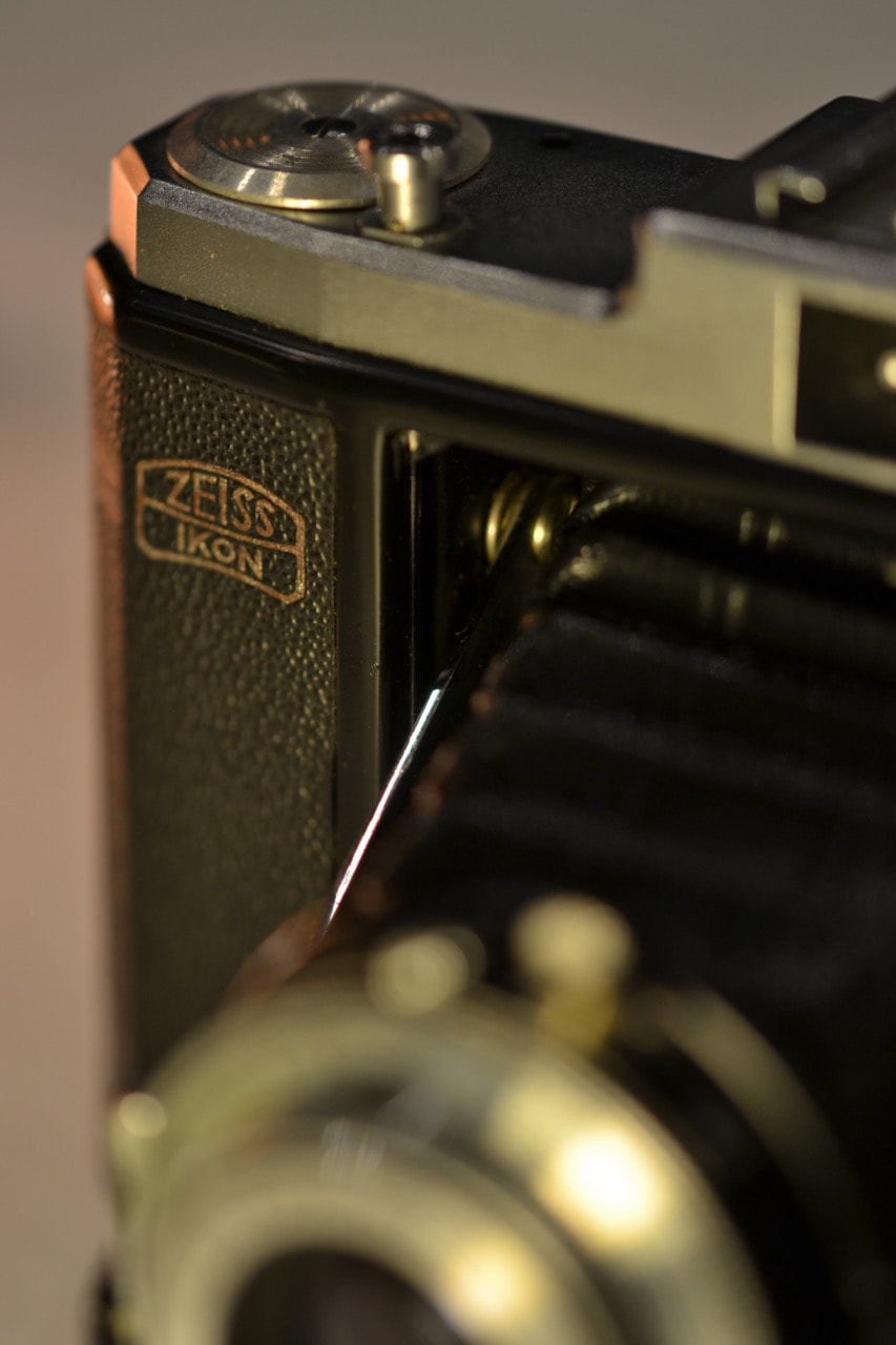
Click here for my full set of studio & macro photographs
For the macro photography, I used a Sigma 105mm macro lens. As it is quite a long focal length, I could crop in tightly to the fine detail of the camera. I set a wide aperture - I wanted a shallow depth of field, and also there wasn't that much available light. I composed mechanical photographs - focusing on the geometric shapes of the plastic and metal of the cameras. I also photographed the dust and scratches on the cameras, as well as composing varied compositions.
Overall, I think that the outcome of my macro photographs of the various cameras are quite successful. I like the composition and mood of the photographs - the closely cropped images have diagonals and strong lines and shapes running through them. The images themselves are quite atmospheric and show some emotion visually - with the use of lighting particularly and shallow depth of field. The use of orange light combined with white light was also quite effective, the orange light providing some interesting patches of colour against the black and silver camera bodies. In terms of the meaning of the images (mainly in terms of focusing on the scratches and dust that have built up over the years of my grandad using the cameras), the images were quite effective. As I had a macro lens, I could focus really closely into the fine details and dust on the surface of the camera bodies, isolating them against defocused backgrounds (with a shallow depth of field).
Overall, I think that the outcome of my macro photographs of the various cameras are quite successful. I like the composition and mood of the photographs - the closely cropped images have diagonals and strong lines and shapes running through them. The images themselves are quite atmospheric and show some emotion visually - with the use of lighting particularly and shallow depth of field. The use of orange light combined with white light was also quite effective, the orange light providing some interesting patches of colour against the black and silver camera bodies. In terms of the meaning of the images (mainly in terms of focusing on the scratches and dust that have built up over the years of my grandad using the cameras), the images were quite effective. As I had a macro lens, I could focus really closely into the fine details and dust on the surface of the camera bodies, isolating them against defocused backgrounds (with a shallow depth of field).
Video Experiments
As a potential outcome, I wanted to produce a film using the set of double exposed film photographs that I had produced in collaboration with my grandparents. As the double exposed images had been scanned as one long film strip, there were overlapping and joins between images – I thought that this could be interesting to show as a continuous video slideshow. At first I was unsure about how I could produce this video and how it would look, but I was planning to potentially use the mounted strip of images I produced.
'Drifter' by Keiko Yamazaki
I was suggested to watch this video by Keiko Yamazaki, who had quite a similar project to myself. In this video, Keiko has made a continuous slide show of one of her photographic montages. Keiko produces a number of these photographic montages, made by threading together images inside the camera itself. Similarly to me, you can see the joins between images, although in Yamazaki’s case the divides between images have been partially blurred and faded due to the processing. I really like this video, especially the way in which the images flow and the speed of the video. As well as this, the use of composed music is also effective in this video piece.
'OOPSY DAISY, TIGER LILY' by Anna Lucas
'Oopsy Daisy, Tiger Lily' was a commissioned project where Anna Lucas was asked to produce a piece in response to the surroundings of Essex Road in Islington. The gallery was situated between a taxidermist and a beauty shop, providing the content of Anna Lucas’ film. As the camera pans across the range of photographic images (and film) produced by Lucas, her hands with painted finger nails enter the frame to arrange her images - a nod to the beauty parlour next to the gallery.
Click here to watch Anna Lucas' video
|
I really like Anna Lucas' video. In particular, I am drawn to the wide variety of imagery running throughout the video. Especially the contrasts of subject matter - for example, fish alongside buttons and unidentifiable coloured shapes. I like the way in which Lucas has produced the video, the personal aspect of the hands arranging the various images on the table. This is something I could experiment with for my piece, I could potentially arrange and interact with my images in a similar way.
|
My first video outcome
To produce the first video experiment, I decided to use the mounted strip of film images. I set up the camera, mounted facing downwards onto the desk. I then placed the long wooden shelf onto the desk, so that the camera would be looking directly down onto the face of the shelf. I attached each strip of 4 mounted images together using tape, so that I could feed the whole strip through. However, filming the whole strip being dragged along the shelf was unsuccessful - the strip was too long to film continuously, I had problems logistically dragging the long strip along the shelf. I then split the whole length of mounted images into 3 sections - each section with 2 strips (of 4 images) taped together. I filmed each section being dragged through the shelf, which I was subsequently planning to edit together in Adobe PremierPro.
Editing Process
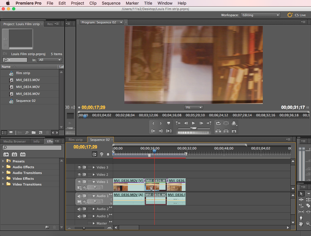
|
(See left) In Adobe Premiere Pro, I threaded together the 3 clips filming the strip of images. In the sequence panel, I placed the clips together in a row. I then trimmed the clips, and added transition effects to have a smooth flow between the clips. I also slowed down the clips, as the film was too fast to clearly view the images. However, the frame rate was only around 30 frames, so i couldn't slow the film down too much without avoiding dragging and stuttering. I then exported the finished clip.
|
My video outcome: First Draft
Evaluation:
Overall, Ithink that the video outcome of the fil strip was partially successful. I like the flow f the video - the way in which the film strip images join together to produce a continuous, flowing film. I think this project works well, and I think it is successful as a video. However, there are a number of ways in which I could improve this outcome. I think that the video could work better if it was slowed down - the film is a bit too fast and blurred, it isn't that easy to see the elements on the strip of images easily. Also, the clarity isn't great - there is slight glare on the shiny images, from where the light shone onto the surface of the images. It would be interesting to experiment more - potentially producing a digital slideshow (like Keiko Yamazaki's film) through iMovie or Adobe PremierPro, or potentially moving around images similarly to Sian Davey's film.
Overall, Ithink that the video outcome of the fil strip was partially successful. I like the flow f the video - the way in which the film strip images join together to produce a continuous, flowing film. I think this project works well, and I think it is successful as a video. However, there are a number of ways in which I could improve this outcome. I think that the video could work better if it was slowed down - the film is a bit too fast and blurred, it isn't that easy to see the elements on the strip of images easily. Also, the clarity isn't great - there is slight glare on the shiny images, from where the light shone onto the surface of the images. It would be interesting to experiment more - potentially producing a digital slideshow (like Keiko Yamazaki's film) through iMovie or Adobe PremierPro, or potentially moving around images similarly to Sian Davey's film.
IDEAS: Concepts moving forward
VIDEO - How can I develop and refine the video piece?
• 'OOPSY DAISY, TIGER LILY' by Anna Lucas - moving and shifting around the photographs, moving the strip of images backwards and forwards?
• Shooting through apertures? - only revealing a small, focused section of each image.
Layering - acetate?
I could place acetate prints of the inherited cameras - revealing the photographs underneath through the transparent sections of the acetate.
INHERITED CAMERAS - How can I photograph the cameras objectively? - anaemic photographs, straightforward with white fill light like product photographs.
• How objective can I be? - setting up the cameras to photograph themselves by setting a timer; inspired by Steven Pippin's conceptual ideas of cameras recording themselves.
• Diptychs?: Emotive images (atmospheric shallow depth of field macro photographs) vs. objective straight forward images of the cameras.
How can I capture/record the cameras without taking an actual image?
• Data (digital images are made up of binary code). What is the minimum information I can provide to give a representation of the camera?
How can I photograph/record the inherited camera without using a camera to record them? - Cameraless photography? Photograms/cyanotypes?
• Cropping - focusing in on the pixels that make up an images?
Wolfgang Tillmans - Focuses on pixels, photographing the light and data of a screen, investigating truth and digital manipulation.
Histograms - the data charts and information recorded by the camera.
• Descriptions? - I could ask people to describe the cameras and display the text.
• Display - Images of the inherited cameras displayed alongside a number of other outcomes I have produced so far - installations? Contrasts - personal images and portraits vs. the mechanical metal, partially abstracted camera images.
What is the minimum amount of information I can provide to describe an image?: Binary Code
CONCEPTS:
Test 1
|
|
To begin with I converted this digital images of a camera into into simplest, raw form: digital code. I converted the images into binary code using a specialist website. Due to the size of the image, it generated massive amounts of code, when pasted into a word document, the code took up 4121 word document pages.
|
Test 2
|
Subsequently, I compressed the images, reducing the size of the camera. As a result, the images produced 1 page worth of binary code. I was interested in how such a detailed photograph can be compressed an reduced down to its simplest possible, raw form of 1s and 0s. This is potentially the most refined and objective way to depict an image, providing the least possible amount of data to describe an images.
|
|

Photographing objectively: My inherited cameras
After photographing the cameras I inherited from my grandparents using a macro lens and varied lighting, I decided to shoot more straight forward images. The macro photographs that I previously shot (click here to view them), were much more emotive and appear to have much more visual emotion and tension in the images. This is due to the macro lens with such a shallow depth of field - some of the images focusing closely into sections of the camera don't necessarily look like a camera at first glance, some images look like pieces of metal machinery. In contrast to this, I wanted to document these cameras as objectively as possible, with a clean white background and plain white light. I shot each camera straight on, shooting each side of each camera, face-on. These images are in the style of a documentary typology. Not only this, but the whole of the project photographing my grandparents (and exploring my relationship to my grandad's photography), has been quite emotive and sensitive to me. In contrast to this, I wanted to step back and produce some straight forward objective photographs, comparatively.
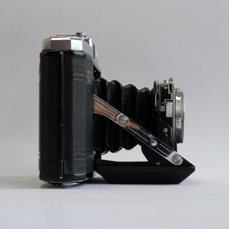
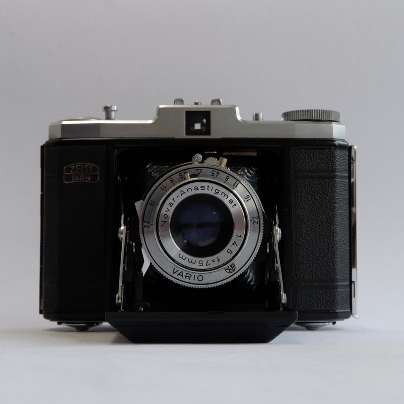

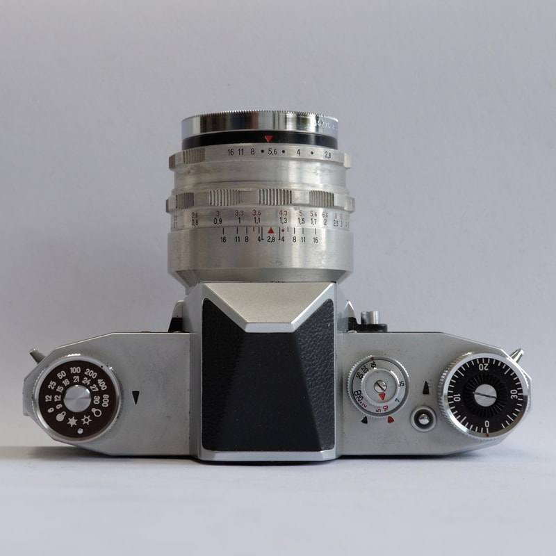
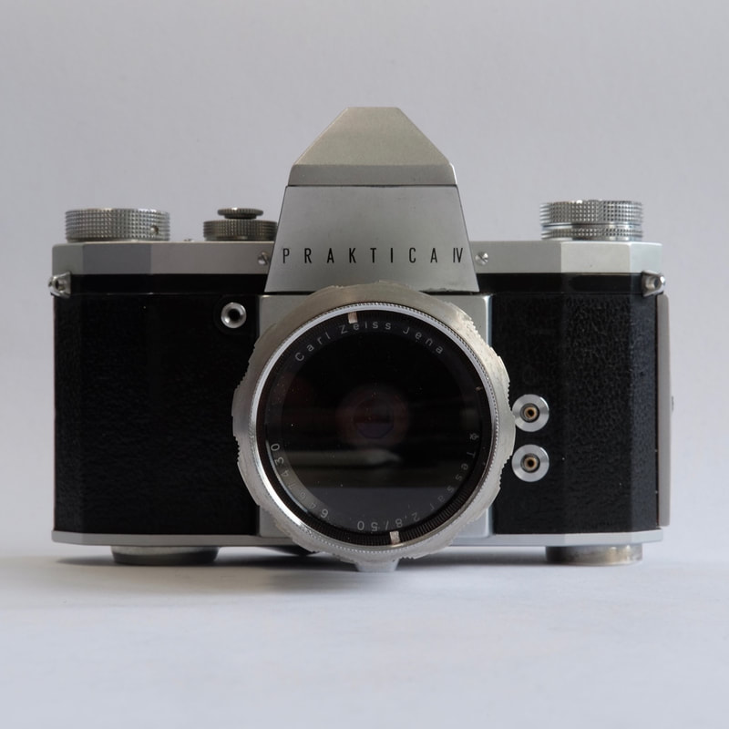
Darkroom experiments
After producing the range of different photographs focusing on my inherited cameras, I subsequently wanted to experiment with these photographs in the darkroom. I thought that it would be interesting to experiment by producing photograms using the images that I shot. The images would produce negative photograms, as the light would be blocked by the darker areas and pass through the lighter areas more easily - I though the effect of this could be interesting.
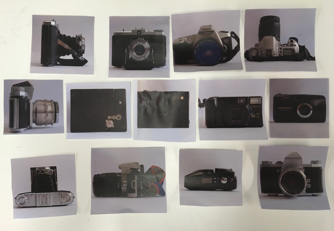
Original images I used for the photograms
|
The range of photograms that I produced
|
Outcome:
Overall, I quite like the photograms that I produced. I like the negative effect of the photograms, with the white outlines and shapes of the cameras against the dark black backgrounds in the prints. From the way in which light passed through the paper print outs onto the photographic paper, the photograms are slightly faded and textured from the paper in places. I like the details of the cameras appearing onto the photographic prints, appearing like faded memories, or old antique prints. I would like to use these prints as part of an installation, I could potentially combine them with projections or display them in a certain way.
Refining my video piece
I wanted to refine my video piece, to produce a higher quality outcome. Although I quite liked the outcome where I filmed the mounted double exposures being physically moved, the outcome wasn't high enough quality. There was glare and the details of the prints weren't really visible in the video outcome. In this case, I wanted to use the original high resolution scans, producing a continuous video from the original images themselves.
Process - Premier Pro
To begin with, I downloaded all of the original scans into Adobe Premier Pro, before ordering them chronologically. After placed them (in order) into the video timeline, making sure they were all lined up precisely together. To achieve the scrolling video effect, I used the transition effect called 'Push'. I applied the transition effect carefully to each of the clips. I had to change the scrolling function, so that the images was scroll across the screen from left to right ('A to B') rather than ('B to A'). I subsequently exported the video in high quality and frame rate.
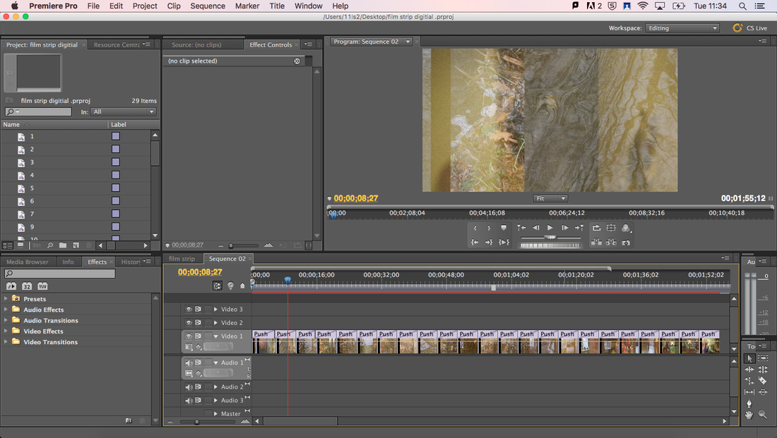
(Above) Screenshots of the process of making the slideshow video in Adobe PremierPro.
My Second video outcome
EVALUATION: Overall, I am pleased with the outcome of this video piece. In terms of the development from the last video I produced of the double exposed film, this is a much more successful and refined outcome. I think that the production quality of the film is especially successful - the images are high quality, as I used the original high quality scans of the film. I think that the speed of the scrolling slideshow is good - it is a good speed, so that you can see the detail of the film whilst it scrolls across the screen (it isn't too fast to see clearly). It would be interesting to develop and use this video to experiment with, especially experimenting with projections and overlapping with my grandfather's old photographs potentially.
Using Slide film
Moving forward, I have a number of ideas for a potential experiments and outcomes that I could pursue. A potential outcome that I was interested in pursuing involving experimenting with colour slides. My idea was that I could display and experiment with my grandfather's old colour slides, but also produce a number of slides myself. Using slide film, I could produce slides suitable for a projector. I wanted to mainly shoot portraiture for this project, which could be projected along portraits shot by my grandfather, many years ago.
Process: shooting E-6 colour positive film for slides
|
|
To be able to produce colour slides, you have to use colour slide film. This type of film is colour positive (rather than negative), so it can be projected, and the film can be mounted and viewed as a slide. I used Kodak 400 colour film for slides, using an Olympus OM20 with a 50mm f1.8 lens. I chose a 50mm f1.8 lens as it is particularly good for portraits - the wide aperture creates a shallow depth of field which I wanted to have in my portraits.
My outcome - scans:
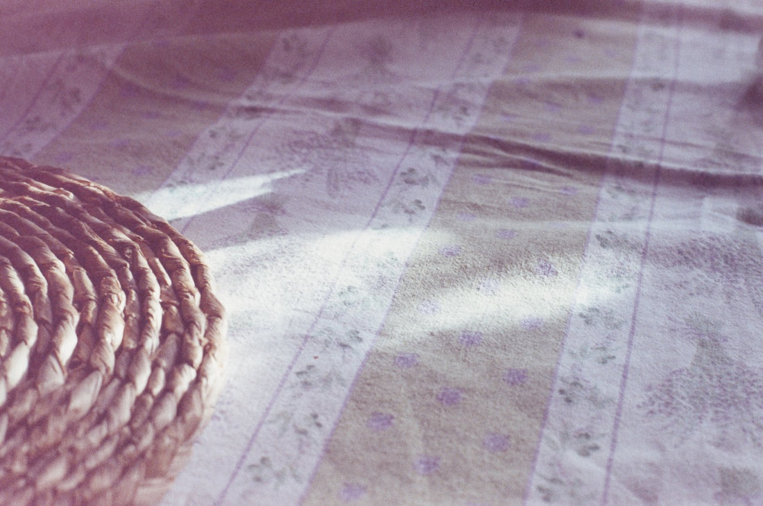
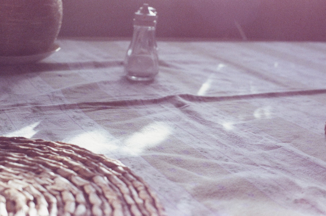
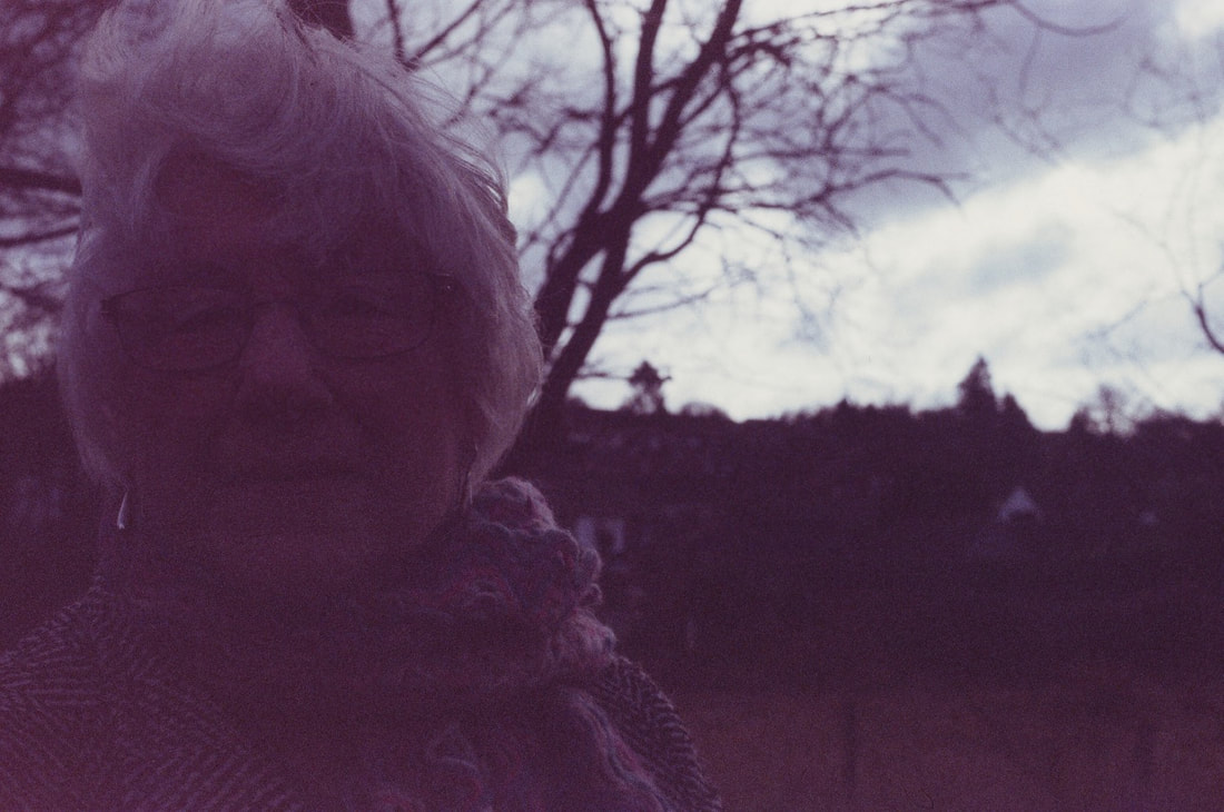
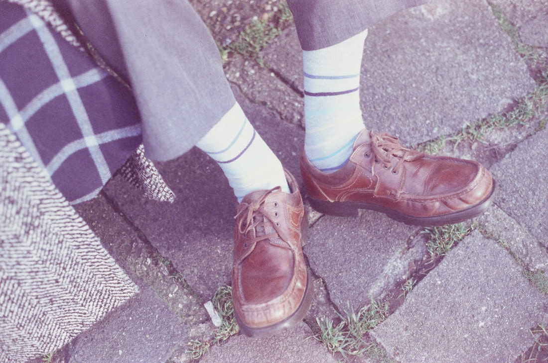
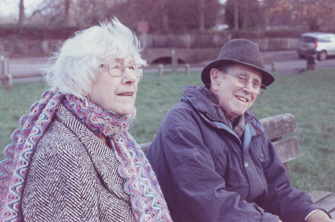
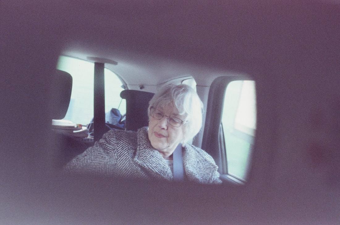
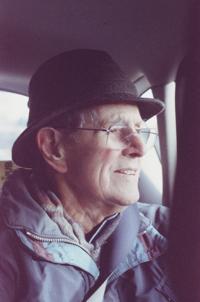
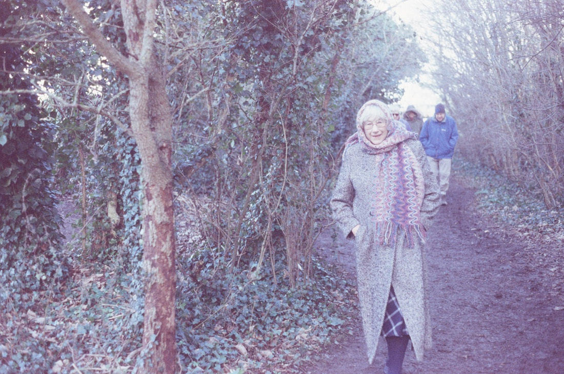
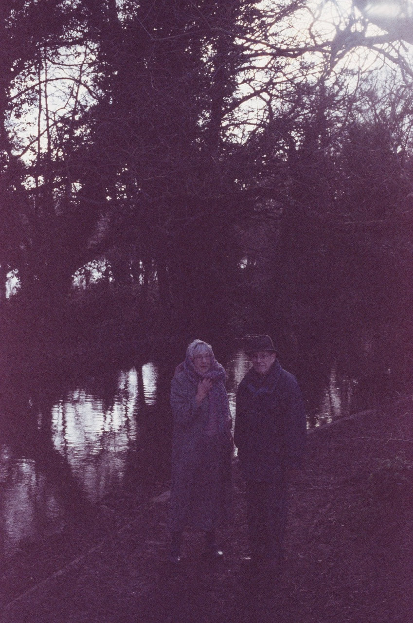
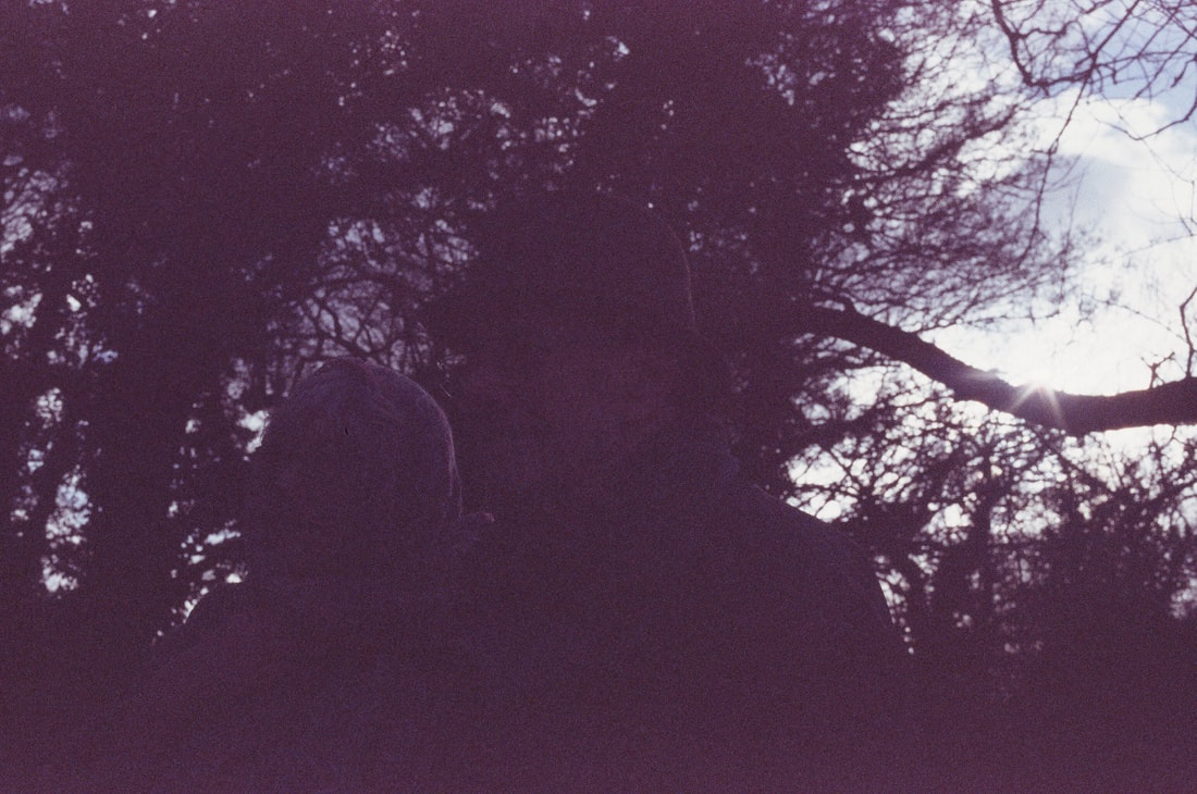
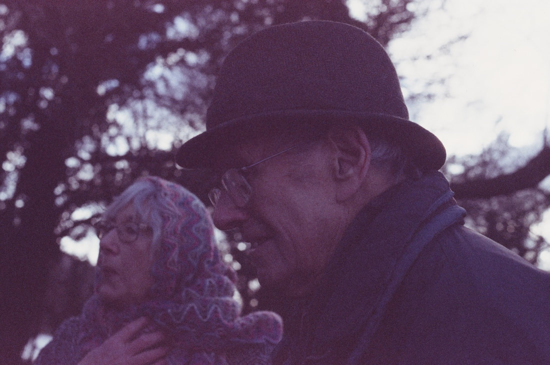
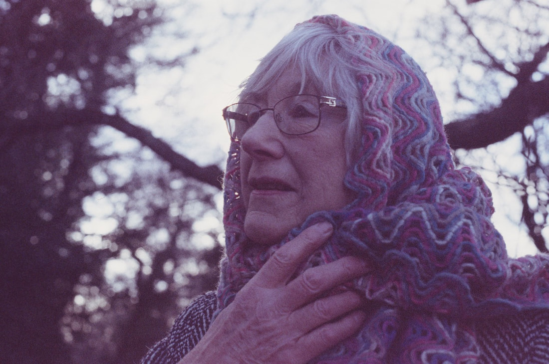
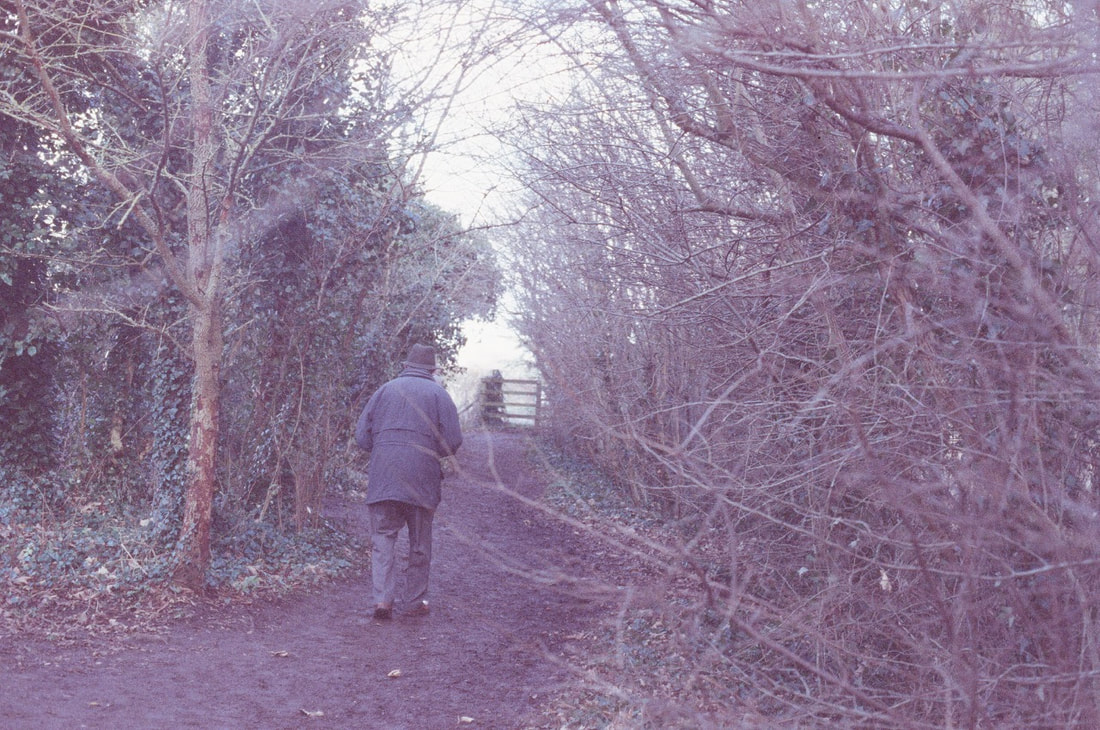
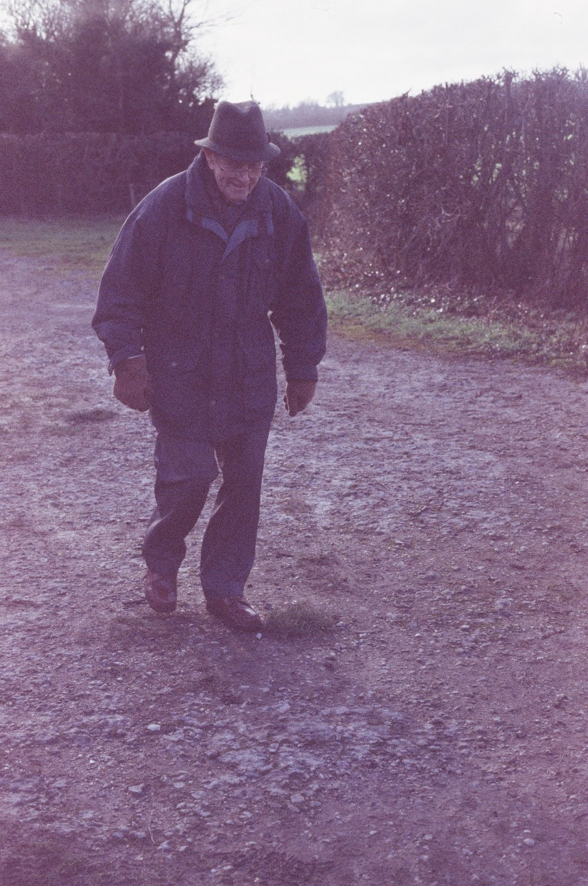
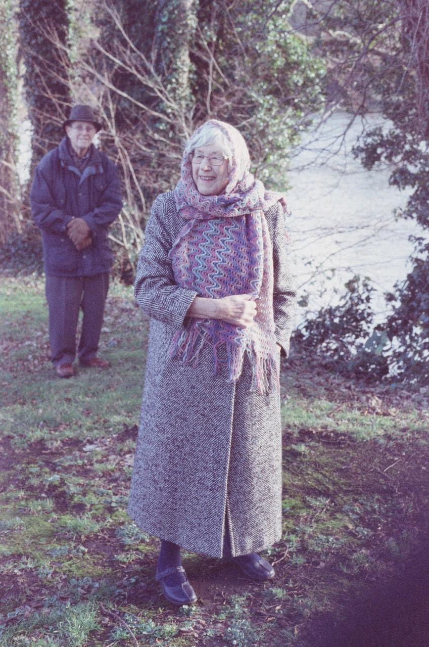
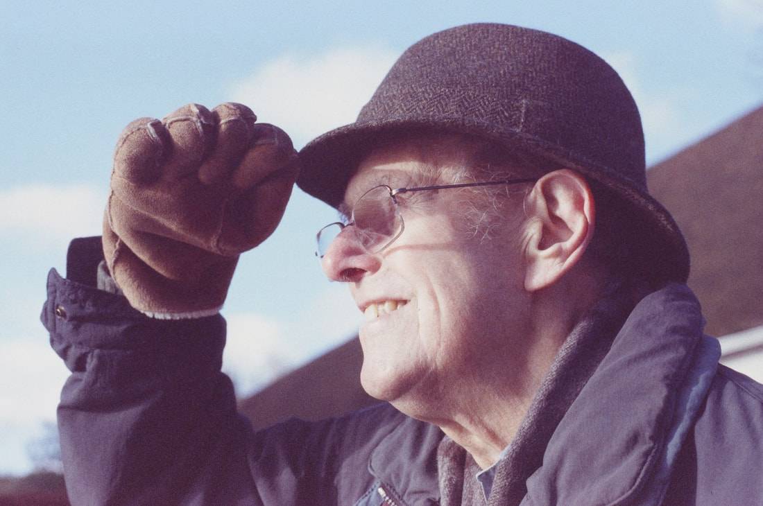
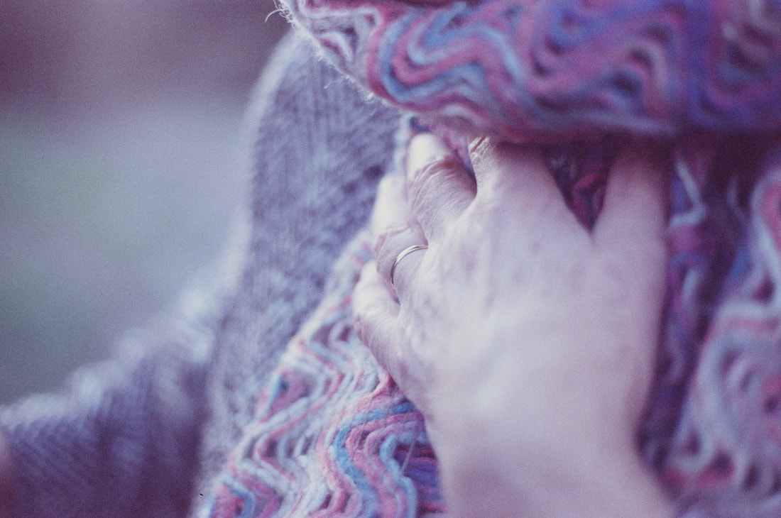
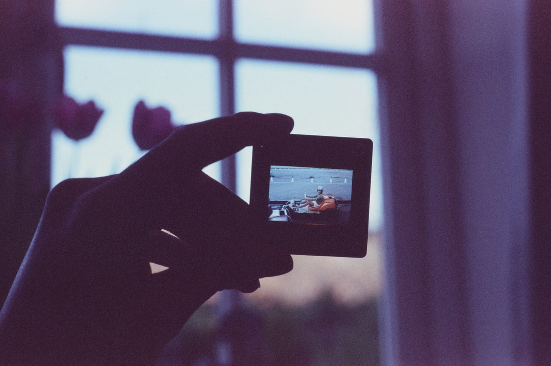
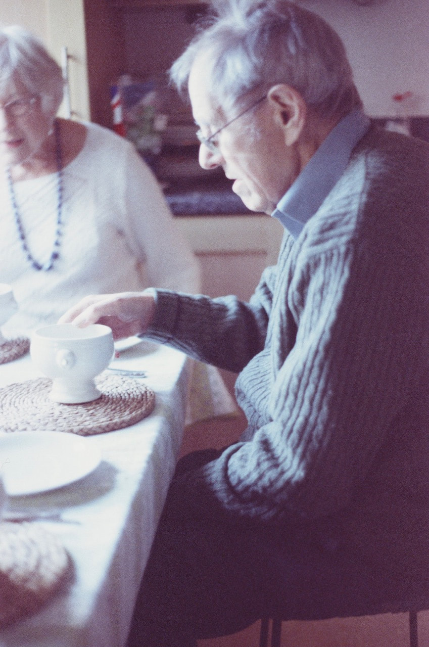
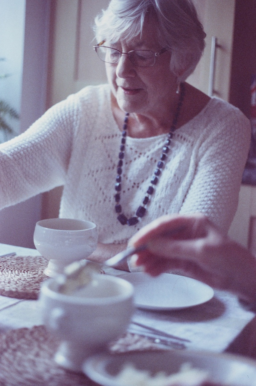
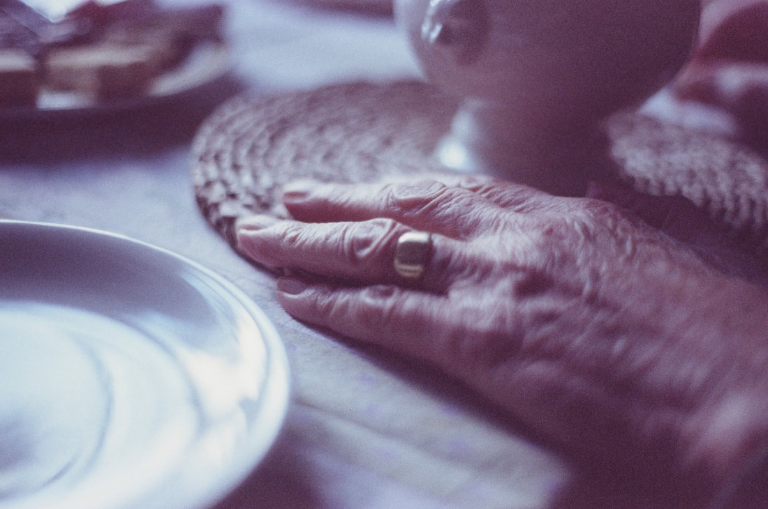
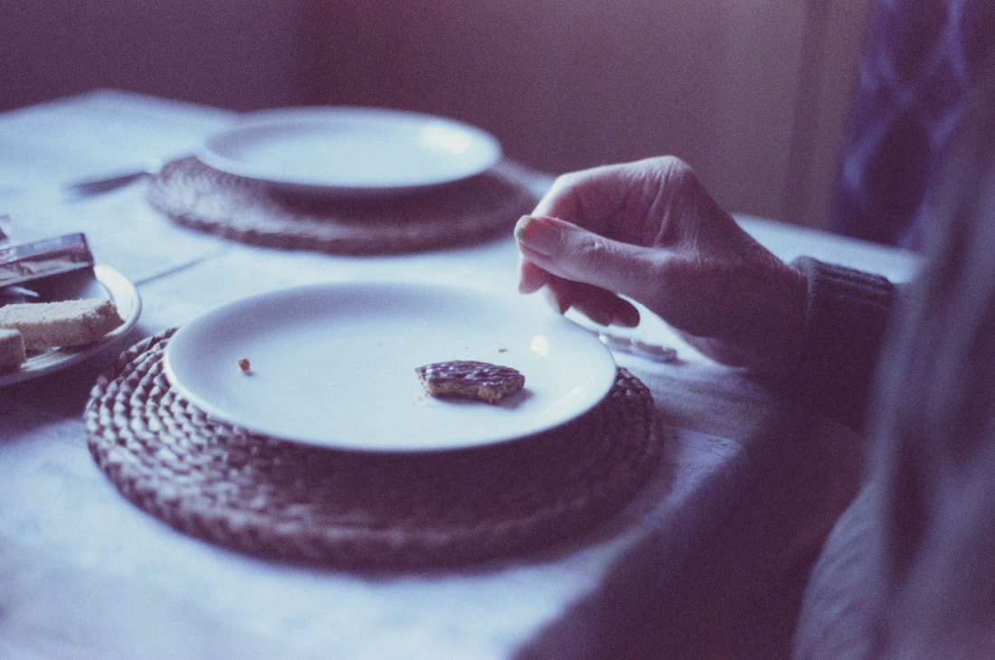
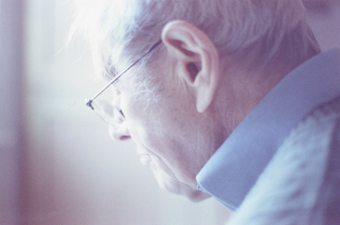
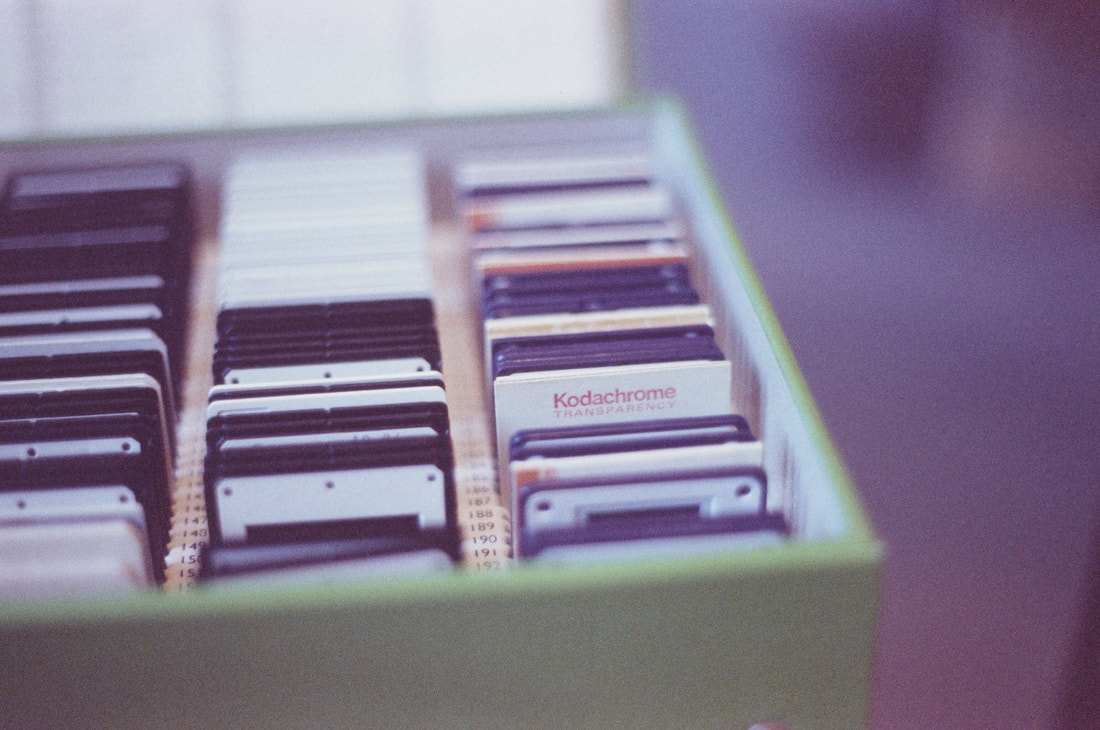
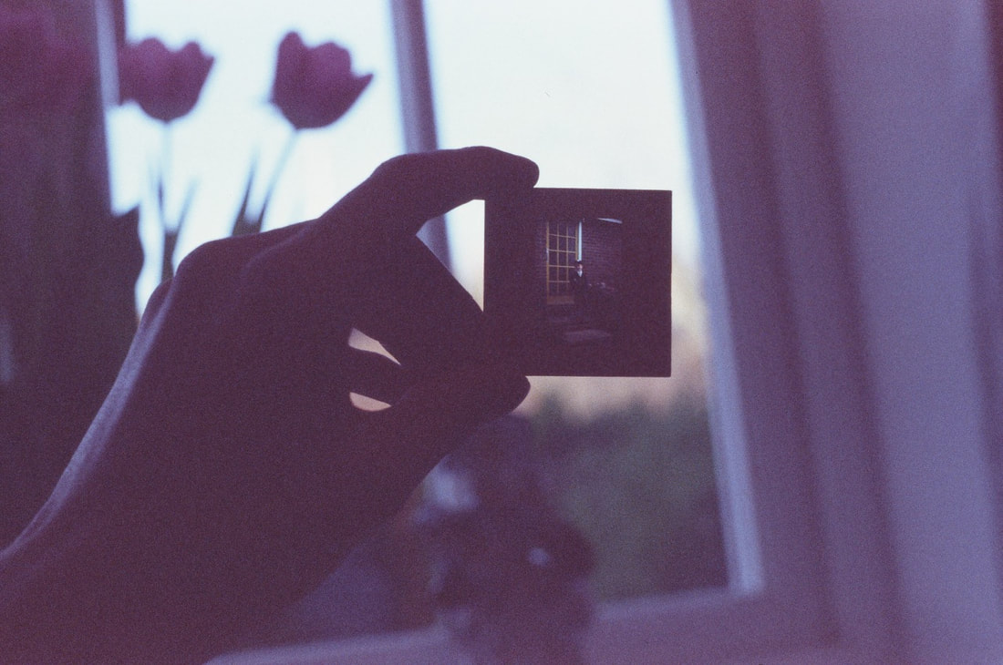
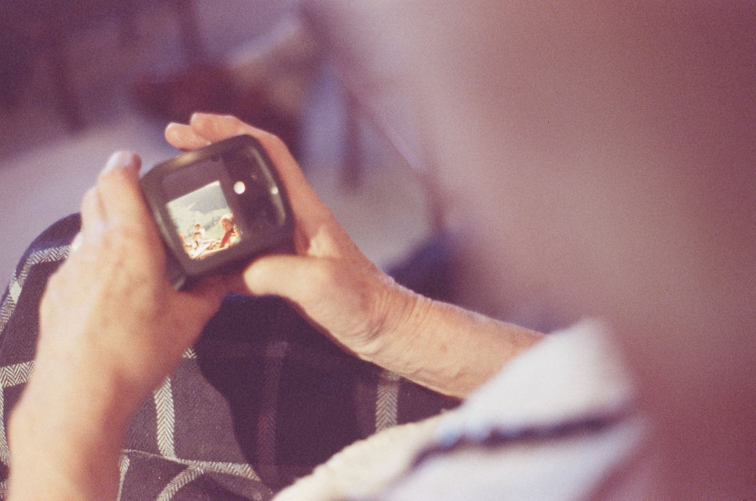
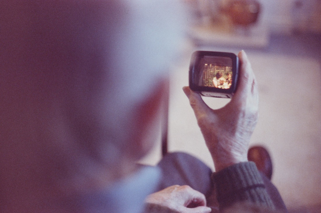
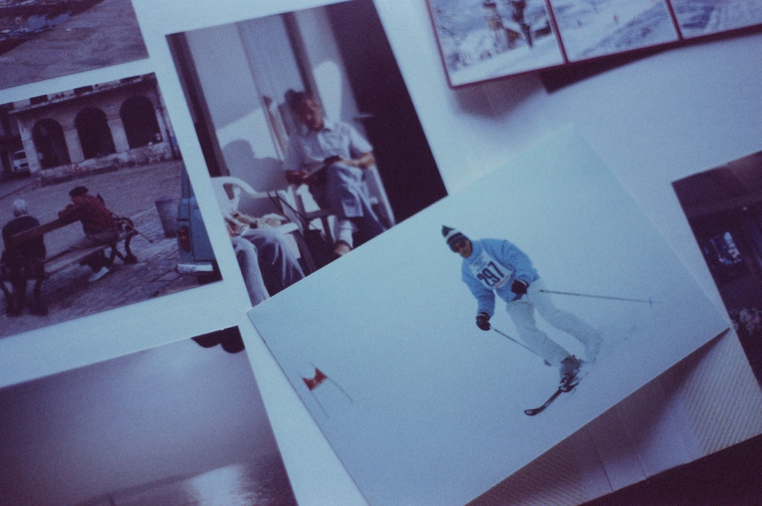
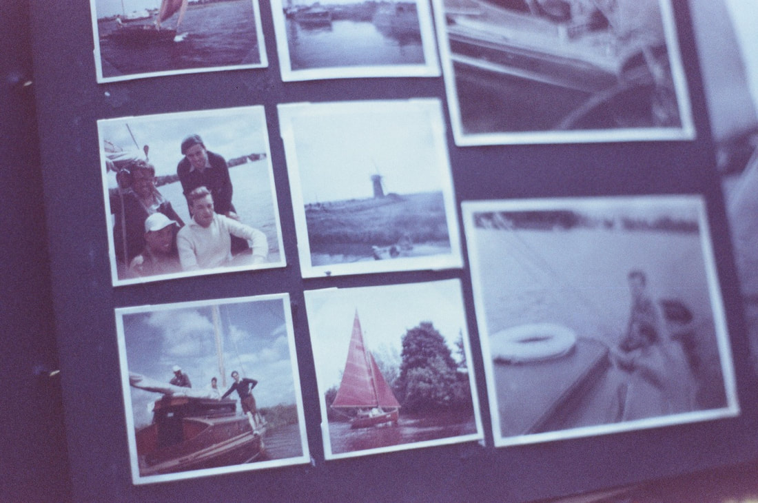
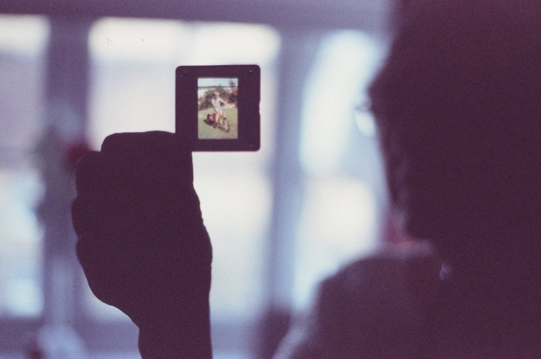
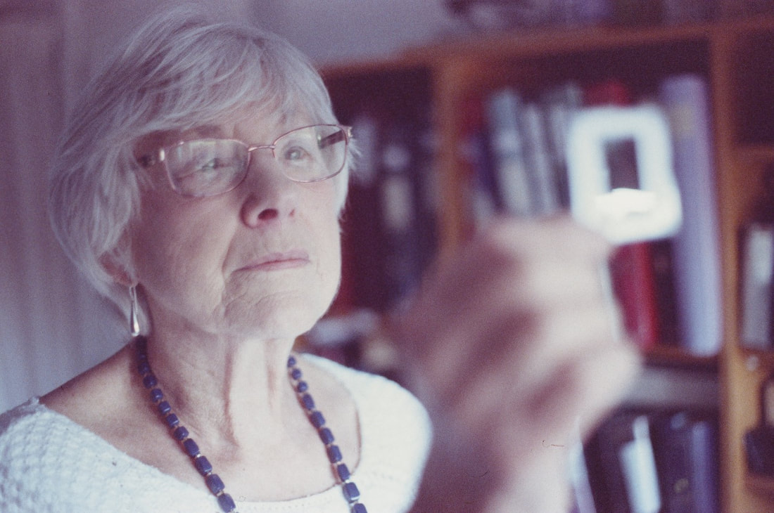
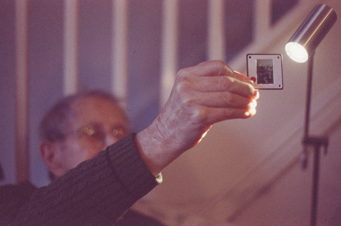
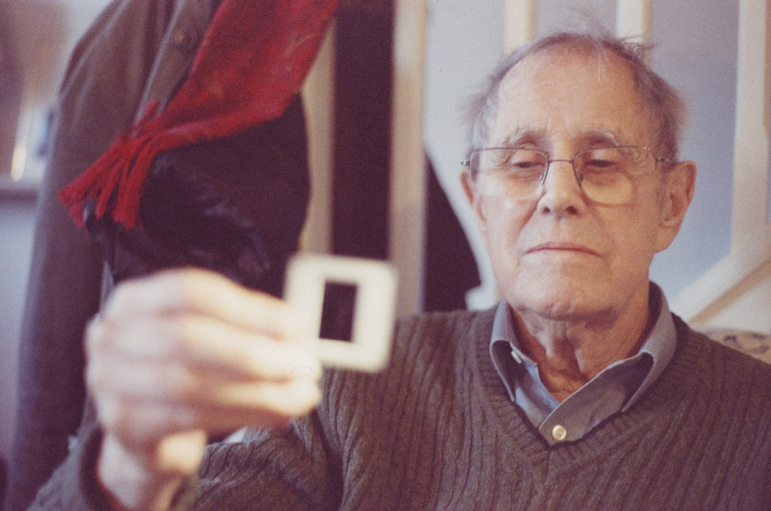
Click here to view the full size resolution images
EVALUATION: Overall, I am very pleased with the outcome of my colour slide photographs. I like the colour renditions and quality of the film that I used - I really like the muted tones and cool tones of the film, with a slightly burgundy, reddish colour cast to the photographs. I think that the range of different photographs and subject matter that I focused on is also effective. This gives me a wide range of different images that I can use and play with. I think that the portraits are particularly successful, as well as the photographs focusing on the colour slides. I enjoyed engaging with and exploring these old photographs of my grandparents looking at the slides. On a personal level, I could explore my relationship to my grandfather and his photography - it was interesting to look through all of his old photographs as he talked about them, and trips in the 1960s and 70s. He talked about all of his old cameras, and the different types of film, especially Kodachrome film that he used to use especially for these slides. In the photographs, you can see my grandparents (my grandfather especially) studying and engaging with the old slides. I also liked the documentary photographs of my grandparents living their everyday lives, especially observing and documenting them in their local surroundings and the village that they live in. These portraits were quite successful - I like the contrast of these portraits against the (defocused with a wide aperture) environment and natural surroundings. Although a couple of these photographs were slightly underexposed, these were especially successful in contrast to the photographs of them in their house looking at the slides.
Full set of slides on the Lightbox:
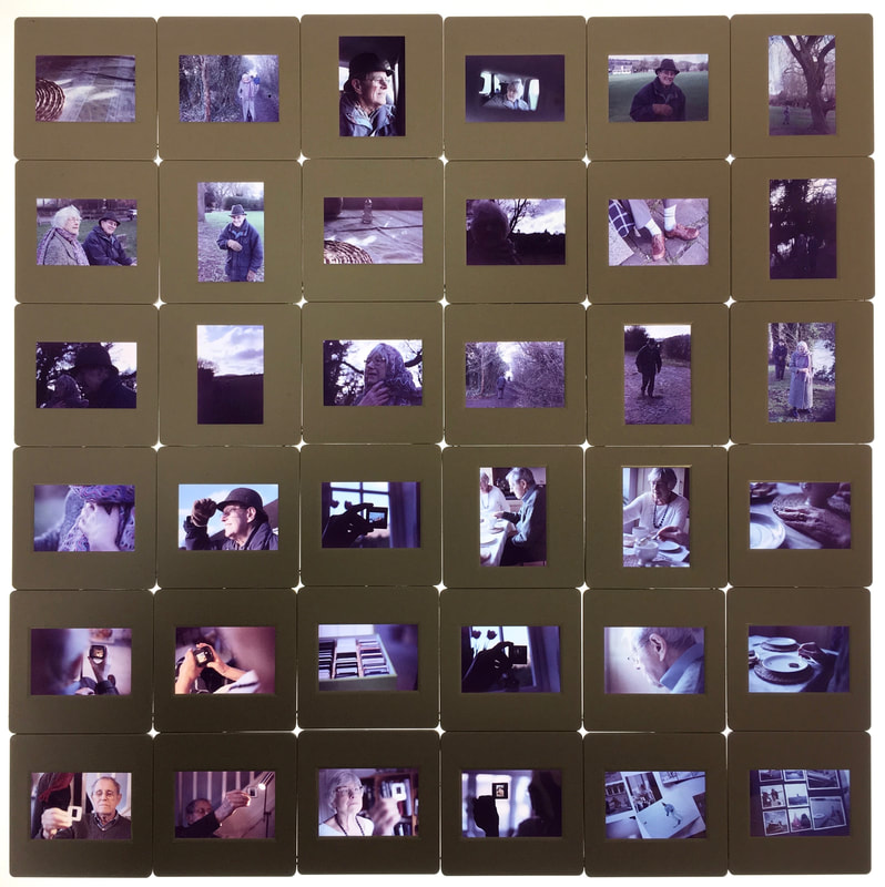
After the slide film was developed and scanned, I also ordered the colour positives to be mounted in plastic slides. This means that the slides can be placed in a slide projector, which I could use as part of my installation. I also photographed my slides set up on a lightbox - I like the composition of all of the slides laid out in rows, like a large contact sheet. I really enjoyed playing with these physical slides - it was enjoyable holding and observing these physical photographs, composed of sections of positive plastic film. This provided an interesting alternative to digital imagery, an antidote to virtual, on-screen images; instead I was holding and playing with physical images that exist as physical objects/materials in themselves. I enjoyed reverting back to this photographic traditional process, as used by my grandfather.
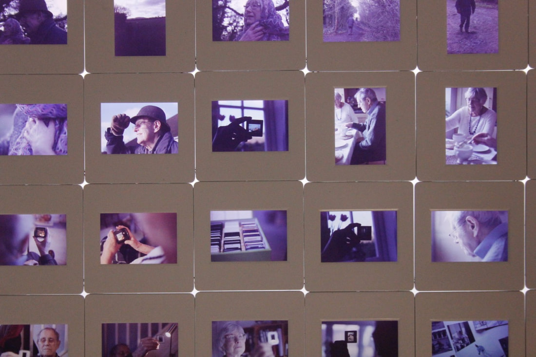
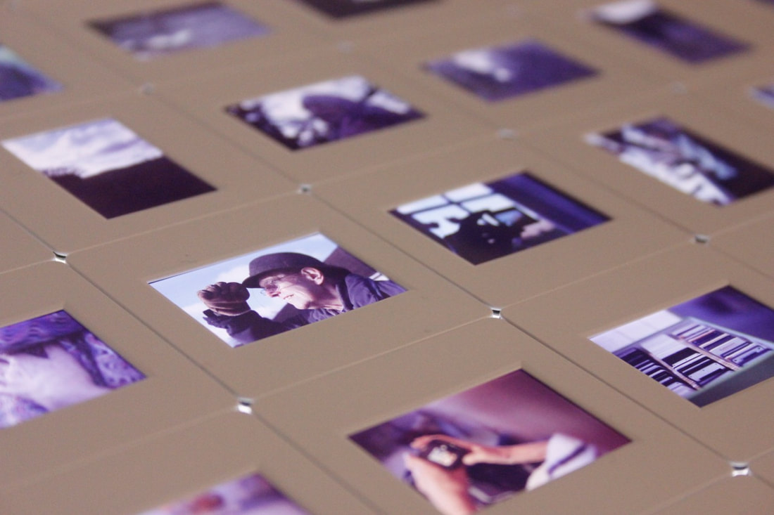
Installation ideas - Viewing and selecting my Grandad's colour slides
Photographing the colour slides through a slide viewer
|
As well as producing my own colour slides, I also focused on the slides that my grandfather shot in the 1960s and 70s. My idea was that I could potentially display or project these slides, alongside the slides that I shot myself. I sorted through my grandfather's boxes, filled with hundreds of colour slides. I chose slides with particularly interesting subject matter or colours, and I looked at these through their slide viewer, photographing the images through the viewer.
|
(Above) A range of my grandfather's slides laid out on the light box
My Grandfather's photographs
I really like the subject matter and composition of the old Kodachrome slides taken by my grandfather. Sorting through his huge boxes of old slides, I was fascinated and really enjoyed exploring the vast range of different photographs. It was a really interesting insight into the lives of my grandparents and family as they grew up. It was also a fascinating insight into the past - with clues of the time periods with typical 1950s, 60s and 70s clothing, style and other clues of that time period. I could see the childhoods of my aunties, uncles, my father etc all captured in the material surface of film in these small Kodachrome slides. As Kodachrome slide film is largely extinct now, and it was an insight into he past to see the vibrant, saturated colour rendition of the old slide film that has now disappeared.
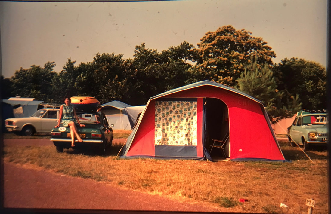
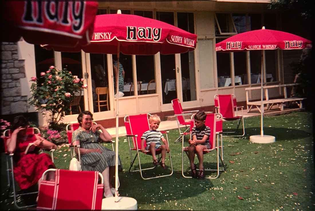
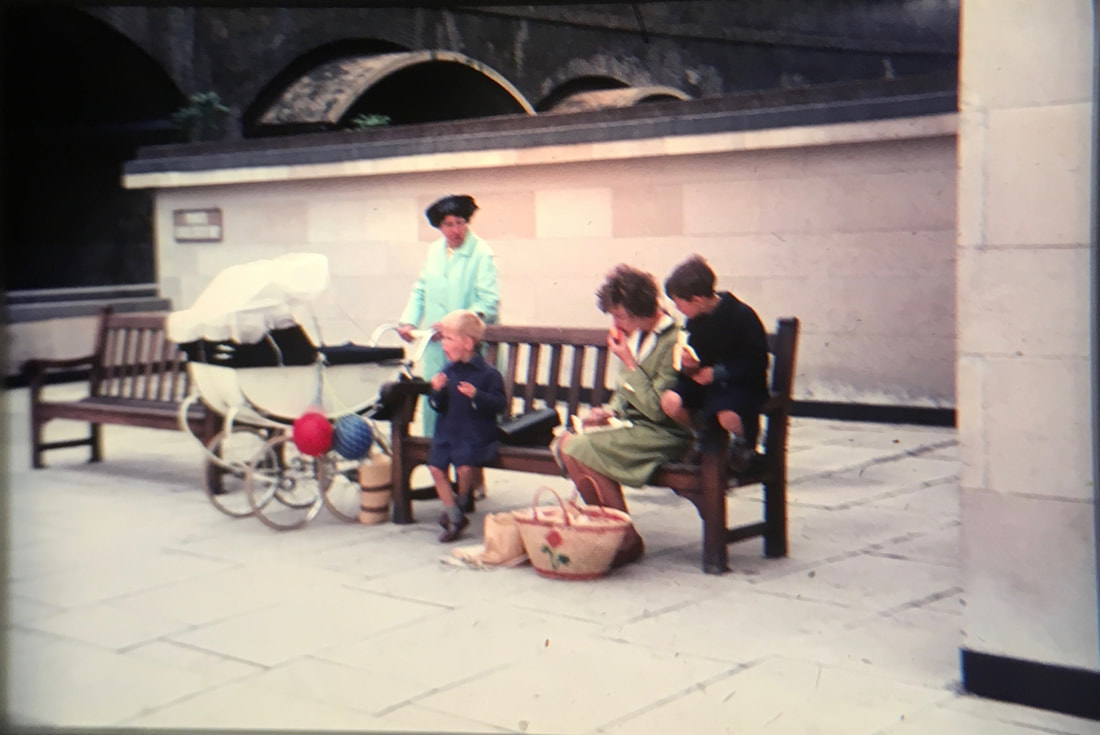
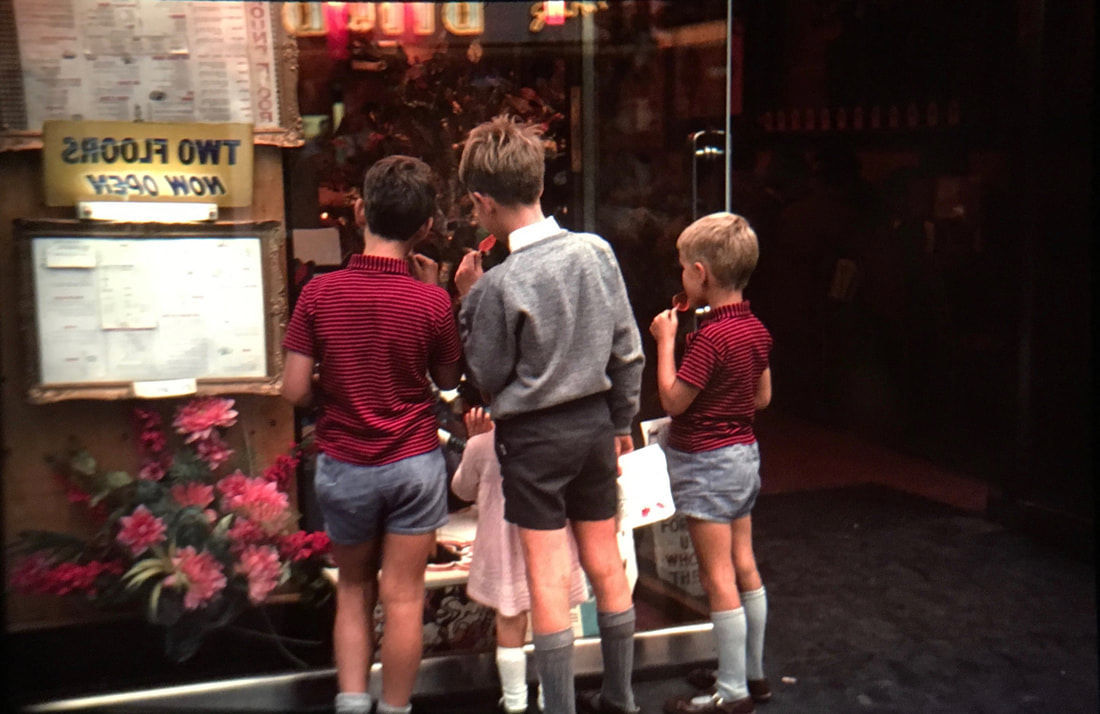
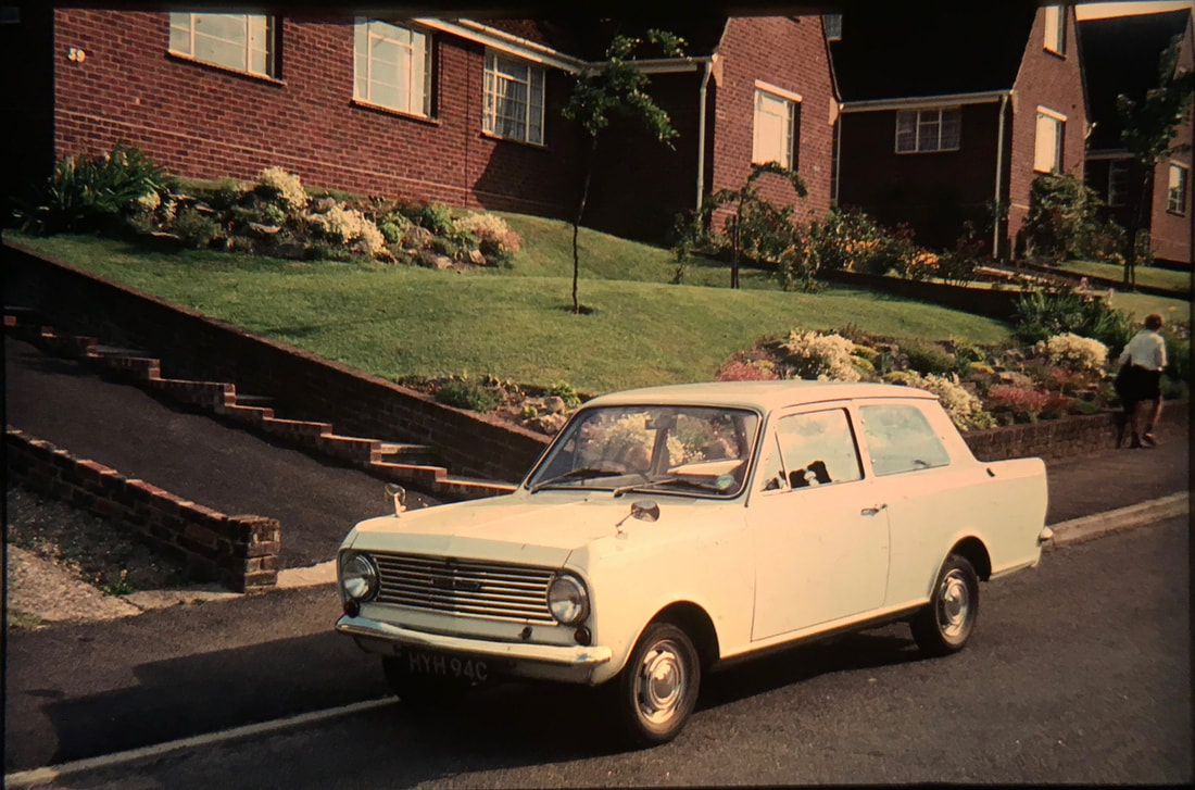
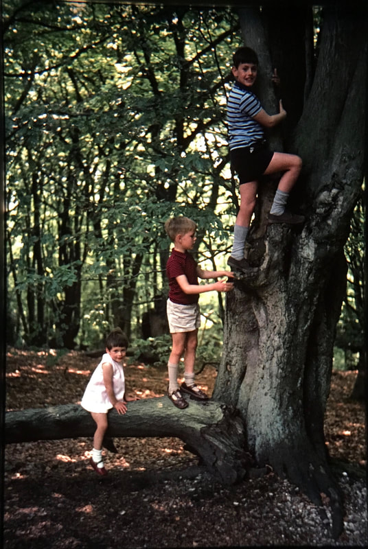
Installation ideas: John Akomfrah - Purple
In terms of inspiration fro my installation (and potential final outcome), I became interested in John Akomfrah's video installation at the barbican. In particular, I was interested in the display, and arrangement of screens in the installation. The screens were arranged in a curved formation, with visitors wandering throughout the space, watching the various videos playing on the monitors. Not only this, but I was also interested in the combination of his own video work in this installation, alongside some old personal, family videos. This could be a key inspiration for my own installation - Could I use screens? How can I display and arrange my photos, videos and projections in a space? How can I visually link my photographs with my grandfather's images in a final outcome?
Akomfrah's installation at the Barbican:
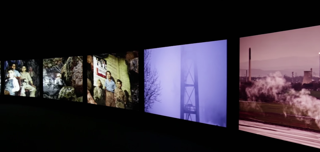
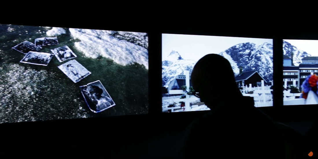
Experimenting with slide film - Projection installation
I wanted to my Grandad's slides from the 60s and 70s, in conjunction with the slides that I had produced. I decided that I would project my slides, overlapping my grandfather's slides. This could create some interesting effects - especially where the slides overlap. This idea was based around bridging the relationship between my photography and my grandfather's - physically combining and partially merging the photographs that I took, with the old Kodachrome slides.
Process:
To execute the idea, I placed two slide projectors side by side, so that I could overlap the projections. I placed my slides into the slide holder, placing the slides in their original order; I also placed my grandfather's slides into the slide holder. I then placed each slide holder into each projector, slotting the holder into the side of the projector. I then arranged the projectors beside one another, so that the projected slides partially overlapped.
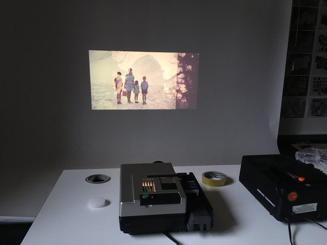
I liked the physical, material aspect of this - reverting back to the past, using physical slide photographs, like my grandfather would have done in the past. I liked using the old slide projectors as well, playing with the antiquated, clunky mechanics of the old slide projectors. The noise of the clicking, old slide projectors as the are slides are inserted mechanically into the projector.
Filming the overlapping slide projections:
Overall, I am pleased with this outcome of combining the slide projections, recorded in this film. The visual aspects especially - with the slides flashing across the wall, the images partially combining and merging together. For me, this was one of the most interesting aspects of the video. I really like the way that the images I had taken combined my my grandfather's old slide photographs. This literally combines my photography with my grandfather's - directly exploring the relationship between my grandfather's and my own photography. The colour rendition is also very good - the rich, vivid colours of the colour slides combining and overlapping. This experimentation with overlapping slides and projections would be especially interesting to pursue further, and could be the main aspect of a final/refined installation.
Photographing overlapping slides
I subsequently photographed the overlapping slides, selecting the most interesting combinations to photograph. I zoomed in to the overlapping slides, focusing on the overlap, where the images partially merge and combine. These distorted images themselves were interesting - they could potentially work well as stand alone photographs. They almost look like double exposures or photoshop manipulations - with the merging of projections. I especially like the combinations of my photographs, combining with my grandad's slides taken in the 1950s, 60s and 70s. I like the contrast of the time periods - with old photographs featuring old cars, clothes etc, contrasting with photographs taken by myself now. Moreover, the contrast of my grandparents as they have aged - a photograph of my grandfather now that took, overlapping with slide of him taken when he was much younger when he was in his 20s and 30s. As well as this, the contrast of the photographs of my grandparents looking at slides, provides an interesting contrast with my grandfather's physical Kodachrome slides projected on top.
Sample:
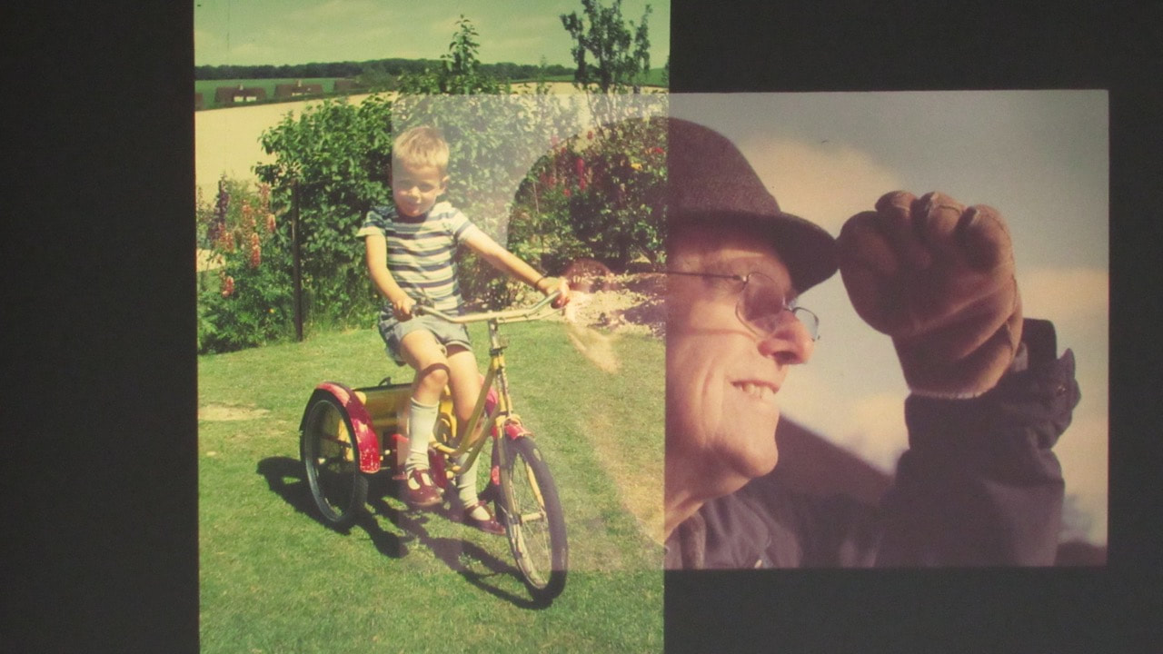
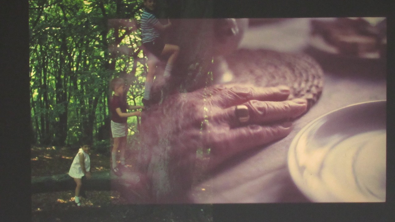
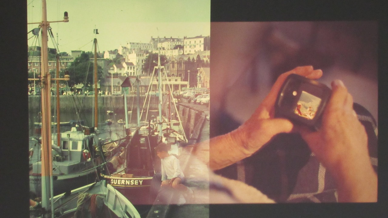
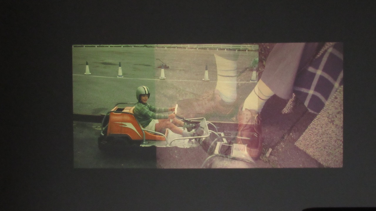
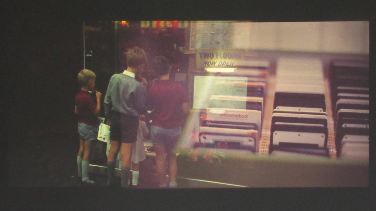
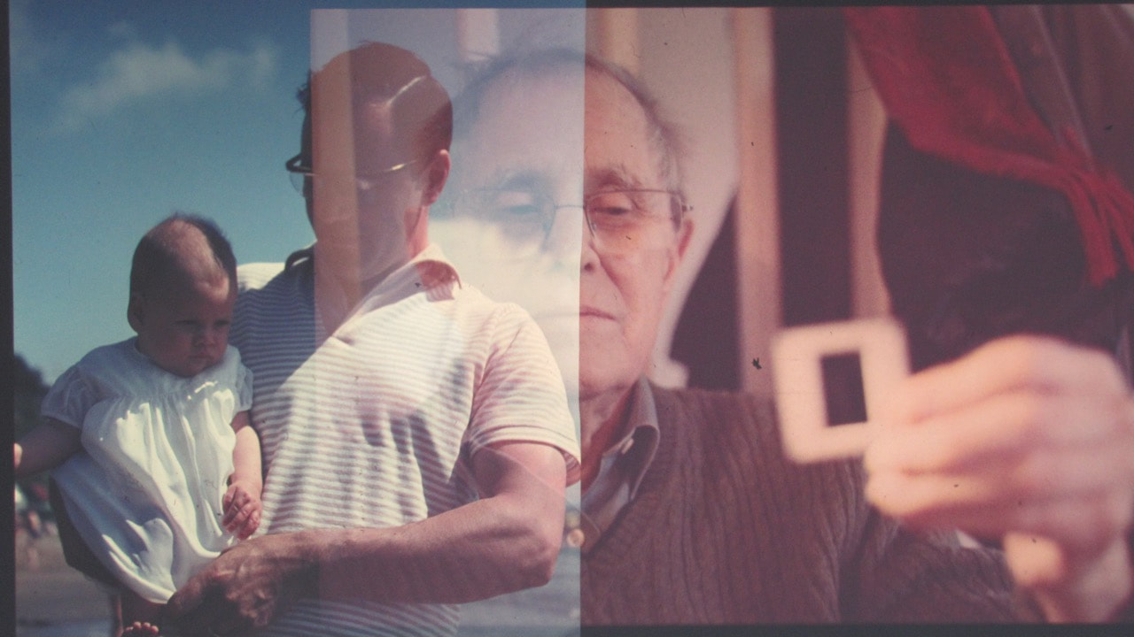
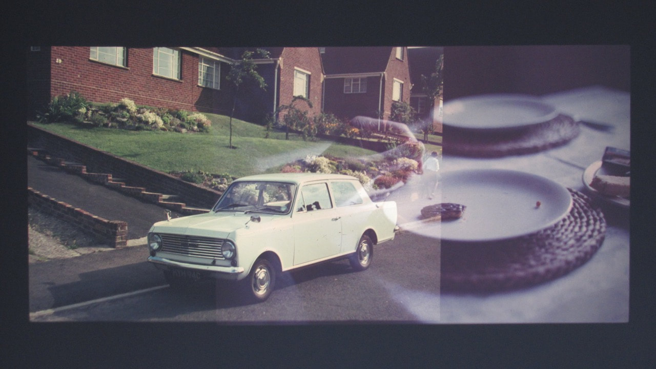
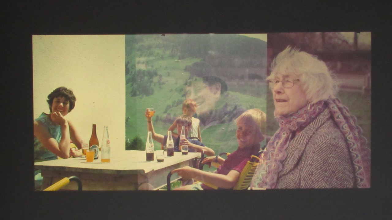
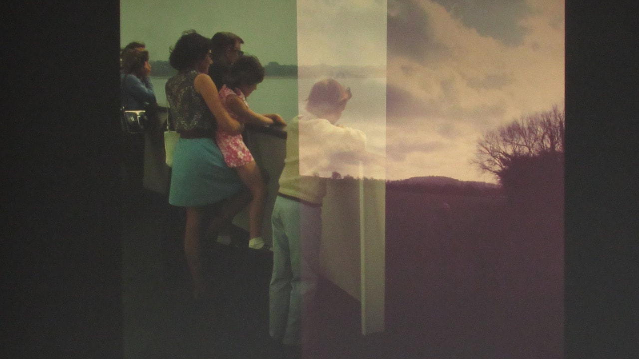
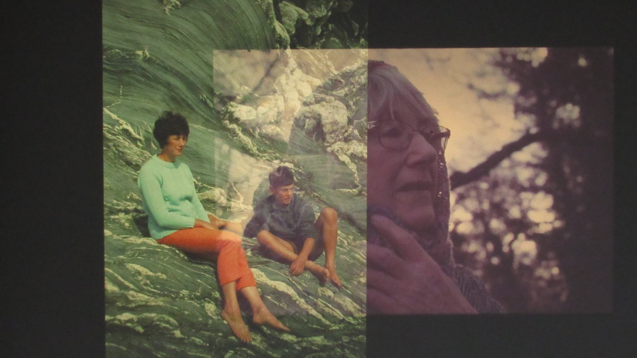
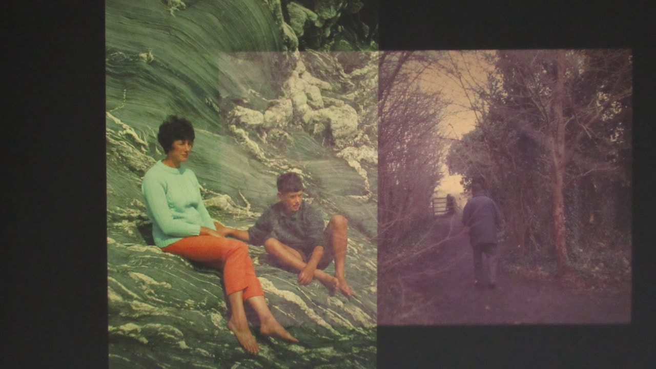
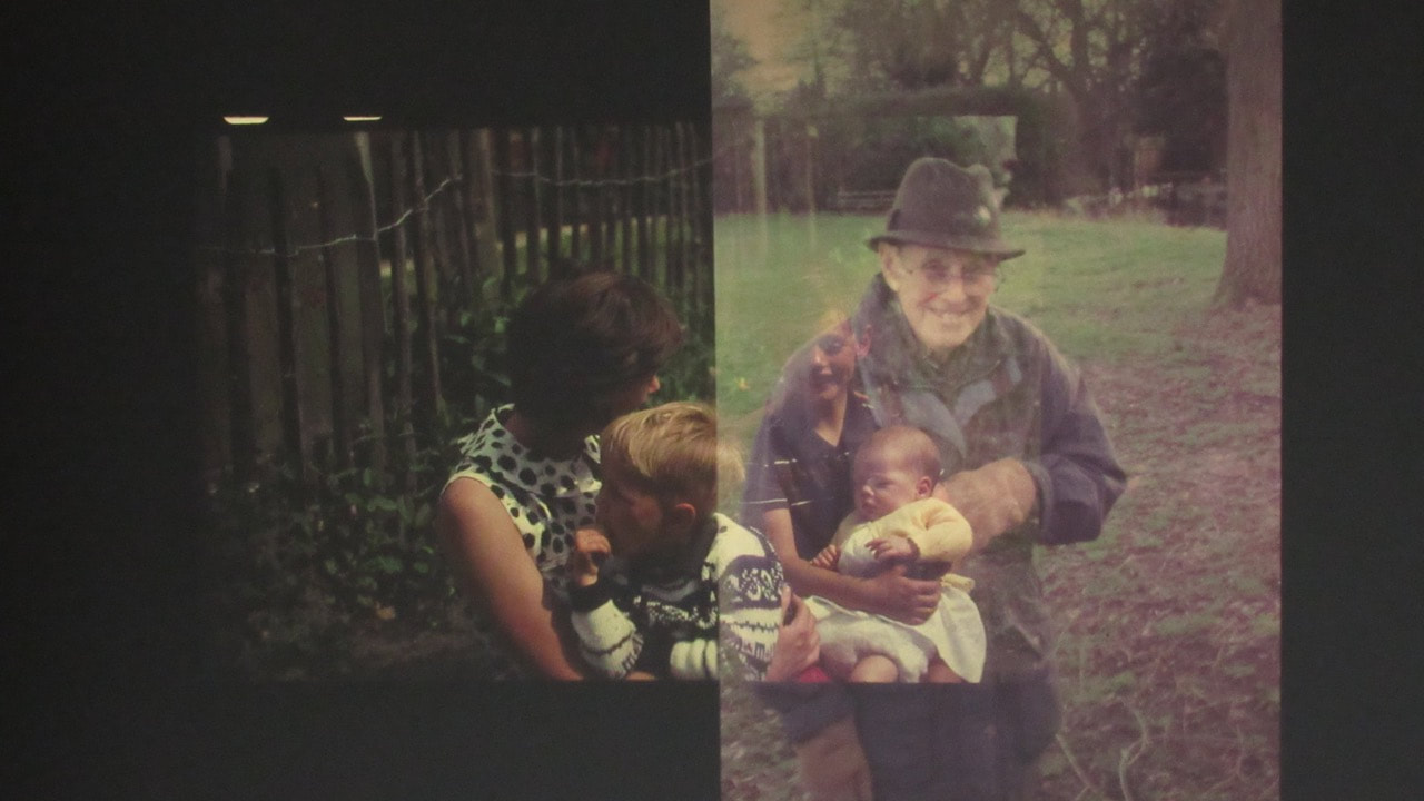
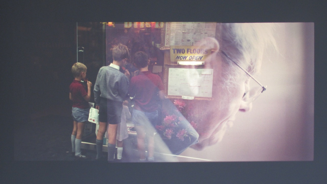
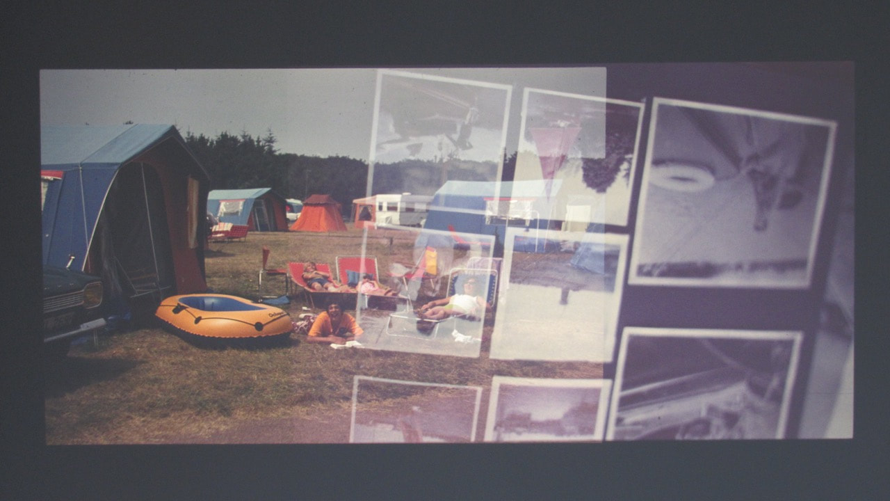
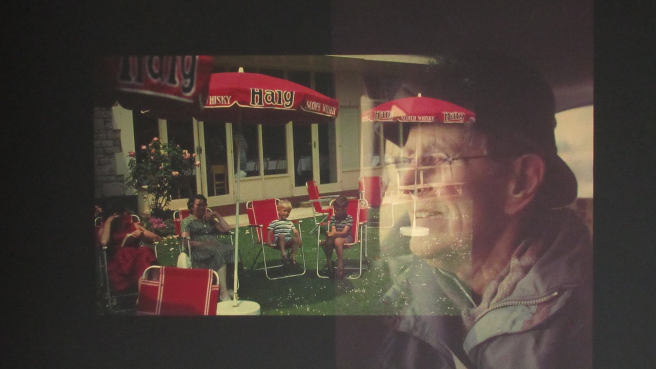
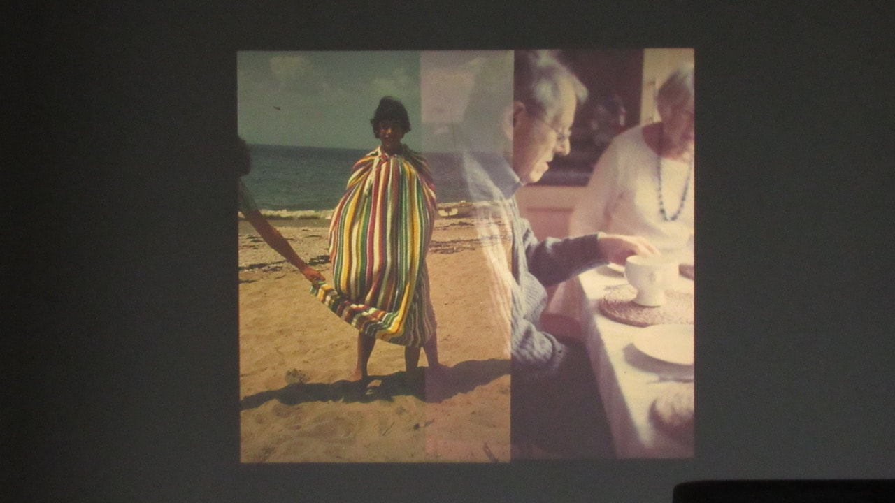
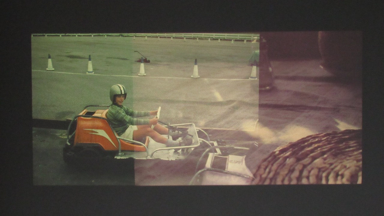
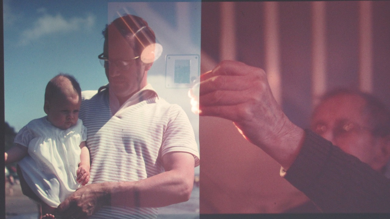
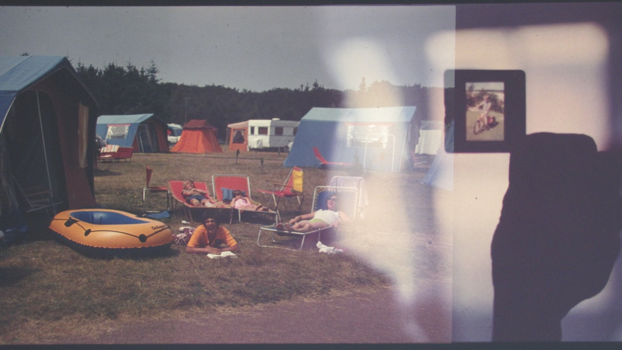
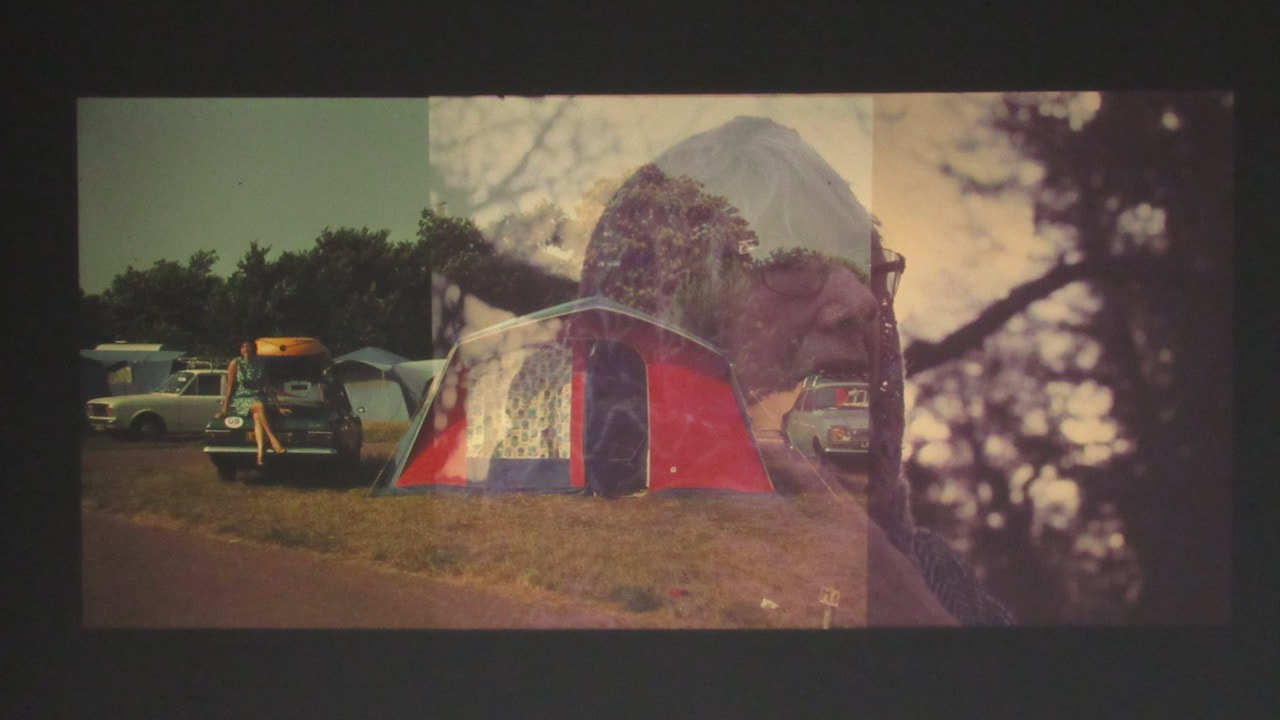
Full set of images:
Click here to view the full set of images
Development - Projecting onto objects and furniture
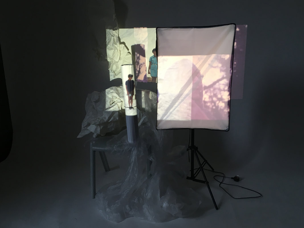
Arranging classroom furniture and objects in front of the overlapping projections
|
After projecting my slides, overlapping with my grandfather's old slides, I decided to add more elements to my installation. My idea was to interrupt and add layers to the installation. Initially, I added a couple of pieces of classroom equipment (a chair and a studio light), to provide different layers for the projections - sections of the projections were interrupted and projected only on to the surface of the apparatus. I then added different textures and shapes - for example crumpled plastic and paper. I also placed a tube onto a chair - with small figures in the slides projected onto the tube, creating interesting shapes and shadows.
|
My first set of object projection experiments:
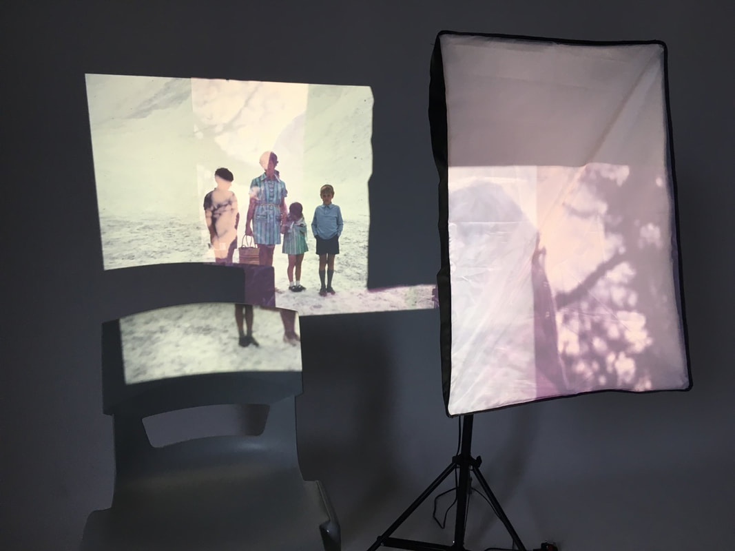
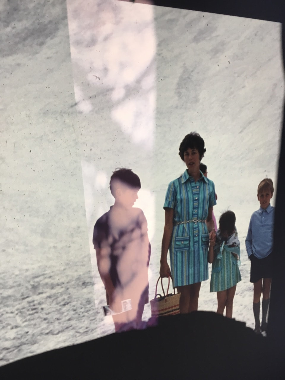
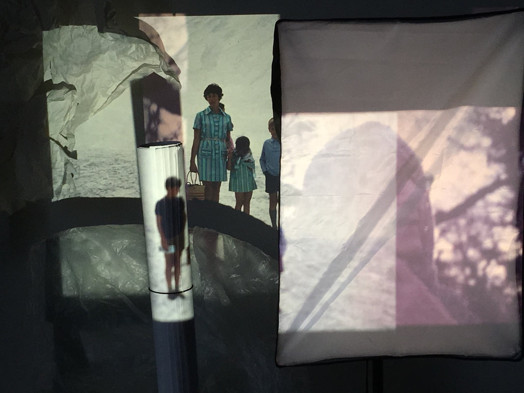
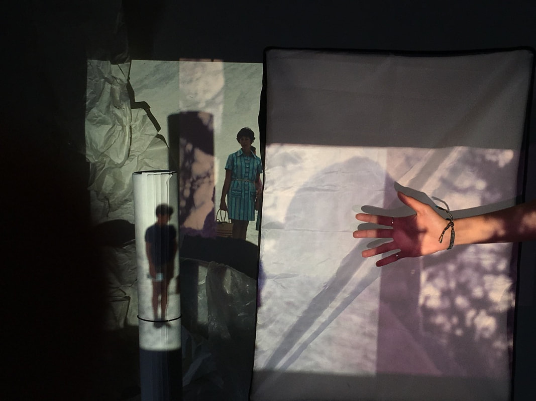
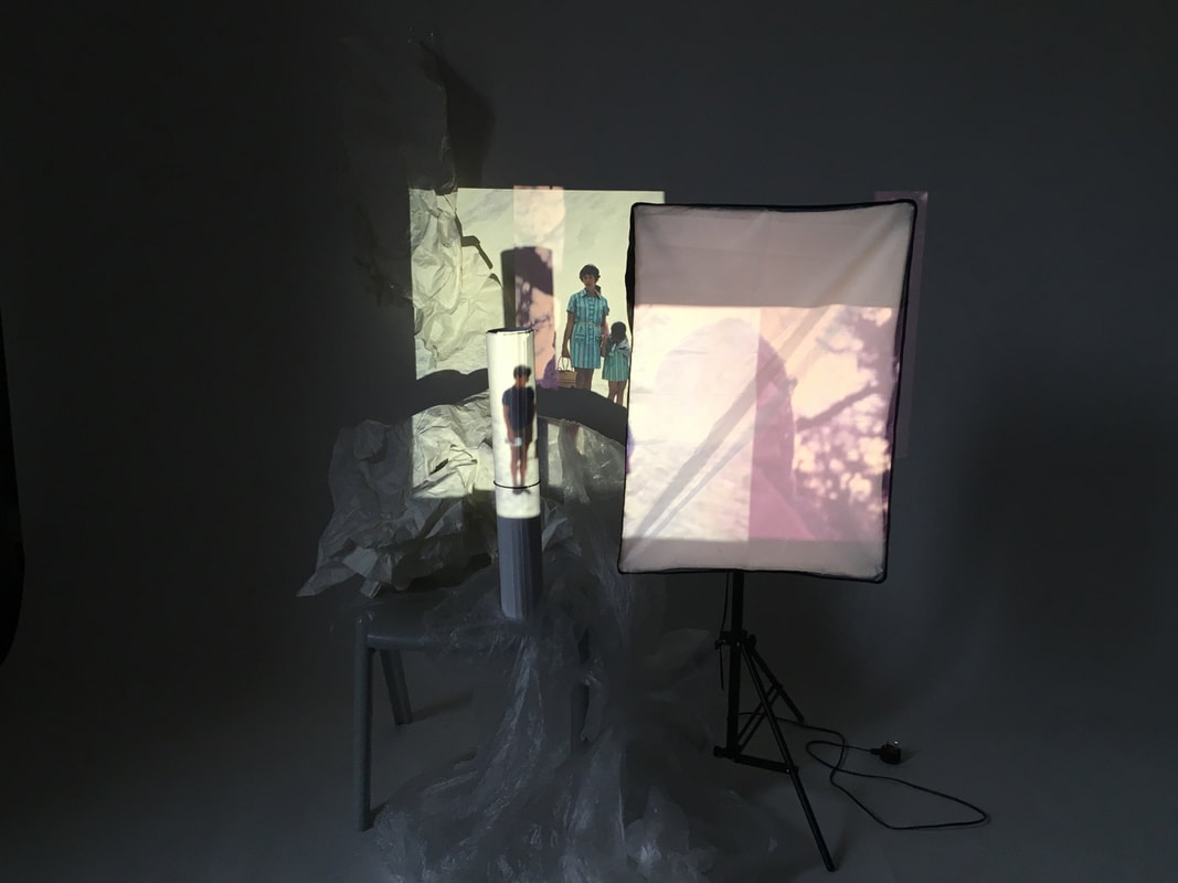
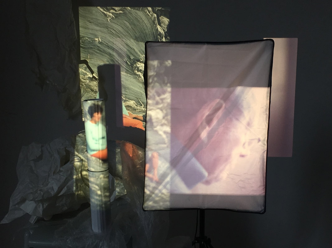
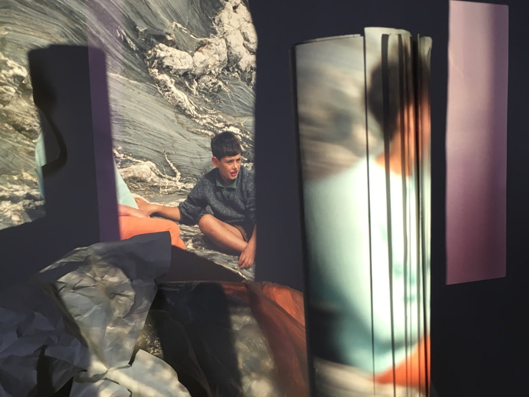
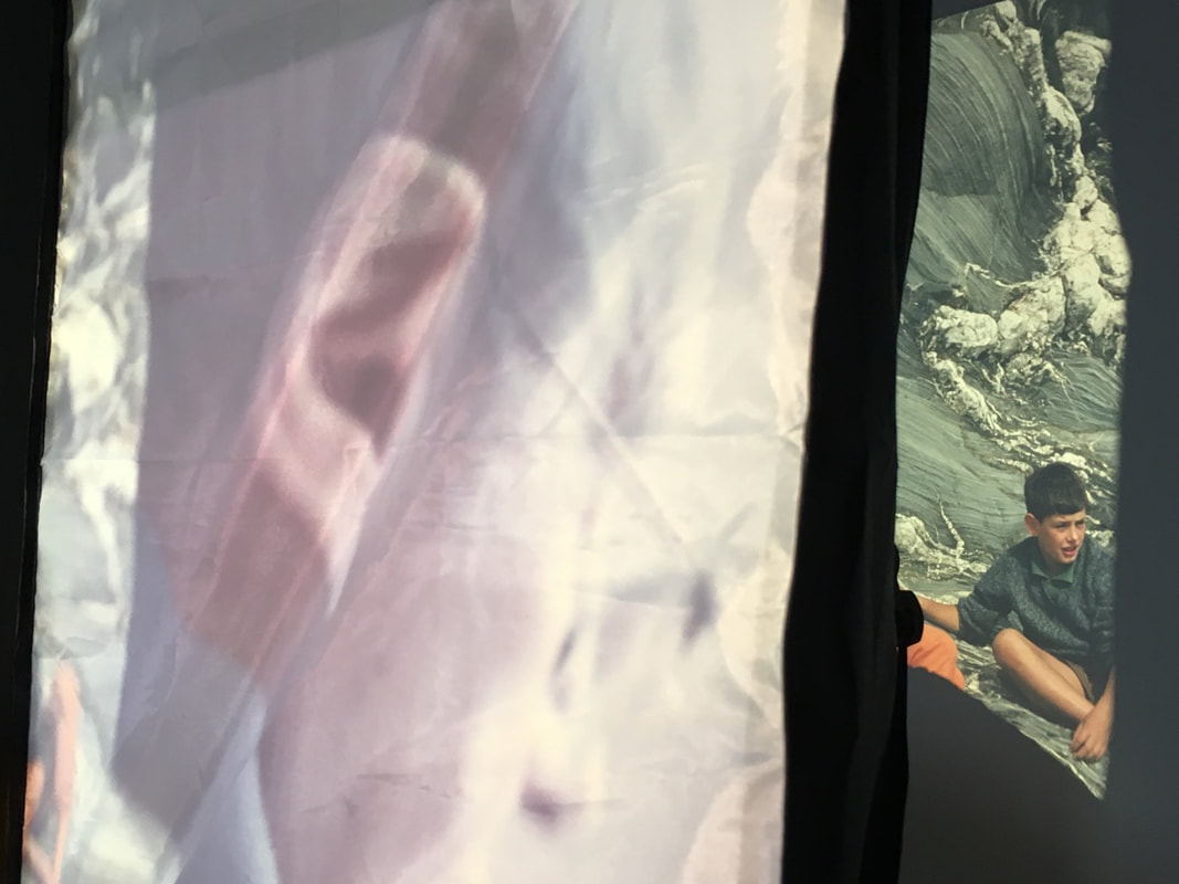
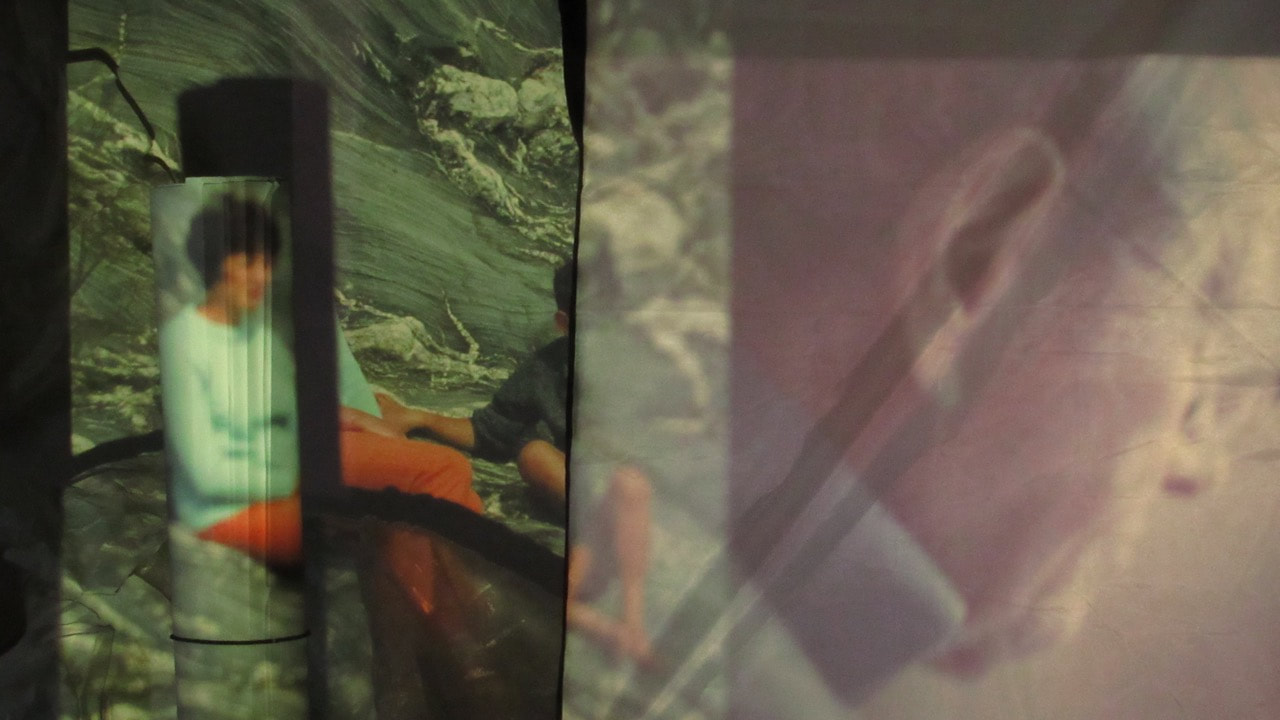
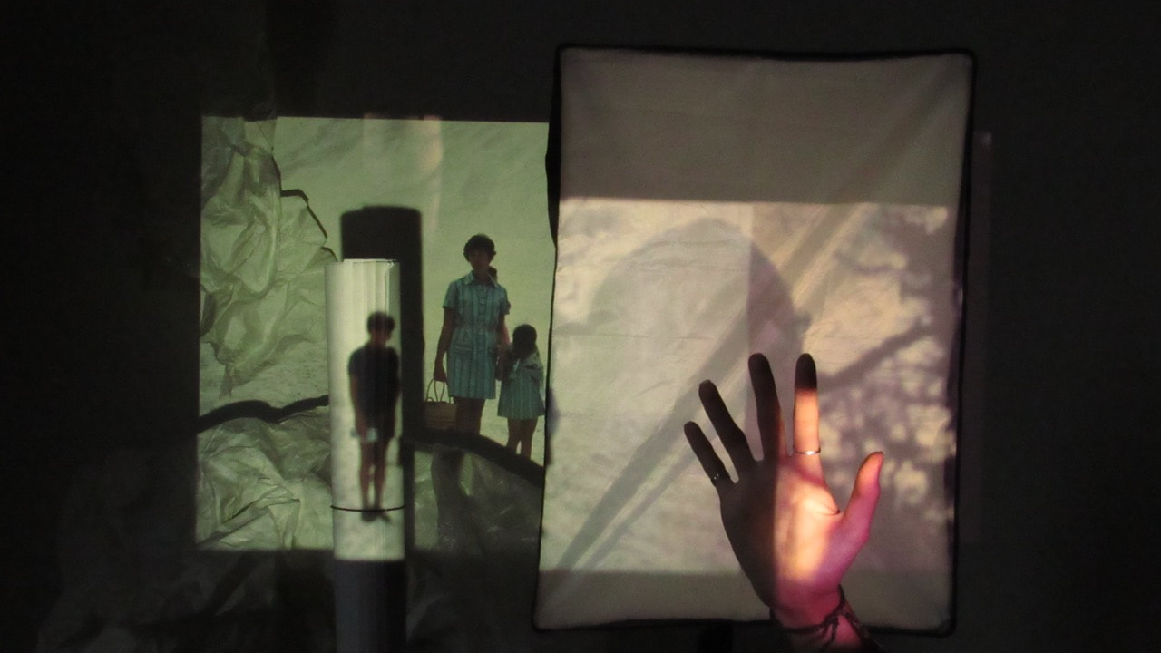
Development: Combining slides with my double exposure video
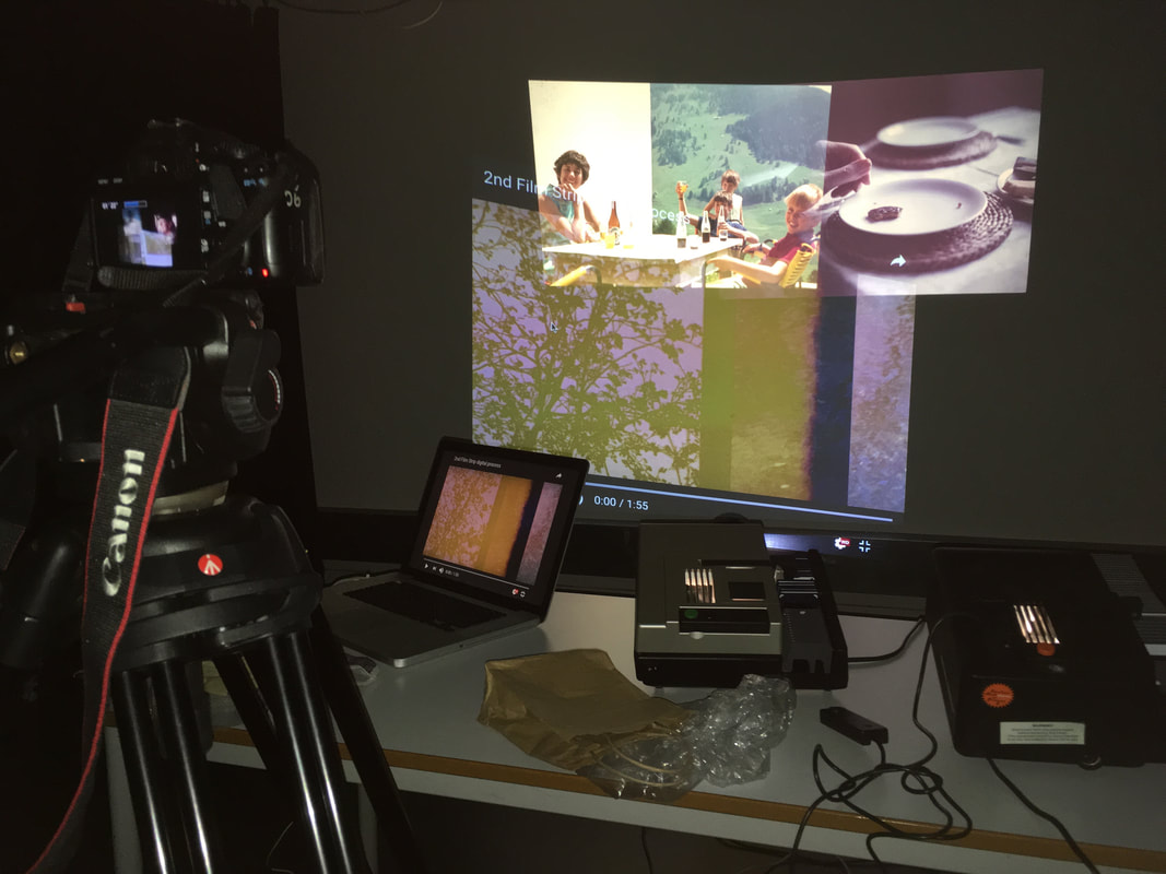
My set-up for the installation
|
After reviewing my first installation outcome, I thought that it would be interesting to add my double exposure slideshow film to the installation. Alongside the scrolling projected slides, adding the double exposure slideshow video would add another element to the installation. The idea was that the smooth scrolling video would contrast well with the slides flashing across the wall. I set up 2 slide projectors, alongside a digital projector to project the double exposure video onto the wall. I filmed the installation using a DSLR mounted onto a tripod, to have a steady video recording of the installation.
|
I also photographed the installation, focusing in closely into sections of the overlapping projections. The merging of the projections resulted in some interesting compositions, with the varied colours and shapes of each projection overlapping. I zoomed in closely, cropping into interesting areas of the composition. I like the outcome of the photos (below), the composition and distortion result in some interesting photographs.
Sample of my photos:
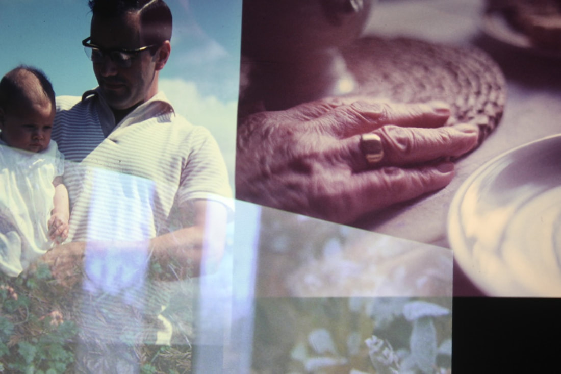
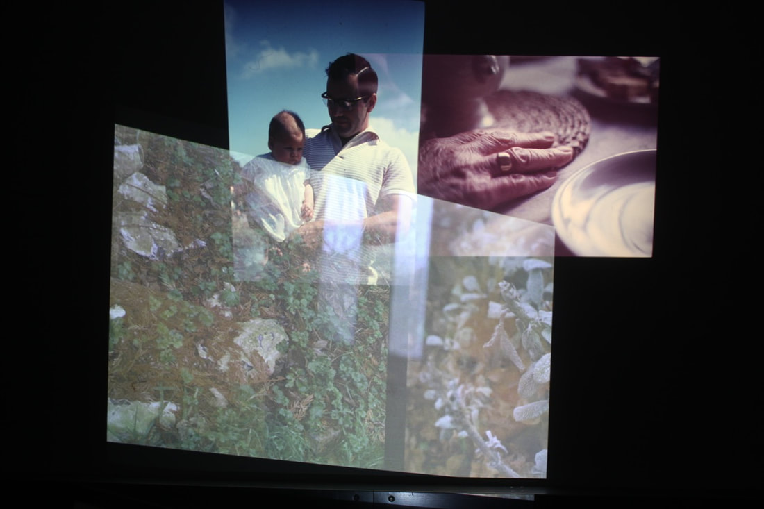
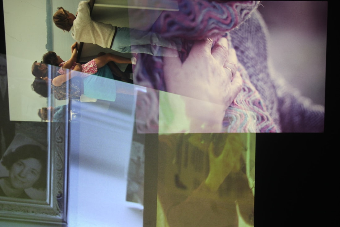
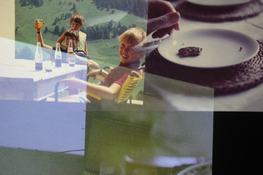
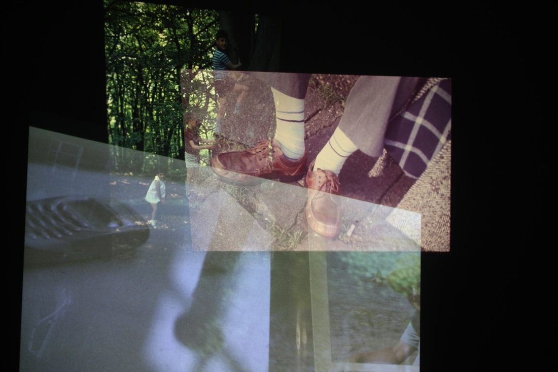
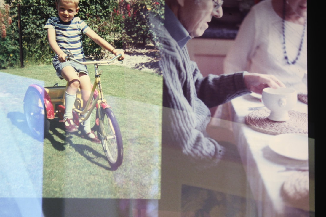
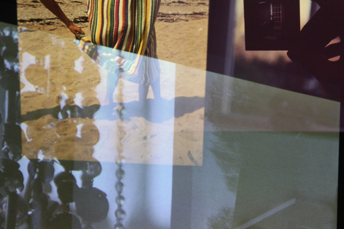
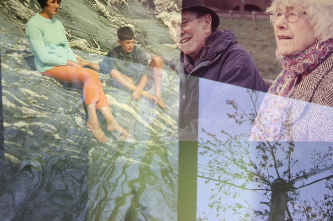
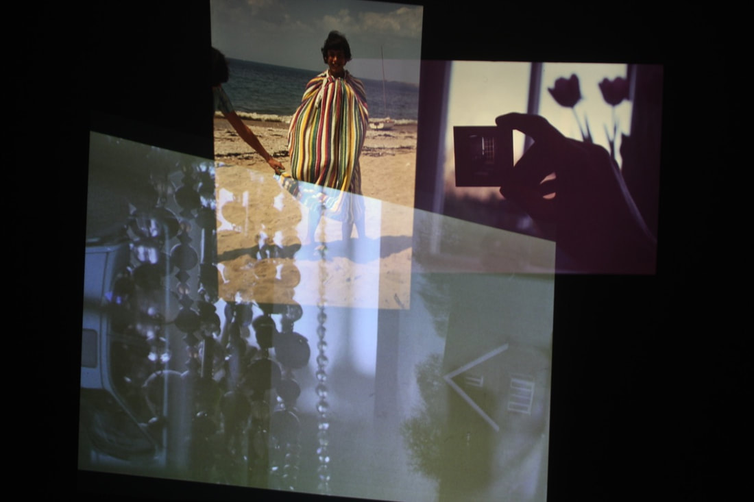
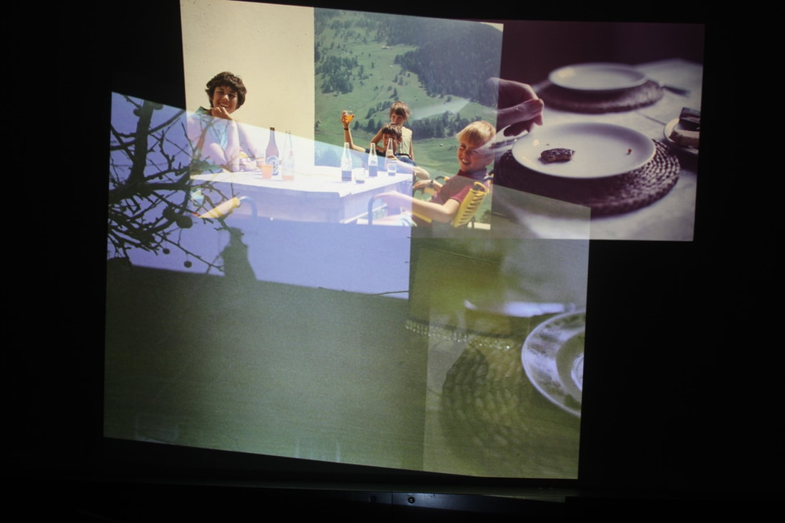
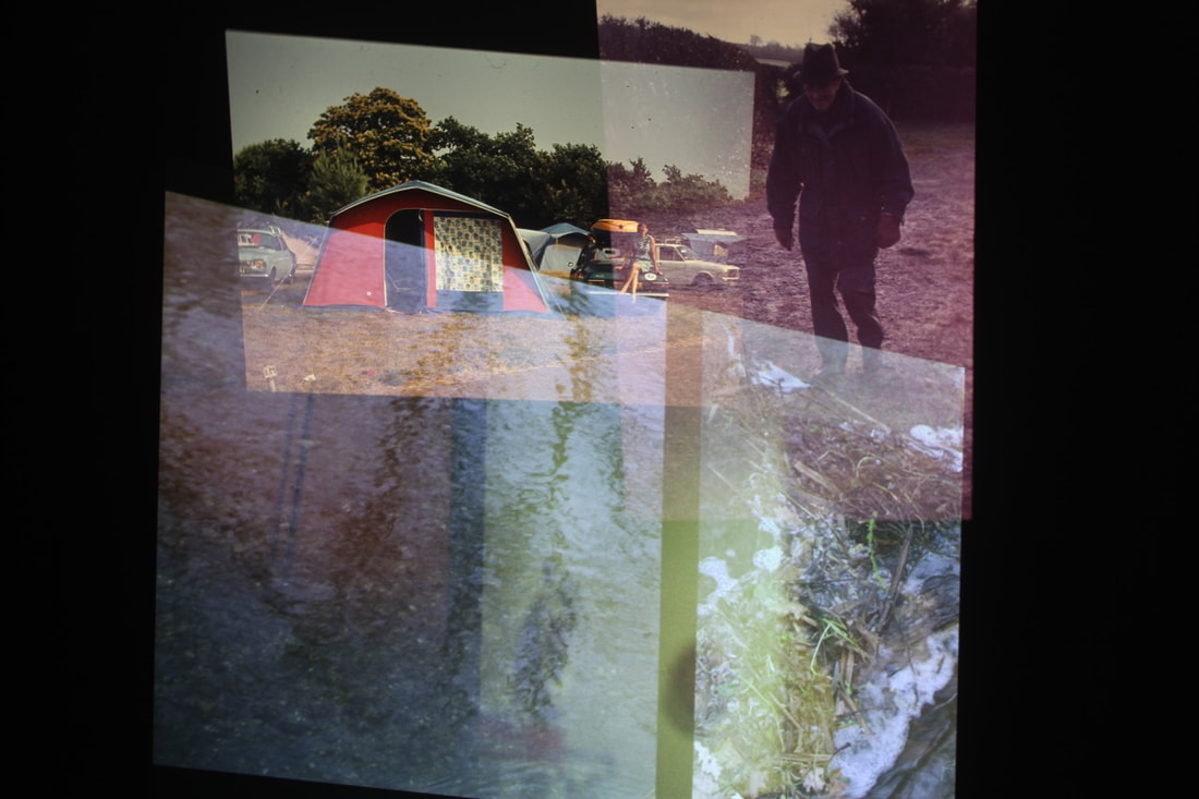
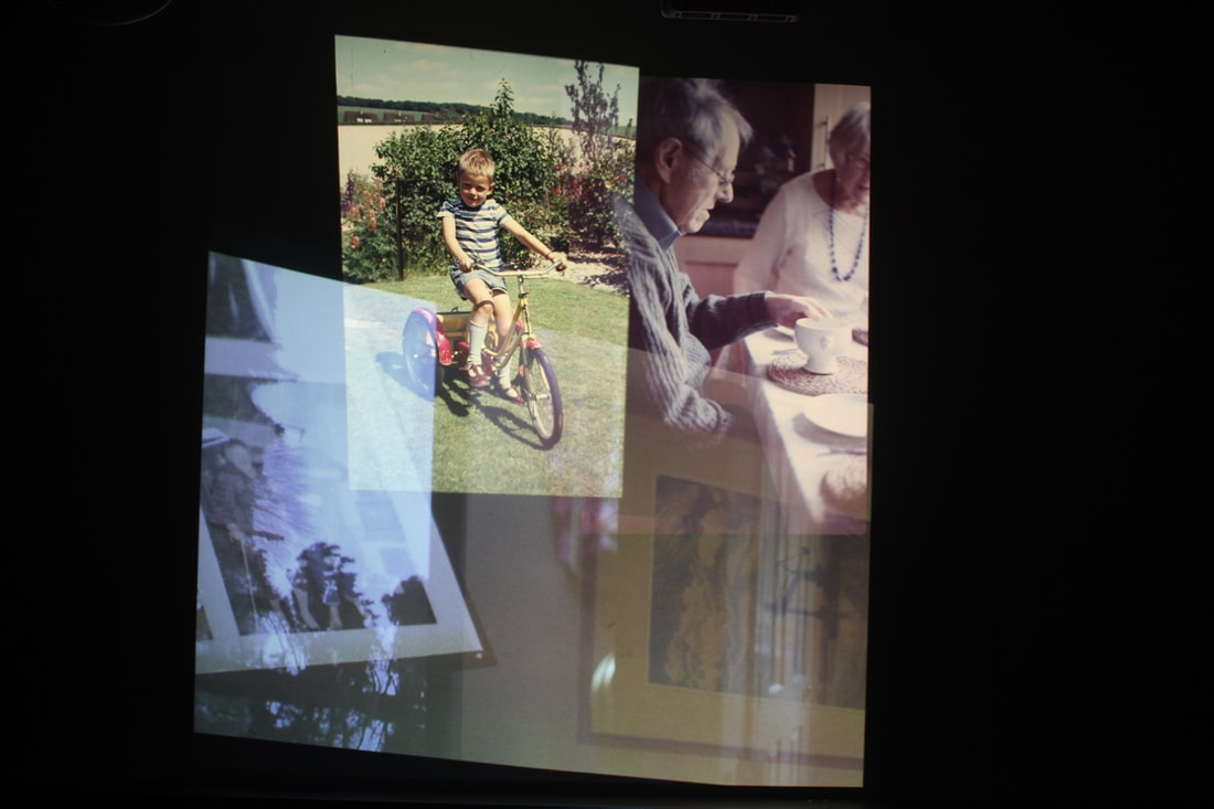
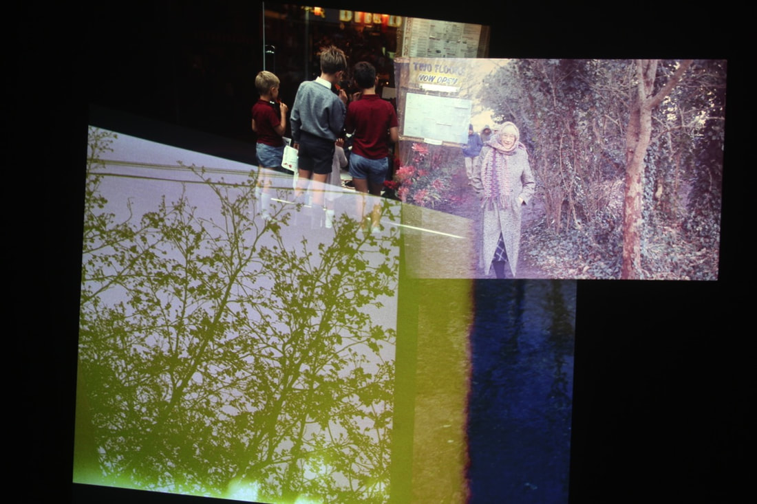
Click here to see full set of images
My installation film:
Disrupting the projections: Adding apparatus to the installation
For my developed installation (with the double exposure video projected alongside the colour slides), I also decided to interrupt the installation, providing larges pieces of classroom equipment to provide added layers. I positioned a large fill light, focusing one of projectors onto the surface - so that different elements in the slides would be projected on top of the white surface of the lights.
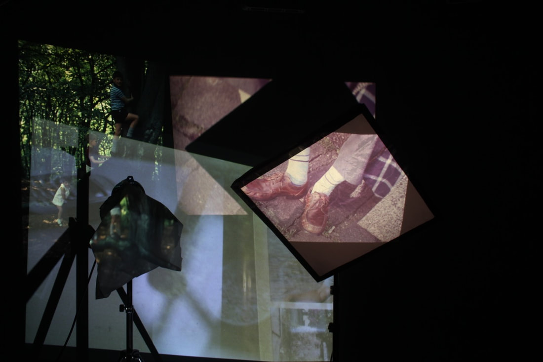
My installation film:
Overall, this refined installation was quite a successful development of my initial outcome. I especially like the effect of the different sections and elements of the projected film slides appearing on different classroom apparatus, lights etc. I like the combination of the double exposure slideshow film, appearing behind these lights, and contrasting with the single photo slides. Moving forward, it would be interesting to display other images on the walls and in a studio alongside the projections - adding another layer/element of the still displayed images to the installation.
Experiments: Projections in the darkroom
I thought about how I could develop my installation, primarily how I could experiment with different ways of projecting, and adding different elements (such as photographs) to the piece. In this development, I used the projector inside the darkroom, focusing the projector onto the washing line. I subsequently hung up all of my photograms of my inherited cameras on the washing line, before I focused my slide projector onto the washing lines. I set up the slide projector with my grandad's colour slides, projecting my grandfather's slides on top of the photograms - as the slides were taken using the cameras in the photograms.
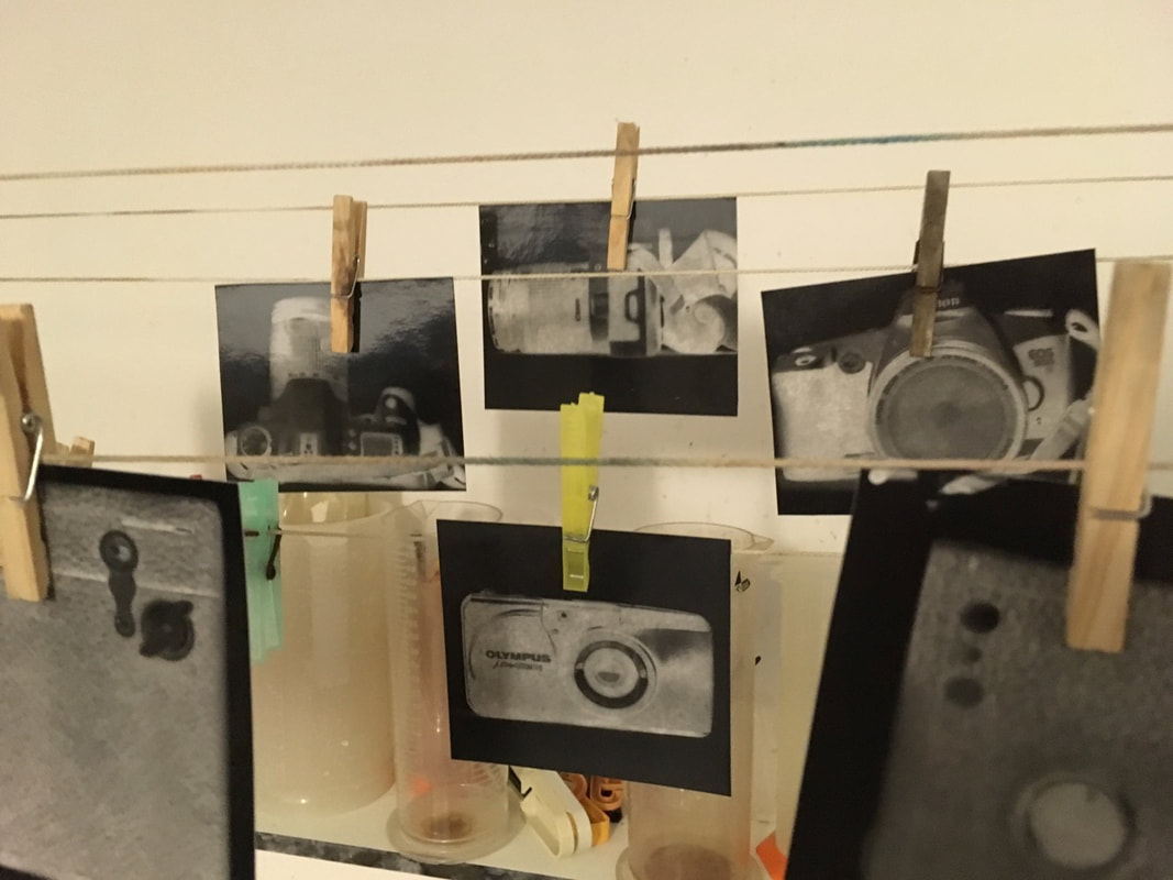
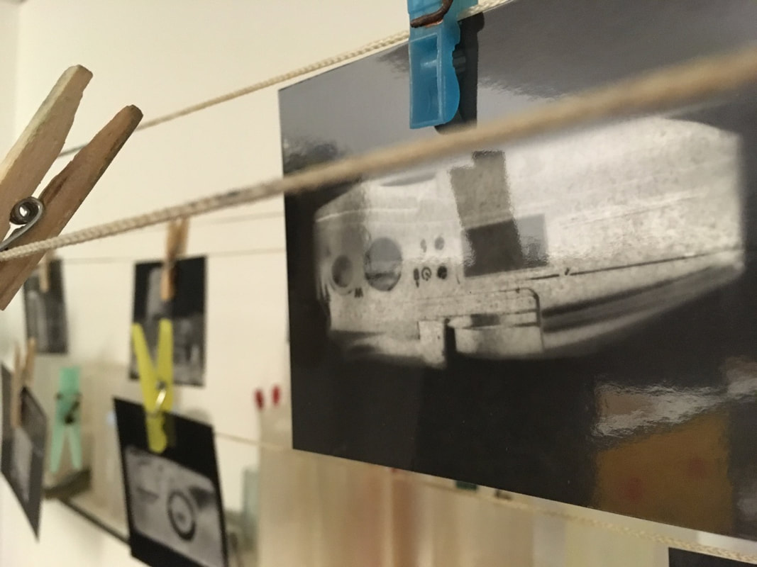
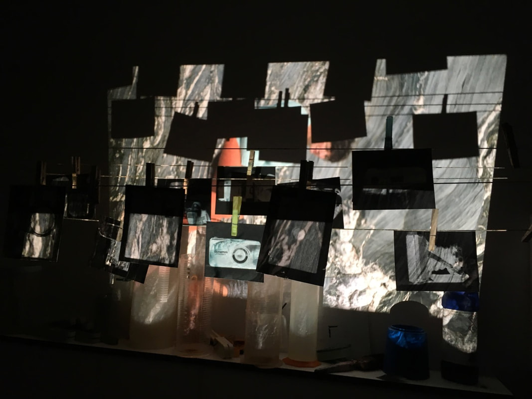
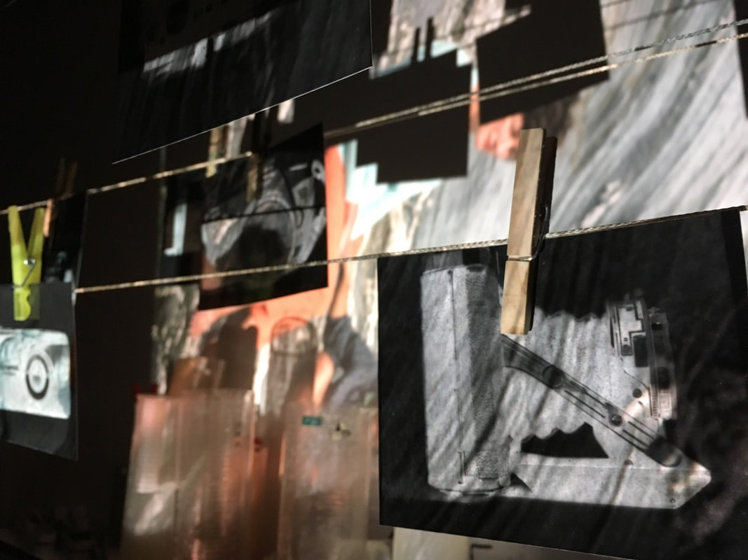
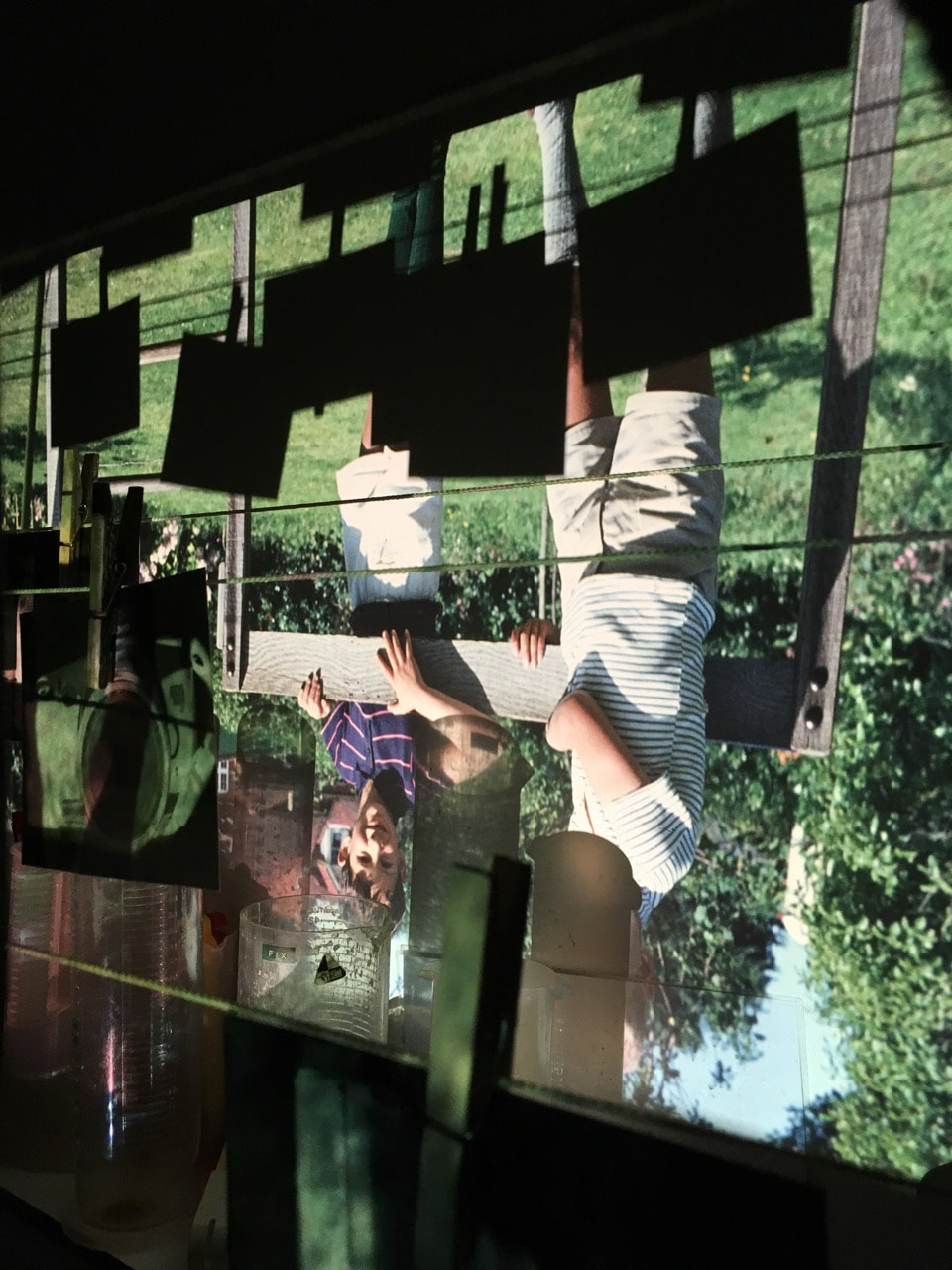
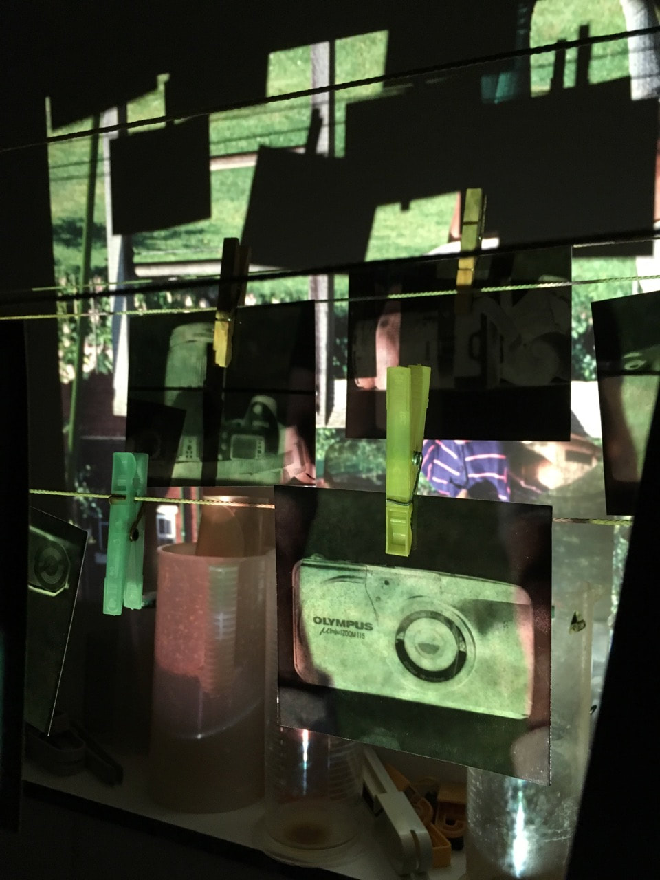
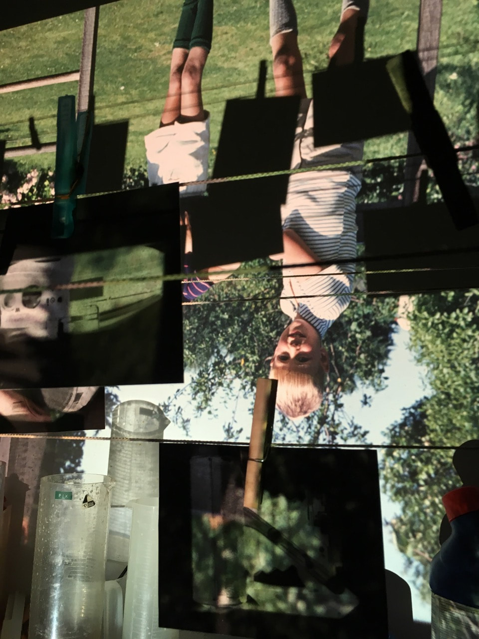
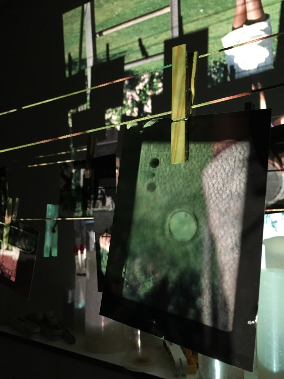
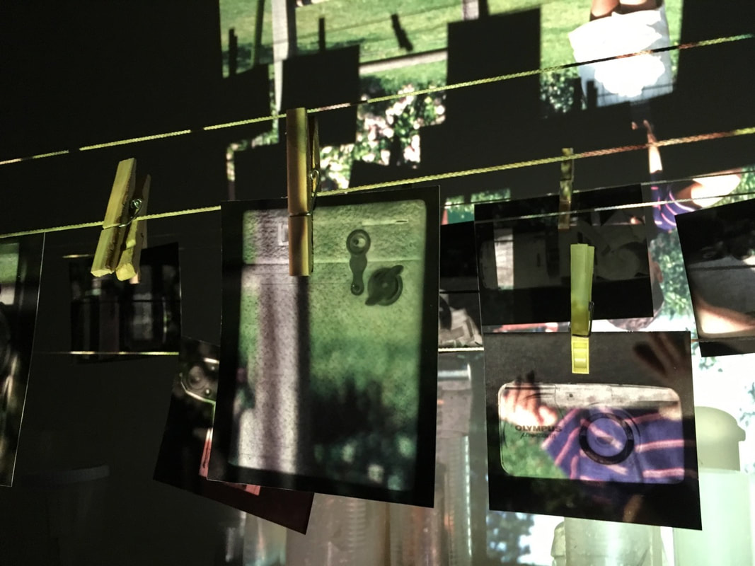
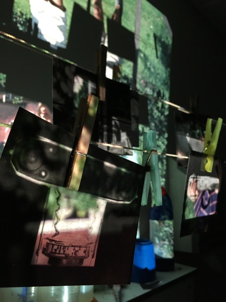
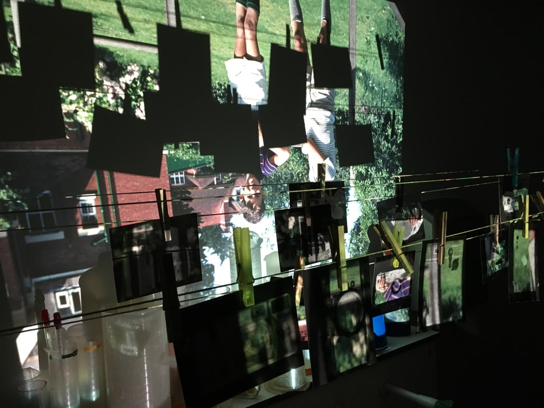
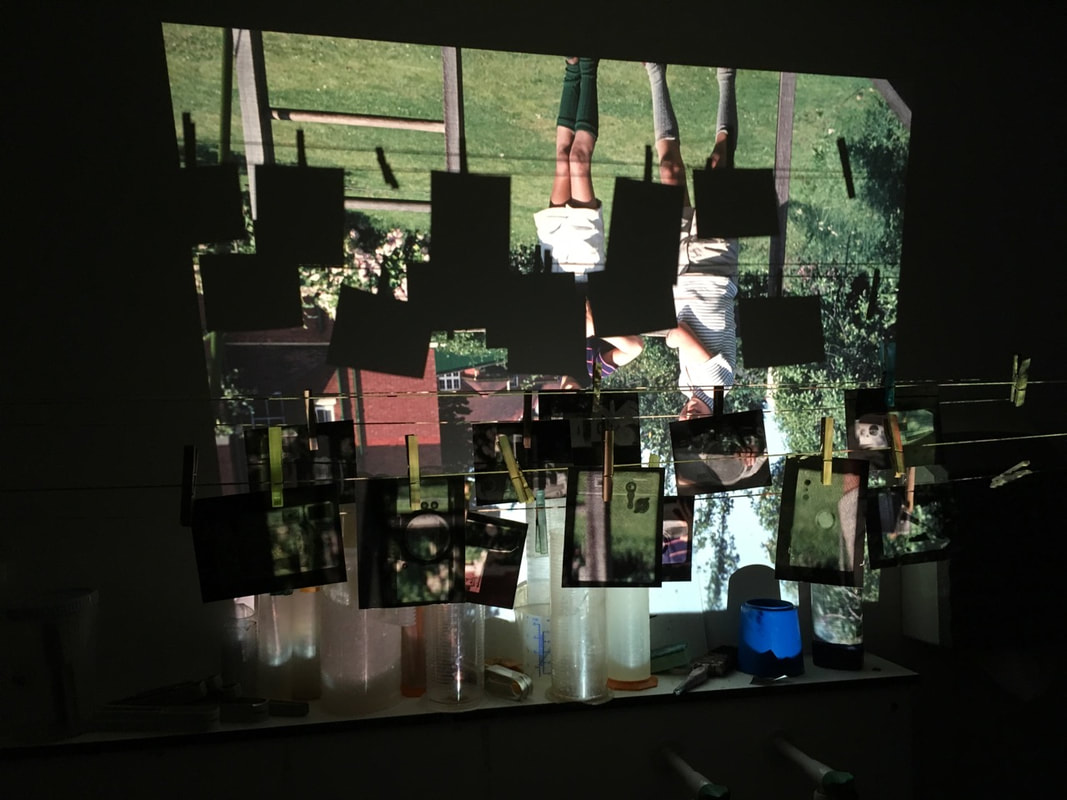
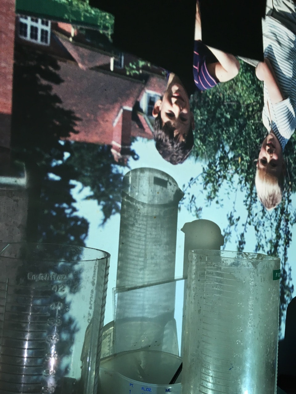
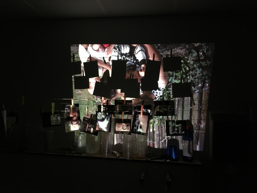
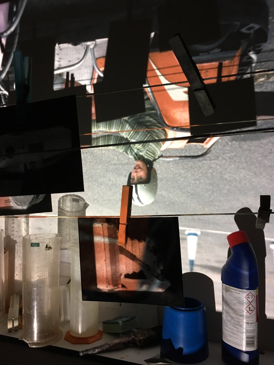
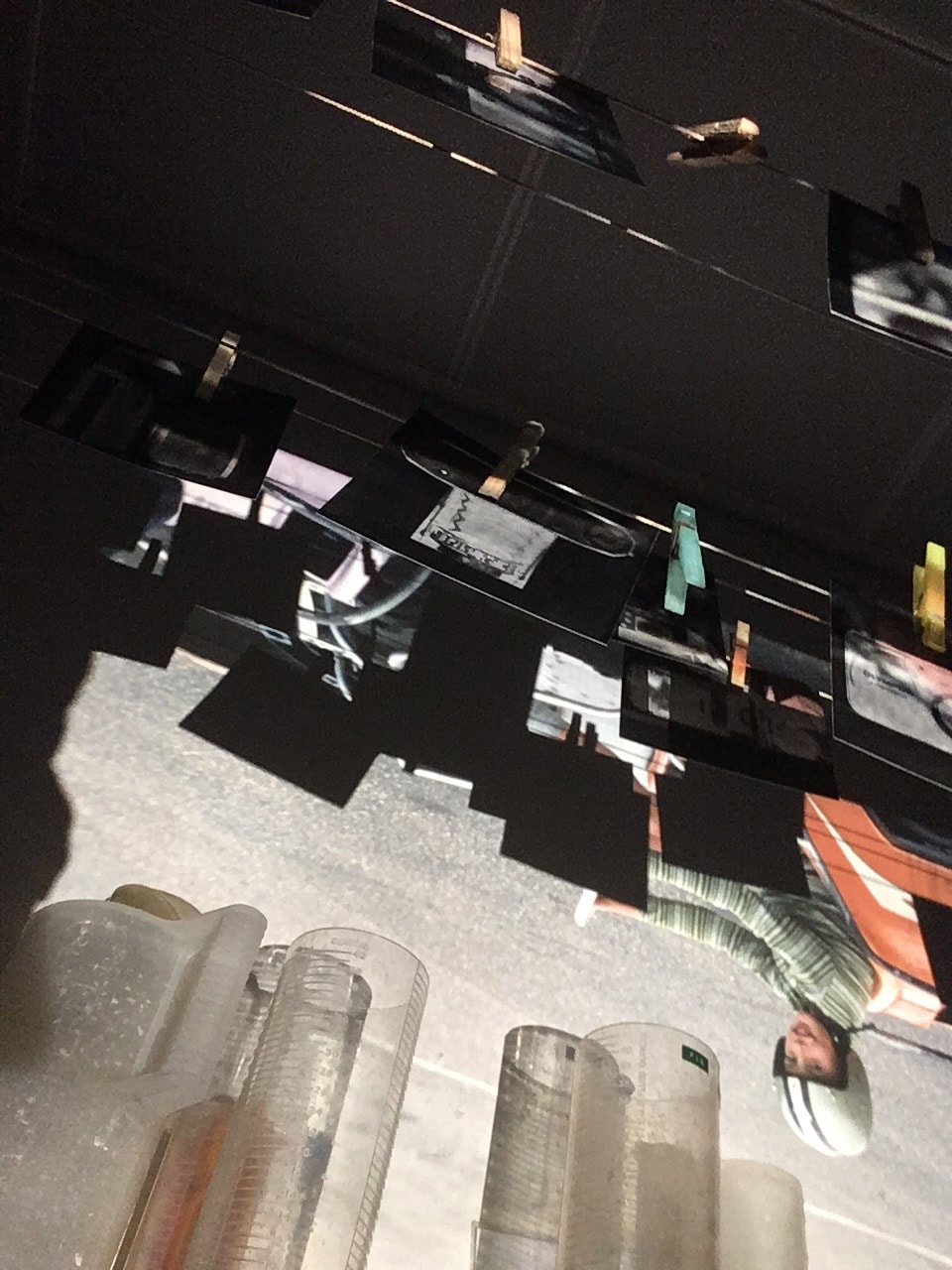
I think the outcome of this experiment was successful - in particular the effect of the slides projected on top of the photograms. I find this direct link of imagery interesting, the photographs overlapping the cameras that my Grandfather used to shoot. In particular, I find the shapes of the shadows cast in the background especially interesting. In particular, the shadows of the lines and rectangular photographs contrasting strongly with the colour images. As well as this, I liked the contrast of the colour and shapes of the slides, in contrast with the black and grey photograms. I think that my video outcome was quite successful - with the video plunged into darkness, as slides flash across the screen. I also shot different viewpoints - the clip shot from underneath was quite interesting.
Developing my installation: Using fill lights
After developing and refining my outcome, I considered how I could develop it further - what new elements could I add to my installation? My main idea was to add a range of my images to the installation, displaying them alongside the projections. However, I didn't was to just display them on a wall, as I had done in my first final outcome. I wanted them to stand out separately, displayed as a separate layer to my installation. To achieve this, I selected a range of different photographs, from throughout my personal investigation. I selected images that most effectively compassed my project - photographs of my grandfather's photo collection, alongside my own photographs produced in response from throughout the investigation. I printed these images in varying sizes, before I layered and overlapped the images, attached to the fill lights. I positioned the fill lights in between my projections, subsequently switching on the lights, to illuminate the photographs from behind. I subsequently recorded the installation, with the video and slides projected across the wall.
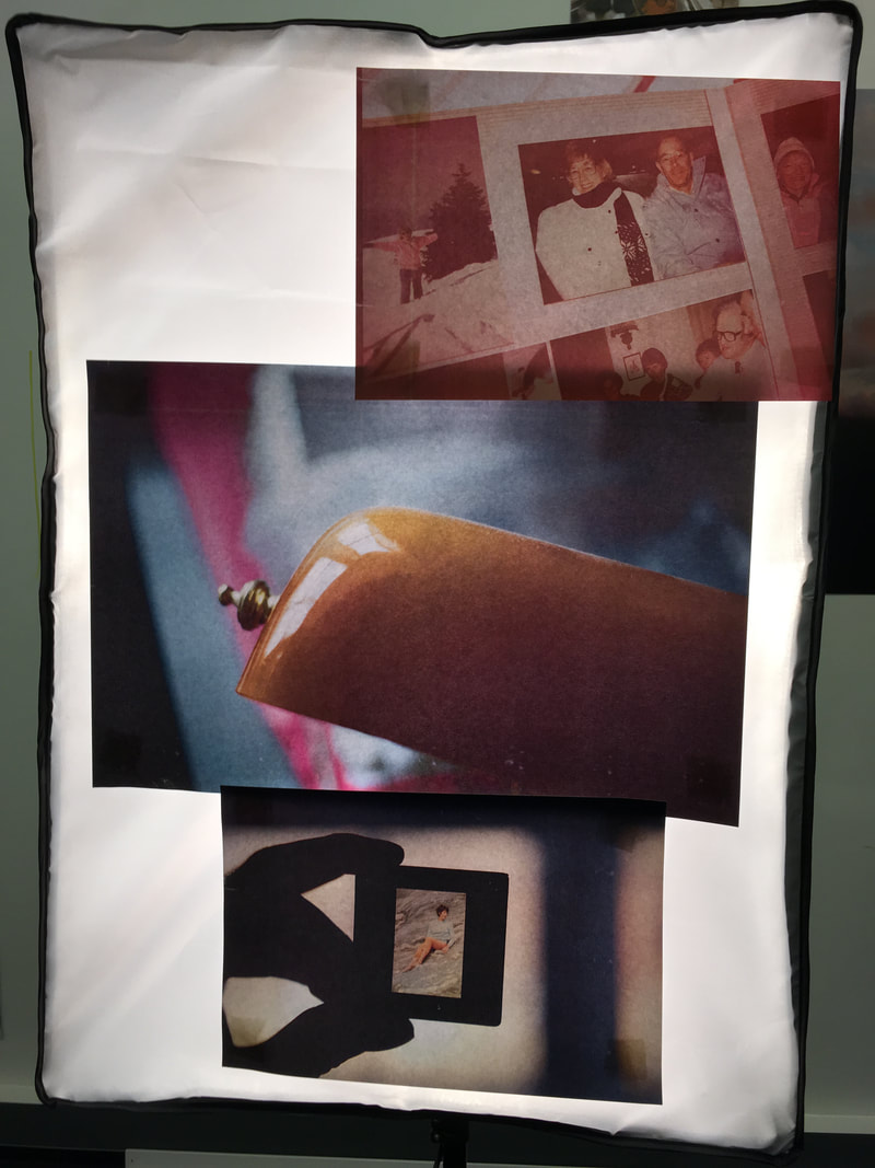
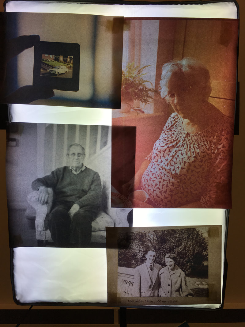
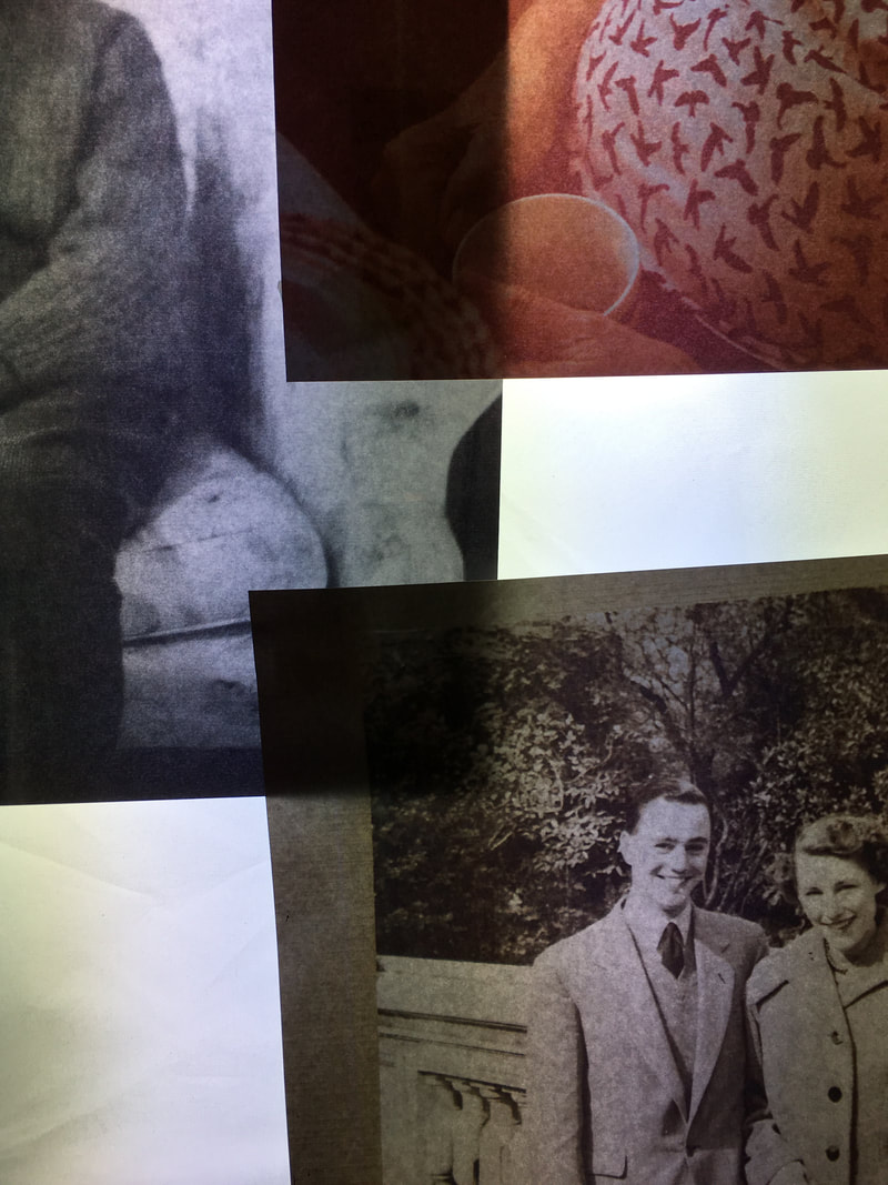
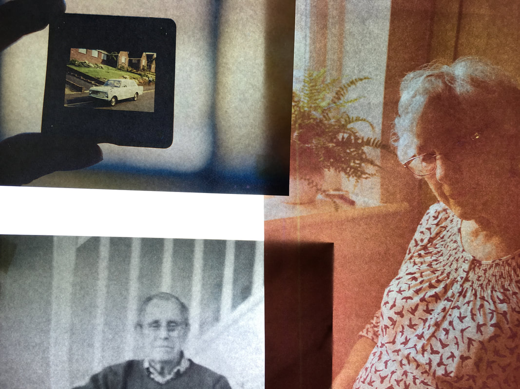
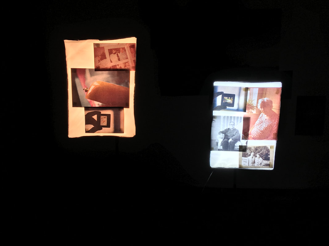
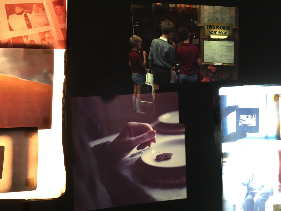
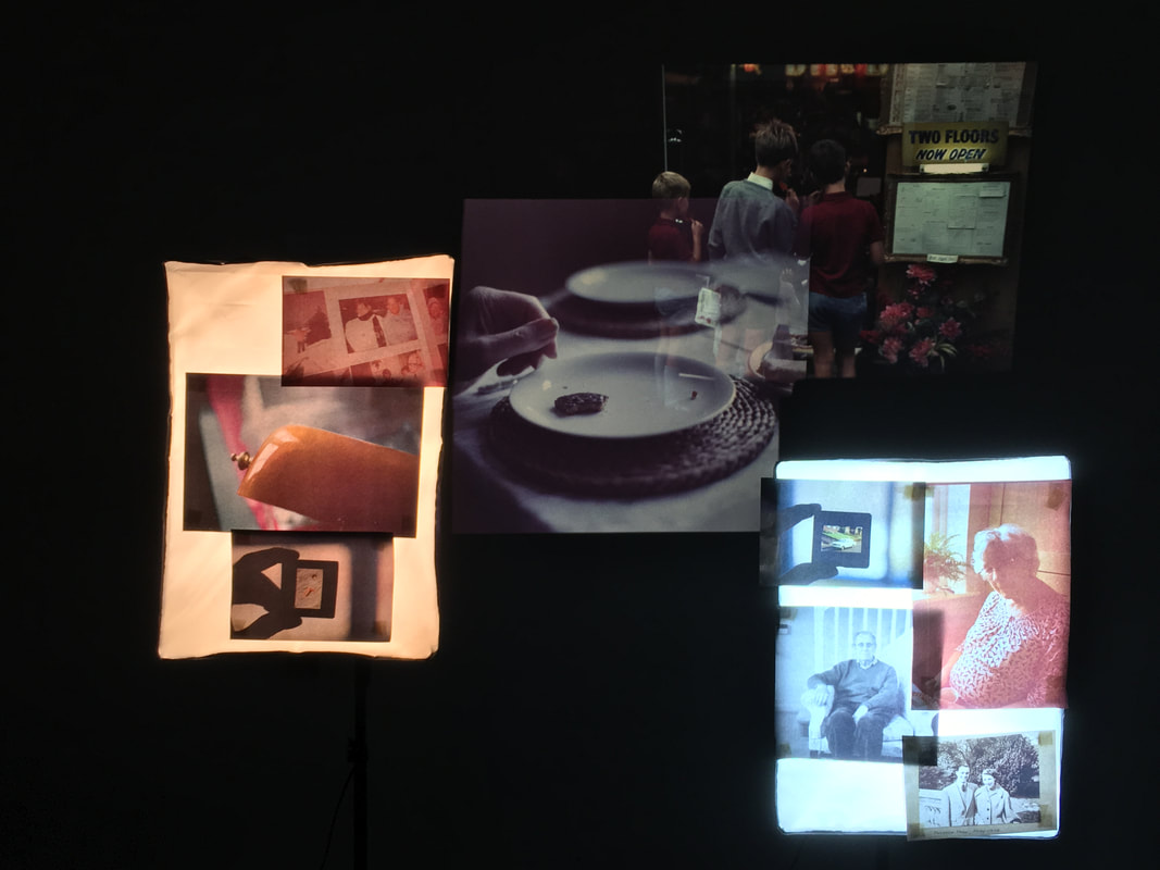
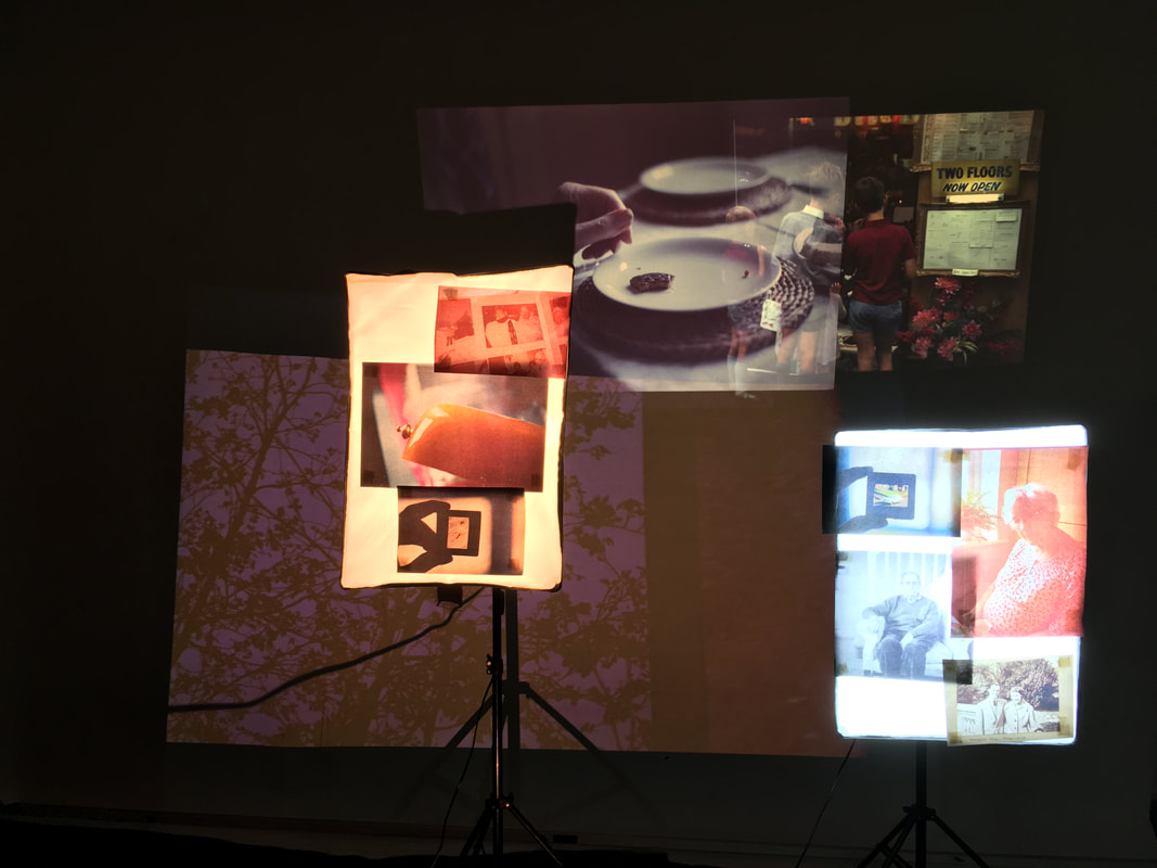
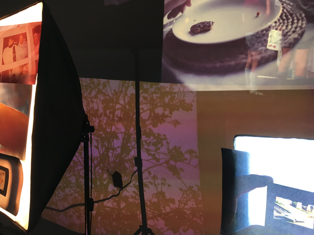
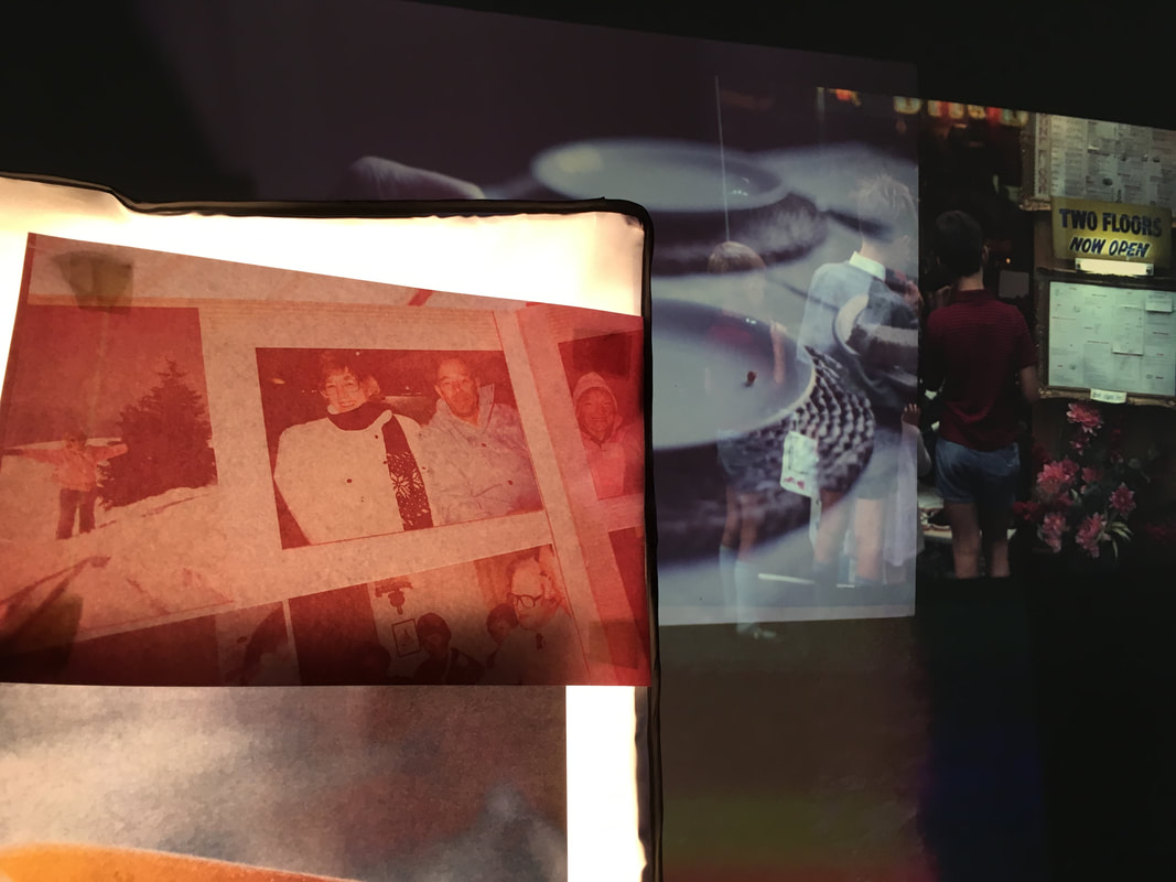
Again, I photographed different close-up compositions of my installation - primarily focusing on visually interesting combinations of imagery, colour and light. I quite liked the contrast between the backlit photographs and the projections, resulting in some interesting arrangements of light and imagery in some of my photographs of the installation.
Overall, I think that this outcome is largely successful. I really like the effect of the backlit photographs, arranged layered on the fill lights. This is a strong contrast to the projections in the background. I think that the video is relatively successful on the whole - the range of different elements in the installation, with the illuminated photographs, bold colours and movement of the projections across the screen. However, on reflection, I think that the bright fill lights dominated the installation too much - they were slightly too bright and dominated - it was difficult to see the projections underneath. For the next development/refinement of my installation, I think that it will be more effective to use the projections to illuminate my displayed images on the fill lights, rather than having the images backlit.
Final Outcome: My multimedia installation
For the final refinement of my installation, I tested using projections to illuminate my displayed images, turning off the fill lights. The fill lights were too overpowering when turned on, and I wanted to put more emphasis on the projections - the fill lights dominated the installation too much previously. Not only this, but I wanted to see the effects of the projections combining with my displayed images. I wanted to experiment with the effects of combining my photographs, overlapping and merging them with vivid colour projections. Not only this, but in terms of my concepts, this is another way of combining my photography with my grandfather's - exploring this relationship.
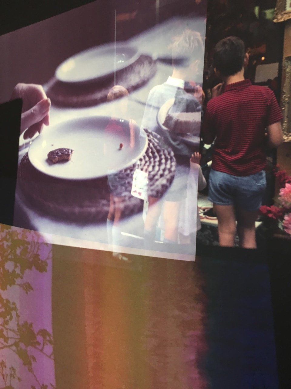
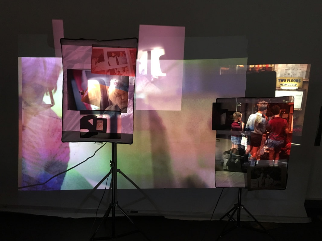
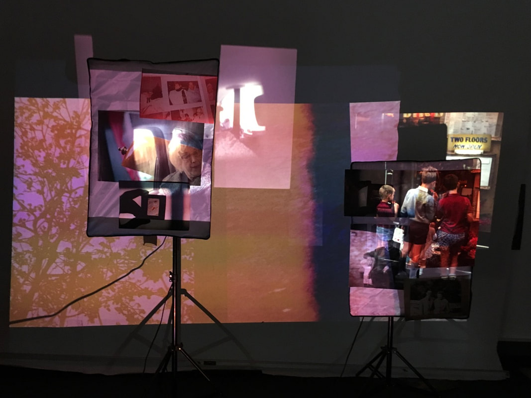
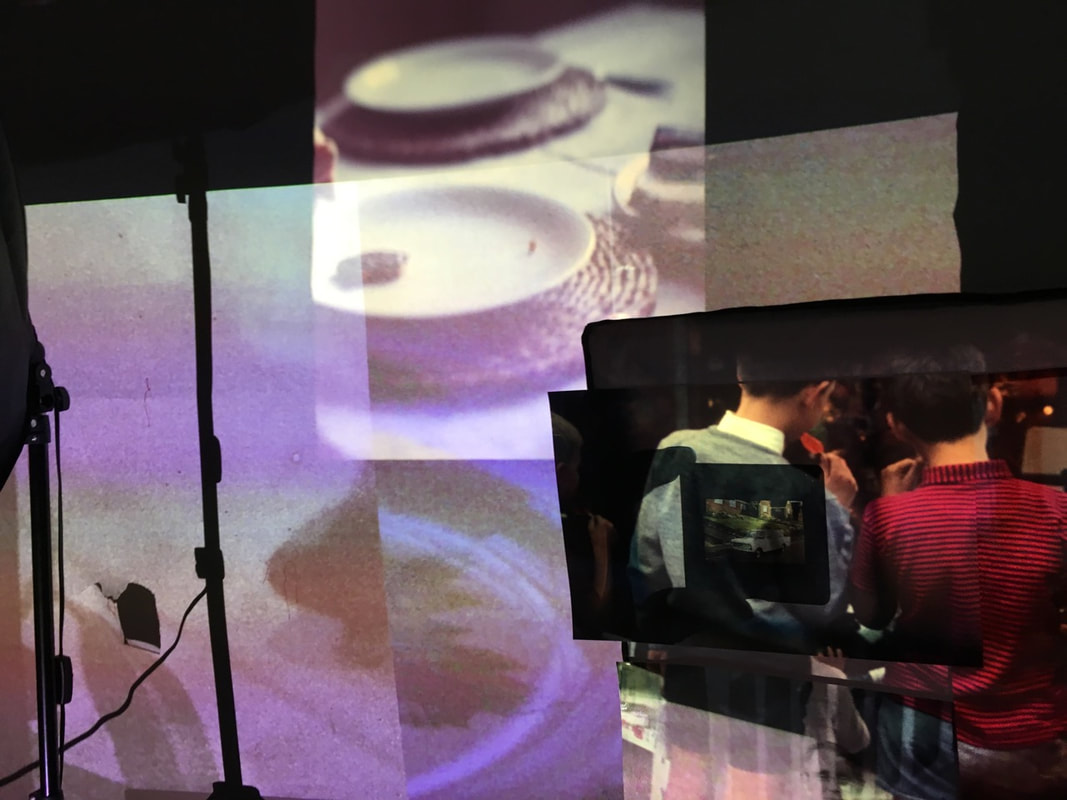
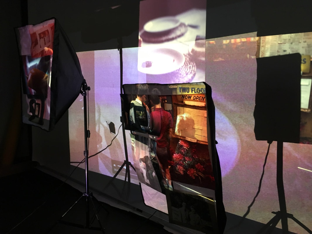
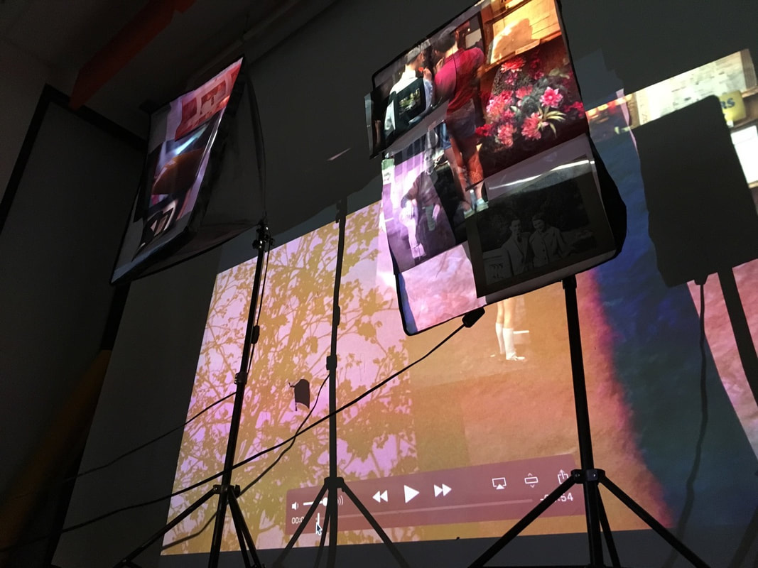
On reflection, I think that the installation with the fill lights switched off is more successful. The projections are clearer, illuminating my displayed images. Overall, this is more effective - the installation looks better overall and provides more interesting combinations of projections and images. In the gallery above, I photographed a number of angles and compositions of the installation, focusing in on interesting areas and compositions of colour and shapes.
Final outcome installation: Video
EVALUATION:
• Overall, I am pleased with this installation, as the final outcome of this project. On reflection, this installation was a successful realisation of this project, and I think that it is an effective outcome for investigating my relationship to my grandfather's photography.
• I like the combination of imagery especially, with my colour slides and my grandfather's overlapping and partially merging being one of the most successful elements of the final outcome. Here, my photographs are physically overlapping and partially combining, my own photographs combined and merged with my grandfather's. This physically bridges this relationship, you can see the contrast of the composition and subject matter between my grandfather's slides and my own images. The wide range of different installations I experimented with were an effective realisation of the concept. Through these installations combining my photography and my grandfather's, sections of the projection overlapped, with photographs and portraits from a number of decades ago, combining with my images taken now.
• Adding various classroom objects and fill lights added a further three dimensional element to the installation, with different sections of the projections appearing on different parts of the classroom furniture and objects. I think that the further refinement of this adding printed images was effective, layering various projections and images. The running video slideshow of double exposures worked well in the background.
• However, if I had an exhibition space and an unlimited budget, there are a number of ways I would like to further develop and refine this project. I could set up display cabinets/tables, containing my grandfather's old cameras, photo albums and slides in an exhibition space. This could be combined with displayed photographs and/or projections. Moreover, I would like to experiment with multiple screens/projectors - potentially producing a multi screen (with different screen layers/levels), which I could display or project images on to (like 'Purple' by John Akompfrah). I could use 5-10 projectors as well, each displaying slideshows/videos of my project photographs. Audio and video could be something to further explore, potentially conducting interviews and filming with my grandparents (maybe with analogue or Super 8) I could even set up large metal poster/banner holders, to display large poster size prints of my photographs in an exhibition space.
•For me personally, more widely it was very interesting for my to explore and discover the huge variety and range of my grandfather's photography, cameras and old physical photos and slides. I was able to explore how my grandfather captured memories and my family's significant events in photo albums.
• Again, on a personal I was able to effectively explore my relationship to my grandfather, triggering his fading memories of the past and discussing his photography. Through this project, I was able to help him engage more and rediscover his hobby of photography. In my photographs, you can see him engaging with his old Kodachrome slides, and engaging with my photography. I enjoyed documenting my grandparents lives, engaging with them through portraits as well as documenting details, ornaments and mementos that they have accumulated in their home throughout these lives. These were especially successful - I think the these more sensitive, intimate portraits were effective in exploring my relationship with my grandparents, and my grandfather's photography.
• In terms of my understanding of photography, I have greater understood how photography can be a medium of recording evidence of time and history, with my grandad recording the major events of his life through the medium of photography, captured in strips of light sensitive film. These remain as evidence and traces of the past, triggering nostalgia and reminding us of 'things lost', the past that we cannot return to.
