Two Frame Films
Luke Fowler - Two Frame Films
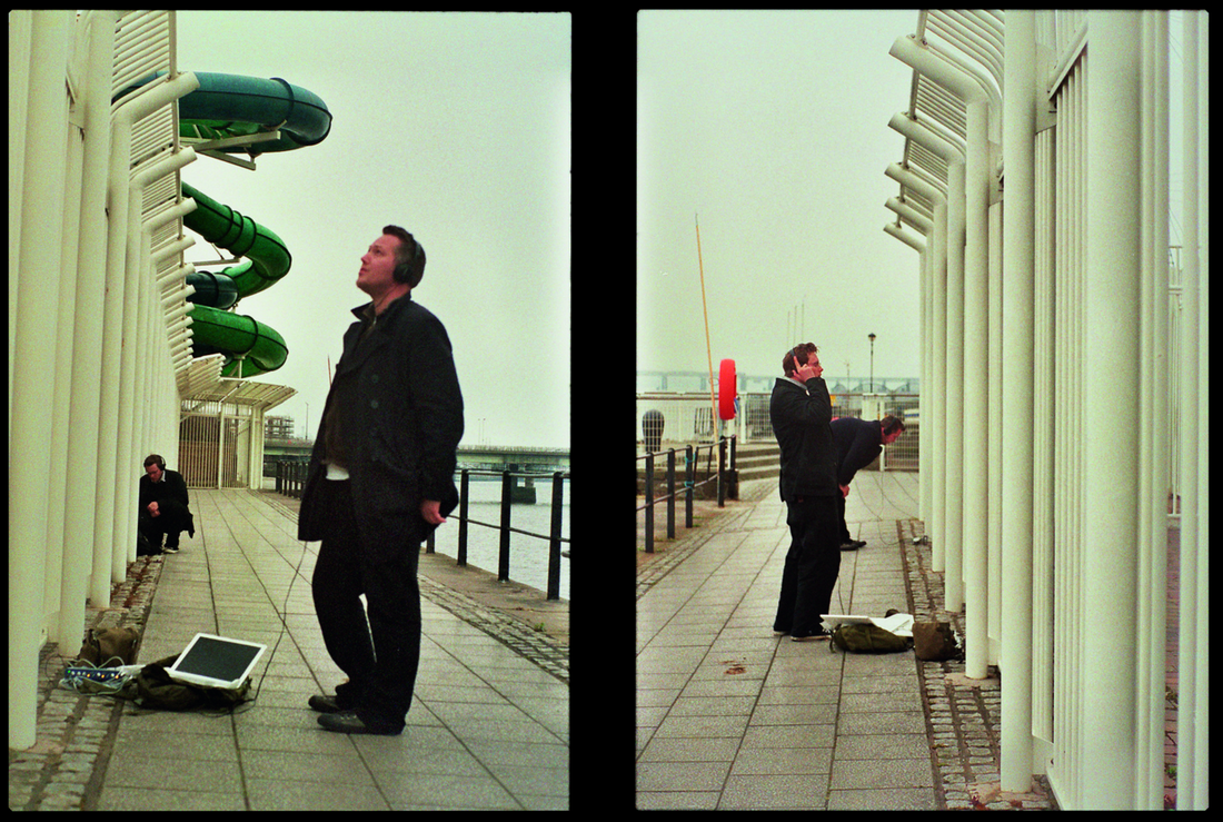
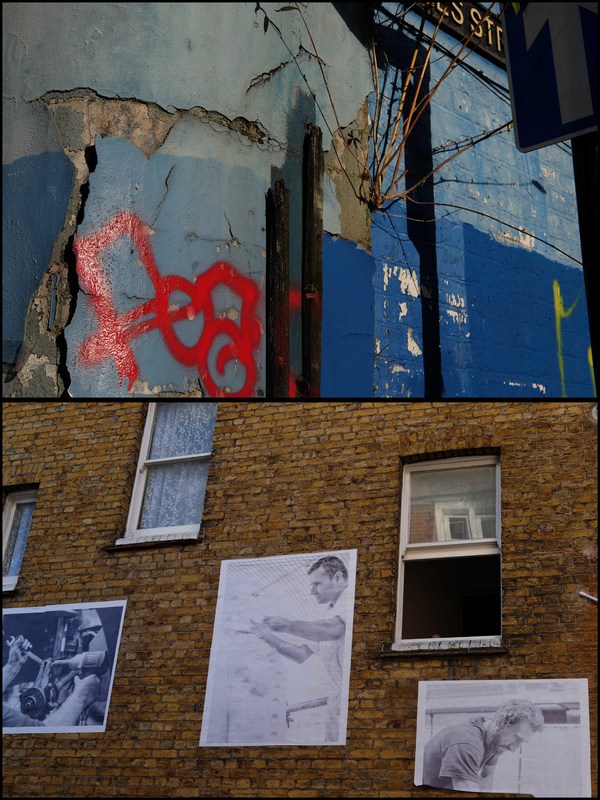
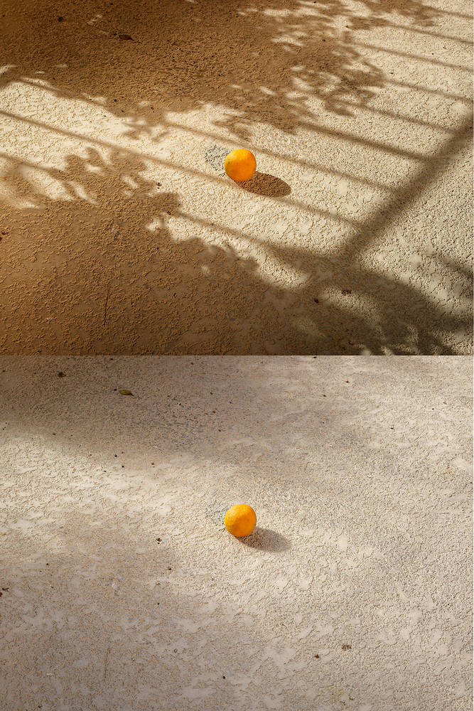
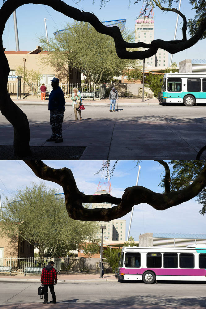
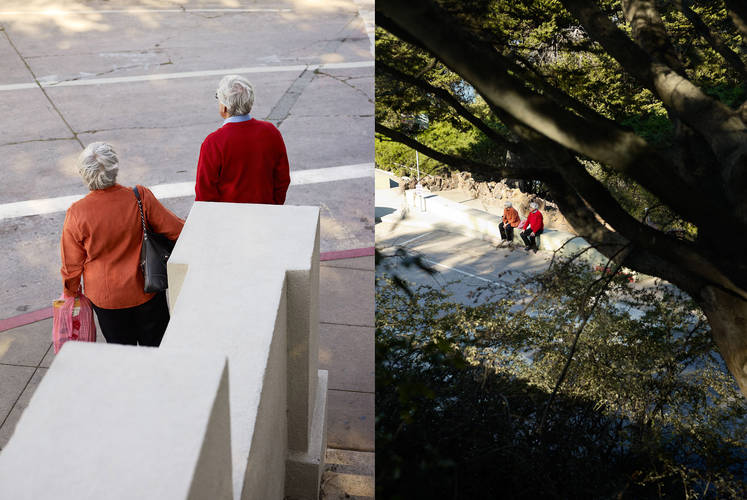
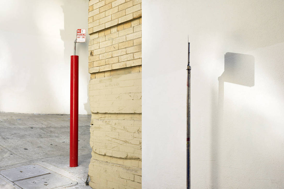
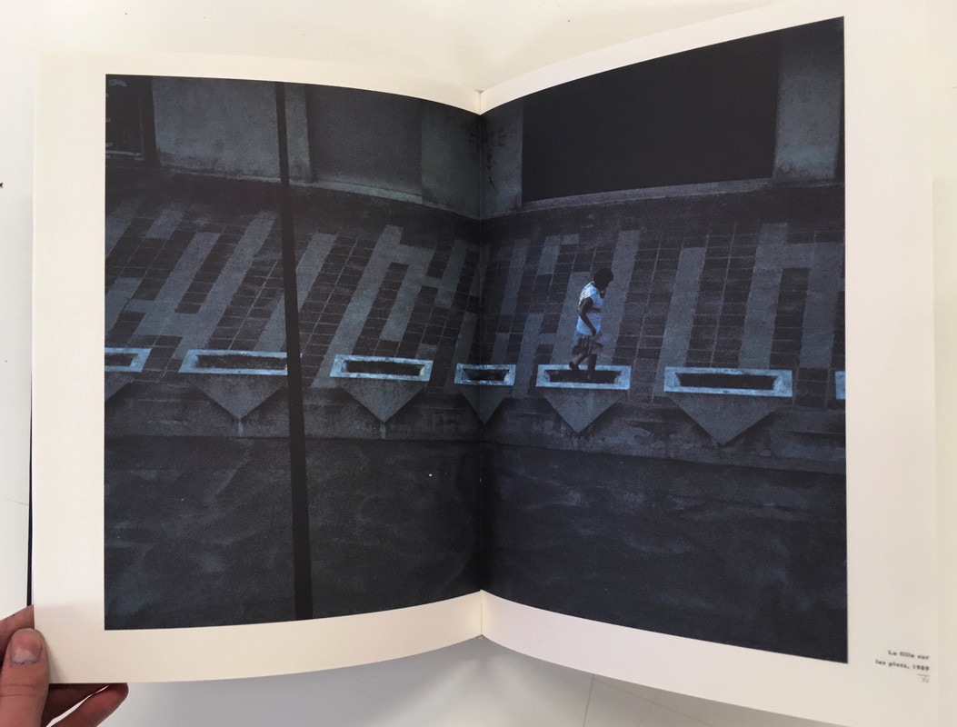
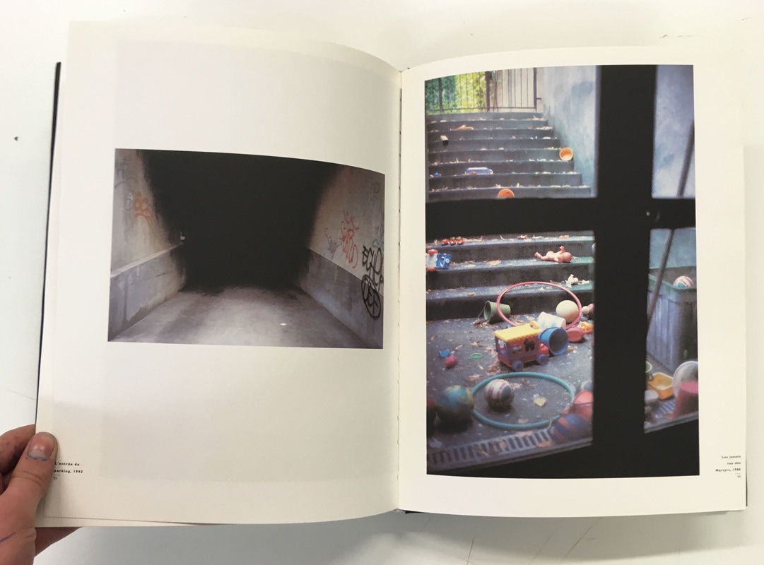
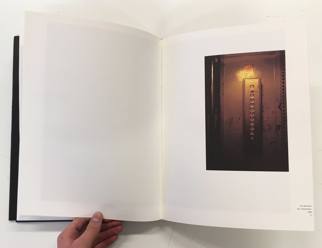
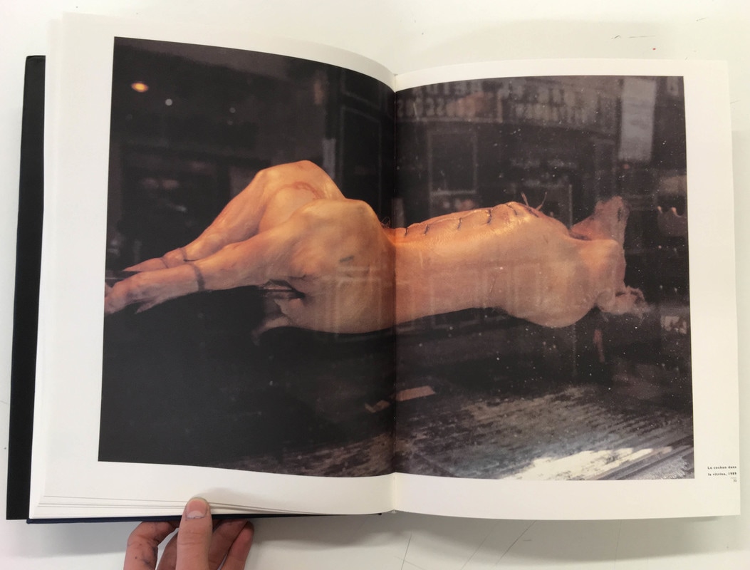
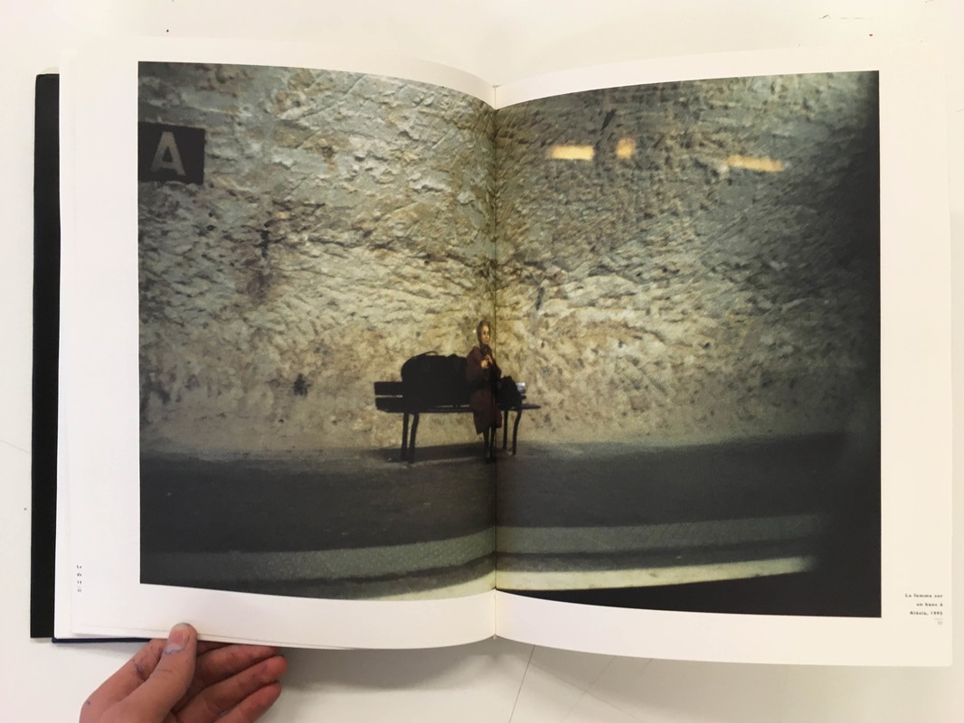
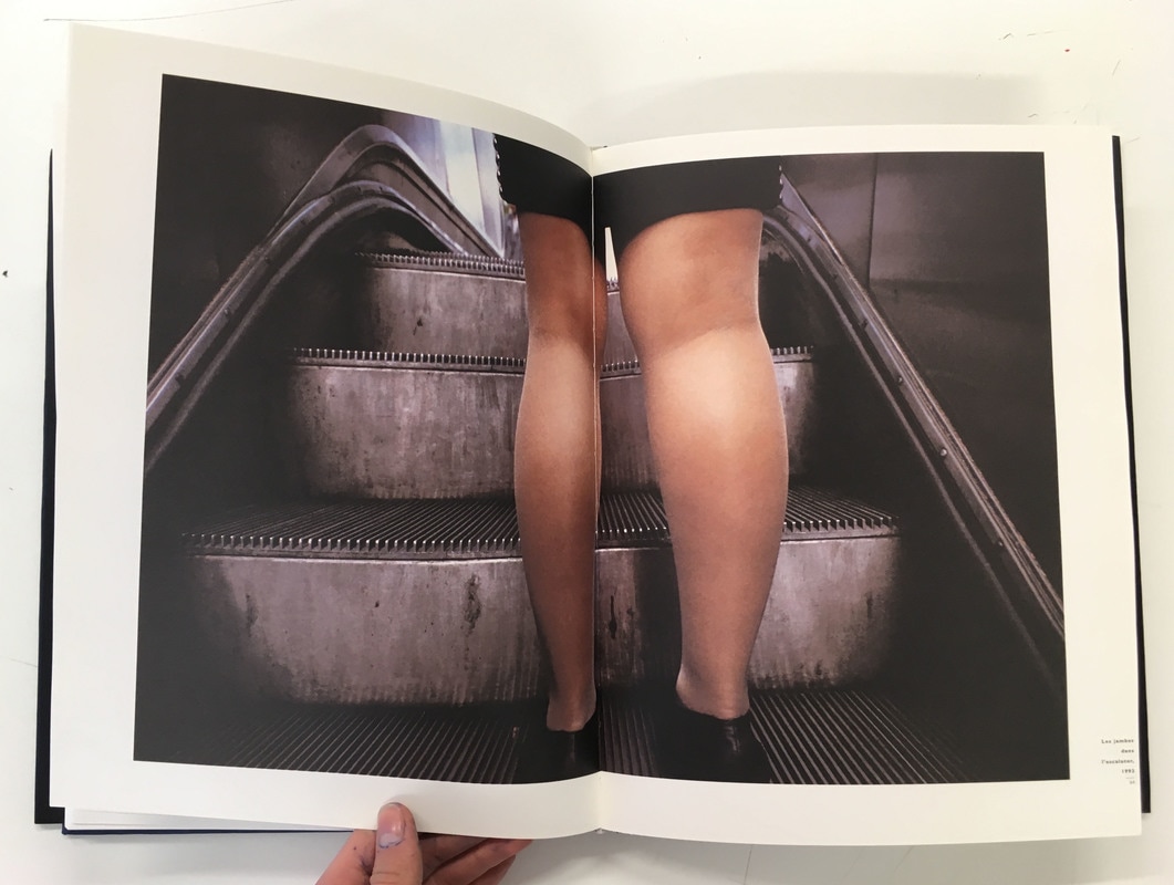
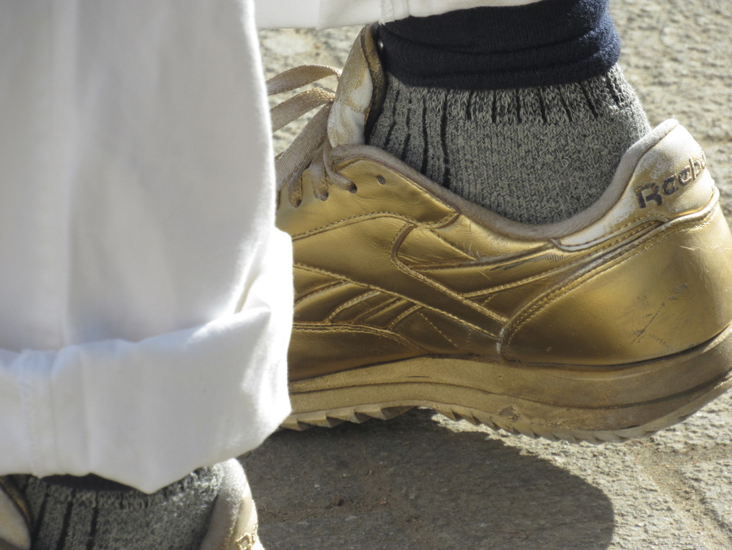
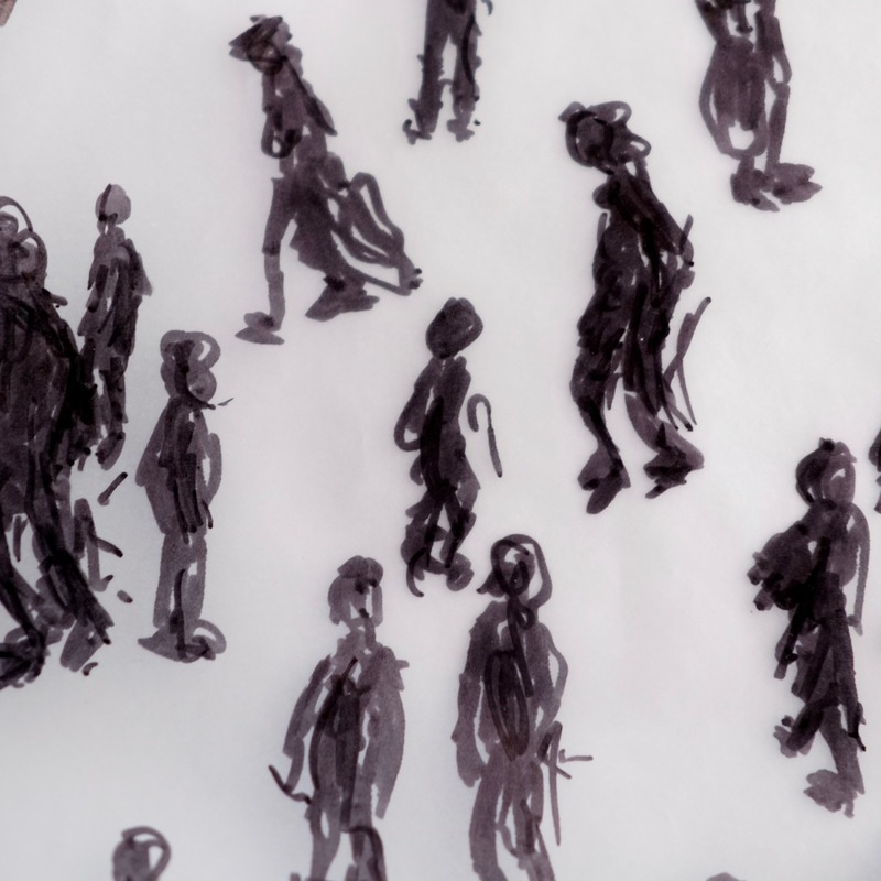
Luke Fowler recently published a new photobook: Two-Frame Films. This book contained Luke Fowler's series of half-frame photographs, using a half-frame camera. A Half-frame camera works by exposing two shots on each 35mm frame, 36 exposures produces 72 images in pairs. His half-frame photographs are juxtaposed next to one another, but often come about by chance. Many of these diptychs come about by chance - many images appear to be taken in different locations, with time between when the images were taken. On the other hand, some images are both taken quickly, often of the same scene. I like the style of Fowler's diptychs, I like the range of different images in these diptych combinations; there are many images that correspond (often in terms of colour, shapes or composition), images together that contrast, as well as images taken in quick succession.
Analysis
Similarities
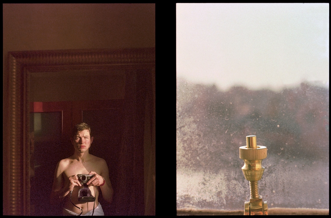
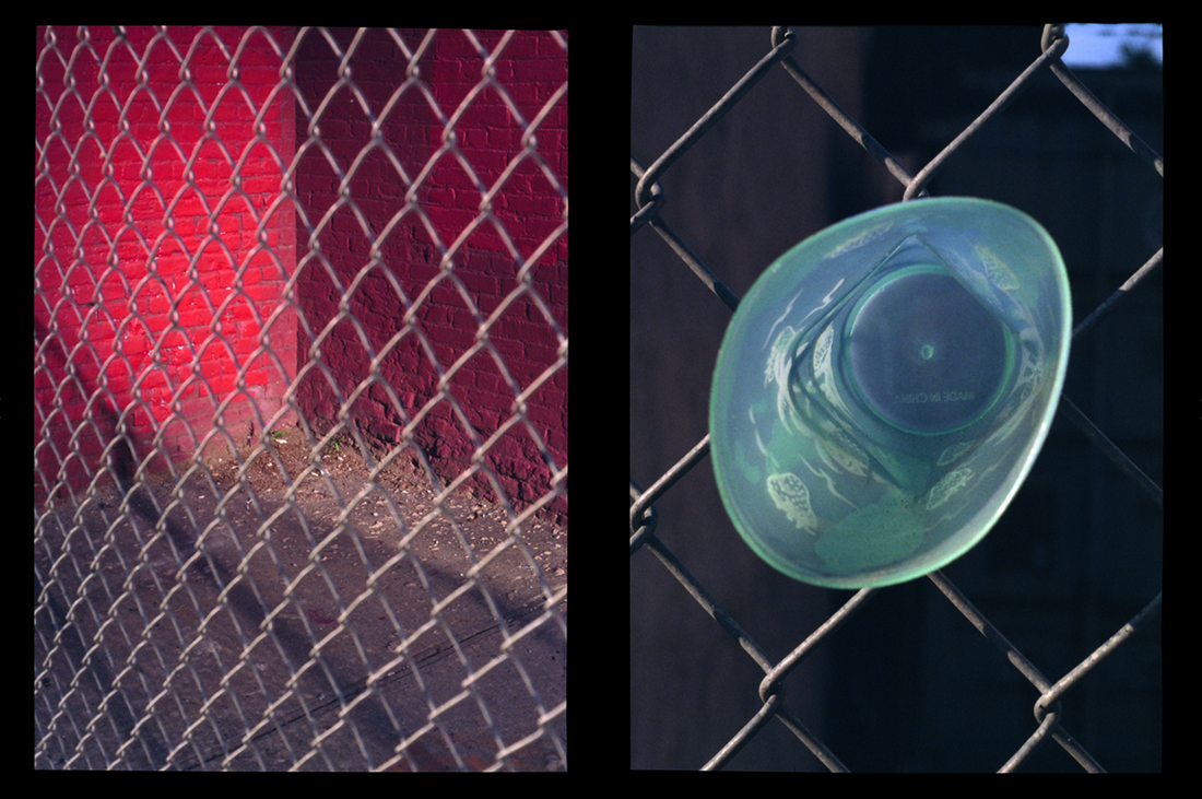
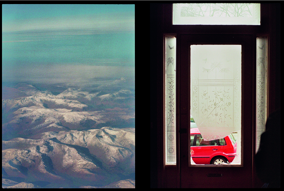
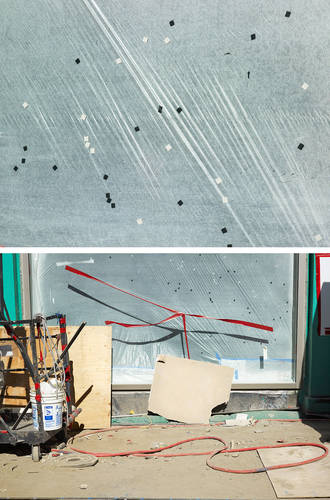
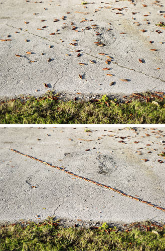
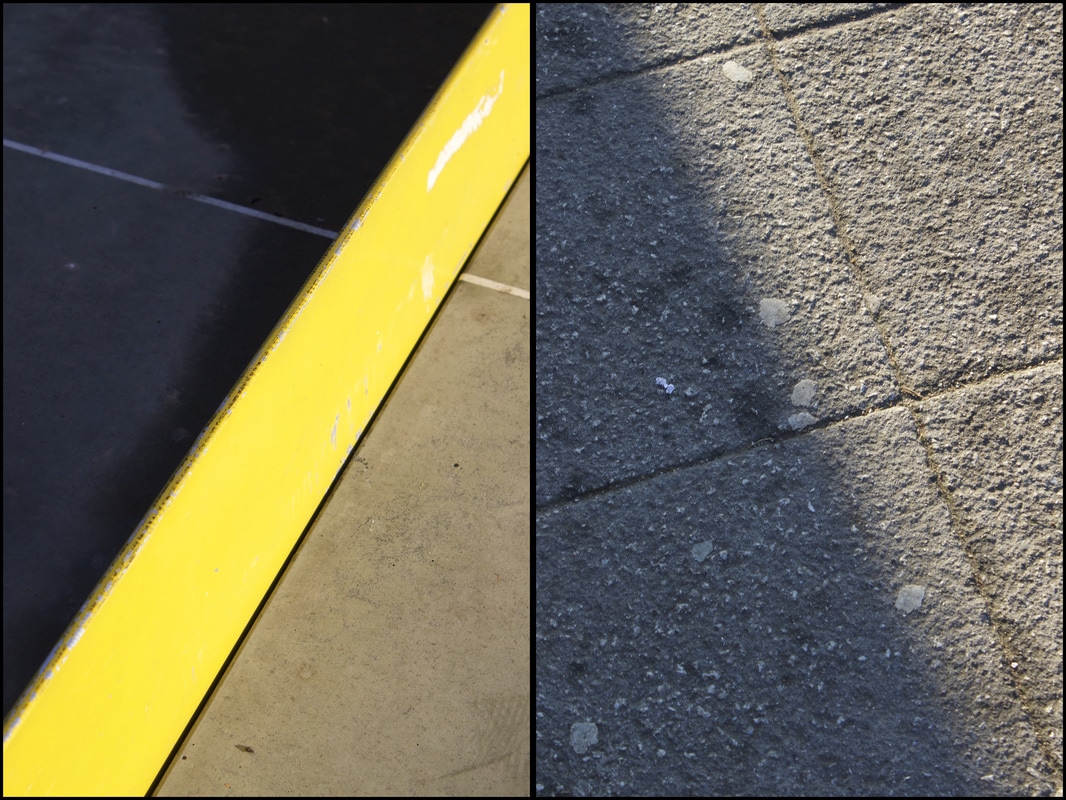
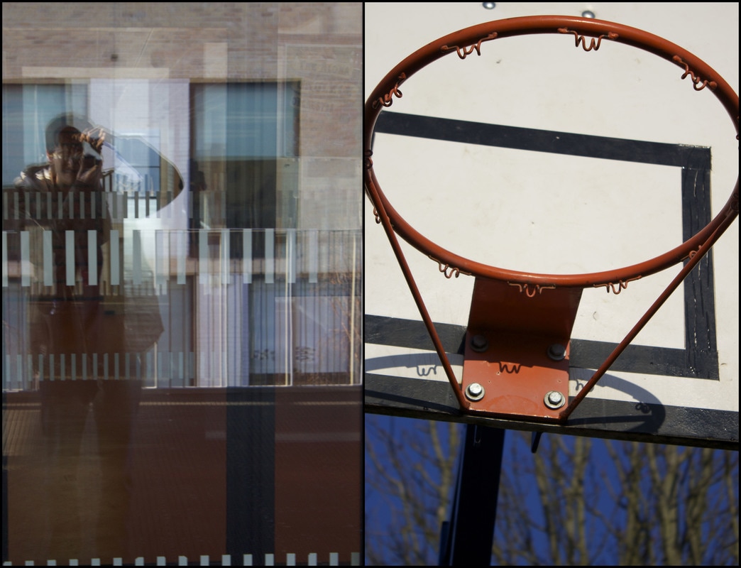
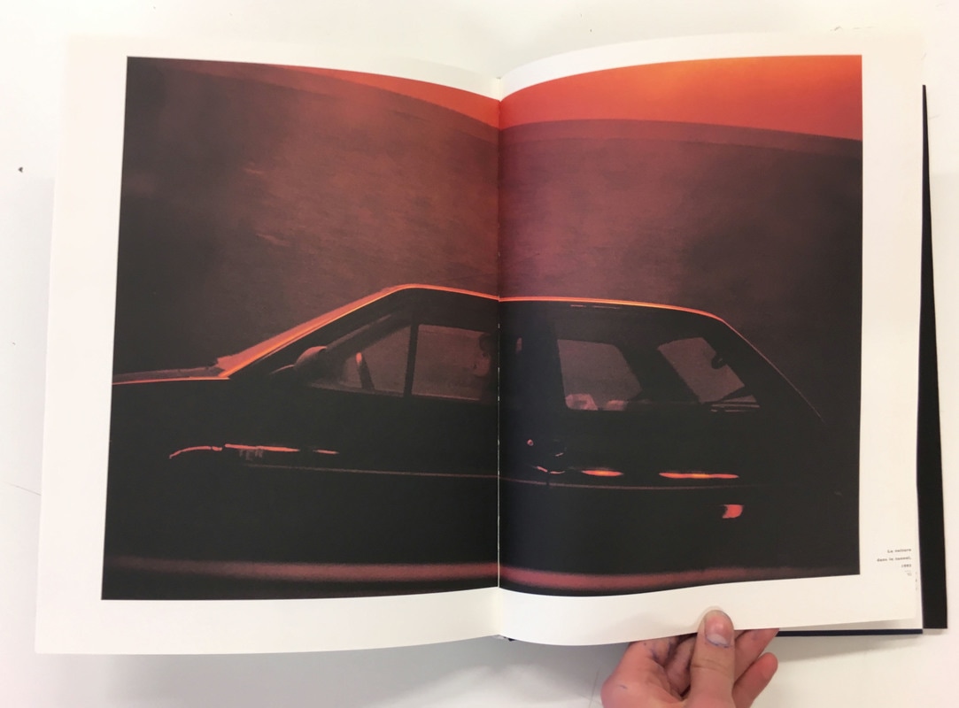
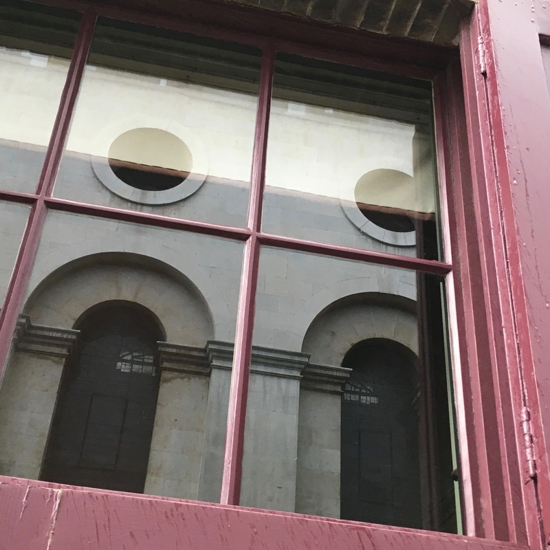
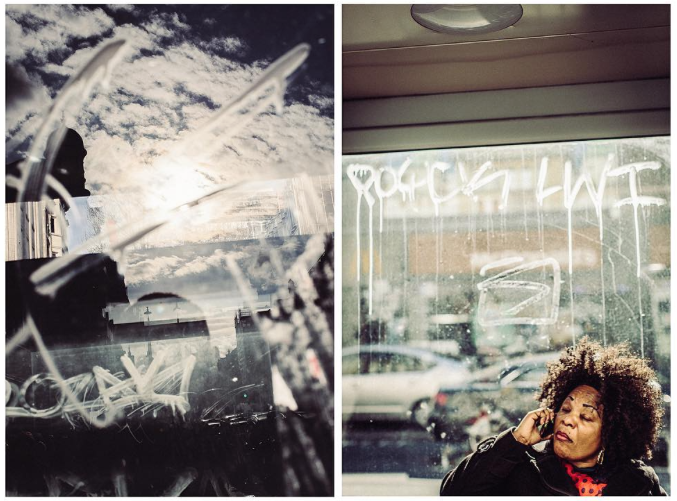
•Both are views from a window - the image on the left is taken from a plane window, and the right hand image is taken through the window on the door.
• There are some compositional elements that are similar in both photographs - the jagged lines in the mountains correspond with the jagged lines of the cracked glass
• Some of the light whiter tones on the cracked window correspond and are similar to some tones in the mountain range - particularly the white peaks of the mountains.
Differences
• Wide open space on the left hand side contrasting with the small, claustrophobic space on the right hand side.
• The left hand photo is taken over the natural, mountainous landscape contrating with the enclosed urban setting on the right.
• Contrast in colours - cooler blue tones in the sky as well as the darker brown tones and white mountains, in the left hand photograph, this contrasts with the dark tones and vibrant red colour of the car; although there are a few similar whiter tones.
• In the left hand photo you can see across the landscape and into the distance, comparing with the right hand photo where your vision is blocked/obscured.
• The left hand photo has mostly jagged, varied lines compared to mostly straight horizontal and vertical lines on the right hand side.
• The image on the left hand side is quite fantastical and slightly distorted whereas the image on the left is a documentary/observational photo.
Theory of Montage
The theory of montage was an advanced theory, it first came about in soviet Russia around the time of the birth of film. At first, Lev Kuleshov experimented with how the order of shots (and what shots were placed next to one another) changed the meaning of a film; the idea that the film is born with the edit. But the Montage Theory was refined by Sergei Eisenstein. Eisenstein believed that two independent images together could collide, to form new ideas and concepts that emerge from the collision. He believed that this was similar to Marxist theory, where a thesis and anti-thesis collied to form a synthesis. Eisenstein used various methods of montage.
(below is an example of two frames form eisentein's film Battleship Potemkin).
(below is an example of two frames form eisentein's film Battleship Potemkin).
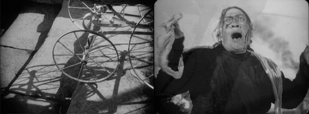
Firstly he used Metric montage - cutting to the beat, causing an emotional response, and able to lower or raise the tempo for effect. Rythmic montage was also used, it was concerned with the rythm of action in the shot, focusing more on subject matter. Tonal montage was concerned with the tone in the shot - for example shapes, shadows, lighting etc; cutting between shots of different aesthetic tones. Over-tonal is concerned with the montage of large sequences and combines the 3 previous methods of montage. Intellectual or Ideological montage interested Eisenstein the most, and looked at expressing abstract ideas using visual intellectual concepts.
Making my own diptych in Photoshop
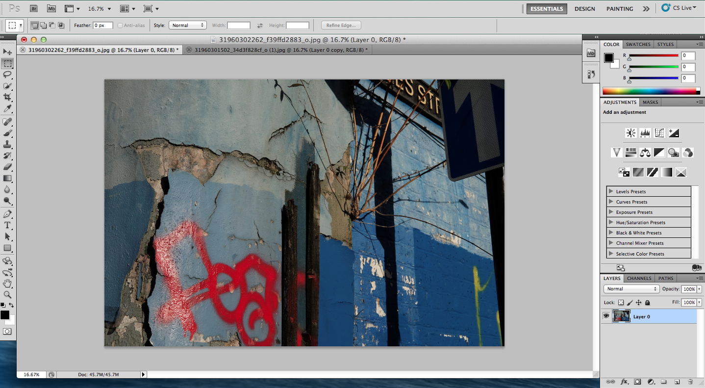
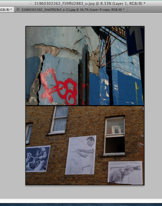
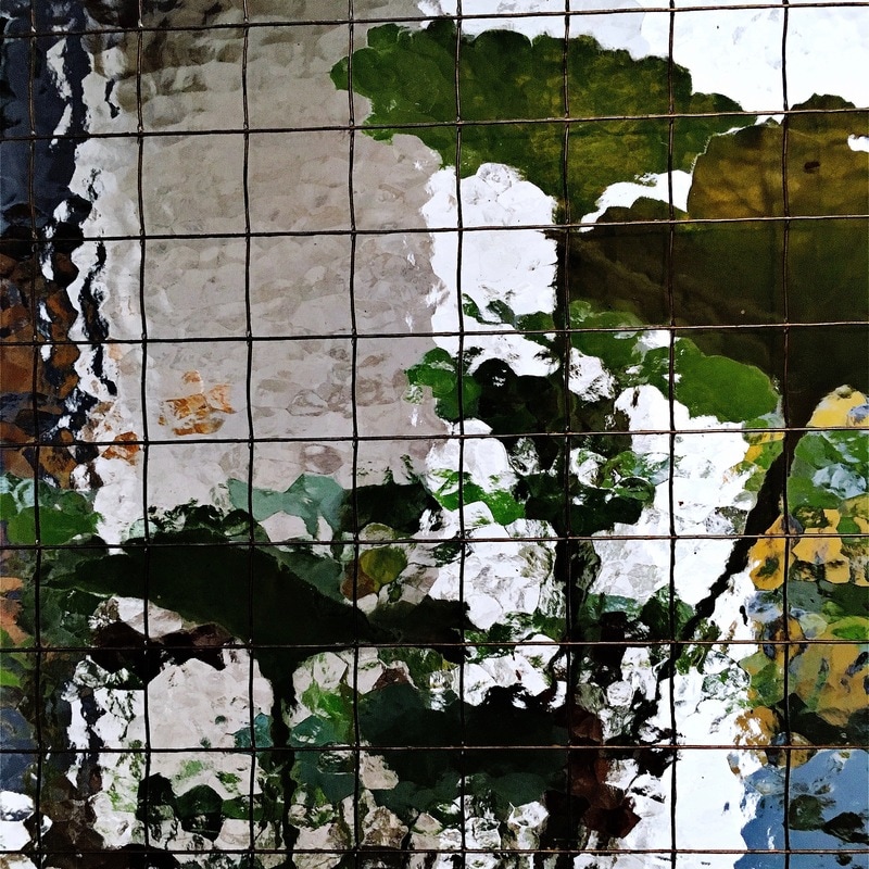
Firstly I selected two of my images to include in my diptych; I selected these images mostly due to their differences and contrasts. The direction of the lines and bricks in each photograph travel in opposite direction, whilst the vibrant blue tones in one contrast with the yellow/orange tones of the bricks in the other photograph (blue and orange are complementary colours). However, the similarities are the textures, both with particularly interesting textures of the bricks.
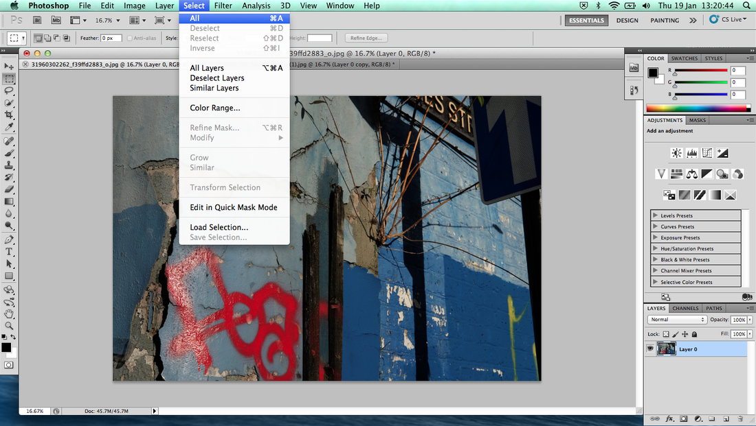
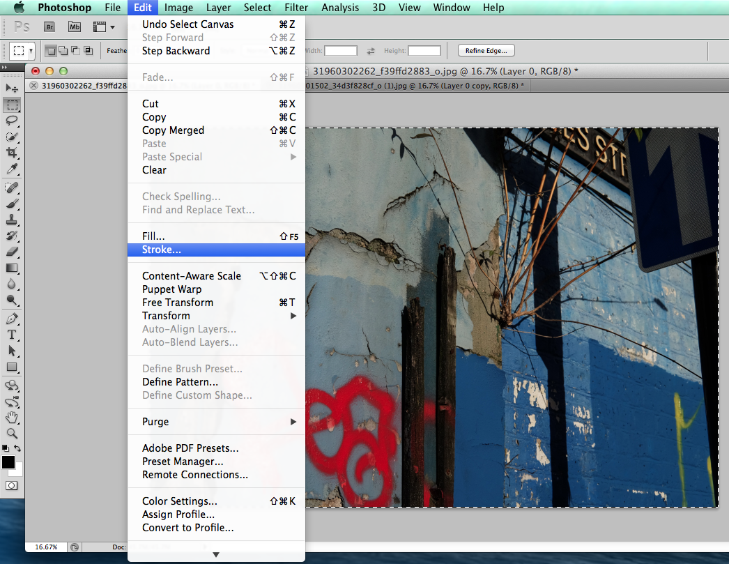
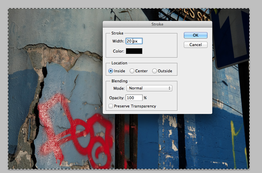
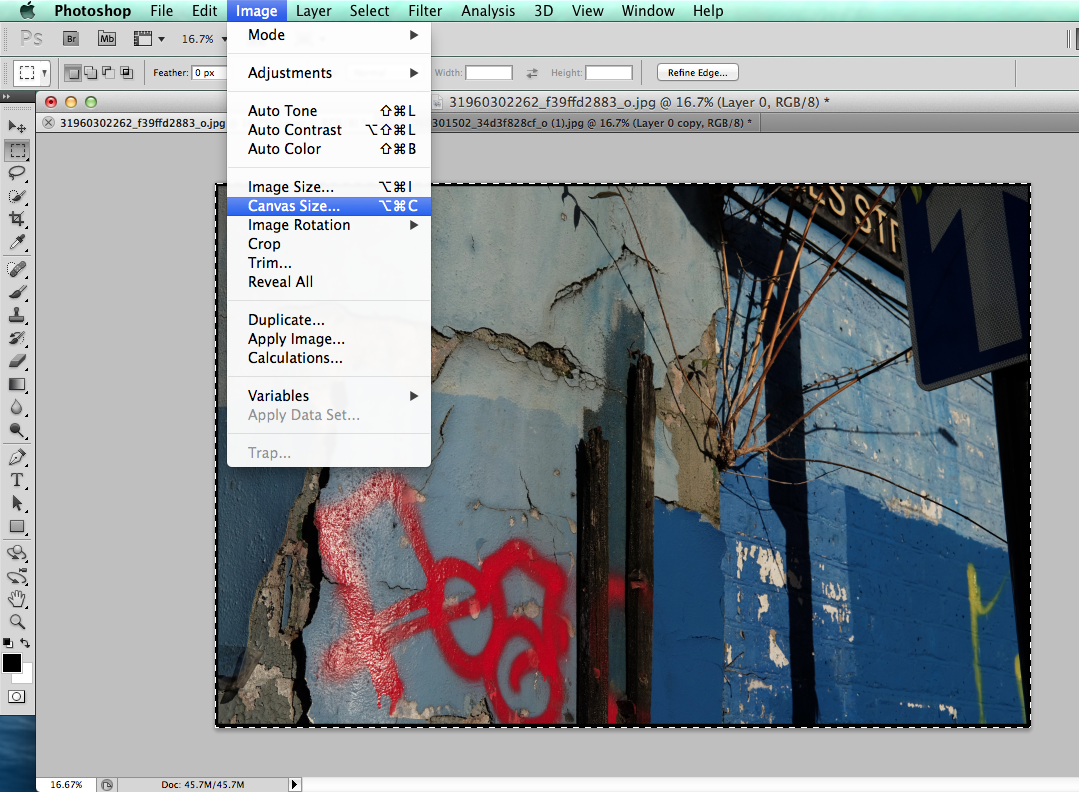
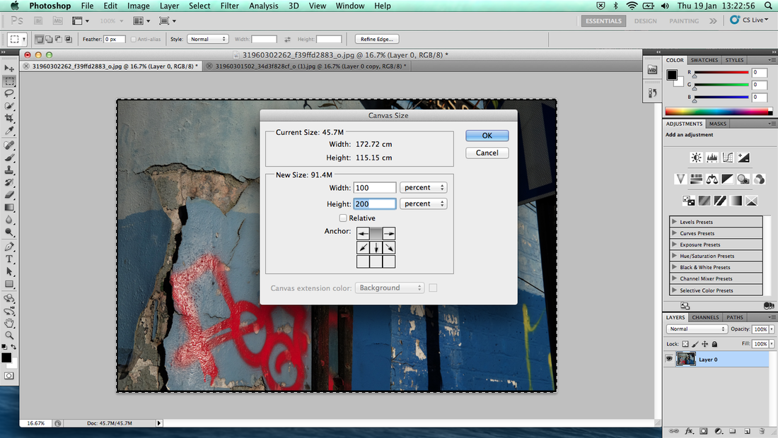
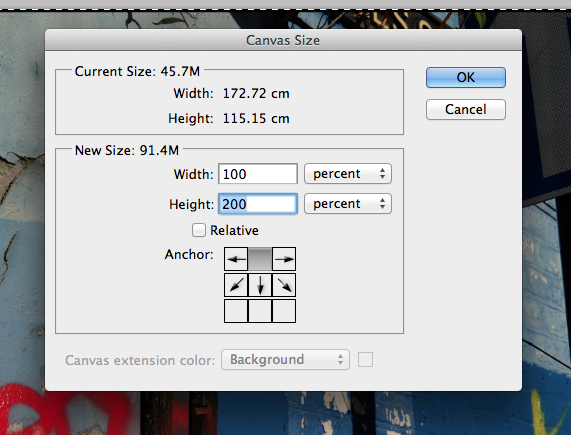
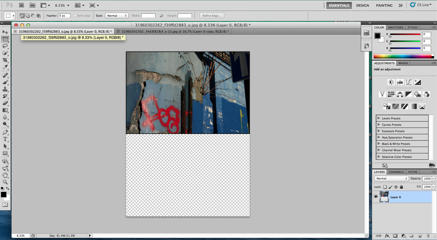
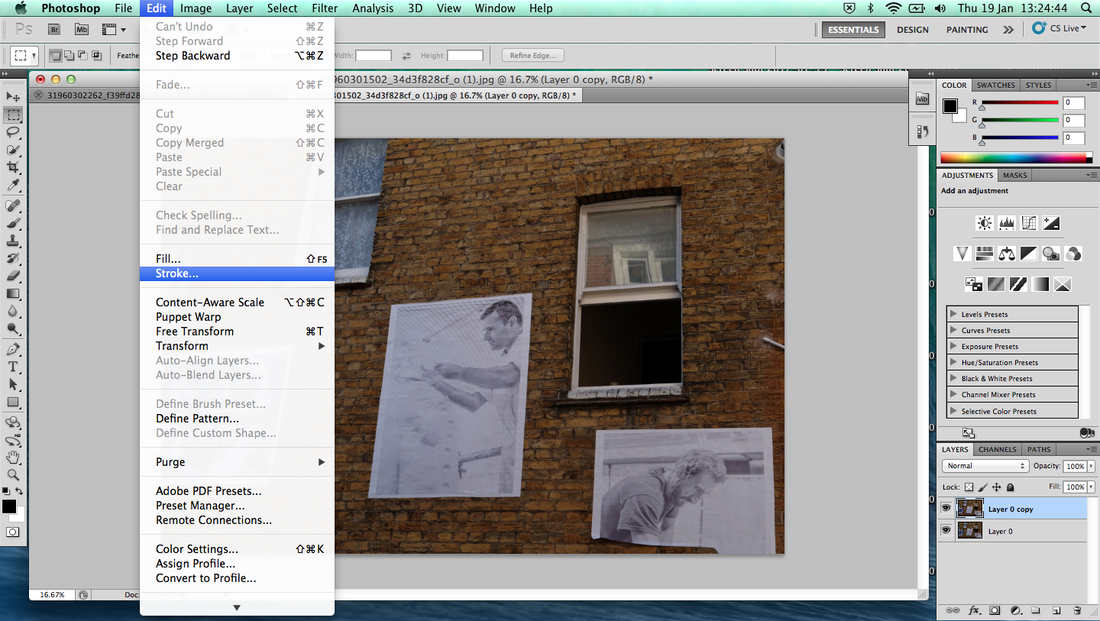
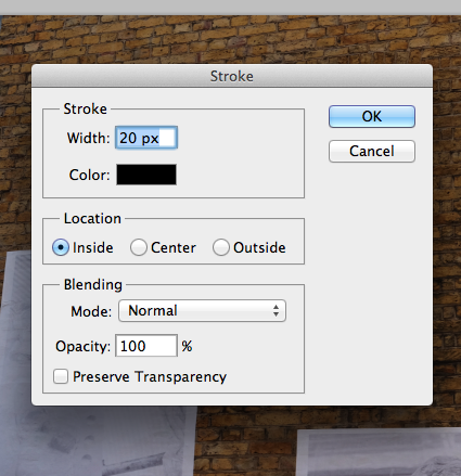
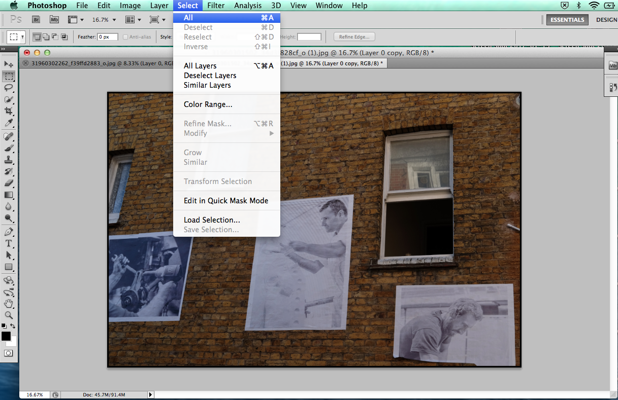
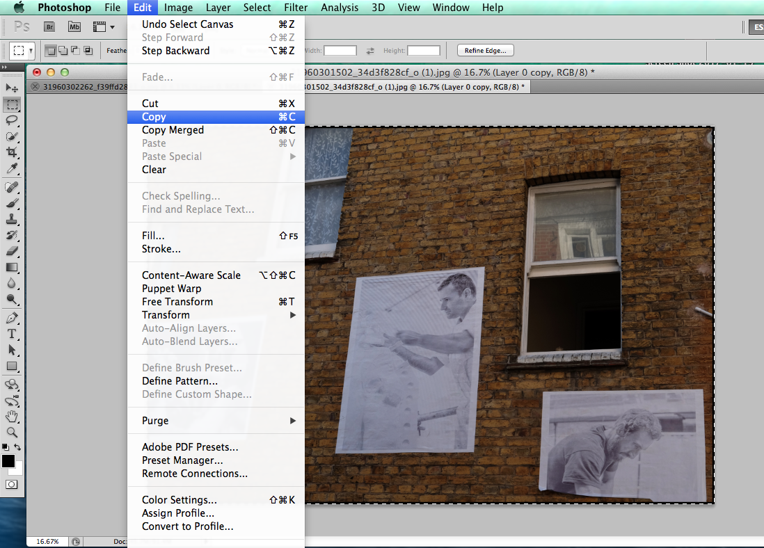
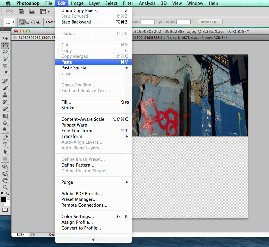
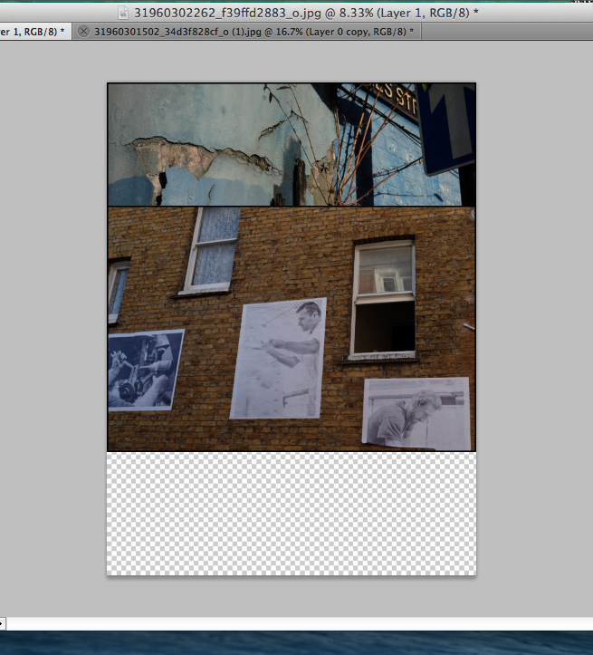
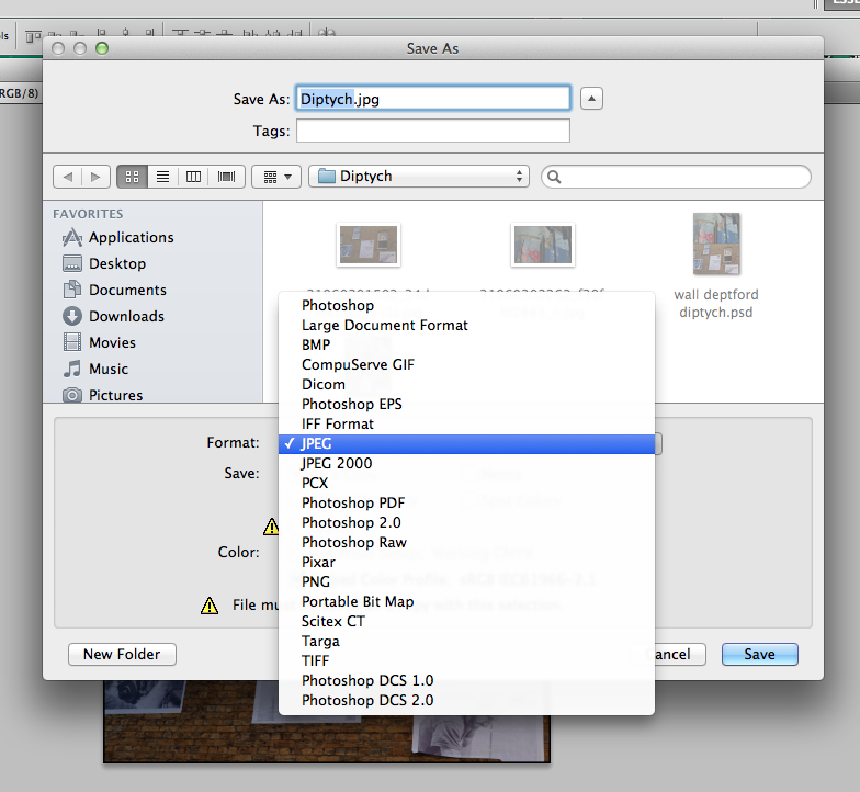
Firstly, I opened both images, and on the first image I went to Select > All then selected Edit > Stroke; I then chose a 20 pixel stroke inside the borders of the first image. I also checked the image size for both images, to check that they were the same size. I then went to image > canvas size and increased the height of the canvas by 200% (twice it's current size), I also selected the image to stay at the bottom of the canvas. I then went onto the other image, and applied another 20 pixel stroke using the same technique as previously. I then went to Select > All and then copied the image (Edit > Copy). I then went to Edit > paste, I then moved the pasted image to the bottom of the extended canvas with the cursor tool, lining it up with the bottom of the canvas. Finally, I saved the image as a high quality JPEG.
Firstly, I opened both images, and on the first image I went to Select > All then selected Edit > Stroke; I then chose a 20 pixel stroke inside the borders of the first image. I also checked the image size for both images, to check that they were the same size. I then went to image > canvas size and increased the height of the canvas by 200% (twice it's current size), I also selected the image to stay at the bottom of the canvas. I then went onto the other image, and applied another 20 pixel stroke using the same technique as previously. I then went to Select > All and then copied the image (Edit > Copy). I then went to Edit > paste, I then moved the pasted image to the bottom of the extended canvas with the cursor tool, lining it up with the bottom of the canvas. Finally, I saved the image as a high quality JPEG.
Other photographers who make diptychs:
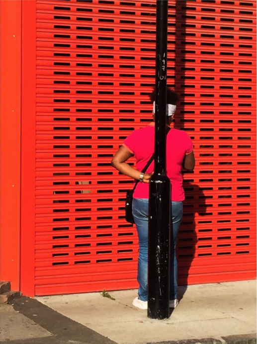
Osma Harvilahti
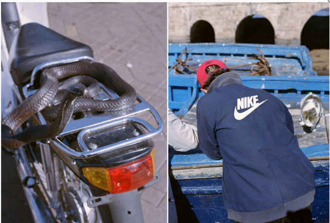
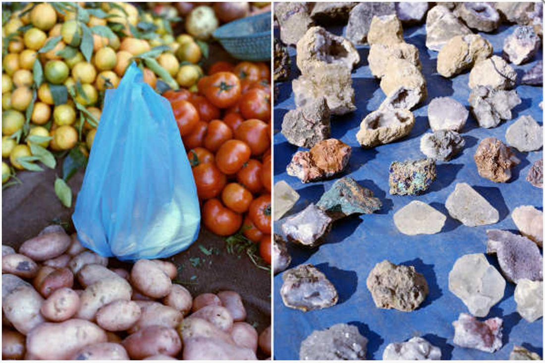
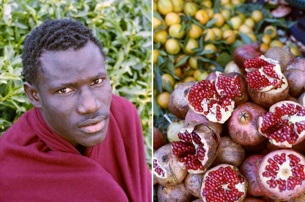
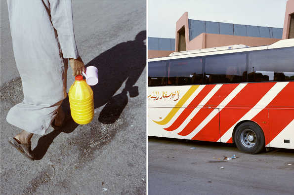
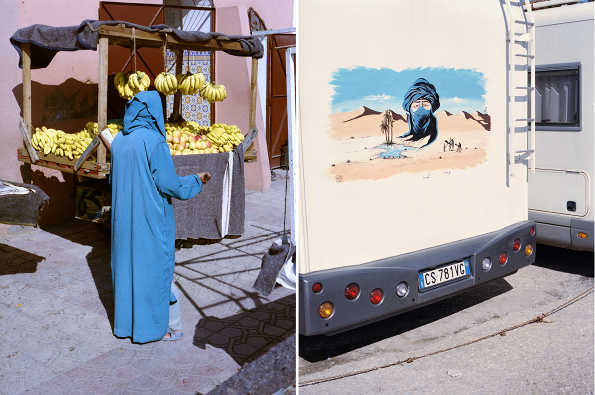
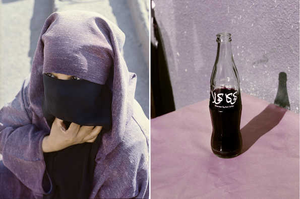
I really like this set of diptychs that Osma Harvilahti created whilst travelling in Morocco. He has a good ability to select and pair images together, paticularly in terms of colour, tone and composition. Many of these photos beside one another are extremely similar especially in terms of colour and composition - for example in this image, the purple tones of the woman's clothing perfectly matches the background of the right hand images, as well as the black tone in the lower centre of the image matching the tones of cola bottle. I really like how the the way that the photographer has paired such similar images, and they correspond very well next to one another as they are so similar. I would definately like to experiment with finding and making images with such similar compositions and colours and placing them next to one another. The individual images themselves are interesting, as he has picked out many different details and colours. You can see that the photographer has carefully thought about how these images correspond and work as together as diptychs.
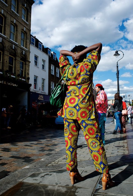
John Mclean
John Maclean created a series of diptychs called 'Two and Two'. In his diptychs there is a clear relationship between each image, or each the photos have been taken in quick succession - often of the same scene or subject with some variations. although many of these photos have been taken quickly one after another, it is clear that Maclean has thought about how the images correspond to one another. For example in this image, the tree trunk appears to extend down through both images and join up - showing how the photographer has thought about how the images can connect and have a relationship. I really like the close relationship and strong similarities each photo has to one another. The photos in each diptych have such a close relationship that they almost merge into one image, and seem connected.
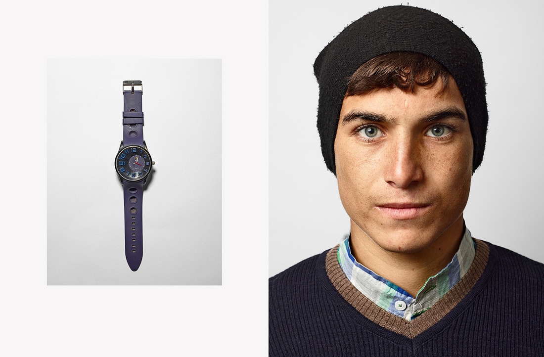
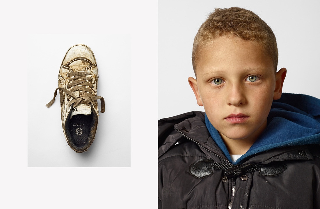
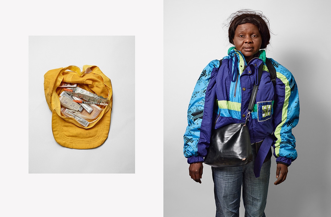
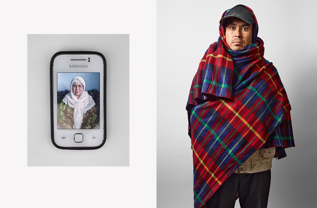
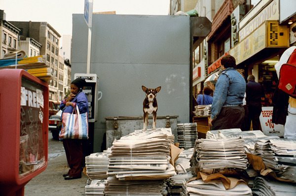
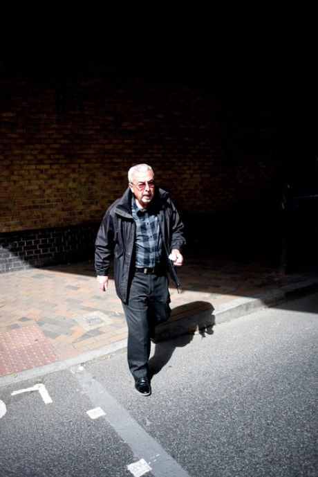
James Mollison
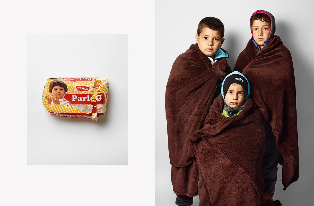
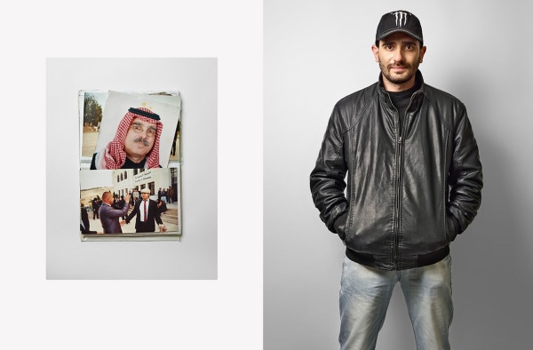
James Mollison created a series of diptychs called 'What refugees carry with them'. This series of diptychs was a documentary project for Time Magazine, looking at refugees and their prized posession that they carry with them. It is clear that this was a very carefully planned set of diptychs, you can see how the photographer carefully set up the lighting and thought about how they capture the refugees and possessions beside them. Instead of a visual or compositional relationship between the images (eg composition, shapes, colours) in each diptych, each image literally corresponds to one another - each refugee beside their own possession. I quite like the style and look of this set of documentary diptychs.
Making more of my own diptychs
After studying the work of a number of photographers who make diptychs, I made a number of my own. I took a number of photos at school, whilst thinking about how my photos could correlate (or contrast) with one another. Whilst photographing, I was looking for interesting details and shapes - I often zoomed in quite tightly to my subject to focus quite closely on the subject. I looked for similar colours or shapes around school; as well as complementary colours. My photographs were particularly inspired by Osma Harvihlati and John Mclean's diptychs. I was inspired by Osma Harvihlati's ability to find similar colours and compositions, but I was also inpsired by John Mclean's ability to make photos which correlate closely in terms of shapes and composition (however this style is difficult to replicate). To create these diptychs in photoshop, I used the same technique that I used previously (outlined further up this page). I am quite pleased with the outcome of this set of diptychs, and I like some of the similarities between images in terms of colour and composition (as wel as some contrasting images in diptychs). I think that they show some similarity to Osma Harvihlati and John Mclean, who I previously researched.
(click on images to enlarge)
(click on images to enlarge)
|
In this diptych, I took two images the correlate quite closely in terms of composition. I spotted the interesting yellow shape, and photographed it so that it ran across the frame, with one side illuminated and the other side in shadow. After this, I looked for a similar composition and spotted the shadow (in the left hand image), and I photographed this similarly to the image of the right - with half the frame in shadow. This image is inspired by John Maclean, who creates diptychs with a close correlation similar images particularly in terms of composition.
|
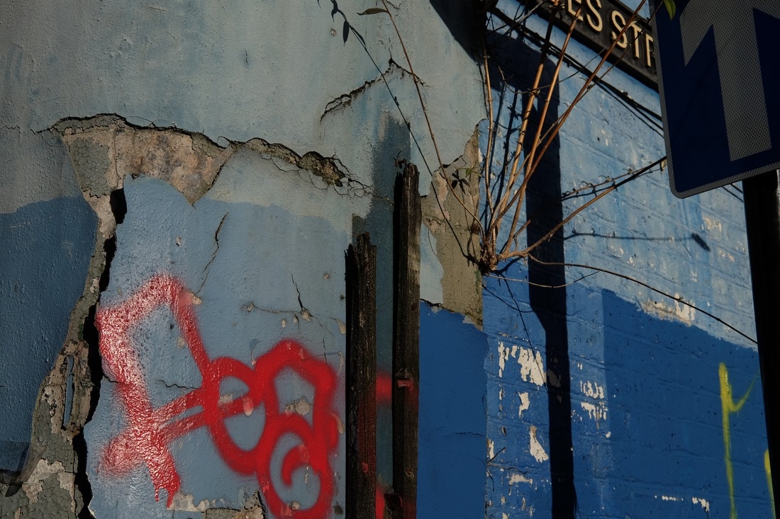
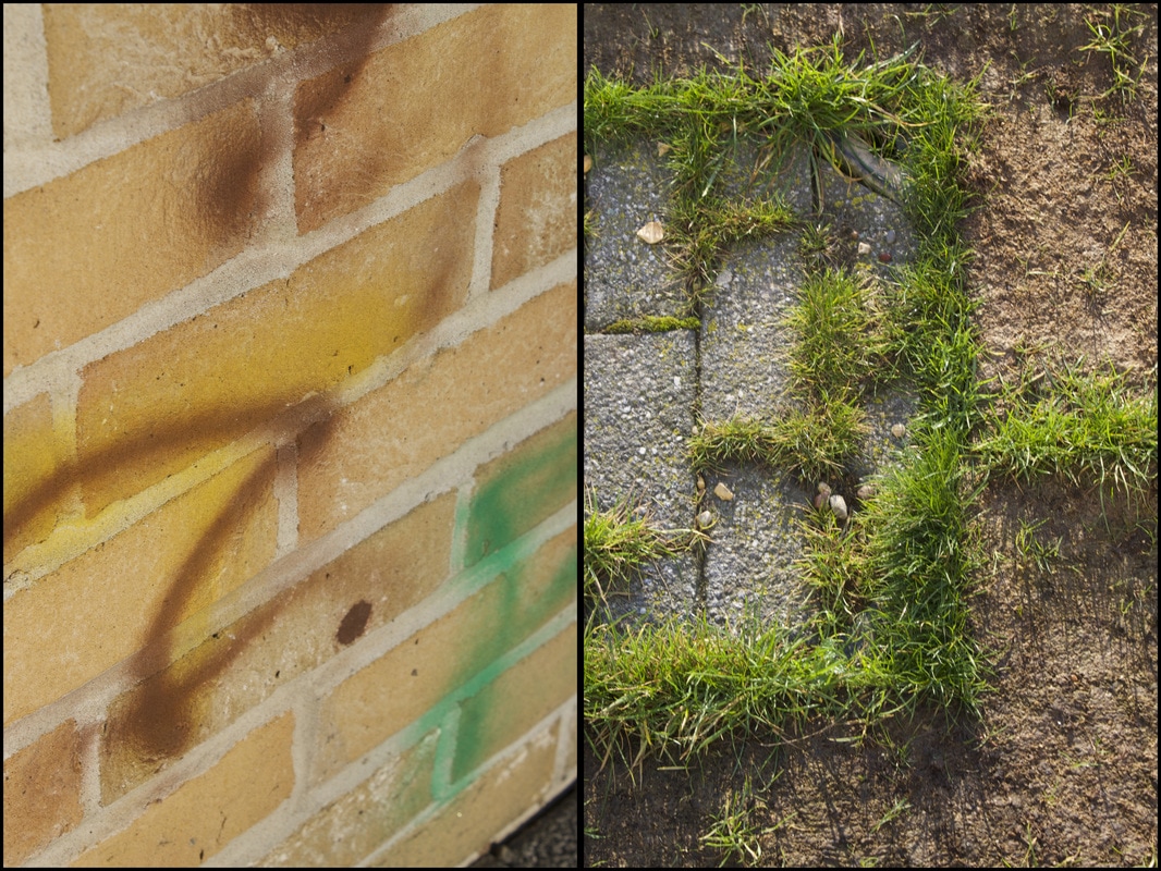
The images in this diptych differ more, but have a few similarities in terms of colour. I photographed each image seperately, but I was looking for images with similar colours. The framing of each image is quite different, as well as the subject matter (although there are bricks in both photos). However, you can see a number of similar colours, particularly browns and oranges, in both images; as well as the green spray paint which correlates with the patches of grass.
|
|
These images, were taken in quite close proximity to one another, and are quite similar in terms of colour and lighting. The photos were taken shooting into the sun, the image on the left low down through some railings, and the image on the right from a high viewpoint. As they were taken of the same scene, the colours are quite similar - the main similarity in this diptych. This was also partially inspired by John Maclean, who took images in quick succession, often of the same scene slightly altered.
|
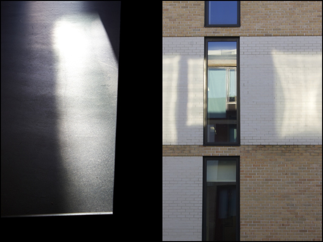
These images were taken seperately, and I didn't think of them corresponding when I took the individual images. I actually paired these images when looking through them on iphoto, after I had finished taking the photos. I paired these two images together particularly due to the reflected light in both images. I zoomed in quite tightly and focused on the shard of light on the left particularly as I liked the strong contrast of the sunlight against the dark flooring. I took the image on the left as I liked the effect the reflected sunlight on the building.
|
|
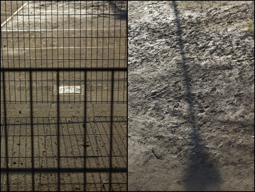
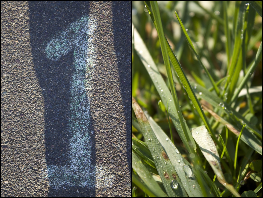
The photos in this diptych were paired when looking through my images, after I had finished photographing. I took the image on the left as I liked the shapes of the shadow against the painted letter on the floor. I took the photo on the left as I was interested in the water droplets on the grass. I put these images together in a diptych as I thought that they worked well together. Both are quite close up and feature mostly vertical lines and shapes in both images. There are also some green speckled colours on the painted number on the left, correlating with the colours on the right.
|
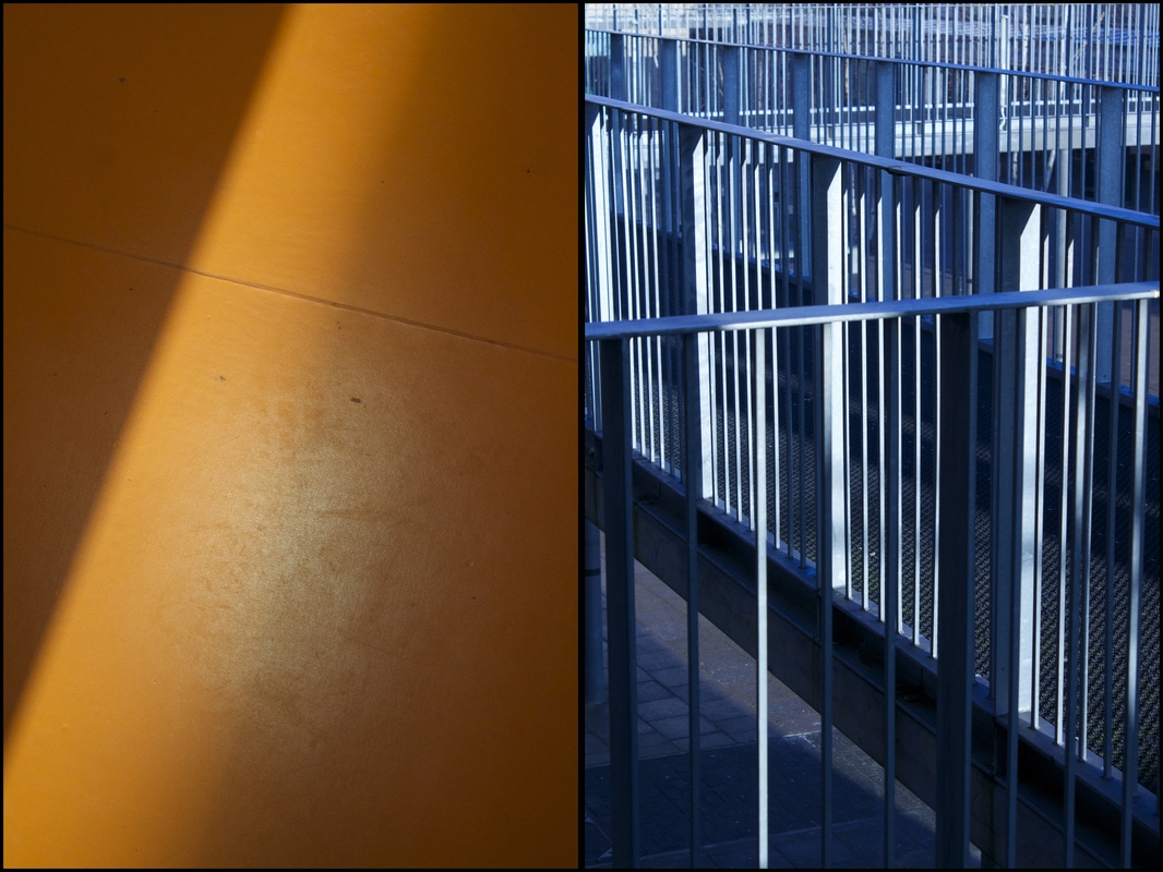
I created a diptych using these images due to the contrasts between the two images. The orange tones on the left contrast the blue tones in the image on the right hand side (the blue tones were created as the wrong white balance setting was selected - although I like the effect it created). Blue and orange are complementary colours - meaning that they contrast and intensify one another. I quite like the effect of placing these two images together in a diptych, and I think the contrasting images in the diptych work well overall.
|
|
Again, I didn't photograph these images with the other photo in mind - I took these seperately and subsequently paired them whilst reviewing my photos. I paired these photos particularly due to the similarities in colours and tones in both images. In both photos, you can see the orange and blue colours particularly and well as the black and white tones in both images. They are not very similar in terms of composition and shapes, but both are sunlight illuminated.
|
|
The Photobook
The photobook is a major tool for photographers, and a large part of showing and communicating their work to a wide audience. Martin Parr said that for photographers, the photobook is a 'supreme platform', and publishers Aron Morel and Hannah Watson said that 'The book is the ultimate space for the photograph' and 'the best way of getting your work out there in a cohesive way' - this shows how important the photobook is for photographers to circulate their work. Book making is now a major area in modern photography, and often changes the way that photographers think about their work. It often changes the way that photographers think about photographing, often as they want to communicate a message or tell a story in their photobook. The number of self publishing platforms for photobooks has increased and the mediums and platforms for photobooks are changing. Digital media has changed the nature of photo publishing - however more to do with wide ranging distribution. Although digital books reach into new different audiences, there are a number of difficulties with digital apps for example for launching photobooks. Photobook publishing is continually changing, and publishers have to keep up with the changing nature of photobooks. However, printed physical copies remain the most popular and there are many photobook collectors.
Analysing photobooks
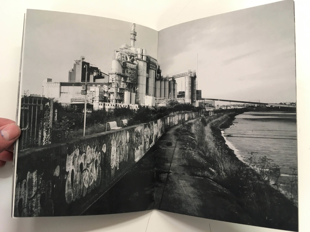
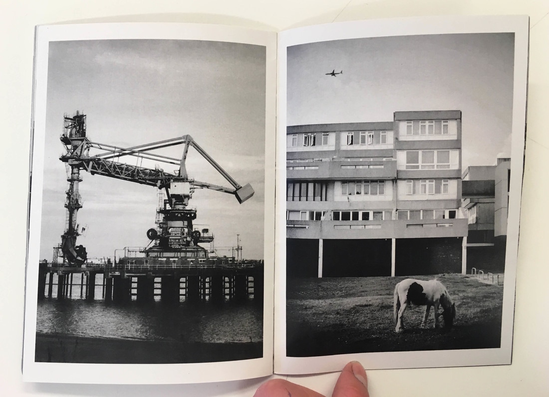
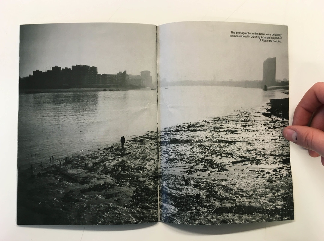
The Thames Path by Johnny Pitts
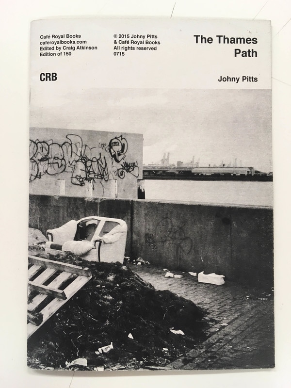
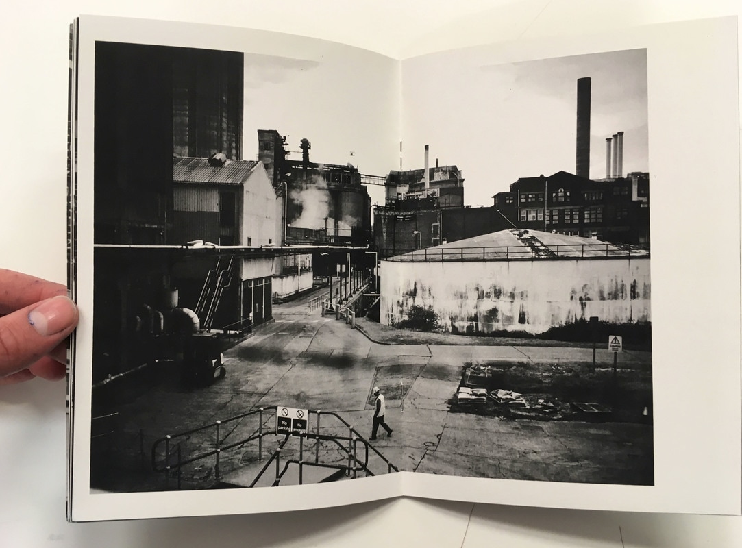
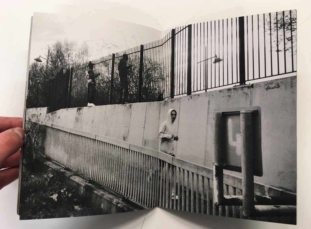
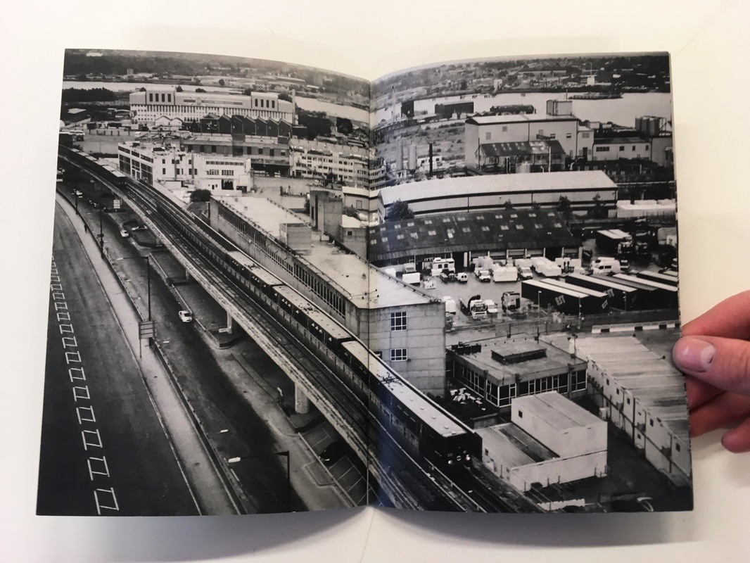
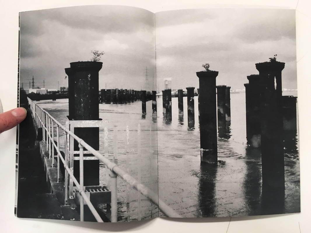
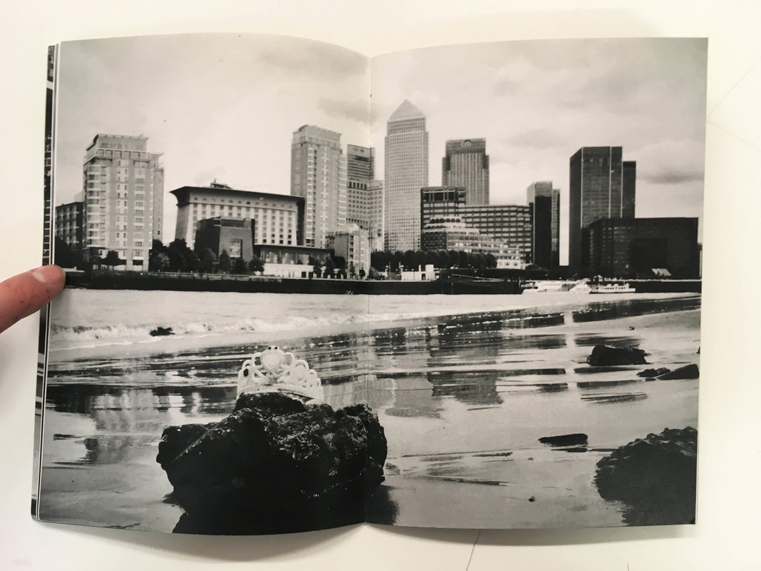
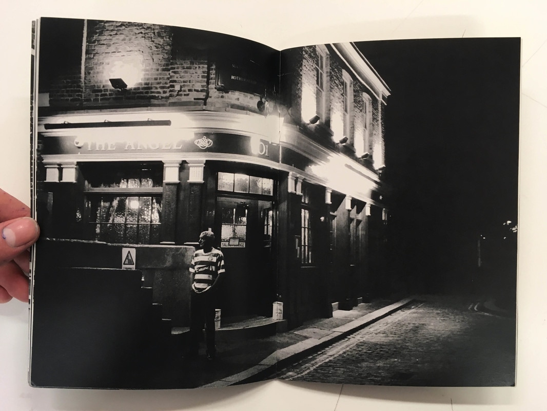
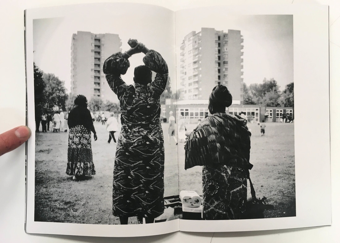
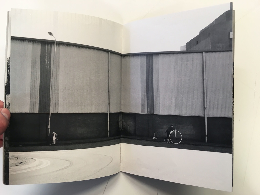
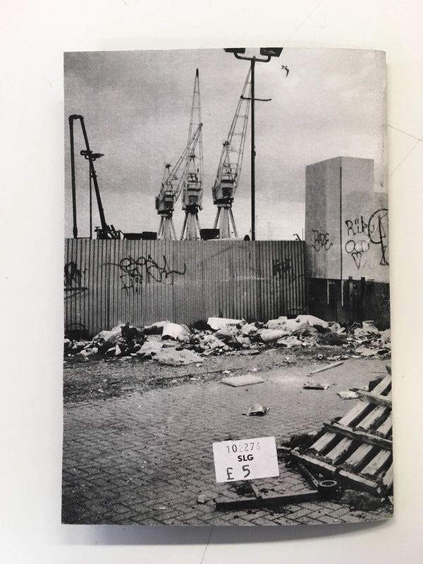
• The title - quite minimalistic and simple font at the top of the front cover, it tells you immediately the subject and content of the photobook. There is a image that fills the whole book cover (both the front and the back, and immediately sets out the themes in this book, and gives you an idea of the style of photographs that will be in the book. The details (publisher, publication date, author etc.) are all listed at the top of the front cover. There is no introduction to the book, the only text is the details and title on the cover, and text in the inside back page.
• Initial impressions and feel of the book - it is a relatively small photobook, more of a booklet with a stapled spine and using relatively thick paper throughout. There are also a relatively small number of pages. I like the small, booklet style of this photobook - I think it suits and displays the theme well.
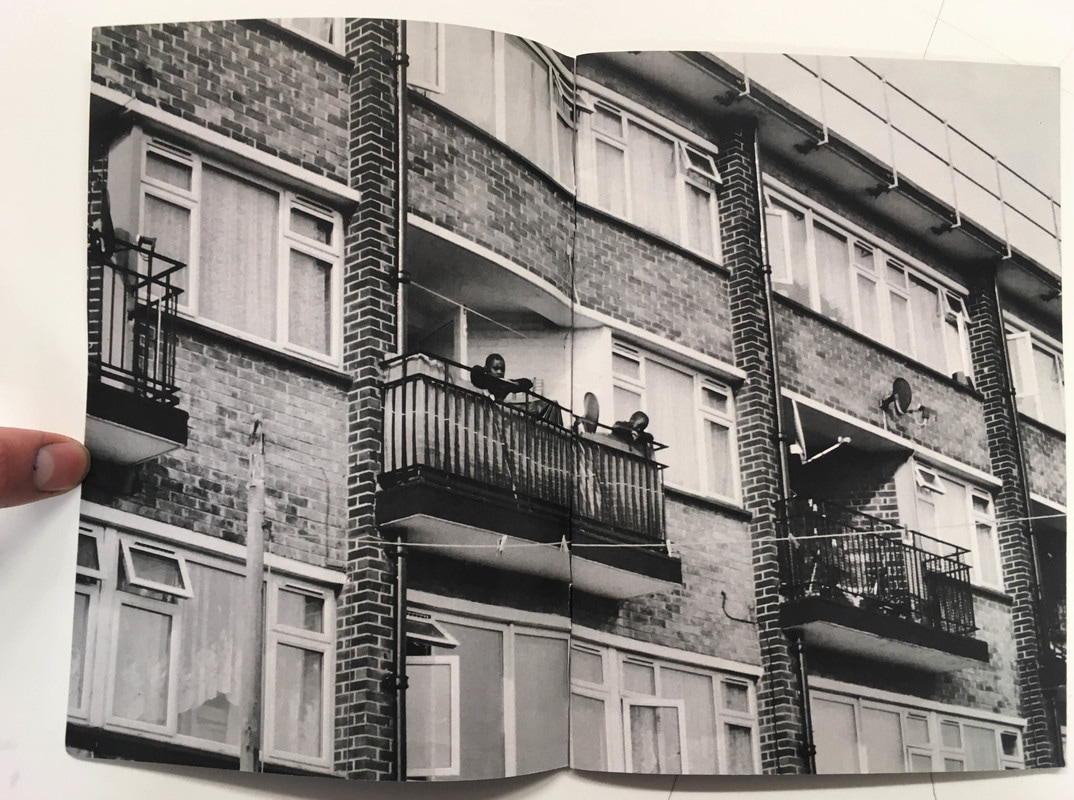
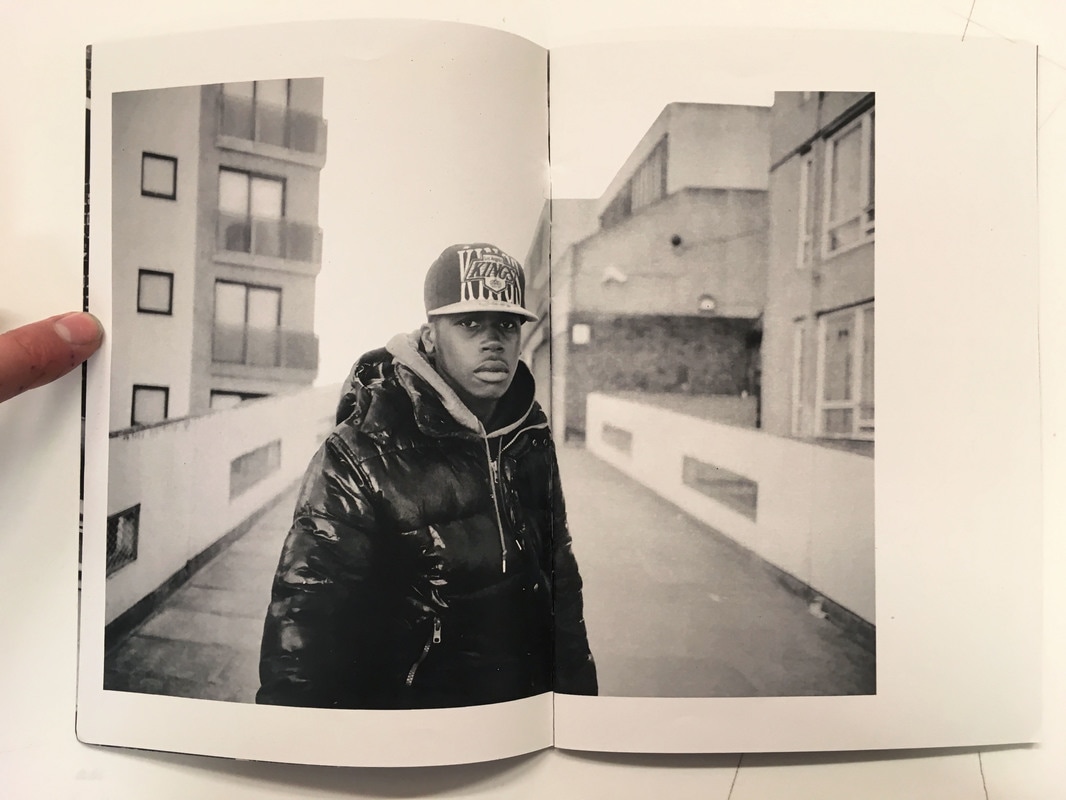
• All the images throughout the book are quite large - many full bleed or spread over two pages; although these are seperated by a few images with relatively shallow white borders now and again throughout the book. All the images are monochrome, and there is a clear style of candid documentary photography that runs through the book. You can tell that the photographer has thought about the type of photos that they wanted to include in the book, but many of the individual images appear to have been spontaneously taken whilst the photographer was at the Thames Path. I think that the photographer has considered the layout of the book, although the majority of photos are landscape and are not placed next to another photographer.
• Theme/Story - All the images are documenting the Thames path and its surroundings, although they don't appear to be chronological or ordered in a particular way. All the images are shot in monochrome and are all in a documentary/observational style. All the images are quite raw, and focus on the rough, urban and industrial surroundings of the Thames path. All the images in the book also have quite high clarity and strong contrast; with the image noise/grain in monochrome reflecting the gritty subject matter within the photographs
• Personally, I really like this photobook. I particularly like the style and look of the observational photographs, and I like the raw, monochrome style running though the book, with some interesting compositions of the urban landscape. I like the small booklet size - it is quite informal and easy to flick through, and I could construct something like this as a test/maquette. However, I don't think that I would use this booklet style myself.
• Initial impressions and feel of the book - it is a relatively small photobook, more of a booklet with a stapled spine and using relatively thick paper throughout. There are also a relatively small number of pages. I like the small, booklet style of this photobook - I think it suits and displays the theme well.
• All the images throughout the book are quite large - many full bleed or spread over two pages; although these are seperated by a few images with relatively shallow white borders now and again throughout the book. All the images are monochrome, and there is a clear style of candid documentary photography that runs through the book. You can tell that the photographer has thought about the type of photos that they wanted to include in the book, but many of the individual images appear to have been spontaneously taken whilst the photographer was at the Thames Path. I think that the photographer has considered the layout of the book, although the majority of photos are landscape and are not placed next to another photographer.
• Theme/Story - All the images are documenting the Thames path and its surroundings, although they don't appear to be chronological or ordered in a particular way. All the images are shot in monochrome and are all in a documentary/observational style. All the images are quite raw, and focus on the rough, urban and industrial surroundings of the Thames path. All the images in the book also have quite high clarity and strong contrast; with the image noise/grain in monochrome reflecting the gritty subject matter within the photographs
• Personally, I really like this photobook. I particularly like the style and look of the observational photographs, and I like the raw, monochrome style running though the book, with some interesting compositions of the urban landscape. I like the small booklet size - it is quite informal and easy to flick through, and I could construct something like this as a test/maquette. However, I don't think that I would use this booklet style myself.
Joel Meyerowitz photographs Wild Flowers
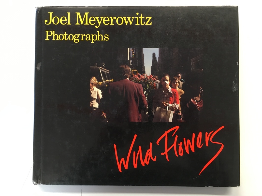
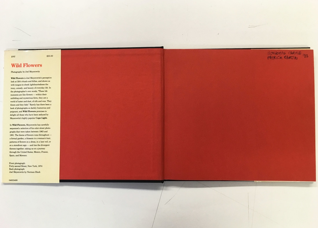
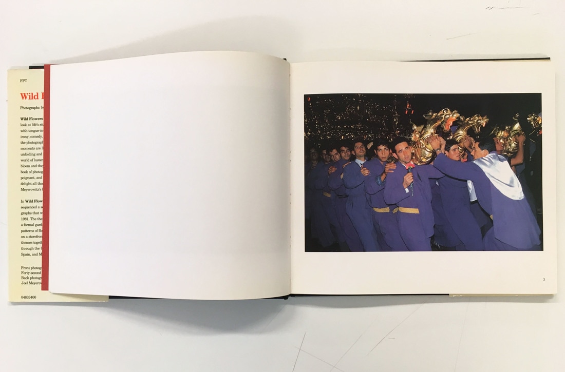
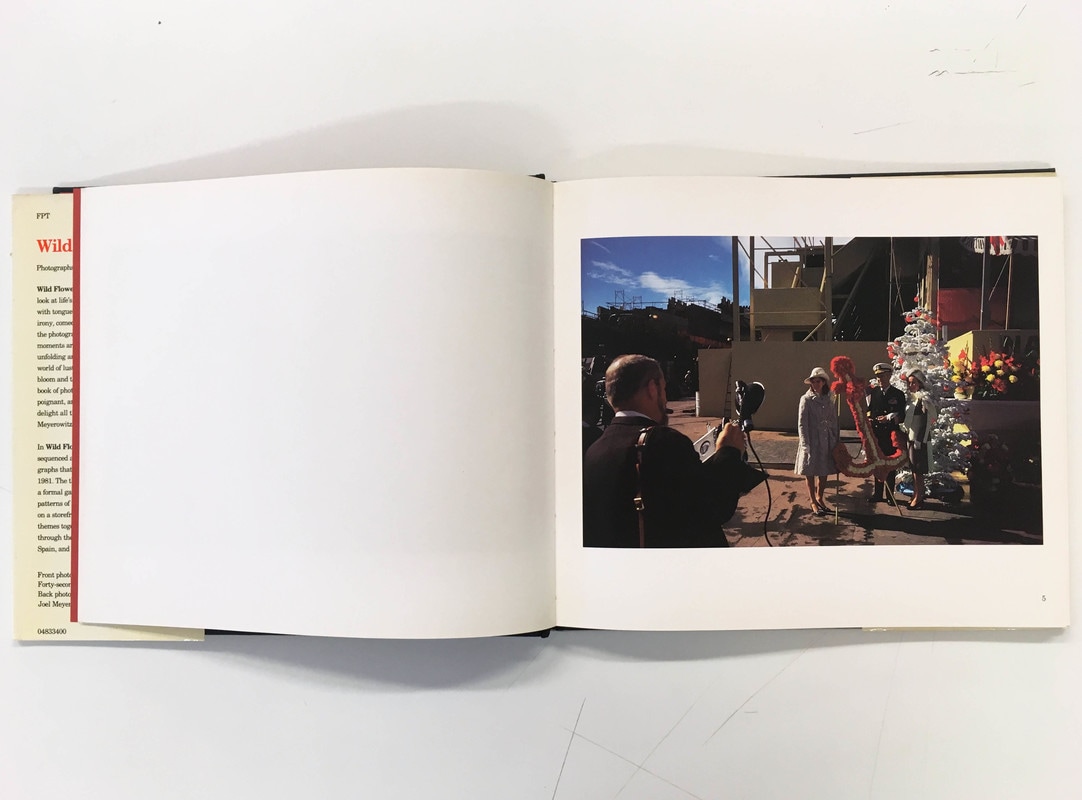
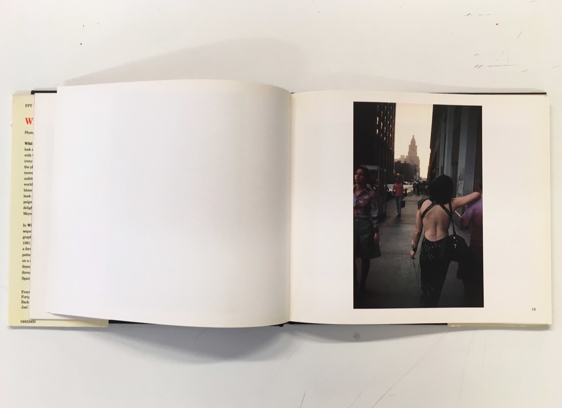
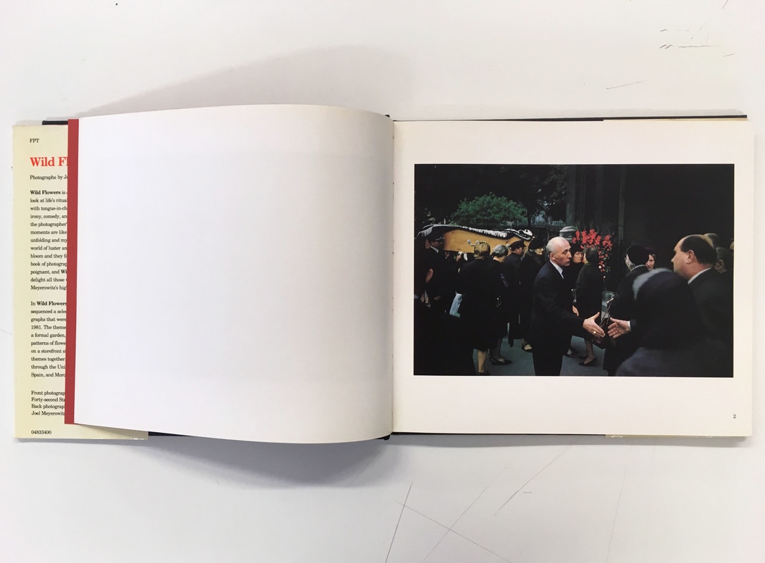
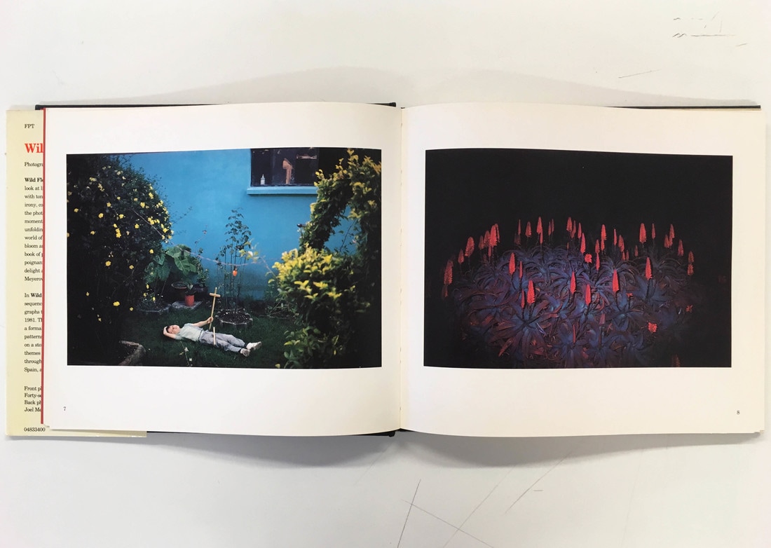
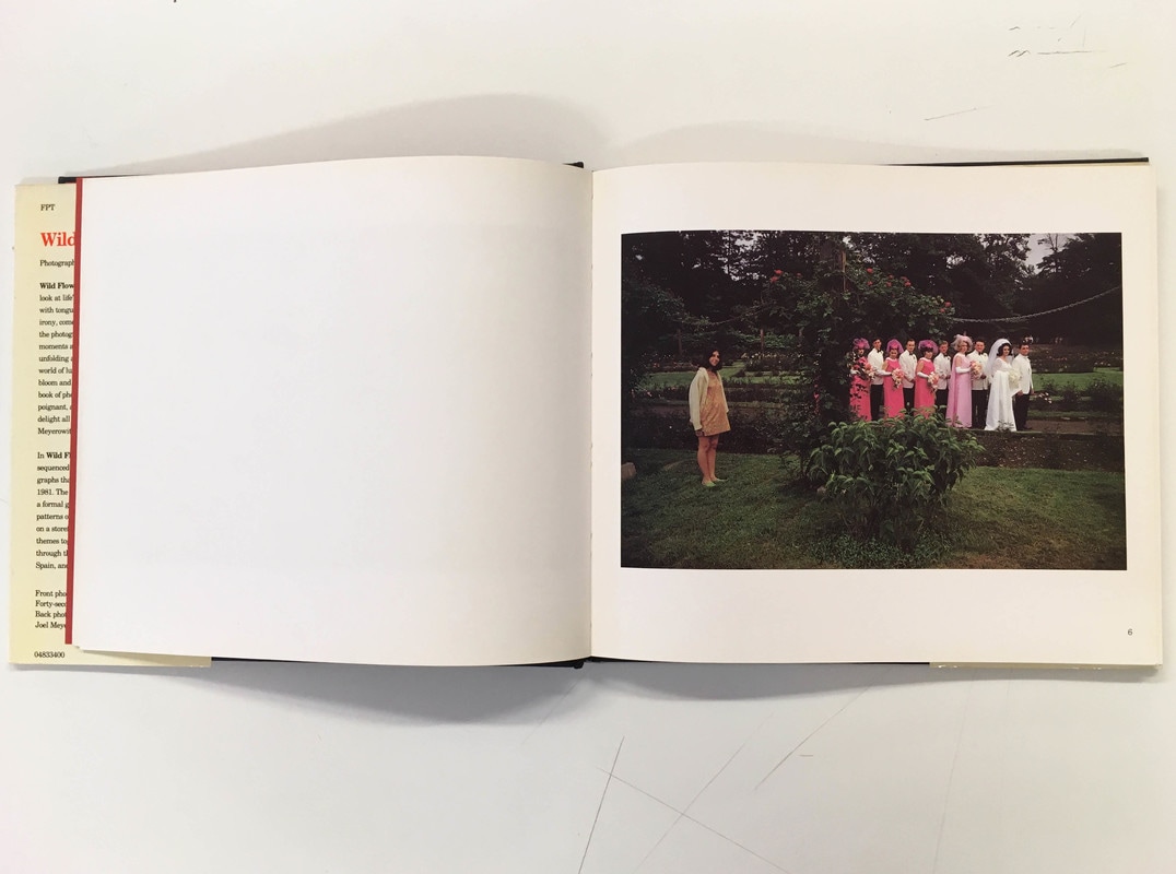
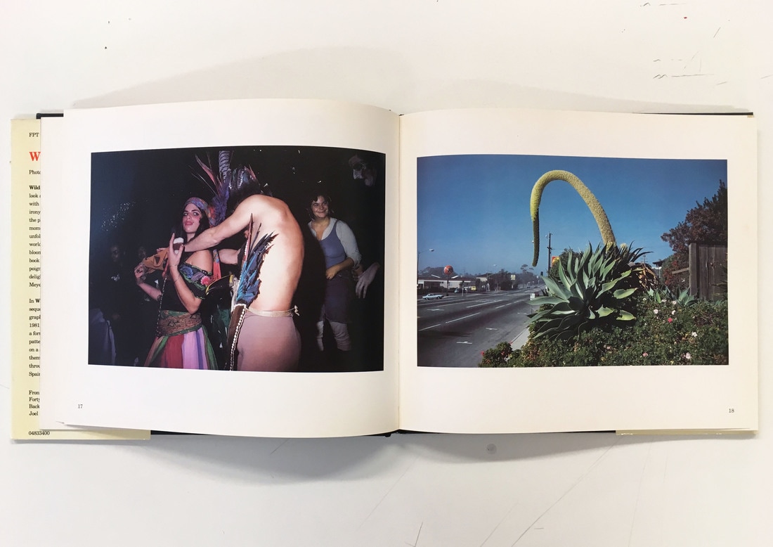
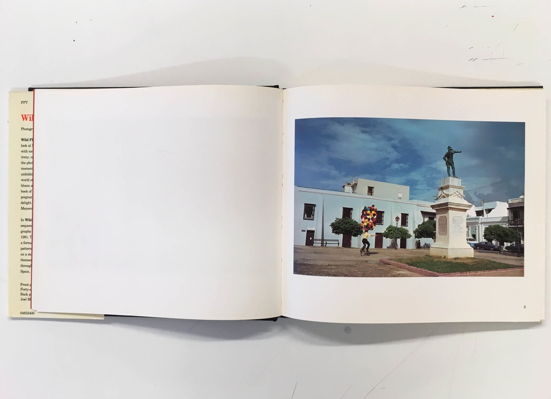
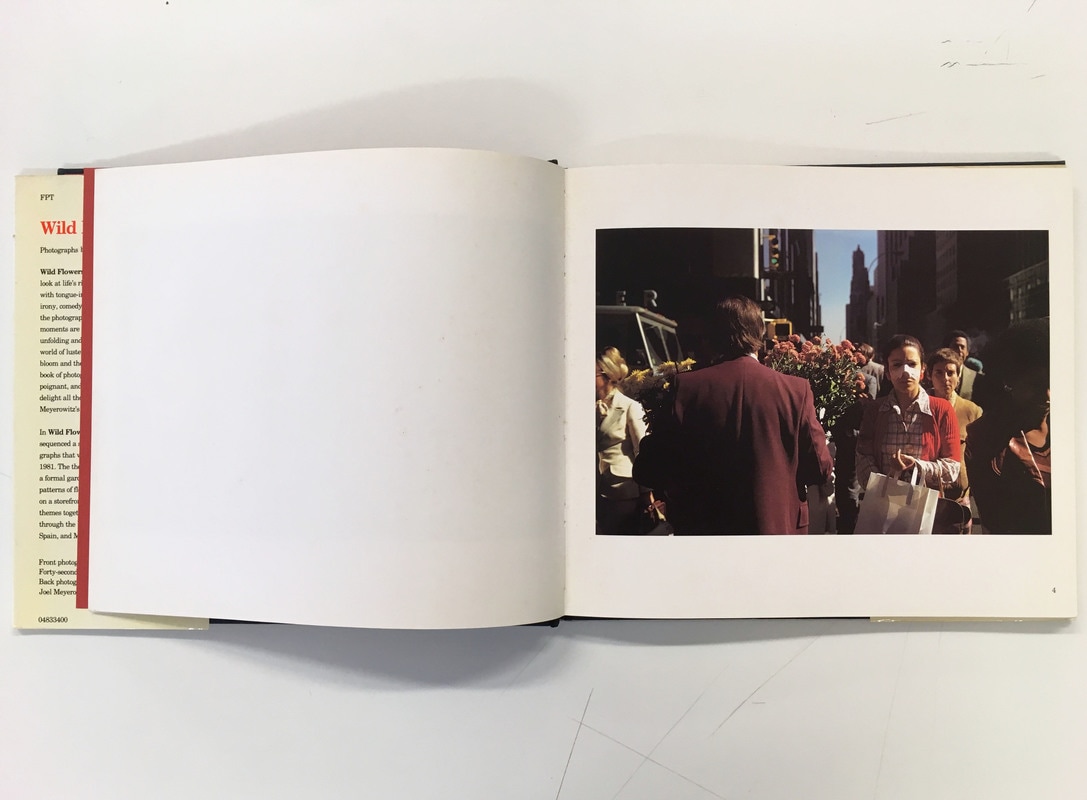
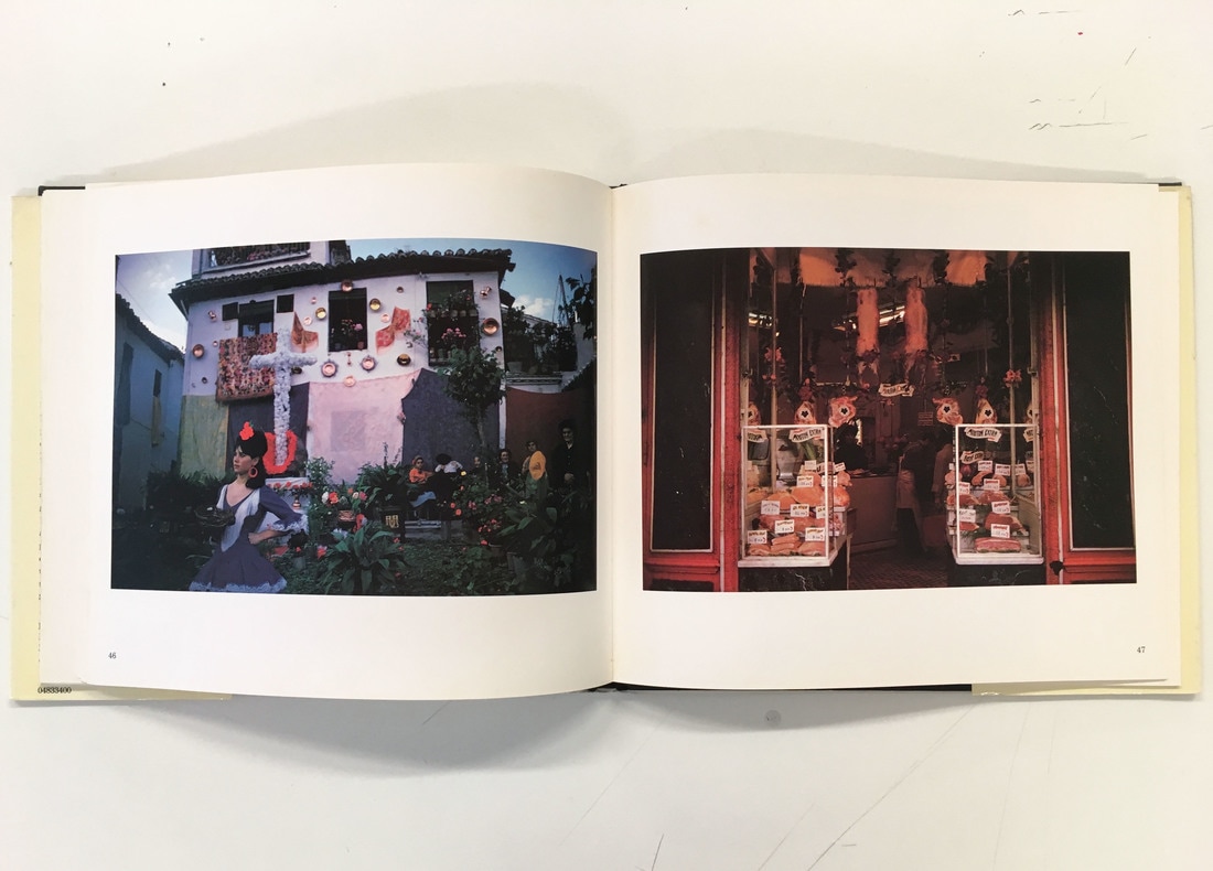
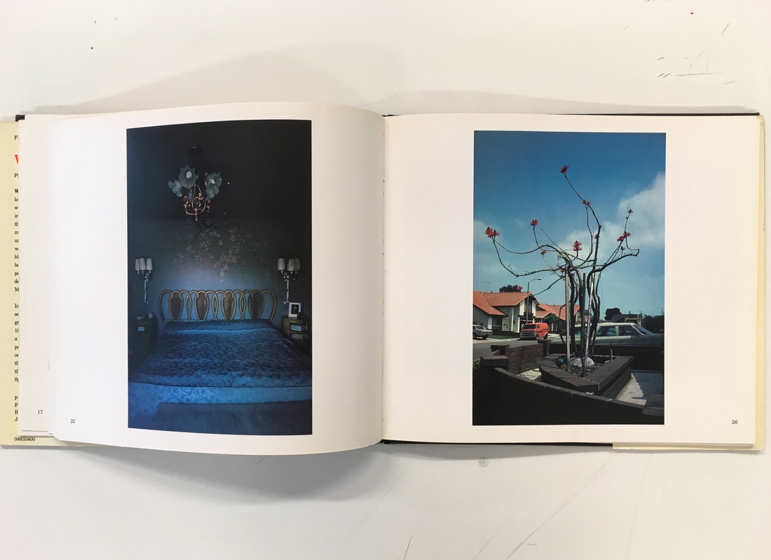
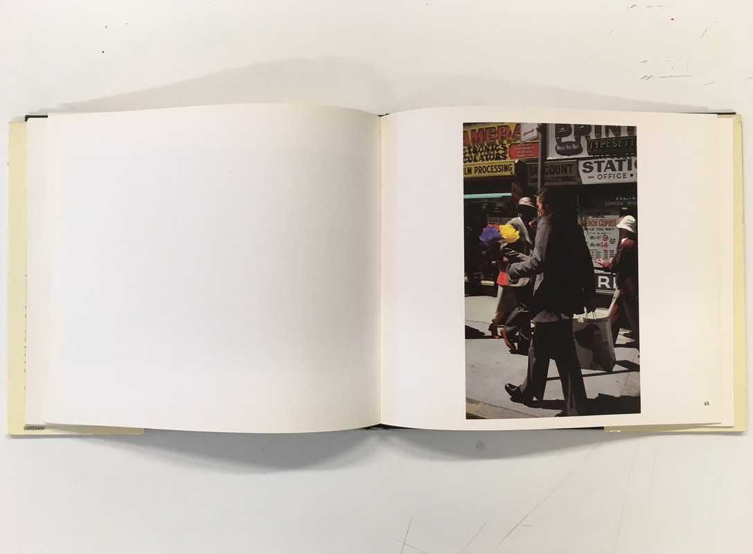
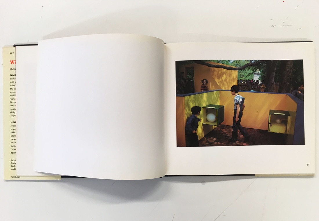
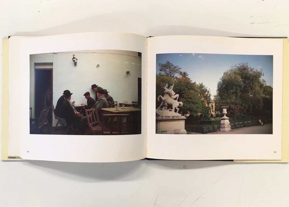
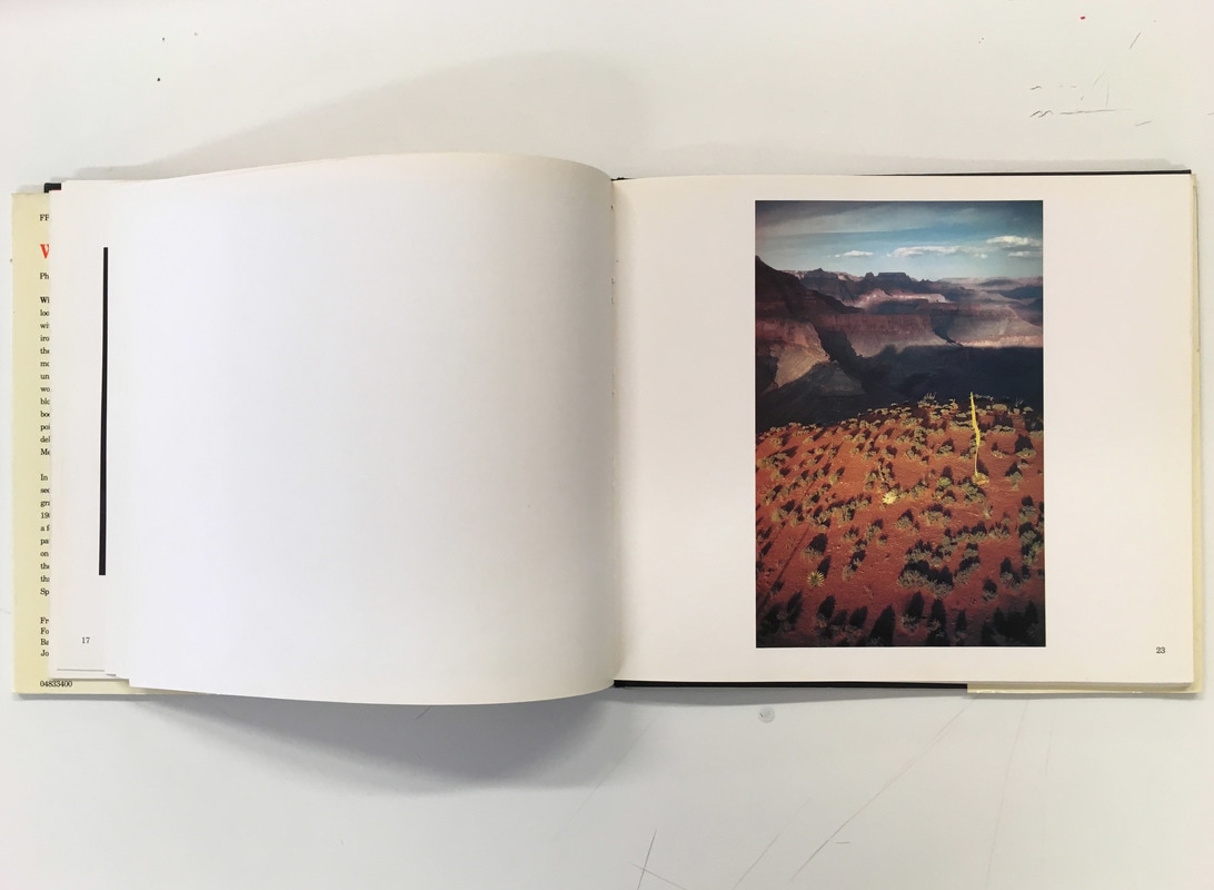
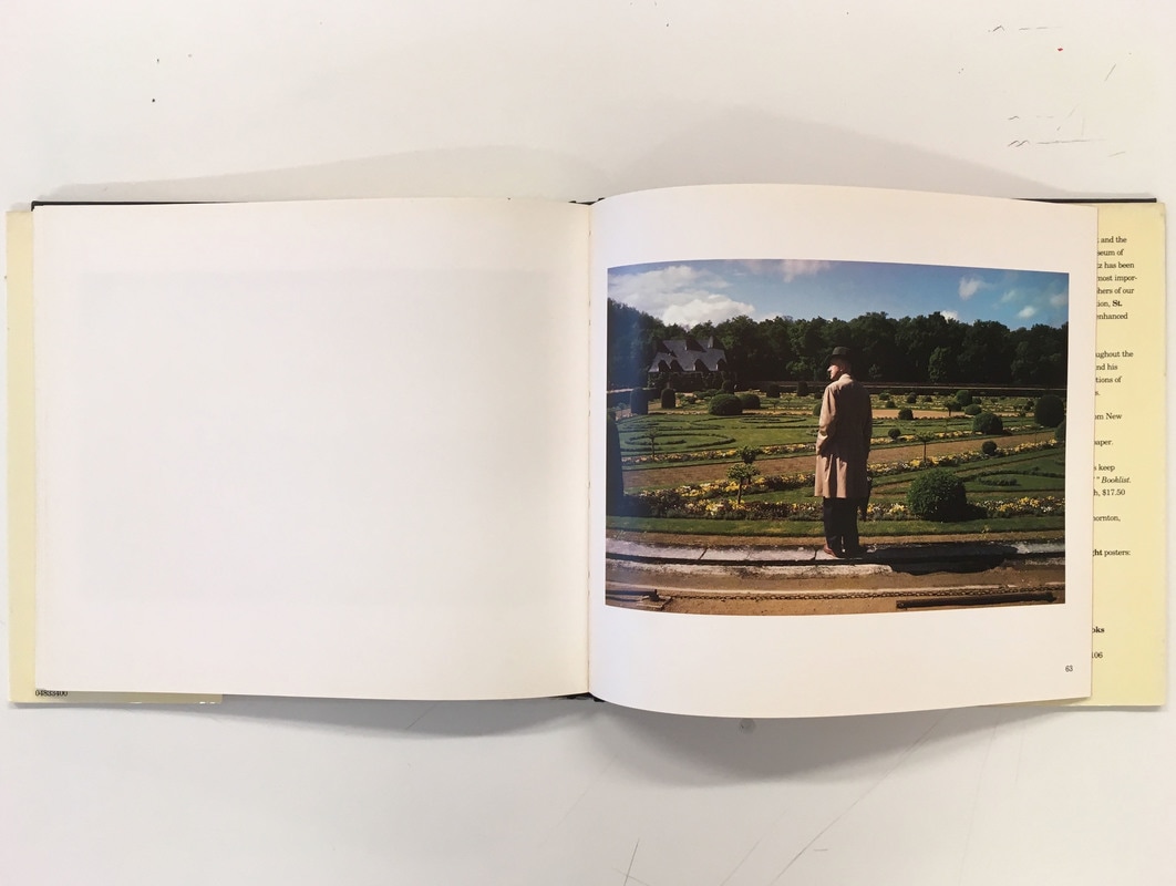
• The title -the title on the cover is quite large and stands out, especially with the bright yellow and red against the black background, they have also included one of Joel's small photographs in the centre of the cover. The cover grabs your attention with the bright text, and also offers a preview of the book's content with the small image on the front. There are a few pages of relatively large text at the start of the photobook, and there is an introduction and context printed in the inside cover of the dust jacket, with a hardback cover.
• Initial impressions and feel of the book - It is a relatively large book, with quite a large number of landscape pages (63 sides), and a thick hardback cover. It has a glossy dust jacket, and the pages themselves are quite glossy. I like this type of paper as a small amount of gloss displays and renders images well, but I do not like too much gloss - which can cause some irritating reflections on the images. Personally, I prefer hardback covers with photobooks - as you can lay them out and read easily on a table, I also prefer the feel of a more solid cover.
• At the start of the book, the photographs are only printed on the right hand page of each double spread, with the left hand page left blank, the images are also mostly landscape. However, as you get to the centre of the book, some double pages have photos printed on both pages, often two landscape or two portrait; as well as some single portrait images. However, towards the end of the book, it returns to single landscape photos on one of the pages of each spread. I think the way that the layout changes as you read the book from start to finish creates an interesting journey and a pattern.
• Theme (explained in the introduction to the book) - selection of Joel Meyerowitz's colour street photographs taken between 1963 and 1981. The theme of flowers runs through the book - each photograph depicting flowers in some way, some obvious, others small and discreet. Joel clearly had a clear vision and specific theme for his photobook. All the photos are quite saturated colour images, taken with slide film, most likely on his Leica. Many of these photographs are wide angle but taken up close - creating quite intimate street photographs. The images were compiled over quite a long period of time, then scanned and compiled. I really like the style of his street photographs. The colours in each photograph are saturated and rendered well in the book - the saturation of colour works well especially with many bright flowers. There is quite a varied range (landscapes, street photography, still life etc.) of very interesting, colourful photographs. Focusing on flowers creates an interesting theme throughout the book, and makes the viewer focus closely on each photograph to hunt for the flowers. In particular, I really like the style of the street photographs, especially the candid photos that feature people. I am considering focusing my photobook on street photography, and I would potentially like to use some of Joel's street photography as inspiration.
• Personally, I really like this photobook, particularly as I really like the style of his saturated, colour street photographs. I think it also works well with the theme of flowers running through the photobook, and it often encourages the viewer to look carefully at some images, often to spot the flowers. However, I think such a specific theme would be quite hard to replicate, and would take a long time to create so many images on this specific theme.
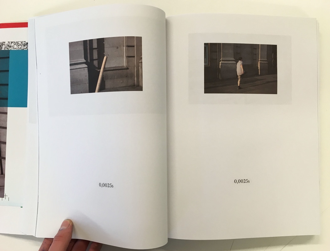
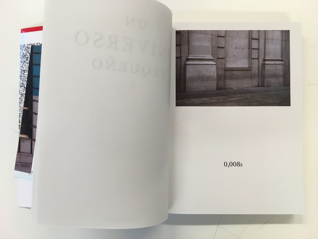
Un Universo Pequeño by Antonio Xoubanova
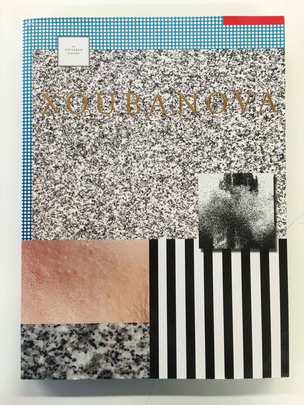
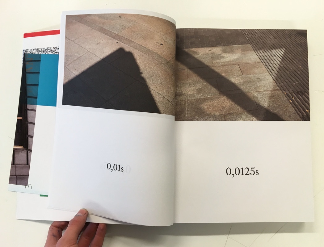
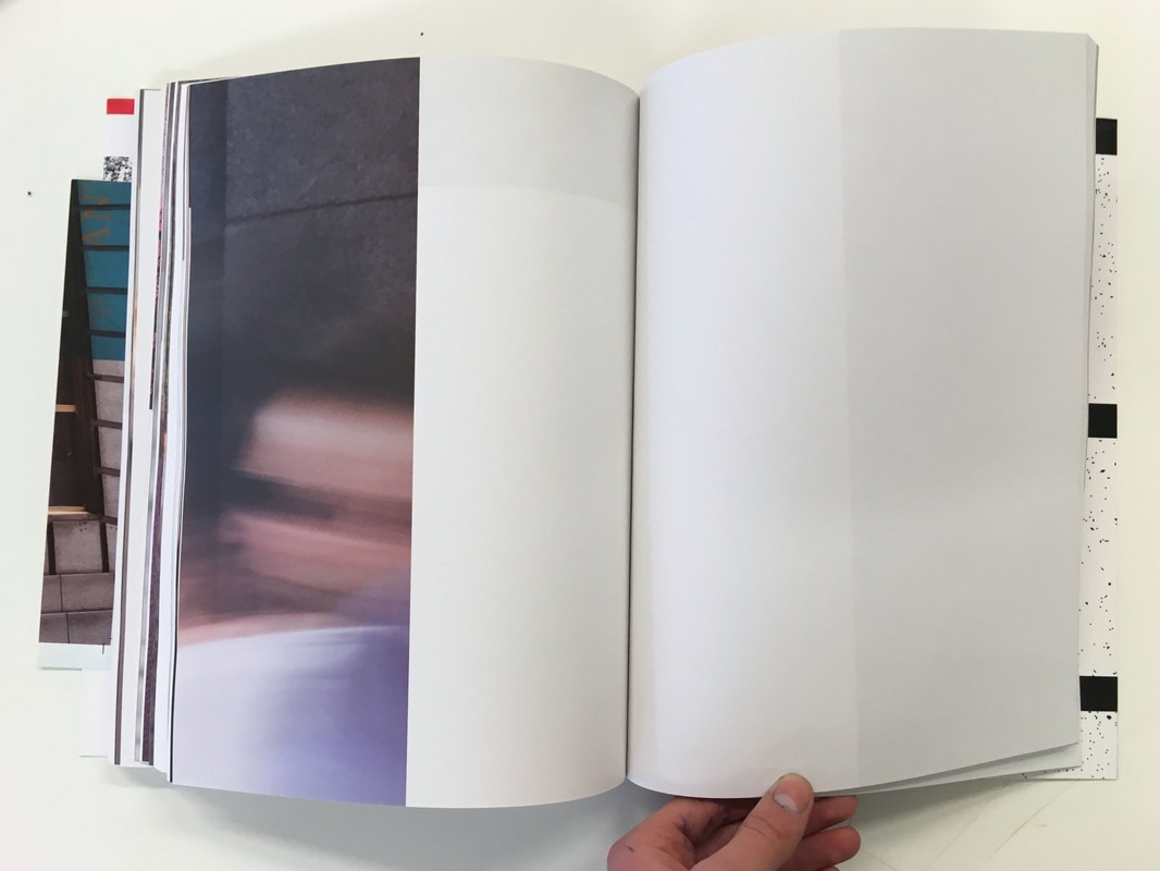
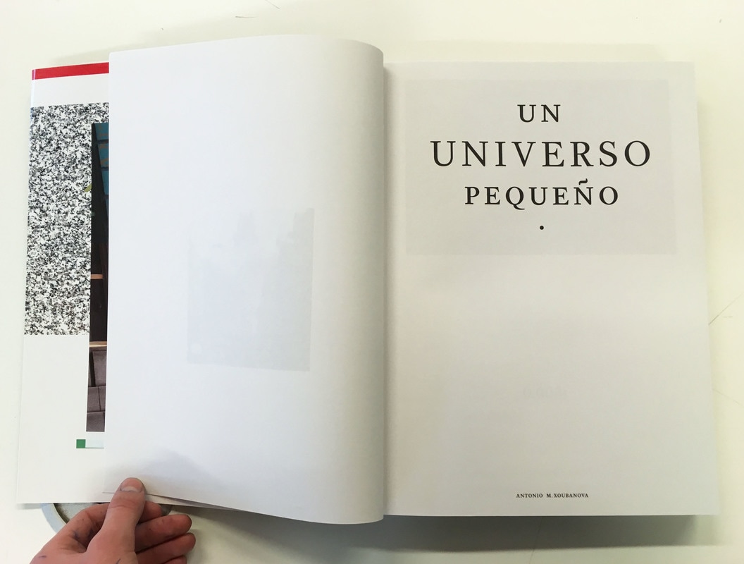
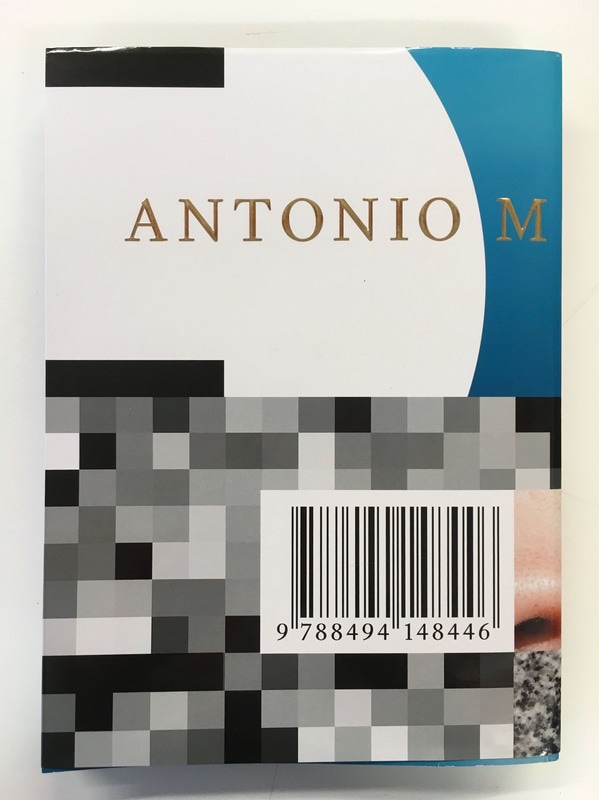
• The title - The main title of the book (Un Universo Pequeño) is on an inside page, with the photographer's name in gold capitals across the glossy front cover. The cover of the book is colourful and quite abstracted - it immediately catches the eye. I like the bright abstract cover - it entices the reader to open the book. It is a big portrait book - it is thick with a large number of pages, but using quite thin paper. I quite like thick books, but this is extremely large. However, I don't like the thin paper that they have used, you can see previous images through the thin pages. I prefer slightly thicker paper, and I think I would prefer slightly thicker or glossy paper for my own book.
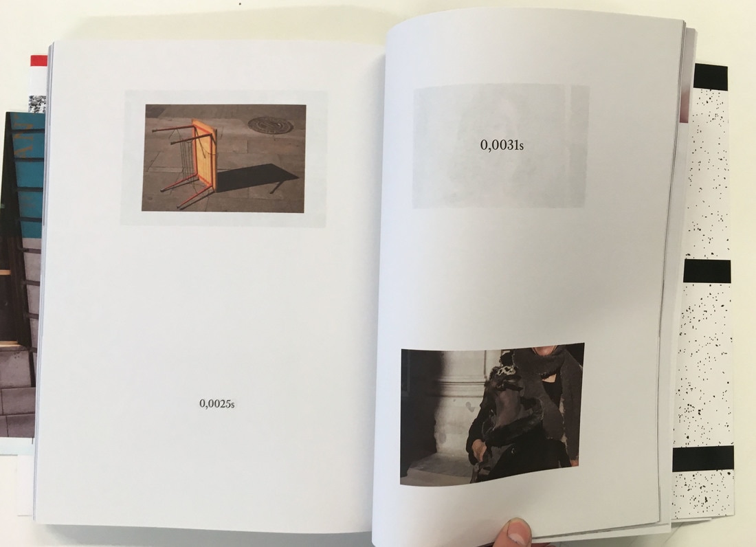
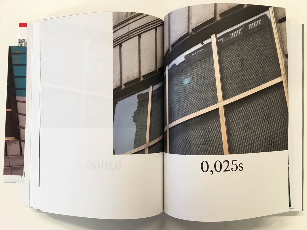
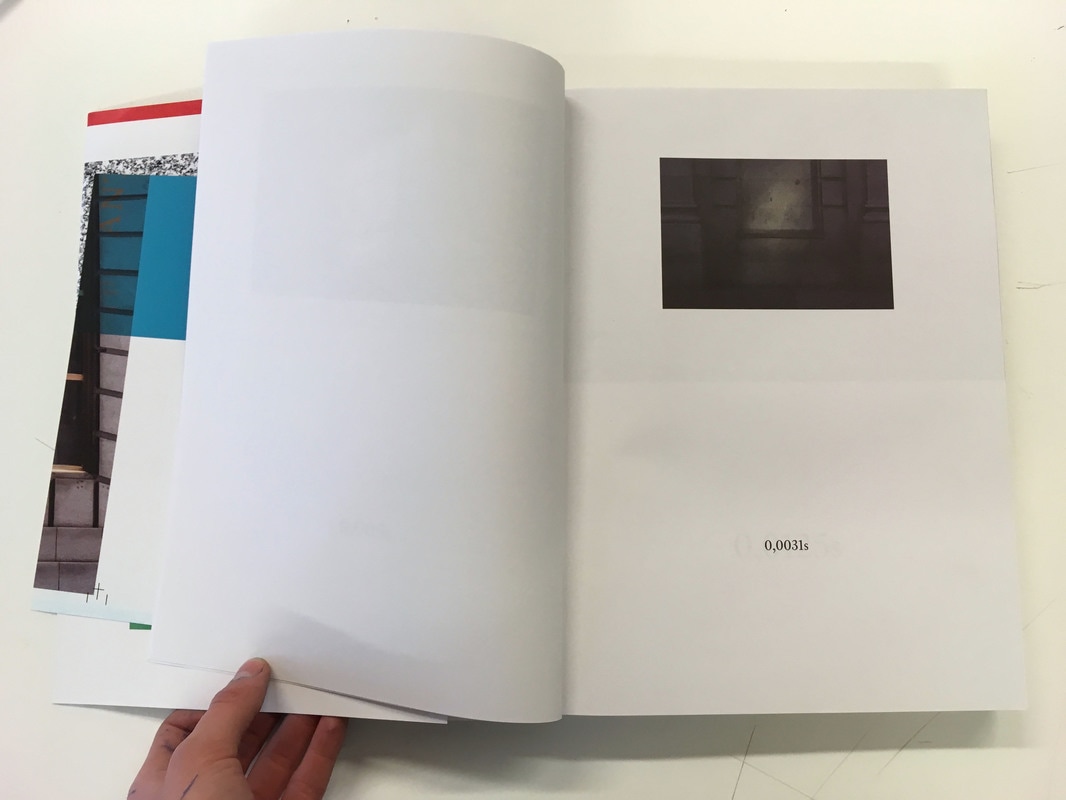
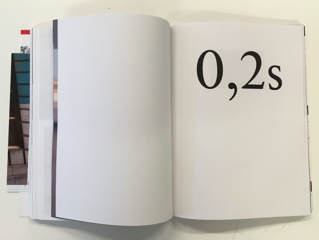
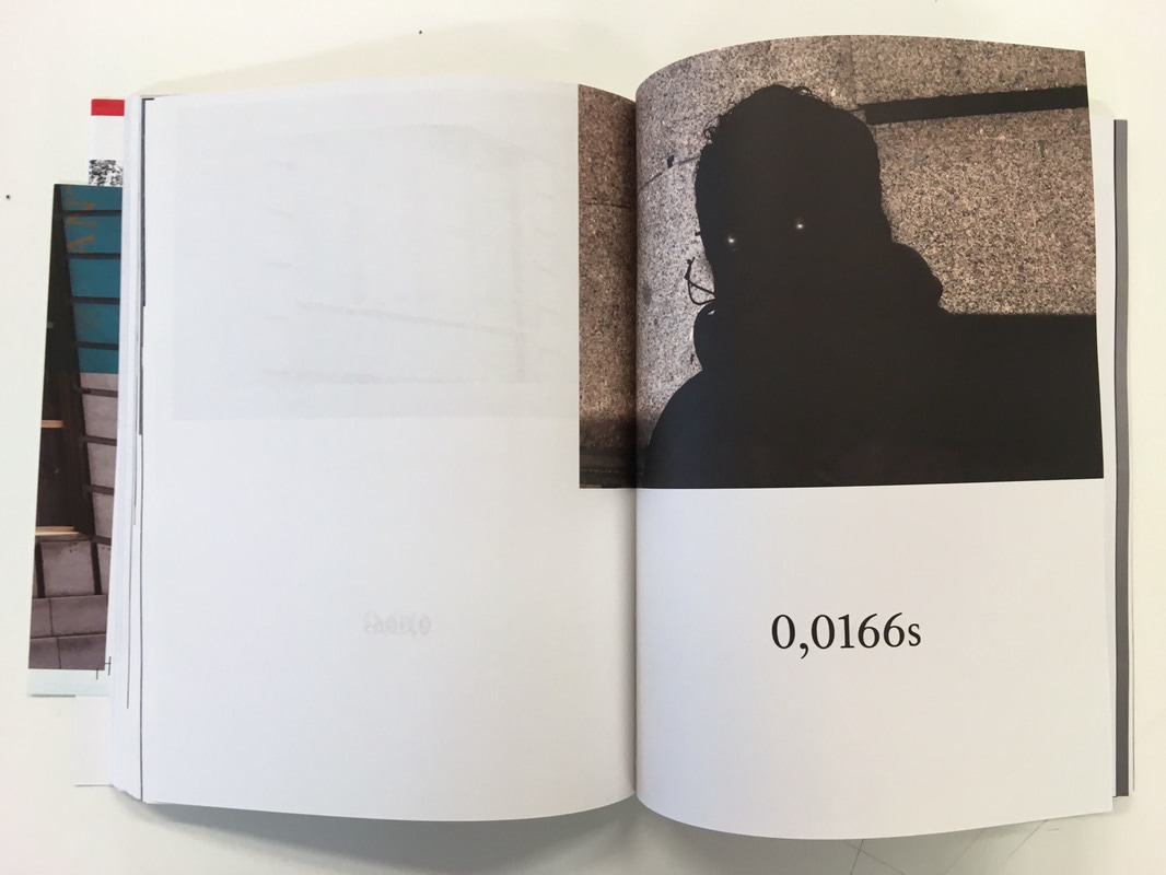
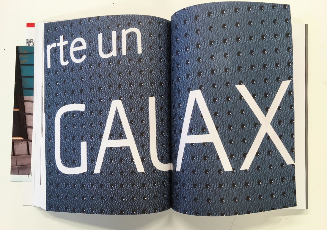
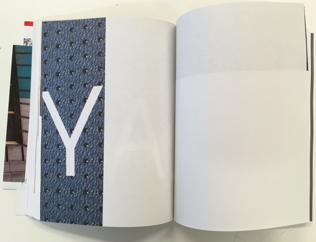
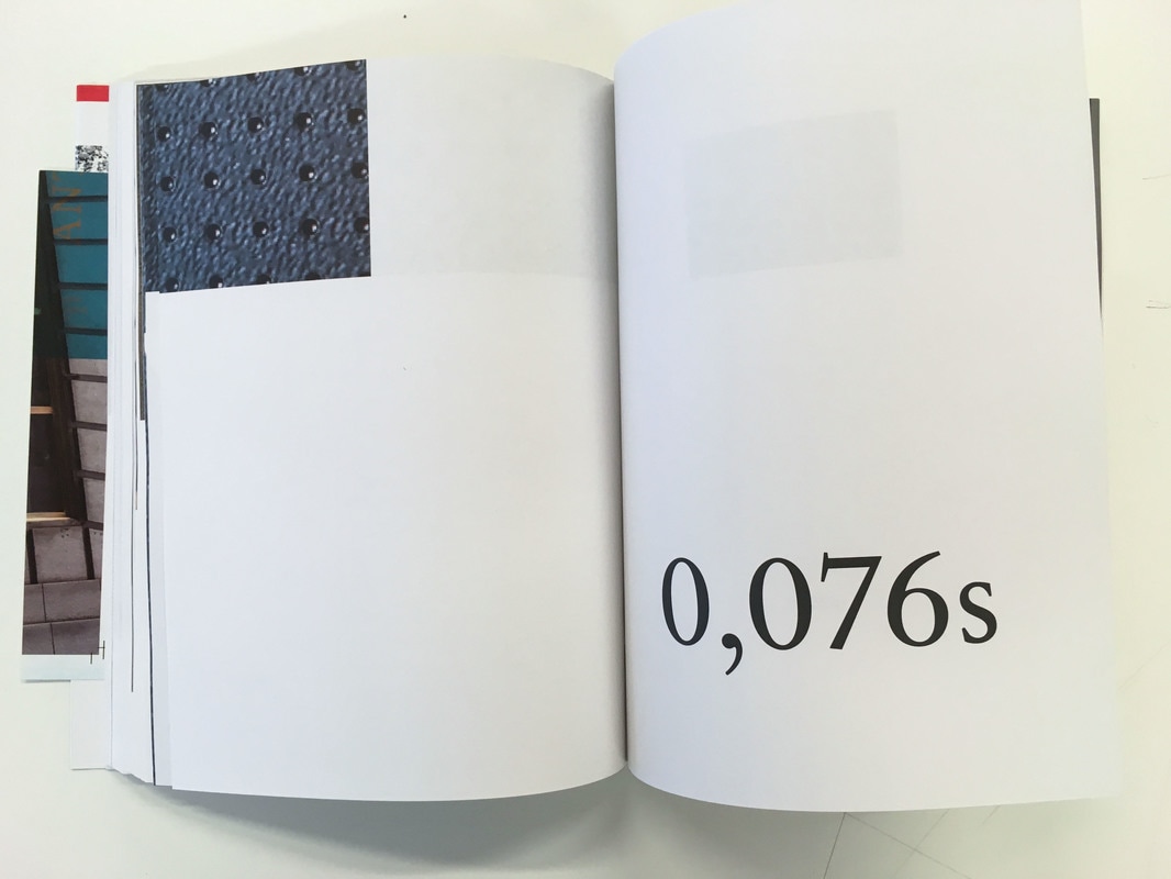
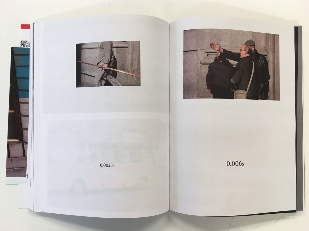
• Theme - All of the images in the book are taken on the same street in Madrid. However, the size of each image depends on its shutter speed; the slower the shutter speed, the larger the image. Not only this, butter the text showing the shutter speed also varies in size. The photographer clearly used mathematics or an equation to work out the size of each image, depending on the shutter speed. Each image has the shutter speed it was taken at printed below it on the same page. This is quite a interesting and very unusual theme - I haven't seen anything like this before. However, I do not think I will create a photobook with a theme like this as it is so specific, and difficult to replicate anything like this.
• The images in the book appear to be quite quickly taken street snapshots. The images often capture details he picks up on the street he was travelling through in Madrid. Smaller photographs (taken at faster shutter speeds) are often printed next to one another, often on a double page spread. However, larger images (taken at slower shutter speeds) are given much more room due to their size. Some really large images (taken at very slow shutter speeds) are given/spread out over a numbed of pages; many pages are filled with a small section of an image, with other pages with just the edges of the photo squeezed onto the page as the huge photos are spread over so many pages. This creates some interesting variation throughout the book which I quite like, and it makes the reader wonder what sort of layout will be on the following page. Not only this, but some interesting, abstracted small sections of photographs can appear when an image is spread out over a number of pages.
• I like this book, as it is so unusual and subsequently sticks in your mind and has quite a strong impact. I have not encountered a book like this before, and it is a very interesting concept and idea to experiment and arrange images according to shutter speed.
Afronaughts by Christina De Middel
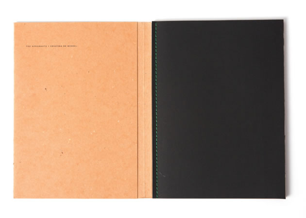
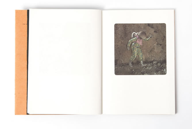
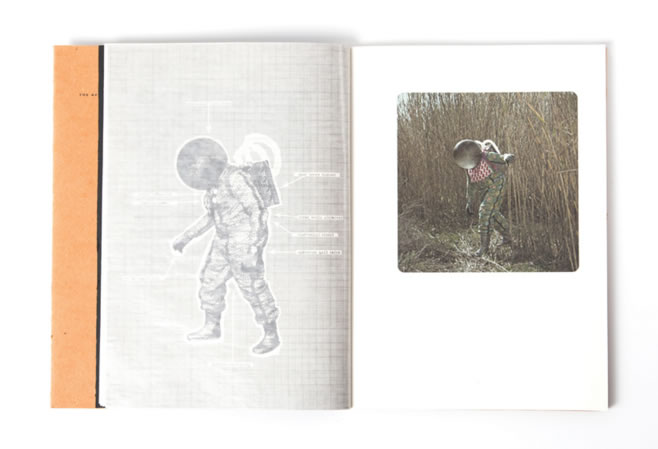
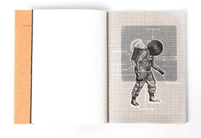
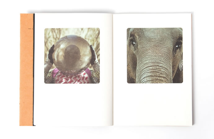
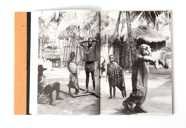
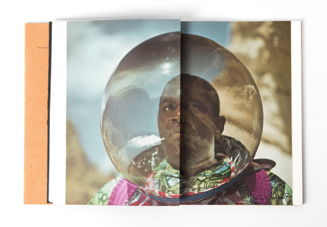
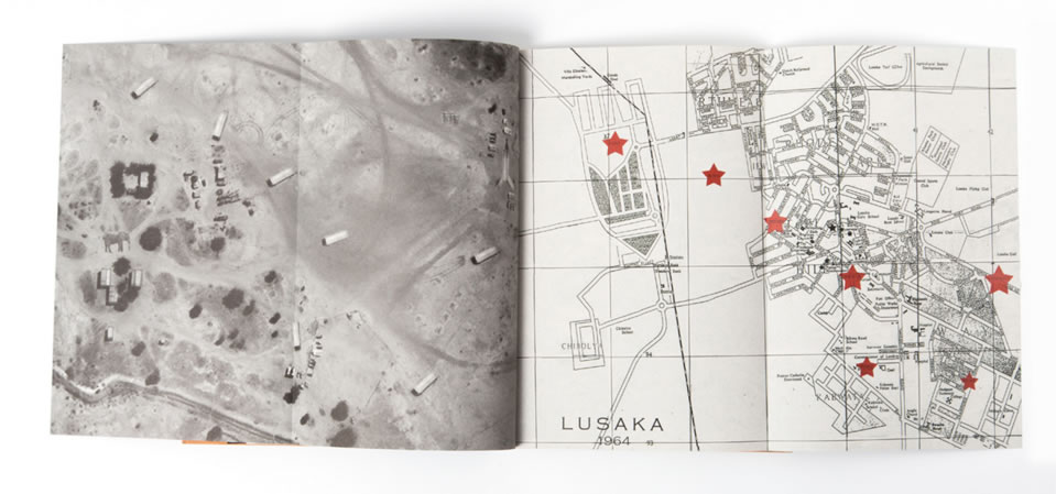
• Although I couldn't get hold of this physical photobook, I really like the style and photography in this book and I wanted to include it on my website.
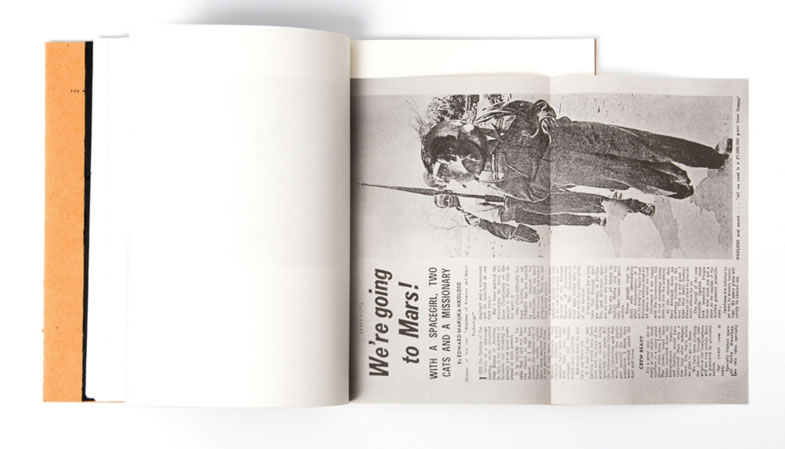
- Context - In the 1960s, some newly independent countries in Africa (like Zambia for example) wanted to spend money on training the first African person in the space race to be sent to the moon. This was mainly for propaganda, as they wanted to improve their reputation. As it was far too expensive and they didn't have the available technology or science, the space mission completely failed.
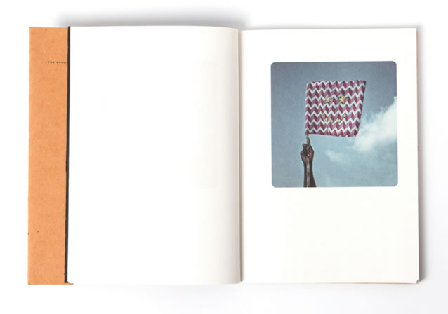
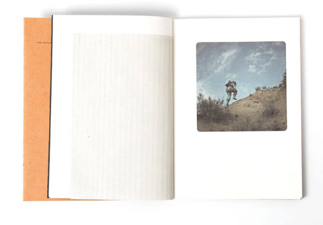
• A number of years later, Spanish photographer Christina De Middel uncovered letters and documents about this planned space mission programme. She put together ideas about the space race involving Africa and African Astronauts. As a photojournalist, Christina said that she was disappointed with the images of poverty and starvation typically associated with Africa. Inspired by the documents she uncovered, Christina shot a whole series of photographs of of African Astronaughts as if they were on the moon, she re-created and photographed the event; she made a photobook as if it had actually happend. All self funded, Christina found Actors, costumes and locations in desert-like regions of Spain to set up these photoshoots, shooting in photojournalistic style. In her photobook, she told a story as if this was a factual event, and included letters and documents (some documents surrounding the original plans for the space project), to tell a story that this space mission actually occured. However, these images are all obviously set up and fictional - unusual for a documentary photographer. Christina questions the status of the photograph, do all photos tell the truth? Photos are not the whole story - not the real, full truth. With this photobook and photography project, Christina was shortlisted for the 2013 Deutsche Börse photography prize. I actually saw the 2013 Deutsche Börse at the Photographers Gallery, and I really liked Christina's photography when I first viewed it. I really liked the large scale prints, especially the mysterious, almost poetic photographs set in the desert.
• Personally, I really like Christina De Middel's Afronaughts photobook. I think that the fictional story of photographs that she tells is very interesting - and questions how truthful a photograph can really be. I also really like the style of her photographs - particularly the portraits and colourful costumes against the background of the desert. She has clearly though carefully about her photography, and planned and set up each photograph. and I also like the documents, articles and drawings that she has inserted throughout the photobook, adding to the story that she is trying to tell.
- Context - In the 1960s, some newly independent countries in Africa (like Zambia for example) wanted to spend money on training the first African person in the space race to be sent to the moon. This was mainly for propaganda, as they wanted to improve their reputation. As it was far too expensive and they didn't have the available technology or science, the space mission completely failed.
• A number of years later, Spanish photographer Christina De Middel uncovered letters and documents about this planned space mission programme. She put together ideas about the space race involving Africa and African Astronauts. As a photojournalist, Christina said that she was disappointed with the images of poverty and starvation typically associated with Africa. Inspired by the documents she uncovered, Christina shot a whole series of photographs of of African Astronaughts as if they were on the moon, she re-created and photographed the event; she made a photobook as if it had actually happend. All self funded, Christina found Actors, costumes and locations in desert-like regions of Spain to set up these photoshoots, shooting in photojournalistic style. In her photobook, she told a story as if this was a factual event, and included letters and documents (some documents surrounding the original plans for the space project), to tell a story that this space mission actually occured. However, these images are all obviously set up and fictional - unusual for a documentary photographer. Christina questions the status of the photograph, do all photos tell the truth? Photos are not the whole story - not the real, full truth. With this photobook and photography project, Christina was shortlisted for the 2013 Deutsche Börse photography prize. I actually saw the 2013 Deutsche Börse at the Photographers Gallery, and I really liked Christina's photography when I first viewed it. I really liked the large scale prints, especially the mysterious, almost poetic photographs set in the desert.
• Personally, I really like Christina De Middel's Afronaughts photobook. I think that the fictional story of photographs that she tells is very interesting - and questions how truthful a photograph can really be. I also really like the style of her photographs - particularly the portraits and colourful costumes against the background of the desert. She has clearly though carefully about her photography, and planned and set up each photograph. and I also like the documents, articles and drawings that she has inserted throughout the photobook, adding to the story that she is trying to tell.
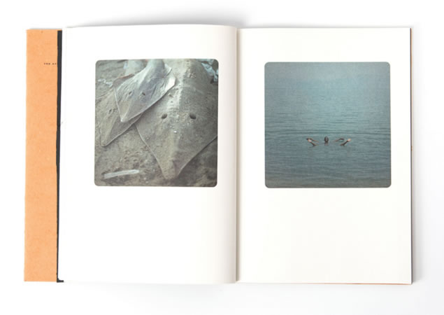
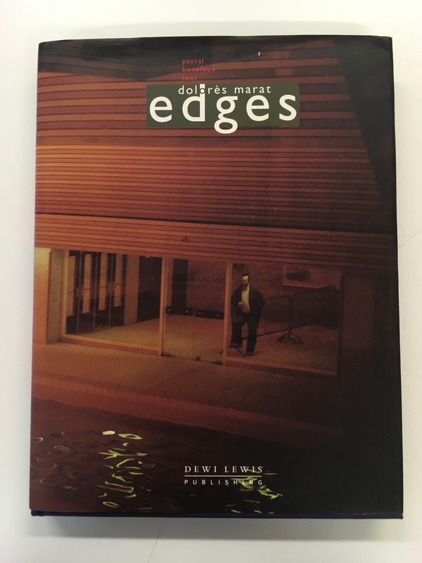
Edges by Dolorès Marat
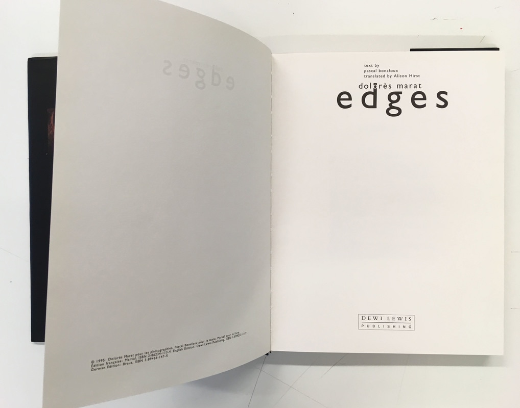
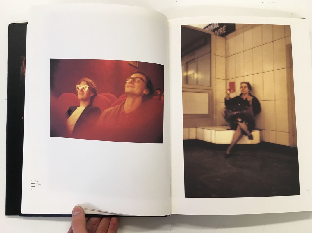
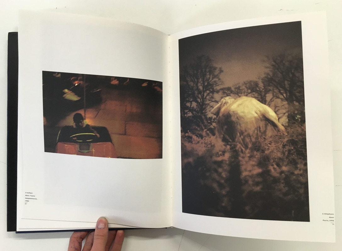
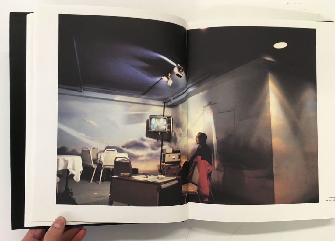
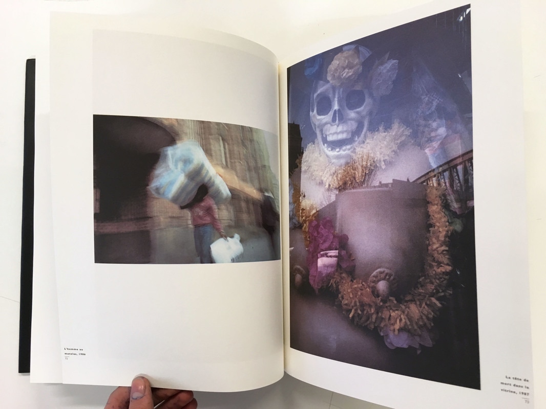
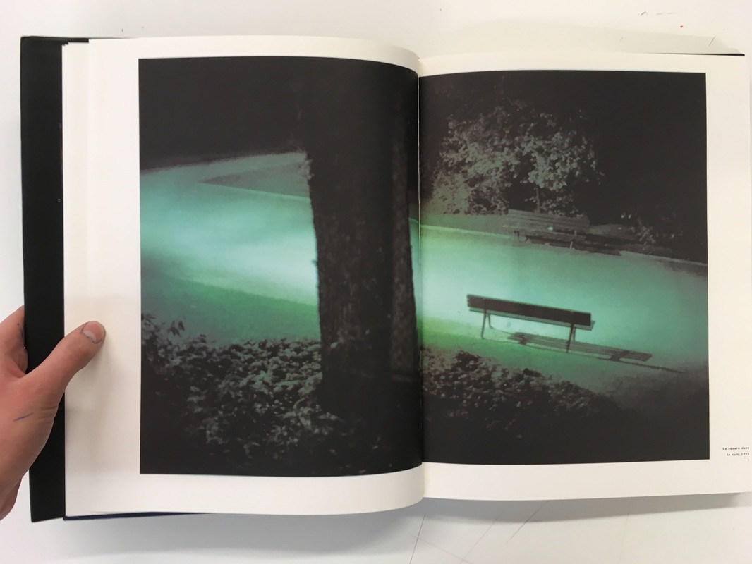
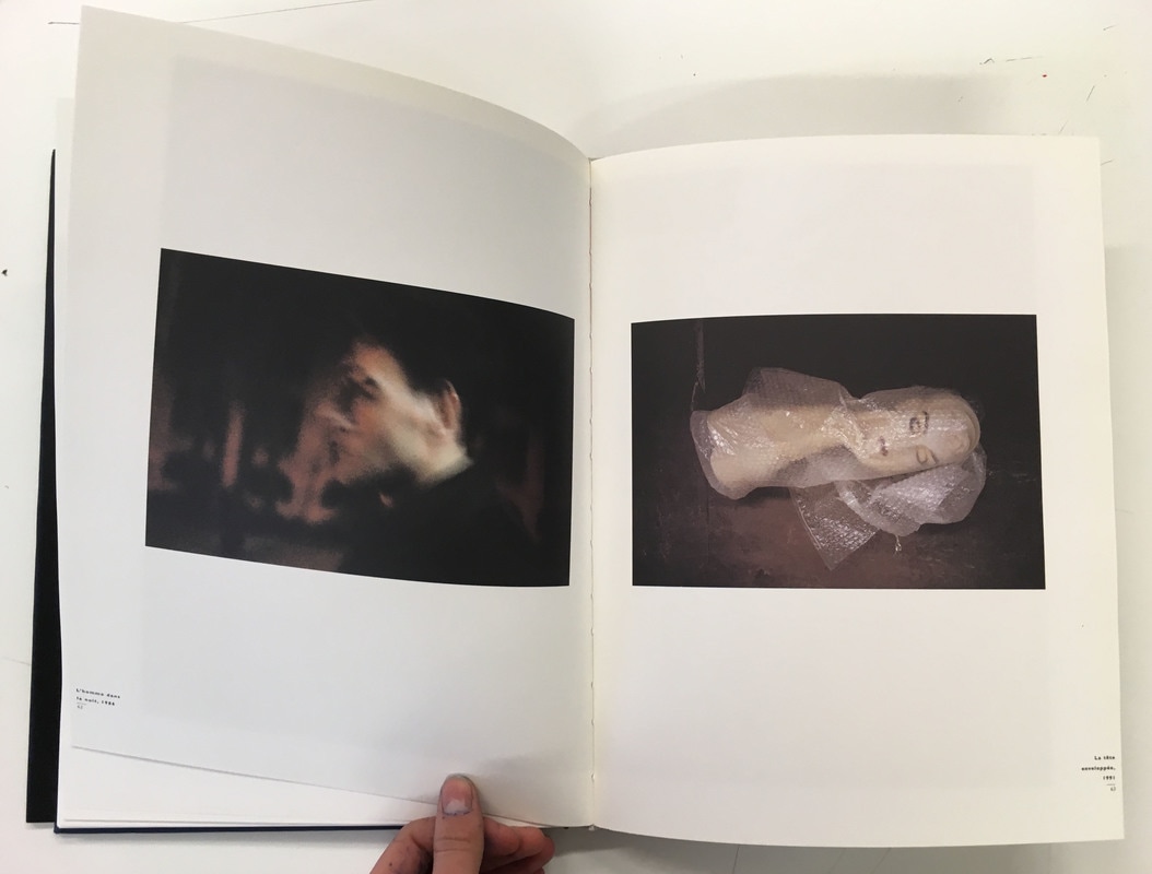
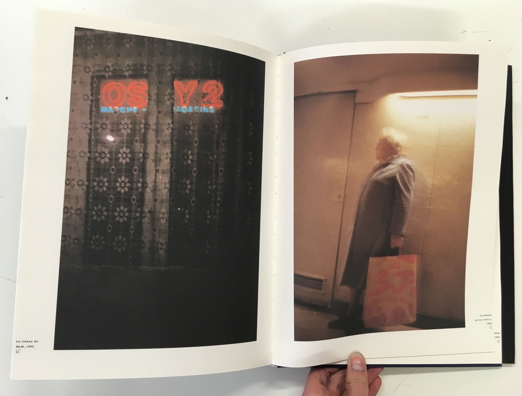
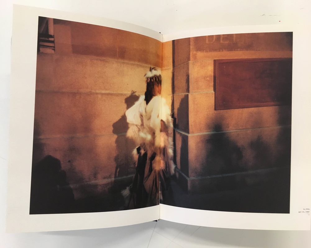
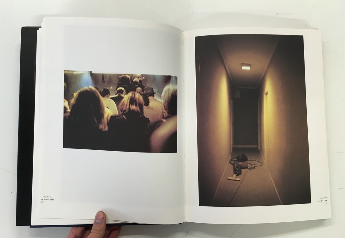
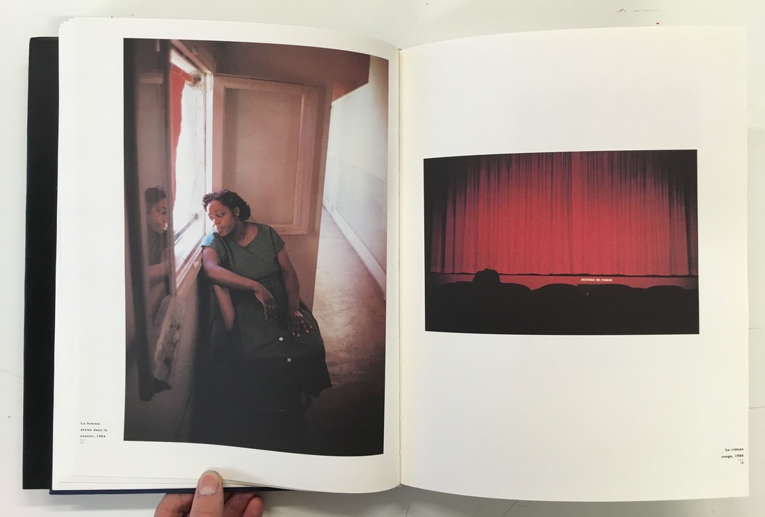
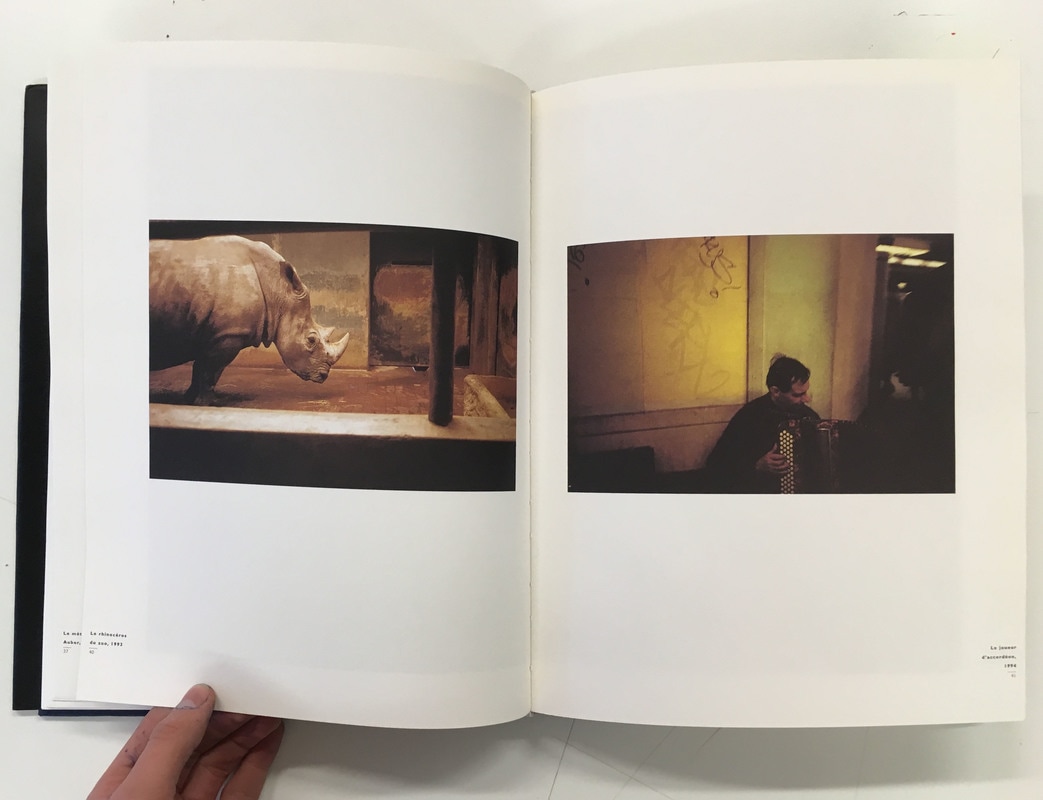
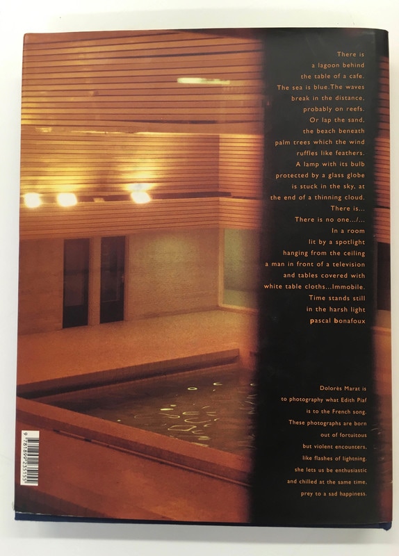
• Title - medium sized and stylised title of the book and the author at the top of the front cover, as well as a blurb along one side of the back cover, with a large image filling the whole sleeve of the book. I like the way that a single image covers the entire sleeve of the book - I think it works well with the title overlayed on top of this image. There is also a title and text on the first few inside pages of the book. The book is portrait and medium sized, with a hardback cover and sleeve. There are quite a large number of pages, and they have printed the images on really thick textured paper - mainly to re-create the thick paper prints that she makes. I quite like the feel of the thick paper as I flicked through the book - it was unusual compared to the photobooks that I had looked at. Generally, there is one photo on each side of a double page spread, or the photographer has printed an image across a double page; however, there are a couple of double spreads with an image printed on only one page. I quite like the variation in the different layouts of images across a number of pages. A number of images beside one another work well together, and it is clear that the photographer has thought about which images he has placed next to one another. Each image also has a small caption, with details and the date and title of each photograph.
• The theme of this book is a collection of photographs taken over quite a long period of time. However, the images in the book appear to generally be quickly taken snapshots; many photographs appear to be blurred and quickly taken. In the blurb on the back, it explains that 'these photographs are born out of fortuitous but violent encounters, like flashes of lightning' - this explains that these photos are generally taken spontaneously, with little time to consider the photographs. The theme of the book appears just to be the collection of her quickly taken snapshots - there also doesn't appear to be a particular order or logical way of ordering the images in the book. There doesn't appear to be a particular pattern or reason for ordering the images in a certain way.
• Personally, I like the style of Dolorès Marat's quickly taken snapshots - I like her style of street photography, the images themselves appearing almost cinematic and poetic, although taken candidly. The fact that they aren't ordered in a particle way means that you can flick through the book and look through the images in any particular order; I personally do not like being forced to look through a photo book in a particular way or in a certain order, although a narrative or journey created through a photobook can be interesting.
Overall, I like different aspects and styles of each photobook. In terms of the photography, 'The Thames path', 'wild flowers' and 'Edges' would be my three favourite styles, particularly in terms of what I would like to inspire my personal photobook. This is mainly because I like the more spontaneous and documentary nature of these photographs - I would like these photographs to inspire the sort of street photography I am considering for my photobook; I like all the photobooks I have looked at, but these photobooks are more relevant for the style of photography I am planning to include in my photobook.
Assessment Challenge
As part of a photobook assessment task I had to create a meaningful set of photographic images, sequencing them by thinking of them as a story/narrative. The title of the sequence of images was, 'Please, please, please let me get what I want', so overall I had to create individual images that fit and correspond to that theme, but also overall correspond to that title as a narrative set of images. Not only this, but we also had to work to a set of instructions, that made the task more challenging overall. The set of images had to be around 5-10 images, and I had to include a range of different types of images. My set of images had to include at least: A film still with english subtitles, a scan/photocopy of a found printed image, a photograph of a photograph, a portrait (could be a self-portrait) and a blurry or indistinct subject. Not only this, but each image had to connect in some way to the image before and after, and each image has to continue my story/ narrative. The task had to be completed in two hours, and displayed as a set.
At first, for a little while I had to think about and consider what I wanted to make. I found it quite difficult at first to begin the project, and it took a little while to start generating ideas. However, when I started making images and thinking about the type of narrative and images that related to the theme (both as a set and individually), I began to find it much easier. Overall, I generally don't find constraints too difficult to work with, but it takes a little bit of time for me to generate ideas and get the ball rolling. When I starting making images and get the ball rolling, I subsequently find it easier to make more images and work - often more ideas begin to emerge when I start to photograph and make images.
At first, for a little while I had to think about and consider what I wanted to make. I found it quite difficult at first to begin the project, and it took a little while to start generating ideas. However, when I started making images and thinking about the type of narrative and images that related to the theme (both as a set and individually), I began to find it much easier. Overall, I generally don't find constraints too difficult to work with, but it takes a little bit of time for me to generate ideas and get the ball rolling. When I starting making images and get the ball rolling, I subsequently find it easier to make more images and work - often more ideas begin to emerge when I start to photograph and make images.
My displayed gallery of images
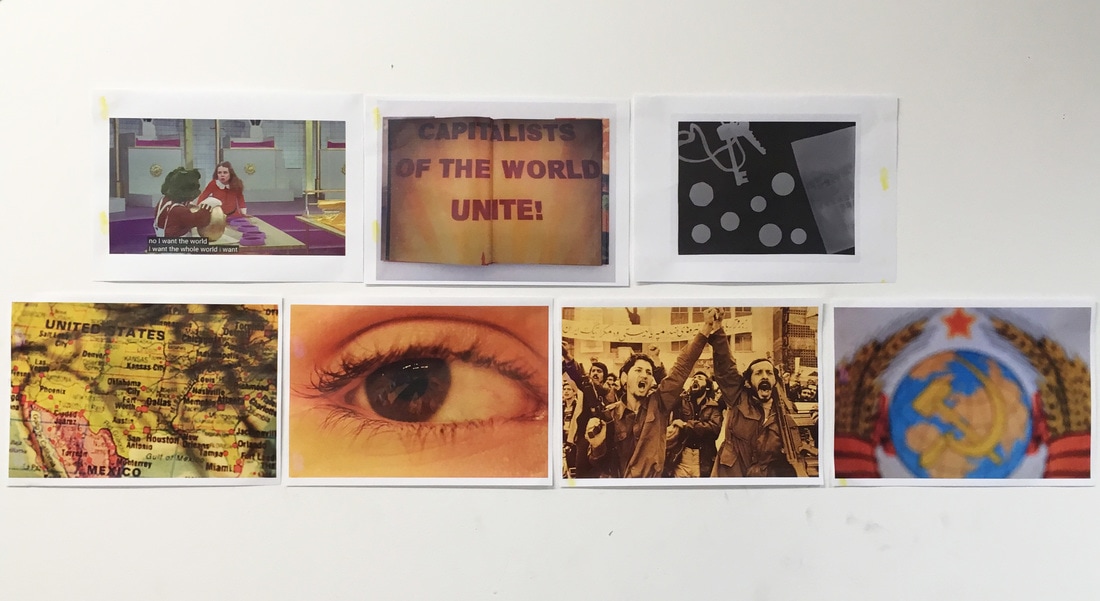
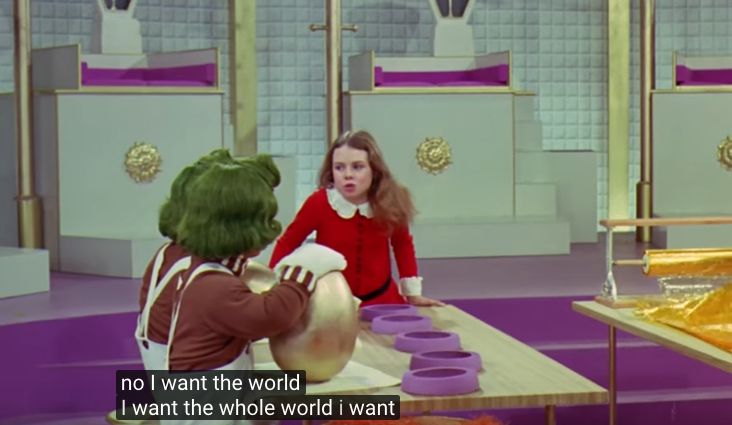
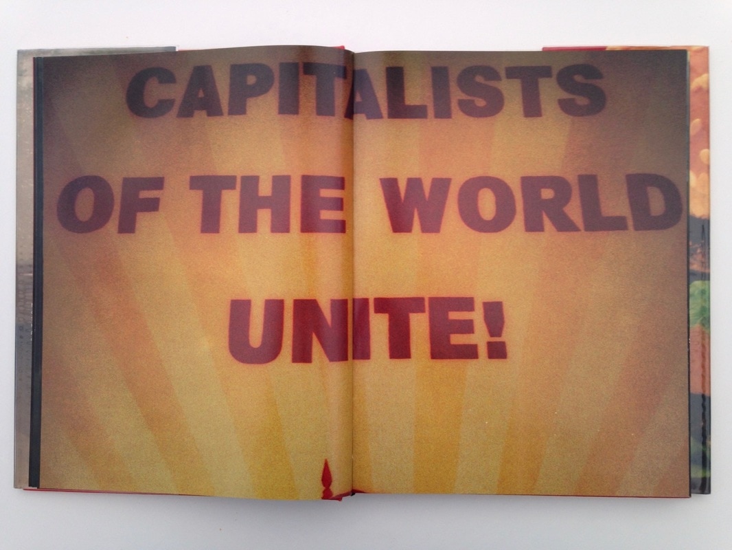
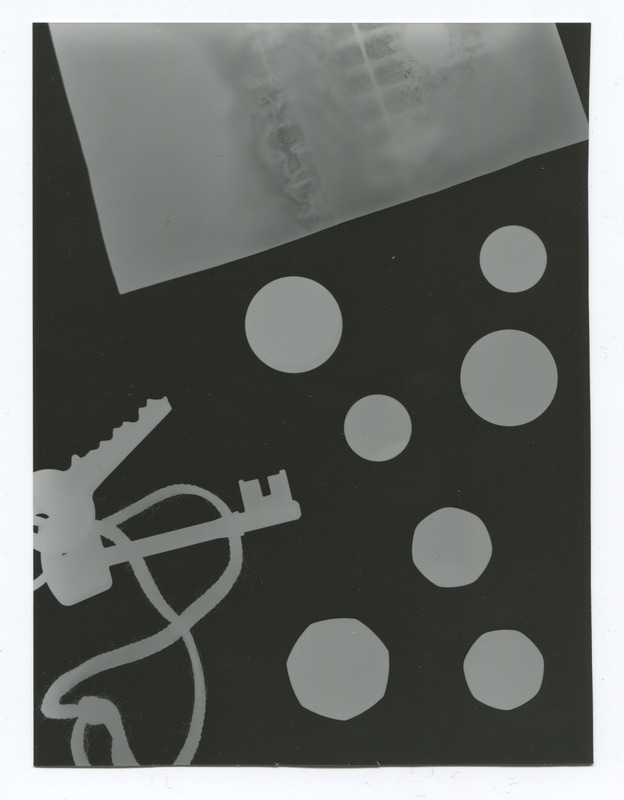
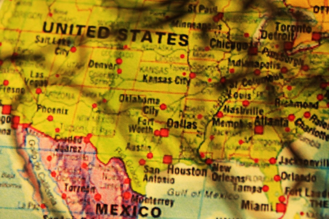
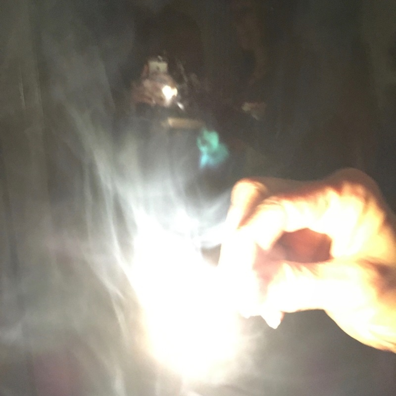
At first, I started with the film still and took a screenshot of the subtitled film on youtube. After looking at the title, I immediately thought of Veruca Salt from the 1971 Willy Wonka and the Chocolate Factory film; as Veruca Salt was spoilt and wanted anything and everything that she fancied - clearly fitting with the theme of 'Please, please, please let me get what I want'. I took a screenshot at the point where she is talking about wanting the whole world - as this clearly illustrates the strength of her desires and wanting to get whatever she likes. After taking this screenshot, The mention of the 'world' alongside desire generated ideas of the modern world - particularly capitalism and globalisation. Specially now with capitalism ruling the world, and also being based on consumerism and individuals getting whatever they want. This made me think of the 'Capitalists of the world unite!' photograph from Nick Waplington's The indecisive memento photobook. This image represents capitalists wanting to take over the globe and spreading wanting and consumerism. Subsequently to this, I wanted to focus again on capitalism (as it is so strongly focused on the individual getting what they want as well as private ownership) - particularly individual possession and capital. To represent this, I made a photogram in the darkroom. I placed the set of keys over the photographic paper to represent private ownership and property, and I also placed a number of coins as well as the bank note (Money/capital being the motive for capitalist society) over the piece of photographic paper, and you can slightly see the Queen's head watermark on the photogram. This photogram also fits the criteria of using a range of different processes. Subsequently to this, I got some more ideas about the USA, being the leader of the free world, and also the biggest advocate of capitalism, and consumerism (based on having and buying what you desire). I found this map of America, and I decided to focus in also on the border between Mexico and America in my photograph. This is mainly because there is such a strong desire to enter America (people are desperate to fufil their amition desire of wanting to enter the USA). However, in light of the recent travel ban imposed by President Trump, I also partially obscured/distorted the map with a wire sculpture - partially obscuring the map, distorting and fading the dream of many to enter the USA.
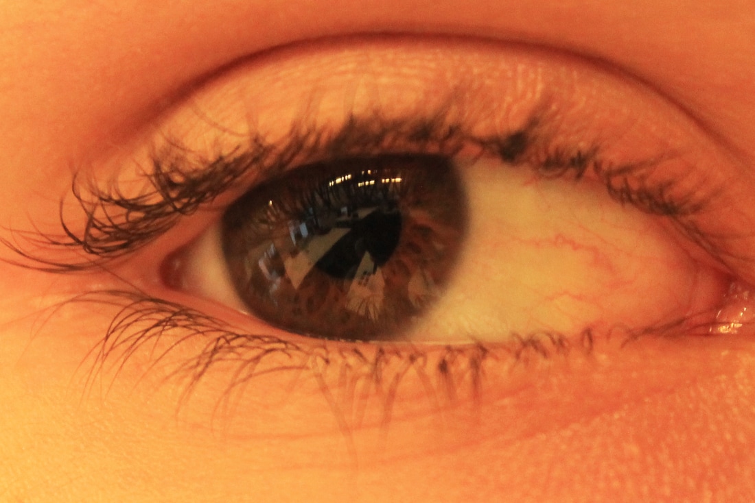
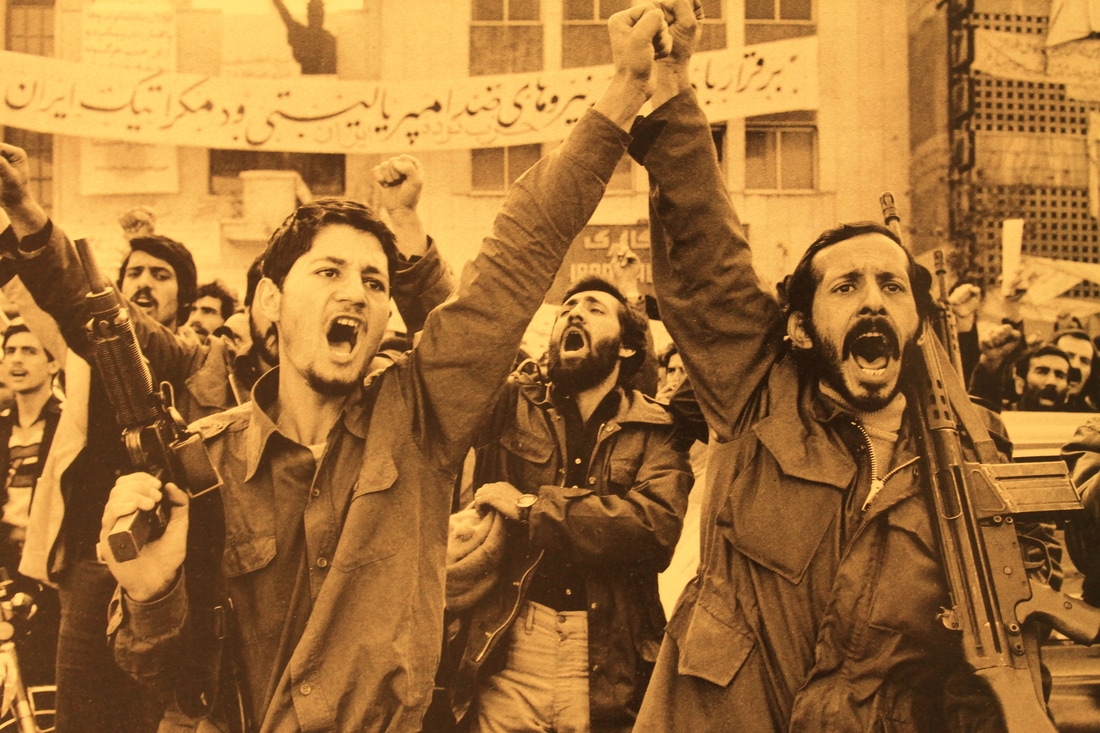
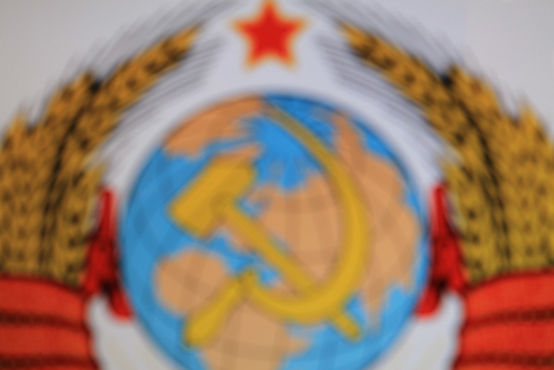
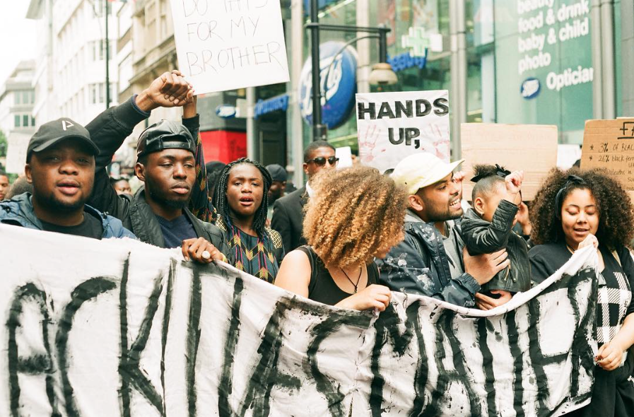
Subsequently to this, I included a self portrait of my eye (also fufilling the portrait catergory on the task list). I set the DSLR I was using to the closest manual focus, and took a number of shots of my eye - I subsequently scrolled though and selected the photos that were in focus. I also took this image of the eye, as the pupil and people's vision often focuses on what they want and desire. Not only this, but the circular pupil and iris visually can be likened to a globe (although this a rough visual idea), but also continuing the themes of the globe and world. Following this, I took a photo to fufil the criteria of taking a photograph of a photograph. I took a photograph of this protest from a Magnum photobook, mainly as this represents people fighting for what they believe in and strongly want. However, I don't think that this image corresponds particularly well to the previous image before it in the sequence. My final image fufils the criteria of a distorted and blurry image - as I manually defocused the subject before I took the photo. Following the image of a protest, I thought of the Soviet Union, as it was founded following revolution and uprising. Not only this, but it also strong correlates to wanting to get what they want - as the Soviet Union wanted to spread communism across the world and expand the Soviet Union. Not only this, but the emblem of the Soviet Union (with the Hammer and Sickle on top of the globe) continues the themes of the world and globalisation. As well as this, this communist symbol strongly contrasts with the previous themes of capitalism - particularly the clash of ideologies, and ideas of communal equality versus individual private ownership, property and wanting/consumerist desire. I decided to make this the distorted/blurring image as it is such a recognisable symbol even when blurred, and metaphorically it also represents the faded past of the Soviet Union, and faded dream of worldwide communism.
Subsequently to this, I included a self portrait of my eye (also fufilling the portrait catergory on the task list). I set the DSLR I was using to the closest manual focus, and took a number of shots of my eye - I subsequently scrolled though and selected the photos that were in focus. I also took this image of the eye, as the pupil and people's vision often focuses on what they want and desire. Not only this, but the circular pupil and iris visually can be likened to a globe (although this a rough visual idea), but also continuing the themes of the globe and world. Following this, I took a photo to fufil the criteria of taking a photograph of a photograph. I took a photograph of this protest from a Magnum photobook, mainly as this represents people fighting for what they believe in and strongly want. However, I don't think that this image corresponds particularly well to the previous image before it in the sequence. My final image fufils the criteria of a distorted and blurry image - as I manually defocused the subject before I took the photo. Following the image of a protest, I thought of the Soviet Union, as it was founded following revolution and uprising. Not only this, but it also strong correlates to wanting to get what they want - as the Soviet Union wanted to spread communism across the world and expand the Soviet Union. Not only this, but the emblem of the Soviet Union (with the Hammer and Sickle on top of the globe) continues the themes of the world and globalisation. As well as this, this communist symbol strongly contrasts with the previous themes of capitalism - particularly the clash of ideologies, and ideas of communal equality versus individual private ownership, property and wanting/consumerist desire. I decided to make this the distorted/blurring image as it is such a recognisable symbol even when blurred, and metaphorically it also represents the faded past of the Soviet Union, and faded dream of worldwide communism.
Gallery of my individual images
Overall, I was relatively pleased with the outcome of the narrative set of images that I made. I managed to fulfil each criteria point on the task, and I made quite a varied range of images. I think that the images correspond to the theme relatively well overall, but I think that they work much better as a set of images in relation to the theme, creating a narrative and each subsequent image moving along the story. I think that the images answer the title/theme better as a set, rather than individually. Also, I think that it may be difficult without an explanation to understand the narrative I tried to create, or how the images individually correspond to the theme.
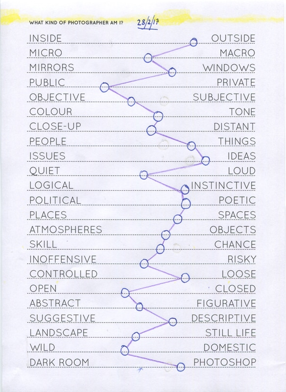
What kind of photographer am I?
I filled out this chart to further think about what type of photographer I am, particularly in terms of preperation for beginning photographing for my photobook. When drawing and placing my position on each scale, I was particularly thinking about what sort of photos I gernerally take. In terms of the headers, I generally thought about them quite literally, and thought about where the types of images I make fall on each scale. I think that this will help me when I am photographing and making images for my photobook, and it could help me narrow down a certain subject, depending on the sort of photographer I am. On the other hand, I could try to photograph at the other end of some of the scales, to try things that I hadn't previously.
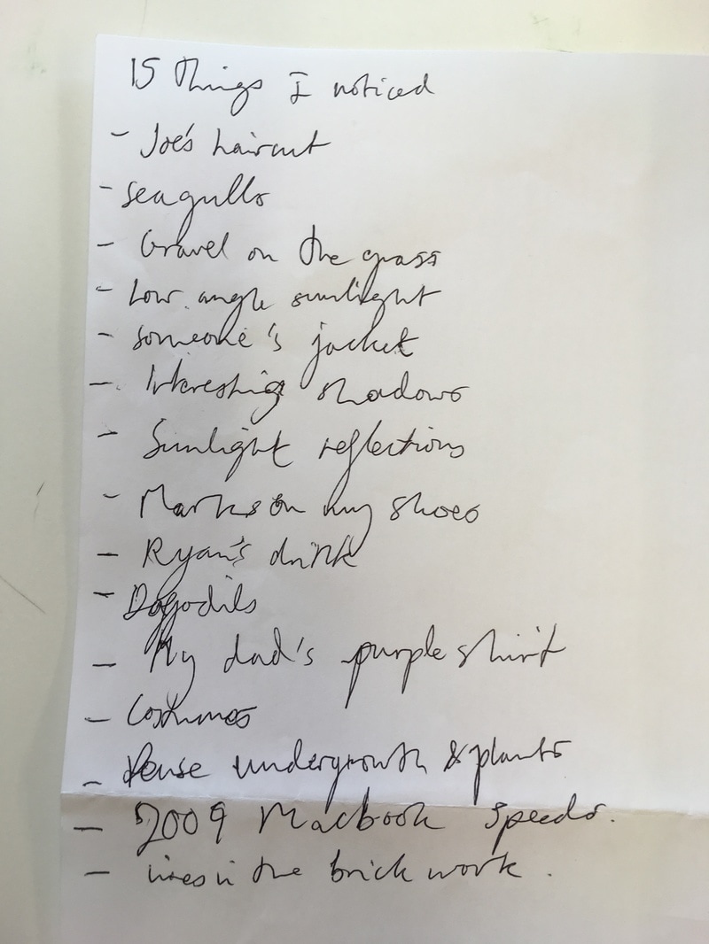
Noticings
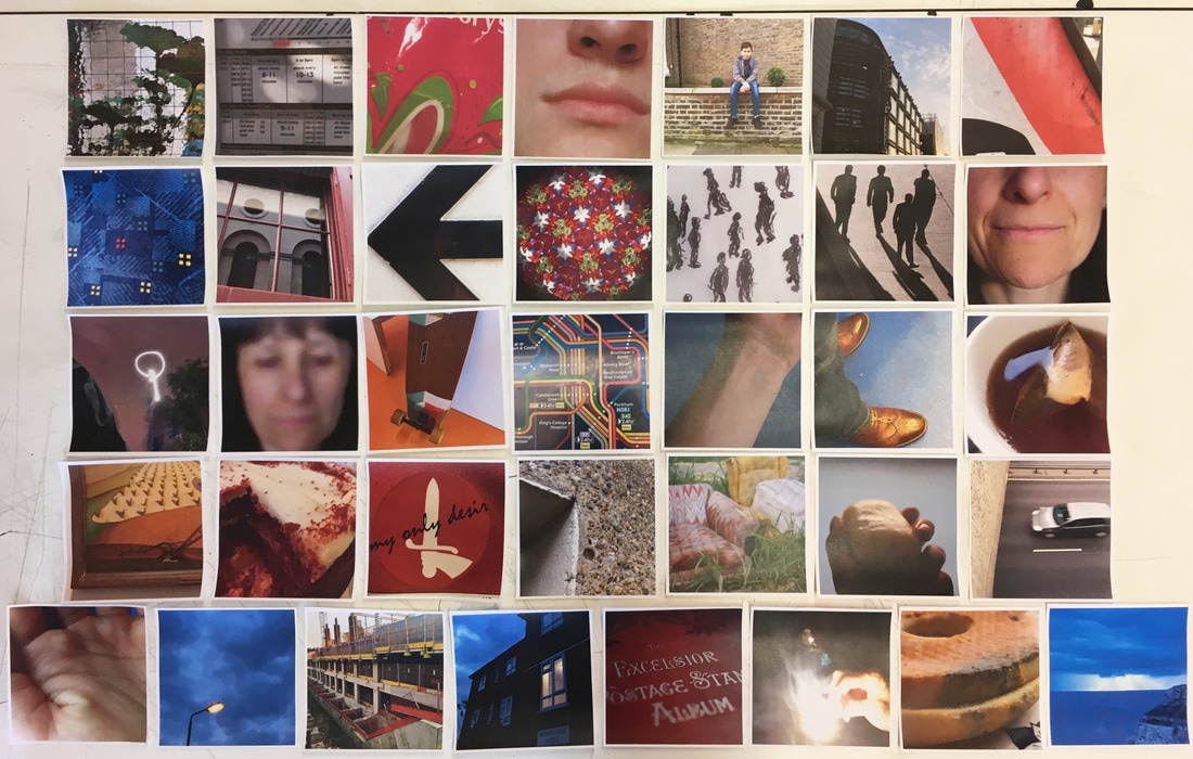
The purpose of making a set/sequence of images of things that I had noticed was mainly to start thinking about how I could sequence images, and think about how different images can relate to one another. To start with, I wrote a list of different things that I had noticed during the day. Overall, from my list of 15 things that I had noticed, I subsequently had around an hour to photograph as many of the things on the list as I could. As I had to photograph in school, I could only photograph things on my list that I had noticed at school, that I could also subsequently photograph.
List and first set of images
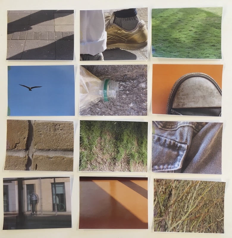
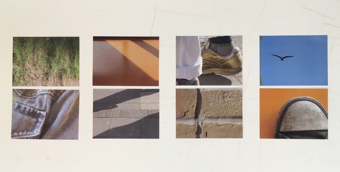
On the left is a photo of the list of 15 things I had noticed, and on the right is a photograph of the first set of photos that I had taken. I printed and laid out the first set of images that I had taken, so that I could decide on which photos to include in my final sequence - and decide which photos looked best alongside one another. Overall, I took photos of the majority of the different things that I had written on my list. However, in some cases I took a couple of different images for something that I had written. When laying out the images, I was mainly thinking about which images worked best beside one another, and how the photos looked as a set.
Narrowed down set of images
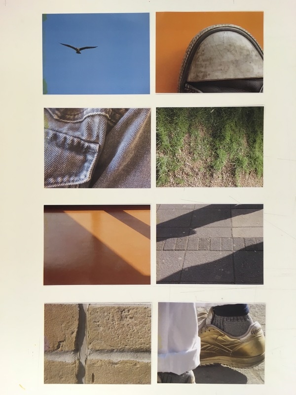
After looking at the different images placed side by side, I began to select the images I thought worked best, and narrowed down my selection of images as a whole. I found editing and selecting my favourite images from the set reasonably difficult, and I had to rearrange and look at my set of images a number of times to select my favourite images. After moving them around and reviewing my photos, I managed to select a set of 7 images that I thought worked best together visually. I had to think about the visual relationship of images with one another, as well as the individual images.
Playing with different ways to order & arrange my images
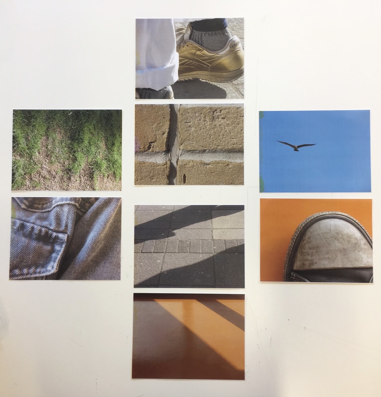
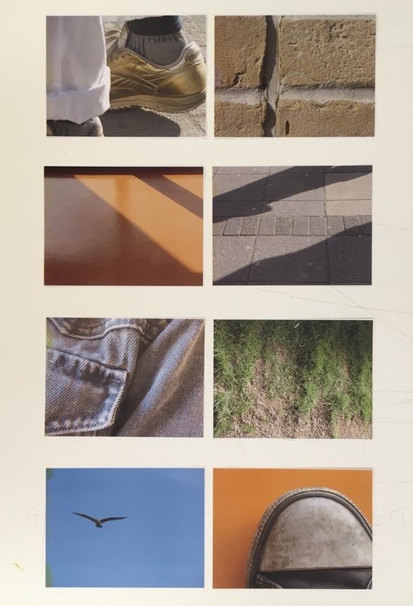
After I had selected my final set of images, I began to experiment and play around with how to order and lay out my images. I ordered the images both horizontally and vertically. In Particular, I was thinking about how images beside one another could relate - how different images could work next to one another as diptychs or as a set. I was also thinking about varying the images that were close to one another (for example I didn't want to have both orange images in a row), I wanted to vary and have differences between the images that were close to one another.

Placing images side by side
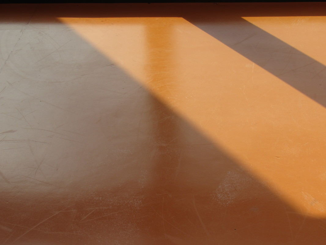
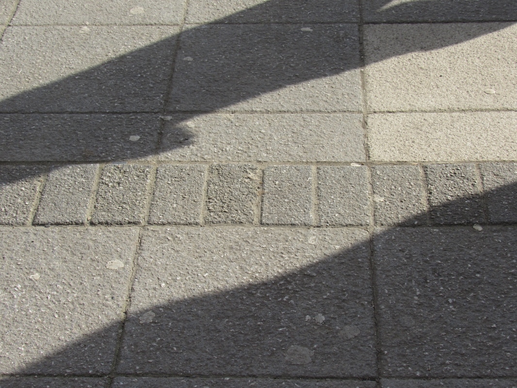
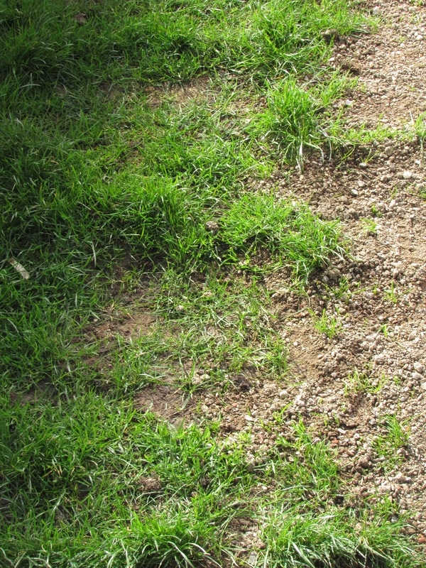
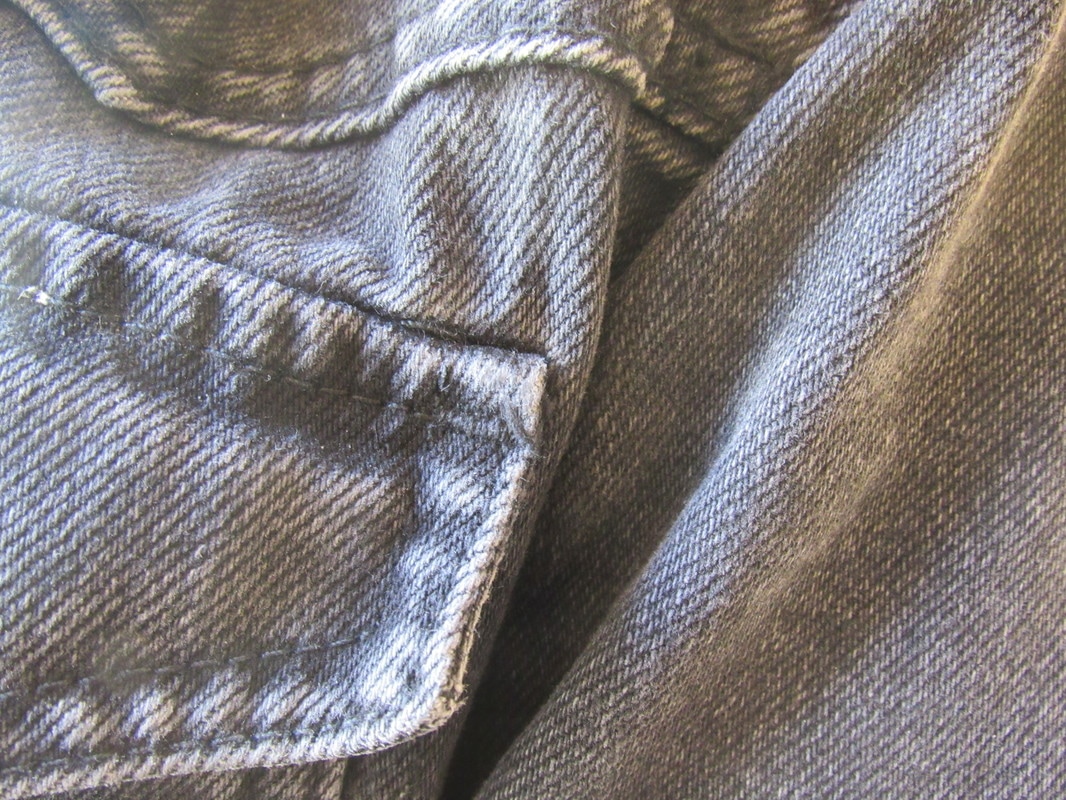
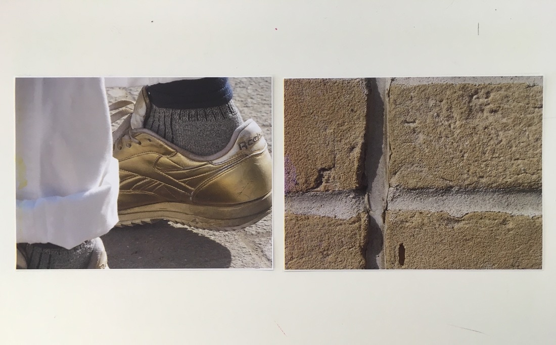
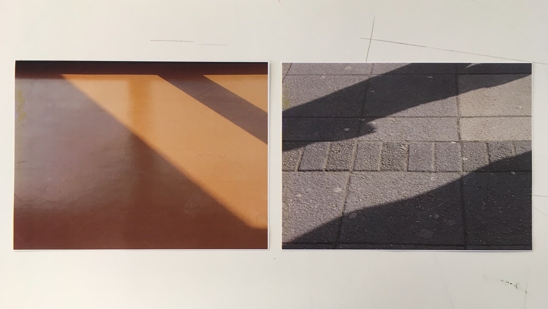
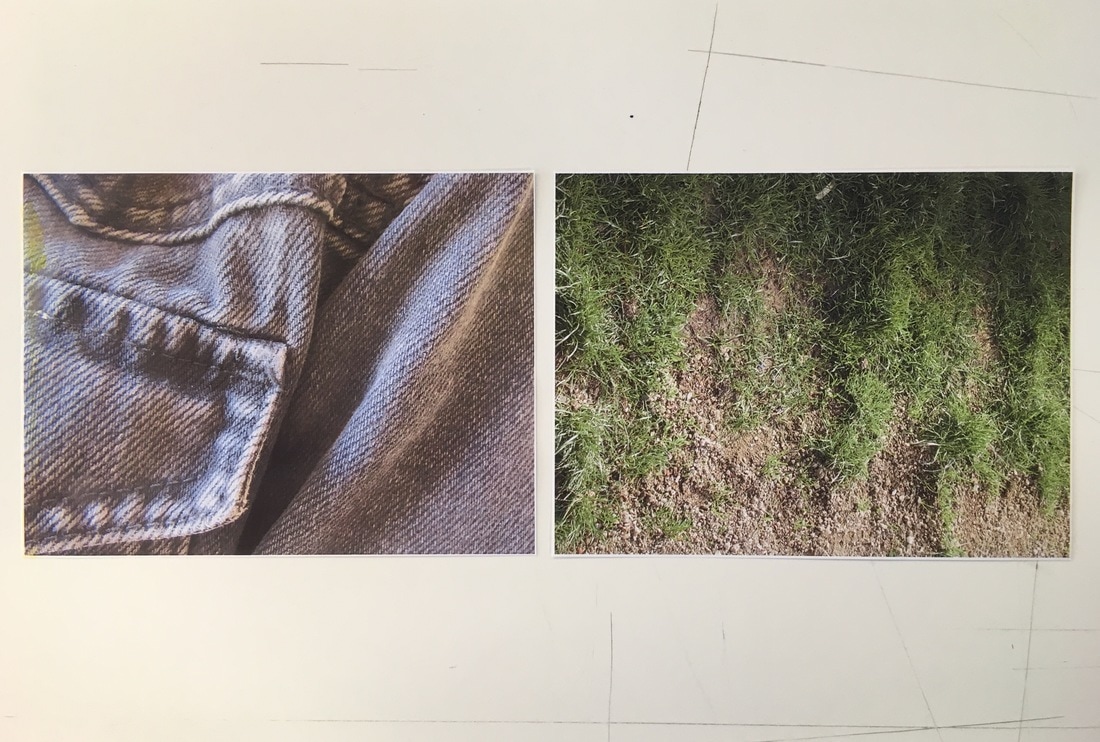
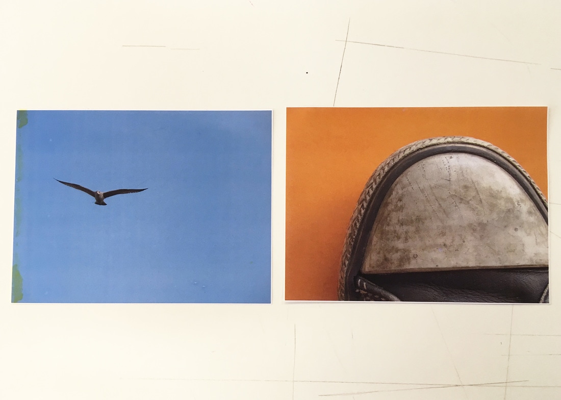
I not only thought about how I can order and layout my images, but also the visual relationships between images - and how I can place them together as a diptych. Although it took quite a lot of experimentation and playing around with placing images side by side, I placed certain images together as shown below. I placed certain images together as I thought that they had a visual relationship to one another in each case. For example, in the first images the images related to one another in terms of colour (both have brown/gold/yellow tones and some lighter tones), and also due to the composition with the vertical line of the leg on the left hand image, and the vertical line of the brick on the left hand image. After this, I put the two images with matching shadows together as they fit together like a mirror image, although this was completely by chance (both images were taken seperately and happened to have the same shadow shapes). The visual shapes of the shadows and sunlight in these images fit perfectly together, mirroring one another perfectly. After this, I put the close-up image of the jacket next to the grass as I thought that they work next to each other relatively well. both have a number of vertical patches of shadow and light areas, and the speckled pattern of the denim looks similar to the blades of grass and gravel; however, these images visually have slightly less in common. I placed the last pair of images together mainly due to the colours and partially due to their composition. In terms of colours, I placed them together as orange and blue are complimentary colours, and intensify one another. Overall, although it was difficult to place the images together as diptychs at first, I am quite happy with the outcome of these diptychs.
Final arrangement of images
This was the final arrangement of images that I put together. I decided to place the images beside on another as diptychs, and then order these images beside one another vertically. Visually, I thought that the diptychs worked best arranged horizontally in this order, after experimenting and switching around the organisation of images. I also wanted to varying the images horizontally (I didn't want to have two similar images on top of one another). I tried to space out images that were similar, in terms of colour particularly. After this task, I think I have greater ability to understand the relationship between images, and arrange these images together. This ability will help me for my photobook, where I will be arranging images beside one another and thinking about their relationship.
The List of Images
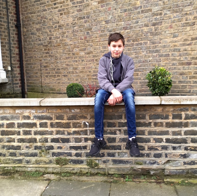
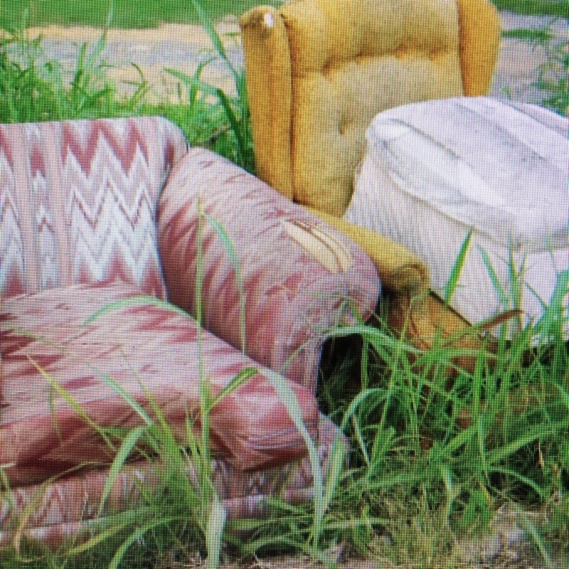
As part of looking into instruction based photography, a list of different subjects was compiled by the class. These were quite specific subjects, and each had to be photographed (although some subjects we had to photograph were quite unusual or difficult to find, or allowed some creative interpretation). Overall, some of the different subjects we had to photograph were harder than others - some were very hard to find. For example, I had to take a photograph of an image of discarded furniture from google images, as I simply couldn't find any discarded furniture. Also, I used my own creative interpretation for some non-specific/vague subjects. I also cropped all of my photos to square size, to have uniformity throughout my set of images. Overall, I found the photo list task relatively challenging as many of the subjects were so specific, and many were difficult to find. I am relatively pleased with the outcome of my set of images, especially considering how specific many of the subjects on the list were. This set of images took a couple of weeks to compile, but I enjoyed the challenge of the photo list overall.
THE LIST
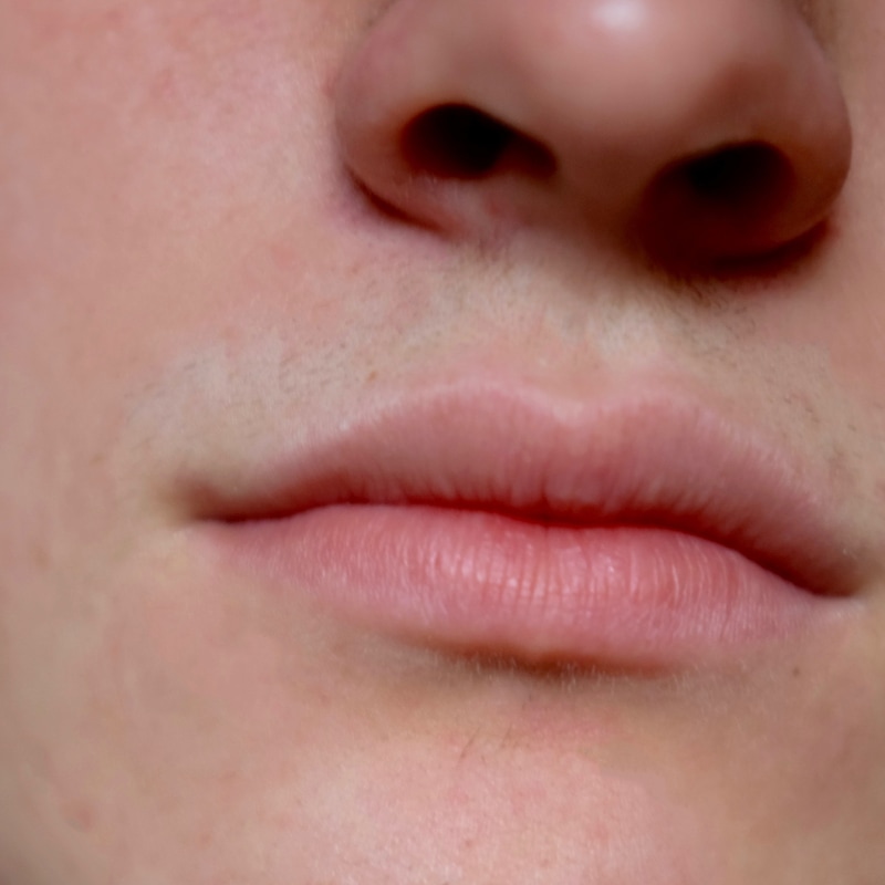
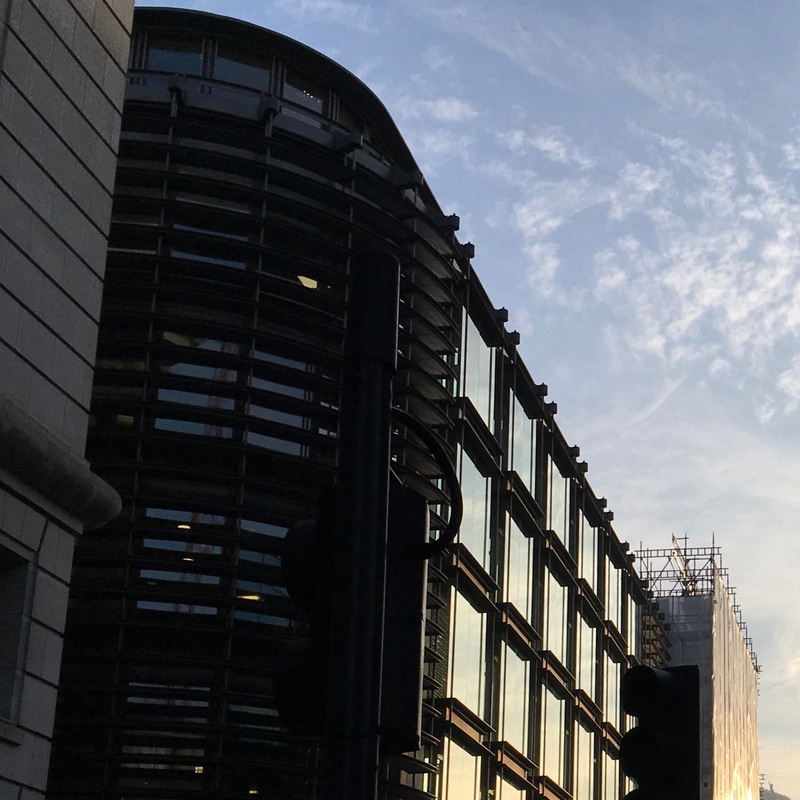
1. Corruption 2. Possibility 3. Artificial colour 4. A little one 5. Lips 6. Top corner of a glass building
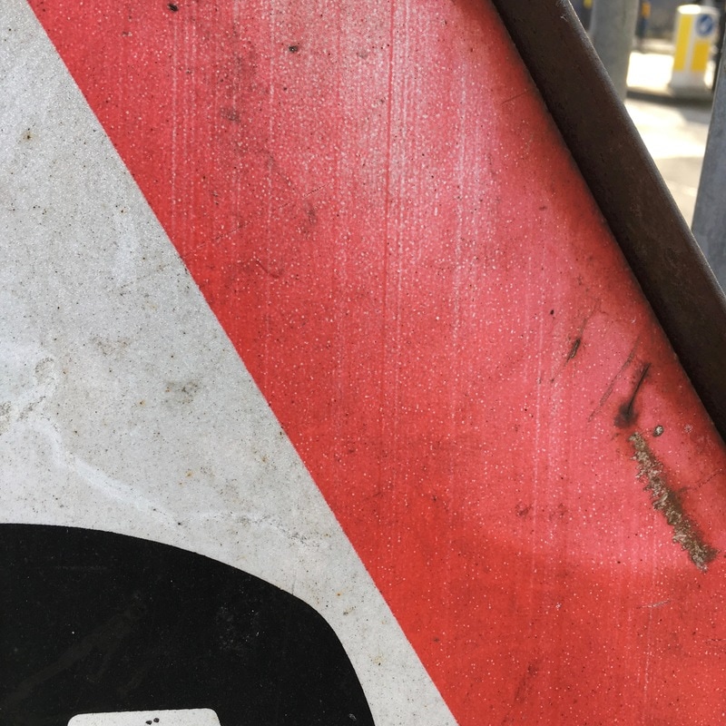
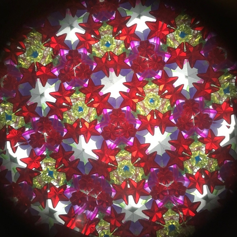
7. Red lines 8. Something that goes against the grain 9. Reflections 10. Triangles 11. Kaleidoscope
12. Beautiful imperfections 13. Silhouetted figures 14. A smile, close-up 15. A single balloon in the sky
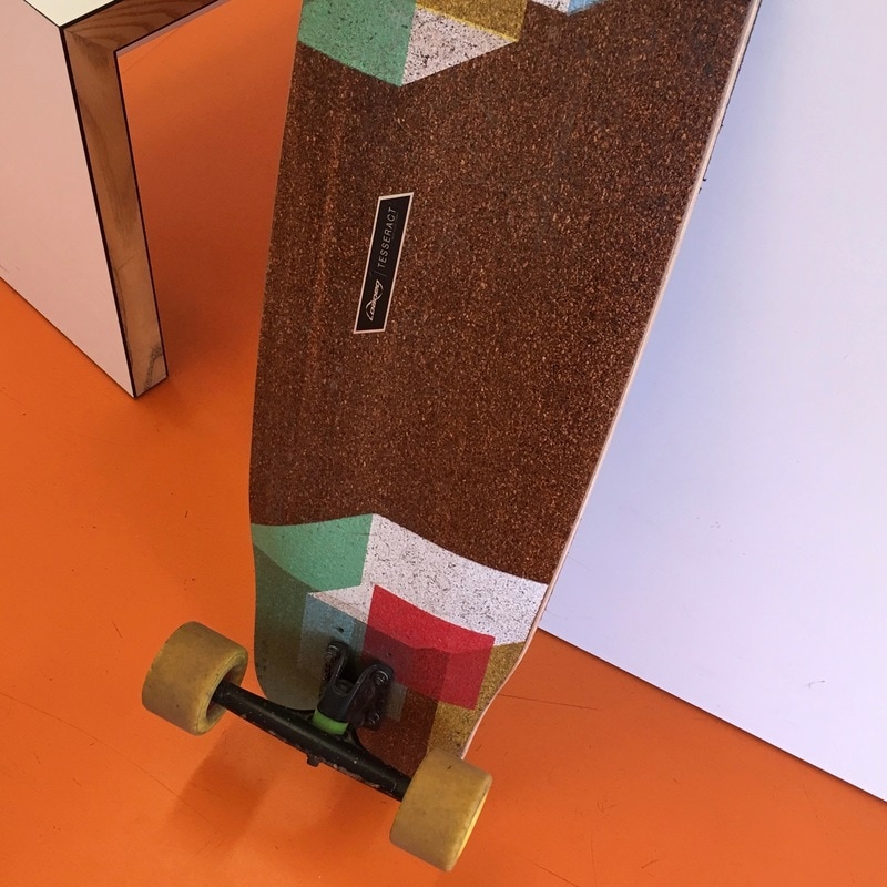
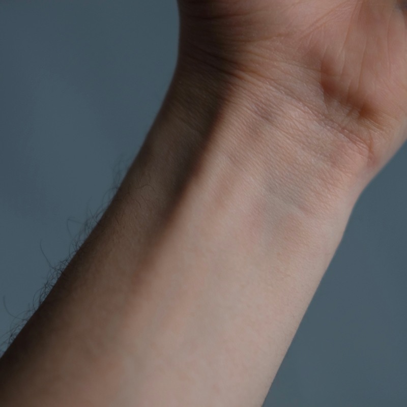
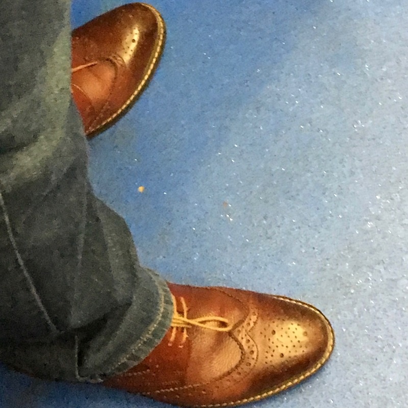
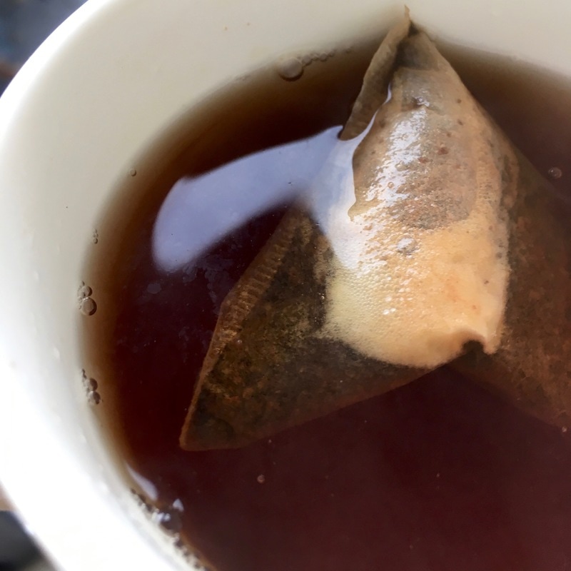
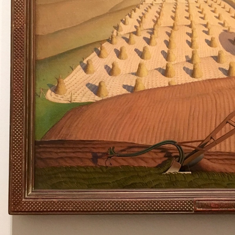
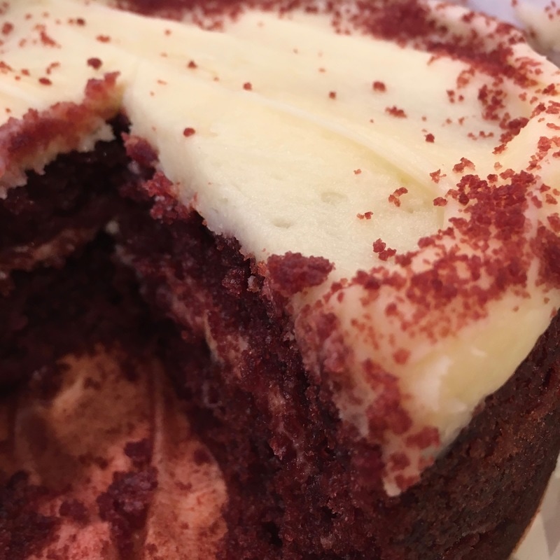
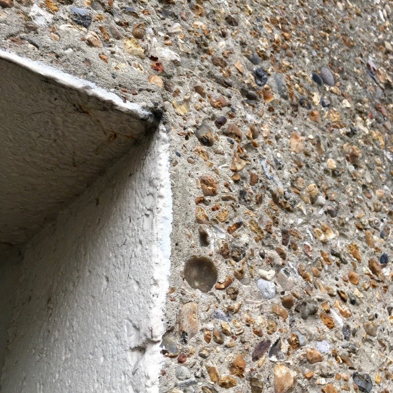
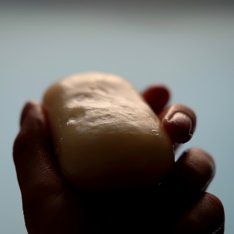
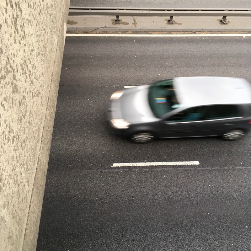
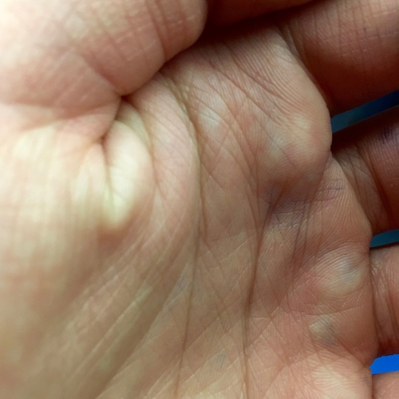
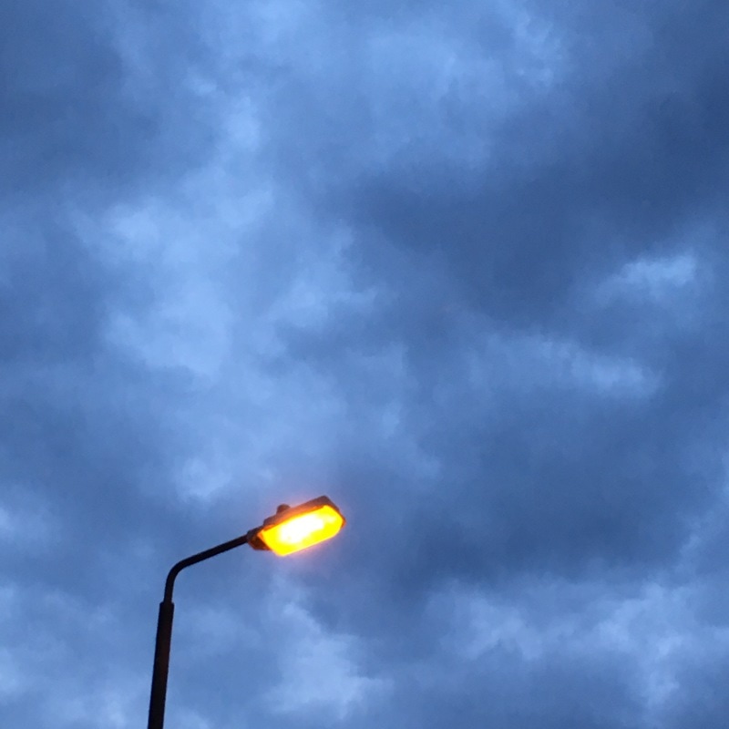
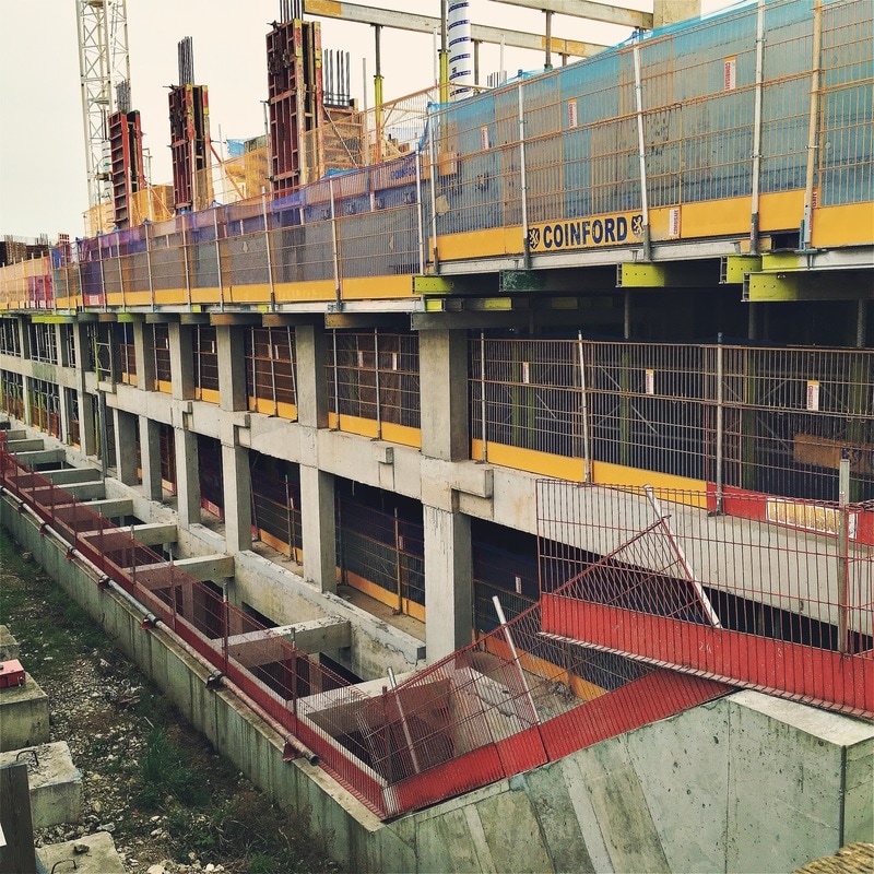
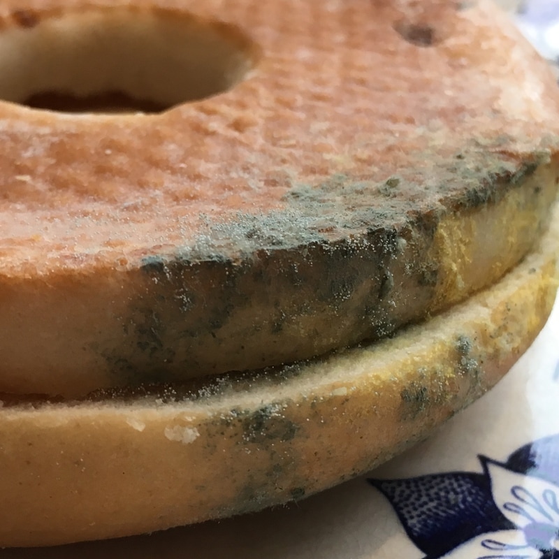
16. A blurry portrait 17. A skateboard 18. Something tangled 19. A non-erotic body part 20. A stranger’s shoes 21. A cup of tea 22. A painting with green in it 23. A cake 24. Discarded furniture 25. Desire 26. Concrete 27. A shallow focus image of a bar of soap 28. A dangerous place 29. Hands 30. The sound of silence 31. A building site 32. A spooky space 33. Something old 34. Smoke 35. Something rotten
36. Electricity
7. Red lines 8. Something that goes against the grain 9. Reflections 10. Triangles 11. Kaleidoscope
12. Beautiful imperfections 13. Silhouetted figures 14. A smile, close-up 15. A single balloon in the sky
16. A blurry portrait 17. A skateboard 18. Something tangled 19. A non-erotic body part 20. A stranger’s shoes 21. A cup of tea 22. A painting with green in it 23. A cake 24. Discarded furniture 25. Desire 26. Concrete 27. A shallow focus image of a bar of soap 28. A dangerous place 29. Hands 30. The sound of silence 31. A building site 32. A spooky space 33. Something old 34. Smoke 35. Something rotten
36. Electricity
My Response:
The Art of Instructions
Yoko Ono was the first conceptual artist who wrote art and photo instructions. At her 1961 exhibition at the AG Gallery, Yoko had several works that contained instructions for visitors to follow. For example, the 1964 book 'Grapefruit' was filled with instructions for visitors to follow. The Dadaists focused on making 'anti-art' after the First World War. Marcel Duchamp said that the artist doesn't need to make the piece of art, with a separation between the artist and art object. 'Fresh Widow' in 1953 was made by a carpenter who followed Marcel Duchamp's instructions and construction specification. John Cage was part of the New school for Social Research 1956-60, teaching artists on music - famous for making music by chance and instruction, often giving artists instructions to make music and instruction based classroom assignments; John Cage subsequently influenced a generation of artists associated with Fluxus. Sol LeWitt an artist associated with the minimalism art movement, who focused on fabrication form instructions (where ideas are more important than things made), and moved towards conceptual art. His exhibitions also involve instructions, which are followed to create art by craftspeople. Lucy Lippard was also a creator who made exhibitions based on numbers, especially different populations, often asking artists to send in various instructions. Erwin Wurm made sculpture instructions, as well as exhibitions with instructions for visitors. In his exhibitions, Erwin Wurm placed instruction drawing and texts by objects in a gallery. Visitors perform these instructions, and occasionally documented by the artist. Hans Urich Obrist made a book called 'Do it', which was full of various instructions for readers to follow. It was a constantly evolving exhibition, with the work exhibited being created from instructions that were submitted by artists.
Instruction given to me
'Gather as many different types of flowers as you can. Photograph the flowers as a still life or throw them in the air and photograph them'
As part of looking at instructions in art, we were given a random instruction written by a member of the class. Initially, I did not like this instruction when it was given to me. I thought it was too specific as the task had very specific instructions for both the subject I had to photograph, and the way in which I had to photograph the flowers. Not only this, but I thought it would be quite difficult to source a wide range of flowers, as I only had a couple of types of flowers in my garden. I approached the task initially by gathering the resources I needed - I had to ask for some spare flowers from a local florist.
I approached the task by taking the instruction quite literally, and photographing exactly how the task instructs. I gathered all of my flowers and arranged them in a still life in my garden, as I wanted to have quite a natural background for the flowers. I arranged as many flowers as I could, as directed by the instruction. I photographed the still life from above, zooming in quite tightly on the arrangement, but including the whole still life. After this, I took some photographs of the flowers being thrown in the air, another instruction directed by the task. My mum had to throw them in the air, as it was too difficult to throw them myself and photograph them whilst they were in the air. I had to hold down the shutter, and take a number of photographs in rapid succession whilst the photographs were in the air - this was quite difficult.
I approached the task by taking the instruction quite literally, and photographing exactly how the task instructs. I gathered all of my flowers and arranged them in a still life in my garden, as I wanted to have quite a natural background for the flowers. I arranged as many flowers as I could, as directed by the instruction. I photographed the still life from above, zooming in quite tightly on the arrangement, but including the whole still life. After this, I took some photographs of the flowers being thrown in the air, another instruction directed by the task. My mum had to throw them in the air, as it was too difficult to throw them myself and photograph them whilst they were in the air. I had to hold down the shutter, and take a number of photographs in rapid succession whilst the photographs were in the air - this was quite difficult.
My Response:
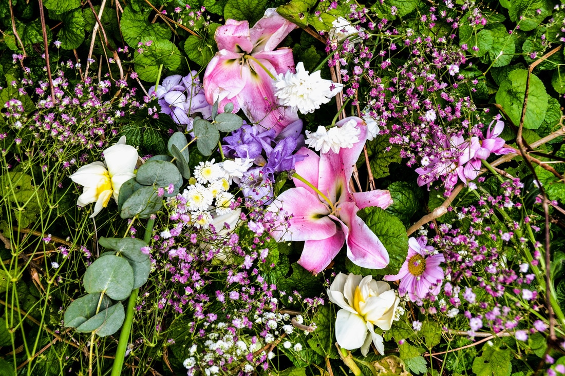
Overall, I was relatively pleased with the outcome of the photographs, considering how restricting and specific the task was. I answered the task and took the instructions quite literally - I didn't really give my own interpretation of the instruction. Personally, I prefer the flowers being thrown in the air because I like the different shapes created by the flowers against the sky. I am relatively pleased with the photograph of the still life arrangement of flowers, but it is quite a simple and straightforward still life as directed by the task. As the task said to gather as many flowers as possible, I included all of my flowers bunched together in the still life. I thought the task was quite restricting in this respected, and I couldn't really give my own interpretation. Overall, I didn't really like the task as I found it too restrictive, and the instruction was too specific. Personally, I do not mind constraints, but I like to have a bit of room and ability to give my own interpretation. However, this instruction didn't really allow me to give my own interpretation.
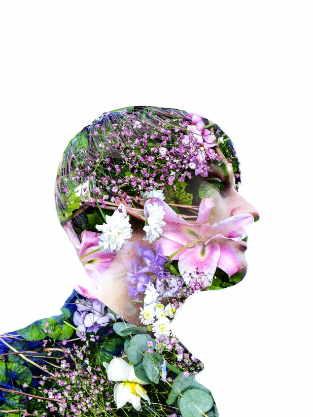
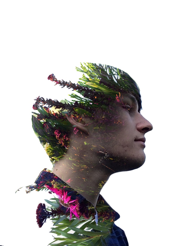
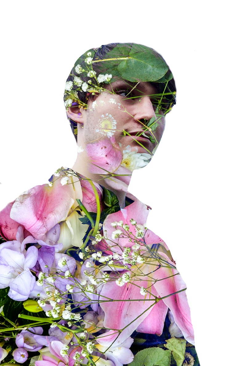
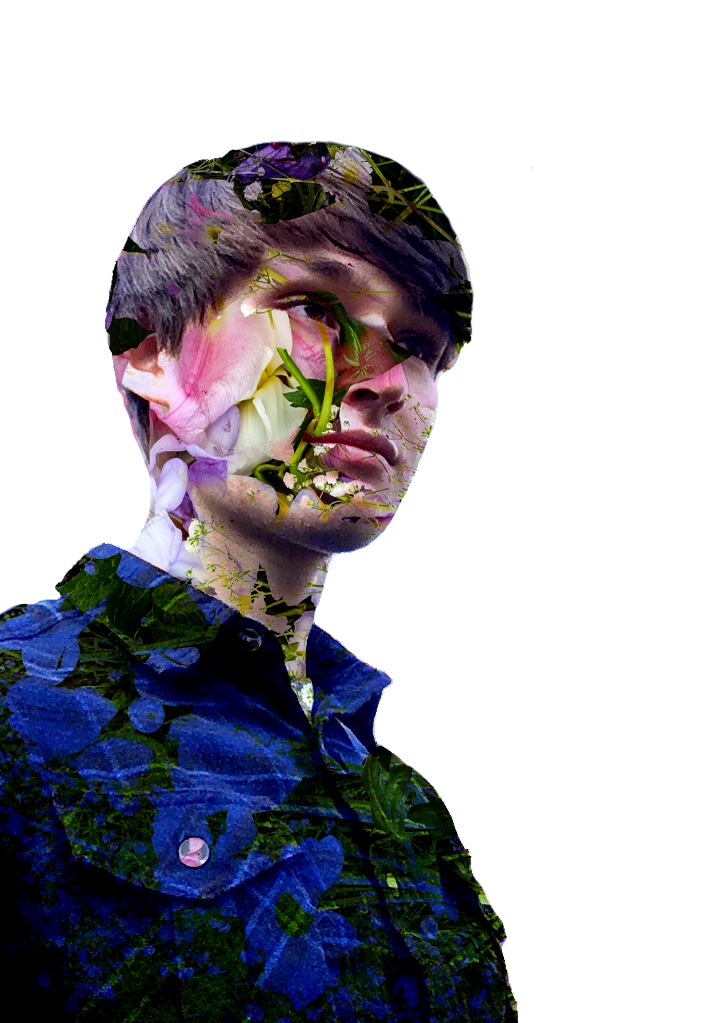
My Interpretation - Digital manipulation
After following this rigid instruction quite carefully, I then wanted to give my own interpretation and create my own work independent of the instruction. I thought that the various images of the flowers I had taken would be good to include in a double exposure manipulation . I had made a number of double exposure manipulations in the past on photoshop, and I really like the effect it creates.
To create these manipulations, I firstly took a number of self portraits against plain backgrounds. In Photoshop, I opened these images and used the eraser tool to remove the background. To get quite a smooth, clean edge, I had to reduce the size of the eraser brush and reduce to hardness; I also increased the clarity and contrast in the photos of myself. I then filled the background with white using the paint bucket tool, so that I would have a clear background. After this, I opened a number of images I had taken of the flowers, and placed this layer behind each layer of my self portrait. After this, I changed the layer blending mode to 'multiply', so that the flowers in the layer underneath appeared in the portraits of myself. I made 4 double exposures, and I was pleased with the result of the manipulations. I particularly like the textures and colours of the flowers emerging through my face.
To create these manipulations, I firstly took a number of self portraits against plain backgrounds. In Photoshop, I opened these images and used the eraser tool to remove the background. To get quite a smooth, clean edge, I had to reduce the size of the eraser brush and reduce to hardness; I also increased the clarity and contrast in the photos of myself. I then filled the background with white using the paint bucket tool, so that I would have a clear background. After this, I opened a number of images I had taken of the flowers, and placed this layer behind each layer of my self portrait. After this, I changed the layer blending mode to 'multiply', so that the flowers in the layer underneath appeared in the portraits of myself. I made 4 double exposures, and I was pleased with the result of the manipulations. I particularly like the textures and colours of the flowers emerging through my face.
Making photobooks
Zines
Zines involve making your own DIY photobook. Zines can be printed in a number of ways, you can print yourself or use professional services. To make a zine, you could use a number of different methods to print the images on a variety of different types of paper, and then bind the different pages together in a number of ways. The ways that you can bind the books can include stitching, Japanese binding and you can also make small booklets where the pages are stapled, as well as newspaper zines where the pages can be simply layered/folded together or stapled. A DIY book can also be made by experimenting with printing, to construct a series of basic hand made books.
Photo zines can be printed on newsprint, and a number of companies print photo zines in a newspaper format. As well as this, paper can be folded or glued to create a booklet. Due to the materials, this is generally cheaper to produce compared to a high quality publication.
Photo zines can be printed on newsprint, and a number of companies print photo zines in a newspaper format. As well as this, paper can be folded or glued to create a booklet. Due to the materials, this is generally cheaper to produce compared to a high quality publication.
Printing on demand services
There are a number of different websites and services that offer print on demand services. These include sites such as Blurb, Photobox, Vistaprint etc. These websites and services allow you to print and upload your own photographs to be professionally in a photobook. These websites allow you to upload images that can be arranged for a photobook on print on demand websites, or you can arrange your photobook photographs on programs like Adobe InDesign, subsequently for printing. Not only this, but these print on demand wesbites allow you to select the different types of print and paper to include in your book and customise your book. You can choose the type of book to create (hardback, softback etc.) as well as the number of pages you want to include. Although these photo books are quite expensive to produce, the main advantage is the quality of the book and prints, as well as the ability to format and organise your photos in your book. I think that I am likely to use print on demand services, as I want the prints to be high quality, and the book to be good build quality. This is because I want to focus more on the photos themselves in my photobook, rather than experimenting with different types of making photobooks or binding etc.
More Photobook inspiration: Artists & Photographers
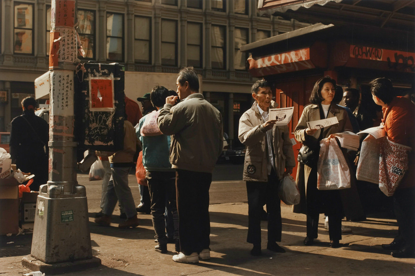
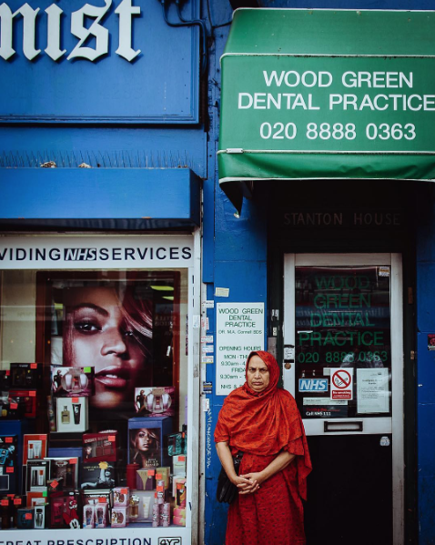
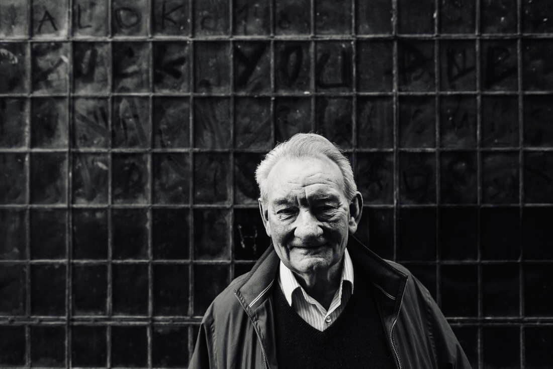
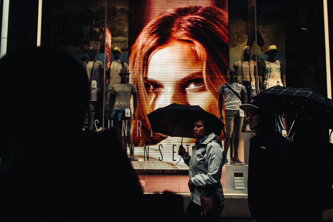
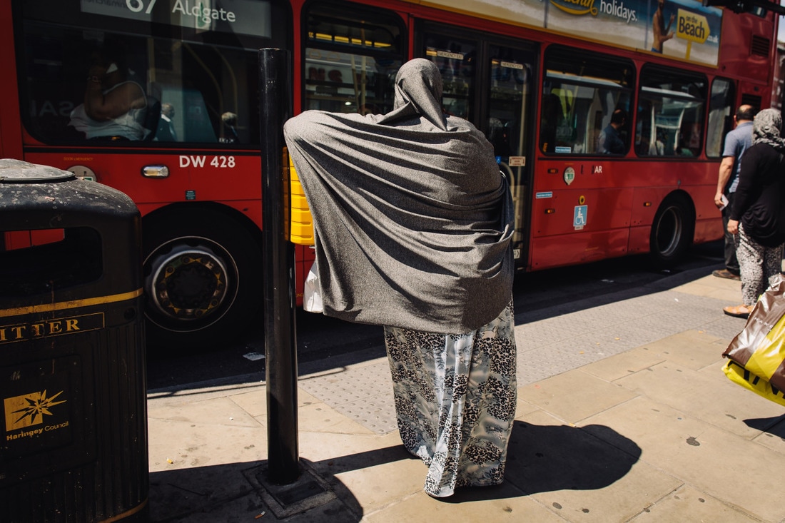
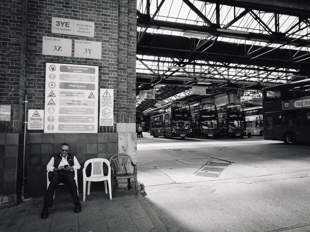
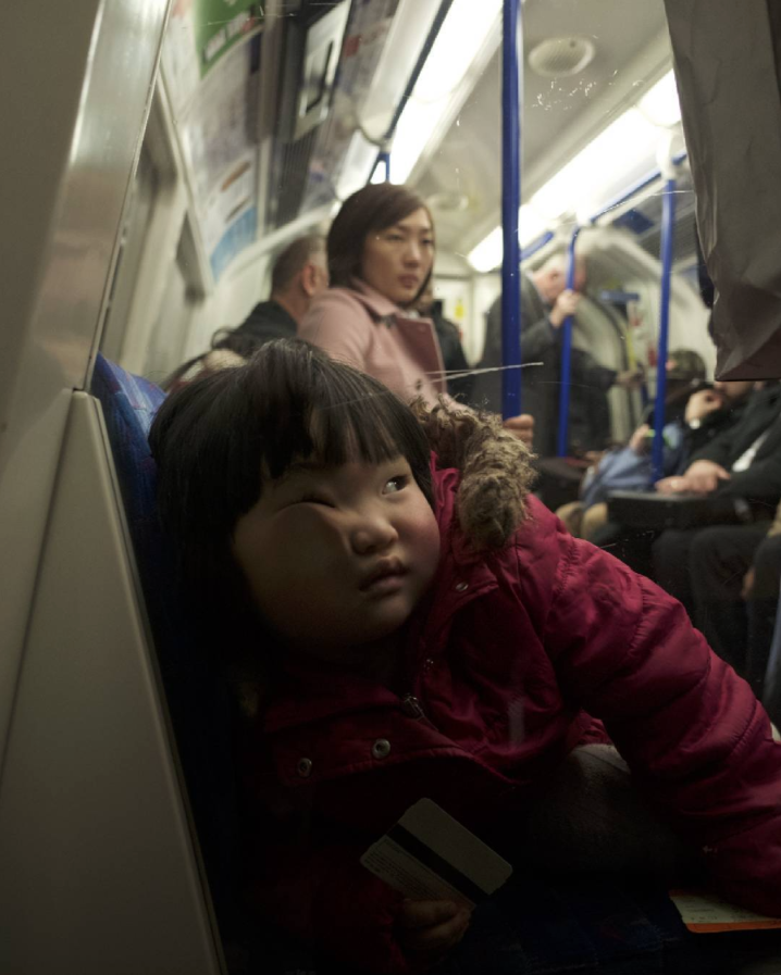
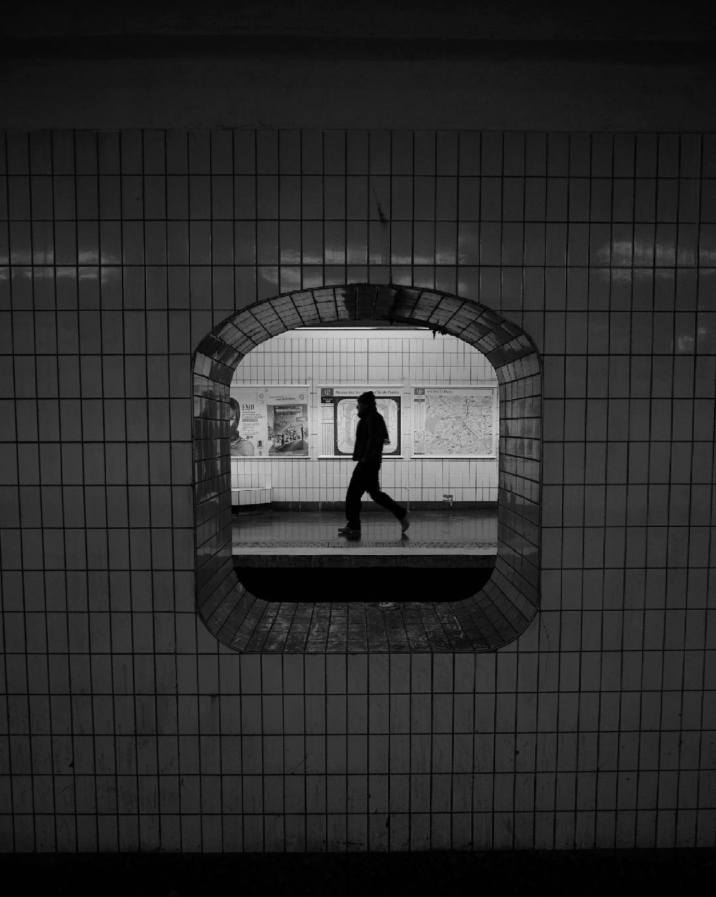
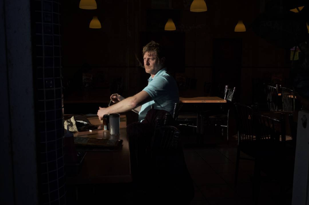
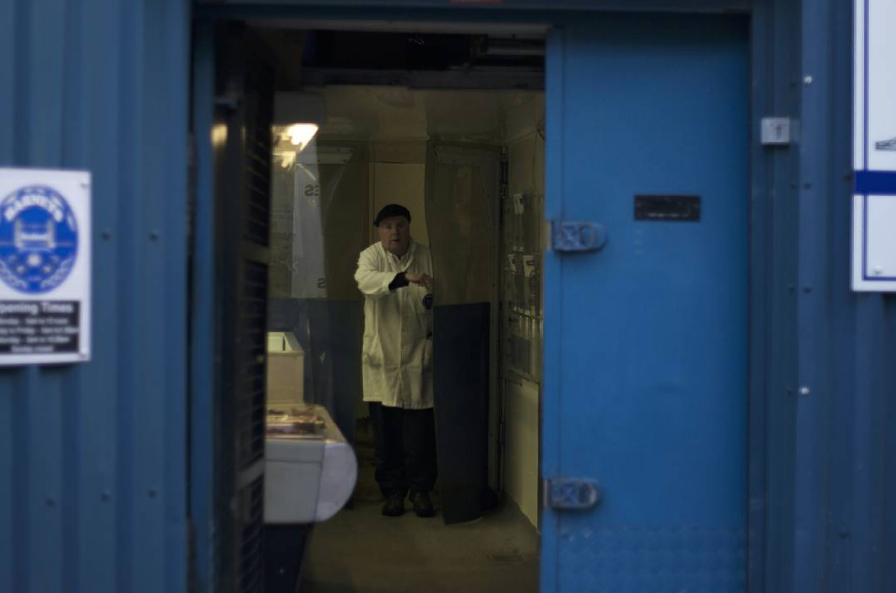
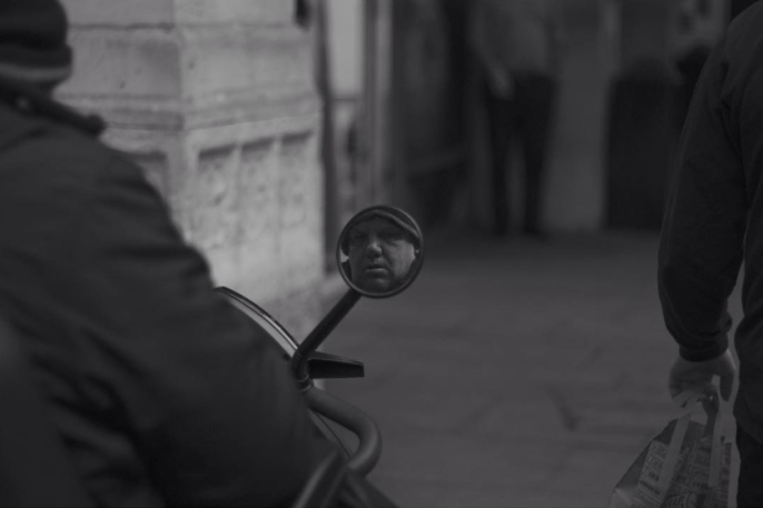
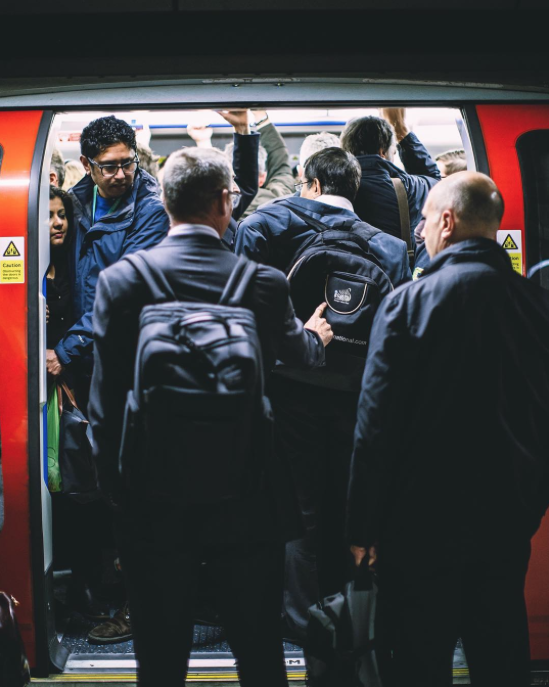
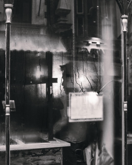
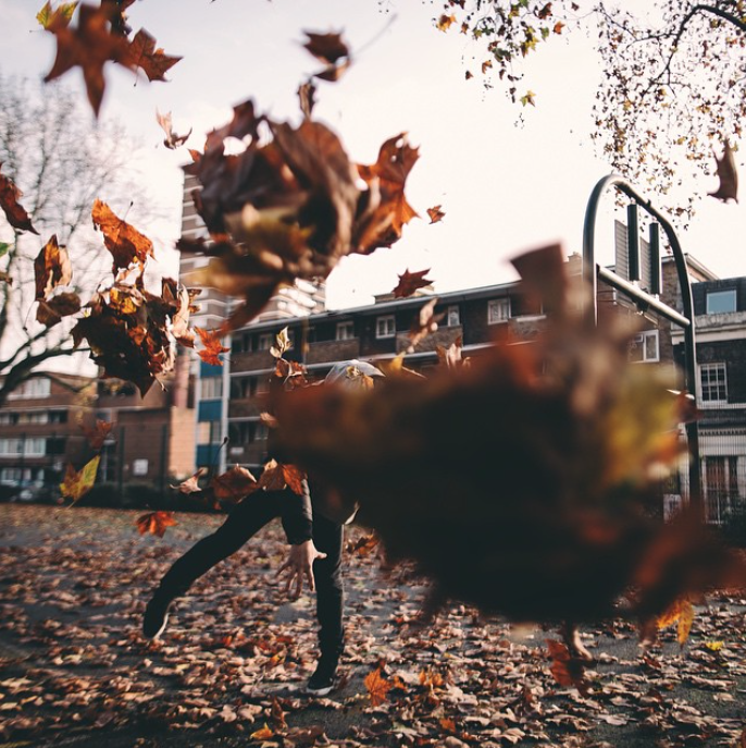
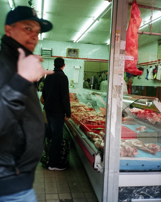
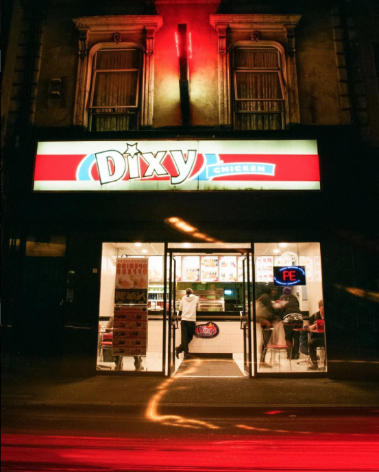
For my photobook, am I planning to focus on street photography. I am very interested in street photography, and a range of different street/documentary photographers. Not only this, but I want to look at this genre/style of photography in greater depth and do some of my own street photography. I haven't done much street photography in the past, and it is something I would like to try and improve myself. As part of my interest in street photography, there are a number of different photographers that I like, who focus mainly on street photography. These photographers can particularly inspire the images that I take. Below are a number of my favourite photographers, particularly as I really like the style of their street photography.
Individual Photographers I used as inspiration:
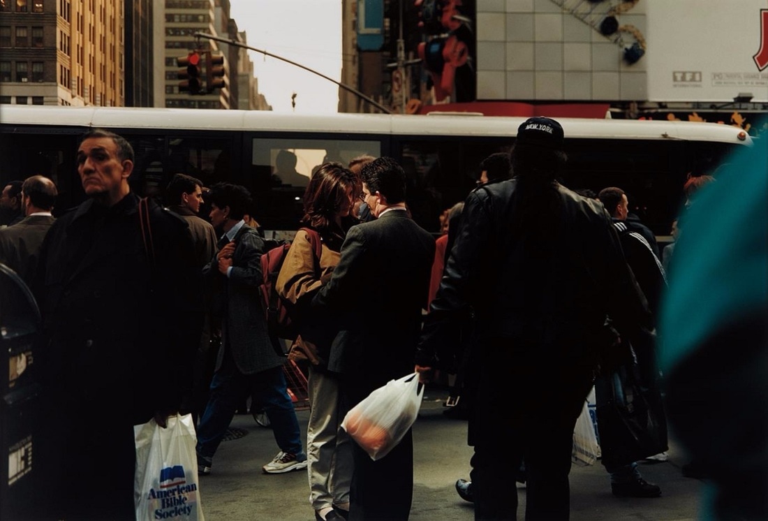
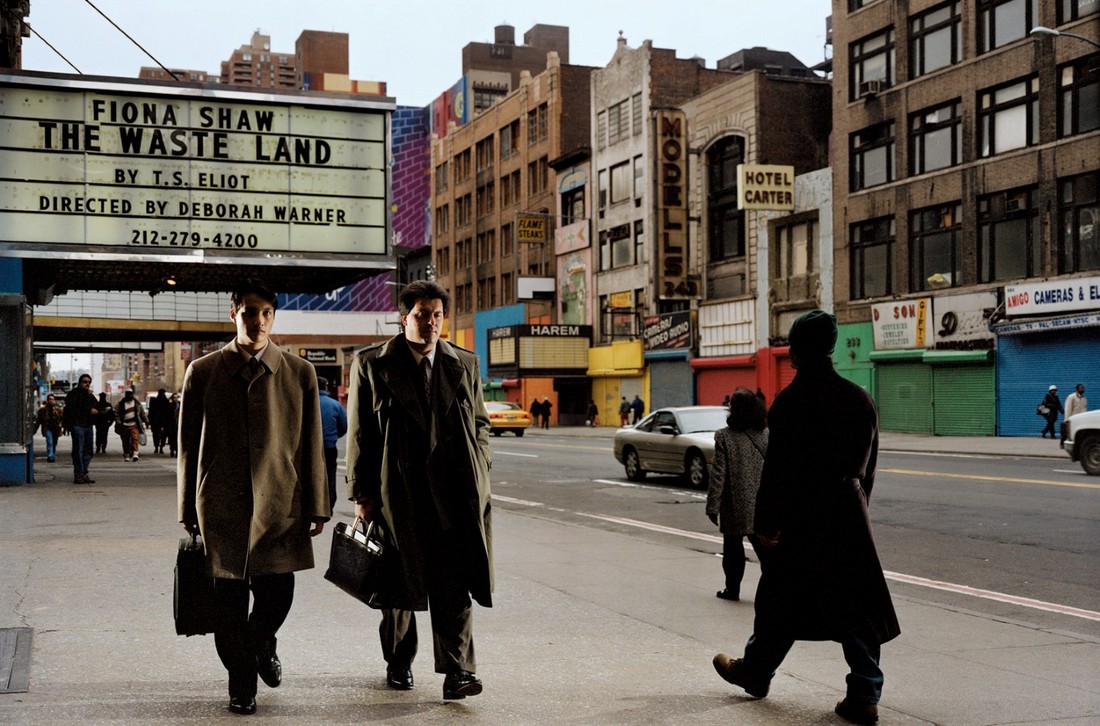
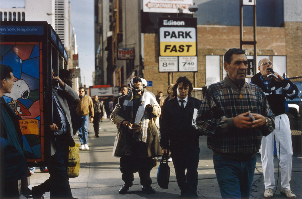
Jeff Mermelstein
Gallery of his photography:
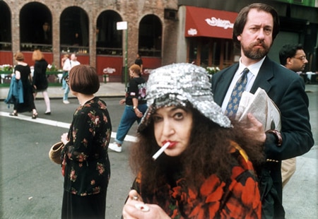
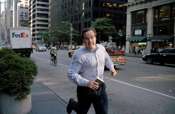
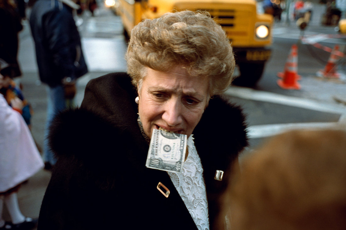
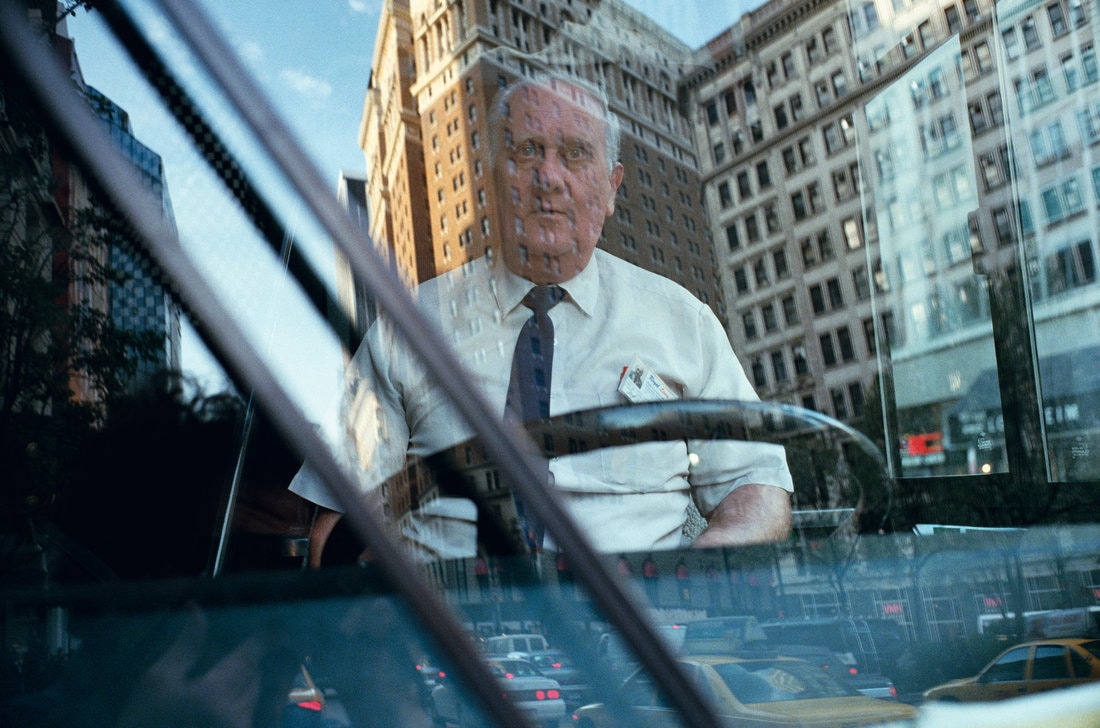
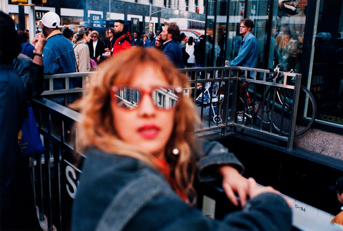
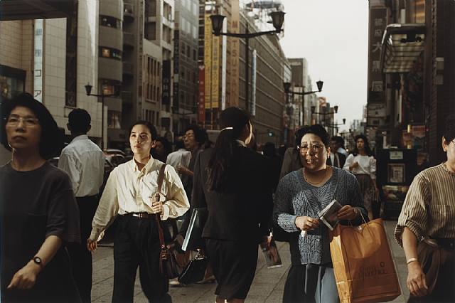
Jeff Mermelstein is a photojournalist and street photographer from New York. He creates a range of different styles of street photographs, and his photos are often quite humorous. He captures life on the streets of New York, and often photographs interesting, unusual details that he spots when wandering the streets. He can often make an ordinary, dull scene seem intereting and unusual. Not only this, but his Instagram account (click here) contains a range of very interesting and unusual details and compositions - often cropped very tightly and photographed close up though a telephoto lens connected to his iphone. I looked at Mermelstein for inspiration as he picks out very interesting details (something I would like to so in my photography), and takes some interesting street portraits and documentary images as well.
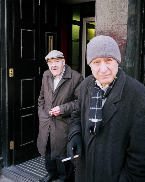
Beat Streuli
Gallery of his photography:
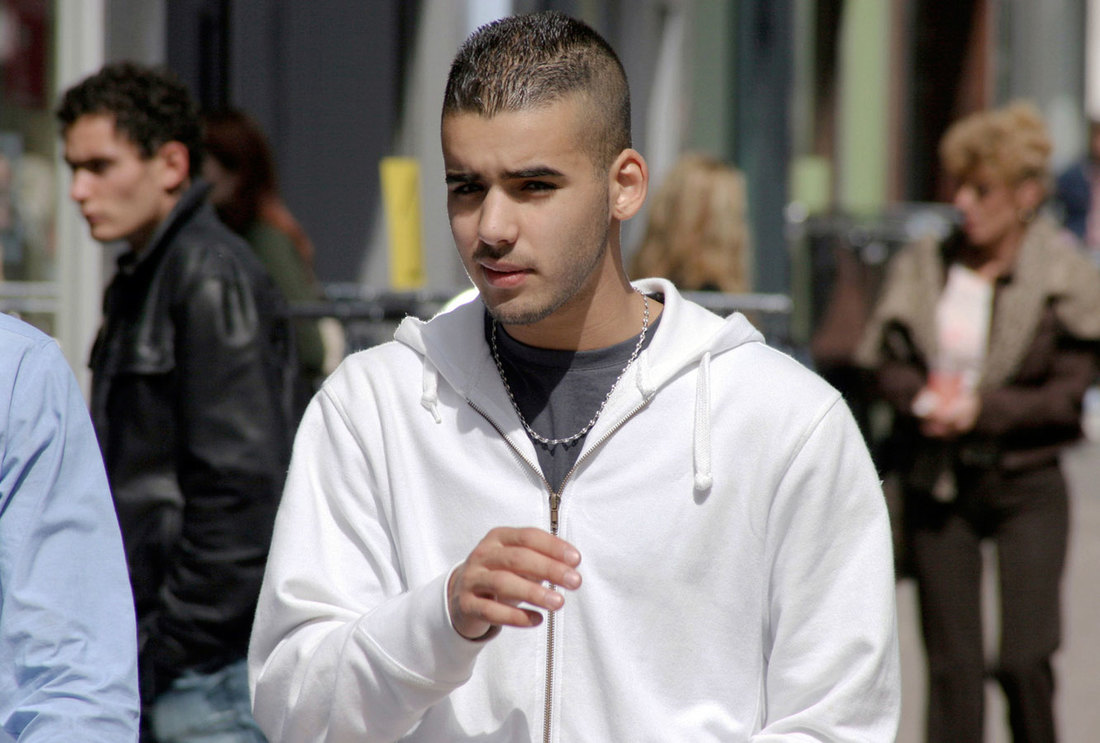
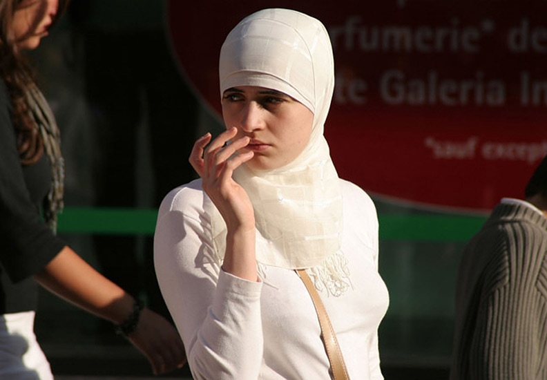
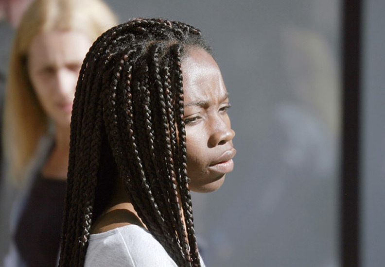
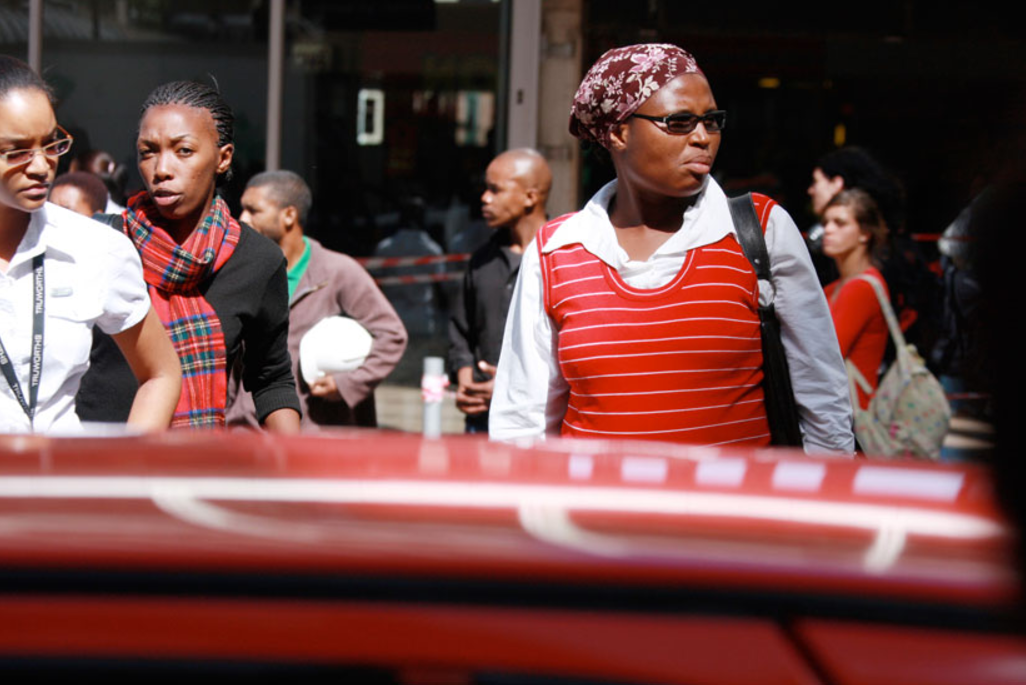
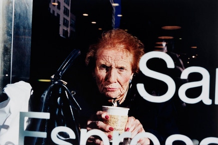
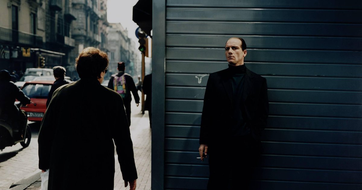
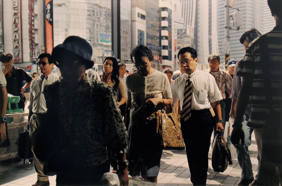
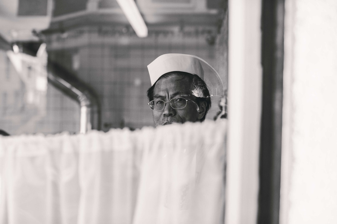
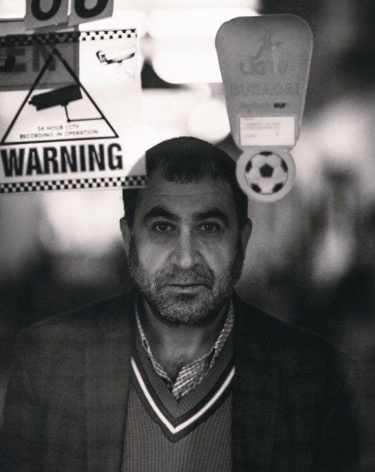
Beat Streuli is known mostly for his street portraiture, documenting a range of different people on the streets. As obvious in the images, Streuli uses a Telephoto lens, zooming in closely on the subject. In his framing, Streuli focuses quite closely on the subject, without revealing much context or much of the subject's surroundings. As he uses a long, telephoto lens, he can photograph his subjects from relatively far away, without them being able to tell. I quite like Streuli's unusual style of street photography, as most street photography is shot quite close-up to the subject. Streuli captures some good portraits, with the subjects looking natural, going about their daily business. I have researchd Streuli as I'd like to try focusing quite closely onto specific subjects when photographing. I'd like to try to photograph subjects similarly to Streuli, but get slightly closer to the subjects.
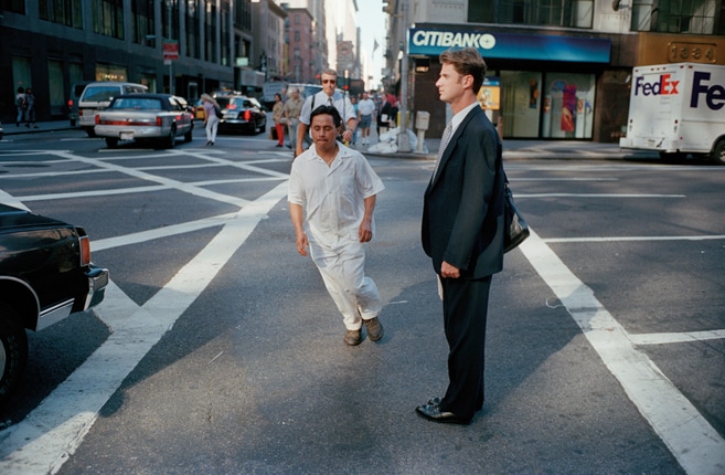
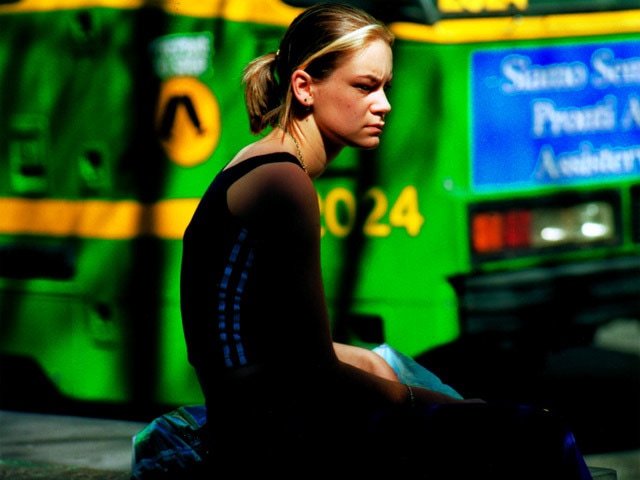
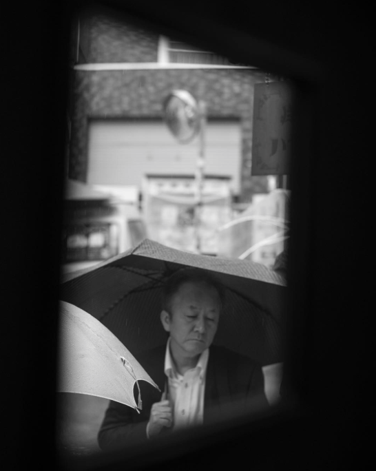
Philip-Lorca diCorcia
Gallery of his photography:
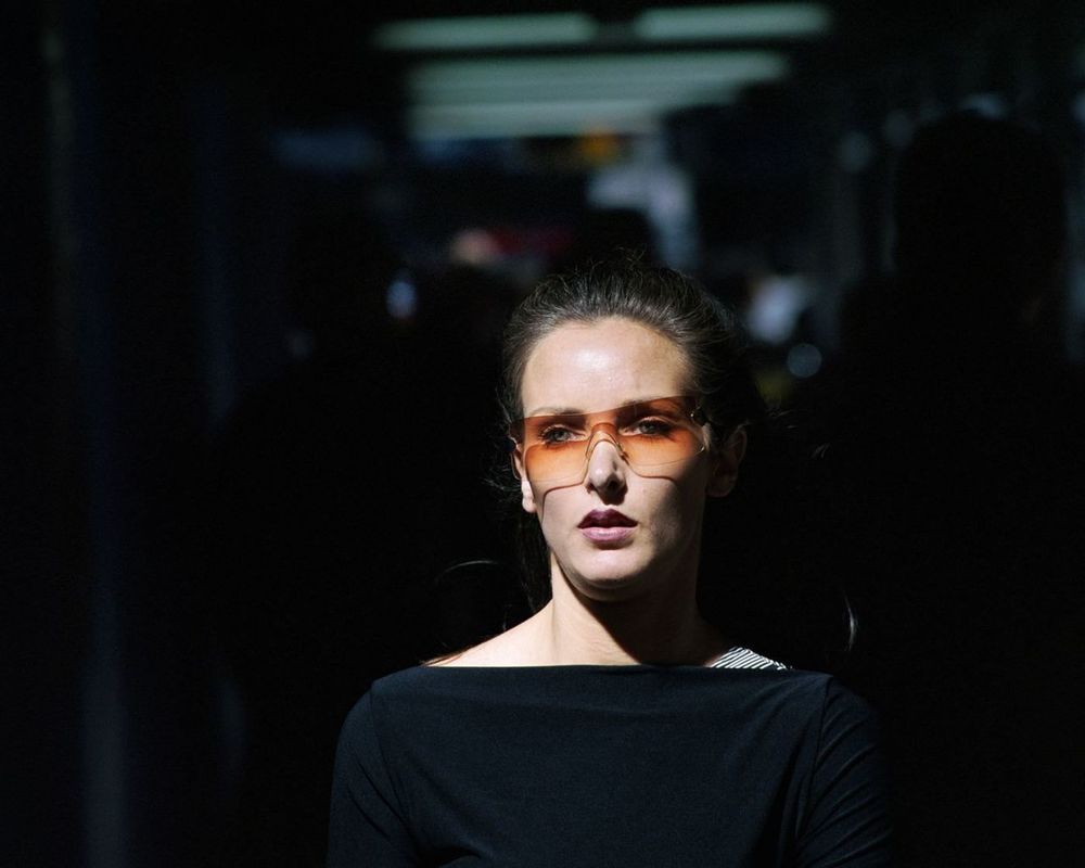
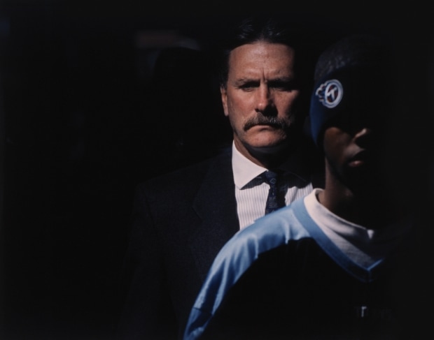
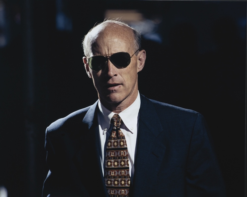
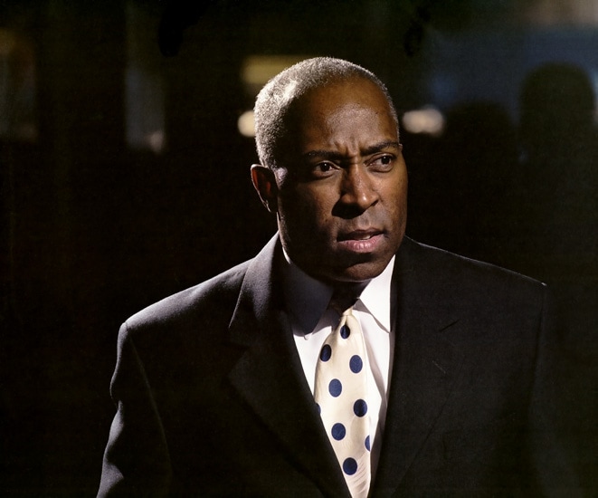
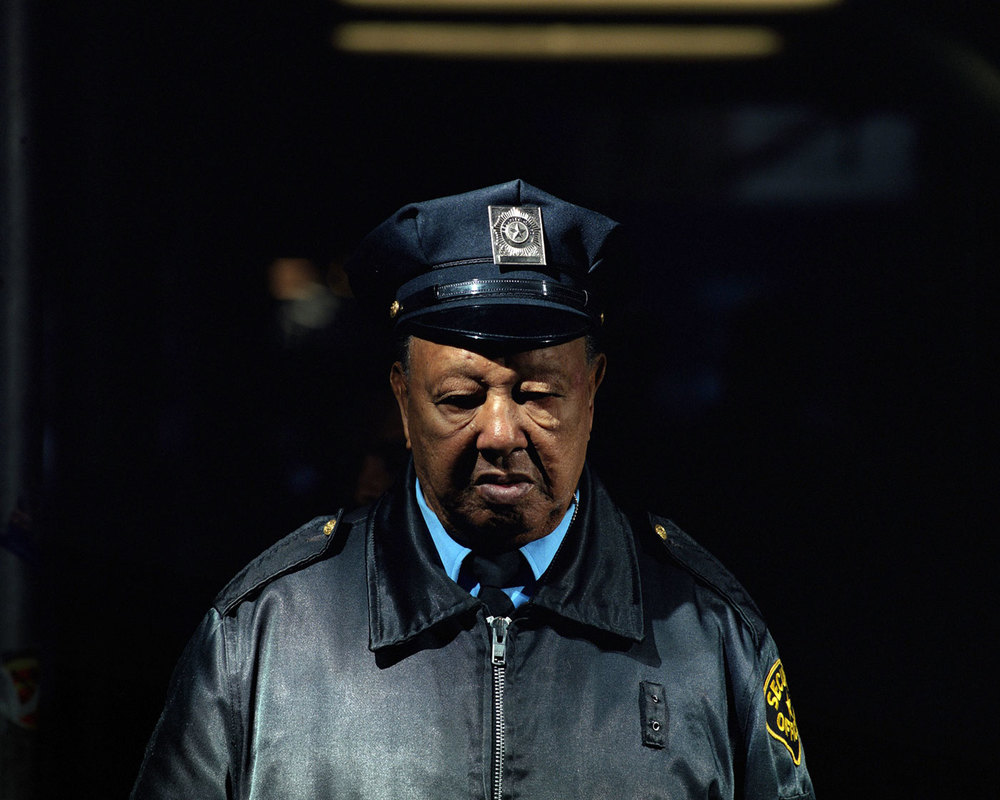
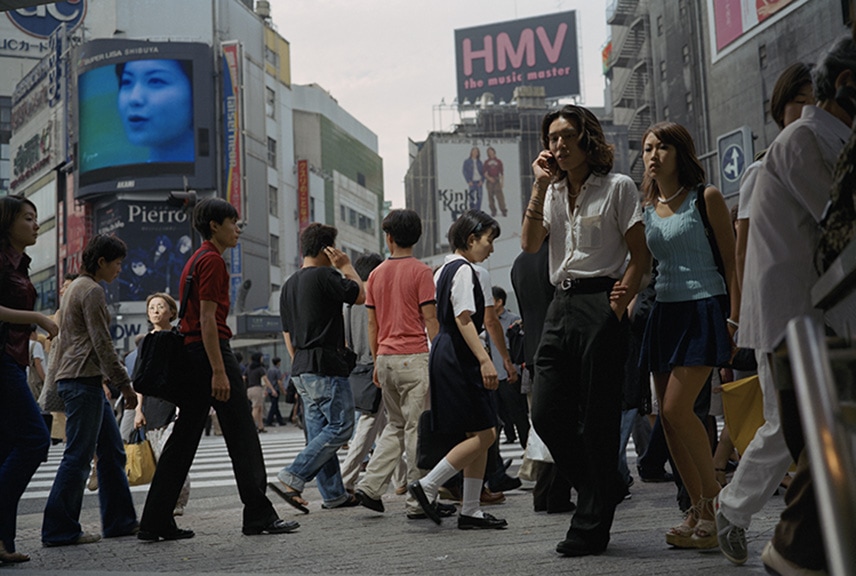
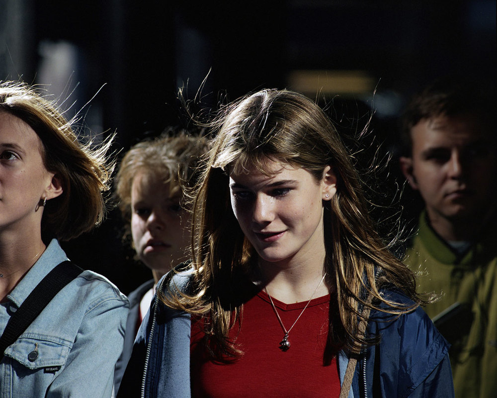
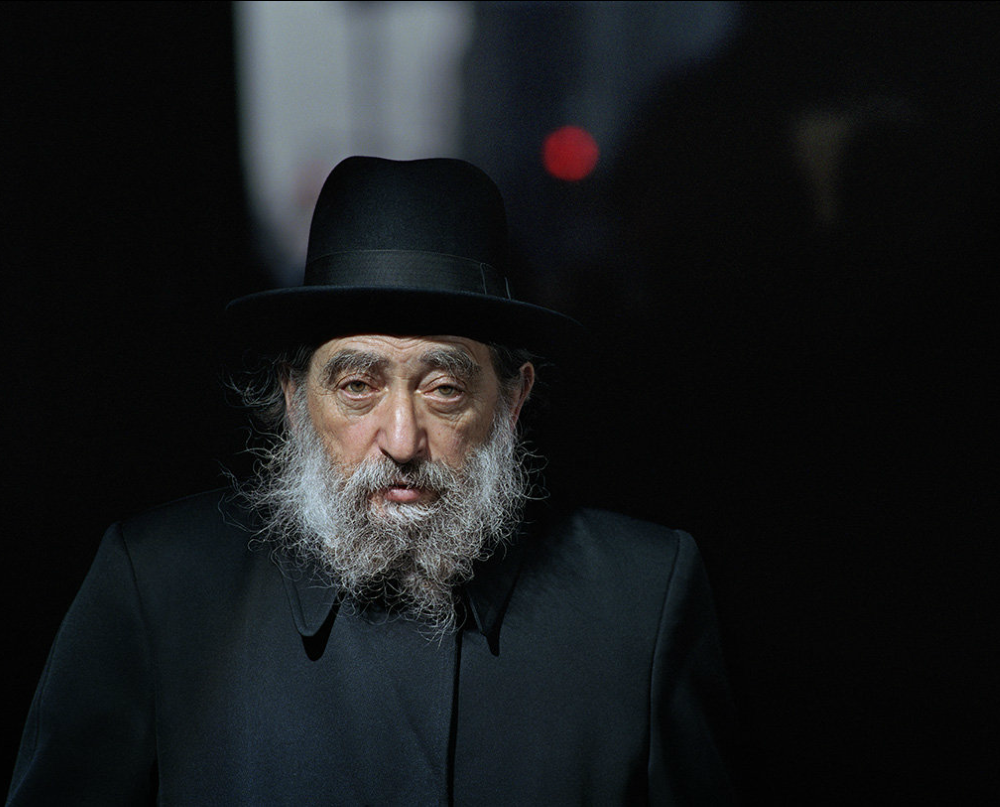
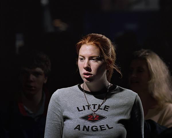
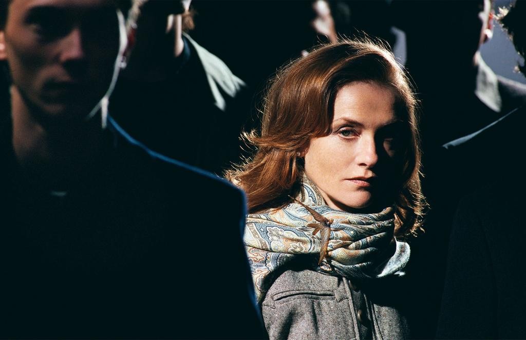
The style of Philip-Lorca diCorcia's photography is relatively similar to Beat Streuli. Philip-Lorca diCorcia again zooms in quite tightly to his subject, and uses a telephoto lens on his photographs focusing closely on different faces (similarly this means that they cannot see or react to the photographer). Philip-Lorca diCorcia also takes some more close up, wide angles shots of groups of people in street scenes. In the photos focusing closely on people's faces, Philip-Lorca diCorcia set up a strobe on some scaffolding, and set up his camera with a telephoto lens quite a far distance from the strobe. Philip-Lorca diCorcia focused on a specific area, and took photos of people as they walked through his strobe. This creates an interesting effect of brightly lit faces (illuminated by the strobe), with dark backgrounds. I like Philip-Lorca diCorcia's photography focusing on a range of different people. I also like the various subject's brightly lit faces against dark, almost black backgrouds - it makes their faces really stand out. I would like to try something similar to this, but I may have to rely on natural light (a spotlight of sun for example) instead of a strobe.
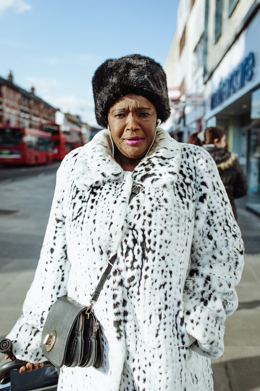
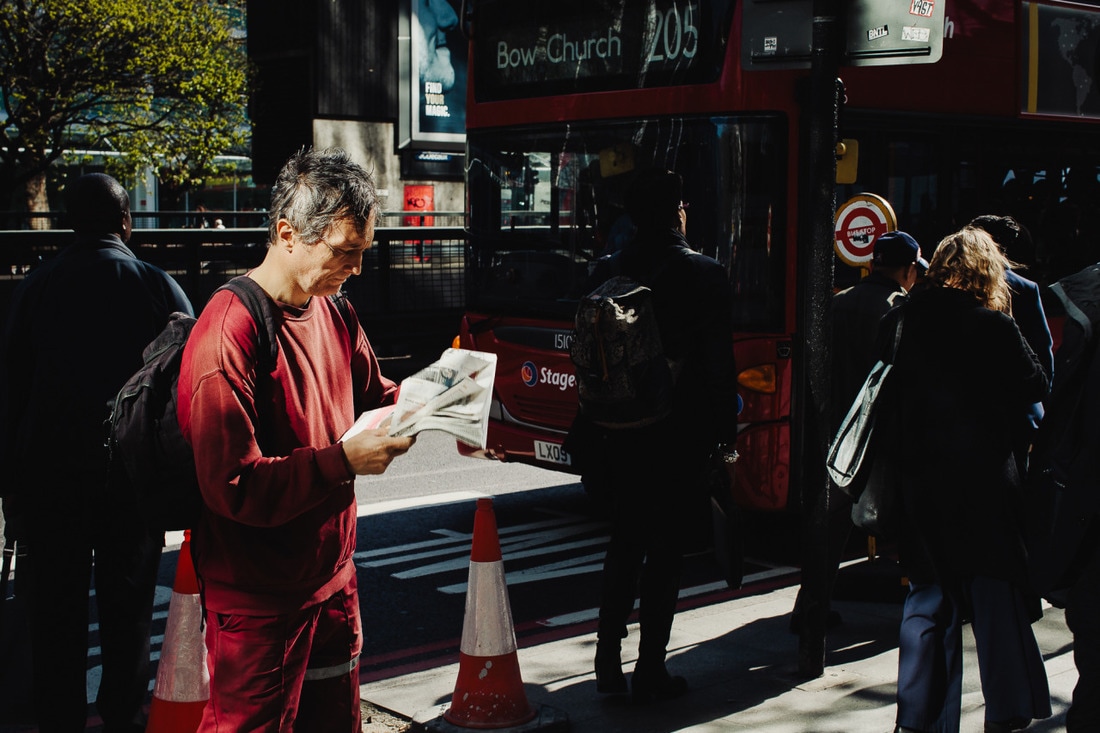
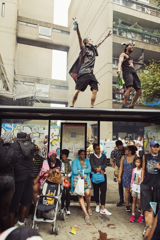
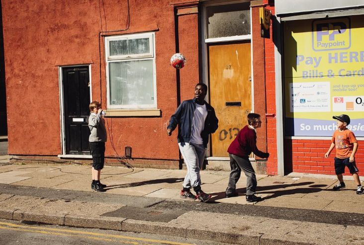
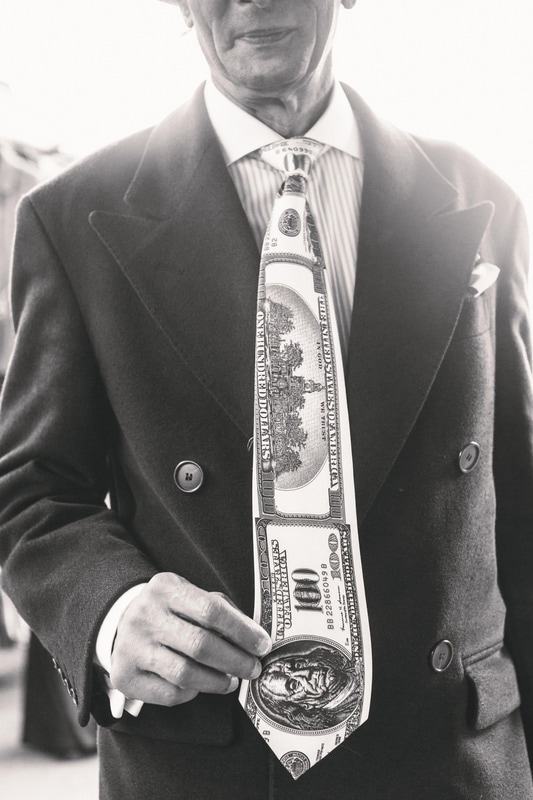
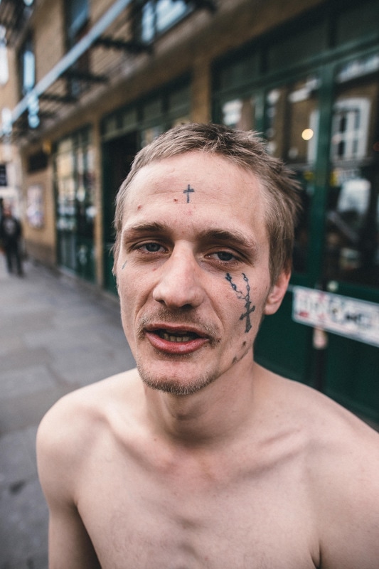
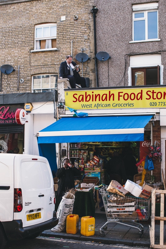
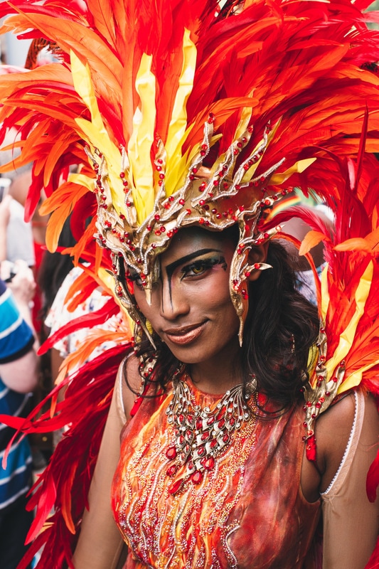
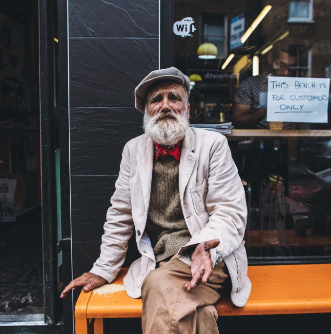
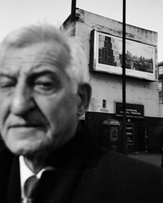
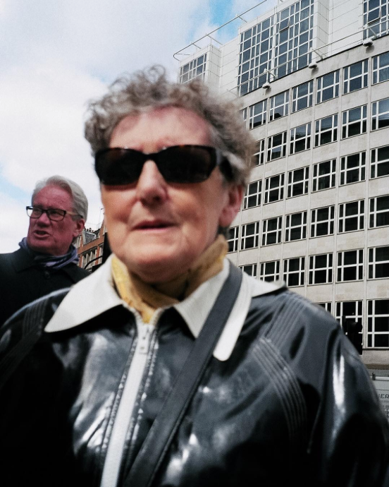
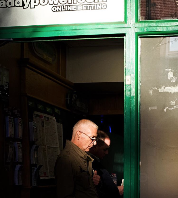
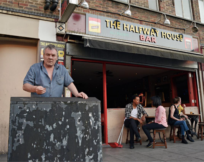
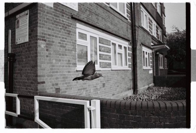
Shane Vincent |
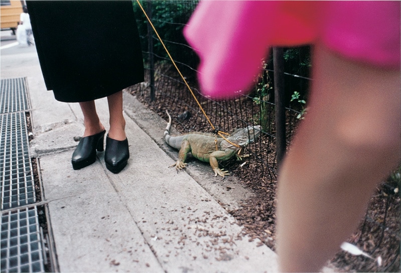
Lorenzo Garrido |
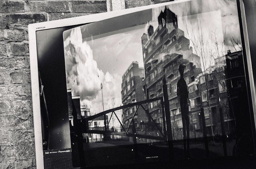
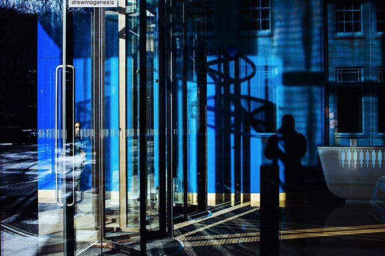
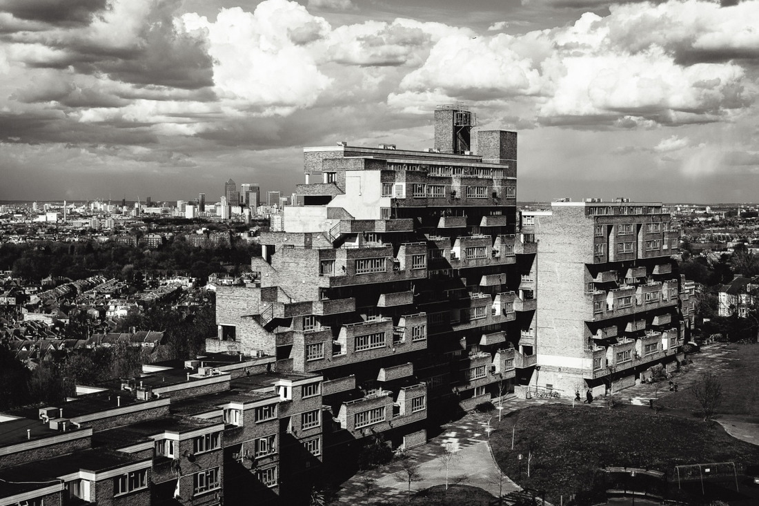
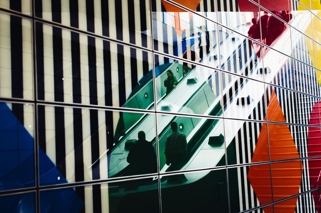
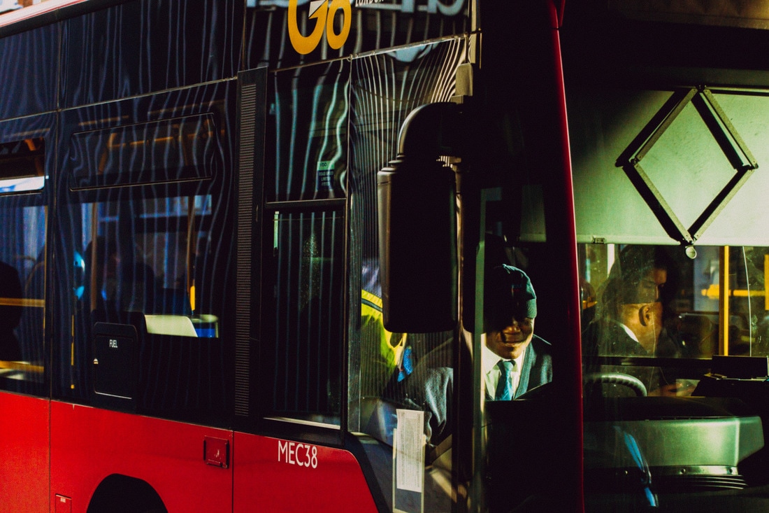
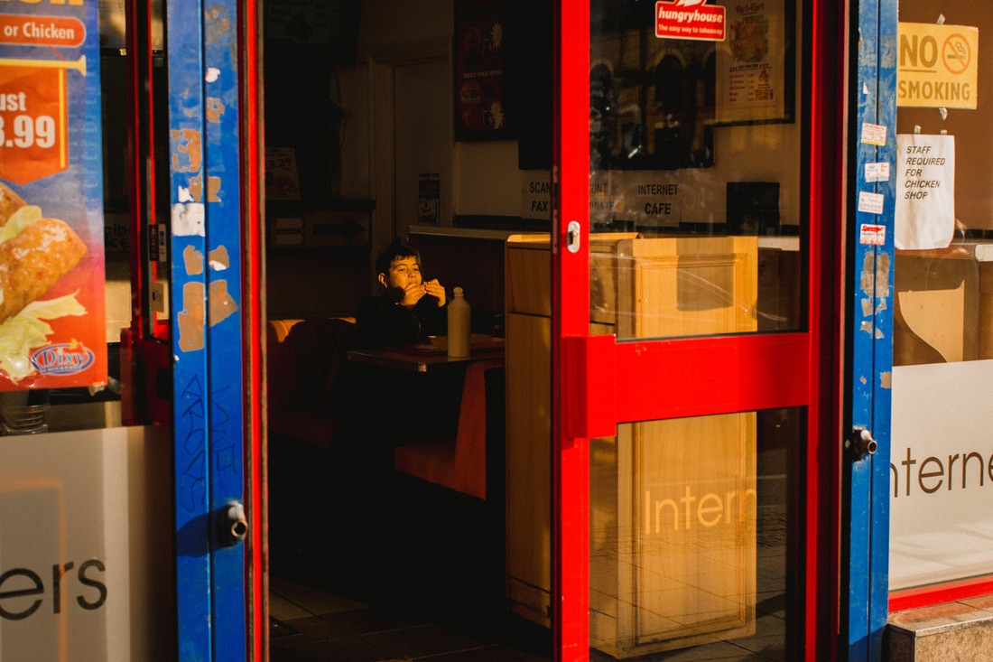
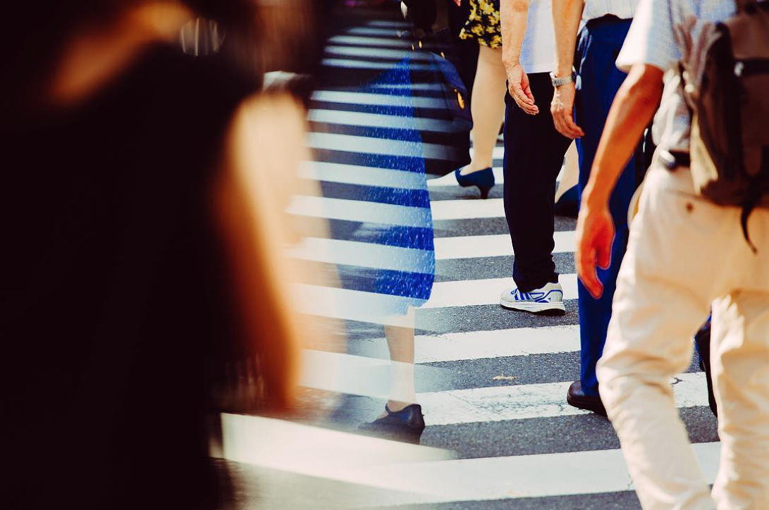
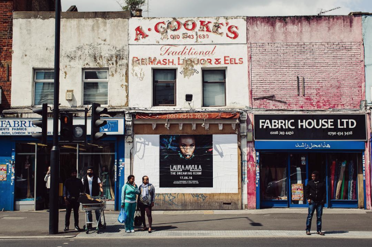
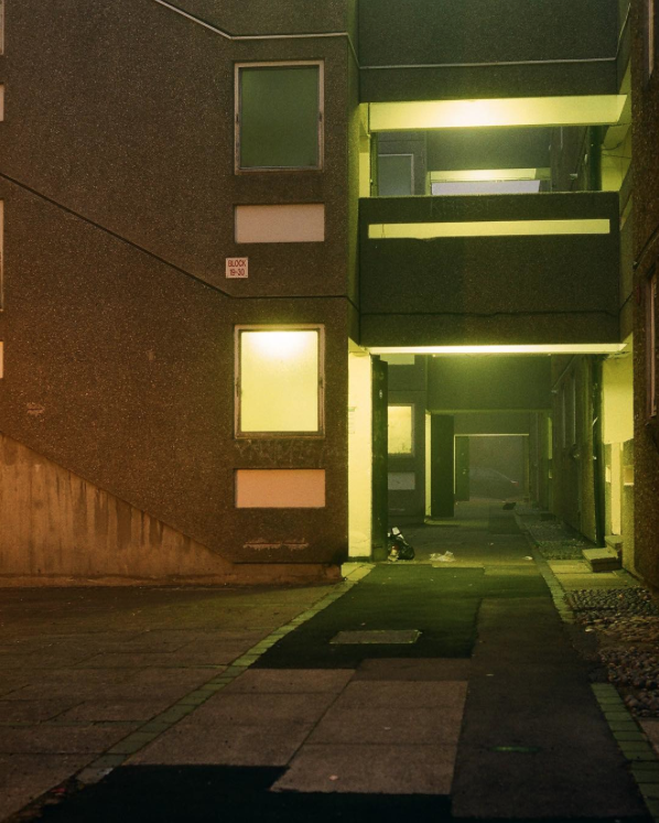
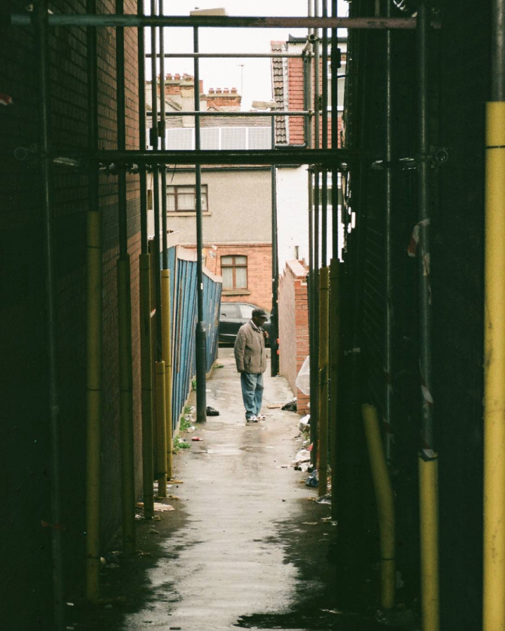
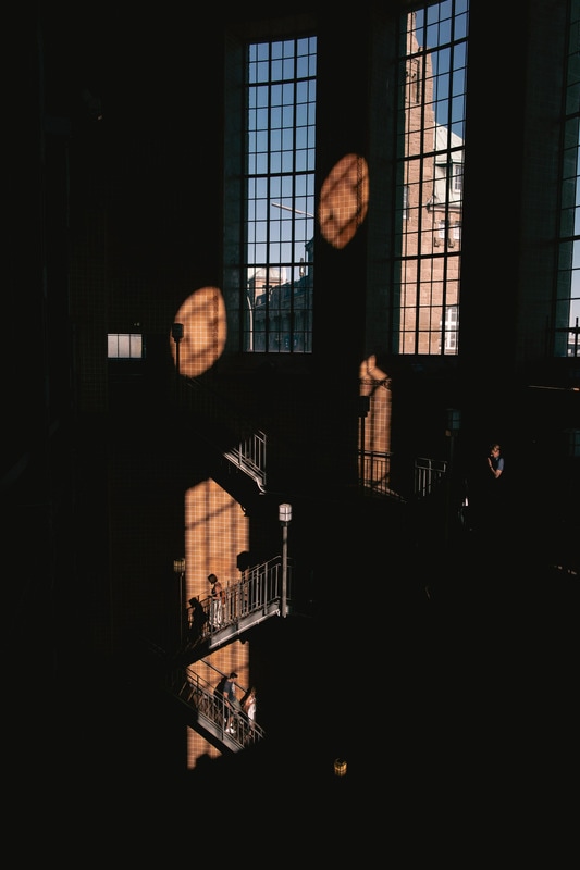
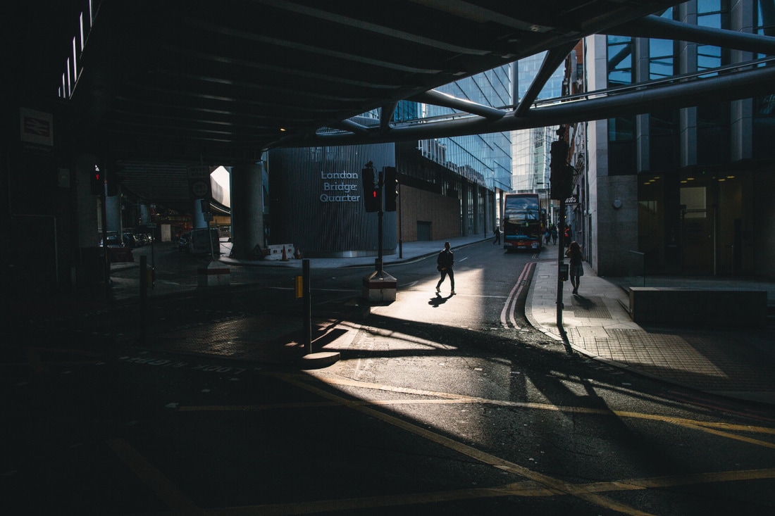
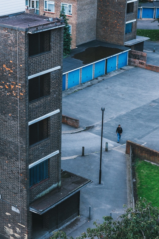
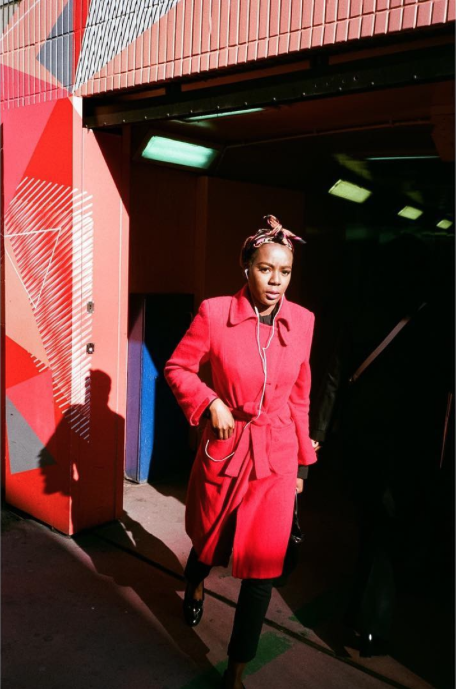
Gallery of his photography:I really like the style of Shane's photography. In particular, his ability to capture details and portraits of the urban landscape and environment around him. Shane's photography is inspirational for my photobook, as I want to capture interesting unusual details of London - Shane's street photography particularly. He is also able to capture the energy of London, and makes some very unusual images and compositions of urban areas. I particlarly like some of the interesting reflections and some of the more distorted images he creates.
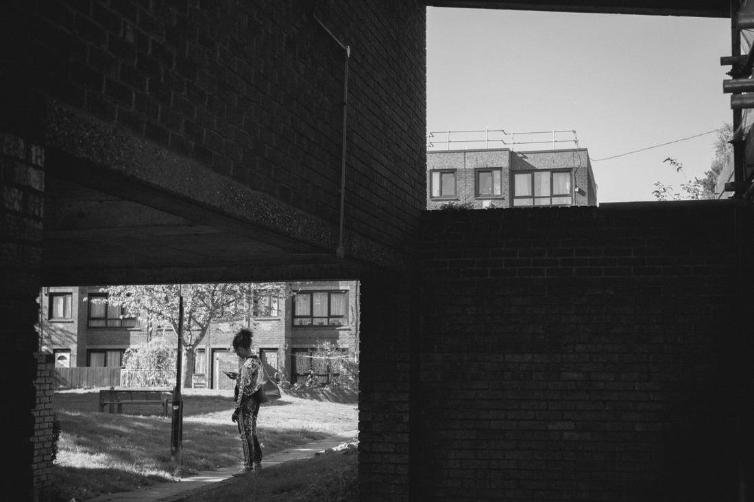
|
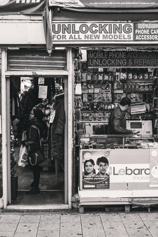
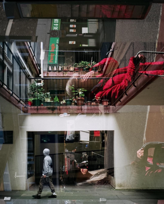
Gallery of his photography:I have been following Lorenzo's photography for a while, and I really like his unusual style of street and documentary photography. In particularly, I like the quite intimate portraits he takes on the streets, he often gets quite close to his subject. Again, I also like his ability to capture the urban landscape of London; especially some of his architectural photography. Lorenzo is also an inspiration for my photobook, I want to able to create intersting compositions on the streets and perhaps some architectural photography too - to include some images of the urban environment. He uses a lot of film as well, although this may be difficult for myself to get the resources to shoot with film.
|
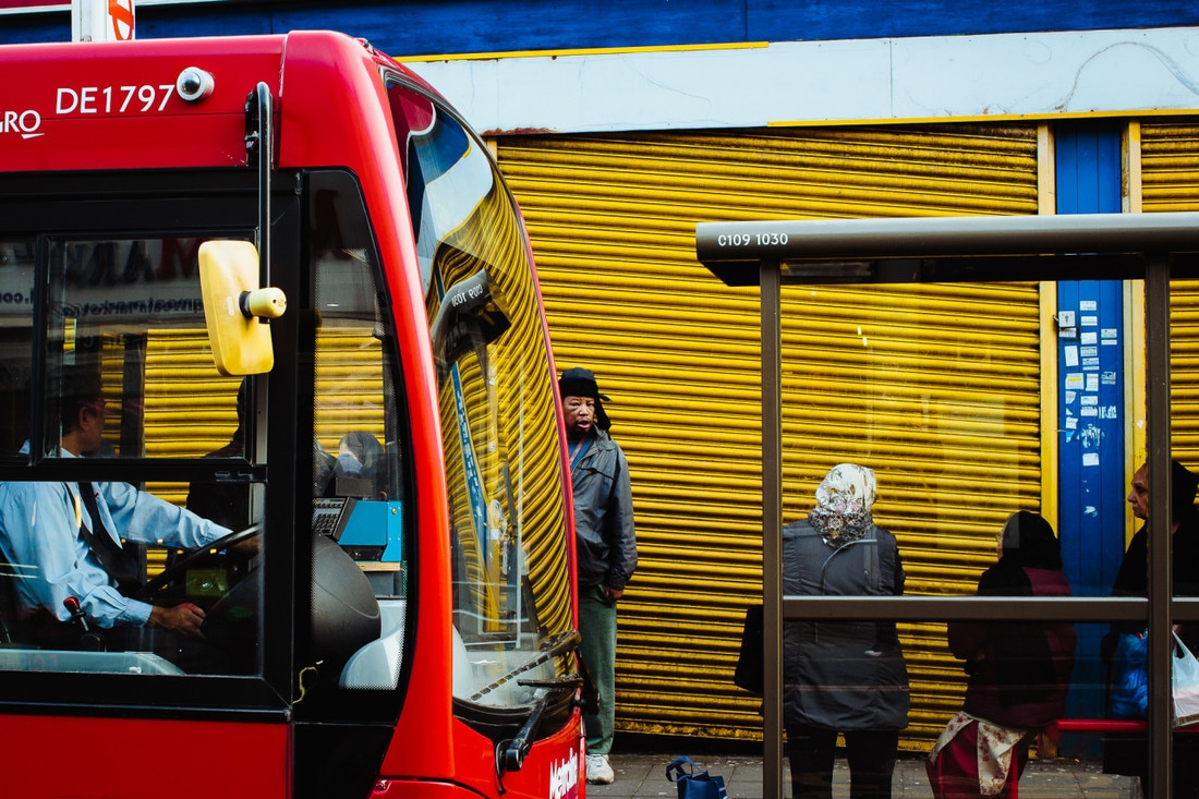
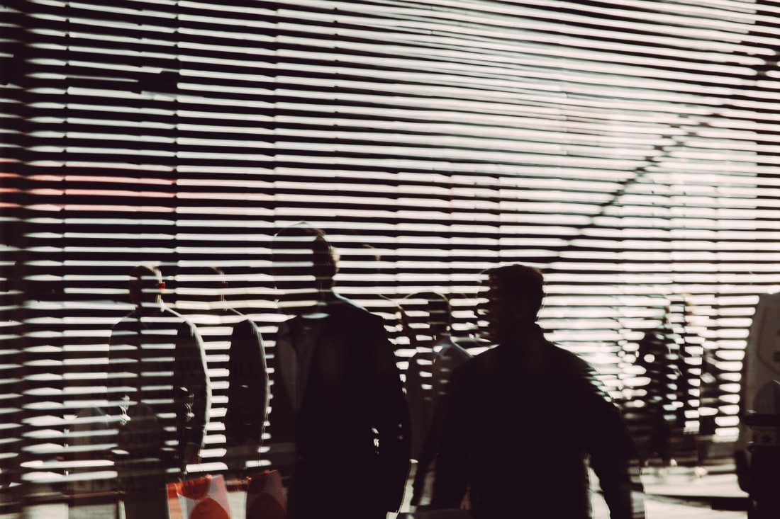
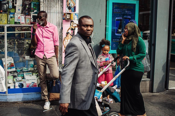
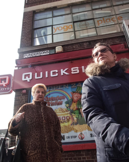
Emmanuel Cole |
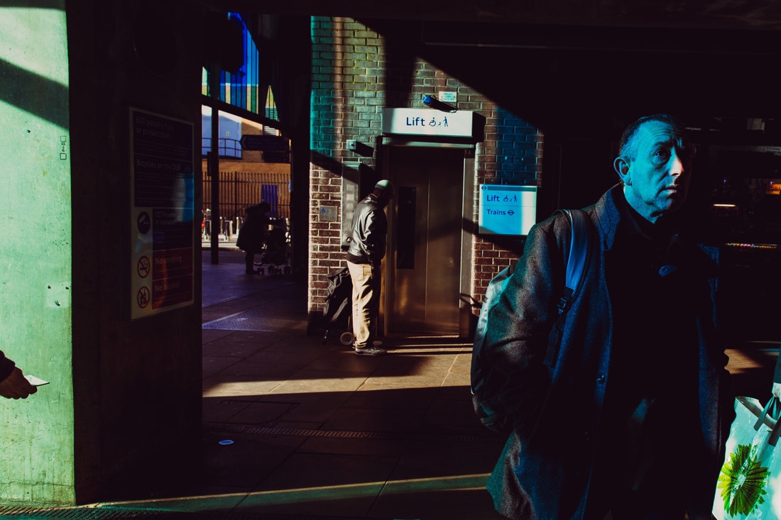
Blue Laybourne
|
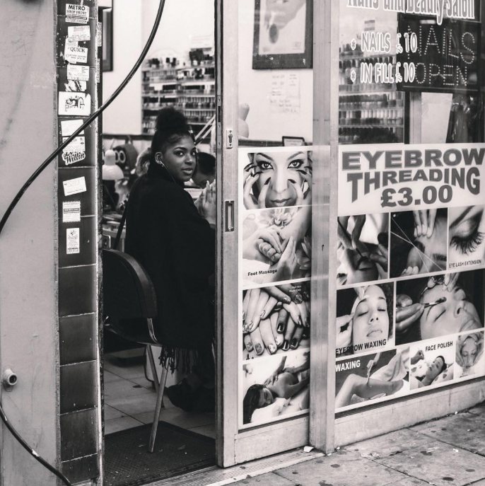
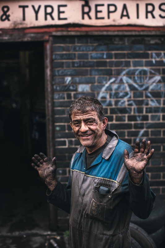
Gallery of his photography:Similarly to Shane Vincent, Emmanuel Cole has the ability to capture the energy of London, and take images of some particularly unusual and interesting street scenes. I like some of his architectural, urban photography as well as some of the details and unusual compositions he captures. I also like a lot of his portraiture, particularly some of his intimate portraits on the streets. Similarly, I want to be able to capture some interesting details and take images of unusual street scenes similarly to Emmanuel. I would also like to be able to document the urban environment and architecture as well.
|
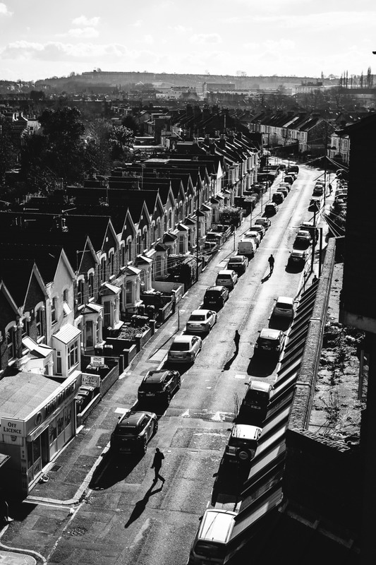
Gallery of his photography:(See his photography on Instagram)
I really like Blue's style of photography, and it is quite unusual compared to a lot of other street and urban photographers. On Blue's Instagram page, he documents the urban landscape and his surroundings well. I like his architectural compositions, and documentation of London. Similarly, he also takes some great portraits and intimate photos of people on the streets. I am inspired by a lot of photos, particularly some of the details he captures, and a lot of the architectural compositions (shop fronts, council estates, landscapes, street scenes etc.) as well as much of his portraiture - I'd like to try some intimate street portraits.
|

Alex Webb
Gallery of his photography:
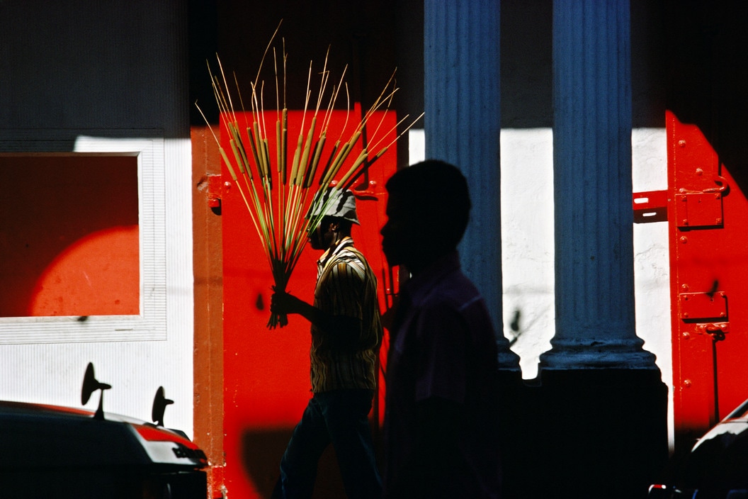
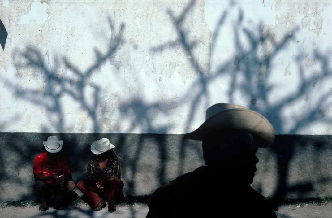
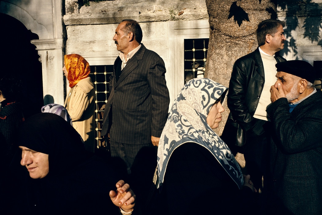
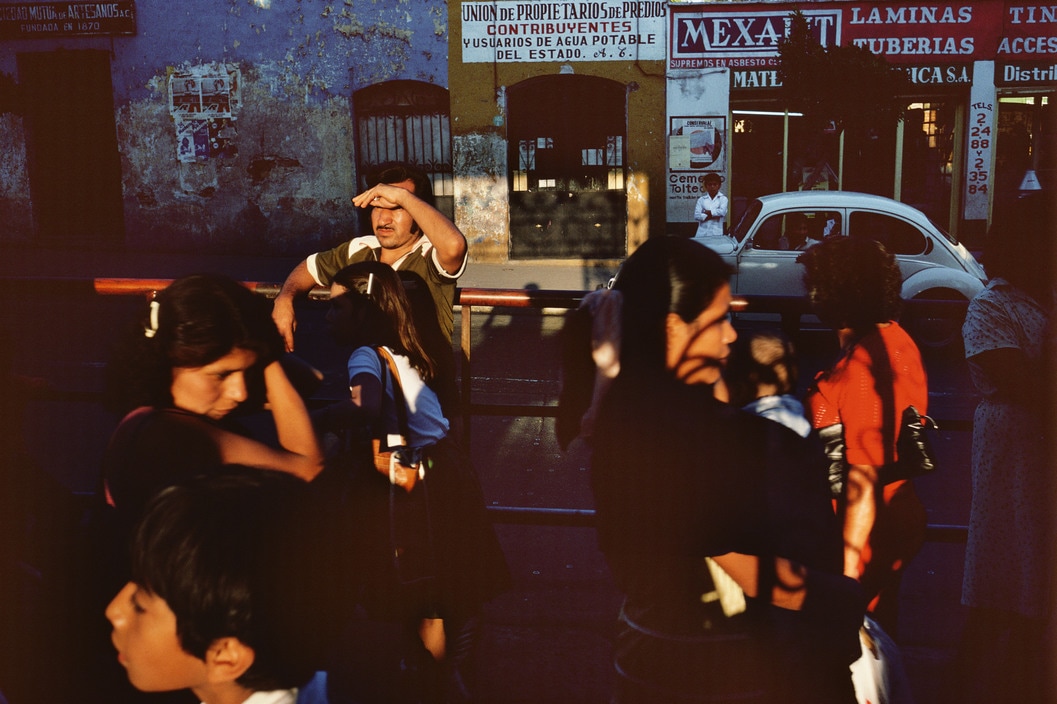
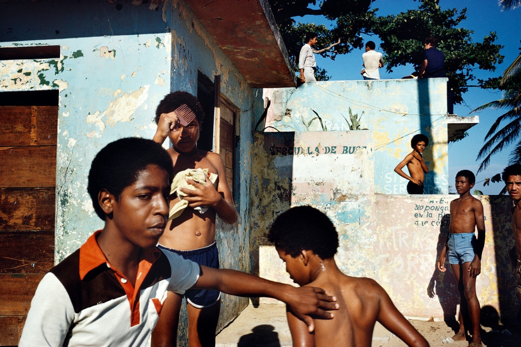
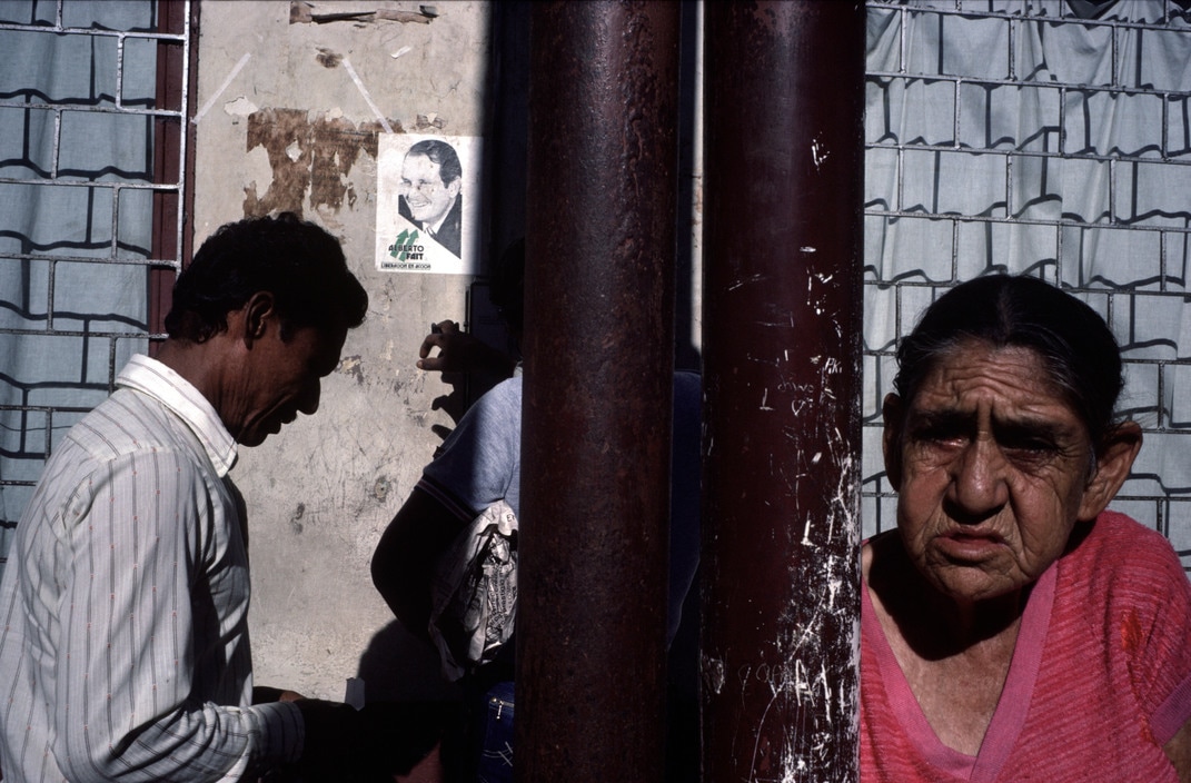
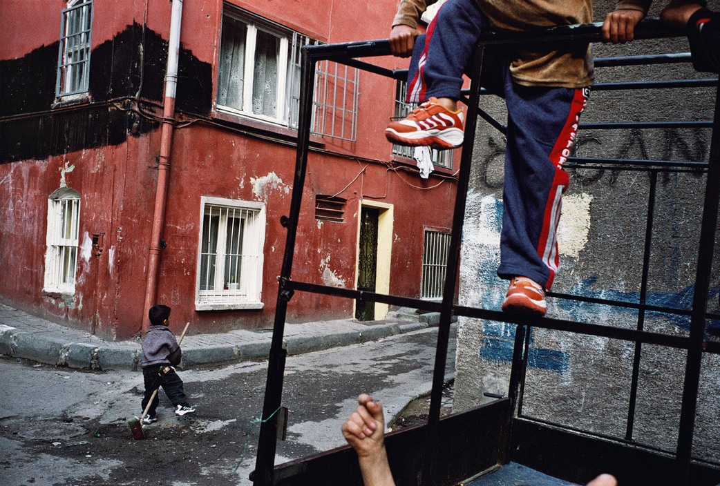
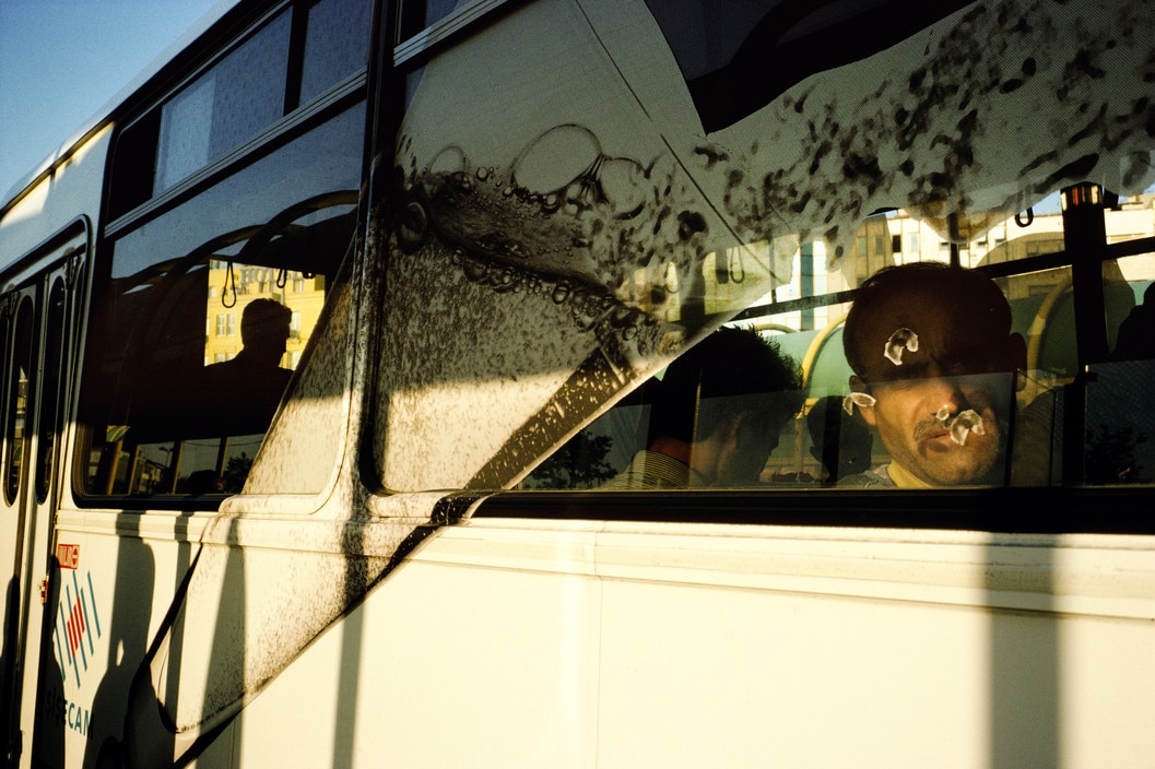
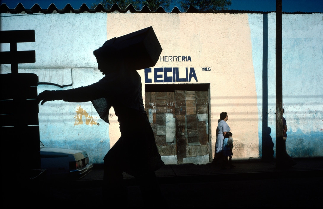
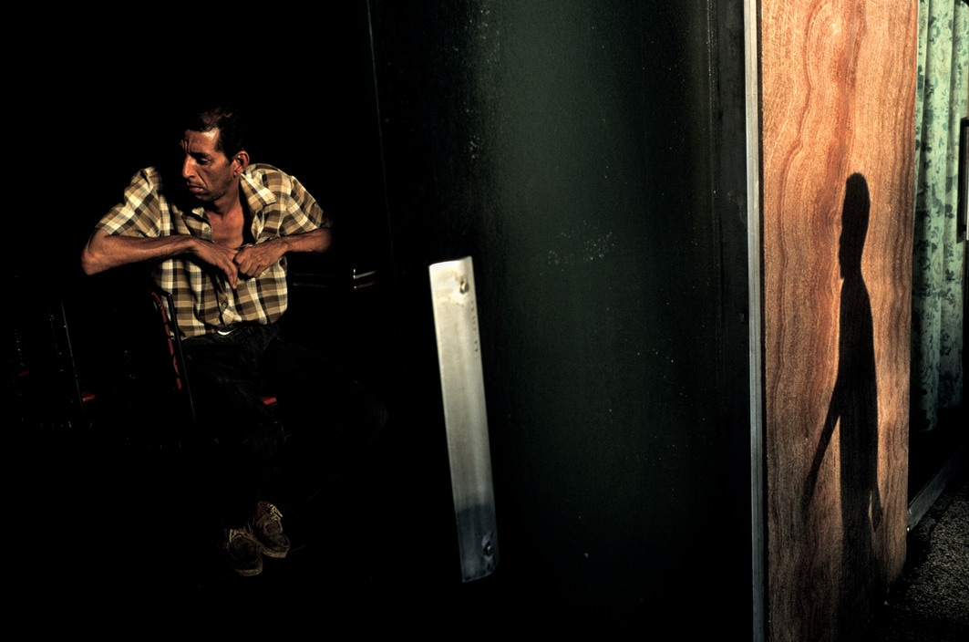
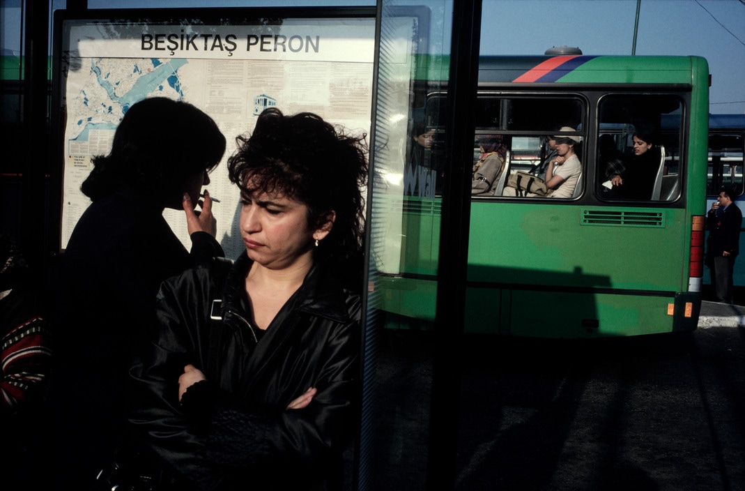
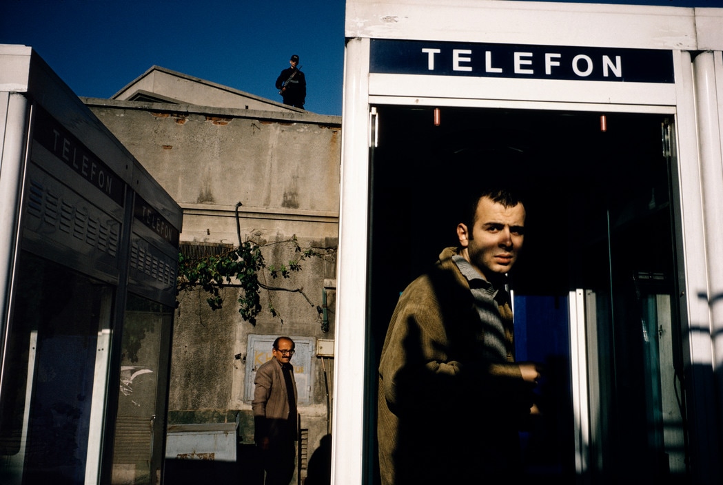
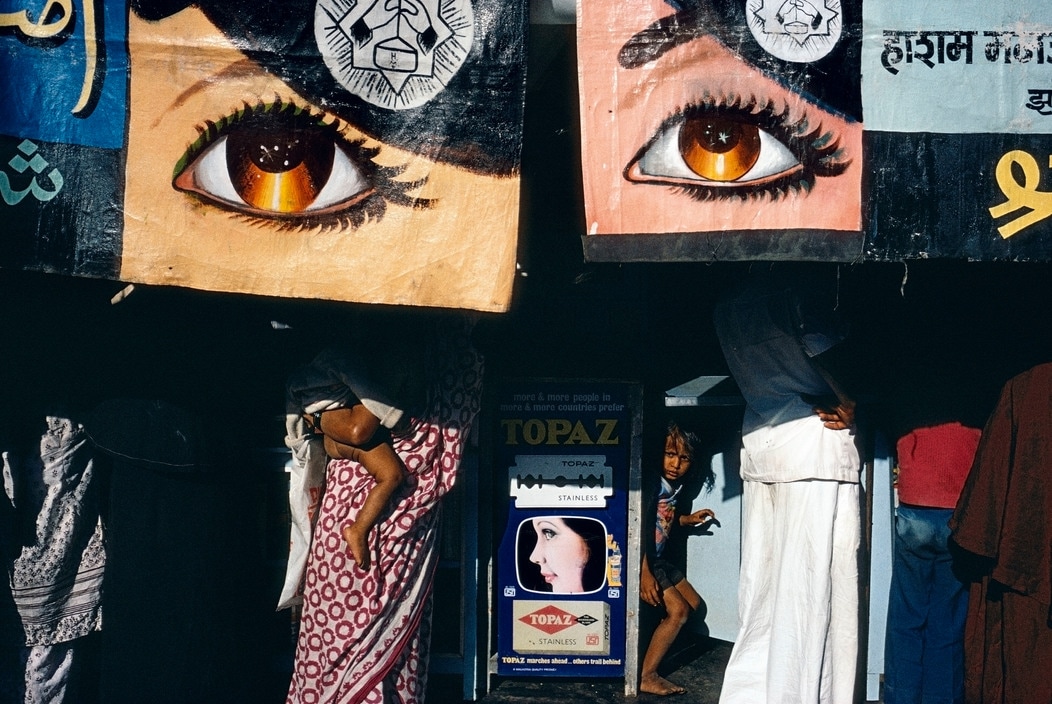
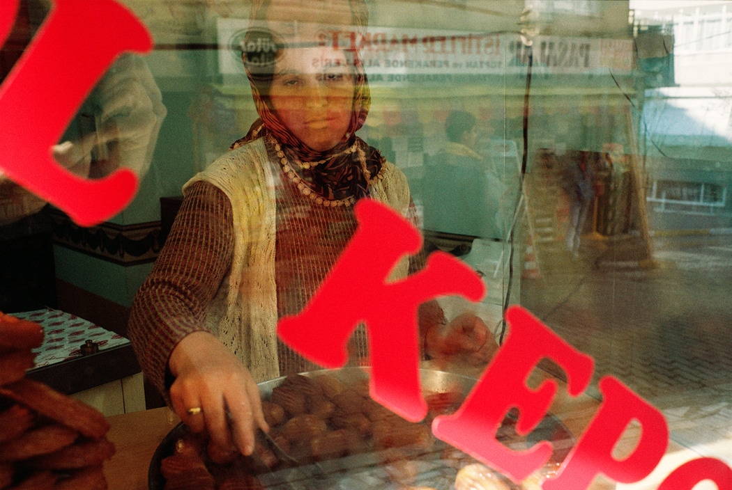
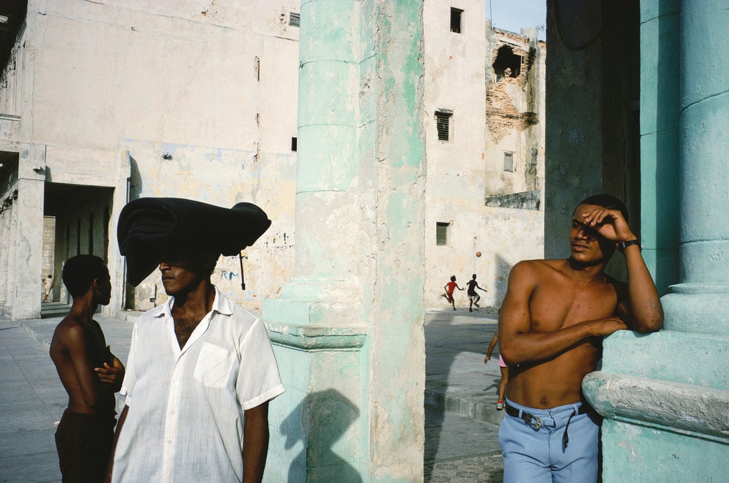
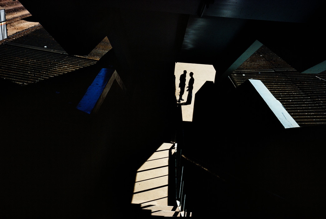
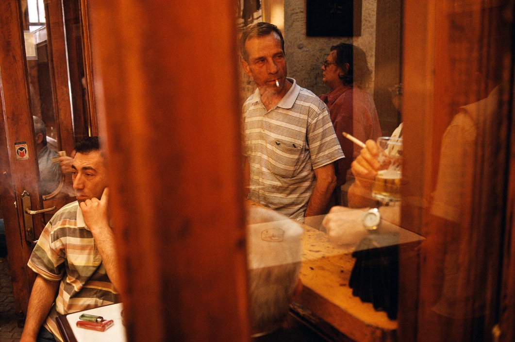
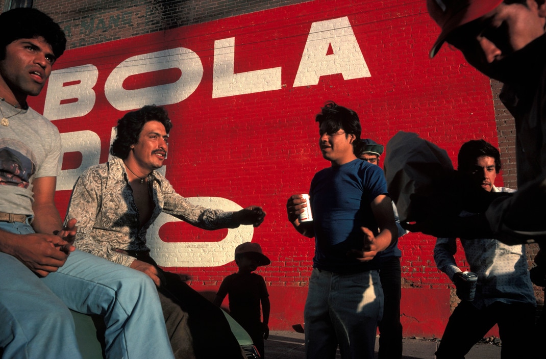
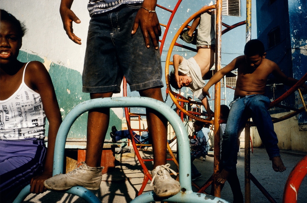
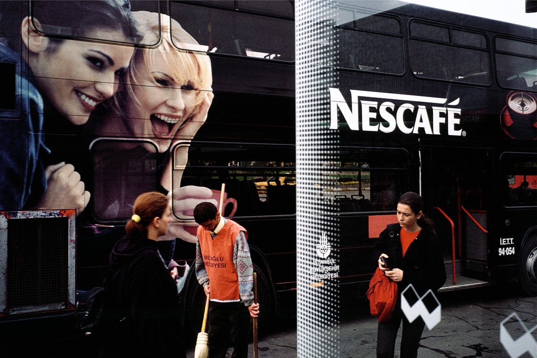
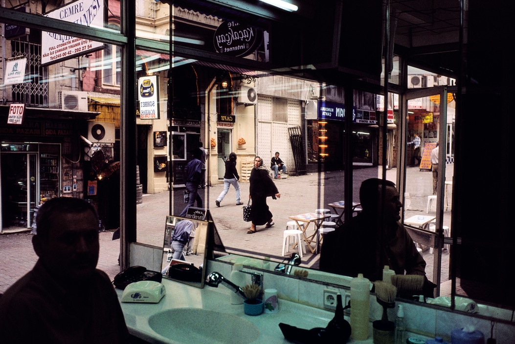
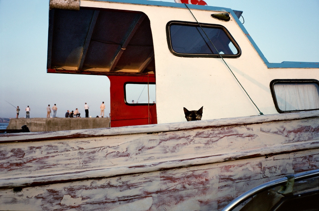
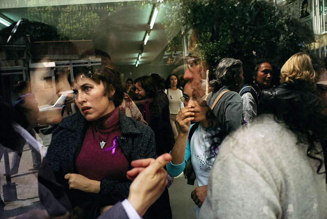
I love Alex Webb's photography, and he is one of my favourite and most inspirational photographers for me recently. I really like thehighly complex compositions of Alex Webb's photography especially, his ability to arrange different elements in the frame is exceptional. Not only this, but Alex Webb is renowned for his use of light and colour, and his photography is particularly inspirational in terms of contrasting light and shadows, as well as saturated colours. I particularly like his photographs that are filled with a range of different shapes and elements, with a complex composition and with faces, shadows, silhouettes, varied shapes and colours etc. Although it is difficult to take photos with compositions like Alex Webb's photos, I have taken particular inspiration from his style of photography and many of his compositions in my photographs. In a few of my photos in my first set of images (below this photographer research), I think you can see some signs of inspiration from Alex Webb; for example I think this photo by Alex Webb shows some similarity and inspiration to this photo by myself.
Gregory Crewdson
Gallery of his photography:
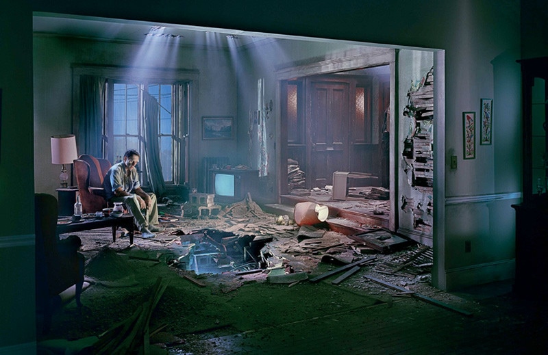
After reviewing my first set of images, I was recommended the photography of Gregory Crewdson. He was recommended mainly due to his use of light. Although his style of photography is very different to mine (his photography is carefully planned and set up, whereas mine is more spontaneous). However, I do like his use of light in many of his photos (particularly the darker photos with spotlights, which is similar to many of my photos with spotlights of light). Also he takes a lot of photos at the twilight/sunset period of the day - I would like to photograph more later in the day or at night, to capture the light of the 'golden hour' before sunset.
Taking and compiling images for my Photobook
My first set of 184 images:
Click here for my first set of photobook images
Evaluating my first set of images:
After researching and looking at different photographers, I began photographing and compiling images for my photobook. The type of photography I wanted to include in my photobook is mainly street photography. I wanted to photograph people and busy street scenes. Not only this, but I wanted to photograph and pick out some unusual compositions, as well as some details and objects on the streets. For my photography, I travelled to a variety of different locations throughout London - particularly busy areas with large numbers of people in interesting settings. To photograph, I used my Fujifilm XE-2, with a fixed 35mm F2 lens. This is quite a small, discreet camera, meaning I could photograph quickly and discreetly in various street settings - so that different people wouldn't be bothered by me too much. Also, 35mm is my favourite focal length, and is cropped enough to focus on quite tightly on interesting details, but is also wide enough to photograph wider scenes and I don't find it too limiting. I find that it is a great focal length for me to frame different compositions.
In this first set of images, I produced a relatively varied set of photographs. I photographed a number of different subjects, and the images varied considerably in terms of composition and colour as well. They varied considerably especially as I photograph in a range of different locations. However, I think that you can see quite a clear theme and style throughout my photography as well. My photographs focus on light particularly, as many of my photographs feature bright sunlight, as well as contrasty shadows and reflections. Not only this, but bright colour is a theme that runs throughout my photography for the photobook. A lot of my photos have quite punchy, saturated colours. Although I did increase the contrast, saturation and clarity slightly during editing, the colours in the original photographs were already quite saturated - this was because I slightly underexposed my photographs (mainly to ensure the white/bright tones in the photos weren't overexposed), as a result the colours were rendered quite richly and bright/saturated.
Overall, I was quite pleased with the outcome of this set of images. Not only this, but I studied the photographs from the photographers that I researched in a lot of detail, and I think that you can see some influence from the photographers that I researched (above) in some of my photographs. For example, I took a number of contrasty portraits (where only the subject is illuminated against a dark background) similarly to Philip-Lorca diCorcia's photography as well as Beat Streuli's photography; for example photographs like this and this that I have taken show some inspirations from Philip-Lorca diCorcia's and Beat Streuli's photographs. Not only this, but I tried to taken some interesting compositions in the style of Alex Webb, although it is difficult to take photos in the similarly to his complex compositions. Overall, I have stuck to the street photography theme that I was looking at, and I think that have picked out some interesting details and compositions in my photos. Moreover, although many of these images were taken candidly and quickly, the compositions were quite effectively composed, with quite effective arrangements of shapes, lines, different elements etc. As well as this, some of the photos appear almost poetic, and you acan almost images the bnarrative and hidden mkeanings within the images (with the facial expressions of differetn subjects I photographed, the actions and activities of people on the street frozen in my photographs etc.)There is a lot of street portraiture, but I have included some other varied photographs of architecture, reflections, objects etc. There are a number of images that I quite like and a number that I think could work well in my photobook. Not only this, but I am beginning to see some relationships emerge between images, and I think some photos could work well together as diptychs. Moreover, I am starting to imagine how I could cut these down t create a refined selection of images, and how these could form an effective narrative/arrangement within a photobook. The next step will be to place some images together to see what images work well together. Not only this, but I think it would be good to review the images overall as a set, and begin to narrow down what I will include in my photobook, looking at them as a body of photographs.
Placing my images together
After taking this set of photographs, I then began to look at the relationship between images and narrowing down my overall number of photos. I printed out the whole set of photos, and lay them all out beside one another, spending a lot of time laying them out, arranging and rearranging these photos until I was happy with my selection. This meant that I could review then overall as a set, and begin to place them next to one another. When placing images next to one another, I was looking at the relationship that I could see between them particularly. When pairing the images, I was looking at various ways that they could correlate or contrast, for example I looked for similarities in composition, colour, subject matter etc. Conversely, I also was looking at ways that the images could contrast, again in terms of contrasting/differing compositions and subject matter, or constrasts in colour (EG contrasting complementary colours). However, placing images together mostly came down to whether the images look right visually and work well beside one another. It took a lot of testing and experimentation, but I was able to place a number of images together, and narrow down the number of images that I will use overall. Although some images look better than others in pairs, I am quite happy with the outcome of the image placement that I decided upon. I think the next step is to test how these images will look placed together in a book maquette. I think this will give me a greater idea of how the images should be laid out, and I can begin experimenting with some book maquettes and thinking about the chronological narrative of these photographs.
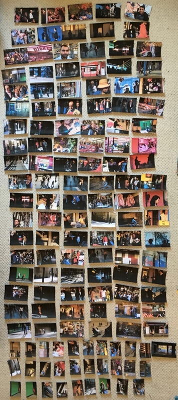
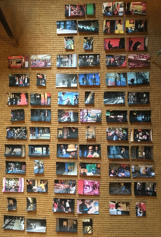
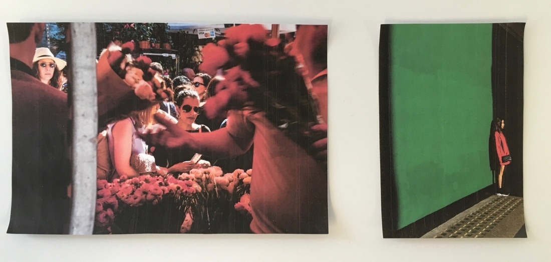
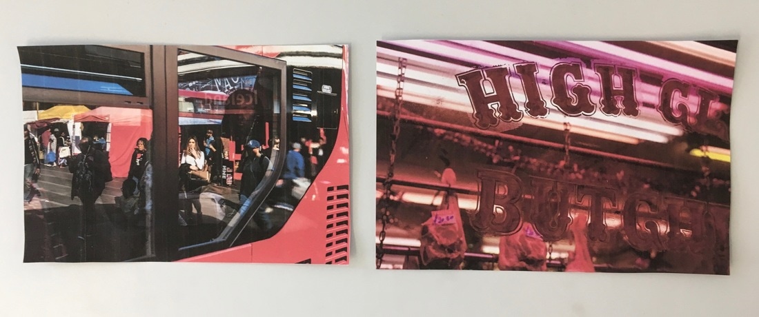
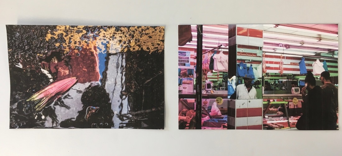
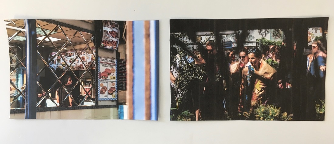
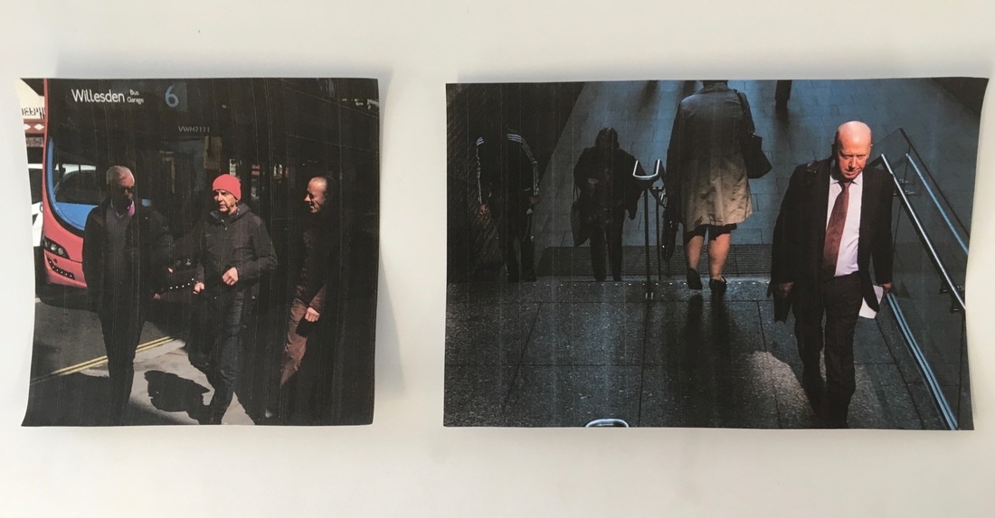
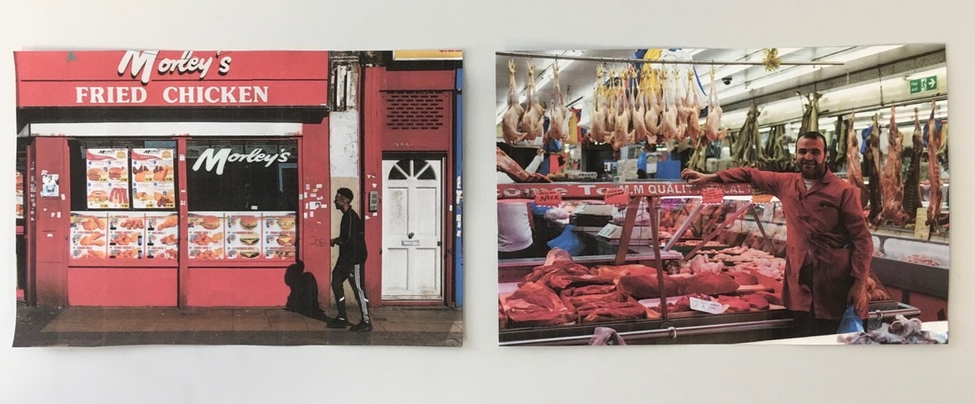
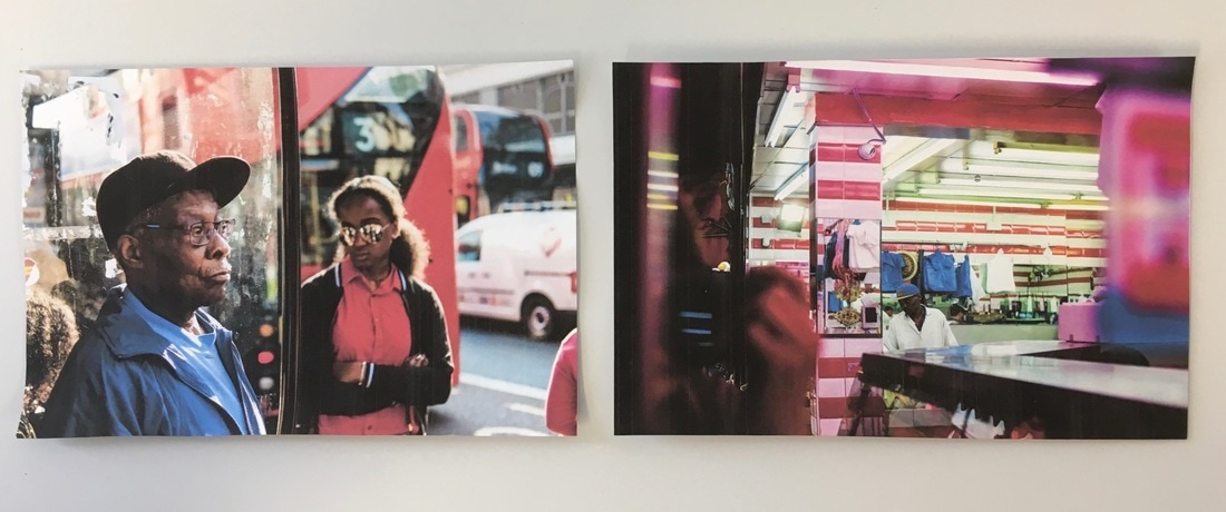
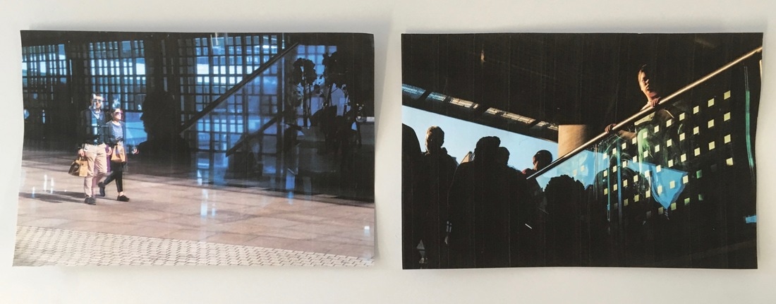
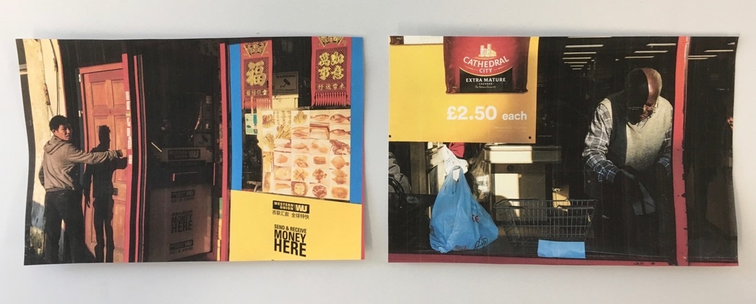
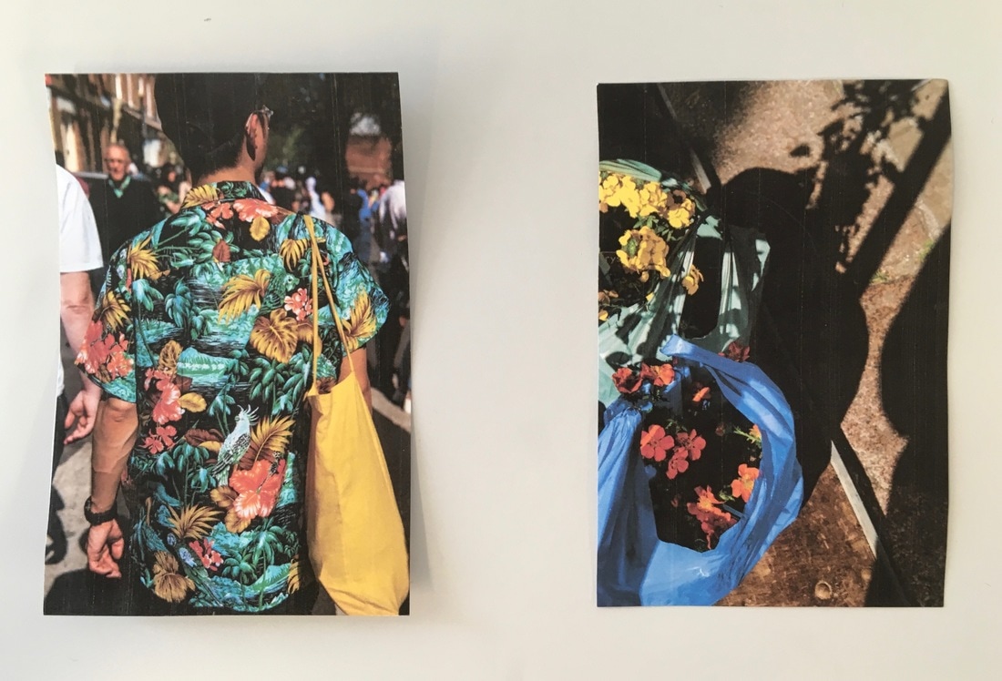
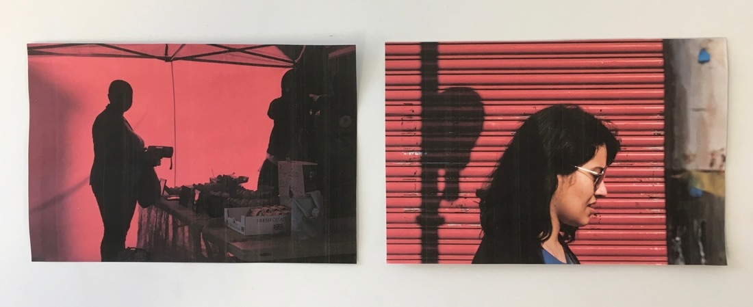
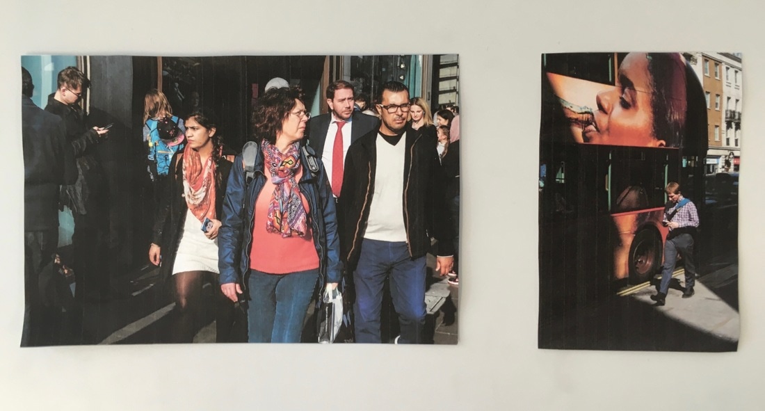
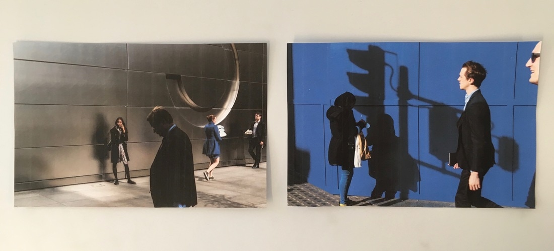
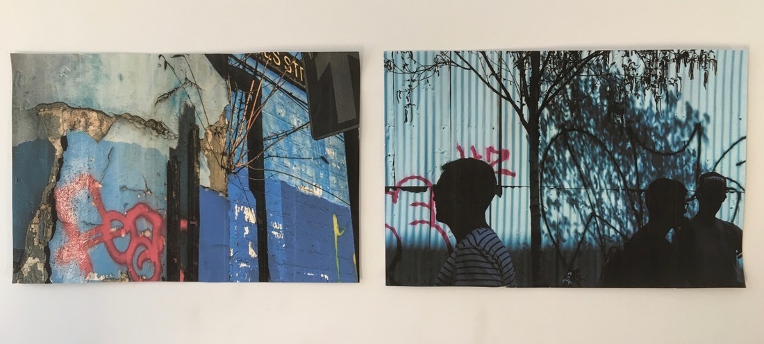
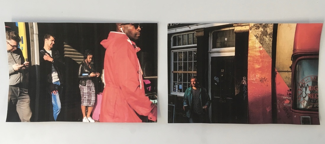
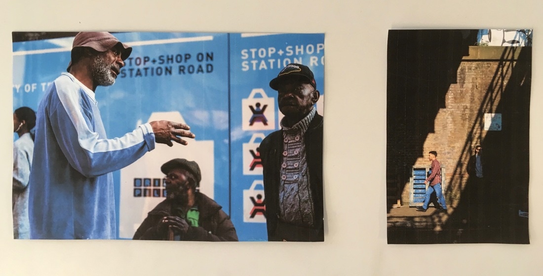
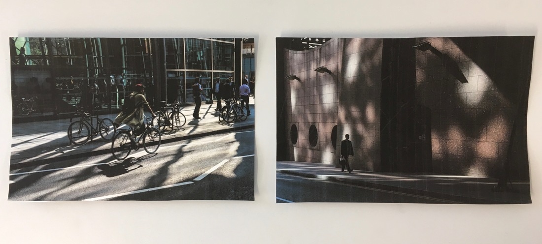
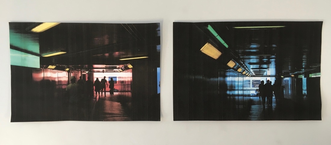
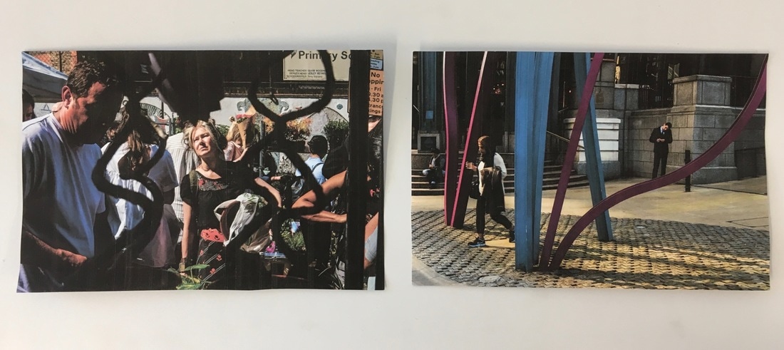
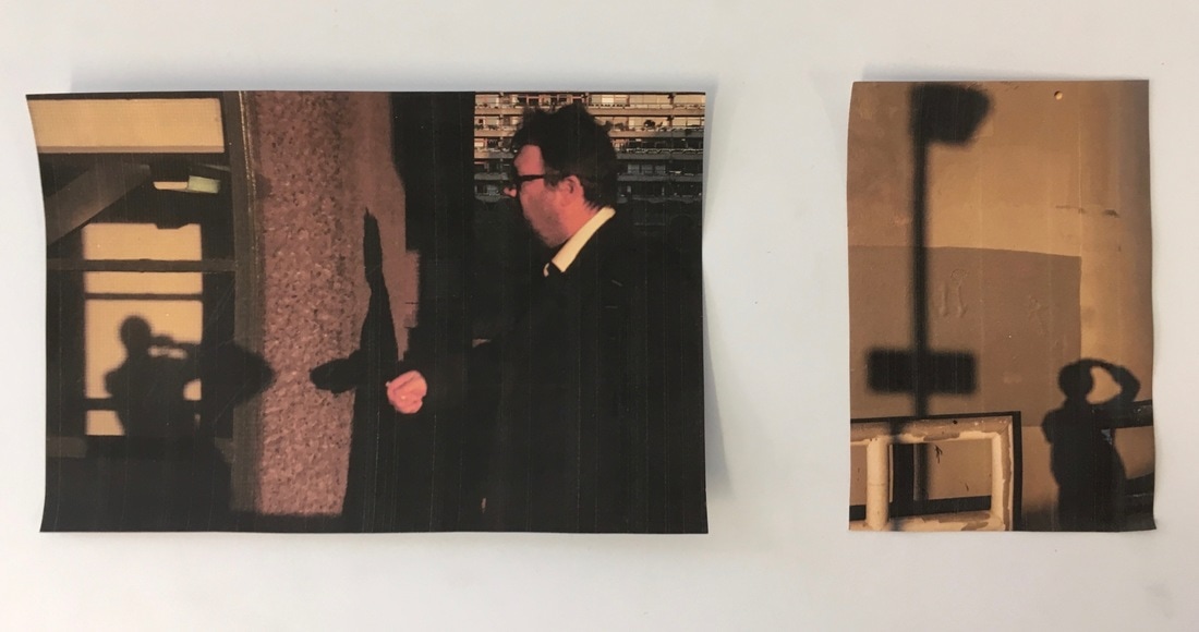
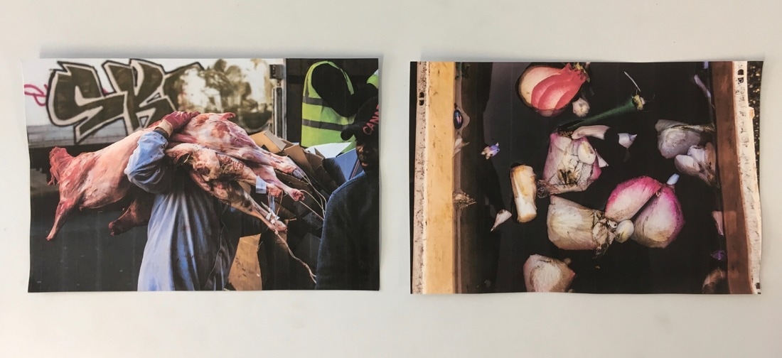
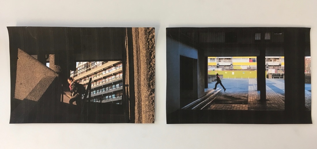
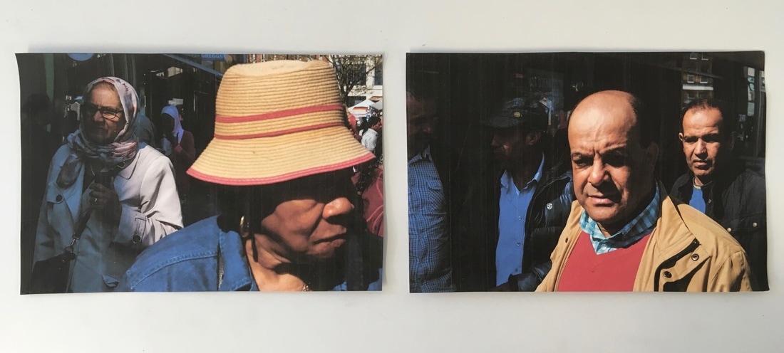
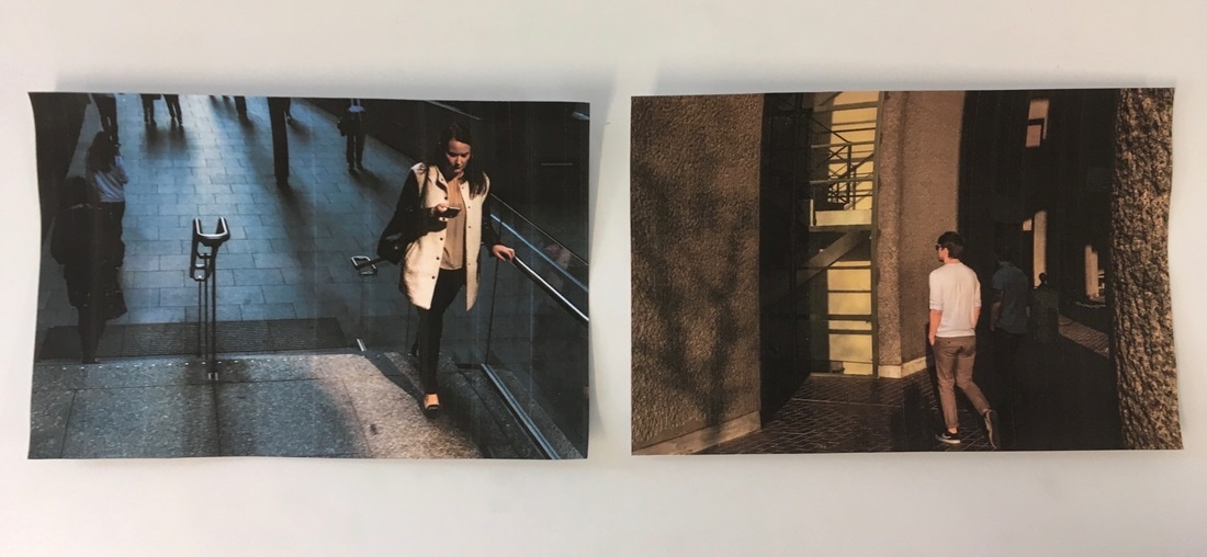
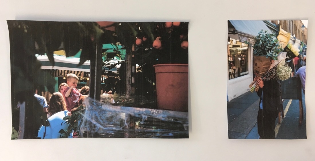
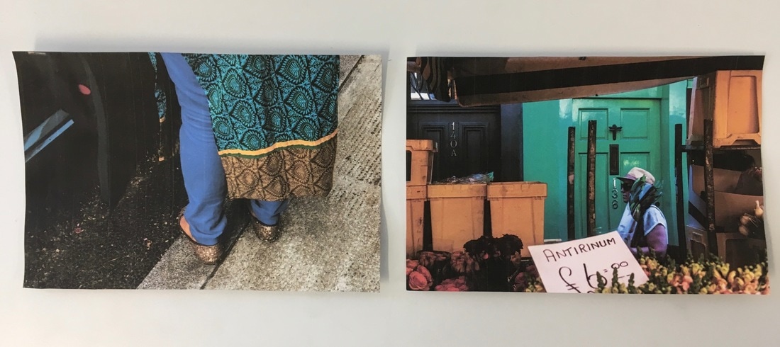
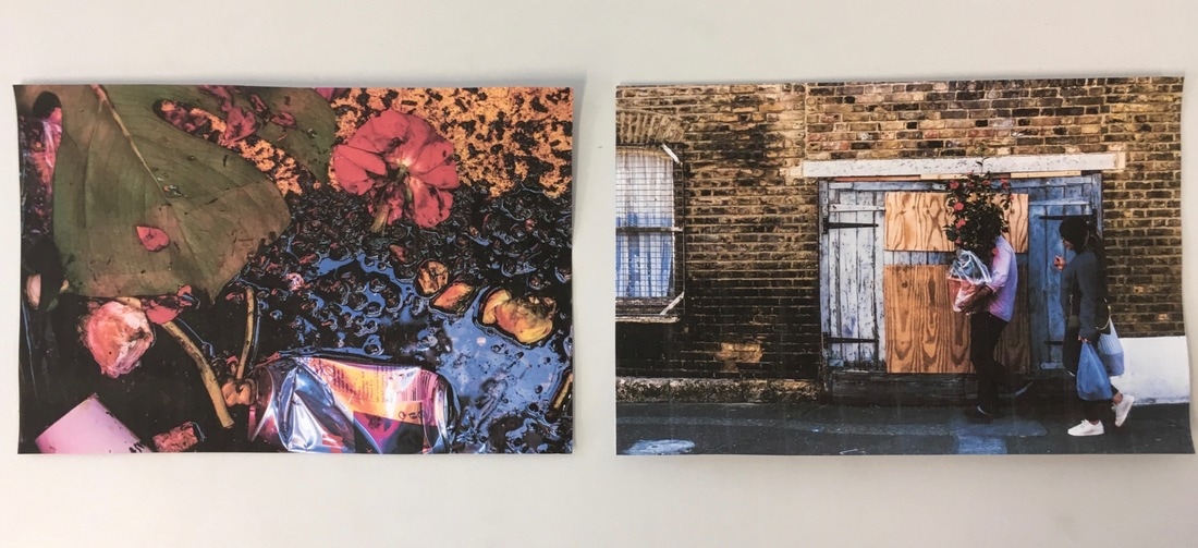
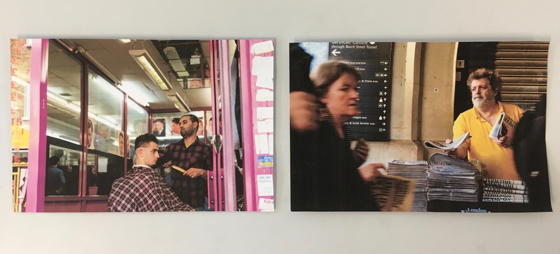
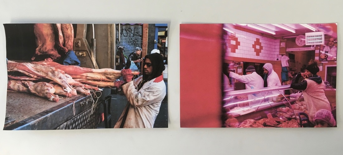
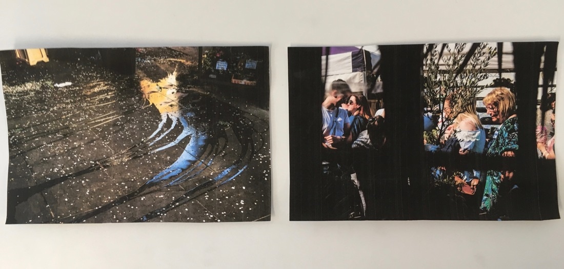
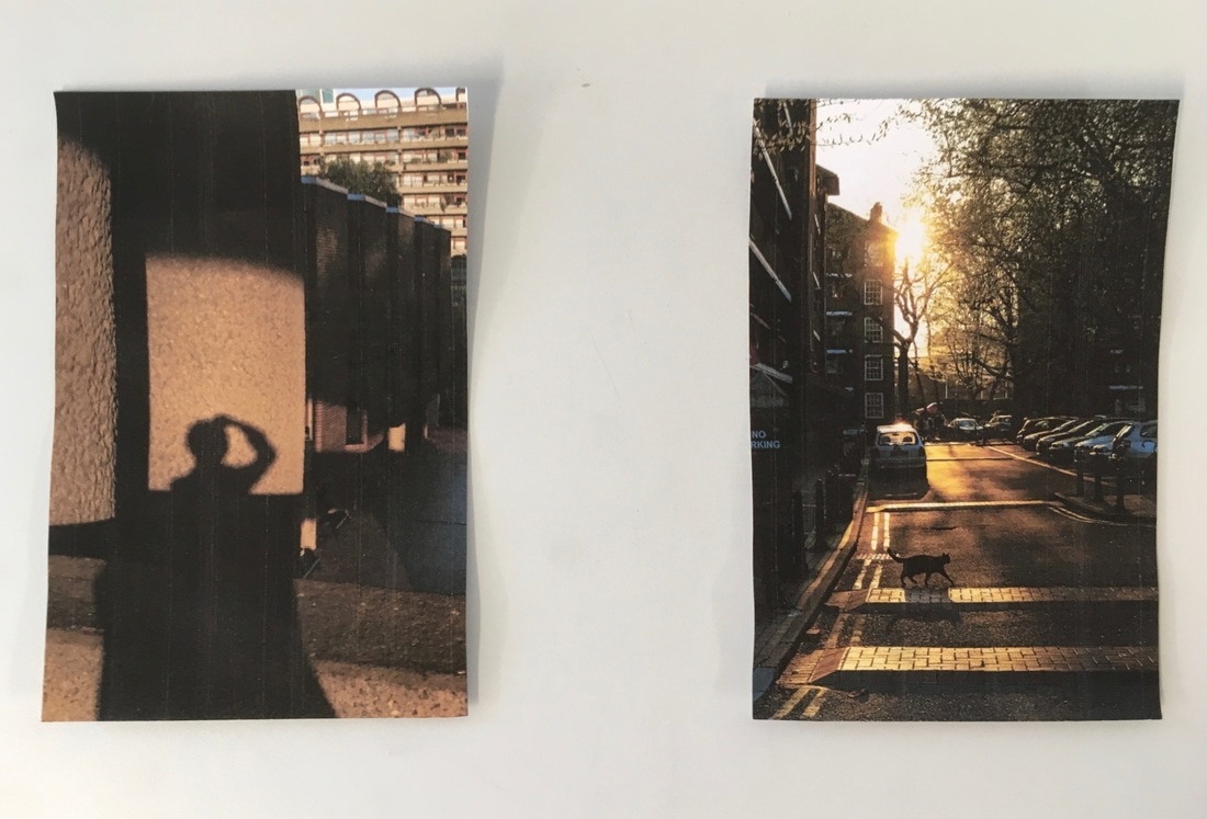
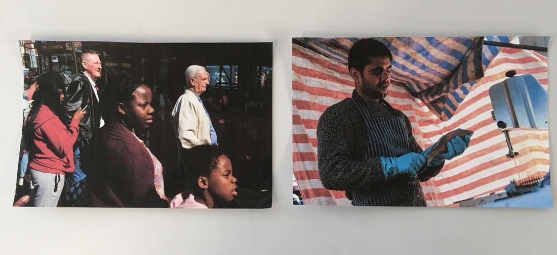
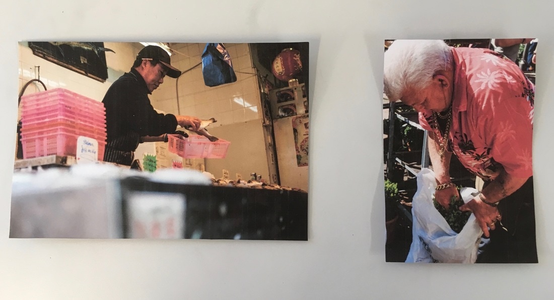
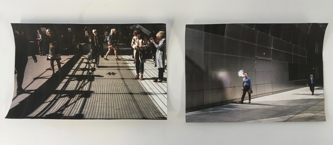
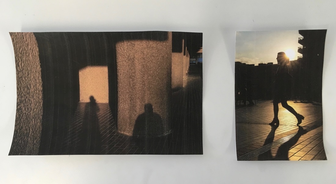
Experimenting with making my photobook
Making the first digital maquetteAfter experimenting and placing various images together, I then started to make my first maquette of my photobook. I made the test maquette to begin to design the layout of my photobook, and see what the images look like arranged together in a book format. I made this maquette on bookwright, which is a publishing software that can be used to make photobooks. This software is provided by Blurb, the company that I am using to make/publish my photobook. This means that it has all the different book formats and styles available in Blurb on the bookwright software.
|

|
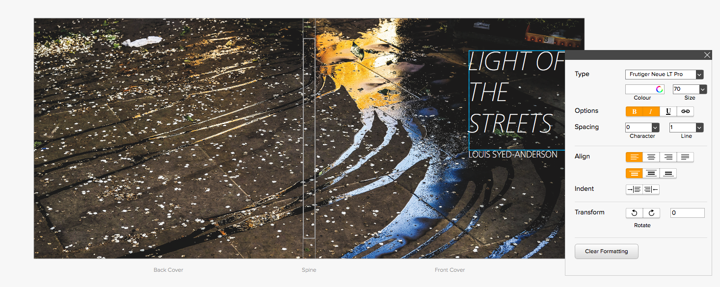
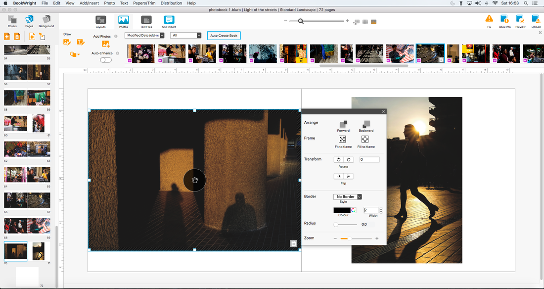
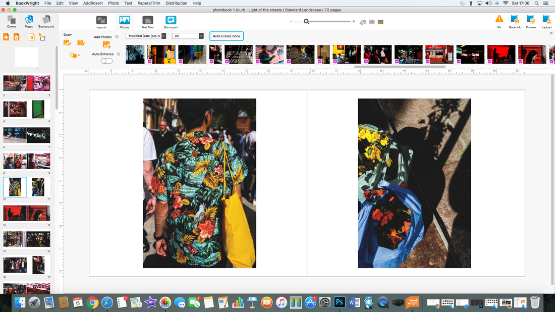
The bookwright software was quite easy and straight forward to use. It had a number of good tools, and allowed my to easily format and arrange my images throughout the layout of the book. Below, you can see screenshots of the bookwright software. On the far left screenshot, I selected the size of book from the available options; I selected standard landscape, as the majority of my images are landscape; and these images would look better displayed in landscape orientation. I also thought that large landscape may be slightly too large, especially if I wanted to include cropped images or images spread over a couple of pages (the quality could be compromised if the images are stretched over large pages); I think standard landscape is the most suitable size for this photobook. On the second screenshot from the left, is the whole cover of the photobook. For the cover, I decided to stretch my image of this splash of water over the whole cover. This is one of my favourite images, and I think it works well with the colourful reflections in the water on the front cover, and then the running streams of water spreading and extending outwards and across the back cover. I also inputted a title onto the cover using the text tool - as I wanted to test different fonts and how the text would look on the cover. I selected quite a simple, modern font (I also selected white text colour due to the dark background) and inputted a large title and my name below - the name I used is just one provisional idea for the title of the book, and I have not decided on the final title yet. In the other two screenshots on the right, you can see my inputting and arranging images across the various pages. On the pages bar/column on the left hand side, I can organise and add pages to my book, and select and move around various pages. In the photos bar at the top, I could import various images to add to my pages. I could easily drag certain images onto the pages and adjust their size and positioning.
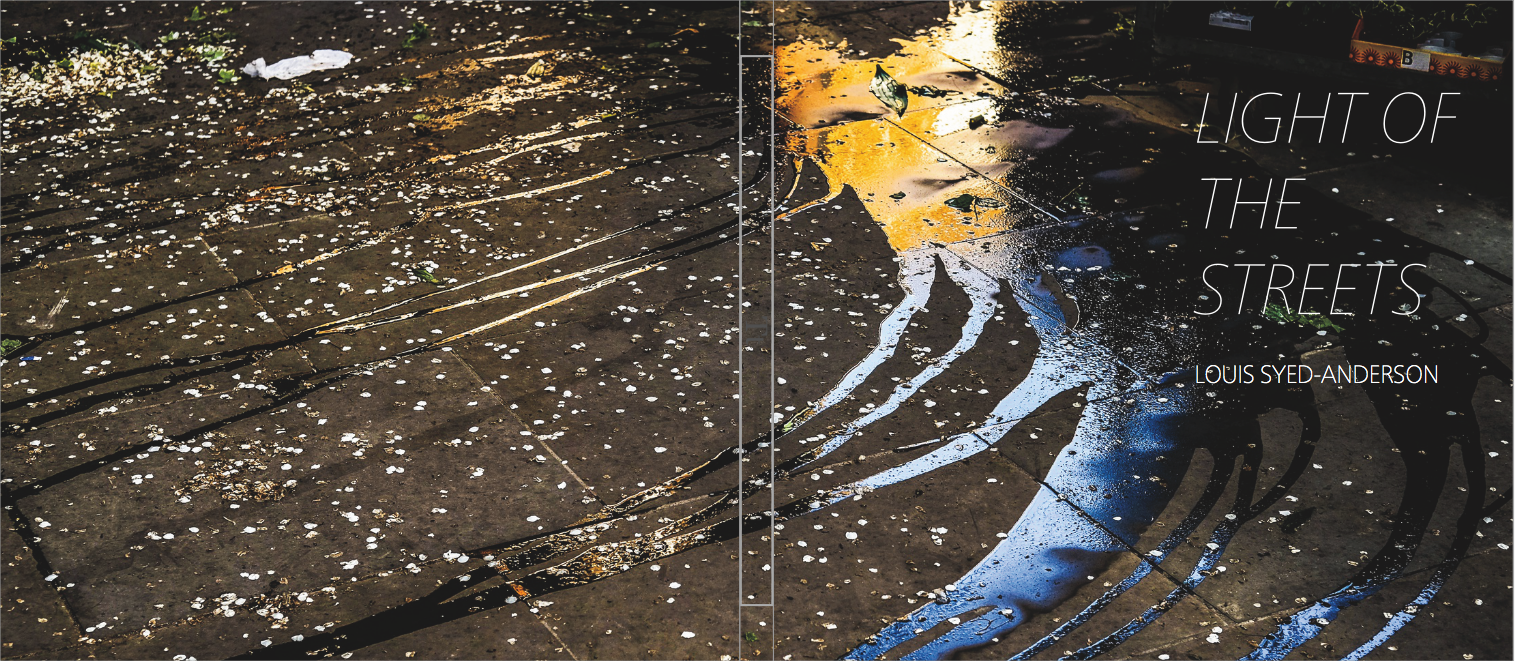
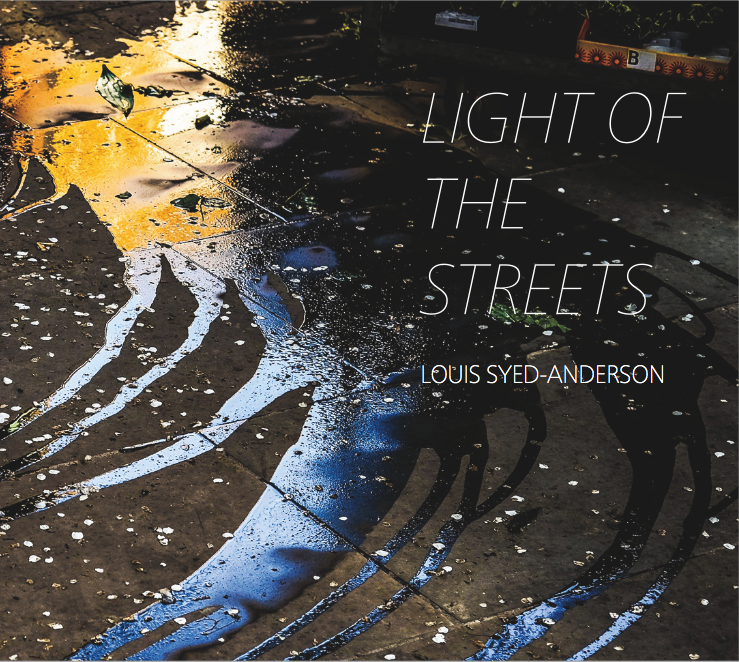
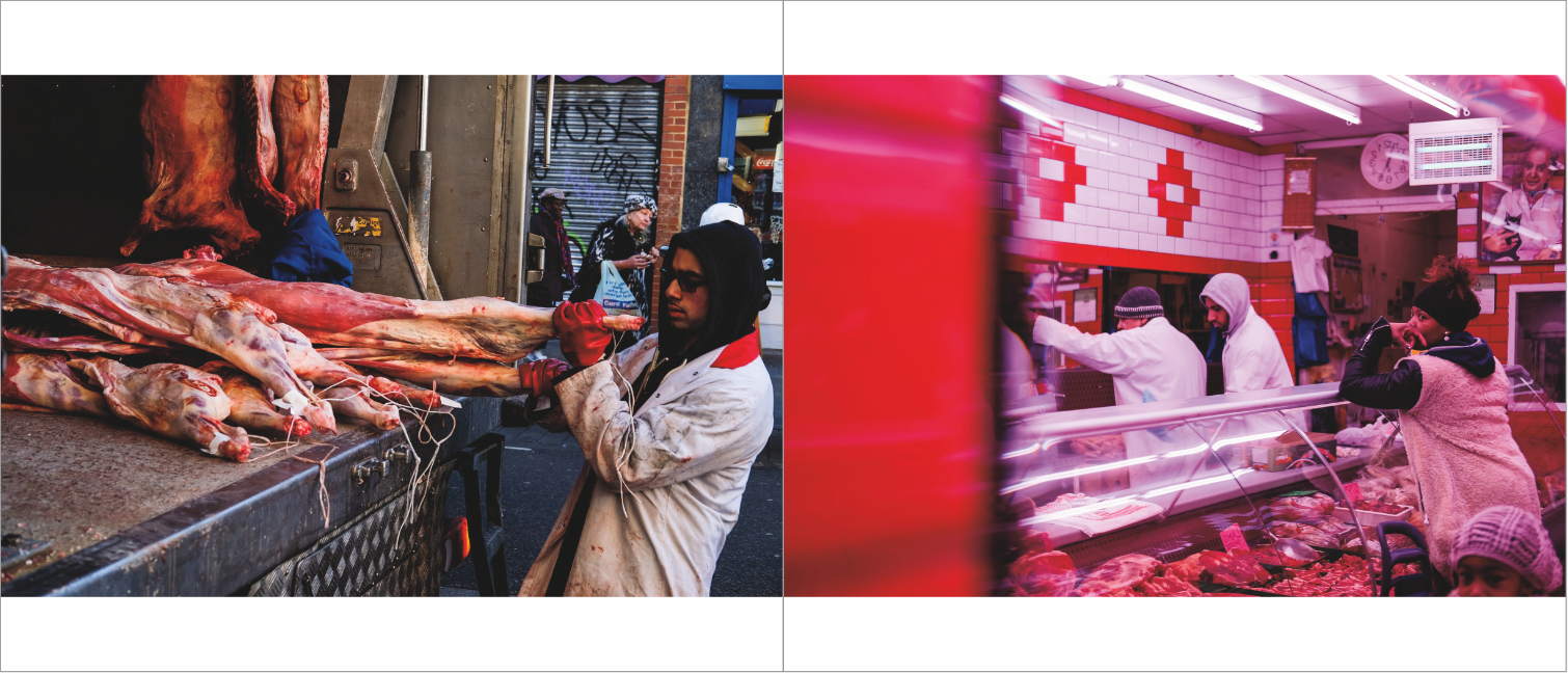
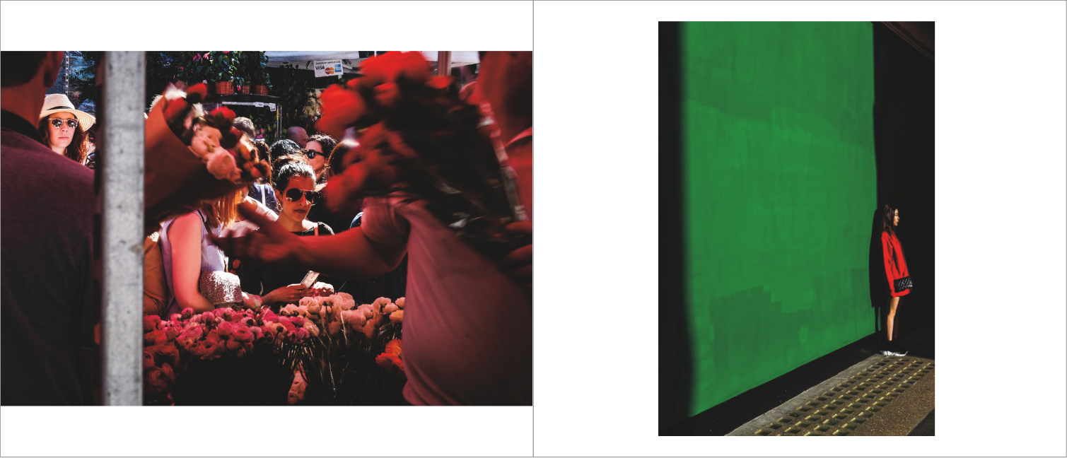
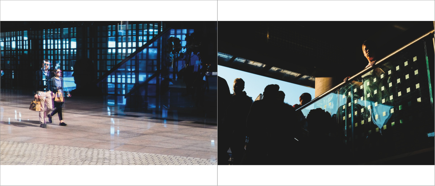
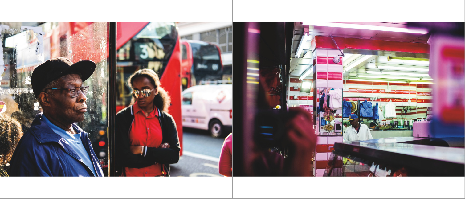
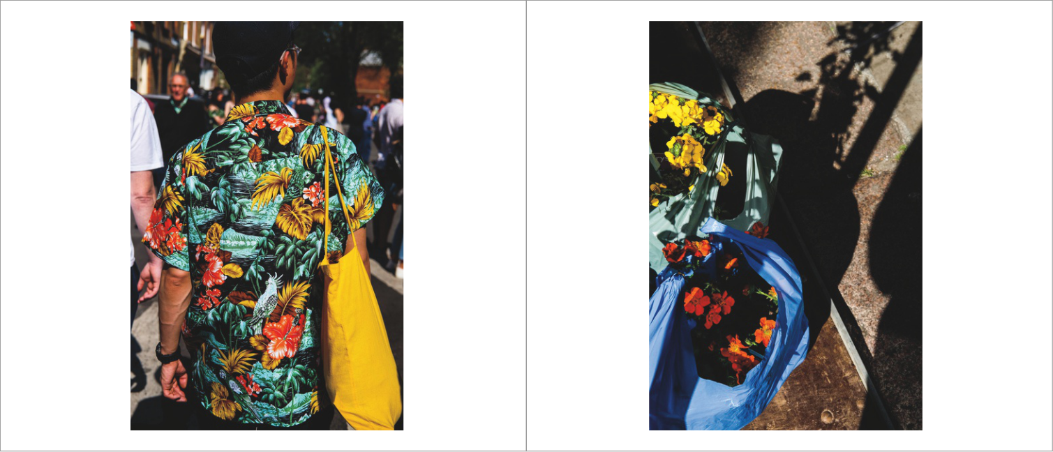
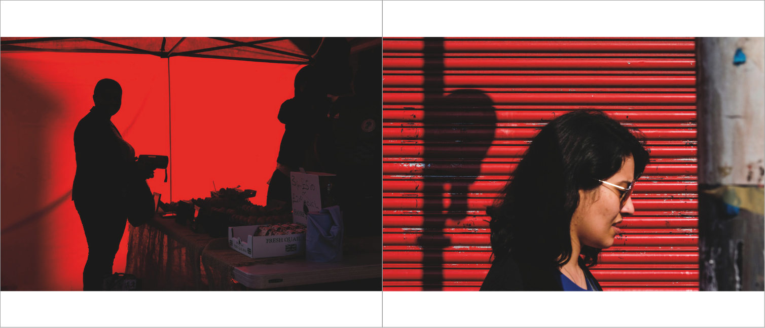
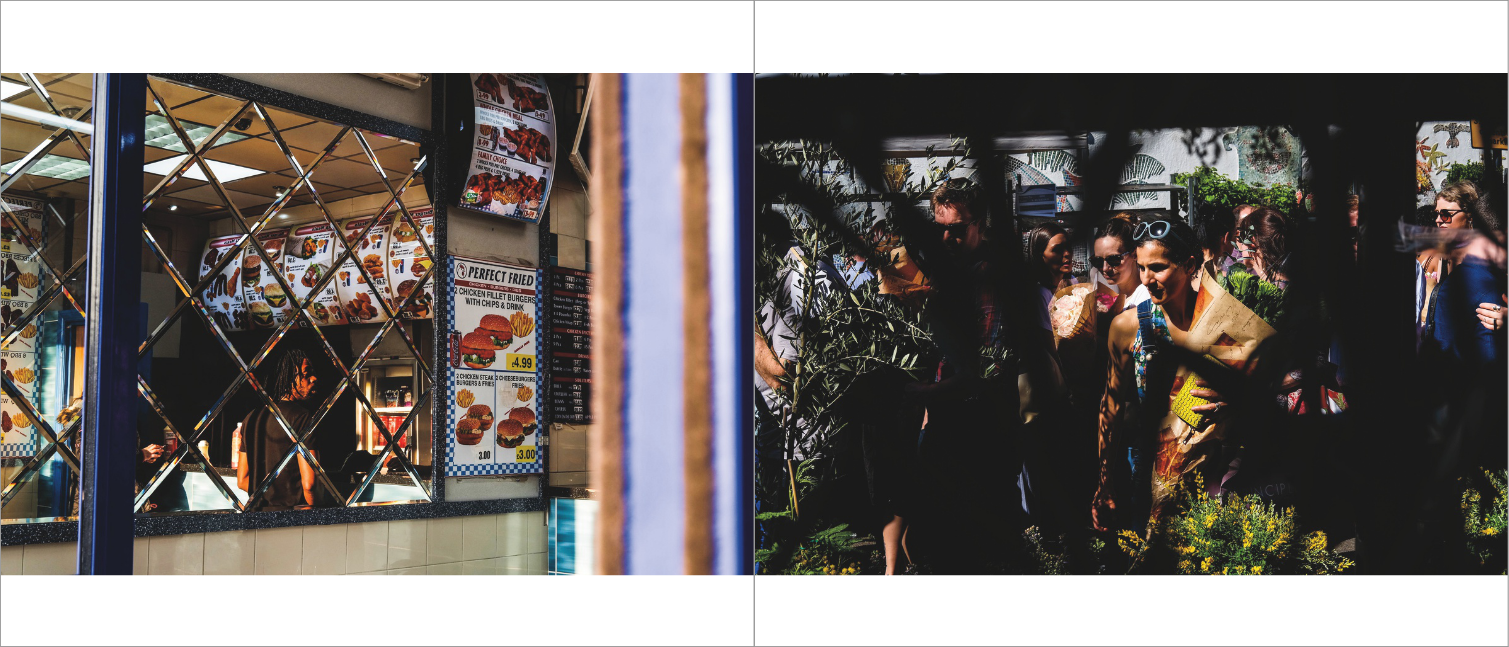

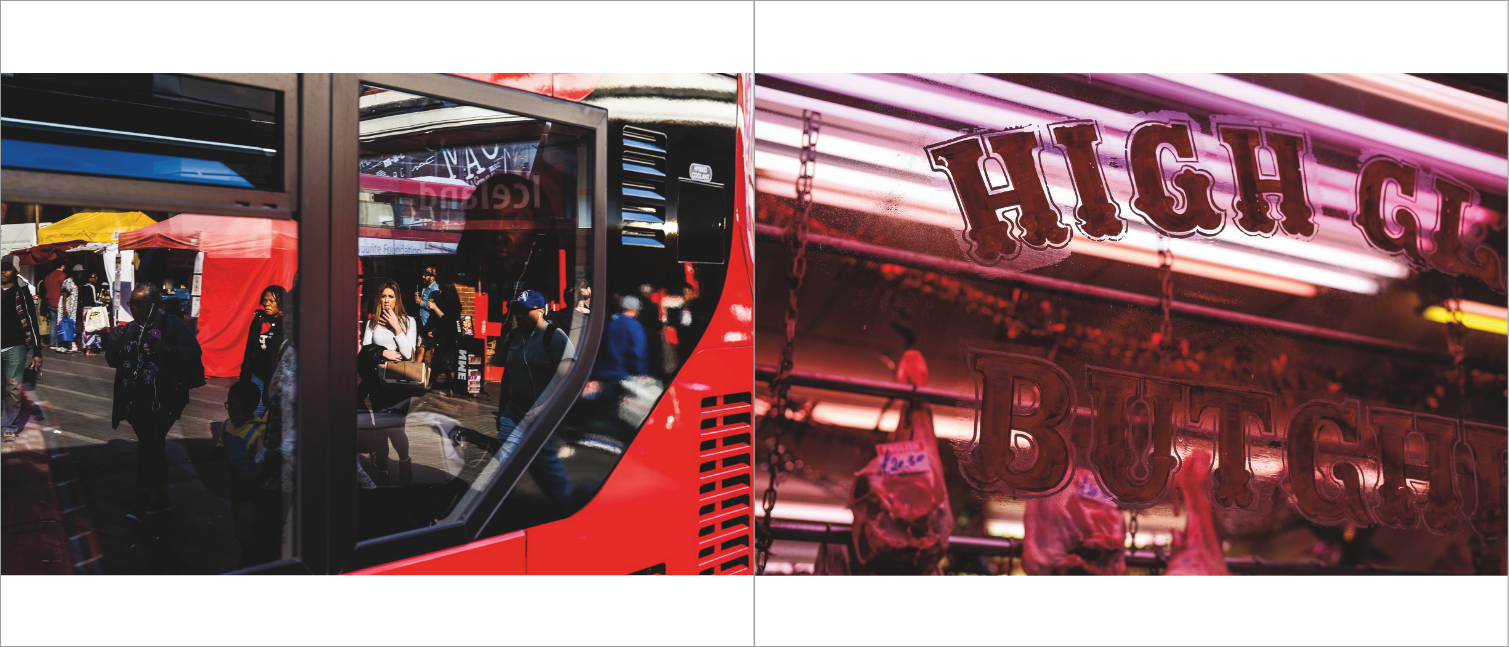

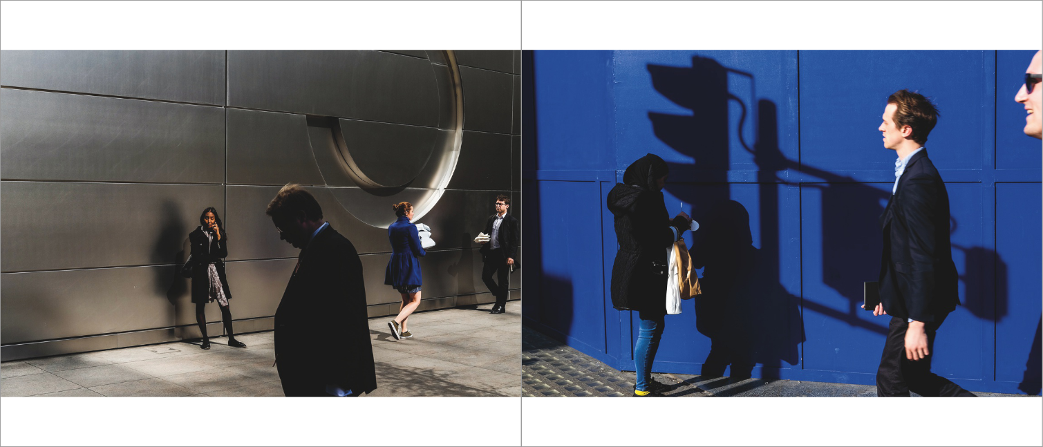
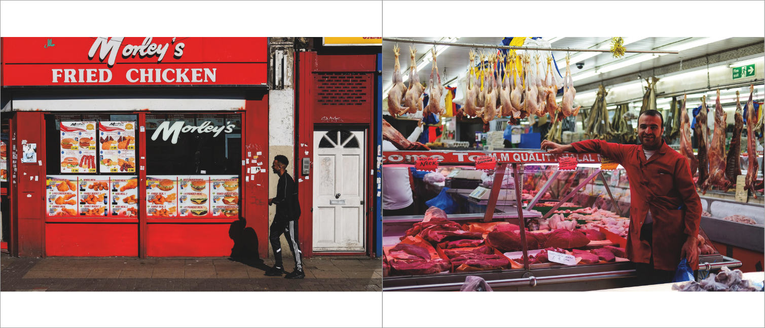
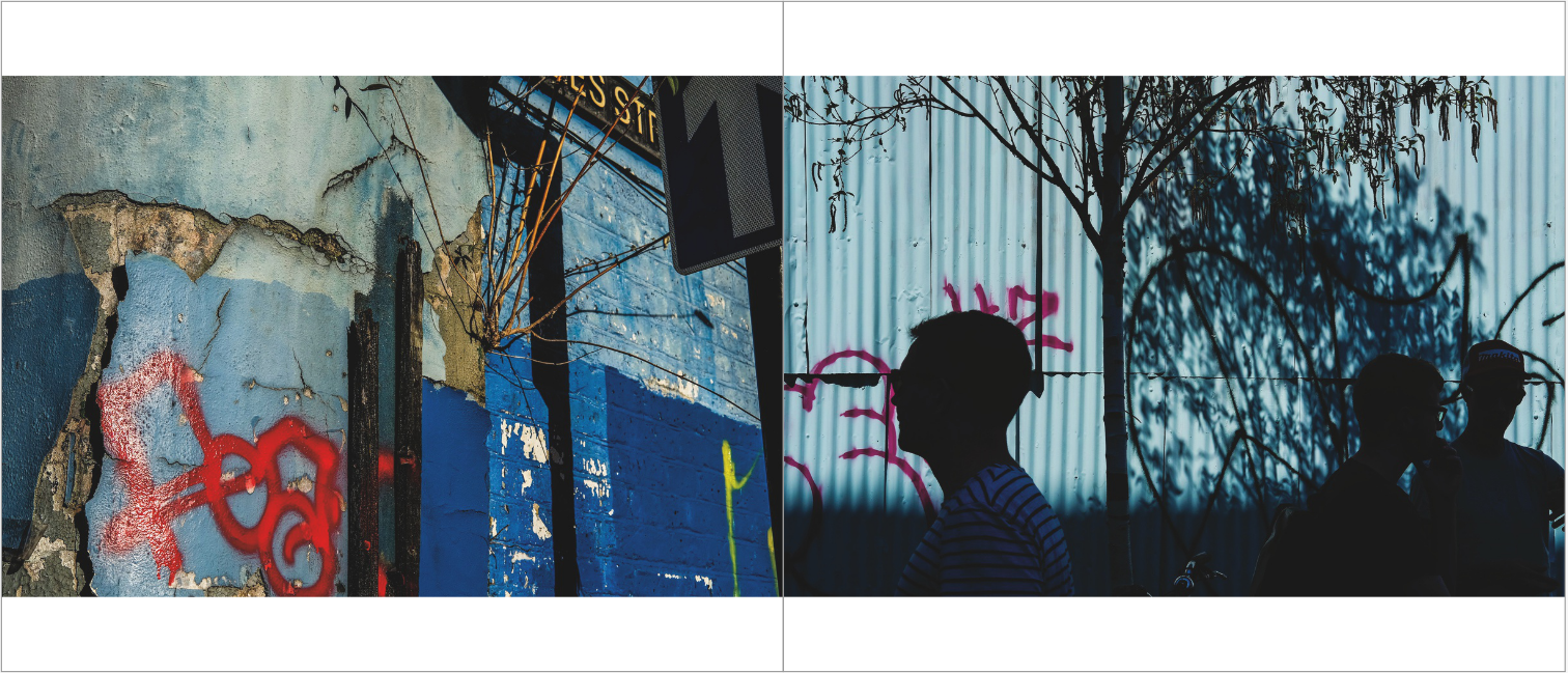
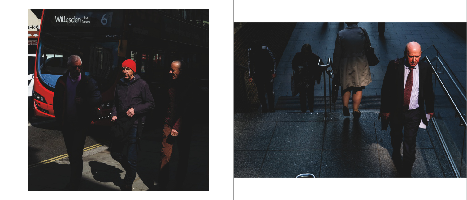


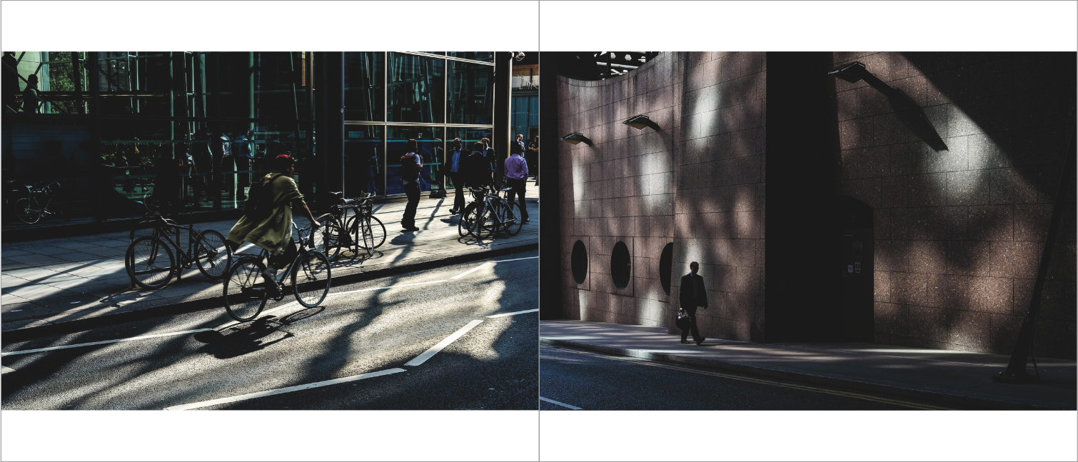
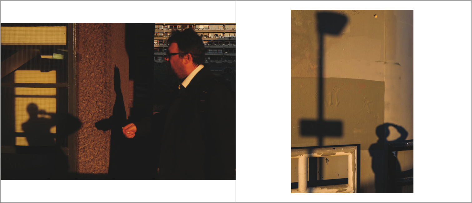


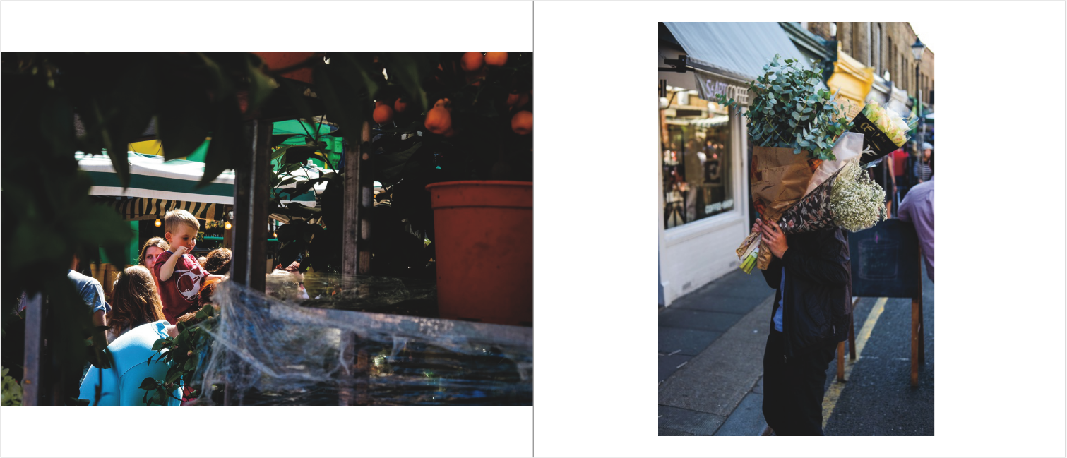
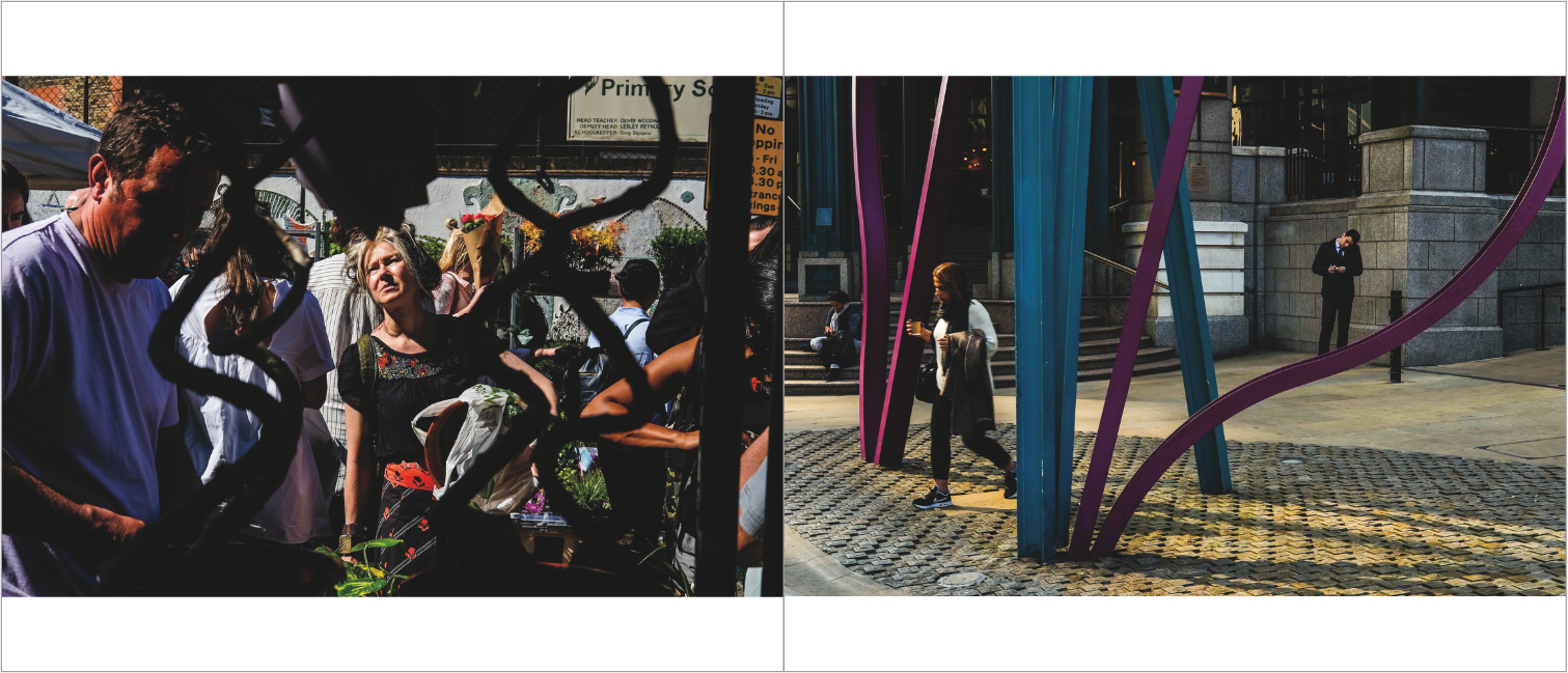


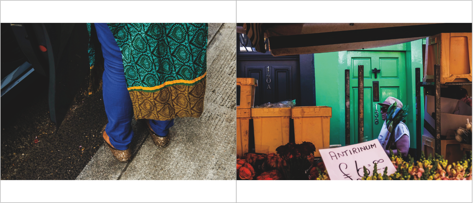
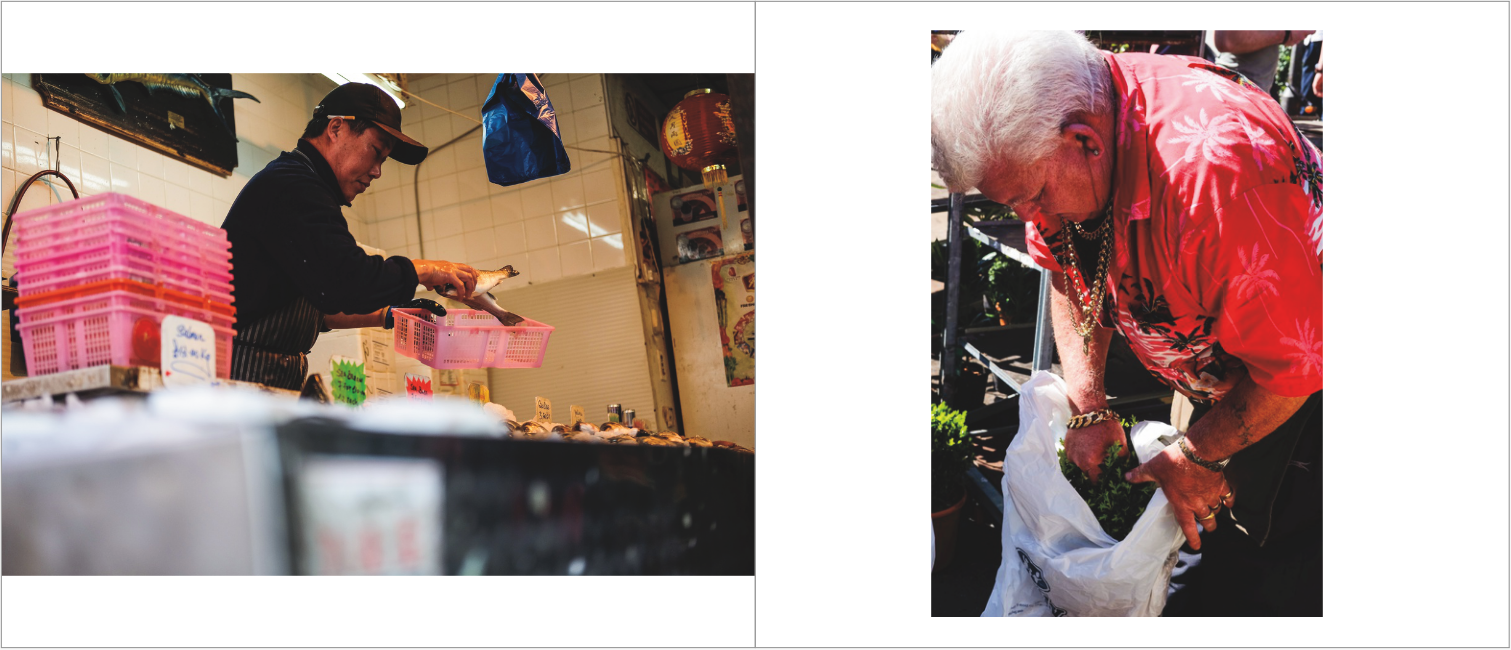
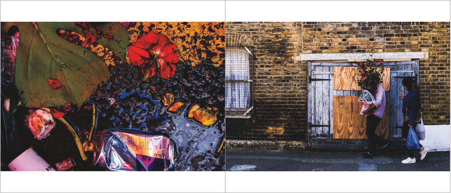
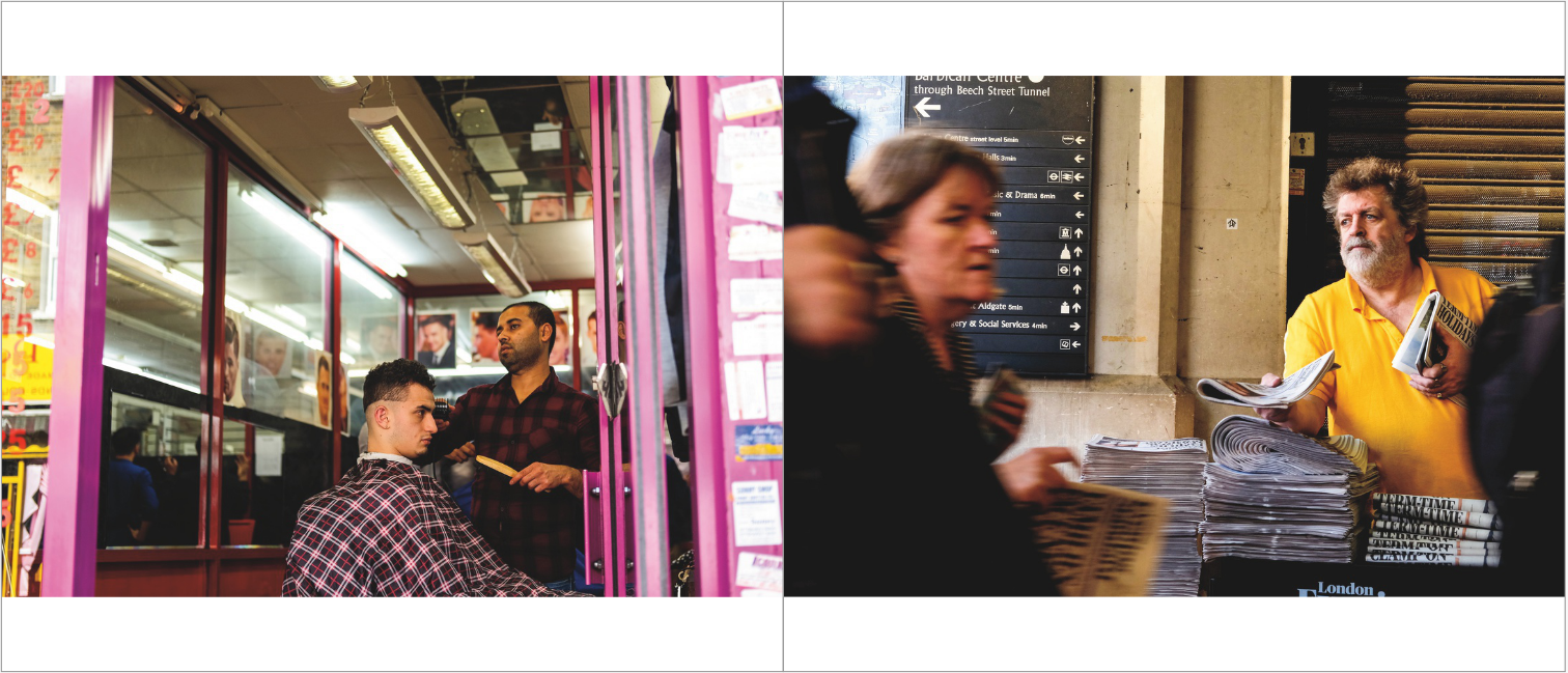
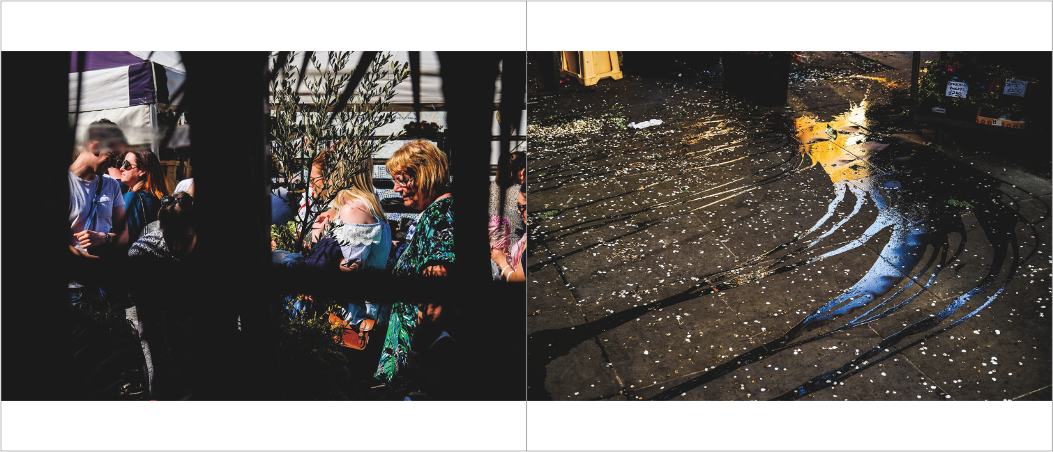

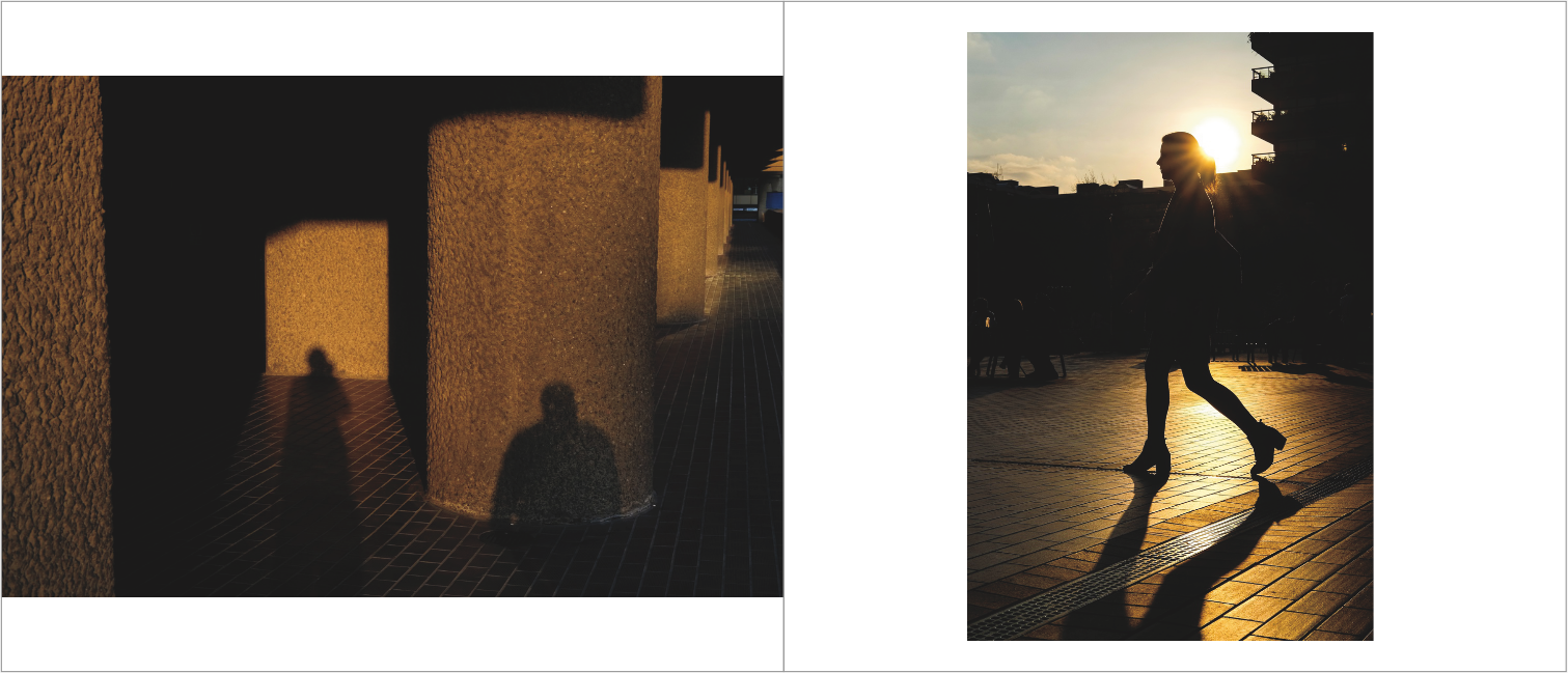
Overall, in this photobook, I was mainly inputting the images that I had previously placed together. I mainly just wanted to see how the images (that I had put together) looked in a book format. I have kept the formatting and size of the images pretty uniform through this first photobook. Every page has an image on it, and the landscape images are all pretty much identically sized on the pages. I am quite pleased with the outcome of this first digital maquette, I think that quite a few images work well together. Moreover, I think they create quite a successful narrative as you read the book from front to back. However, I think that I will vary and change the formatting of my images in the next maquette that I make. Although there is uniformity in this book, I think variations in the placement and formatting of images is needed. Also, some images being placed on their own across a double page spread could work well - certain images could look better individually with some breathing space, or enlarged. However, this will take some testing and experimentation in the next maquette that I make. I think that I will use bookwright again and probably for my final photobook - this is because I enjoyed using the software, especially as it is specifically tailored for the books available through Blurb.
Making a second digital maquette
After reviewing and evaluating my previous digital maquette, I then made a second digital maquette. In this maquette, I was aiming to change the format of my photos; as mentioned in the evaluation of the first maquette. As mentioned before, I wanted to place a few images by themselves, with some spread across double page spreads. I implemented this with a few images, but overall I didn't make a massive number of changes. I was quite happy with the relationship between many of the images that were placed next to one another - I didn't want to change this too much. I as quite happy with the order of images as well, as the types of images and the colours in these images vary from page to page; and similar images or similar colours were distributed quite well in the first photobook. Therefore, I only made a couple of changes in this second maquette in terms of page and image order. Not only this, but I also changes the title of the book to 'street light'. This title is a play on words and I think it summarises the streets photography theme of the book, and my use of light in the various images. As well as this, I think this title works better as it is more snappy and shorter than the previous title ('light of the streets'). Overall, I am happy with this second maquette and I think it displays and orders my images well. I do not think that I will make many, if any, changes before I order my published book from Blurb.
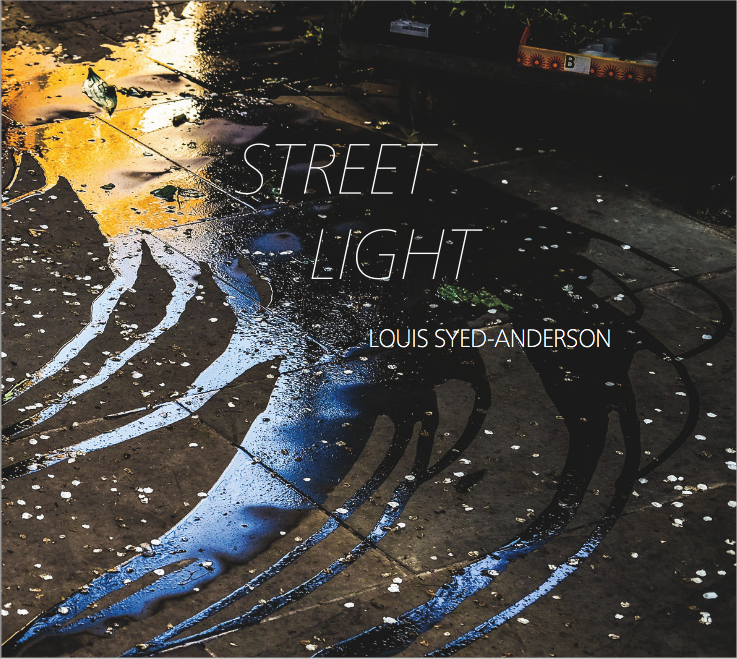


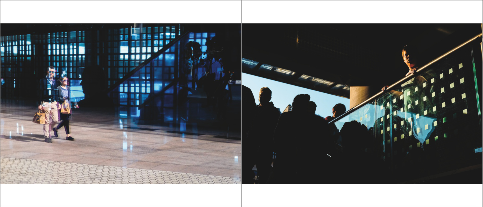

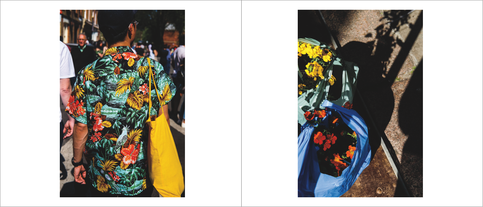

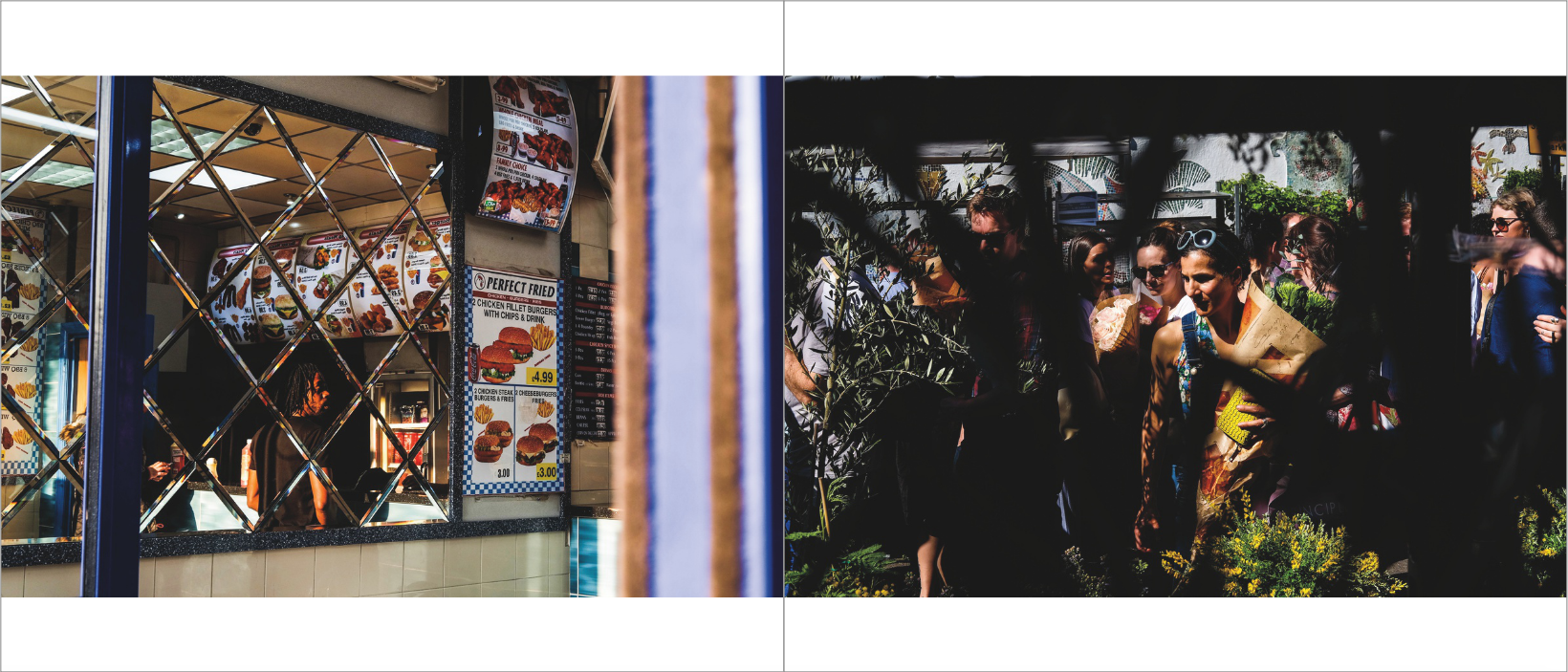

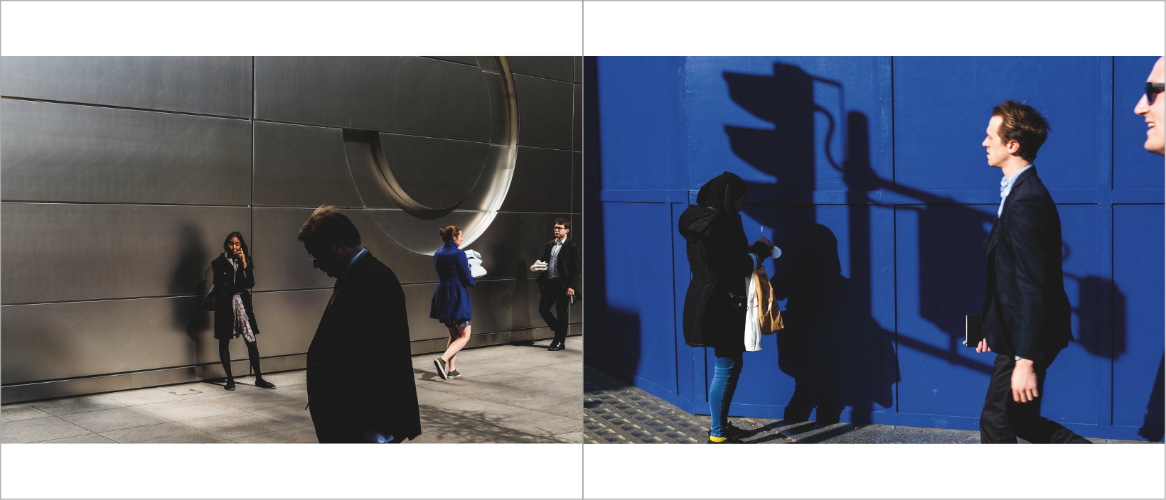
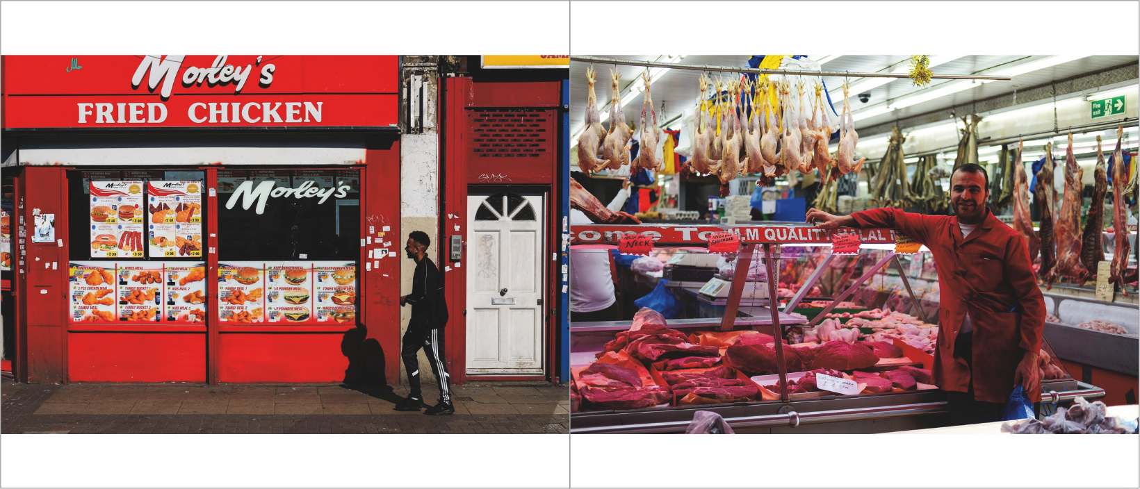
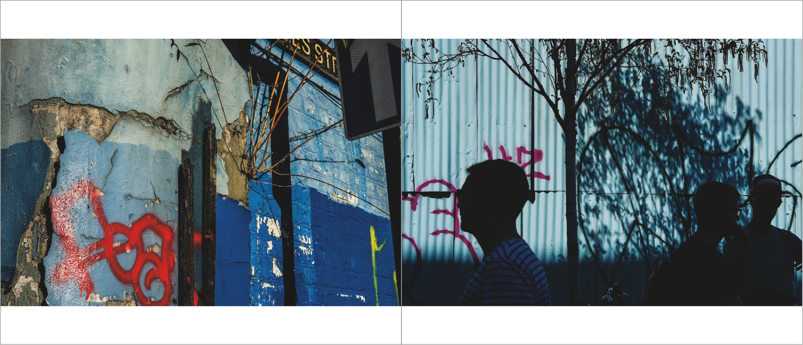
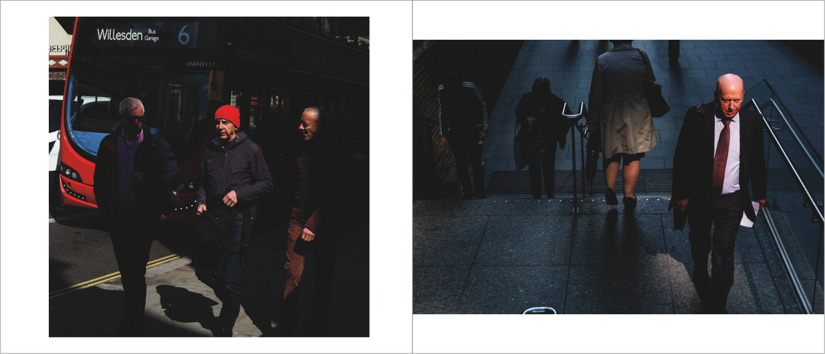
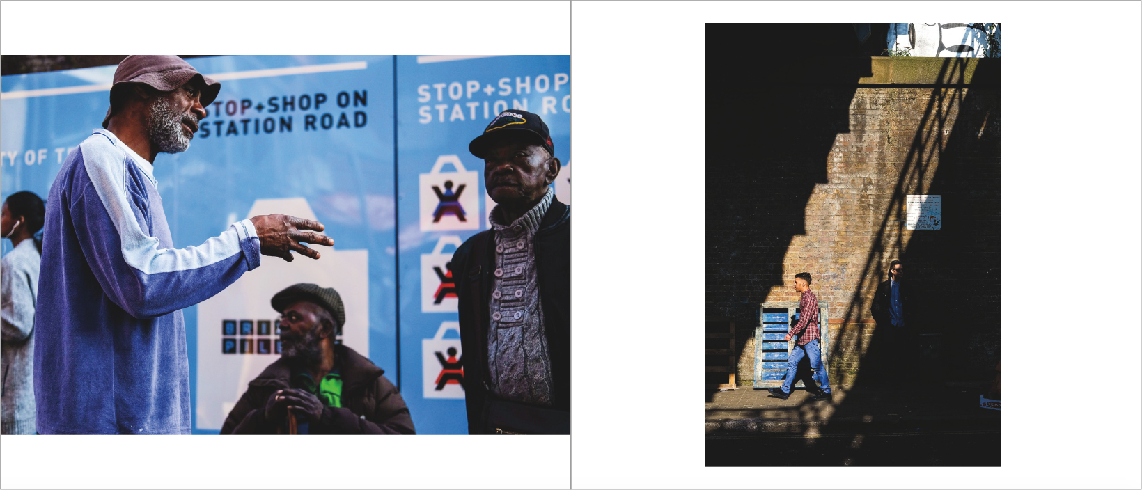
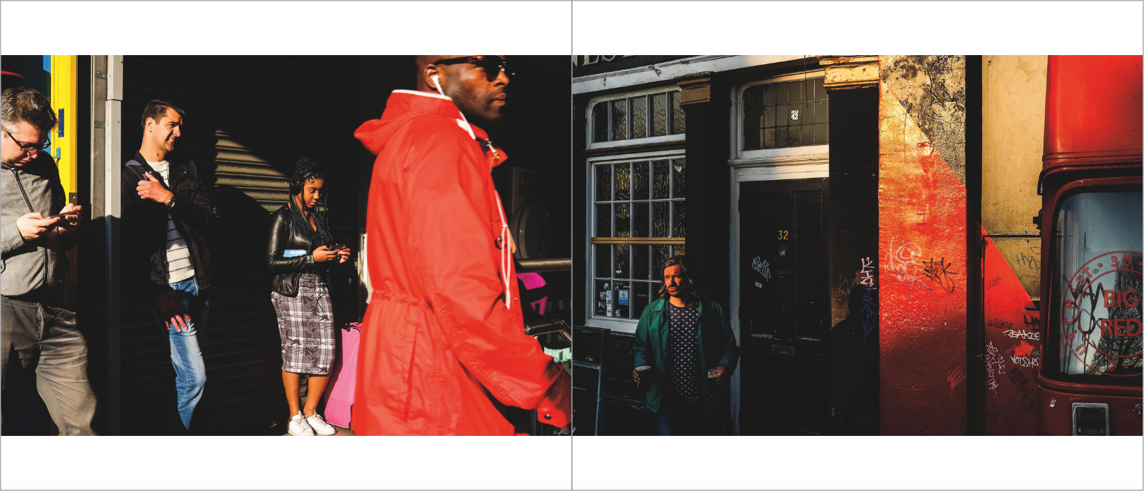


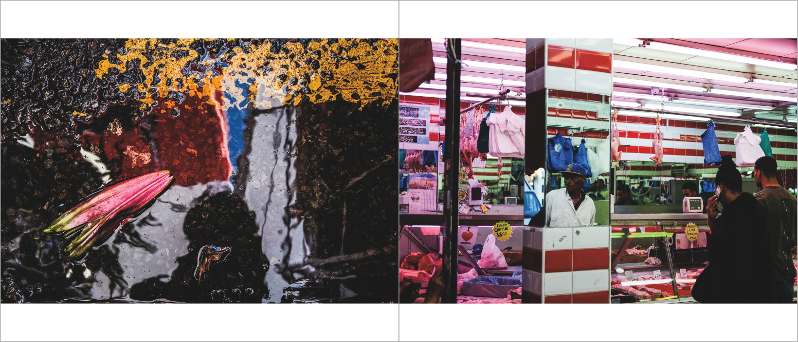
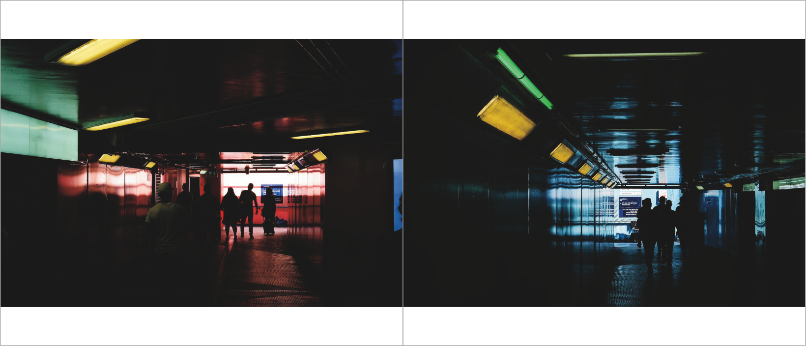
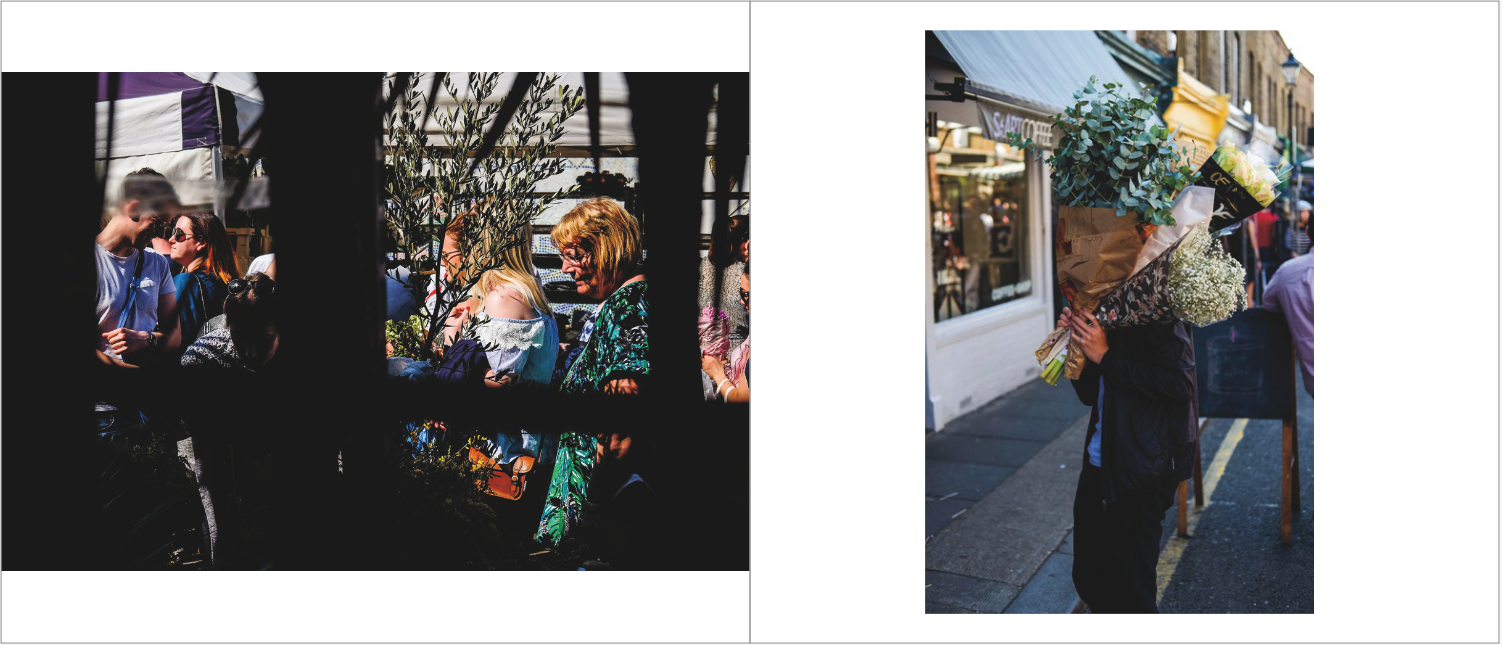
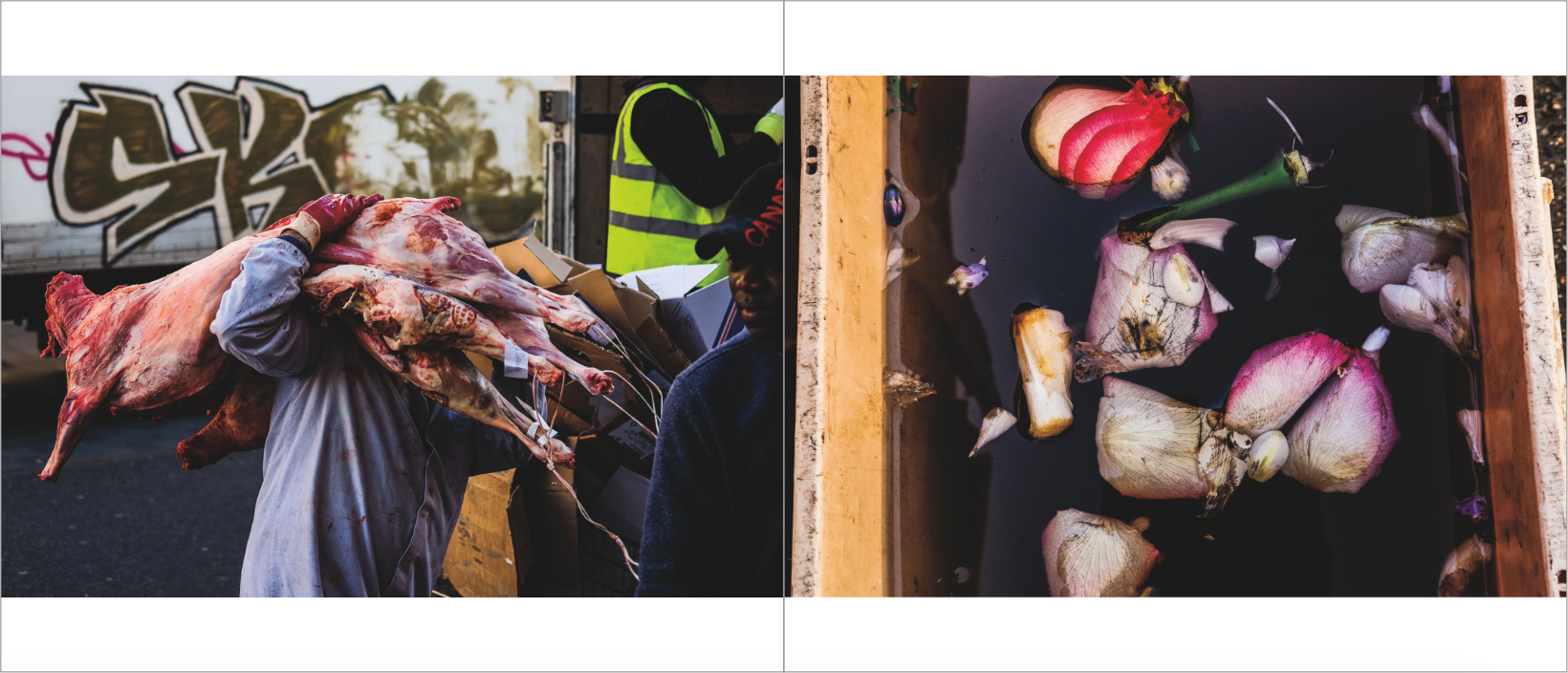
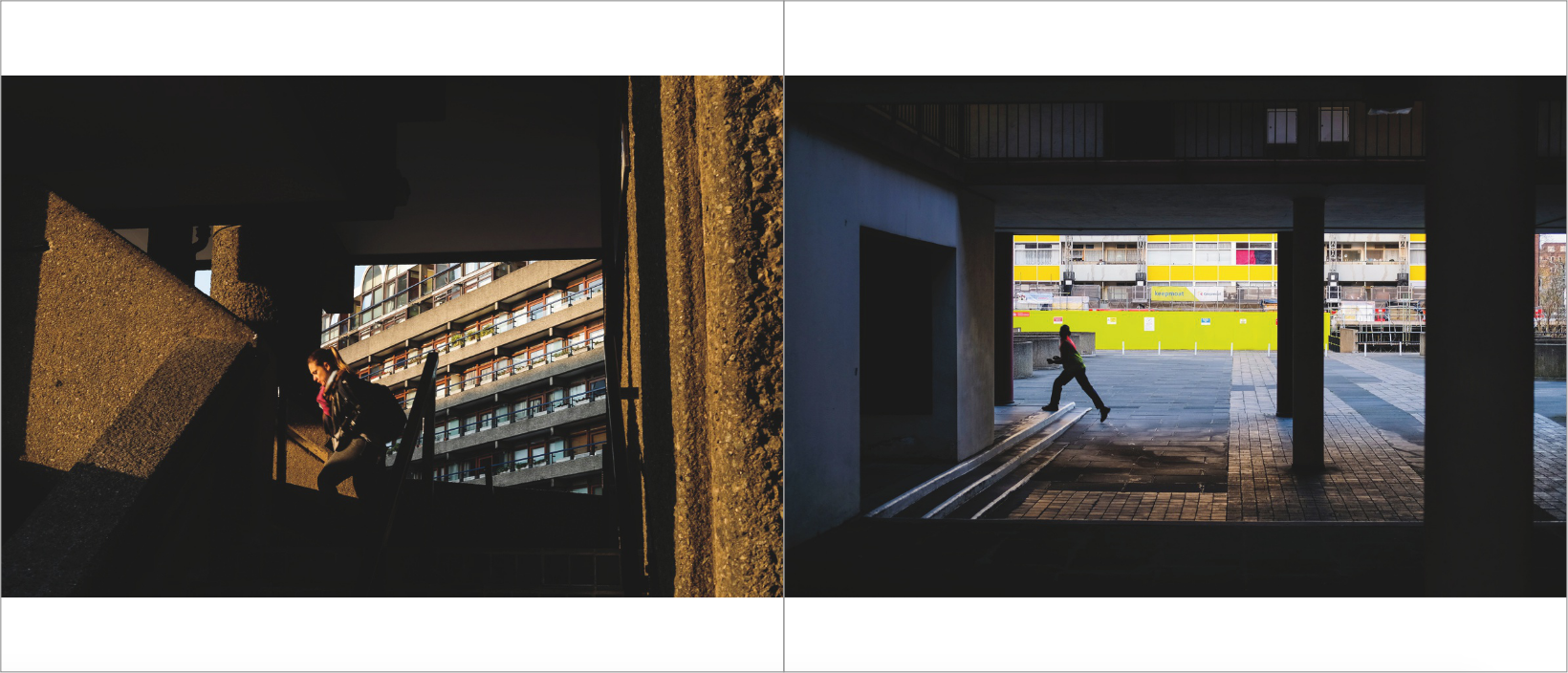
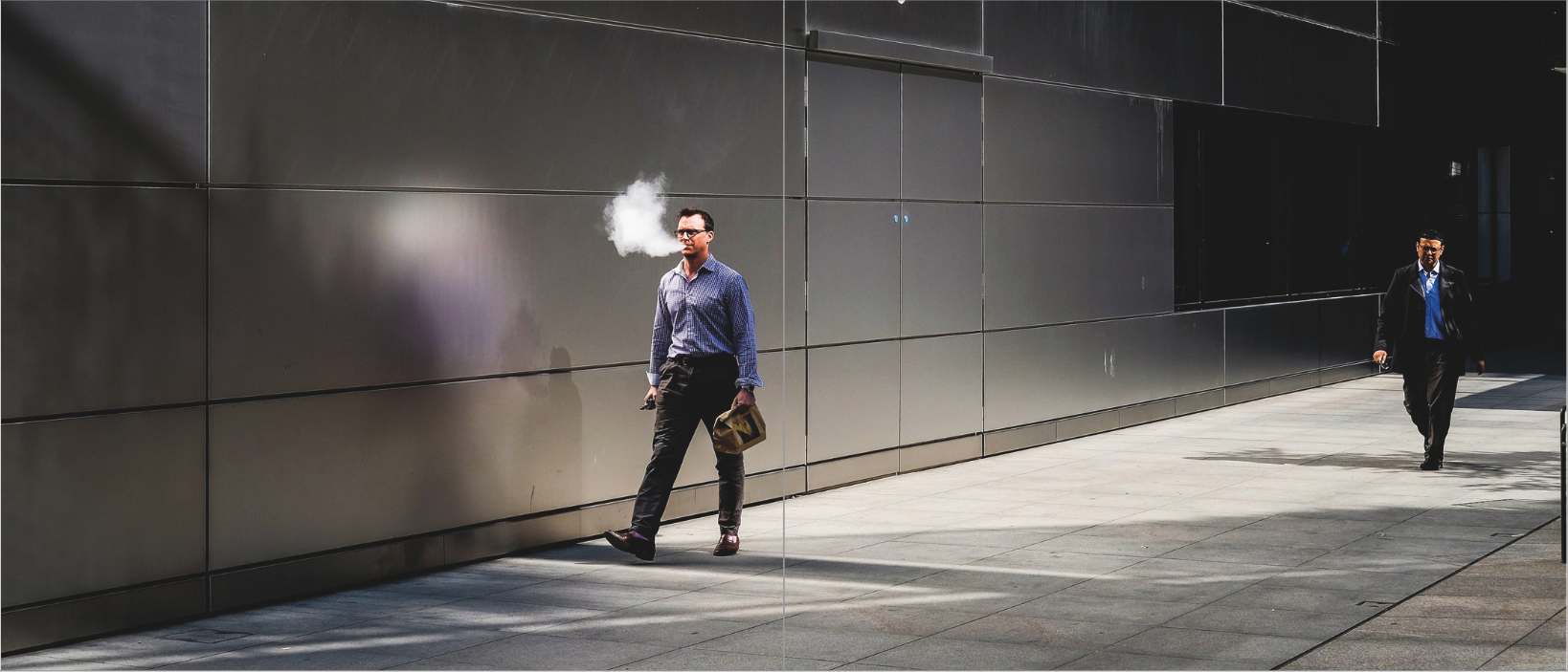
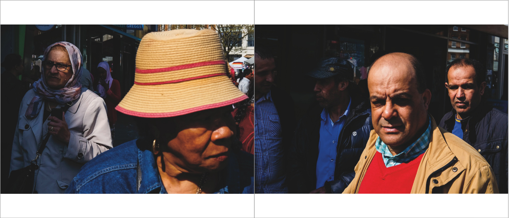
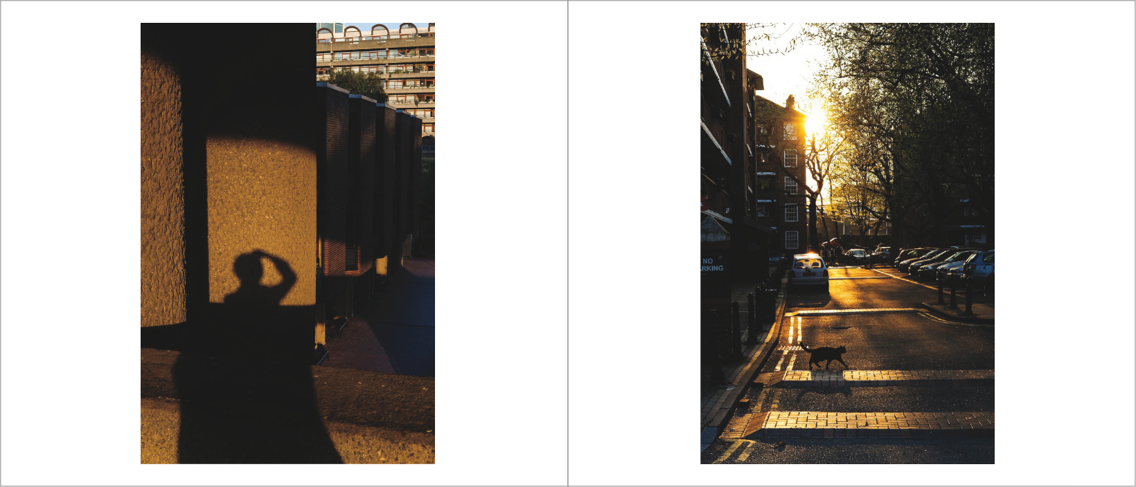


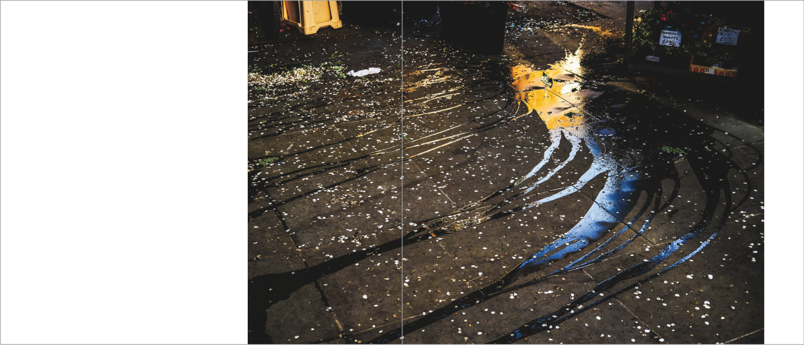
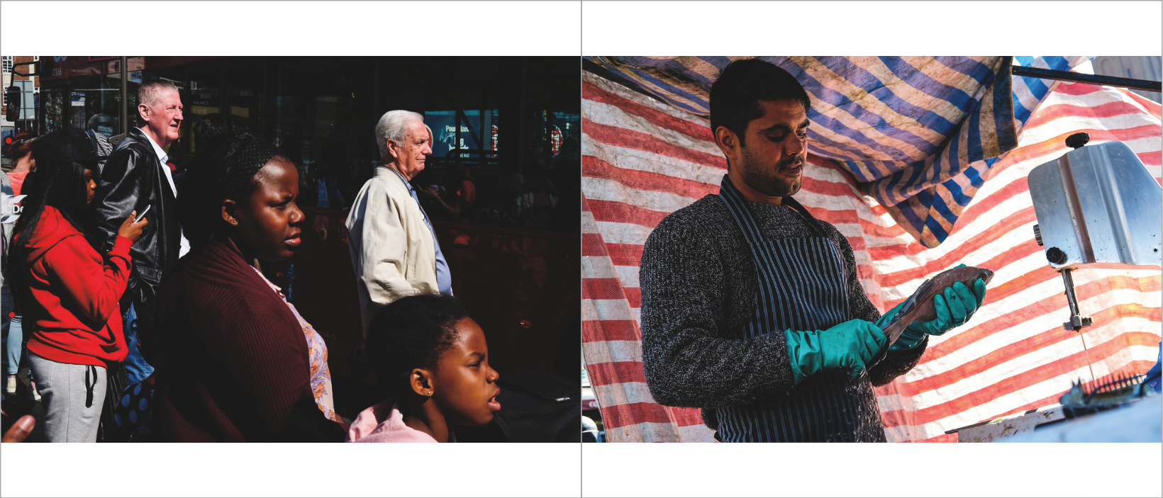
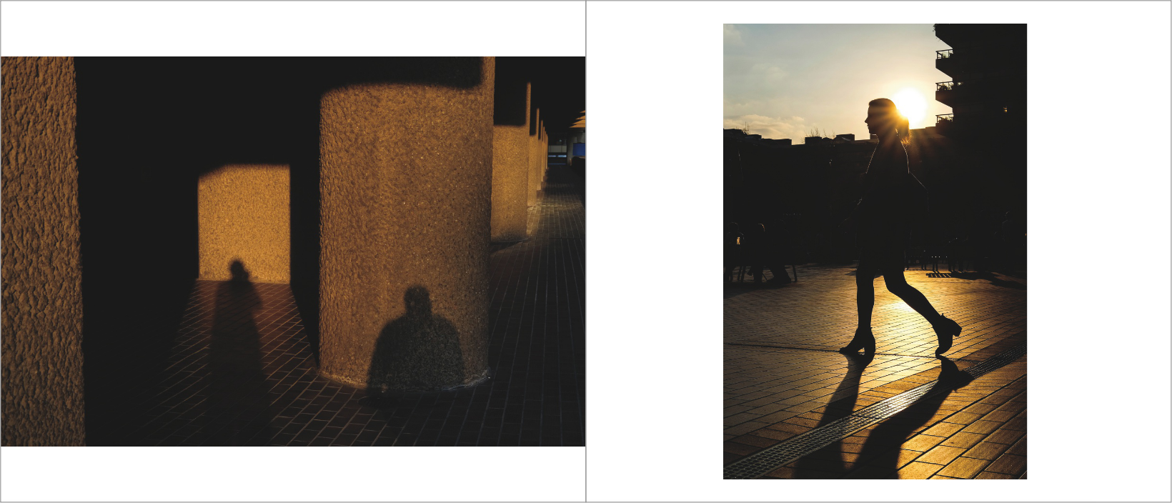
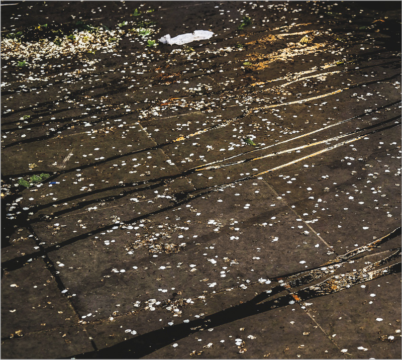
I think that the next step to see if I need to make any more changes or improvements is to make a physical book. By making a physical book, I think I will have a better idea how well the book will work, and if any changes are necessary. By flicking through the pages of a physical maquette, I will have the best possible idea of how well my book will work and feel before I order the published copy. I will need to print all of the images, but I will probably make the book by simply sticking the pages back to back.
Making a physical maquette
After creating my final digital maquette, I subsequently made this maquette, to see roughly how this book will appear when it is professionally printed. To make this photobook, I printed out all of the double spreads from my digital maquette. I then put these spreads in the right order, and I glued the backs of each page together. I did this for the whole photobook, and I glued all the backs together to construct the entire book. It was quite a lengthy process and I had to be careful when glueing, but overall, I think it is quite a successful and decent quality maquette. After I glued completed the maquette, I then flicked through and reviewed the layout. I also looked at how the images look as you read through the book chronologically, the order of images particularly. You can get a much better idea of how well the book will work overall when you can physically flick through the pages. Making a maquette gives you the best idea of how well the book will actually work when published.
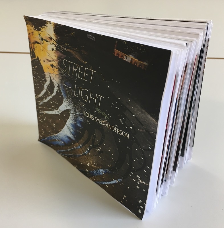
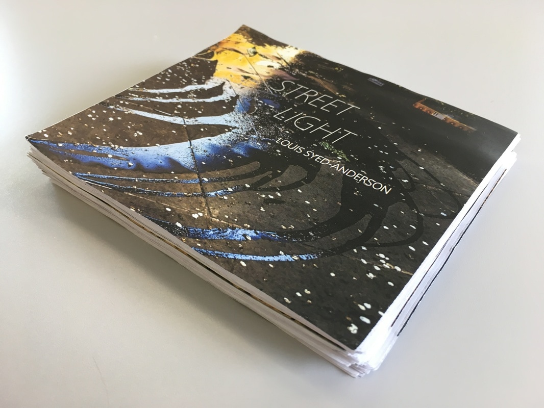
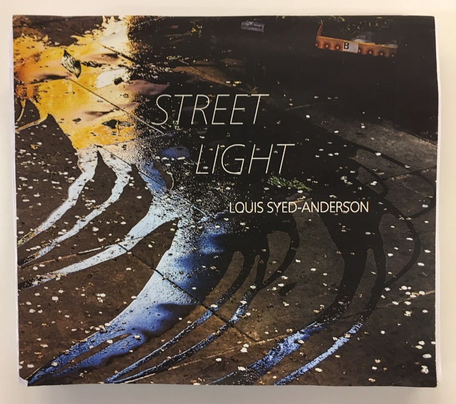
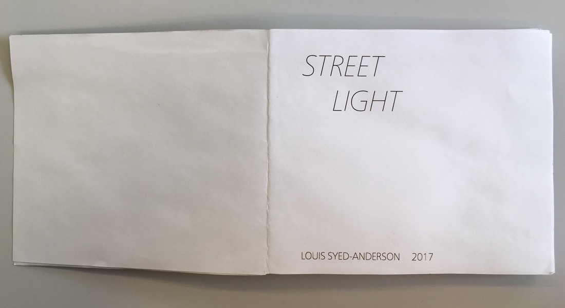
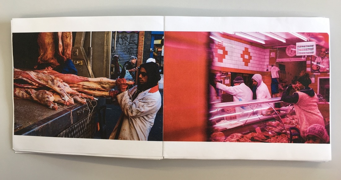
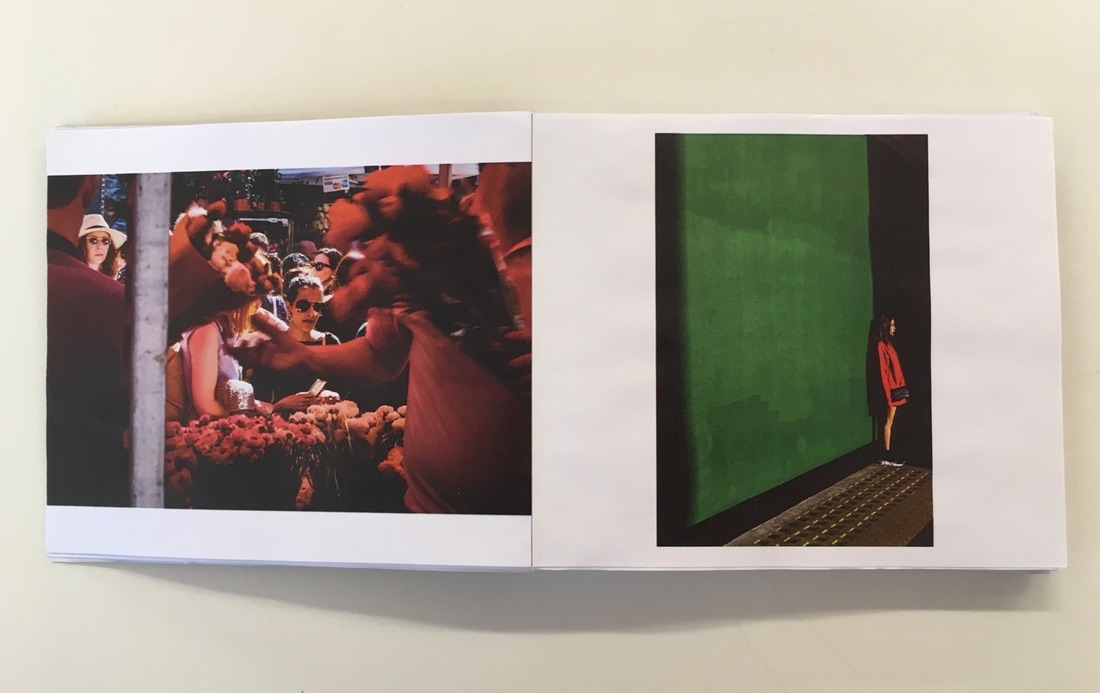
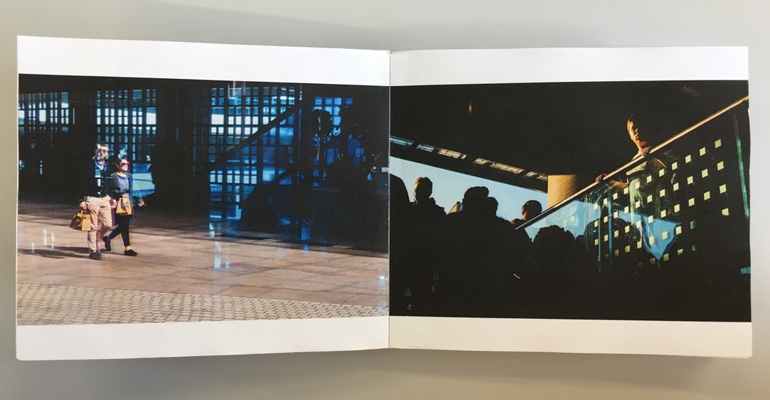
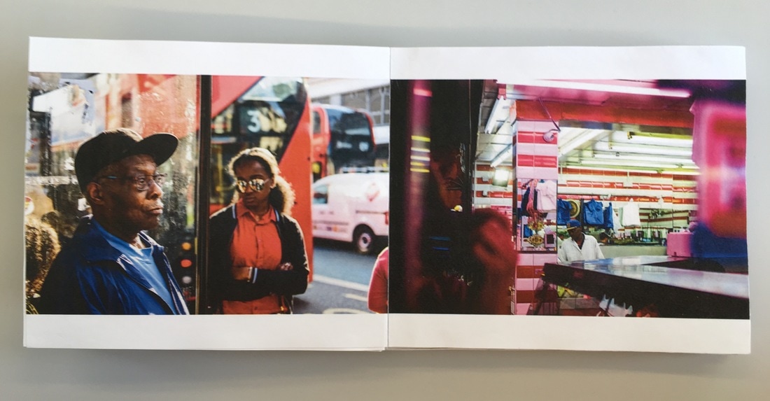
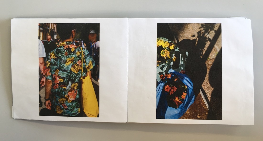
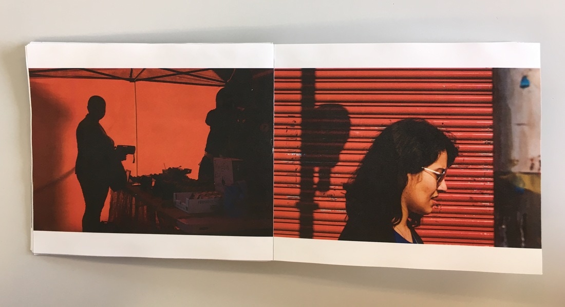
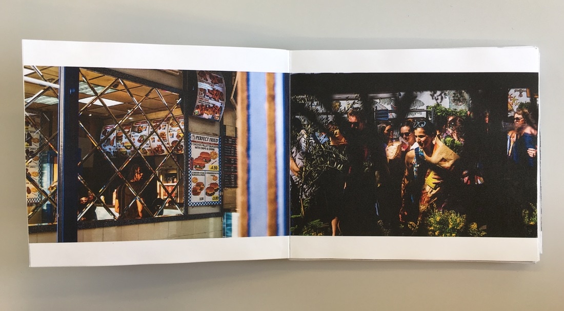
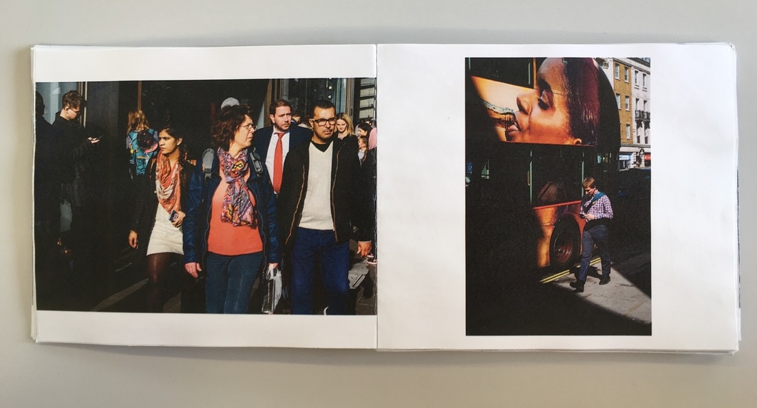
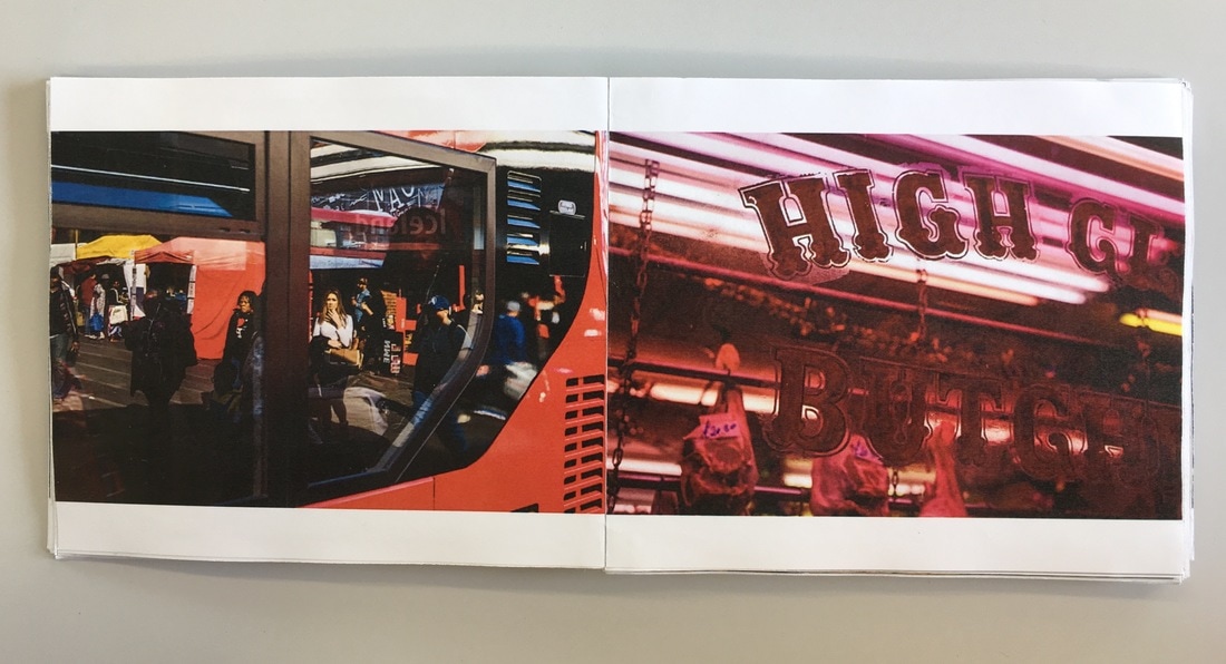
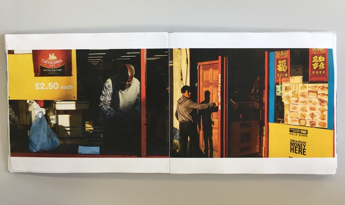
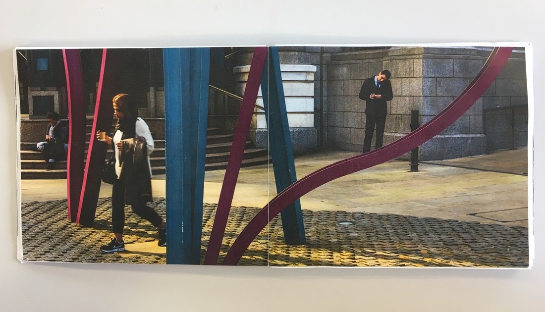
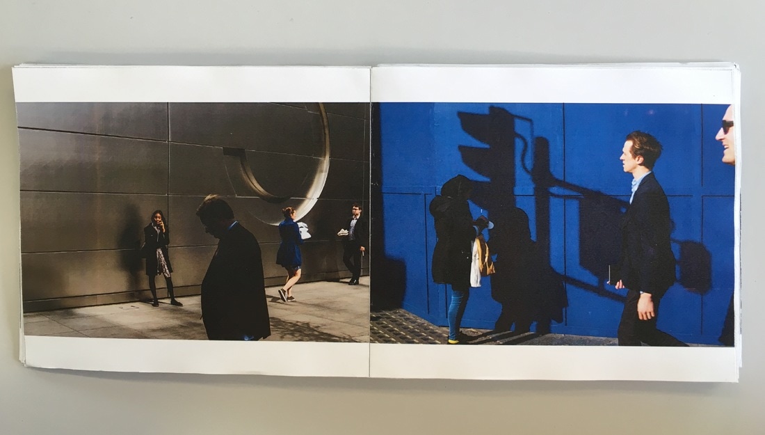
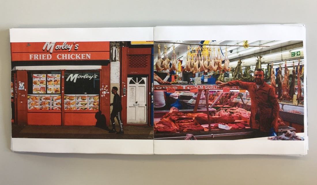
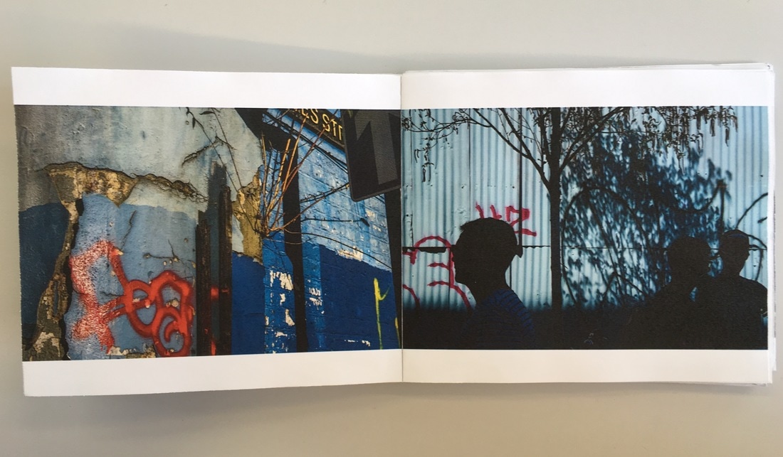
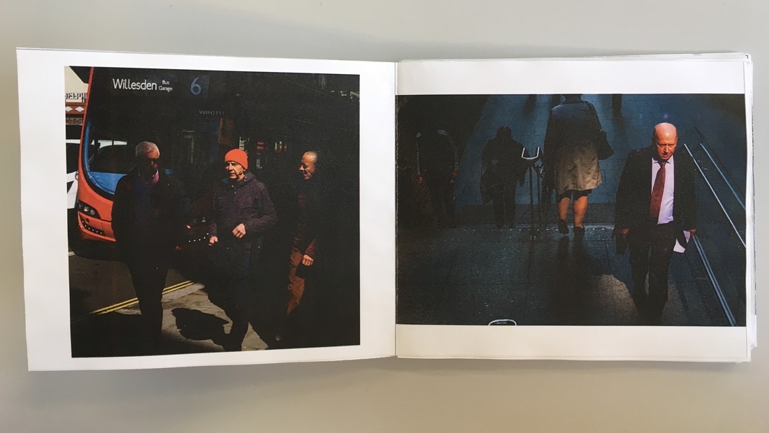
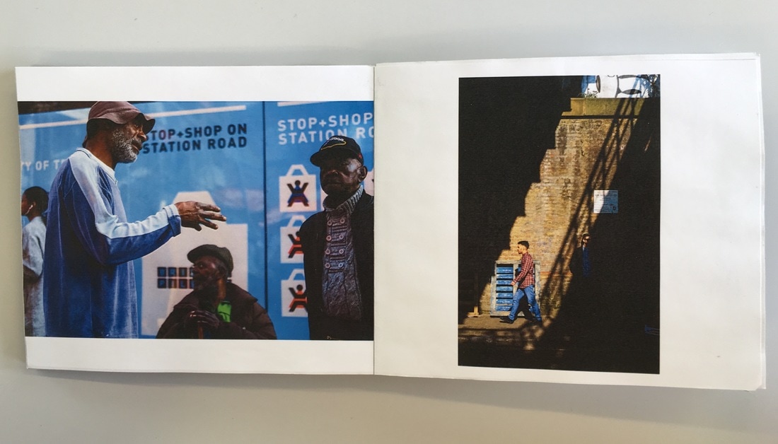
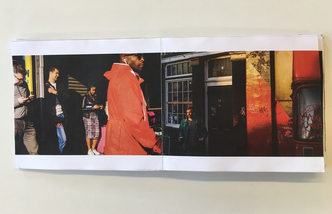
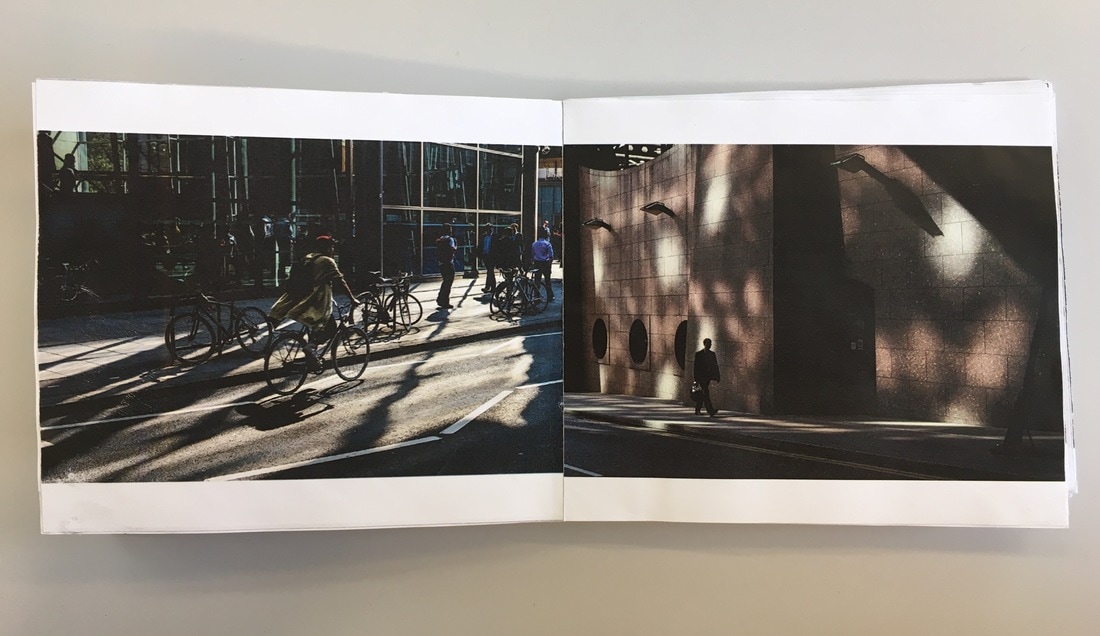
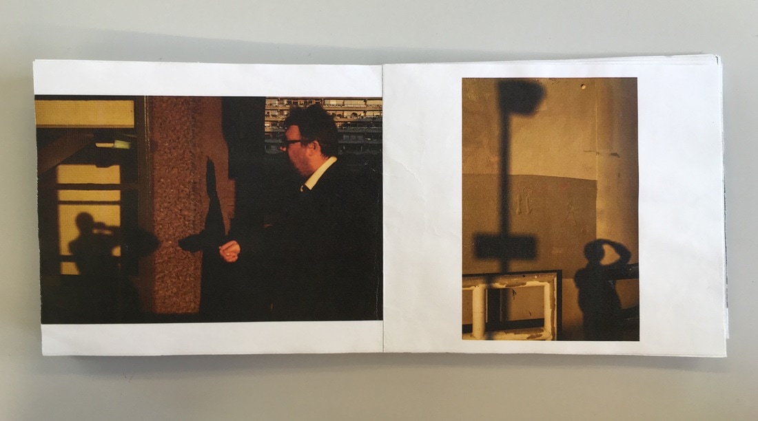
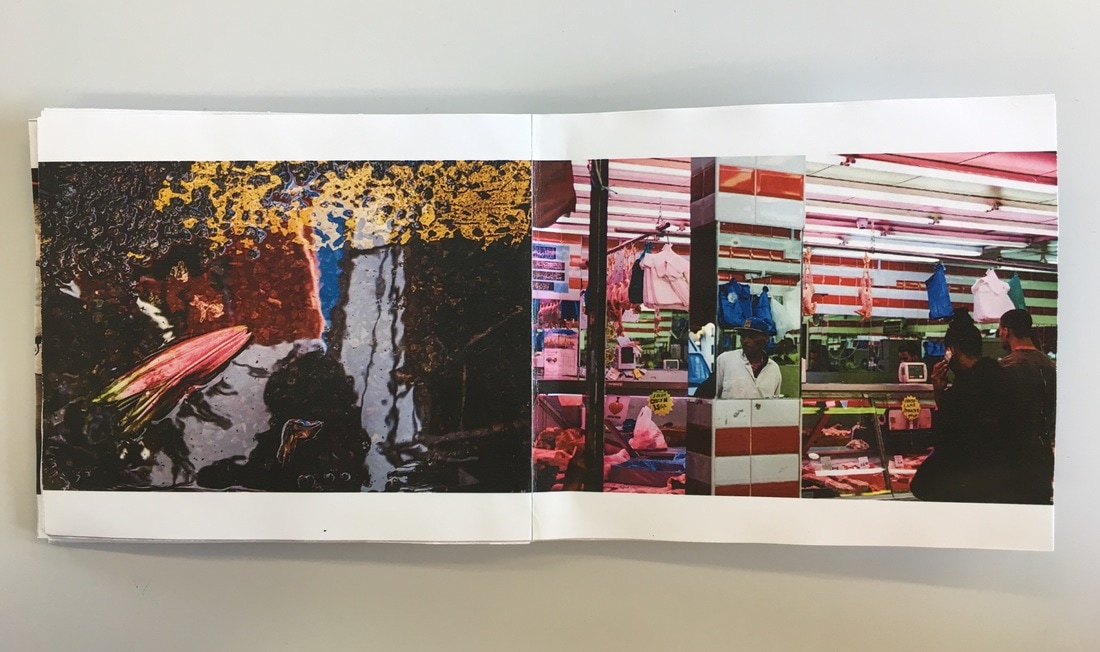
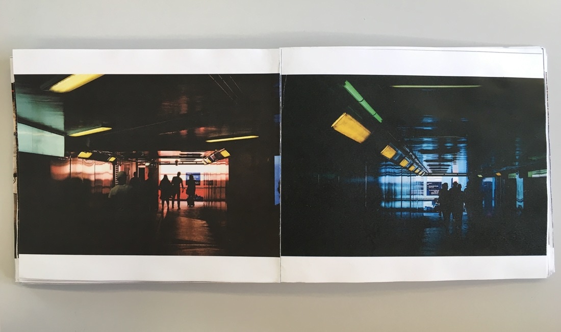
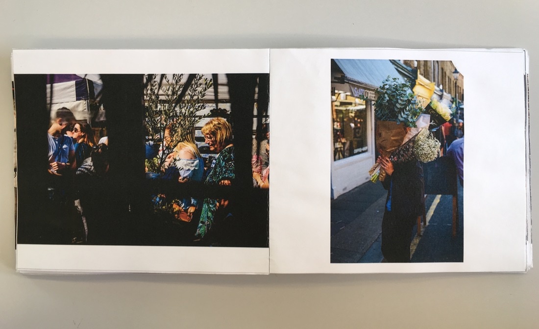
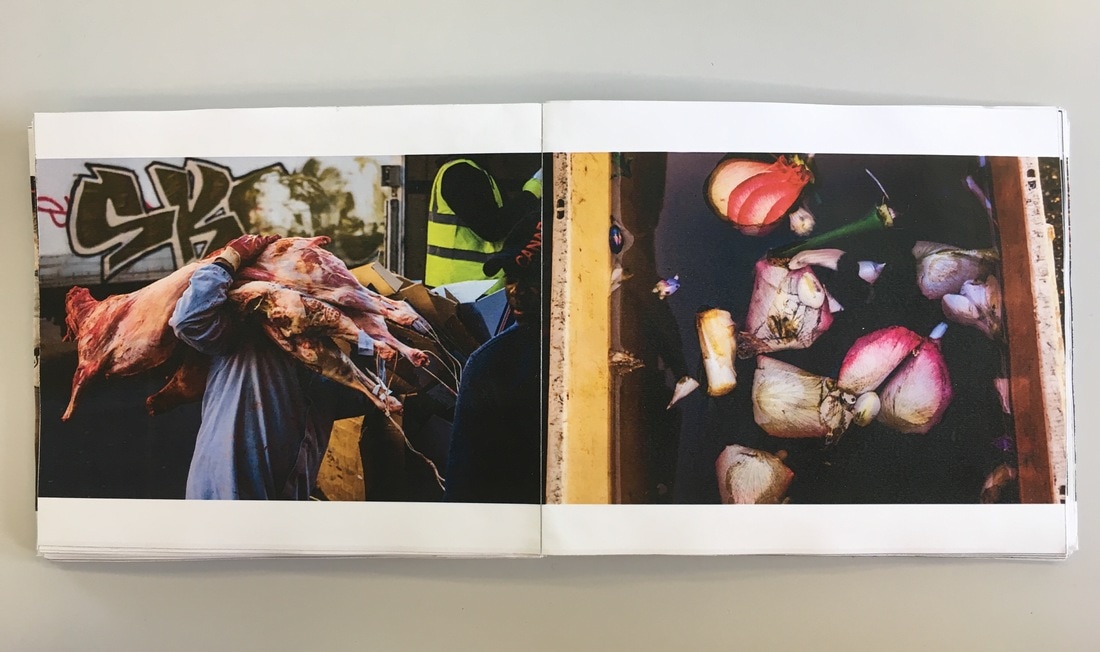
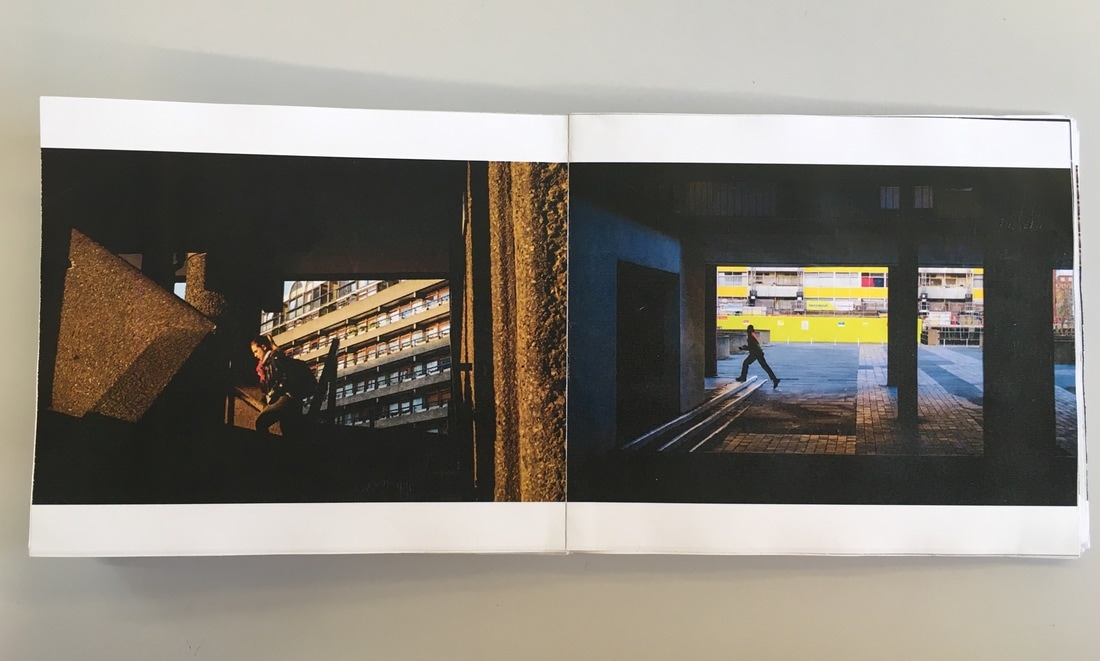
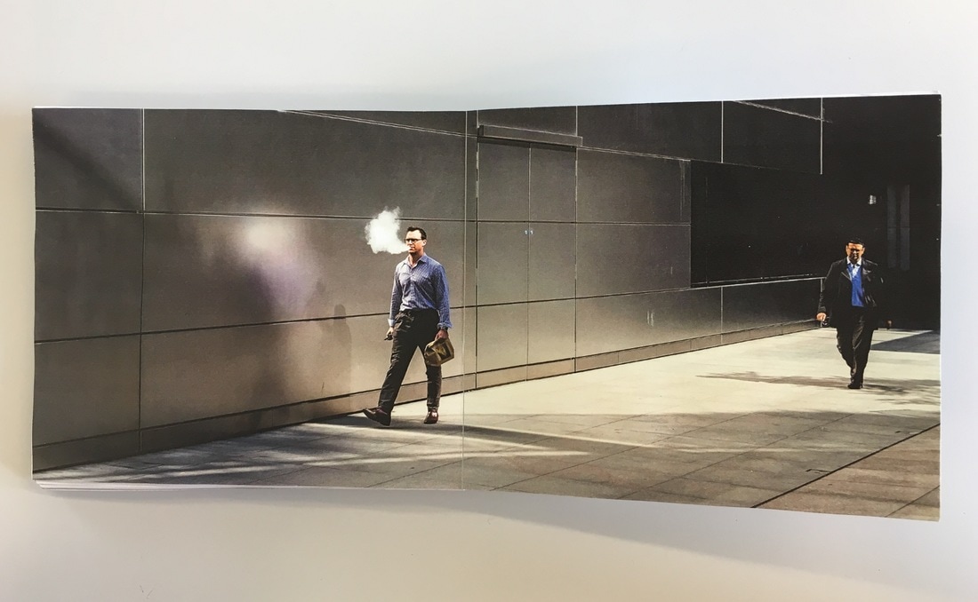
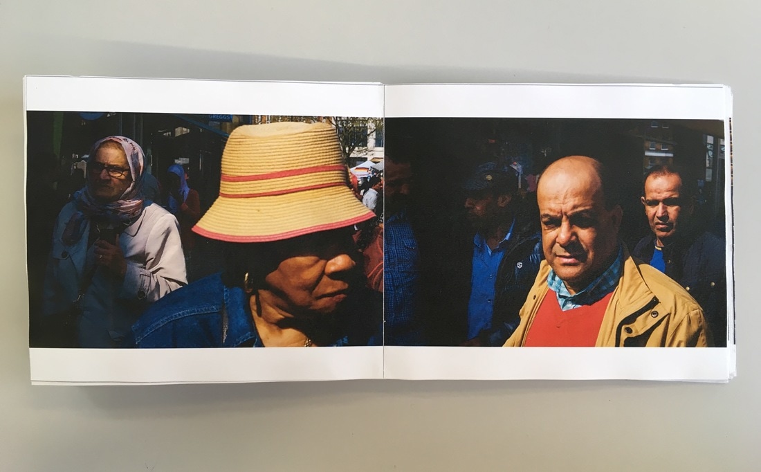
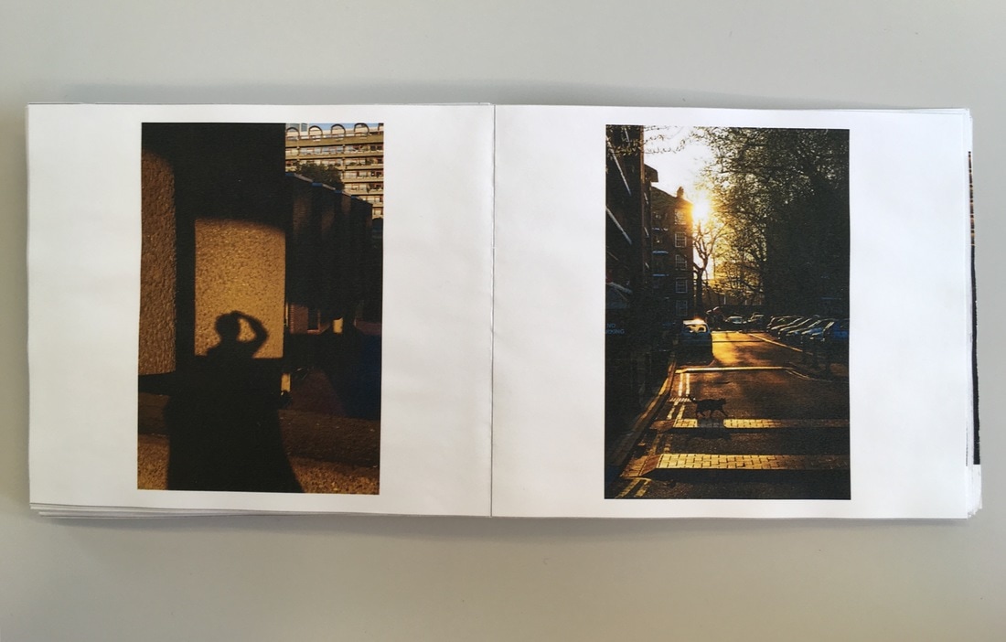
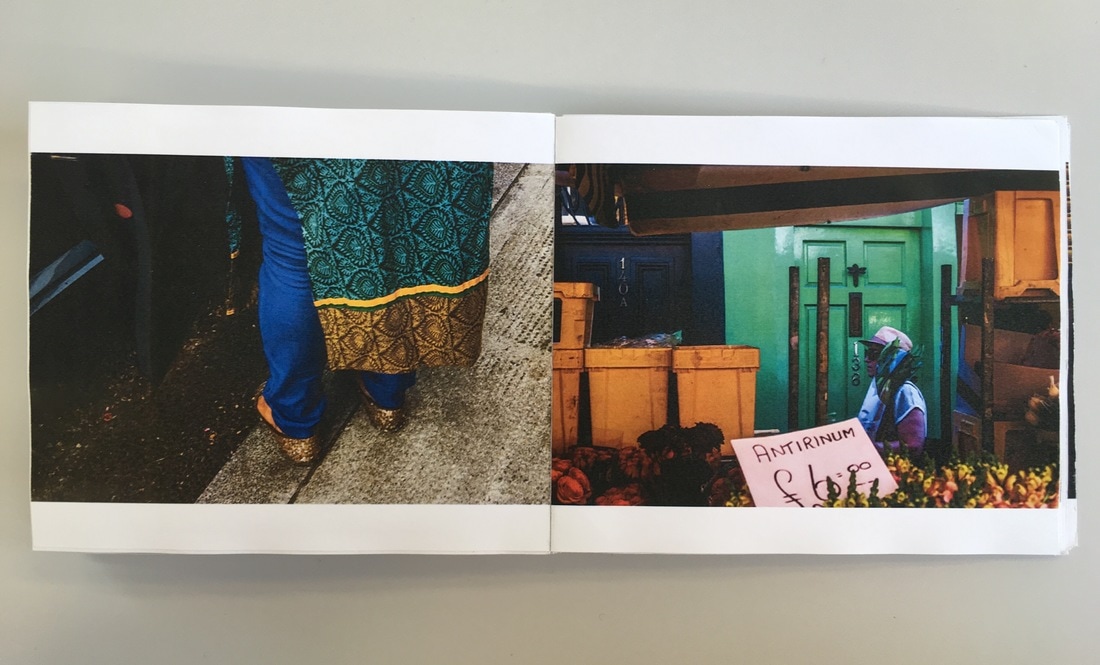
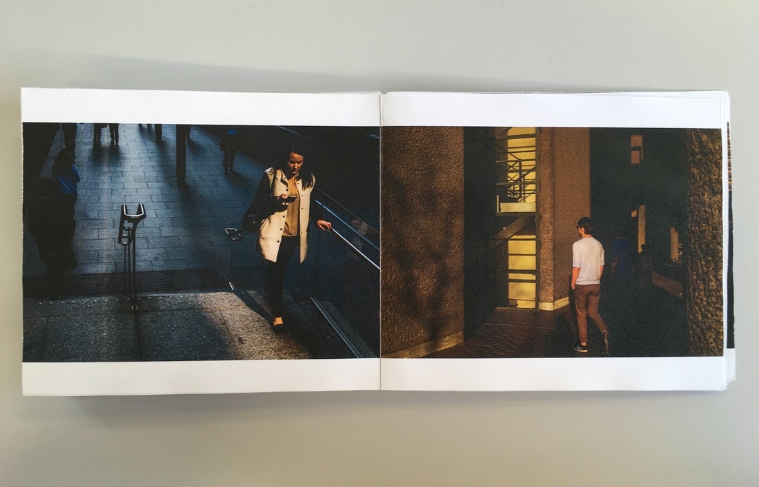
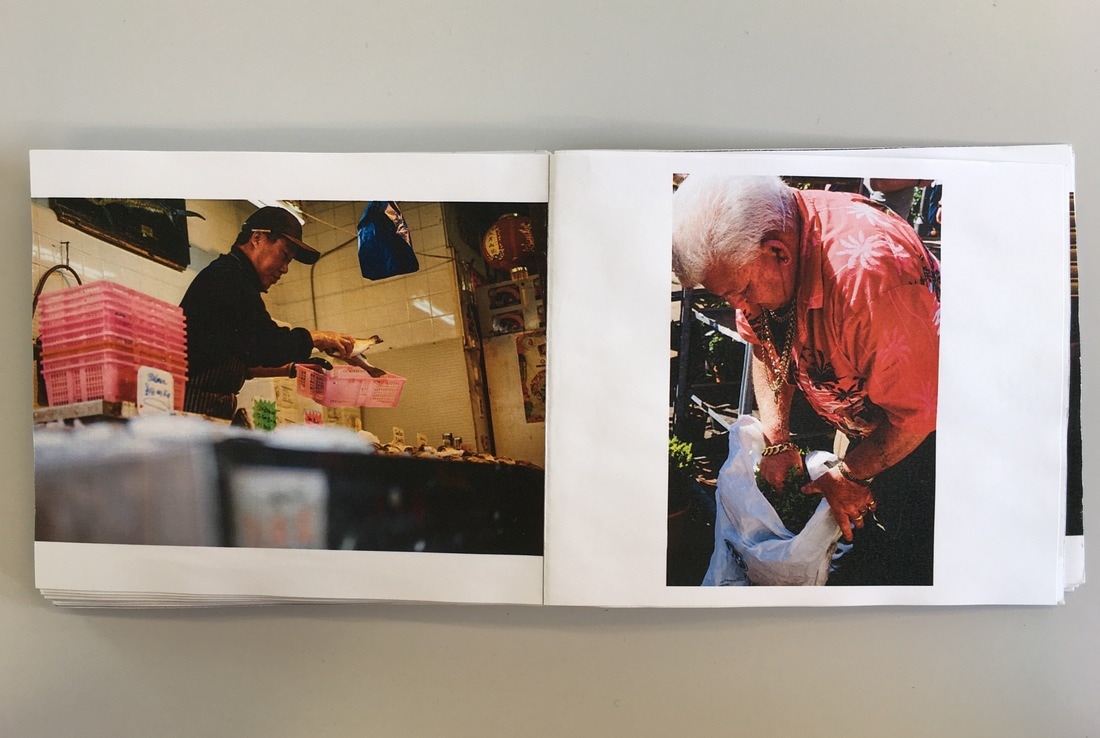
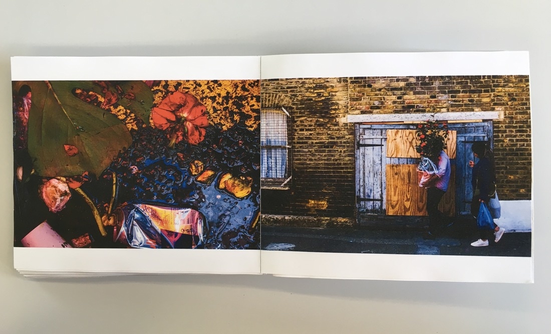
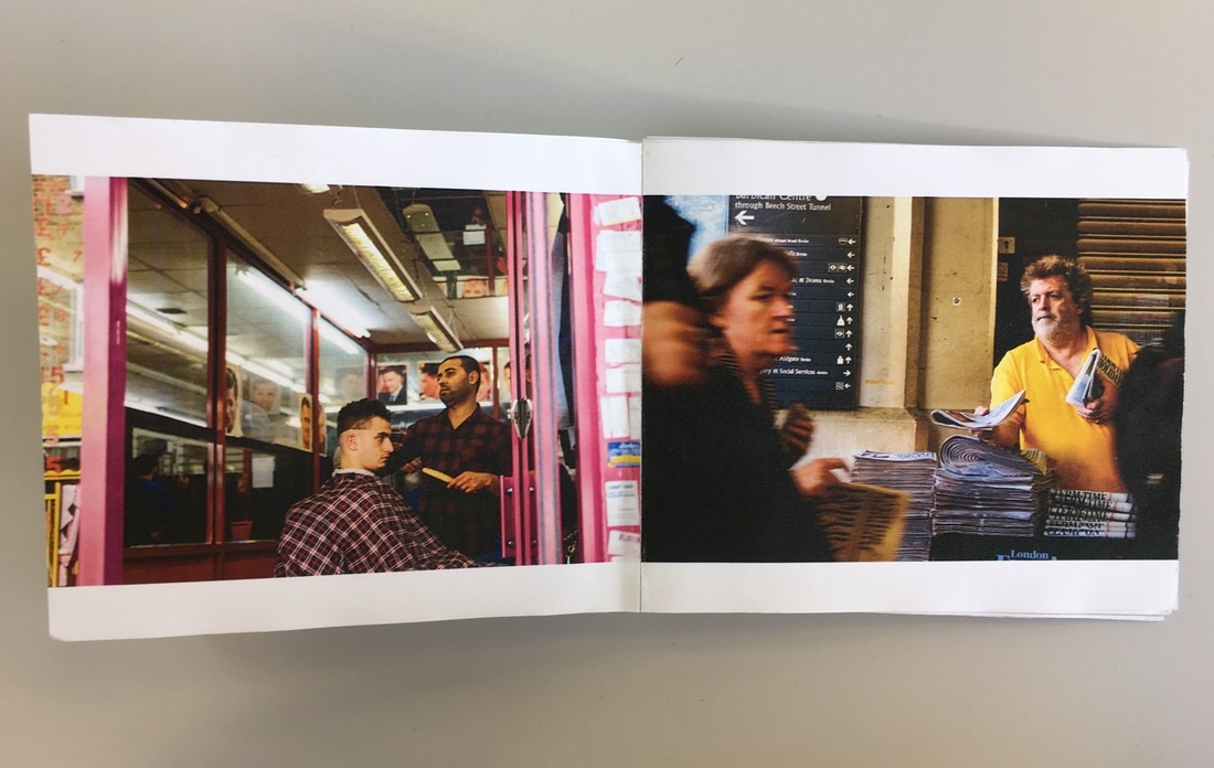
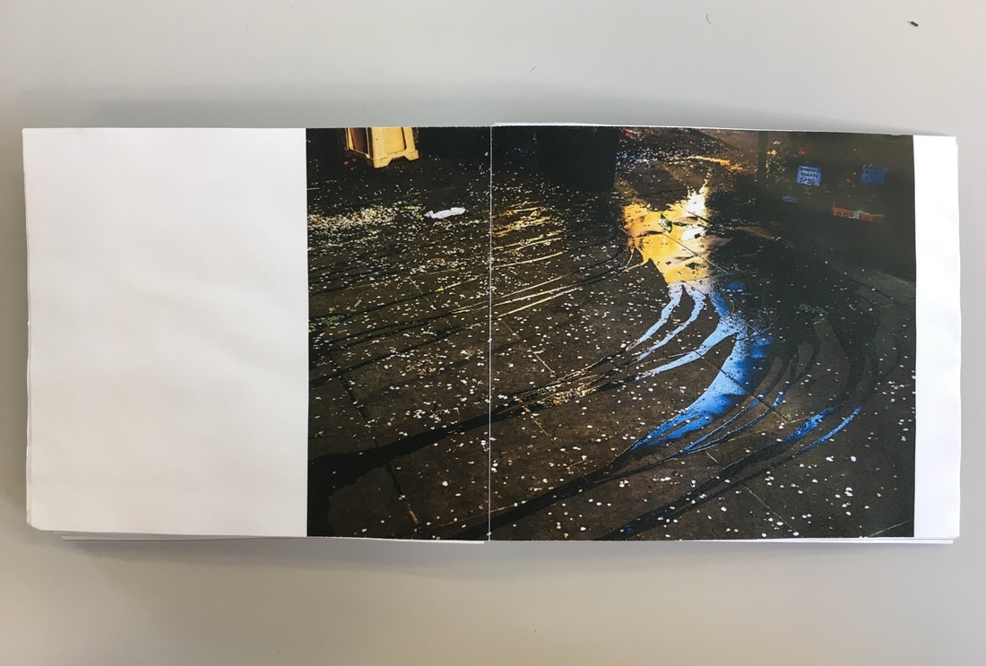
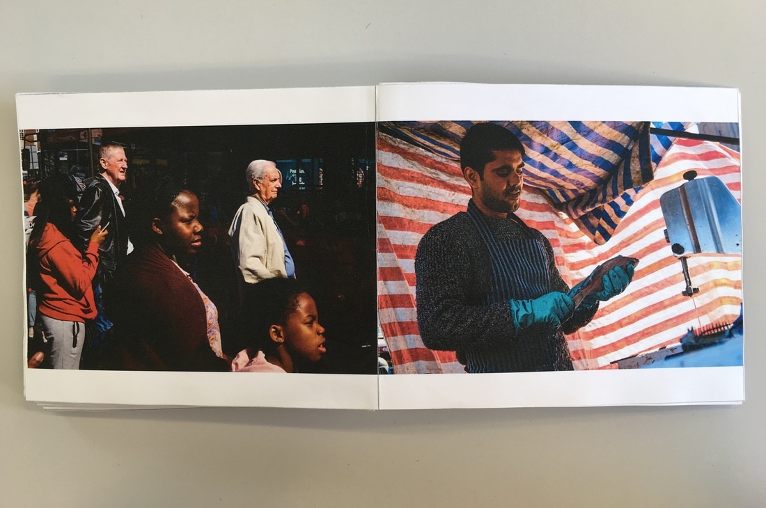
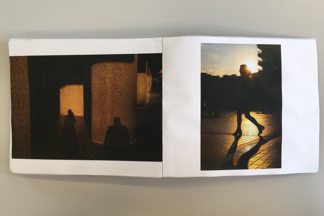
I read through and reviewed it a number of times, and I also got a few different people's opinions. Overall, I don't think that I will make any changes to my book before I get it published through Blurb. I am happy with my choice of images, and I think I paired a number of images together that work well. Not only this, but I am quite happy with the way that the images are ordered, similar images (in terms of colour or composition) are mostly spread out throughout the book, and I have tried to make sure they don't appear directly after one another. The next process will be to select the type of paper and cover of the book, I will then publish the book through the publishing company Blurb.
Publishing my Photobook
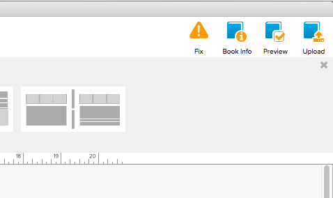
After I completed and reviewed my maquette, I then published my book and ordered it through Blurb. I looked through my maquette in Bookwright (the software I used to make my photobook), making sure that all of my images were in the right place and formatted correctly. Not only this, I made sure that I had selected 'hardcover imagewrap' as the cover, and Proline Pearl photo paper. After this, in Bookwright I clicked 'upload' in the top right corner of the window, and I then signed into my blurb account and reviewwd the book and checked that everything was correct. After I double checked my book, I clicked upload and the book was uploaded to my account. After this, I ordered my book, checking that I had selected the right preferences for my photobook. I had designed my book as 'standard landscape', as I thought it was the most suitable as the majority of my images were landscape, and I thought this size would be the best for displaying my images (I also thought Large landscape would be too large and possibly stretch and compromise the image quality. I chose Proline Pearl Photo paper because it was the highest quality paper, and it was recommended for photos with 'bright colours' and 'deep blacks', which would fit with and would be most suitable for the sort of photos I had taken. I chose hardcover imagewrap as I prefer hardcover books, and I think it would work best with the image that I selected to wrap around my book cover. For the end sheet, I chose 'standard mid grey', as I think it looks the most professional and work best with my photobook. After I was happy with everything, I then ordered my book.
My published Photobook
Click here for my Photobook images
Evaluation
Overall, I am happy with the outcome of my finished photobook. Although it took a lot of work, and it was a very lengthy process, I am pleased with the published photobook. I am glad that I used Blurb to publish my photobook, as it was very high quality and the images were rendered extremely well - they were very vivid, sharp and contrasty. I was very happy with the print quality - the pages were glossy and thick, and the hardcover and make of the book was also high quality. The simple style of the font is quite effective especially, standing out clearly against the darker tones of the cover. I really like the outcome of the image wrap, with the reflections and colours of the water splash spreading across the whole book cover. I am happy with the layout and flow of the book as well - I spent a long time working on this. Not only this, but I think that the pairing of the images was successful, and the relationship of images particularly across double pages. Again, I spent a long time finding relationships (and contrasts) between these images, and there are a number of successful pairings in terms of imagery. There are strong contrasts and similarities throughout this book; I paired images due to their contrasts (EG complementary colour contrasts, subject matter contrasts etc.), as well as clear differences compositionally and in terms of subject matter. Overall, I think that my photobook is successful in capturing street scenes and details. I wanted to create a photobook containing a series of street photographs, and capturing the energy of the streets of my city. I wanted to photograph some unusual, busy scenes, as well as documenting details and eye catching observations on the streets. I spent quite a long time photographing, and I subsequently captured quite a wide, varied range of images; in terms of colour, composition as well as subject matter. My selection of photographs are mostly quite complex compositions of street scenes, and many focus on many people; obviously typical subject matter in street photography. This style of photography showed clear inspiration from a number of photographers I studied, especially the complex street scenes of Alex Webb. However, I did include some variety in terms of subject matter, with some photographs focusing more on fine details and noticings on the streets (such as discarded objects, details of buildings, markets etc,) rather than solely these Webb inspired highly complex street scenes. Not only this, I have included a number of photos that also focus on light, reflections and shadows as well - which is what inspired the title of the book. There is significant variation in terms of imagery throughout my photobook - especially the contrasts across double page spreads of photographs. Despite the variation between images, the continuity and uniformity in terms of the street photography theme throughout the book is clear - this book provides quite a clear, focused narrative on this particular subject.
Feedback
This is beautifully designed and highly sophisticated outcome Louis. The image wrap works really effectively on the cover and I like your choice of typography. I know how long you spent refining the selection and sequencing of your images and this has really paid off. There are some wonderful conversations between images exploring compsoition, colour harmonies (and contrasts) and subject matter. The whole book is coherent, engaging and illuminating (pun intended). You demonstrate a high level of technical control in your photography and the choice of Blurb as POD service was a good one since the quality of the book matches that of the images. Thank you for the care, patience and skill that you have invested in this project. I hope you feel very proud of the outcome. I look forward to seeing how your interest in documentary photography continues to develop during the remainder of your personal investigation.
